Downloaded 24 times
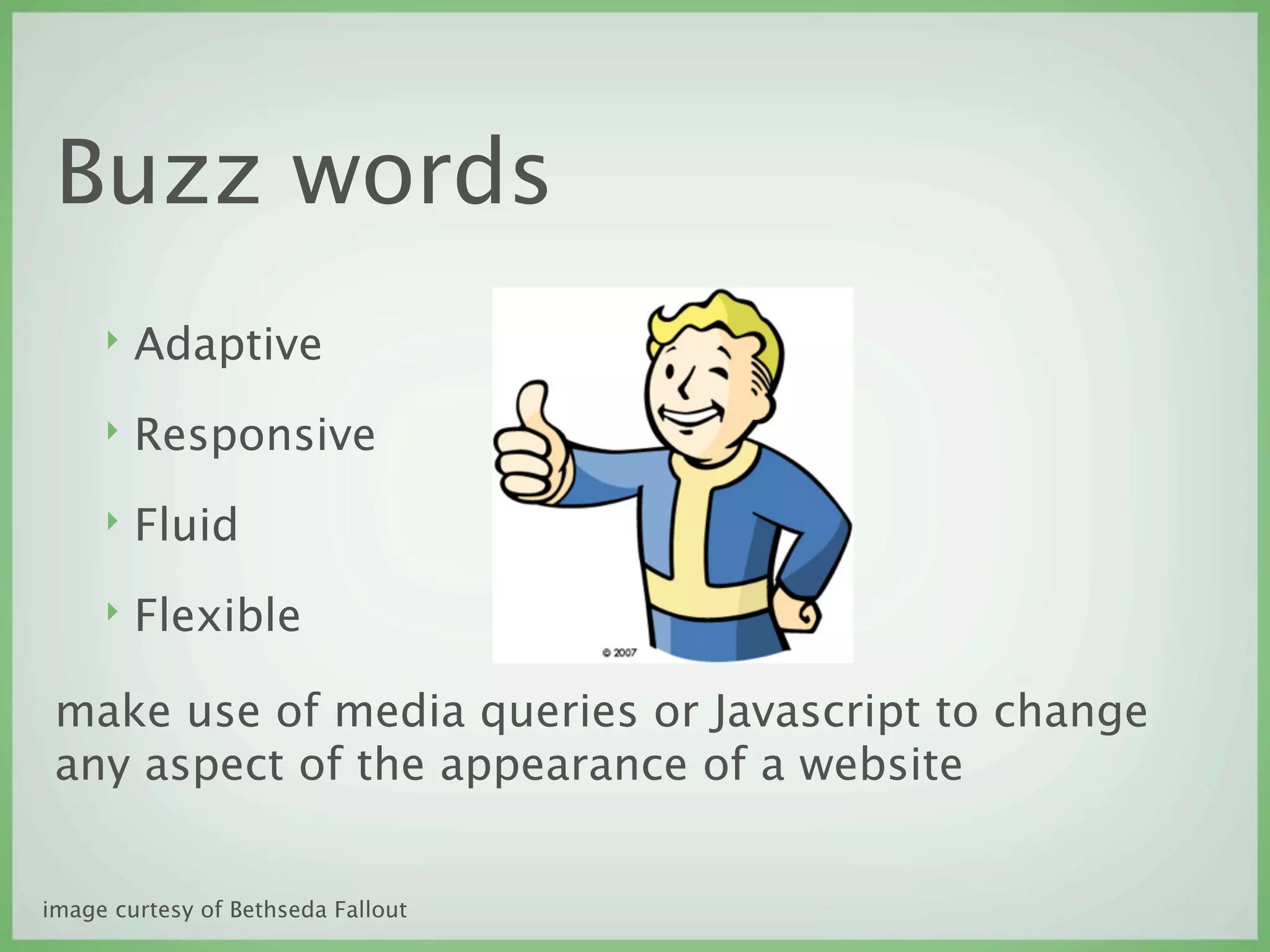
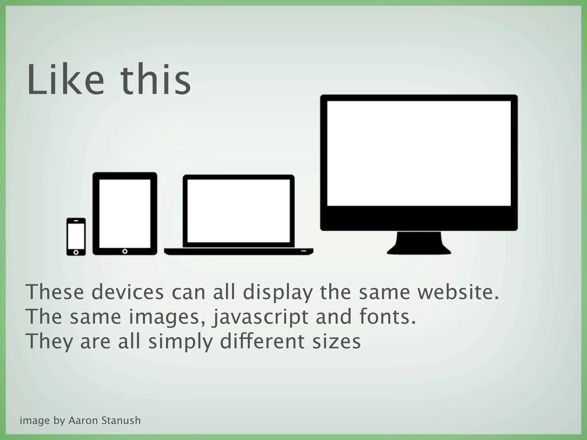
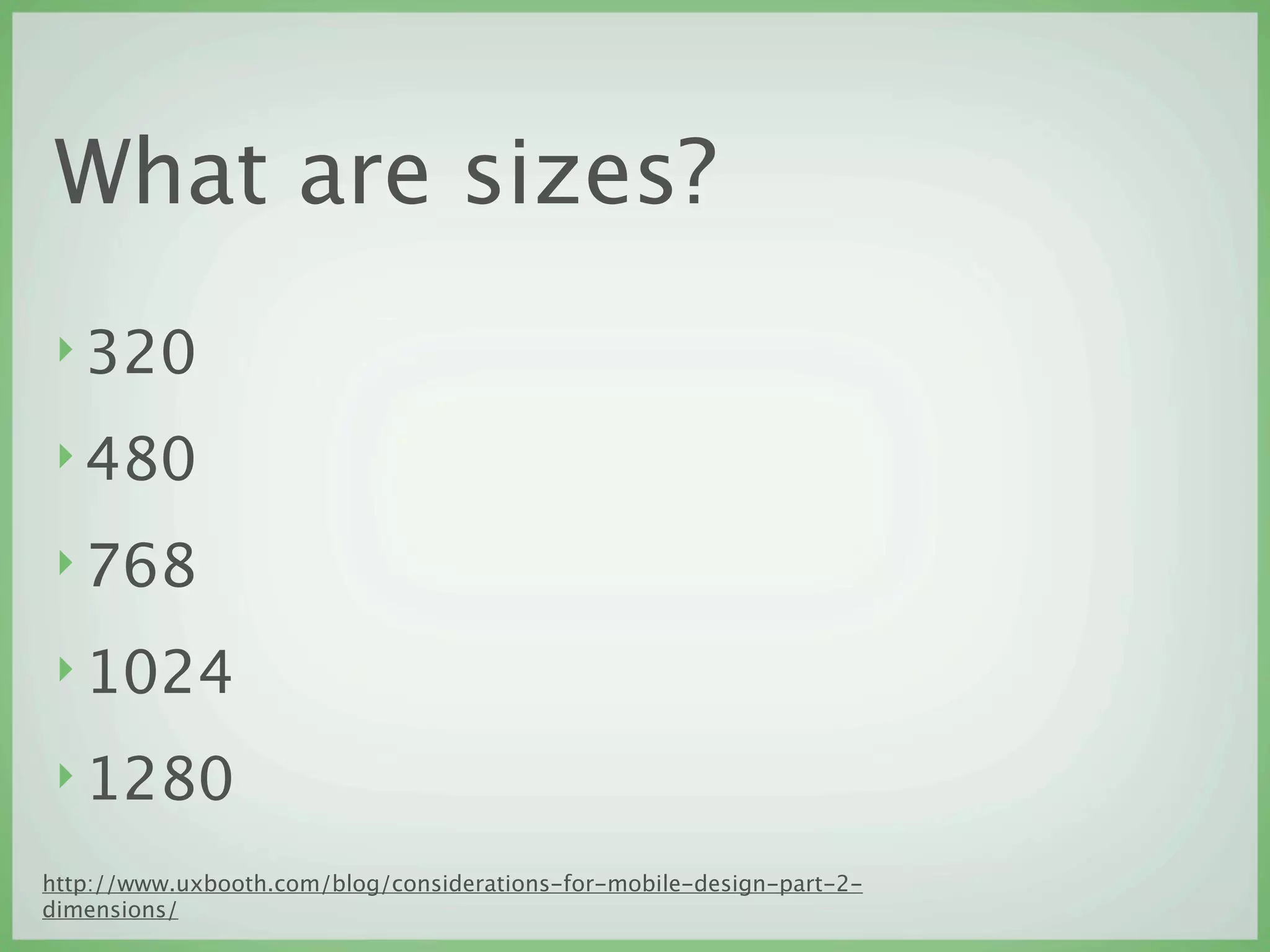
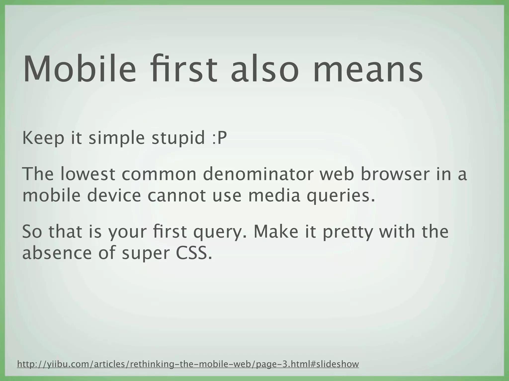
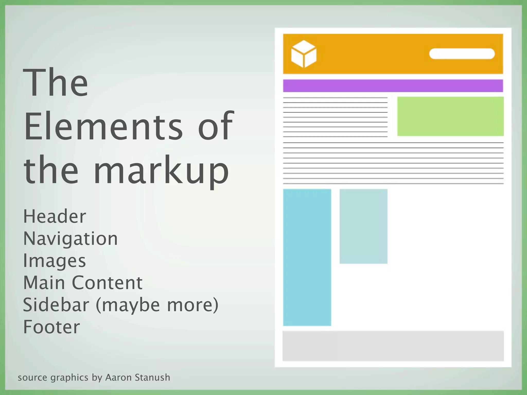
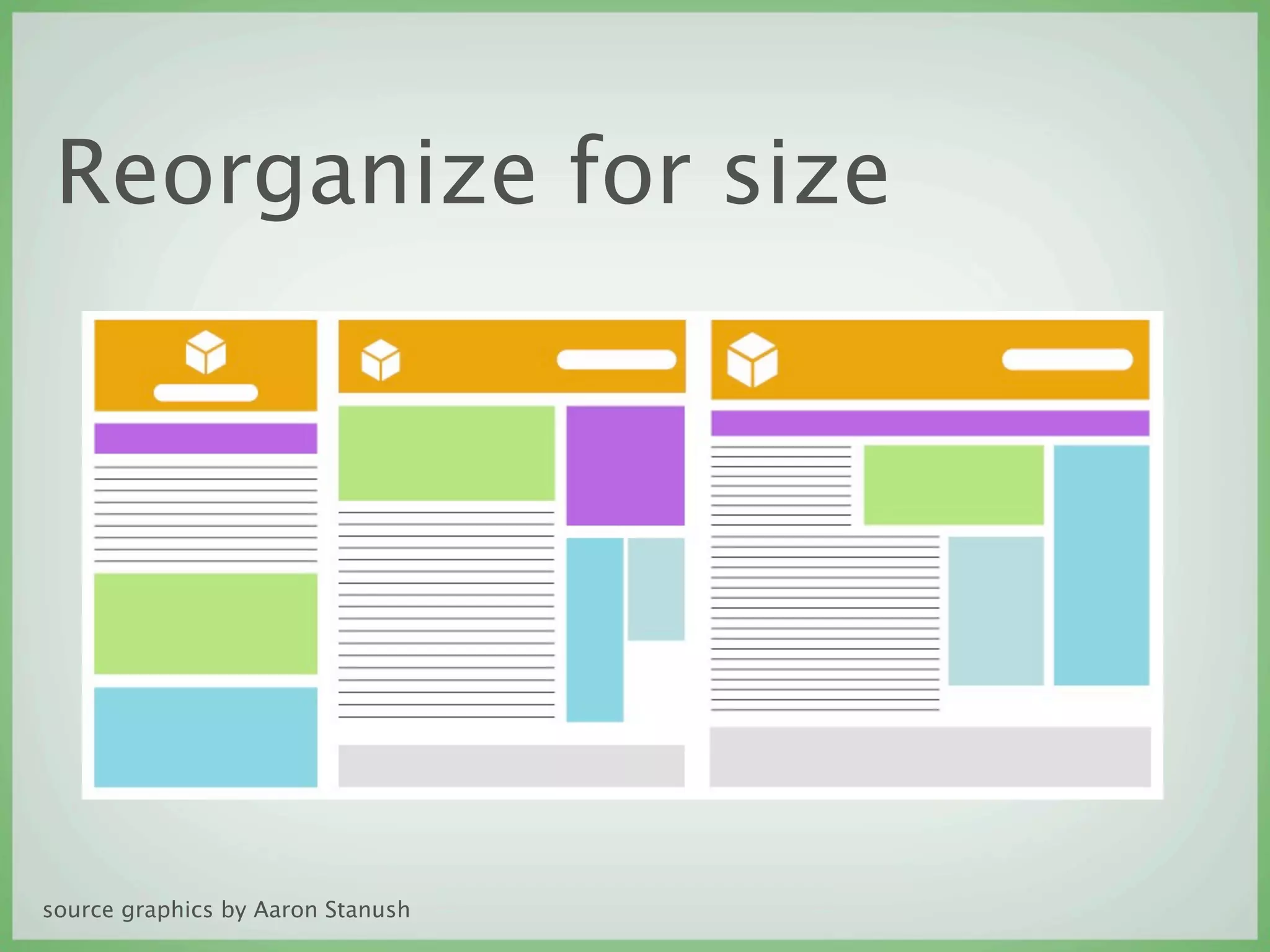
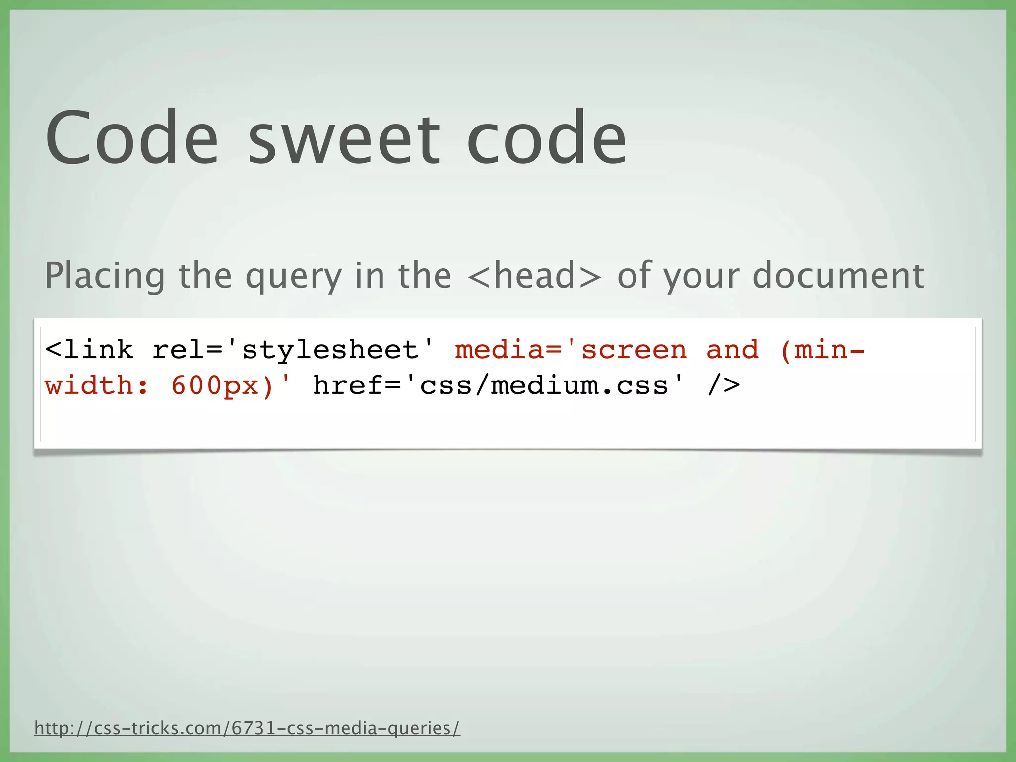
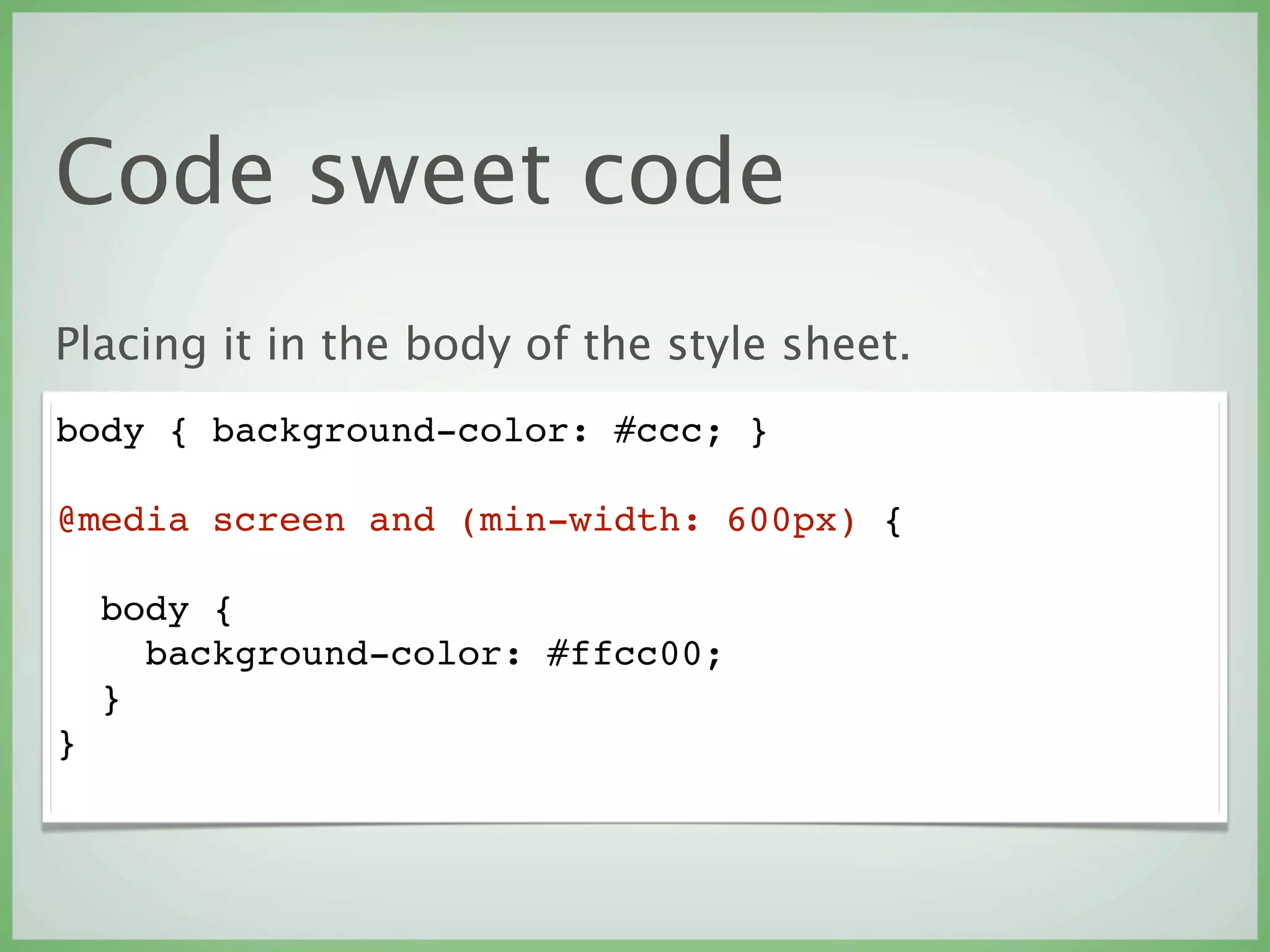


This document discusses designing websites for future-proofing and different device dimensions. It recommends a responsive design approach using CSS3 media queries to create layouts that adapt based on device size and capabilities. The key aspects are to consider the mobile interface first, keep designs simple, and reorganize elements like headers, navigation and content for different screen sizes. Code examples are provided for implementing media queries in both the HTML link and CSS style sheets.


![Csac05[1].p](https://cdn.slidesharecdn.com/ss_thumbnails/csac051-p-110520053600-phpapp01-thumbnail.jpg?width=640&height=640&fit=bounds)


