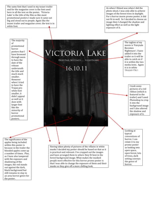
1. As when I filmed was when I did the photo shoot, I was only able to achieve images of the forest trees in daylight. For a horror movie promo poster, it did not fit in well. So I decided to choose an image then I changed the shadow and lighting effect as well as the light exposure of it. <br />The same font that I used in my teaser trailer and for the magazine cover is the font used here in all the text on the poster. ‘Victoria Lake’ is the title of the film so like most promotional posters I made sure it came out big and stood out to people. Again like the teaser trailer and magazine cover, the text is in white font. <br /> <br />The majority of promotional horror posters that I have browsed through seem to have the date of the release underneath the title and much much smaller. However when I tried to have the Trajan pro white font smaller, it didn’t appeal as well as it does with larger font like the minority of horror promotional posters.<br />The tagline of my movie is ‘Fairytale Becomes Nightmare’. I have added it into the trailer so it will be able to catch on if it is within the two media texts. Again it is in white Trajan Pro.<br />I took some pictures of a red ribbon (which is featured in the trailer) and I used Photoshop to crop it into the background image and I also altered the shadow and exposure of it. <br /> <br />Looking at typical conventions of horror, I can relate it to my promo poster as looking into open space, open forest, lots of trees, dark setting conveys the genre of horror.<br />The significance of the apples being included within this poster is because in the trailer the blooded apples come up a number of times. Plus, as I have also tampered with the exposure and shadowing of the images, the red stands out against the dark, black background but still remains to stay in an area horror genre for the poster. <br />Having taken plenty of pictures of the villains in white masks I decided my poster should be based on that as it is practical and relevant. I’ve cropped out the images and have arranged them to where they fit best in the forest background image. What makes the masked people more effective for this horror promo poster is that I was able to change the exposure of them and their masks so they give off a more chilling look.<br />