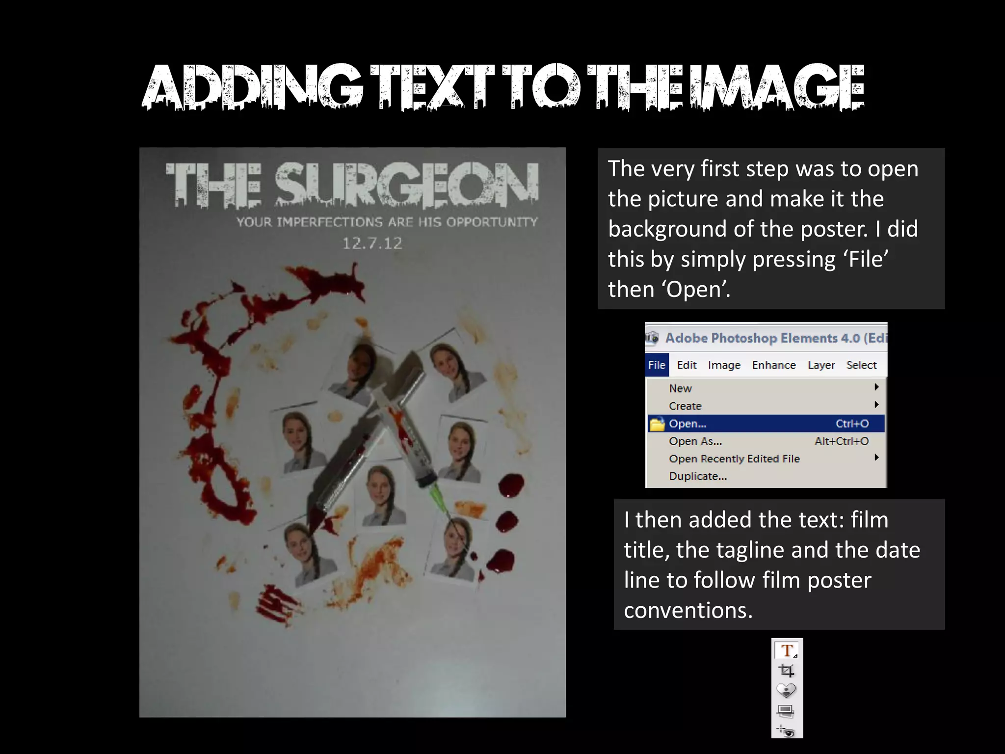
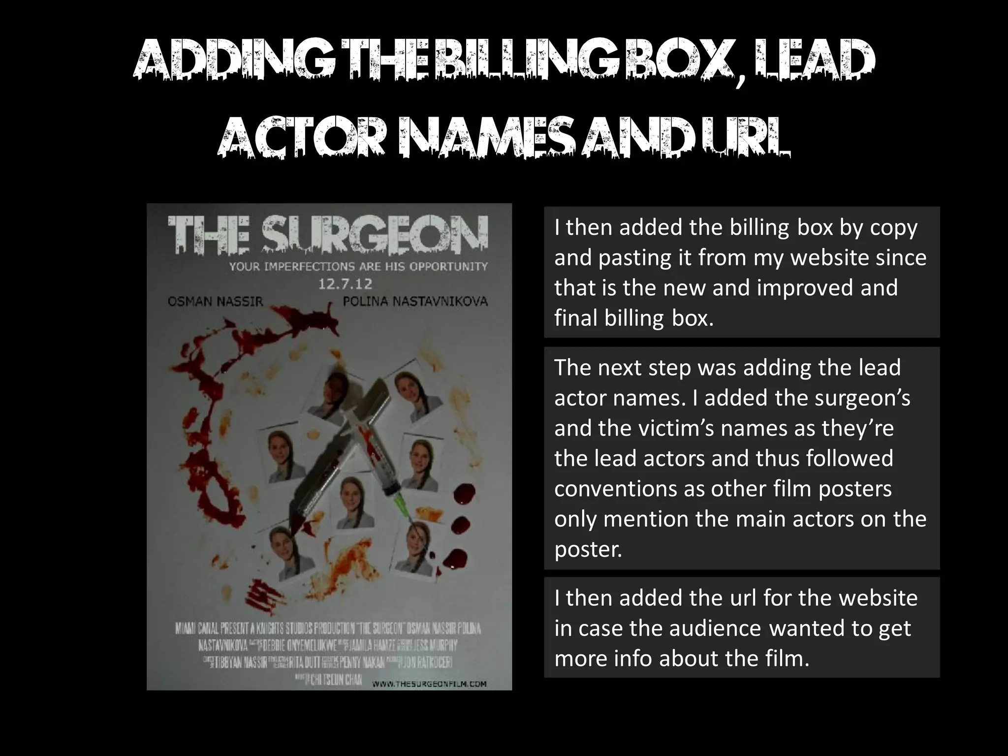
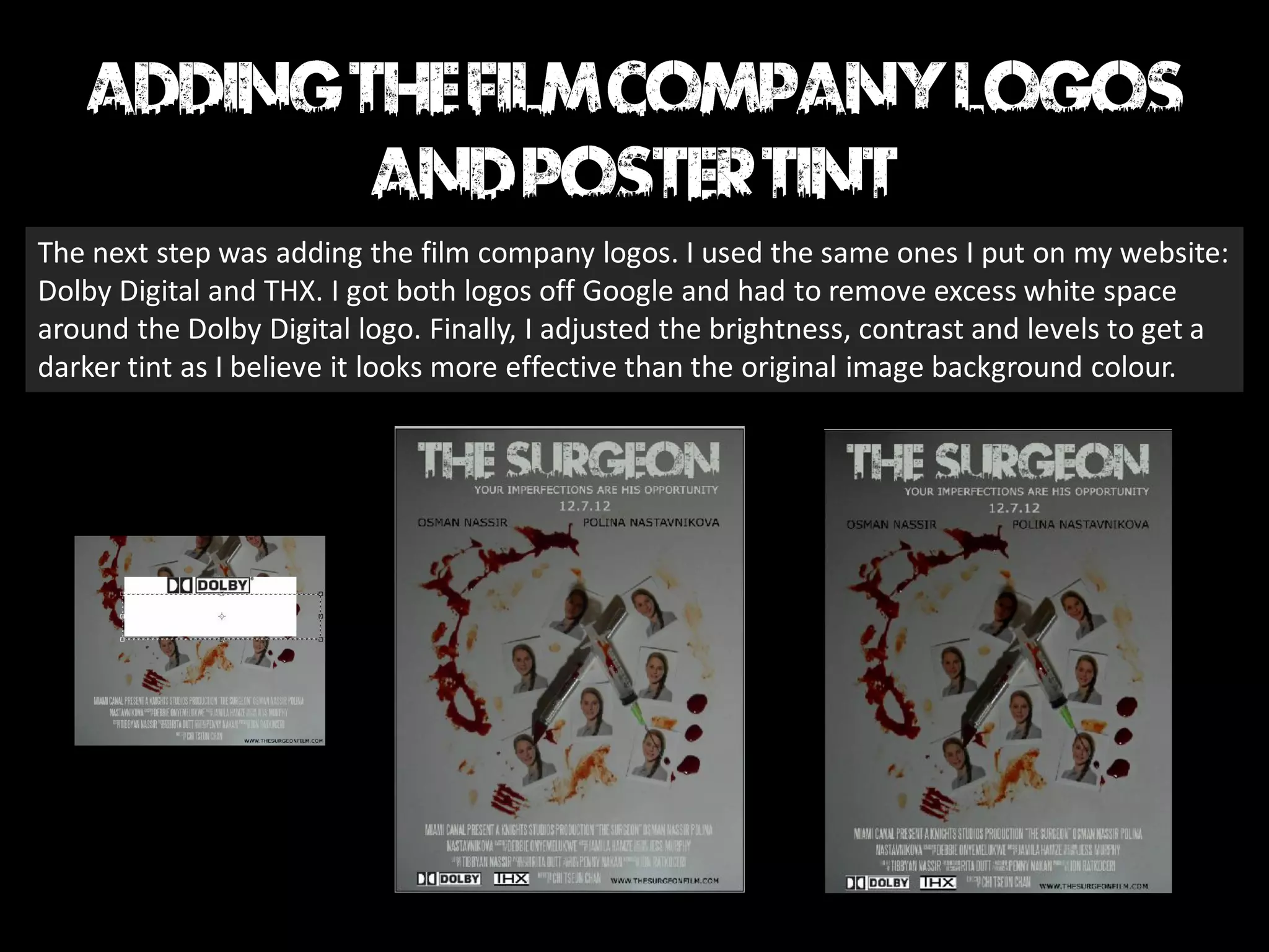
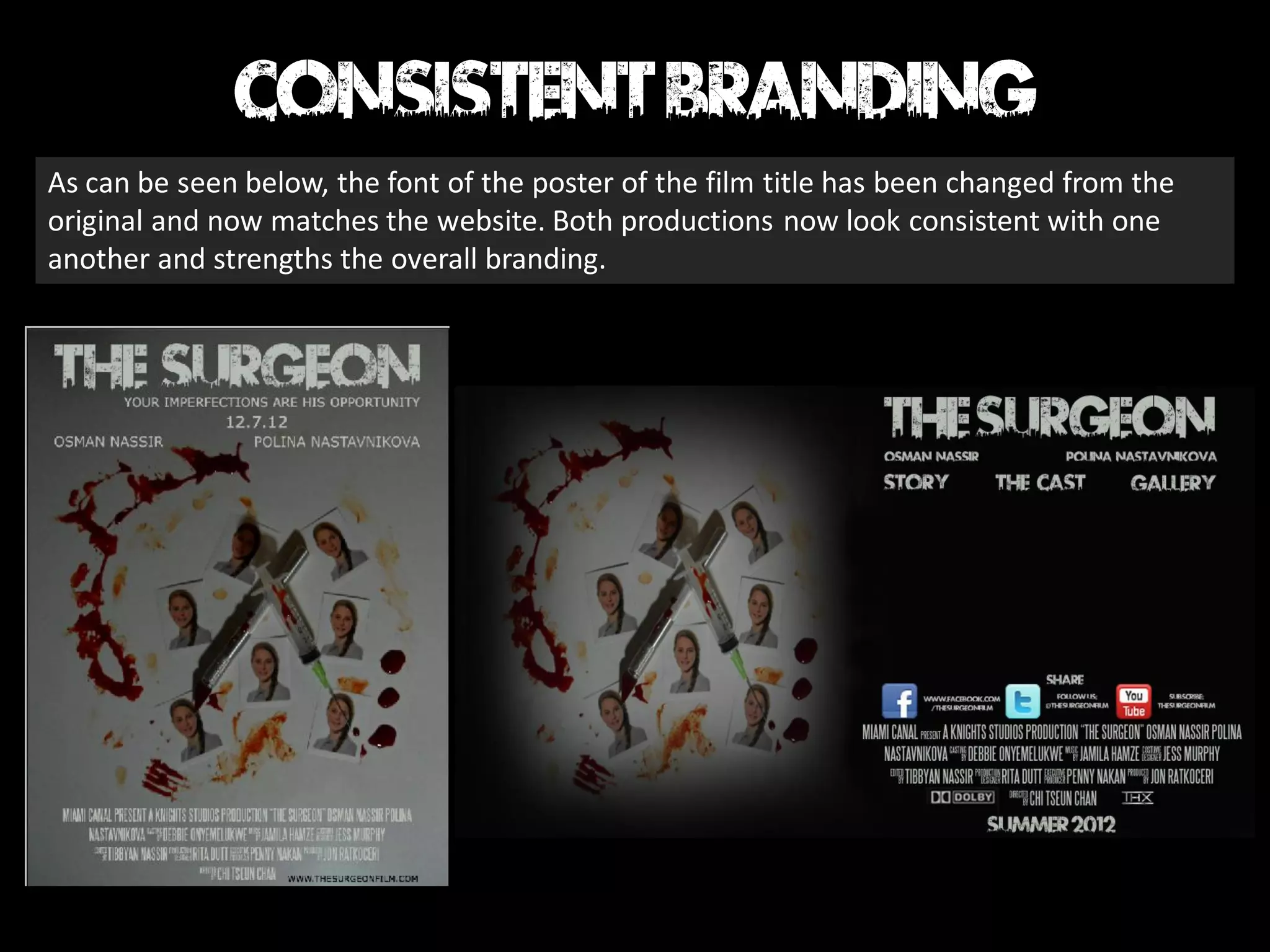
BY DEBBIE
The very first step was to open
the picture and make it the
background of the poster. I did
this by simply pressing ‘File’
then ‘Open’.


 I then added the text: film
 title, the tagline and the date
 line to follow film poster
 conventions.
,

I then added the billing box by copy
and pasting it from my website since
that is the new and improved and
final billing box.
The next step was adding the lead
actor names. I added the surgeon’s
and the victim’s names as they’re
the lead actors and thus followed
conventions as other film posters
only mention the main actors on the
poster.
I then added the url for the website
in case the audience wanted to get
more info about the film.
The next step was adding the film company logos. I used the same ones I put on my website:
Dolby Digital and THX. I got both logos off Google and had to remove excess white space
around the Dolby Digital logo. Finally, I adjusted the brightness, contrast and levels to get a
darker tint as I believe it looks more effective than the original image background colour.
As can be seen below, the font of the poster of the film title has been changed from the
original and now matches the website. Both productions now look consistent with one
another and strengths the overall branding.

Making the poster 2 nd draft

  • 1.
  • 2.
    The very firststep was to open the picture and make it the background of the poster. I did this by simply pressing ‘File’ then ‘Open’. I then added the text: film title, the tagline and the date line to follow film poster conventions.
  • 3.
    , I then addedthe billing box by copy and pasting it from my website since that is the new and improved and final billing box. The next step was adding the lead actor names. I added the surgeon’s and the victim’s names as they’re the lead actors and thus followed conventions as other film posters only mention the main actors on the poster. I then added the url for the website in case the audience wanted to get more info about the film.
  • 4.
    The next stepwas adding the film company logos. I used the same ones I put on my website: Dolby Digital and THX. I got both logos off Google and had to remove excess white space around the Dolby Digital logo. Finally, I adjusted the brightness, contrast and levels to get a darker tint as I believe it looks more effective than the original image background colour.
  • 5.
    As can beseen below, the font of the poster of the film title has been changed from the original and now matches the website. Both productions now look consistent with one another and strengths the overall branding.