The art of making effective presentations
•
5 likes•2,961 views

The document discusses effective public speaking and presentation skills. It emphasizes that speaking skills can be learned and outlines best practices for analyzing the audience, organizing content, delivering speeches, using visual aids, and handling questions. The key points are that good speakers are audience-centered, they take time to understand the audience's needs and objectives, and they prepare well by organizing their content and practicing their delivery. Visual aids should enhance the presentation but not overshadow the speaker.

Recommended
Recommended
More Related Content
What's hot
What's hot (20)
Similar to The art of making effective presentations
Similar to The art of making effective presentations (20)
Recently uploaded
Recently uploaded (20)
The art of making effective presentations
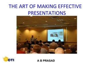
- 1. 1 ©Copyright by AB. PRASAAD A B PRASAD INTERPERSONAL RELATIONS THE ART OF MAKING EFFECTIVE PRESENTATIONS
- 2. 2 ©Copyright by AB. PRASAAD • THERE IS A MYTH THAT SPEAKERS ARE BORN • SPEAKING SKILLS CAN BE LEARNT • IT IS A COMMUNICATION SKILL
- 3. 3 ©Copyright by AB. PRASAAD “The biggest problem with communication is the illusion that it has been accomplished.” -George Bernard Shaw
- 4. 4 ©Copyright by AB. PRASAAD SPEAKERS: a) Self centered b) Message centered c) Audience-centered A good public speaker is Audience-centered
- 5. 5 ©Copyright by AB. PRASAAD Preparing content • Analyze your AUDIENCE • Define what ACTION you want them to take • Arrange your ARGUMENT to move them 3 A’s
- 6. 6 ©Copyright by AB. PRASAAD Analyze Your Audience • What are their names, titles, backgrounds, reasons for attending, etc…? • What are their big concerns? • What are their objectives, fears, hot buttons, and attitudes?
- 7. 7 ©Copyright by AB. PRASAAD Analyze your Audience -- General information -- Heterogeneity -- Age -- Sex -- Socio-economic background -- Level of understanding -- Attitudes -- Interests -- Needs
- 8. 8 ©Copyright by AB. PRASAAD Analyze Your Audience • What is their perception of you and your institution? • What are their questions likely to be? • What is personally at stake for them? • How much detail do they need?
- 9. 9 ©Copyright by AB. PRASAAD Define What Action • What action do you want the audience to take? • Define it in terms of the audience. • What will they feel, believe, and do after hearing your talk?
- 10. 10 ©Copyright by AB. PRASAAD Adopt the speech to the audience and the occasion
- 11. 11 ©Copyright by AB. PRASAAD SPEECH PREPARATION • Decide on the purpose of your speech - Is it supposed to inform? or persuade? • Select content that is compatible with your purpose • Gather information - Personal experiences - Interviews - Newspapers - Books - Internet • Make a creative analysis of topic • Develop the objectives
- 12. 12 ©Copyright by AB. PRASAAD ORGANISE YOUR SPEECH • The body: Main ideas and supporting ideas • The introduction: Drawing attention, establishing credibility, usefulness • The conclusion: Summation, challenge and action
- 13. 13 ©Copyright by AB. PRASAAD • The speech should be unified, coherent, relevant, concise and comprehensive • Tell them what you are going to tell them, tell them, and tell them what you told them • Prepare handouts and visual aids
- 14. 14 ©Copyright by AB. PRASAAD DELIVERING THE SPEECH
- 15. 15 ©Copyright by AB. PRASAAD TYPES OF DELIVERY Extemporaneous mode: (Without referring to notes) - Speech prepared before delivery • Plan for speaking Outline Content Rehearsal • Time to gather data • Well-organized (Disadvantage : Sticking to the structure & ignoring audience response)
- 16. 16 ©Copyright by AB. PRASAAD • Security of knowing what to say and how to say it • Each word is painstakingly selected • Sometimes it is appropriate and desirable • Mechanical, lacks spontaneity, stifles interaction with participants • Read with interest, enthusiasm and vitality MANUSCRIPT MODE:
- 17. 17 ©Copyright by AB. PRASAAD • Delivered with little or no preparation • Ability to think on your feet • Break your topic into parts past, present and future • Give introductory remarks • Order your thoughts • Review main points • End with a strong conclusion IMPROMPTU MODE:
- 18. 18 ©Copyright by AB. PRASAAD MEMORISED SPEECH • Success depends on memory • Present naturally • Difficulty in responding to the audience • Lacks spontaneity
- 19. 19 ©Copyright by AB. PRASAAD Podium Panic For some people, the thought of giving a presentation is more frightening than falling off a cliff, financial difficulties, snakes and even death.
- 20. 20 ©Copyright by AB. PRASAAD DELIVERING SPEECH • Understand speech anxiety: - Self-conscious (how you are being perceived) - Fear of rejection - Stage fright • Extensive preparation builds confidence • Anxiety is found out through non-verbal cues
- 21. 21 ©Copyright by AB. PRASAAD DELIVERING SPEECH • Every good speaker gets keyed up before delivery • We are all afraid of unknown • Audience want you to be a good speaker • Focus on the topic • Have positive attitude about the self
- 22. 22 ©Copyright by AB. PRASAAD • Rehearsing and thorough preparation helps • Prepare the audience • Explain the session plan • Talk about the benefits • Maintain eye contact DELIVERING SPEECH
- 23. 23 ©Copyright by AB. PRASAAD • Never let them out of your sight. • Looking them in the eye makes them feel that they are influencing what you say. • Eye contact allows the presentation to approximate conversation—the audience feels much more involved. Eye Contact
- 24. 24 ©Copyright by AB. PRASAAD Principles of Effective Delivery • Avoid frequent repetition of words • Avoid vocal disfluencies, or vocalised pauses. • Avoid distracting physical activities like scratching head, rubbing nose etc. • Delivery includes voice elements and body movements • Think the thought and feel the emotion
- 25. 25 ©Copyright by AB. PRASAAD Principles of Effective Delivery • Appear to be natural and spontaneous • Avoid distracting verbal and nonverbal cues • Adjust delivery to the audience, topic and situation • Reinforce meaning in message • While using notes don’t pretend that you are not using • Develop the ability to see yourself as the audience does.
- 26. 26 ©Copyright by AB. PRASAAD Principles of Effective Delivery Improve gestures and movement - Dress and appearance - Postures - Facial expressions - Gestures - Voice
- 27. 27 ©Copyright by AB. PRASAAD Use Humor - Great way to Break ice - It must be linked to the subject speaker, audience or occasions NOTHING IS MORE EMBRASSING THAN A JOKE THAT FALLS FLAT Principles of Effective Delivery
- 28. 28 ©Copyright by AB. PRASAAD Body Language NO-NO’s • Lean on or grip the podium • Rock or sway in place • Stand immobile • Use a single gesture repeatedly • Examine or bite your fingernails
- 29. 29 ©Copyright by AB. PRASAAD Body Language NO-NO’s • Cross your arms in front of your chest • Use obviously practiced or stilted gestures • Chew gum or eat candy • Click or tap your pen, pencil or pointer
- 30. 30 ©Copyright by AB. PRASAAD Body Language NO-NO’s • Lean into the microphone • Shuffle your notes unnecessarily • Tighten your tie or otherwise play with your clothing • Crack your knuckles • Jangle change or key in your pocket
- 31. 31 ©Copyright by AB. PRASAAD Voice • Voice Intelligibility –Articulation –Pronunciation –Vocalized pauses –Overuse of stock expressions –Substandard grammar • Voice Variability –Rate of speech –Volume –Pitch or tone –Emphasis
- 32. 32 ©Copyright by AB. PRASAAD
- 33. 33 ©Copyright by AB. PRASAAD Why use Visuals? • Increase and reinforce learning • Add Interest • Facilitate listening & remembering • Essential for understanding concepts • Increase teaching effectiveness • A picture is worth thousand words
- 34. 34 ©Copyright by AB. PRASAAD Impact of Audio-Visual Aids • People remember – 20% of what is heard – 30% of what is seen – 50% of what is seen & heard
- 35. 35 ©Copyright by AB. PRASAAD Planning and Preparation • Requires time, thought & imagination in – Selecting the points to be visualised – Translating ideas into suitably visual forms – Choosing the most appropriate medium – Designing layout and choosing colour – Manning the aid – Evaluating its effectiveness – Revising for future use
- 36. 36 ©Copyright by AB. PRASAAD Deciding which Device to use • Size of audience • Where the talk to be held • Once or many times • Cost of Preparing • Transport • Availability of power • Availability of equipment • Familiarity of speaker with aids • Subject
- 37. 37 ©Copyright by AB. PRASAAD Devices Available• Chalk Board • White Board • Flip Chart • Magnetic Board • Smart Board • Flannel Board • Over head Projector • Episcope or opaque projector • Slides • Films • LCD Projector, Power point • Video • Video Conferencing • Pana…
- 38. 38 ©Copyright by AB. PRASAAD Chalk Board • Advantages : – Generally available – Inexpensive – No Preparation • Disadvantages – Speaker to turn away from audience – Talking to the board – Ignoring audience – Limited distance – Dusty and messy – Dramatic effects not possible
- 39. 39 ©Copyright by AB. PRASAAD Tips • Write for audience • Write legibly • Use capitals • Keep neat and tidy • Cut down to essentials • Don’t over crowd • Clean the board • Use colored chalk for emphasis
- 40. 40 ©Copyright by AB. PRASAAD Flip Chart • Advantages – Can be used as blackboard or previously prepared charts – Less time and money – No need to erase – Can be reused for Recapitulation and review • Disadvantages – Limited space – Transportation Problems – Dramatic effect limited – Paper curling in storage – ‘Strip-tease’ chart to reveal one at a time – Drawings can be prepared ‘invisibly’
- 41. 41 ©Copyright by AB. PRASAAD White Board • Advantages – Permits wide use of colour – Less messy than chalk – Writing smooth and silent – Bright, Clean and Pleasant to look – Can also be used for projections • Disadvantages – Expensive – Wrong Pens create stains – Some boards scratch easily
- 42. 42 ©Copyright by AB. PRASAAD Magnetic Board • Can be used as black board • Very heavy for portability • Expensive • Dramatic effect by lightly throwing
- 43. 43 ©Copyright by AB. PRASAAD • Good for displaying – Photographs – Posters – Cutting from magazines • Colourful • Can be reused • Cannot be used as chalk board
- 44. 44 ©Copyright by AB. PRASAAD Overhead Projector • Various Models • Widely used • Can be used in normal daylight • Transparent acetate sheets • Marker Pens • Can also be photo copied • Colour transparencies • Type script is too small • Card Board frames for mounting
- 45. 45 ©Copyright by AB. PRASAAD Overhead Projector • Advantages – Speaker can face audience – Can work on transparencies – Roll of plastic as board – Easier to write on horizontal surface – Is clean and quick – Complete darkening not needed – Permits note-taking
- 46. 46 ©Copyright by AB. PRASAAD Panaboard • Advantages – Now-with integral printer for plain paper printing – Easy to write and wipe – Can use color pens – The Panasonic Interactive Panaboard can support your needs by opening your meetings and presentations to your business colleagues at locations around the world, thereby offering a cost effective and real-time global teleconference solution. You can project images from computer onto the board and control your applications for Windows . So whether your requirements call for training, global teleconferencing, or affordable brainstorming solution,
- 47. 47 ©Copyright by AB. PRASAAD Visuals can be used • To bring out a series of facts and the conclusions • To bring out points to be emphasized • To attract attentions through devices or colours • To present a complex processes • To introduce new concepts • To show relationships among objects • To show outline
- 48. 48 ©Copyright by AB. PRASAAD Methodology • Use pictures • Use words as second choice • Use graphs • Use devices • Use colour • Use your imagination
- 49. 49 ©Copyright by AB. PRASAAD Ranking of colors in getting attention • ORANGE • RED • BLUE • BLACK • GREEN • YELLOW • VIOLET • GREY
- 50. 50 ©Copyright by AB. PRASAAD Preference of Colors • BLUE • RED • GREEN • VIOLET • ORANGE • YELLOW • RED AND BLUE ARE THE BEST COLOURS
- 51. 51 ©Copyright by AB. PRASAAD Yellow on Dark Blue Pink on Violet Brown on White Green on White Dark Blue on White Yellow on Black Black on Yellow White on Black Black on White
- 52. 52 ©Copyright by AB. PRASAAD Use of Symbols
- 53. 53 ©Copyright by AB. PRASAAD Design Concepts •Big •Simple •Clear
- 54. 54 ©Copyright by AB. PRASAAD Simple •Not many lines( 6 to 10) •No more than 10 words per line
- 55. 55 ©Copyright by AB. PRASAAD Clear • Color of the background and text •Arial or Helvetica •Avoid overuse of red, shadows, animation and transitions •Beware of glaring backgrounds
- 56. 56 ©Copyright by AB. PRASAAD Clear •Clip art should add to the content •Ditto on sound clips •Use a different background only to emphasize one slide
- 57. 57 ©Copyright by AB. PRASAAD Visual Aids (not the stars of the show)
- 58. 58 ©Copyright by AB. PRASAAD VISUAL AIDS - Don’t talk to visual aids - Place yourself at centre stage - Use Pointer sparingly - Learn Black Board Management
- 59. 59 ©Copyright by AB. PRASAAD Questions & Answers “Does anyone have any questions for my answers?” -Henry Kissinger
- 60. 60 ©Copyright by AB. PRASAAD Questions & Answers • Beginning of a whole new interactive presentation • Opportunity to make a point • Most presentations are won or lost here
- 61. 61 ©Copyright by AB. PRASAAD Question and Answers - Encourage Questions - Ask Questions with proper gestures - Anticipate questions and prepare - Watch the person asking questions and Listen carefully - Repeat the question - Involve whole audience
- 62. 62 ©Copyright by AB. PRASAAD Questions & Answers • Anticipate lines of questioning • Rehearse • Don’t rank questions • Keep answers brief • Be honest • Don’t repeat negative questions • Clarify question • Refer to experts • Move your eyes off questioner
- 63. 63 ©Copyright by AB. PRASAAD NEVER argue with a member of the audience. THE RULE
- 64. 64 ©Copyright by AB. PRASAAD • Look at the questioner. • Remain neutral and attentive. • Listen to the whole question. • Pause before you respond. • Address the questioner, then move your eyes to others. Instead…
- 65. 65 ©Copyright by AB. PRASAAD Easy as A B C “I can’t Answer that question Because …, but I Can tell you…”
- 66. 66 ©Copyright by AB. PRASAAD “Better to keep your mouth shut and appear ignorant than open it and remove all doubt.” -Mark Twain
- 67. 67 ©Copyright by AB. PRASAAD Speaking Environment Control over speaking environment - Checkup Equipments - Proper seating arrangement - Reach before time - Acquaint yourself with environment - Handouts - Glass of water
- 68. 68 ©Copyright by AB. PRASAAD • PPT is designed to ENHANCE your presentation, not BE the presentation. • Remember, only you can prevent “Death by PowerPoint” PowerPoint Presentation GuidelinesPowerPoint Presentation Guidelines
- 69. 69 ©Copyright by AB. PRASAAD • Highlight key points or reinforce what the facilitator is saying • Should be short and to the point, include only key words and phrases for visual, reinforcement • In order for your presentation to fit on most screens, text and images should be placed within 95% of the PowerPoint slide. This “action safe” area is seen in the next slide. PowerPoint SlidePowerPoint Slide
- 70. 70 ©Copyright by AB. PRASAAD
- 71. 71 ©Copyright by AB. PRASAAD • Layout continuity from frame to frame conveys a sense of completeness • Headings, subheadings, and logos should show up in the same spot on each frame • Margins, fonts, font size, and colors should be consistent with graphics located in the same general position on each frame • Lines, boxes, borders, and open space also should be consistent throughout PowerPoint LayoutPowerPoint Layout
- 72. 72 ©Copyright by AB. PRASAAD FontsFonts • Font Style Should be Readable – Recommended fonts: Arial, Tahoma, Veranda • Standardize the Font Throughout Do !
- 73. 73 ©Copyright by AB. PRASAAD • This is a good title size Verdana 40 point • A good subtitle or bullet point size Verdana 32 point • Content text should be no smaller than Verdana 24 point • This font size is not recommended for content. Verdana 12 point. Font SizeFont Size The larger, the better. Remember, your slides must be readable, even at the back of the room.
- 74. 74 ©Copyright by AB. PRASAAD TIPS Presentation: 3/8/2004 Dawn Thomas, CRM Don’t ! Font SizeFont Size What does this say? Garamond Font, Italic, Bold 12pt. • This is very difficult to read. Times Font, Bold, 12pt. • This point could be lost. Century Gothic Font, Bold, Italic, 14pt. • No one will be able to read this. Gill Sans Font, Condensed Bold, 12pt Combining small font sizes with bold or italics is not recommended: Small fonts are okay for a footer, such as:
- 75. 75 ©Copyright by AB. PRASAAD FontsFonts • Don’t Sacrifice Readability for Style • Don’t Sacrifice reaDability for Style • Don’t Sacrifice Readability for Style • Don’t Sacrifice Readability for Style Don’t !
- 76. 76 ©Copyright by AB. PRASAAD Caps and ItalicsCaps and Italics • DO NOT USE ALL CAPITAL LETTERS – Makes text hard to read – Conceals acronyms – Denies their use for EMPHASIS • Italics – Used for “quotes” – Used to highlight thoughts or ideas – Used for book, journal, or magazine titles
- 77. 77 ©Copyright by AB. PRASAAD Use a TemplateUse a Template • Use a set font and color scheme. • Different styles are disconcerting to the audience. • You want the audience to focus on what you present, not the way you present.
- 78. 78 ©Copyright by AB. PRASAAD Use the Same BackgroundBackground on Each Slide Do !!
- 79. 79 ©Copyright by AB. PRASAAD Don’t! • Don’t use multiple backgrounds in your presentation • Changing the style is distracting
- 80. 80 ©Copyright by AB. PRASAAD CCoolloorrss • Reds and oranges are high-energy but can be difficult to stay focused on. • Greens, blues, and browns are mellower, but not as attention grabbing. • Reds and Greens can be difficult to see for those who are color blind.
- 81. 81 ©Copyright by AB. PRASAAD CCoolloorrss • White on dark background should not be used if audience is more than 20 ft away. – This set of slides is a good example. – You can read the slides up close. – The further away you get, the harder it is to read. – This is a good color combination if viewed on a computer. – A dark background on a computer screen reduces glare.
- 82. 82 ©Copyright by AB. PRASAAD CCoolloorrss • Large Hall Events –Avoid WhiteWhite Backgrounds –The white screen can be blinding in a dark room –Dark SlidesDark Slides with Light ColoredLight Colored TextText Work Best Don’t
- 83. 83 ©Copyright by AB. PRASAAD TheThe CCoolloorr WheelWheel • Colors separated by another color are contrasting colors (complementary) • Adjacent colors harmonize with one another (Green and Yellow) • Colors directly opposite one another are said to CLASH • Clashing colors provide readability – OrangeOrange on BlueBlue Do !
- 84. 84 ©Copyright by AB. PRASAAD Graphs and ChartsGraphs and Charts Make sure the audience can read them!
- 85. 85 ©Copyright by AB. PRASAAD Avoid using graphics that are difficult to read. In this example, the bright colors on a white background and the small font make the graph hard to read. It would be very difficult to see, especially in the back of a room. 8 Don’t ! Graphics and ChartsGraphics and Charts
- 86. 86 ©Copyright by AB. PRASAAD This graph contains too much information in an unreadable format. 10 Don’t !
- 87. 87 ©Copyright by AB. PRASAAD These are examples of good graphs, with nice line widths and good colors. Good GraphGood Graph Do !
- 88. 88 ©Copyright by AB. PRASAAD Charts and GraphsCharts and Graphs 0 10 20 30 40 50 60 70 80 Nort h America Europe Aust railia Mode A Mode B Mode C Don’t
- 89. 89 ©Copyright by AB. PRASAAD Charts and GraphsCharts and Graphs 0 10 20 30 40 50 60 70 80 NorthNorth AmericaAmerica Europe Australia Mode A Mode B Mode C Do !
- 90. 90 ©Copyright by AB. PRASAAD IllustrationsIllustrations • Use only when needed, otherwise they become distracters instead of communicators • They should relate to the message and help make a point • Ask yourself if it makes the message clearer • Simple diagrams are great communicators Do !
- 91. 91 ©Copyright by AB. PRASAAD Don’t !
- 92. 92 ©Copyright by AB. PRASAAD Limit Each Slide to One IdeaLimit Each Slide to One Idea • UseUse Bullet PointsBullet Points to Coverto Cover Components of Each IdeaComponents of Each Idea
- 93. 93 ©Copyright by AB. PRASAAD BulletsBullets • Keep each bullet to 1 line, 2 at the most • Limit the number of bullets in a screen to 6, 4 if there is a large title, logo, picture, etc. – This is known as “cueing” – You want to “cue” the audience on what you’re going to say • Cues are a a brief “preview” • Gives the audience a “framework” to build upon
- 94. 94 ©Copyright by AB. PRASAAD BulletsBullets (con.)(con.) • If you crowd too much text, the audience won’t read it – Too much text looks busy and is hard to read – Why read it, when you’re going to tell them what it says? – Our reading speed does not match our listening speed; hence, they confuse instead of reinforce
- 95. 95 ©Copyright by AB. PRASAAD Points to RememberPoints to Remember • Limit each slide to 1 idea • Limit each bullet point to only a few words to avoid long sentences that go on and on!
- 96. 96 ©Copyright by AB. PRASAAD Points to RememberPoints to Remember • Limit animation • Too much animation can be distracting. • Be consistent with animation and have all text and photos appear on the screen the same way each time. • There are many animation modes to choose from, but it is best to use just one throughout.
- 97. 97 ©Copyright by AB. PRASAAD Limit AnimationLimit Animation • Use the same animation throughout the entire presentation • Using more than one can be very distracting – The audience will only see the animation and not the message you’re trying to get across !! Bam!Don’t
- 98. 98 ©Copyright by AB. PRASAAD Points to RememberPoints to Remember • Keep bullet points brief • Use the same background for each slide • Use dark slides with light colored text in large hall events Do !
- 99. 99 ©Copyright by AB. PRASAAD Avoid the “All Word” SlideAvoid the “All Word” Slide Another thing to avoid is the use of a large block paragraph to introduce your information. Attendees do not like to have what is on the screen, read to them verbatim. So, please use short, bulleted statements and avoid typing out your whole presentation on to the slides. Also, it is difficult for some to listen and read a large amount of text at the same time. Don’t
- 100. 100 ©Copyright by AB. PRASAAD • To make a slide stand out,To make a slide stand out, change the font, background,change the font, background, or add animation.or add animation.
- 101. 101 ©Copyright by AB. PRASAAD YOUYOU • Do not use the media to hide you • The audience came to SEE you • The media should ENHANCE the presentation, not BE the presentation • If you’re only going to read from the slides, then just send them the slides! • Remember, only you can prevent “Death by PowerPoint”
- 102. 102 ©Copyright by AB. PRASAAD “Make sure you have finished speaking before your audience has finished listening.” -Dorothy Sarnoff
- 103. 103 ©Copyright by AB. PRASAAD
Editor's Notes
- Intelligibility =understandability Variability =expresses differences in meaning Articulation (enunciation)= the precision and clarity with which you utter the sounds of speech. Chiefly the job of the jaw, tongue, and lips. Most articulation problems come from laziness on the parts of these organs. Pronunciation =traditional or customary utterance of words. Common faults are the misplacement of accent, omitting sounds, adding sounds,and verbalizing silent letters. Vocalized pauses =uh, um, ah. Know your subject. Overuse of stock expressions =OK, like, you know. Conveys a lack of originality. Substandard grammar Force= variability of volume Pitch =highness or lowness Emphasis =stressing certain phrases or sections