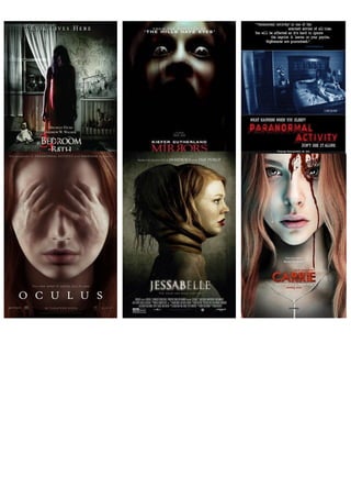
2. SUPERNATURAL POSTER OVERVIEW
INTRODUCTION: The eight posters displayed above evidently promote horror films
of the supernatural sub-genre. By carrying out an investigation, and by comparing
them to each other, it is possible to identify shared features within them and to
establish repeated patterns.
GENERAL CONVENTIONS: Each of the eight posters shown feature typical film
poster conventions. For example, we see the film title presented in each of the
posters and placed in line with the main image, which is the most significant and
largest text we see, highlighting its importance. An example would be in the very last
film poster displayed above, titled ‘GRAVE ENCOUNTERS’. We are also presented
with images that dominate the frame, signalling the films narrative as well as a luring
slogan to anchor the image and as we would expect to find, ghastly imagery to terrify
the audience. We are also shown institutional information placed at the bottom of the
page. This shows that this piece of text is not necessarily as relevant as the rest,
hence why it is discreetly placed. For instance, In ‘THE HAUNTED HOUSE
PROJECT’ poster, this information is barely shown to us.
SUB-GENRE CONVENTIONS: Furthermore, we as an audience can identify other
repeated patterns within the above film posters. The majority of the film posters
displayed above feature a protagonist (main character) who is female and appears to
be the victim and target of the torment from the demon that destroys her or seems to
threaten her in some way. In the ‘JESSABELLE’ poster, for instance, we see two
sides of the female character; the normal and the possessed. The fact that her hair is
wrapped around her neck may indicate that there’s no escape to this torture and that
she is forever trapped. In addition, the fact that both the antagonist and protagonist
are shown on either side of each other reveals that there are two sides to her. As we
3. would expect to find, the main image fully and effectively dominates the murky
frame. The slogan of the film ’The dead are back to life’ reinforces the dominant
image displayed to us, allowing us to see an anchorage between the two.
Another example is from the very first film poster ‘2 BEDROOM 1 BATH’. We see a
possessed child at the centre of the frame. However, when you look very carefully at
the mise-en-scene, we notice a very young child in his pyjamas staring at the female
character through the window, and the black shadows around him which create more
mystery and fear for the audience. We would normally associate a young child with
supernatural horror as they are the most likely to be the victims. The childish writing
on the wall: ‘NO CHILD….OR PAIN’ illustrates what the narrative of the film is as
well as the films sub-genre. This is because usually in supernatural/possession
horror films, a young child (mainly female) is the vulnerable target for the demon as
they are easier to control and destroy.
THE IMAGE: The images that feature within the eight posters all promote the same
sub-genre, supernatural. I particularly like the ‘CARRIE’ and ‘THE HAUNTED
HOUSE PROJECT’ images as they clearly differentiate between the remaining
posters. I like the ‘CARRIE’ poster mainly because the image of Chloe Moretz fills
the whole frame and immediately grabs the audience’s attention. The use of direct
address also grabs our attention as we are made to look at the character. When
looking at the poster, with the use of a close-up shot, we notice a tear trickling down
one side of her face. But on the other side, there is blood dripping down on the other
which makes us assume that not all is as it seems and that there is more than a
innocent young child to her.
The use of props/ iconography give us a hint of the films genre. The cross necklace
displayed on her neck may show that she comes from a strict religious background
and that she is ‘sacred’. The female characters face is pale and sallow. This seems
to be a convention within the supernatural sub-genre. Most of the film posters above
feature this as well. This may be used to show that the characters identity has been
taken and that her spirit has vanished because of the demon trapped inside her.
The second poster, ‘THE HAUNTED HOUSE PROJECT’ features an
establishing/long shot, allowing the audience to establish the setting of the film as
well as the figure standing inside the ‘haunted house’. The fact that it appears to be a
crime scene (yellow ‘KEEP OUT DO NOT CROSS’ tapes) blocking entrance to the
front of the house is very different to most of the other film posters which do not
show a setting. Moreover, we would normally associate these uses of iconography
as part of a crime scene investigation and the image displayed looks as though it
could have been used within the narrative. The main image of this poster, however,
Is the ‘haunted house’ and its dark surroundings than the character itself. I believe
that this has been used to make the poster seem more original and unique for the
audience, and to also show the significance and importance of the ‘haunted house’.
Overall, the images and shots from all the eight posters are very typical of a
supernatural horror. ‘THE PARANORMAL ACTIVITY’ poster is great in showing how
4. the main characters are being watched and under threat. The use of a wide-shot
allows us to see that they are in their bedroom. In reality, the bedroom and house
are seen as a quiet and secure place but when something or someone enters that
safety barrier, you then start to feel unsafe. Furthermore, huge, abandoned houses
are typical conventions found within a supernatural horror film. This could be used to
show the vulnerability and the loneliness of the character. Also, the fact that the
image is of a film recording reinforces the fact that the characters are not safe and
the night vision makes it even more effective.
COLOUR SCHEME: The colours used in the eight film posters are predominantly
black, white and red, colours which the audience would certainly associate with
horror. I believe that these colours complement each other well and the use of red
make the film posers even more effective but adding a touch a colour, which could
signify further mystery and intrigue. The colour red also connotes danger, doom and
evil which reflect the horror films being promoted. The costume the character wears
are pale, light colours such as cream and white. The use of these colours may be to
show the loss of life in the character as well as their vulnerability. In the ‘MIRRORS’
poster, these three colours are used well to bring the audience in. The film title is
presented in bright red and the background surrounding the main character is
completely black reflecting dark things to come. The film’s institutional information
and director information is displayed in white as well. All three colours come together
in creating a very scary and haunting film poster, and are successful in reaching to
its audience.
TYPOGRAPHY: Each of the eight posters, clearly and cleverly use a range of
typography and text effects to attract and address their audience. To begin with,
printed on the ‘2 BEDROOM 1 BATH’ poster, across the top of the frame is the strap
‘EVIL LIVES HERE’ in an uppercase serif font, matching the film title font, allowing
the audience to see a link between them. The tall, serif font is quite simplistic yet,
effective at the same time as it is displayed in quite a bold font which draws the
audience in. If you look very closely at the tagline ‘EVIL LIVES HERE’, each first
letter (typeface) is presented in a bigger font than the rest of the text. The use of this
effect makes the text seem more interesting and appealing for the eye.
Similarly, in the ‘MIRRORS’ poster, the same font style is used. The fact that the two
‘R’s in ‘MIRRORS’ are facing each other creates the idea that they are reversed in
the reflection of a mirror. I believe that this has been used to create more of an effect
on the text and to reflect the film title. Whereas, in the ‘O C U L U S’ poster, the font
used for the tagline is a basic sans serif, Arial-type font style, showing simplicity.
Also, the font style is quite circular and round which could reflect the film title. The
spacing of the word ‘O C U L U S’ allows this poster to differ from the seven
remaining posters and allows us to pay even more attention to the poster.
The typography on the ‘JESSABELLE’ poster is very interesting and clever of the
designer(s). Firstly, the fact that the first half of the text ‘JESSAB’ is lit and shone
significantly makes the title more intriguing and appealing for the audience, and
5. further brings them in. The second part of the title ‘ELLE’ is less significantly shown.
Reinforcing the fact that there are two parts to this character. In addition, the English
translation of ‘ELLE’ is ‘SHE’ which suggests that the leading character is female and
that she plays a large part in the narrative. The fact that the first part of the name is
lit and in a white font could connote new life. However , the remaining letters could
reinforce the fact that the demon has come back to haunt her, creating an
anchorage, especially as the strap reads ‘THE DEAD ARE BACK FOR LIFE’.
Finally, the second last poster ‘THE HAUNTED HOUSE PROJECT’ has a cartoon-
Halloween effect on the text displayed, adding a “haunted” and mysterious feel to
both the title and tagline. The tagline, presented across the top of the page ‘STAY
OUT IF YOU WANT TO STAY ALIVE’ is in a wet paint effect which adds more
intrigue and suspense for the audience. However, the film title appears to be in a
skinny stick-type affect, which may reflect the abandoned, old and rotten haunted
house.
All of the posters above which show film institutional information are presented in a
very slim, tall serif font which may add to the type of film being promoted. Again, the
fact that this information is inconspicuously placed, shows that it is not as important
as the main texts displayed such as the film title and film release date. For instance,
in this poster, at the bottom of the page (a convention of film posters) reads ‘IN
CINEMAS 2 DEC.
USE OF LIGHTING: Most of the posters displayed feature limited lighting, adding to
the type of genre being promoted. For example, in the ‘GRAVE ENCOUNTERS’
poster, we see night vision so no real lighting is used. On the other hand, in the
‘MIRRORS’ poster, low key lighting is used to show the main character in full focus
and to make the poster appear even scarier. Also, In the ‘CARRIE’ poster, top
lighting is used make the character seem angelic and to show her importance in the
film narrative as well.
CONCLUSION: From analysing each of the eight posters, I have been able to draw
a conclusion from them. They are all very effective and unique in their own way but
still manage to maintain that link that allows the audience to identify the type of
horror genre they belong to. The main images on each poster remain dominant and
eye-grabbing. From looking at the posters, it is able to see that it is the image that
sells and grabs the audience the most and the text effectively aides the image when
getting the audiences attention.