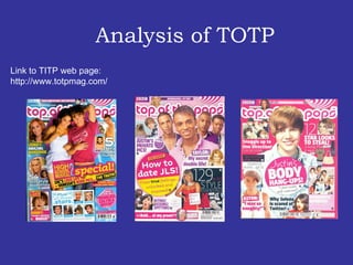
2. The masthead is written in bold writing, the font style is very appealing to the target audience. The header is in block capitals and it is in pink writing this could suggest that the target audience my be mainly female. The layout of the cover is quite messy, there a lot going on. There are several pictures. The main image takes over most of the page, this could imply that its more important then the other images . There are various amount if quotes on the cover, this could be a way of luring the target audience .
4. Rule of Thirds The ‘TOTP’ contents page is pretty simple but it has a lot going on in it. Its set in three columns with several images on it and it has a lot of bold writing and colour. This intrigues the target audience. ‘ TOTP’ content pages is quite unusual because it doesn’t have the masthead on the contents page while most other magazines do. Also, its image lead which could suggest its directed at a younger age group.
6. The layout on ‘TOTP’ DPS is quite simple, its has 1 large image and a smaller image. It’s split into three columns. Both the text and images balance each other out. The simplicity could be used because of the target audience being from a younger age range. However because there’s a lot of colour used this could appeal to the target audience.