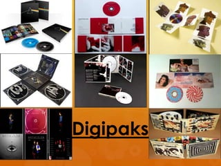
2. Mimics the
scrap book of
a killer. The use
of messy tape
to secure the
images and
the constant
relation to
women
through their
feet creates an
uncomfortable
mood.
White liquid under
women could be
used to connote
blood however, the
use of white takes
the serious effect
away making it
more artistic.
Reminds viewer of a
cross word due to
the colour portrays
the effect the music
might have on the
listener, confusion.
Also looks like an
optical illusion could
hint there are
hidden messages in
the lyrics of the
songs.
Bright colours
give album a
pop art effect
and an
uplifting mood
the album
hinting the
genre of music
is pop.
Bands image is featured in black and white
which contrasts with the coloured images
and could be used to symbolism
newspaper clippings.
3. Very simplistic
design and
theme which
lingers throughout
all of the panels.
A simple black
background is
used with an
image of the
Band member
who has been
edited to make
their brightly
coloured clothing
more distinct.
Connotes how he
band stand out
and are
something new, a
new light for the
genre of music.
Wearing ordinary clothes reflect their personality
which can be shared with the audience. Reveals they
care about their music rather than appearance
which links into why in two images the members are
facing away from the camera and are facing each
other instead.
Only image which goes against the overall layout as the colour
scheme has changed to grey. Gives the album more uniqueness as
the image adds an artistic sense to the music and although simplistic
it is interesting to look at and find out how it relates to the music.
Again, adding the sense that the band aren’t typical and bring
something new and creative to the genre of music.
4. As a whole the
digipak is purely
based on the
appearance of
the artist who is
made to look
angelic and like a
princess. This
allows the
audience to
identify the artist’s
personality as
being fun and in
a sense childish
as it appears she
is trapped in a
childhood
fantasy.
Main colours are
pink and white
which have
strong
connotations of
sweets and even
the clouds are
designed to look
like candy floss.
This could
suggest the artist
has a sweet
personality and
also reveals the
target audience
are likely to be
females. From
the use of this
colour scheme
and the focus on
the artist it is
clear he identify
the genre of
music is pop.
The discs themselves are designed to look
like sweet treats which makes the digipak
look like a fantasy world built out of sweets.
This could suggest to the audience that if
they purchase this album they will feel like
they are in this fantasy.
5. This digipak is
extremely
simplistic and is
similar to a design
I would like to use
for the creation of
my own digipak.
The use of the
plain white
backgrounds
work really well to
highlight the
characters and
ensure attention
isn’t drawn from
them.
I am fond of the
fact the actual
band aren’t
featured and
instead they
have animated
characters to
represent the
band members
which has
worked as an
overall image
for the band
gorillaz and has
allowed them
to have this
unique twist on
their bands
image.
By having only the animated characters featured as the band
it forms a special link between the core fans and the artist as
they are the ones who can identify that they are the ‘band’
whereas people who don’t know the artist will be confused as
to why there are these cartoons. Thus the fans are in some way
referenced/ acknowledged through the CD.
7. Script for presentation
Colours
- The colour scheme of the digipak consists of earthy brown
tones which are normally used to gives a natural or soothing
appearance however in this instance the colours connote rust
and gives a sense of discomfort to the viewer. Already this
portrays the style of music the band produces is dark music
possibly from the rock genre.
- On the inside covers of the digipak red colours are used which
have orange undertones making it appear like fire and adding
to the illusion that the album has endured damage or neglect.
The presence of this fire can be used to signify hell revealing
that the band probably produce music with religious
symbolisms hidden in the lyrics.
- As for our band the colour scheme used in this digipak
wouldn’t work for them as it goes against the conventions of
the indie/pop genre an would give the wrong impression of
our band.
8. Images
The images used on the digipak are rather strong and unusual.
There is no image of the band which is done for an artistic
effect as it appears the whole album design has been
dedicated to make the audience feel a certain way possibly
discomfort as the visual all appear negative and unappealing
to look at.
The use of random smudges of dark browns mimics the album
becoming rustic and decaying away which could be a
reflection of the disorientation of the music.
Two panels of the digipak feature similar images of holes in a
wall which look like nails have been hammered into this
relating to the bands name ‘nine inch nails.’ This creates
negative connotations of isolation and it makes the audience
feel nailed into a putrid room and being forced to stare at this
wall. Above the holes are what looks like scratch marks which
symbolisms going insane which could be the theme the band
focused on when producing the soundtrack or how the
audience will feel when listening to the music.
9. CD
There are two CD’s in the digipak which adds to the
sentimental value for fans as they are getting something
new by purchasing the digipak as it acts like a special
edition for the CD. This would work well as a selling point for
our digipak as it persuades core fans to purchase the
album. As for the CD design it appears to mimic a fossil
which I particularly like as it adds a sense of beauty to the
album due to the interesting shapes formed onto it. This
adds to the connotations of aging but in a more natural
way as fossilisation is a natural process. This could be a
subliminal message as it hints to the audience that the
album should be treasured for years to come. It also adds a
sense of importance to the album as fossils are seen as
beautiful and rare as they often are only seen in museums
thus informing the audience they own something rare.