Infographic Guide of Guides

This guide was created for NeuroDevNet researchers and trainees (however it could also be useful to practitioners and KT professionals) with an interest in exploring infographics as a KT product. It begins with an evidence-informed introduction followed by an annotated bibliography of web-based resources and ends with appendices of evidence-informed worksheets (see Appendices A-E) created by the KT Core for you to use during the design and creation of your infographic. This guide is intended to provide you with information including: what is an infographic, what are the different types of infographics, what should you consider when planning your infographic, how you can either do it yourself or work with a graphic designer, and a form-fillable tool you can use to help you think through and collate the information you need before sketching a draft of your infographic.

Recommended
More Related Content
What's hot
Viewers also liked
Viewers also liked (20)
Similar to Infographic Guide of Guides
Similar to Infographic Guide of Guides (20)
More from KBHN KT
More from KBHN KT (20)
Recently uploaded
Recently uploaded (20)
Infographic Guide of Guides
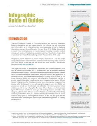
- 1. This guide was developed by the Kids Brain Health Network (formerly NeuroDevNet) KT Core and York University Last updated November 2016 1 KT - KNOWLEDGE TRANSLATION - GUIDES KT Infographic Guide of Guides Infographic Guide of Guides Anneliese Poetz, David Phipps, Stacie Ross1 Introduction The word “infographic” is short for “information graphic” and “combines data visua- lizations, illustrations, text, and images together into a format that tells a complete story” (Krum, 2014: p. 6). Infographics have become a popular vehicle for displaying abstract, complex and dense information (Kos and Sims, 2014; Dunlap & Lowenthal, in press). It has similarly become an important type of knowledge translation product, since people are drawn to attractive visualizations and can “transfer knowledge about a topic faster and more effectively than pure text” (Kos and Sims, 2014: p. 2). Infographics provide the means to present complex information in a way that can be easily understood and is sometimes the preferred format depending on the audience2 (see David Phipps’ journal club post that reviews this article from a KT Practitioner’s perspective: http://bit.ly/1Q9RC82). This guide was created for NeuroDevNet researchers and trainees (however it could also be useful to practitioners and KT professionals) with an interest in exploring infographics as a KT product. It begins with an evidence-informed introduction followed by an annotated bibliography of web-based resources and ends with appendices of evidence-informed worksheets (see Appendices A-E) created by the KT Core for you to use during the design and creation of your infographic. This guide is intended to provide you with information including: what is an infographic, what are the different types of infographics, what should you consider when planning your infographic, how you can either do it yourself or work with a graphic designer, and a form-fillable tool you can use to help you think through and collate the information you need before sketching a draft of your infographic. The suite of form-fillable worksheets created by the KT Core are intended to assist you with making decisions about the initial design (e.g. based on the data you have and the story you wish to tell), and to identify some key stakeholders from your target audience(s) to contact in order to review drafts for the purpose of informing future iterations. In this way, this guide and the worksheets have been designed to encourage stakeholder engagement for creating this KT product. 1 The KT Core wishes to thank the following individuals for contributing feedback on a draft version of this guide: Lonnie Zwaigenbaum, David Nicholas, Jonathan Weiss (NeuroDevNet researchers); Krista Jensen, Meghan Brintnell (York University KMb Unit staff) 2 Crick, K. and Hartling, L. (2015) Preferences of Knowledge Users for Two Formats of Summarizing Results from Systematic Reviews: Infographics and Critical Appraisals. PLoS One. 2015; 10(10): e0140029 doi: 10.1371/journal.pone.0140029 http://www.ncbi.nlm.nih.gov/pmc/articles/PMC4605679/ * When creating infographics or layouts, it is common to fill text areas with “fake Greek” placeholder text until final text is defined and placed. “Lorem ipsum...” followed by random Greek is commonly used by text generators for this purpose.
- 2. 2 This guide was developed by the Kids Brain Health Network (formerly NeuroDevNet) KT Core and York University Last updated November 2016 KT - KNOWLEDGE TRANSLATION - GUIDES KT Infographic Guide of Guides Why an infographic? The benefits of creating infographics as opposed to text-based KT products lie in the power of visualization: because of the use of symbols and other graphics, its messages are understood across language and cultural boundaries (Kos and Sims, 2014). Visuals help improve memory and recall, in fact, the more visual a message is the more likely it is to be recognized and remembered3 . Indeed, Pavio’s (1971) theory hypothesizes that when an image is viewed, both verbal and image neural pathways are activated in the brain to support memory. The literature cites instances where infographics have been used or found to be preferred by practitioners to aid in the application of knowledge from education and training4,5 . Infographics as a dissemination product have been found useful in practice (education and job training) for reasons including: maximum amount of information can be transferred in minimum period of time, user friendly, easy to understand, easier memorizing and reminding process, (results in) accurate decision making process, clear and quick presentation of information, simplicity in conveying information6 . Infographics simplify complex information and reduce the amount of cognitive effort needed to achieve understanding because our minds process and store symbols more easily than text7 . A pilot study of 107 physicians, nurses, nurse practitioners, health care administrators and physician assistants showed a preference for infographic format in the context of social media sites and online medical journals, and respondents believed that infographics allowed for a “quicker, more efficient read…more likely to facilitate long-term, factual retention” (Turck, C.J. et al., 2014: S37). In this way, infographics can be used as a tool toward achieving uptake and implementation of your research findings. Structure and Design “Design is an opportunity to continue telling the story, not just to sum everything up” – Tate Linden There are thousands of types and examples of infographics8 . However, there are 2 main categories of infographics: qualitative and quantitative9 . Within these categories are different classifications (static, dynamic, interactive, physical)10 but this guide will focus mainly on the creation of static (use of pictures, symbols, figures, maps etc. to convey data) infographics. The blogs and other publications referenced in this guide provide practice-based details and examples for designing and creating effective infographics. General tips for creators of infographics based on the literature include: have clear titles that quickly establish its focus and purpose, only use graphics that are necessary (no decorations to distract the viewer), choose the proper structure to tell the story, use simple visuals to maintain focus11 . In terms of dimensions, keep in mind that there is no ‘standard’ infographic size. Decide on the dimensions based on how you will use it: if you are creating a poster for a conference use the dimensions they provide, if you wish to print it use the size of the paper you wish to print it on (and consider whether you need to leave room for margins and/or bleed if you wish to have a printer print the colour to the edge of the page), if you want to use it in a PowerPoint presentation use the dimensions of a PowerPoint slide, and if you want to share it on social media search what are the optimal dimensions for sharing graphics on the platforms you wish to use. 3 Medina, 2008 4 Yavar, B. et al. (2012). Effective Role of Infographics on Disaster Management Oriented Education and Training. Conference Paper. DOI: 10.13140/RG.2.1.3317.2001 5 Turck, C.J. et al. (2014). A preliminary study of health care professionals’ preferences for infographics versus conventional abstracts for communicating the results of clinical research. Journal of continuing education in the health professions. 34(S1): S36-S38. 6 Yavar, B. & Mirtaheri, M. (2012). Effective role of infographics on disaster management oriented education and training. Conference paper. DOI: 10.13140/RG.2.1.3317.2001 7 Bojko, A. Communicating Usability Findings Through Effective Infographics. Proceedings of the UPA 2009 Conference. 8 Harris, Robert L. (2000). Information Graphics: A Comprehensive Illustrated Reference. Oxford University Press. 9 Bojko, A. Communicating Usability Findings Through Effective Infographics. Proceedings of the UPA 2009 Conference. 10 Yavar, B. et al. (2012). Effective Role of Infographics on Disaster Management Oriented Education and Training. Conference Paper. DOI: 10.13140/RG.2.1.3317.2001 11 Dunlap, J.C., & Lowenthal, P.R. (in press). Getting graphic about infographics: Design lessons learned from popular infographics. Journal of Visual Literacy. Introduction / Why an infographic? / Structure and Design
- 3. This guide was developed by the Kids Brain Health Network (formerly NeuroDevNet) KT Core and York University Last updated November 2016 3 KT - KNOWLEDGE TRANSLATION - GUIDES KT Infographic Guide of Guides 12 Siricharoen, W.V. & N. Siricharoen (2015). How Infographic should be evaluated? ICIT 2015 The 7th International Conference on Information Technology. DOI: 10.15849/icit.2015.0100 13 Dunlap, J.C., & Lowenthal, P.R. (in press). Getting graphic about infographics: Design lessons learned from popular infographics. Journal of Visual Literacy. 14 Yavar, B. et al. (2012). Effective Role of Infographics on Disaster Management Oriented Education and Training. Conference Paper. DOI: 10.13140/RG.2.1.3317.2001 Why does structure and design matter? The effectiveness and credibility of your infographic depend on it, and are determined by how well it achieves its desired goal, how easy and/or pleasing it is to review. Overall, when designing an infographic “focus on creating efficient, precise, and clear visuals that support the instructional goals of the message” (Dunlap & Lowenthal, in press: p. 17). Formative evaluation should be an important step during the creation of your infographic12,13 , while summative evaluation can illuminate the usefulness (uptake), application (implementation), and impact (e.g. change in practice, policy, quality of life for families) of your infographic on health care decision-making. Throughout the process, continuously monitor the development of the infographic to make sure only essential content is clearly, precisely and concisely conveyed (see Appendix C for an evaluation worksheet to be used by the infographic creator before sharing with stakeholders). Once you have a first draft you feel is ready to share with stakeholders for feedback, use Appendix D for the worksheet to provide to key stakeholders along with the draft of your infographic. Do this in an iterative fashion throughout the production of the infographic (formative evaluation) to make sure all the elements contribute to effective delivery of the message. Following up with end-users who are in receipt of your infographic (either printed/laminated copy or electronic version viewed on mobile or tablet device, report, policy paper, presentations, or other format)14 can help you evaluate the uptake, implementation and impact of your research (see Appendix E for questions you can ask in a one-on-one or focus group interview). Introduction / Structure and Design Top Tips: • Resist the urge to start drawing/designing your infographic until you have planned out your goals, story, structure, colours, etc. (use the worksheet in Appendix A) • Have a clear (non-academic) title that establishes its focus and purpose • Only use graphics that are necessary • Choose the proper structure to tell the story • Use simple visuals • Decide on the size/dimensions based on how you will use it • Solicit and incorporate end-user feedback to inform design The following tables summarize the main design elements to consider for your infographic. Part of both form- ative and summative evaluation includes a consideration of the (often subjective) situational characteristics of the infographic’s design.
- 4. 4 This guide was developed by the Kids Brain Health Network (formerly NeuroDevNet) KT Core and York University Last updated November 2016 KT - KNOWLEDGE TRANSLATION - GUIDES KT Infographic Guide of Guides Table 1. Situational characteristics of infographics Situational characteristics15 Immediacy Creates sense of excitement or urgency, encourages users to take action. Malleability Allows users to explore the content, apply the content in various ways, determine their own personal meaning and relevance. Compellingness Grabs/holds users’ attention, shares provocative idea or problem, uses unexpected design elements, shares a novel idea or problem, uses storytelling to deliver the message. Resonance Helps users to see how the content is relevant to them, helps users to see connections, evokes users’ emotions and memories, is credible. Coherence Includes relevant text and images, includes consistent design elements, presents a complete message, is logically structured, message is clear, presents a well-informed message. Table 2. Design elements of infographics Design elements16 Colour Use the right colour to create a mood, make viewers comfortable with use of colour, communicate/attract the target audience (use relevant, compatible colours). Avoid dominant dark colours and neons. Every colour clarifies meaning of content. Typography Choice of font characters, margins, size of fonts, ordered hierarchy, backgrounds for texts. Typography is most important design tool to show data. Context and Layout Design objectives must be determined and planned to achieve the goals of the infographic. The layout should have a well-planned structure. Need introduction, key message and conclusion17 . Structure should be clear, help viewers locate the information. Format Vertical or horizontal. Icons Appropriate use (not overuse) of pictographic icons. Visual elements that Consciously choose elements that integrate with each other well, to avoid are on-topic (relevant) distracting the viewer. If you have the means, try to avoid using ready-made clip-art, templates, charts and pictograms – increases credibility. Introduction / Structure and Design 15 Dunlap, J.C., & Lowenthal, P.R. (in press). Getting graphic about infographics: Design lessons learned from popular infographics. Journal of Visual Literacy. 16 Arslan, D. & Toy, E. (2015). The visual problems of infographics, Global Journal on Humanities & Social Sciences. [online]. 01, pp 409-414. Available from: http://www.world-education-center-org/index.php/pntsbs 17 Krum, 2014
- 5. This guide was developed by the Kids Brain Health Network (formerly NeuroDevNet) KT Core and York University Last updated November 2016 5 KT - KNOWLEDGE TRANSLATION - GUIDES KT Infographic Guide of Guides 18 Duarte, N. (2008). Slideology: The art and science of creating great presentations. Sebastopol, CA: O’Reilly. Introduction / Structure and Design Table 3. Visual structures for infographics Types of visual organization and structure Flow - (a) linear, (b) circular, (c) divergent, (d) convergent, (e) multidirectional Flow (a) linear Flow (b) circular Flow (c) divergent Flow (d) convergent Flow (e) multidirectional Examples: choose a structure depending on the story you are trying to tell18 Flow (flowchart) to show process
- 6. 6 This guide was developed by the Kids Brain Health Network (formerly NeuroDevNet) KT Core and York University Last updated November 2016 KT - KNOWLEDGE TRANSLATION - GUIDES KT Infographic Guide of Guides Table 3. Visual structures for infographics - continued Types of visual organization and structure Structure - (a) matrices, (b) trees, (c) layers Examples: choose a structure depending on the story you are trying to tell Hierarchical chart to show classification Structure (a) matrices Structure (b) trees Introduction / Structure and Design Structure (c) layers
- 7. This guide was developed by the Kids Brain Health Network (formerly NeuroDevNet) KT Core and York University Last updated November 2016 7 KT - KNOWLEDGE TRANSLATION - GUIDES KT Infographic Guide of Guides Introduction / Structure and Design Table 3. Visual structures for infographics - continued Types of visual organization and structure Cluster - overlapping, closure, enclosed, linked Examples: choose a structure depending on the story you are trying to tell Cluster (Venn diagram) to show grouping relationships Cluster (Venn overlapping) Types of visual organization and structure Radiate - from a point, with a core, without a core Radiate examples Examples: choose a structure depending on the story you are trying to tell Concept map to show connections between links and nodes
- 8. 8 This guide was developed by the Kids Brain Health Network (formerly NeuroDevNet) KT Core and York University Last updated November 2016 KT - KNOWLEDGE TRANSLATION - GUIDES KT Infographic Guide of Guides Table 3. Visual structures for infographics - continued Types of visual organization and structure Pictorial - process, reveal, direction, location, influence Pictorial examples Introduction / Structure and Design Examples: choose a structure depending on the story you are trying to tell Road map for showing realistic concepts
- 9. This guide was developed by the Kids Brain Health Network (formerly NeuroDevNet) KT Core and York University Last updated November 2016 9 KT - KNOWLEDGE TRANSLATION - GUIDES KT Infographic Guide of Guides Introduction / Structure and Design Table 3. Visual structures for infographics - continued Types of visual organization and structure Display - comparison, trend, distribution Display examples Examples: choose a structure depending on the story you are trying to tell Bar chart for showing cause and effect
- 10. 10 This guide was developed by the Kids Brain Health Network (formerly NeuroDevNet) KT Core and York University Last updated November 2016 KT - KNOWLEDGE TRANSLATION - GUIDES KT Infographic Guide of Guides At the end of this guide in Appendix A, the KT Core has created a form-fillable “Infographic Planning Worksheet” (use Tables 2 & 3 to inform your design decisions as you fill out the worksheet) based upon the information found in the literature and the resources contained within this Guide of Guides. The online resources (blogs) that comprise the annotated bibliography section of this document provide examples of these design elements so you can visualize how each may look for informing your layout and format decisions while filling out the worksheet in Appendix A. This worksheet is intended to help you think through and collect the information you will need in order to either create your own infographic or contract a graphic designer. Do-it-yourself or Contract a Graphic Designer? There are pros and cons for designing and creating your own infographic versus hiring a professional graphic designer. From experience, there are online tools that are free and contain pre-made templates, however, often the final product is stamped with the logo of the software provider. If you use a pre-made template you may feel that you are trying to ‘fit a square peg in a round hole’ if the design of the template does not fit the story you wish to tell with your data. You take the risk that your final product will look like several other individuals’ or organizations’ infographics that have been created using the same template. Contracting a graphic designer will cost more than using free (or even paid) online tools, but since research has shown that good design is critical to the effectiveness of your infographic, it can be argued that it is well worth the investment. As mentioned in the previous section, an important step in creating an infographic that will be useful to your end- users is to engage them in the process, asking for iterative feedback on each draft (see worksheet Appendix D). If you use a pre-designed template, your ability to respond to their feedback with design changes can be limited by the functionality of the particular online tool. In addition, the literature has shown that the design of an infographic is crucial to the viewer’s uptake of information. If your infographic is unpleasant to view or difficult to follow/read the chances are greater that the information will not be understood, remembered, nor used (Arslan and Toy, 2015). Using a graphic designer can cost between $600-$1000 for one infographic but you have greater control over the outcome. You can expect to receive a final product that is unique and tailored to the messages you wish to convey in addition to ongoing support and expert advice on critical design elements such as choice of colour, typography, layout, etc. throughout the development process. The effectiveness of an infographic as a dissemination product depends on its quality and presentation (Kos and Sims, 2014; Dunlap & Lowenthal, in press). If a dissemination product is ineffective it is much more difficult to achieve uptake and implementation (leading to impact) of your research-based findings and recommendations. In addition to the online resources that comprise the annotated bibliography, the peer-reviewed references cited throughout this document may also be useful for practical tips on creating infographics. If you do not have time to review all of the resources below, the ‘star’ H identifies a handful of key resources to start with. We hope you find this guide useful. If you are a NeuroDevNet researcher or trainee and would like a consult to help you think through the design of your infographic from your research results, or if you need help finding a graphic designer, contact the KT Core (Anneliese Poetz, KT Core Manager, apoetz@yorku.ca). Introduction / Structure and Design / Do-it-yourself or Contract a Graphic Designer?
- 11. This guide was developed by the Kids Brain Health Network (formerly NeuroDevNet) KT Core and York University Last updated November 2016 11 KT - KNOWLEDGE TRANSLATION - GUIDES KT Infographic Guide of Guides Introduction to Infographics How To Make an Infographic: The researcher version – 2015 bit.ly/1P0bFG0 Author: Emilie Futterman (TripleScoopMillennials) Level: Beginner What is this about? This video (2 minutes, 24 seconds in length) is targeted to researchers and is a high level overview of the steps for creating an infographic. It is for researchers with no design knowledge. Steps overviewed include: 1) focus your subject matter, 2) put your data into an interesting story with clear key messages, 3) make it look great by adhering to design principles. Has tips for keywords to search with on google to learn more about good infographic design. How can you use it? • Watch this short video as an introduction to infographics • Learn the basic steps for creating an infographic, and specific things to keep in mind for each stage InfoGraphic Designs: Overview, Examples and Best Practices – 2009 bit.ly/23w8rDZ Author: Anders Ross (Instant Shift) Level: Beginner What is this about? Explains what an infographic is and a little about the history of infographics. Contains sections on: why use infographics, elements of an information graphic, and types (statistical, timeline, process, location/ geography). Brief information about selecting colours, typography including examples (called “best practices” but it is uncertain what their definition of best practices is, and whether it is evidence-informed). Contains many examples of infographics, links to additional information are included at both the beginning of the blog as well as the end. How can you use it? • Learn about the history of infographics and what they are • View examples of different types of infographics Introduction to Infographics H
- 12. 12 This guide was developed by the Kids Brain Health Network (formerly NeuroDevNet) KT Core and York University Last updated November 2016 KT - KNOWLEDGE TRANSLATION - GUIDES KT Infographic Guide of Guides Use Infographics to Explain Your Work – 2011 bit.ly/1FDjFeV Author: Dennis Meredith (Research Explainer) Level: Beginner What is this about? This blog post answers questions such as: What is an infographic, who is your audience, do you really need an infographic, is it informational or editorial, charting your points and organizing design, do you want a video animated infographic, will you hire a designer or do it yourself. How can you use it? • Inform your decision about whether to pursue creating an infographic • Skip the section entitled “Do lots of research” since you will use your own research findings/data 10 ways to use infographics – 2013 bit.ly/1P0cfDy Author: Emilie Futterman (TNW News, Design & Dev) Level: Beginner What is this about? Contains information about the value of infographics, and why a researcher may wish to use one including: as a recruiting tool for students and staff (as a job advertisement, but could be modified for recruiting research participants), presenting survey data, simplifying a complicated concept, explaining how something works, comparisons. On page 2: how to organize and attract readers to interesting facts, use images when words don’t work, raise awareness, inform consumers (end users). How can you use it? • Think about why you may wish to use an infographic as a KT tool • Inform how your research data may be displayed in an infographic format Introduction to Infographics
- 13. This guide was developed by the Kids Brain Health Network (formerly NeuroDevNet) KT Core and York University Last updated November 2016 13 KT - KNOWLEDGE TRANSLATION - GUIDES KT Infographic Guide of Guides Designing Your Infographic How to Make an Infographic in 5 Steps – 2015 bit.ly/1lXqIrI Author: Eugene Woo (Venngage) Level: Beginner What is this about? Outlines 5 step process for creating an infographic: select a story for the infographic (data driven or problem/question approach), choose a type of infographic (statistical, timeline, process, informational, geographic, compare/contrast, hierarchical, research-based, interactive, word cloud), get the relevant data (your own data, original research, data sources), design (colour schemes, fonts, layouts, chart types, sketches and outlines) and finally promote (contains ideas for various dissemination channels) the infographic. How can you use it? • Learn the basic considerations you should think about if you want to create an infographic • As a guide for designing and/or creating your infographic • As inspiration for creating a dissemination strategy for promoting your infographic 10 steps to creating the perfect infographic – 2014 bit.ly/1Qvrd7q Author: Tiffany Farrant-Gonzalez and Jarred Romley (Creative Bloq) Level: Beginner What is this about? This blog post provides practical information that explains concepts such as telling a story with your infographic (content should be compelling, credible and controversial), identifying your purpose and audience, how to construct an engaging narrative with your data, making complex data understandable, considerations for good structure including size of the infographic, creating a first draft of your infographic called a ‘wireframe’, selecting the right tool(s) for creating your infographic, selecting the right visual approach for your audience and purpose, distribution, and moral considerations. How can you use it? • Learn the key considerations to keep in mind when creating an infographic • Learn about what it means to ‘tell a story’ with your infographic Designing Your Infographic H
- 14. 14 This guide was developed by the Kids Brain Health Network (formerly NeuroDevNet) KT Core and York University Last updated November 2016 KT - KNOWLEDGE TRANSLATION - GUIDES KT Infographic Guide of Guides Quick Guide to Infographics – 2012 bit.ly/1nB2Pbp Author: Ivan Cash (Graphs.net) Level: Beginner What is this about? This is an infographic that shows the key elements of infographics, with averages relating to each (from a sample of 49 randomly chosen infographics). Elements include: chart styles, font styles, countries featured, relative popularity of themes/topics, number of symbols per legend/key, base colours used, navigational iconography, sections, credited sources and title length. How can you use it? • Reduce the temptation to overload your infographic with too much information or a title that is too lengthy, etc. • As inspiration for ideas about what type of chart to choose for visualizing quantitative data • To inform your decision about how many peer reviewed papers to cite on your infographic The Anatomy of an Infographic: 5 Steps To Create A Powerful Visual – 2009 bit.ly/1nqGNHx Author: Sneh Roy (SpyreStudios) Level: Beginner/Intermediate What is this about? This blog post overviews the 3 core components of any infographic: visual, content and knowledge and differentiates between a ‘one level deep’ and a ‘two levels deep’ infographic. Overviews the 5 essential steps to creating a good infographic, beginning with: sketching a skeleton or flowchart of your infographic, devising a colour scheme, deciding which type of graphics to use, research and data to base the infographic on, and what knowledge or content to focus on with your infographic so it can be easily understood by the viewer. How can you use it? • As a step-by-step guide for making key decisions about how you’d like to create an infographic • Inform your decision about whether to create your own infographic or contract a graphic designer • Since this blog post was written for a general audience, you may wish to skip over the advice provided in the section on research and data upon which to base your infographic (since you will be using your own research and data) Designing Your Infographic
- 15. This guide was developed by the Kids Brain Health Network (formerly NeuroDevNet) KT Core and York University Last updated November 2016 15 KT - KNOWLEDGE TRANSLATION - GUIDES KT Infographic Guide of Guides A Periodic Table of Visualization Methods bit.ly/1nqH25j Author: Ralph Lengler and Martin J. Eppler (Visual-Literacy.org) Level: Intermediate What is this about? This is an infographic in the style of a periodic table. It shows the reader the different types of visual representations in each of the following categories: data, information, concept, strategy, metaphor, compound. This is an even more useful tool because when you hover your pointer over any one of the “elements” in the infographic, it shows you an example of that type of visualization. How can you use it? • As a reference to help inform the design you choose for your infographic 5 Infographics to Teach You How to Easily Make Infographics in PowerPoint – 2015 bit.ly/1nRD86e Author: Erik Devaney (HubSpot) Level: Intermediate What is this about? This blog post is targeted toward biomedical, clinical, health services and public health researchers and overviews 5 different types of infographics with specific information and an example of each type of infographic. The five types are: data based infographics, timeline infographics, ‘hip’ infographics, flowcharts, and infographics with many photographs. How can you use it? • As a reference to help decide which among these 5 types you wish to pursue based on the type of data you have Designing Your Infographic H
- 16. 16 This guide was developed by the Kids Brain Health Network (formerly NeuroDevNet) KT Core and York University Last updated November 2016 KT - KNOWLEDGE TRANSLATION - GUIDES KT Infographic Guide of Guides Data Visualization and Infographics Resources – 2009 bit.ly/1SlKN7O Author: Cameron Chapman (Smashing Magazine) Level: Intermediate What is this about? This is a compilation of links to websites and blogs that aggregate numerous examples of infographics including some unusual infographics (see Infographic News). Some of these sites provide commentary as well: iGraphics explains the effectiveness of infographics and how they were done, examples of which graphics work and which don’t, while Simple Complexity posts some how-to articles on creating better infographics. How can you use it? • Browse examples to see the different types of infographics that are possible • Use during the planning stage as inspiration for your own design • As examples to provide to your graphic designer to inform the development of your infographic (be sure to note what you like/don’t like about each) Pretty and pretty useful: How to create awesome infographics – 2013 bit.ly/1nB1nFG Author: Carley Fain, Carolyn Laihow, Kelvin Claveria (Vision Critical) Level: Intermediate What is this about? This blog is written from a marketing perspective, but contains information not contained in other resources in this guide of guides, such as: which type of infographic to use, the benefits of using infographics, what makes an infographic successful, how to design great infographics, how to make infographics relevant to a global audience, how to promote your infographic, when infographics fail, and what is the future of infographics. How can you use it? • Think about why you may wish to use an infographic as a KT tool • Inform how your research data may be displayed in an infographic format • Inform your dissemination plan for your infographic Designing Your Infographic
- 17. This guide was developed by the Kids Brain Health Network (formerly NeuroDevNet) KT Core and York University Last updated November 2016 17 KT - KNOWLEDGE TRANSLATION - GUIDES KT Infographic Guide of Guides Designing an infographic - 2014 bit.ly/1JIUZGi Author: Nigel French (Lynda.com) Level: Advanced What is this about? This is an online course (video series) that teaches concepts of infographic design and creation such as: How to use maps, how to represent data that are easily digestible and visually compelling, how to explain a complicated sequence of events, how to situate concurrent events on a timeline and tell the stories of those who experienced these times. How to set up the document, manage the project, choose type and colour and create a background image. How to convert print infographic to screen infographic for use on a website. For advanced users, requires access to: Adobe Illustrator, Adobe Photoshop, Adobe InDesign, and Microsoft Excel. How can you use it? • View the introduction to the online course for free • Sign up for a free trial of Lynda.com to view the rest of the videos in this course • Learn how to use the (featured Adobe and Microsoft) software for creating your infographic after you have filled out the Infographic Planning Worksheet (Appendix A) and sketched out the general outline (wireframe) of your infographic Advanced Infographics bit.ly/1PVH7Fn Author: Adele Magowan, Jane Foo, Kathryn Klages, Shanna Pearson (Create Impact with Infographics) Level: Advanced What is this about? This is a blog dedicated to providing information on how to create infographics. This particular post is about how to create interactive infographics, but there are links to other sections of the blog on topics such as “deconstructing infographics”, “design tips”, “beyond the basics”, “free tools and resources” and “examples”. You may need to hire someone to write the code for the interactive features of your blog, after you have planned and sketched a draft of the design. How can you use it? • Learn about interactive infographics so you may consider whether this type is right for you • Skip the section about using open data, since you will be using your own research data to inform your infographic • Explore the rest of the blog to learn more about infographics Designing Your Infographic
- 18. 18 This guide was developed by the Kids Brain Health Network (formerly NeuroDevNet) KT Core and York University Last updated November 2016 KT - KNOWLEDGE TRANSLATION - GUIDES KT Infographic Guide of Guides Tools and Resources for Creating Your Infographic 10 Tools for Creating Infographics and Visualizations – 2013 bit.ly/1PIn96R Author: Miranda Rensch (Moz) Level: Beginner What is this about? Provides a comprehensive list of links to the most popular online tools (some have free versions, some need subscription/payment) that you can use if you do not have access to graphic design software. Brief explanations are provided for each tool. Contains examples of infographics, as well as general information about designing and planning an infographic. How can you use it? • As a starting point if you are considering using online tools to create a do-it-yourself infographic • View examples of infographics as inspiration for designing your own Most popular (free) infographic apps19 : 1. Canva (see: https://www.canva.com/) This is an easy to use website that has a free or paid option. You need to create a login/password to use it. Provides a variety of templates for social media, blogs, presentations, posters, business cards, invitations, etc. along with a large library of images. You can change the dimensions of your infographic to conform to the dimensions for different social media platforms. Contains a blog and tutorials on how to create infographics using Canva. 2. Venngage (see: https://venngage.com/) This is an easy to use website that has a free (limited number of: themes, templates, charts, icons, can only create a limited number of infographics) and a paid version (can create unlimited number of infographics, infographics are brand-free, privacy controls, can export to .pdf and .png). You need to create a login/ password to use it. Offers a variety of templates and a blog with tips and tricks. Tools and Resources for Creating Your Infographic H 19 Thank you to Meghan Brintnell and Krista Jensen, KMb Unit York University for these suggestions H
- 19. This guide was developed by the Kids Brain Health Network (formerly NeuroDevNet) KT Core and York University Last updated November 2016 19 KT - KNOWLEDGE TRANSLATION - GUIDES KT Infographic Guide of Guides Kids Brain Health Network KT Core - KT helps to maximize the impact of research and training in neurodevelopmental disorders Contact the KT Core: http://neurodevnet.ca/kt-coreteam LinkedIn: https://ca.linkedin.com/in/neurodevnet Acknowledgement for HCARRD people who pilot tested the infographic guide tool and provided feedback: J. Weiss, B. Isaacs, A. Wilton, & Y. Lunsky. Health profiles of Young Adults with Developmental Disabilities, part of Health Care Access Research in Developmental Disabilities Program, Ministry of Health and Long-Term Care Health System Research Fund Program Awards 2013-2016 ($1,811,232). Acknowledgement
- 20. 20 This guide was developed by the Kids Brain Health Network (formerly NeuroDevNet) KT Core and York University Last updated November 2016 KT - KNOWLEDGE TRANSLATION - GUIDES KT Infographic Guide of Guides Appendix A: Infographic Planning Worksheet Appendix A: Infographic Planning Worksheet Purpose/Goal(s) What do you want people to think, feel, do as a result of viewing your infographic? What do you want to happen as a result? Changes in practice or policy? Definitions for following page: Key messages focus on the project itself, the work that is being done, its latest accomplishments, its plans for the future—in this way, these messages are more insular. A story takes a broader view, considers the world around the project, then its larger role within that world and its impact on the people who live in it. A story provides a sense of purpose and meaning behind the key messages by helping the audience understand the context for them, therefore making those messages more believable and palatable. Modified from source: http://bbcostorytelling.com/blog/2014/09/04/three-differences-corporate-messages-corporate-story/ Target audience(s) for stakeholder engagement during design and development: Who are the people who can help achieve your goal(s)? (by profession, organization, geographic location, role (e.g. parent)) Name of person in target audience (and type Contact information (email, phone) of target) willing to review drafts of infographic (sample input that can be overwritten) The goal of this infographic is to create awareness of the unique (mental) health needs of young adults (age 18-24) with Austism Spectrum Disorder (ASD) compared to same-age peers with other developmental disabilities and those without disabilities. An increased awareness of the unique (mental) health needs of young adults with ASD will influence the health care planning for this population. Michael Smith (Health) sample input michael.smith@ontario.ca (sample input) Margaret Jones (advocate) mjones@autismontario.com 888-732-1555 David Mann (policy maker, MCYS) david.mann@ontario.ca Christine Rose (policy maker, Education) christine.rose@ontario.ca
- 21. This guide was developed by the Kids Brain Health Network (formerly NeuroDevNet) KT Core and York University Last updated November 2016 21 KT - KNOWLEDGE TRANSLATION - GUIDES KT Infographic Guide of Guides Appendix A: Infographic Planning Worksheet Appendix A: Infographic Planning Worksheet - continued What is the story you want to tell? What are the key messages you wish to convey? (sample input that can be overwritten) We know that adults with Autism Spectrum Disorders (ASD) have multiple health issues and often face difficulties accessing health care services. We wondered however, are these issues unique to those with ASD or typical for those with any type of developmental disability? Through a unique process of linking health administrative and social support data, this study identified 15,980 young adults, 18-24, with developmental disabilities in Ontario, one of the largest studies ever. Of those 15,980, 5,095 had ASD and 10,487 had some other form of developmental disability. We compared these groups for their health characteristics (overall health, chronic diseases, psychiatric disorders) and health service use (specialist visits, emergency department visits, hospitalizations). We learned that 51% of young adults with ASD have at least one psychiatric diagnosis, compared to 38% of young adults with other developmental disabilities. Those with ASD are also more likely to visit the emergency department or hospital for psychiatric reasons and are more likely to visit a psychiatrist compared to those with other developmental disabilities. All these differences are even larger when we compare young adults with ASD to their peers without developmental disabilities, where 20% have at least one psychiatric diagnosis. These findings show that it is important to include access to mental health care services in the health care planning for young adults with developmental disabilities, specifically for those with ASD. (sample input that can be overwritten) 1. Young adults with Autism Spectrum Disorder (ASD) are more likely to have a psychiatric disorder (51%) compared to their peers with other developmental disabilities (38%) or those without developmental disabilities (20%). About 1 in 2 of young adults with ASD has a psychiatric disorder. 2. Young adults with ASD are more likely to visit a psychiatrist (16.4%) compared to their peers with other developmental disabilities (8.2%) or those without developmental disabilities (2.4%). 3. Both young adults with ASD (5.4%) and those with other developmental disabilities (4.6%) are far more likely to visit the emergency department for psychiatric reasons comapred to sam-aged peers without developmental disabilities (1.8%). 4. Both young adults with ASD (3.2%) and those with other developmental disabilities (2.9%) are far more likely to visit the hospital for psychiatric reasons compared to their same-age peers without developmental disabilities (0.5%) 5. Access to mental health care and prevention of mental health issues should be prioritized when planning health care for young adults with ASD in Ontario, as well as for adults with other forms of developmental disability.
- 22. 22 This guide was developed by the Kids Brain Health Network (formerly NeuroDevNet) KT Core and York University Last updated November 2016 KT - KNOWLEDGE TRANSLATION - GUIDES KT Infographic Guide of Guides Appendix A: Infographic Planning Worksheet Appendix A: Infographic Planning Worksheet - continued List the sources (filenames) of data for your infographic: List sources of qualitative (testimonials, interview transcript excerpts, recommendations, etc.) and/or quantitative (percentages, monetary values, number of people) data. Can also provide geographic information (locations with quantitative values for data in that location) if you wish to do a map type of infographic. Qualitative (charts, diagrams, photos, quotes) Quantitative (graphs, maps) What size do you need your infographic to be? What are you doing to use your infographic for: conference poster, social media, printed handout, etc. This will help you determine what size the infographic should be, before you start designing it. What is the infographic structure that fits best? Tip: Consider which infographic visual structure (Table 3) is best suited for EACH of your key messages. If you have difficulty with this, a graphic designer can provide advice based on the data you have and the story you want to tell. (sample) C://Desktop/ResearchDataFile.docx (sample) C://Desktop/ResearchData.xlsx Applied Health Research Question report for MCYS (sample input that can be overwritten) The infographic will be shared 1. electronically via social media (Twitter and Facebook) and the H-CARDD website 2. in print at meetings with policy and decision makers (sample input that can be overwritten) To be determined by deisgner Key characteristics in this story: 1. linking or of two large data-bases (health administrative and social support) housed at the ministries on Ontario and Institute of Clinical Evaluative Sciences (ICES) is unique method to establish A POPULATION COHORT 2. comparison of health characteristics and health services use of three groups (young adults with ASD vs young adults with other developmental disabilities vs young adults without developmental disabilities)
- 23. This guide was developed by the Kids Brain Health Network (formerly NeuroDevNet) KT Core and York University Last updated November 2016 23 KT - KNOWLEDGE TRANSLATION - GUIDES KT Infographic Guide of Guides Appendix A: Infographic Planning Worksheet Appendix A: Infographic Planning Worksheet - continued Which colour(s) would catch the attention of your target audience(s)? If you have difficulty with this, a graphic designer can help you work through this. Which font(s) are you considering? If you have difficulty with this one, a graphic designer can provide advice. If you are using an online tool/template this will already be chosen for you. How will you disseminate your infographic? List social media channels (your own) and other orgs that will re-share for you. Will you print and mail to practitioners as a reference? Email? Use in conference presentations? How will you evaluate your infographic? Try to think beyond # views, # downloads, # distributed. Can you contact members of your target audience and interview (or survey) them about how they have used the infographic, and what they have changed about their practice as a result of the information? Have they seen a change in the behavior and/or satisfaction (of services provided) of those served by practitioners/programs? (sample input that can be overwritten) Note that H-CARDD has a graphic design guide, logo and colour code HEX#: 8dc63f PMS: PANTONE376 (sample input that can be overwritten) To be determined by designer. (sample input that can be overwritten) The infograhic will be archived on the H-CARDD website www.hcardd.ca and made available for download from this website. (sample input that can be overwritten) TBD? H-CARDD has build relationships with a varied group of knowledge users who could be contacted after dissemination of the infographic. H-CARDD uses electronic newsletters to share resources. A question on the ASD infographic could be included in a newsletter survey at the end of a 6 months communications strategy May - October '16.
- 24. 24 This guide was developed by the Kids Brain Health Network (formerly NeuroDevNet) KT Core and York University Last updated November 2016 KT - KNOWLEDGE TRANSLATION - GUIDES KT Infographic Guide of Guides Appendix B: Sketch a draft of your infographic (look at examples for layout/format/visual elements inspiration): Appendix B
- 25. This guide was developed by the Kids Brain Health Network (formerly NeuroDevNet) KT Core and York University Last updated November 2016 25 KT - KNOWLEDGE TRANSLATION - GUIDES KT Infographic Guide of Guides Appendix C Appendix C: Appendix C is intended to be used among project team members to make changes to the infographic before you send it to stakeholders for review, along with Appendix D to provide to stakeholders for feedback after internal review. 20 Siricharoen, W.V. & N. Siricharoen (2015). How Infographic should be evaluated? ICIT 2015 The 7th International Conference on Information Technology. DOI: 10.15849/icit.2015.0100 21 Questions adapted from: Siricharoen, W.V. & N. Siricharoen (2015). How Infographic should be evaluated? ICIT 2015 The 7th International Conference on Information Technology. DOI: 10.15849/icit.2015.0100 Check off items as you review your infographic for each checkpoint21 C1. Has clear and meaningful title C2. Author is listed C3. Contains information to identify the author as reputable C4. Contains credible sources/references for the data C5. All spelling and grammar have been corrected C6. Objects are displayed in an organized manner in accordance with accepted structure(s) for the design of infographics C7. Objects appear to be proportional in size to the data they represent (if applicable) C8. All objects (size, colour, type) or text correctly represent the data C9. No objects and/or words that are unnecessary/distracting C10. There is no missing data. Anything missing has been gathered, analyzed and integrated to give an accurate portrait of the topic covered in the infographic C11. Infographic is legible C12. Infographic is functional in terms of comparing, relating variables and getting across the main point or messages you wish to convey C13. Kids Brain Health Network (formerly NeuroDevNet) and the NCE-RCE is identified as a funder of the research C14. Kids Brain Health Network (formerly NeuroDevNet) and NCE-RCE logos are present ✔ There are 4 main categories to consider for evaluating your infographic20 : Usefulness Easy to understand, clear purpose, reliable data (sources cited), informative – viewer learns something Legibility Easy to read, colour scheme should not hinder ability to read, graphs/diagrams labeled appropriately, font choice, size and colour used to make it legible Design Graphics should reflect purpose and audience, graphics are good quality, not distracting and consistent, space used effectively (no excess clutter), appropriate use of contrast and colour Aesthetics Easy to follow, overall design facilitates understanding, hierarchy/organization of data Evaluation checklist for you to use during creation of your infographic (before you share a draft with your stakeholders)
- 26. 26 This guide was developed by the Kids Brain Health Network (formerly NeuroDevNet) KT Core and York University Last updated November 2016 KT - KNOWLEDGE TRANSLATION - GUIDES KT Infographic Guide of Guides Appendix D: Appendix D Notes / suggested improvement: Check off items as you review your infographic for each checkpoint D1. Has clear and meaningful title D2. Contains information to identify the author as reputable D3. Contains credible sources/references for the data D4. Objects displayed in an organized manner, using accepted infographic structures D5. Objects appear to be proportional in size to the data they represent (if applicable) D6. All objects (size, colour, type) or text correctly represent the data D7. No objects and/or words that are unnecessary/distracting D8. Infographic is legible D9. Infographic is functional in terms of comparing, relating variables and getting across the messages you wish to convey D10. The infographic tells a story D11. Allows viewer to understand the content and is not confusing D12. The infographic is attractive / pleasing to view D13. Nothing that would be considered offensive within this infographic D14. Sufficient data presented to give an accurate portrait of the topic covered in the infographic. Please note what other data should be gathered / analyzed. ✔ 22 Questions adapted from: Siricharoen, W.V. & N. Siricharoen (2015). How Infographic should be evaluated? ICIT 2015 The 7th International Conference on Information Technology. DOI: 10.15849/icit.2015.0100 Evaluation worksheet for you to give to your stakeholders/key members of target audience for providing feedback on your draft infographic22
- 27. This guide was developed by the Kids Brain Health Network (formerly NeuroDevNet) KT Core and York University Last updated November 2016 27 KT - KNOWLEDGE TRANSLATION - GUIDES KT Infographic Guide of Guides Appendix D Appendix D - continued Evaluation worksheet for you to give to your stakeholders/key members of target audience for providing feedback on your draft infographic Short answer (can ask these questions in an email or one-on-one/focus group interview): 1. Would you use this infographic for (insert purpose of infographic)? Why or why not? 2. What is the story being told by this infographic? 3. What are the main messages? 4. What did you learn from this infographic? 5. What surprised you about this infographic? 6. What did it make you feel? 7. Any additional feedback/comments?
- 28. 28 This guide was developed by the Kids Brain Health Network (formerly NeuroDevNet) KT Core and York University Last updated November 2016 KT - KNOWLEDGE TRANSLATION - GUIDES KT Infographic Guide of Guides Appendix E Appendix E: (suggested) interview/focus group questions for you to use for evaluating uptake, implementation, impact of your infographic 1. How do you use the (title of infographic) infographic in your work? 2. What is the biggest difference you have noticed in the way that you approach your work? 3. (if applicable) What is the biggest difference you have noticed in your patients’/clients’: i. satisfaction with services ii. compliance with treatment recommendations/decisions iii. quality of life/lifestyle iv. usage of services/products 4. Please tell me about any current or anticipated future change(s) in policies, guidelines, practices, services or organizational frameworks in your program/organization based on the information in the infographic you received 5. What do you think is the most effective aspect of this infographic? Why? 6. Would you recommend other practitioners/policymakers/colleagues use this infographic to inform their work? i. Who are they (roles/positions)? ii. Why would you recommend they use it? 7. Is there anything more you’d like to say about how useful (or not) this infographic was for informing your work? 8. Is there anything I didn’t ask you that I should have?
- 29. This guide was developed by the Kids Brain Health Network (formerly NeuroDevNet) KT Core and York University Last updated November 2016 29 KT - KNOWLEDGE TRANSLATION - GUIDES KT Infographic Guide of Guides Sample HCARDD infographic (shown in two parts) corresponding to filled form data 33 %67% Healthcare Needs of Young Adults with Autism Spectrum Disorder (ASD) 15,582young adults (age 18 - 24) with ASD or other developmental disabilities (DD) across Ontario A B5,095 young adults with ASD 10,487 young adults with other DD Young adults with ASD are 2 times more likely to visit a psychiatrist compared to their peers with other DD or almost 7 times those without DD (A 16.4% vs B 8.2% vs C 2.4%) A C Why is it important to share and act on this information? B A How many have at least one psychiatric disorder? 51%A with ASD B with other DD C young adults without DD 38% How likely to visit the Emergency Department (ED) for psychiatric reason? with ASD with no DD with other DD 2.5x over 2x 7x almost A B C How likely to be hospitalized for psychiatric reason? with ASD with no DD with other DD Young adults with ASD and their peers with other DD visit the ED and are hopitalized at similar rates, but much more often than the general population. 20% 3x for every 1x for every 1x 5.8x 6.4x C 393,263 young adults without DD, the comparison group was a random sample comprising 20% of the population age 18 - 24 in Ontario without DD Young adults with ASD are 2 times more likely to visit a psychiatrist compared to their peers with other DD or almost 7 times those without DD (A 16.4% vs B 8.2% vs C 2.4%) A C Why is it important to share and act on this information? B A How many have at least one psychiatric disorder? 51%A with ASD B with other DD C young adults without DD 38% How likely to visit the Emergency Department (ED) for psychiatric reason? with ASD with no DD with other DD 2.5x over 2x 7x almost A B C How likely to be hospitalized for psychiatric reason? with ASD with no DD with other DD Young adults with ASD and their peers with other DD visit the ED and are hopitalized at similar rates, but much more often than the general population. Not receiving timely mental health care can lead to crises in young adults with ASD and other DD, with a very high personal and social cost, such as greater dependency on hospital based services. Access to mental health care and prevention of mental health issues should be prioritized when planning health care for young adults with ASD and other developmental disabilities. We acknowledge the Province of Ontario for their support of this project through their research grants program. The opinions, results, and conclusions in this infographic are those of the authors and do not reflect that of the Province or the data providers. No endorsement by the Province for the Institute for Clinical Evaluative Sciences (ICES) is intended or should be inferred. Parts of this material are based on data and information compiled and provided by the Canadian Institute for Health Information (CIHI). However the analyses, conclusions, opinions and statements expressed herein are those of the author, not necessarily those of CIHI. This infographic is based on the publication “Health and health care use of young adults with ASD, Journal Reference” More information about this research available at www.hcardd.ca 20% 3x for every 1x for every 1x 5.8x 6.4x