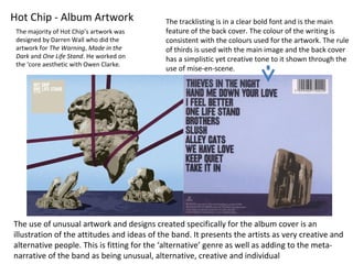
1. Hot Chip - Album Artwork
The use of unusual artwork and designs created specifically for the album cover is an
illustration of the attitudes and ideas of the band. It presents the artists as very creative and
alternative people. This is fitting for the ‘alternative’ genre as well as adding to the meta-
narrative of the band as being unusual, alternative, creative and individual
The tracklisting is in a clear bold font and is the main
feature of the back cover. The colour of the writing is
consistent with the colours used for the artwork. The rule
of thirds is used with the main image and the back cover
has a simplistic yet creative tone to it shown through the
use of mise-en-scene.
The majority of Hot Chip’s artwork was
designed by Darren Wall who did the
artwork for The Warning, Made in the
Dark and One Life Stand. He worked on
the ‘core aesthetic with Owen Clarke.
2. These album and single
covers show a common
theme in album art for the
artist. The majority of the
covers use patterns and
shapes as well as bright
colours. This could be
viewed as a representation
of their music through
visuals. The connotations
of the cover art add to the
meta-narrative of the band
and represent the style of
music.
While most of the print is
graphic designs and
drawing, photgraphs such
as the cake photograph for
the ‘Over and Over’ single
is still within the theme of
the other artwork
3. These promotional images
of the band are most likely
to be consumed through
advertisement in music
magazines or reviews and
possibly as posters.
The representation of the band adds
to the metanarrative of the band as
creative and individual people and
the use of lots of bright colours and
patterns represents them in a
positive way . The mise-en-scene and
costume is a reference to ‘nerd-
culture’ and ‘grandpa-chic’ connoting
that they are individuals and don’t
care about the opinions of others on
their style.