
Recommended
Recommended
More Related Content
What's hot
What's hot (20)
Similar to Mouse Brand Identity Guidelines
Similar to Mouse Brand Identity Guidelines (20)
More from Hubert de la Vega
More from Hubert de la Vega (19)
Recently uploaded
Recently uploaded (20)
Mouse Brand Identity Guidelines
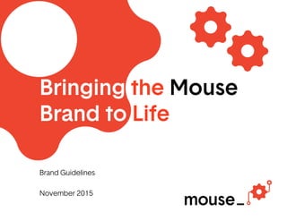
- 1. Bringing the Mouse Brand to Life Brand Guidelines November 2015
- 2. Mouse Brand Guidelines November 2015 Table of contents 1_What We Stand For 4 Introduction 5 Brand platform 6 Brand positioning 7 Brand behaviors 8 Brand voice 9 About Mouse 10 Tagline 2_Visual Identity 12 Introduction 13 Kit of parts 14 Typography – Primary typeface – Electronic typeface 31 Photography – Individual students – Groups of students – Objects 3_Design Inspiration 36 Introduction 37 Website homepage 38 Le erhead 39 Business card 40 Why Mouse card 41 About Mouse card 42 Mouse story 43 Posters 44 Start-up kit and t-shirt 45 Stickers 16 Color pale e 17 Characters – Character creation – Examples – Things to avoid 20 Logo – Primary organization logo § Variations § Clear space, proportion size, minimum size § Web icons – Dynamic organization logos § Variations § Clear space, proportion size, minimum size – Affiliate partner logos – Sub-brand logos § Variations § Clear space, proportion size, minimum size – Program logos – Logos – things to avoid
- 3. 1_What We Stand For
- 4. 2_Our Visual Identity 4 Mouse Brand Guidelines November 2015 Introduction The Mouse identity is guided by our brand strategy — which serves as a lens for the way we think, act, and communicate. As we move forward, our positioning, behaviors, and voice will help inspire our experiences and inform our expressions, helping us bring our story to life in a bold, fresh, and inspiring way.
- 5. 1_What We Stand For 5 Mouse Brand Guidelines November 2015 Brand platform Vision Mission VoiceBehaviorsPositioning Youth from all backgrounds will realize their identity as creators, designers and innovators, and become active citizens and leaders in the global economy Empowering underserved youth to learn, lead, and create with technology Technology as a force for good We open ways to engage We design and develop with originality We empower for the greater good Open Original Bold The Mouse identity is brought to life through our brand strategy — our positioning, behaviors, and voice. It is a guide for the way we think, act, and communicate — and serves as a bridge between our mission and vision.
- 6. 1_What We Stand For 6 Mouse Brand Guidelines November 2015 Brand positioning Mouse is a youth development nonprofit that believes in technology as a force for good. We empower students to harness this strength to solve real problems and make meaningful change in our communities and the world around us. With a commitment to creating more diversity in STEM and elevating under- resourced communities, we open opportunities through technology, expand minds with original, hands-on programming, and increase confidence through positive peer-to-peer and mentor relationships. Together with our partners and supporters, Mouse is helping students realize their full potential—and the potential of technology—to learn, lead, and create for the greater good. Whatwedo Howwedoit Whywedoit Our brand positioning crystallizes what we stand for, how we’re different, and why audiences should engage with us. Building on our core strengths, what makes us stand out relative to peers, and what compels our key audiences (students, educators, and funders), it focuses on the positive change that Mouse and technology can bring about.
- 7. 1_What We Stand For 7 Mouse Brand Guidelines November 2015 Brand behaviors We open ways to engage. We design and develop with originality. We empower for the greater good. Everything we do at Mouse is guided by our behaviors: a clear, strongly held set of core beliefs that reflect who we are and guides what our audiences can expect from us. Our behaviors carry through our thoughts and actions every day, drive our commitment to create more diversity in STEM, to inspire innovation in our programs and content, and to empower all students to create technology with purpose.
- 8. 1_What We Stand For 8 Mouse Brand Guidelines November 2015 Brand voice Voice Definition Guardrails Open Our voice amplifies the urgent need for diversity in STEM and reflects the power of many perspectives to achieve shared goals. Our stories and experiences strive to open opportunities and minds, inviting our audiences to join in and take action. We are... Diverse Upli ing Progressive But not... Unfocused Sentimental Extreme Original Our voice is fresh, authentic and inspiring—it reflects our original programs and content that help students think about and resolve real issues in smart and fun ways. Our stories and experiences are dynamic, imaginative and interactive. We are... Dynamic Creative Innovative But not... Frenetic Impractical Reckless Bold Our voice is clear, confident and passionate, empowering students to rise to challenges and bravely create and use technology for the greater good. We choose words and imagery with intention and always to inspire fresh ideas and fierce action. We are... Purposeful Fearless Inspiring But not... Unbending Brash Lo y Our brand voice guides the tone and personality of all our visual and verbal communications — it informs everything we express through words and pictures.
- 9. 1_What We Stand For 9 Mouse Brand Guidelines November 2015 About Mouse line Our About Mouse line helps communicate who we are, what we stand for, and why audiences should care about us in a clear, succinct, and compelling way. When space is limited and time is of the essence, use one of the following statements to help quickly and simply express our brand. Mouse is a national youth development nonprofit that empowers all students to create with technology to solve real problems and make meaningful change in our world. Mouse empowers all students to create with technology to solve real problems and make meaningful change in our world. Version1 Version2
- 10. 1_What We Stand For 10 Mouse Brand Guidelines November 2015 Tagline Our tagline is a simple, memorable line that encapsulates the essence of our brand. It underscores our commitment to empowering all students to create with technology to solve real problems and make meaningful change in our world. Technology with Purpose
- 12. 2_Our Visual Identity 12 Mouse Brand Guidelines November 2015 Introduction The Mouse visual system is open, original, and bold, reflecting a brand that can inspire fresh ideas and action. The core elements — our dynamic system and logo, approachable typeface, vibrant color, and action-oriented imagery — may be used in a variety of ways, offering both the framework and flexibility for a wide range of applications and audiences.
- 13. 2_Our Visual Identity 13 Mouse Brand Guidelines November 2015 Kit of parts The Mouse visual system starts with the kit of parts. From the heart to the 3D printer and the LED light to the coding language, the kit consists of elements that best represent our programming, content, and brand purpose. The kit is made up of five key categories: 1. basic shapes, 2. objects, 3. electrical components, 4. mechanical elements, 5. coding language. 1. 2. 3. 4. 5.
- 14. 2_Our Visual Identity 14 Mouse Brand Guidelines November 2015 Typography Primary typeface Our primary typeface is Basetica. It reinforces our identity as open and bold and gives our words a distinctive look and feel even before someone reads our text. It comes in variety of weights, offering flexibility for a wide range of applications and audiences. Our typeface is a vital ingredient in representing the Mouse brand consistently and should be used for all our internal and external materials. Basetica Light ABCDEFGHIJKLMNOPQRSTUVWXYZ abcdefghijklmnopqrstuvwxyz 1234567890!”S%§&?()=? Basetica Light Italic ABCDEFGHIJKLMNOPQRSTUVWXYZ abcdefghijklmnopqrstuvwxyz 1234567890!”S%§&?()=? Basetica Regular ABCDEFGHIJKLMNOPQRSTUVWXYZ abcdefghijklmnopqrstuvwxyz 1234567890!”S%§&?()=? Basetica Regular Italic ABCDEFGHIJKLMNOPQRSTUVWXYZ abcdefghijklmnopqrstuvwxyz 1234567890!”S%§&?()=? Basetica Bold ABCDEFGHIJKLMNOPQRSTUVWXYZ abcdefghijklmnopqrstuvwxyz 1234567890!”S%§&?()=? Basetica Bold Italic ABCDEFGHIJKLMNOPQRSTUVWXYZ abcdefghijklmnopqrstuvwxyz 1234567890!”S%§&?()=? Basetica Black ABCDEFGHIJKLMNOPQRSTUVWXYZ abcdefghijklmnopqrstuvwxyz 1234567890!”S%§&?()=? Basetica Black Italic ABCDEFGHIJKLMNOPQRSTUVWXYZ abcdefghijklmnopqrstuvwxyz 1234567890!”S%§&?()=?
- 15. 2_Our Visual Identity 15 Mouse Brand Guidelines November 2015 Typography Electronic typeface Our electronic typeface is Arial. Like our primary typeface, Basetica, Arial is a clean sans-serif font that is available on all computers and applications. It upholds our open and bold brand a ributes. For online applications or instances in which our primary typeface is not available, use Arial. Examples of these applications include Google Docs, online applications that use HTML text, and e-mail. Arial ABCDEFGHIJKLMNOPQRSTUVWXYZ abcdefghijklmnopqrstuvwxyz 1234567890!”S%§&?()=? Arial Italic ABCDEFGHIJKLMNOPQRSTUVWXYZ abcdefghijklmnopqrstuvwxyz 1234567890!”S%§&?()=? Arial Bold ABCDEFGHIJKLMNOPQRSTUVWXYZ abcdefghijklmnopqrstuvwxyz 1234567890!”S%§&?()=? Arial Bold Italic ABCDEFGHIJKLMNOPQRSTUVWXYZ abcdefghijklmnopqrstuvwxyz 1234567890!”S%§&?()=?
- 16. 2_Our Visual Identity 16 Mouse Brand Guidelines November 2015 Color pale e Primary and secondary colors The Mouse color pale e is inspired by RGB — the core colors of red, green, and blue that, when added together, help bring photography, technology, and other electronic systems to life. In addition to the kit of parts and typography, our fresh color pale e helps express the vibrancy and creativity of our brand. Therefore, it is important to be consistent and use only the colors that we’ve chosen as part of our brand. Pantone (PMS), CMYK, RGB and Web hexadecimal colors are provided below. Blue PMS Blue C C 100 M 97 Y 3 K 3 R 0 G 15 B 159 # 000f9f Green PMS Green C C 100 M 0 Y 64 K 0 R 0 G 168 B 136 # 00a888 Cool Grey PMS Cool Grey 8C C 0 M 0 Y 0 K 60 R 109 G 110 B 113 # 6d6e71 Primary colors Our primary brand colors are bright red and black. Branded applications that represent the Mouse organization (e.g., mouse.org, stationery, fundraising materials, etc..) should mainly employ these colors. Secondary colors Our secondary colors are blue, green, and cool grey. They complement our primary colors on more consumer-facing applications that are geared towards students and educators (e.g., start-up kit, posters, t-shirts, etc.). The secondary colors can also be used to help illustrate characters that are used in designs for organization materials.
- 17. 2_Our Visual Identity 17 Mouse Brand Guidelines November 2015 Characters Character creation The Mouse visual system is dynamic, imaginative, and interactive, much like the programming and content we develop and the original creations that Mouse students make. Our kit of parts allows for that creativity to come through — with custom-built, story-driven characters. With elements from the kit, you can create something wholly original, wholly Mouse. No more than five elements are recommended for each character. With a multitude of possible combinations, you can use your imagination and have fun.
- 18. 2_Our Visual Identity 18 Mouse Brand Guidelines November 2015 Characters Character creation – examples Following the rules for character creation, here are some good examples of characters that use various elements from the kit of parts.
- 19. 2_Our Visual Identity 19 Mouse Brand Guidelines November 2015 Characters Character creation – things to avoid Ensure characters have a purpose, tell a clear story, and respect the integrity of our brand. Here are some things to avoid when creating characters. Do not create characters without any symmetry. Do not use too many elements. Do not use colors that are not part of our color pale e. Do not pull apart individual elements. Do not distort. Do not alter the fill or apply different textures.
- 20. 2_Our Visual Identity 20 Mouse Brand Guidelines November 2015 Logo Primary organization logo Our logo says a lot about who we are and what we stand for. Which is why it’s fresh, original, and bold. It celebrates our creativity and innovation, and our belief in technology as a force for good. Our custom logo comprises the wordmark, underscore, and character. The wordmark is treated in our primary typeface Basetica, with the lowercase le erforms serving as an approachable invitation to participate. The underscore, which connects our wordmark and character, punctuates the importance of our mission and suggests a future rich with possibilities. The character that best represents our brand is the gear. In bright red, it symbolizes how Mouse is an engine for creativity and signifies that we’re always striving to make the world work be er. The raised right arm highlights that we’re active participants in our community, with the positive sign serving as an important reminder of our positive impact. Mouse in Text In wri en form, the Mouse name is in title case: Mouse. Wordmark Character Underscore
- 21. 2_Our Visual Identity 21 Mouse Brand Guidelines November 2015 Logo Primary organization logo – variations Below are the only acceptable versions of our logo. Each version has a specific purpose and should not be used in ways other than listed. Preferred version: Full-color (PMS/CMYK/RGB) The full-color version of the logo is the preferred version and, whenever possible, should be used on all branded materials. Alternate versions: Black In some circumstances, our logo can be used in black, e.g., on simple, text- based communications and when only greyscale printing is available. Knockout (white) The knockout version is for use on a dark background or photograph. When using this version you must ensure that the background color or photograph is dark enough to provide enough contrast for clarity and legibility. Full-color logo Black logo Knockout logo
- 22. 2_Our Visual Identity 22 Mouse Brand Guidelines November 2015 Logo Primary organization logo – clear space, proportion size, and minimum size Our logo makes a statement. It is fresh, original, and bold: it is uniquely Mouse. Follow the recommendations here to ensure that our logo communicates consistently across all applications. Clear Space Keep the logo clear of competing text, images, and graphics by maintaining the minimum amount of clear space, equal to the size of the lowercase “m” of the mouse logo on all sides. Proportion size The character needs to fit in the space to the right of the underscore. It is equal to 3 “m” in height and 3 “m” in width, minus the underscore on the bo om le side. Minimum size Keep the logo legible by always using it in sizes equal to or greater than 0.125” high for print, and 20px high for digital applications. Clear space is equal to the size of the lowercase “m” on all sides. Minimum height for print: 0.125” Minimum height for digital: 20px
- 23. 2_Our Visual Identity 23 Mouse Brand Guidelines November 2015 Logo Primary organization logo – web icons For web and social media applications where space is limited, use the character and gear icon to best represent the Mouse brand. Favicon Use the gear as the Mouse favicon — the small icon displayed in the browser's address bar (sometimes in the history as well), and next to the page's name in a list of bookmarks. The minimum size for favicon is 16 x 16px. Social media icon For social media such as Facebook and Twi er, use the gear character from our primary organization logo. The minimum size for social media Icon is 48 x 48px. Favicon 16 x16px Social media icon 48 x 48px
- 24. 2_Our Visual Identity 24 Mouse Brand Guidelines November 2015 Logo Dynamic organization logos Our organization logo has the opportunity to be dynamic in web and electronic applications where the characters can actively change. Our dynamic organization logos comprise of the heart and circuit characters and can alternate with the gear from the primary organization logo. Across all three characters, the positive sign is a common theme that communicates the essence of our brand: technology with purpose. For clear space, proportion size, and minimum size, please refer to page 22 for the rules and parameters. Primary organization logo Dynamic organization logo Dynamic organization logo
- 25. 2_Our Visual Identity 25 Mouse Brand Guidelines November 2015 Logo Affiliate partner logos To build equity to the overarching Mouse brand, it is important to communicate our logo consistently across markets. For our affiliate partners, use the primary organization logo with a modifier line to highlight the market/ geography underneath the wordmark. The line should be treated as text in Basetica Light and in a smaller font size.
- 26. 2_Our Visual Identity 26 Mouse Brand Guidelines November 2015 Logo Sub-brand logos Our sub-brand logos represent the signature modules or curriculum from Mouse. In the same style and format as our organization logos, the sub-brand logos comprise of the wordmark, underscore, character, and Mouse endorsement line. Each character is made up of elements that best represent their respective modules — the LED light for Garage Robotics, the game controller with the positive sign for Serious Games, and the leaf with circuitry for Green Tech. Wordmark Character Underscore Endorsement
- 27. 2_Our Visual Identity 27 Mouse Brand Guidelines November 2015 Logo Sub-brands – variations Below are the only acceptable versions of our sub-brand logos. Each version has a specific purpose and should not be used in ways other than listed. Full-color logo Black logo Knockout logo Preferred version: Full-color (PMS/CMYK/RGB) The full-color sub-brand logos are preferred and, whenever possible, should be used on all branded materials. Alternate versions: Black In some circumstances, our sub-brand logos can be used in black, e.g., on simple, text-based communications and when only greyscale printing is available. Knockout (white) The knockout versions are for use on dark backgrounds or photos — ensure they are dark enough to provide sufficient contrast for clarity and legibility.
- 28. 2_Our Visual Identity 28 Mouse Brand Guidelines November 2015 Logo Sub-brands – clear space, proportion size and minimum size Follow the recommendations here to ensure that our sub-brand logos communicate consistently across all applications. Clear Space Keep the logo clear of competing text, images and graphics by maintaining the minimum amount of clear space, equal to the size of the lowercase “m” on all sides. Proportion size The character needs to fit in the space to the right of the underscore. It is equal to 3 “m” in height and 3 “m” in width, minus the underscore on the bo om le side. Minimum size Keep the logo legible by always using it in sizes equal to or greater than 0.125” high for print, and 20px high for digital applications.
- 29. 2_Our Visual Identity 29 Mouse Brand Guidelines November 2015 Logo Program logos Mouse Design League and Mouse Squad are signature programs of Mouse. Both exemplify how we are empowering all students to create technology with purpose, and it is essential that we visually express the importance and distinction of our programs. For our program logos, use the primary organization logo with the program name underneath the wordmark. The program name is treated as text in Basetica Bold in our primary color red, scaled to ¾ height of “m”.
- 30. 2_Our Visual Identity 30 Mouse Brand Guidelines November 2015 Logo Things to avoid Our logos stand for who we are. They are recognizable, full of character, and always consistent. As such, they should not be altered under any circumstances. Here are some examples of things to avoid when using our logos. Do not alter the font case. Do not change the font. Do not outline the logo. Do not change the logo’s proportions. Do not add drop shadows or other effects. Do not change the wordmark and character size relationship. Do not change the colors. Do not place the logo in a holding shape. Do not crop the logo.
- 31. 2_Our Visual Identity 31 Mouse Brand Guidelines November 2015 Photography Imagery categories – individual students Our imagery tells our story. It represents a diversity of students and communities we serve, and the positive impact we make. Imagery of individual students should be active and showcase them creating things and demonstrate their optimism and enthusiasm.
- 32. 2_Our Visual Identity 32 Mouse Brand Guidelines November 2015 Photography Imagery categories – groups of students Similarly, groups of students should highlight teamwork, a diverse set of teens working together with purpose to solve real world problems in smart and fun ways.
- 33. 2_Our Visual Identity 33 Mouse Brand Guidelines November 2015 Photography Imagery categories – objects Our third imagery category is objects — close-up photography of the parts and pieces that students are working with to create original designs. The intricacies and details showcase the innovation and creativity we spark within students.
- 34. 2_Our Visual Identity 34 Mouse Brand Guidelines November 2015 Photography Things to avoid Our imagery shows who we are and helps us connect with our audiences. So don’t just fall back on safe and traditional stock shots: explore and find authentic photographs that best represent Mouse. Here are some examples of things to avoid when choosing photography. Avoid improbable or unrealistic vantage points and images that do not seem like genuine “captured moments.” Avoid images where people look disengaged and that do not feel purposeful. Avoid images that over-index in one field and do not showcase the diversity in STEM. Avoid images with people with extreme facial expressions, or anything that feels disingenuous and looks unrealistic. Avoid images where people feel posed, even when not facing the camera. Avoid extreme juxtapositions of foreground and background.
- 36. 2_Our Visual Identity 36 Mouse Brand Guidelines November 2015 Introduction The notional applications on the following pages demonstrate our visual identity system across a spectrum of communications. Use these examples as inspiration for implementing our brand.
- 37. 2_Our Visual Identity 37 Mouse Brand Guidelines November 2015 Design inspiration Website home page
- 38. 2_Our Visual Identity 38 Mouse Brand Guidelines November 2015 Design inspiration Le erhead
- 39. 2_Our Visual Identity 39 Mouse Brand Guidelines November 2015 Design inspiration Business card
- 40. 2_Our Visual Identity 40 Mouse Brand Guidelines November 2015 Design inspiration Why Mouse card
- 41. 2_Our Visual Identity 41 Mouse Brand Guidelines November 2015 Design inspiration About Mouse card
- 42. 2_Our Visual Identity 42 Mouse Brand Guidelines November 2015 Design inspiration Mouse story
- 43. 2_Our Visual Identity 43 Mouse Brand Guidelines November 2015 Design inspiration Posters
- 44. 2_Our Visual Identity 44 Mouse Brand Guidelines November 2015 Design inspiration Start-up kit and t-shirt
- 45. 2_Our Visual Identity 45 Mouse Brand Guidelines November 2015 Design inspiration Stickers
- 46. For more information contact: Susan Schwartz Communications Director 646 574 1014 susan@mouse.org