2. My brief
You have been commissioned by the
Northern Echo to produce a new
magazine or newspaper product. Your
product could be in any style or genre but
it must be self financed through sales or
advertising. You must also produce your
magazine for a specified audience
segment within the 16 to 25 age group
“
”
3. How I met the brief
• To ensure that I am able to meet the brief I have
done the following:
• It appeals to the socioeconomic group ABC1
• Ensure it makes a profit but is still of a high
quality
• University cooking magazine for 16-25 year olds
• A gap in the food market and is commercially
viable
• Self financed through advertising – free
magazine
• Able to appeal to both my own audience and the
5. Things to consider
Secondary Audience
• The secondary audience for my magazine is the
northern echo readers and 26-35 year olds. it is really
important that I don't cause offence to my secondary
audience to do this there will be ...
• no taboo language
• no inappropriate context or images
• no nudity
• no jokes that may cause offence
6. Constraints
• the press complaints commission; they are to stop things
from being published through books newspapers etc.
that could be harmful, offence damage reputations,
discriminate and various other things. there are 16 codes
that must be followed by magazines and newspapers.
The PCC look into complaints made by the individuals
that may have been effected by what the journalists have
said or what pictures the photographers have took.
• to ensure I don't not break any of the PCC codes I have
created 5 golden rules to follow...
7. My 5 Golden Rules
Don't put anything on my magazine that could be offensive or that
some people may not take as a joke.
take all my pictures with permission from the owner of the restaurant
and from my models.
Don't slate anyone unless its your own opinion make sure you can tell
its your own opinion, you cant make up facts!
do not put any pictures of people in the magazine until they have
signed forms to say you can.
don't tress pass, if I want pictures I will ask the owner of the particular
place if its okay to take photos there.
8. My USP
• my magazines USP is that its a food
magazine for university students, it will
help them become independent and a lot
healthier. They will enjoy cooking for them
selves and with one of my articles being
about drinking it can hopefully help in a lot
of different departments when it comes to
teenage health.
9. How it will change my audience
what will effect my audience …?
The colours – bright, catchy, bold
Fonts – fun, float, creative
Images – happy, future self, fun
Articles – interesting, not to long, not to
complex
Layout – not to full, clear separation
between things so it doesn't look to
busy.
10. Briefing My Ideas
• I brief my idea which involved discussing my article,
design and genre. I asked my target audience and
various other people and this is the feedback I have
collected.
“each idea for the food
articles
is good and could be used
but
pick the ones that will suit
your
target audience the most”
“plenty of unique selling points,
good choices of audience not
many of this particular genre
for this age group”
“The photography could be an issue
due to most of it not being in a
studio?”
“Great colours, all connotation
health and suit both male and
female audience”
12. Genre Research
• BBC good food
• Font is san serif for
mast head.
• Colours fit with healthy
style.
• Green and it sticks to
the rule of three.
• A lot of different
shades
• Has a button that
would work with my
food magazine.
14. Genre Research - DPS
• Idea behind speedy
step by step
• Bright colours,
aesthetically pleasing
food
• Not a lot of writing
• Rule of three colours
• Easy to read
• San serif font (suits
audience)
17. Good and bad
• clear layout easily readable
• suitable colours – connotations
• good amount of columns
• good images to portray message for teens
• not enough paragraphs
• sentences to long
• bit boring for my target audience
18. Good and bad
• nice use of colour suits audience
• good pictures of females and males
• article is laid out in easily readable paragraphs
• good break out box
• no images of food
• No where to start the articles
• The mast head is not at the top
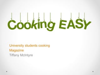
19. The Name
• long but not to long for the front cover
• good use of capitals to emphasise ‘easy’
• colour aimed at both male and female
• related to genre - creative font
• Different to a normal masthead - stands out
20. The
Aims
• talk about subjects that not many magazines talk
about
• make people at university have a healthier life
style
• understandable to a wide audience
• cooking can be for both genders
• Teach young people how to cook a quick meal
• Find places for university students to eat and
have fun
22. My Product
Front cover
content
article 1 - Hangover Hell
article 2 - Speedy Step By Step
article 3 - What's cooking in Newcastle
23. Article Details
Front cover
• images - Active, ideal,
window to future self,
happy, joyful, male and
female.
• layout - clear,
professional, main cell
line, clear fonts (san
serif)
• colours - Greens,
Greys, Oranges, Bright
colours, fit with image.
24. Article Details
Contents
page
• Images – active, fun,
future self, happy,
university life.
• Layout – not full,
spaced well, sauce
down pictures,
adverts.
• Colours – brown, grey,
red and green.
25. DPS
Hangover Hell
• images - active
(dancing), powerful,
mid range, difference
• layout - 7 different
paragraphs, break out
box, a lot going on
• colours - Greens,
Oranges, Reds,
Greys, also bright
colours so match the
light in the main
picture
26. DPS
Speedy Step By Step
• images - food,
desire, bright,
delicate, perfect
presentation
• layout - 2/6 writing,
big images, Big
main title at top,
clear
• colours - bright,
match with images,
match front cover,
healthy
27. DPS
What’s Cooking In Newcastle?
• images - full page
image, 4 restaurant
images, different,
stand out, extreme
long range and close
up
• layout - unique,
words over images, 4
columns, 5 6
sections
• colour - Grey,
yellow/orange,
green, brown. all link
to the other articles.
28. Conclusion
16 pages
paper size - A4
paper type – Matt
price - FREE
1/3 adverts
40,000 copies (university students from
Northumbria, Durham and Newcastle is 63,000)
33. • Studio space
rental
• Flash lighting
studio kit
• Camera
• Additional lens
hire
• QE indemnity
insurance
• Travel
• Props
Expenditure
Hours needed
2 Half days 1 hour
0
24
24
5 full days
30
9
Hire rate
half day £60, 1 hour £20
0
£45
£15
100
10
£5
Total cost
140
0
1080
360
500
300
45
2425 £2425 – equipment costs
34. Expenditure
Total cost - personal
Journalists
Photographers
Models
graphic designers
Researchers
Lighting assistant
Make up assistants
Other
Total cost - equipment
Studio space rental:
Flash lighting studio
kit:
Camera:
Additional lens hire:
QE indemnity
insurance:
£2425 – equipment costs
£1855 – Personal costs
36. Advertising prices
Rate Card
Double page spread £6000
Full page £3200
Half page £1600
Third strip £900
Quarter page £500
Eighth page £350
Cover positions
Outside back £5000
Inside back £4000
Inside front £4300
There are options to have
inserts these would be £300
and there is also
sponsorships are
Available throughout the
listings section,
Cooking pages and review.
www.foodsthebest.org.co.uk
tel no: 0190 362 753
37. Advertising sales
Back cover
Inside front
Inside back
Double page spread
Full page
Half page
Quarter page
Eighth Page
£5000
£4300
£3200
£2100
£4300
£350
£500
39. Net Profit
Total expenditure – £11,144.59
-
Total income - £21,000
£9855.41
40. My brief
You have been commissioned by the
Northern Echo to produce a new
magazine or newspaper product. Your
product could be in any style or genre but
it must be self financed through sales or
advertising. You must also produce your
magazine for a specified audience
segment within the 16 to 25 age group
“
”