Downloaded 21 times


![Responsive Website vs Mobile Web App
Semester Research Report Assignment
23References
1. http://repurposedapps.com
2. http://lukew.com/ff/entry.asp?933
3. http://alistapart.com/articles/responsive-web-design
4. http://mattkersley.com/responsive/?repurposedapps.com
5. http://css-tricks.com/which-responsive-images-solutionshould-you-use/
6. https://docs.google.com/spreadsheet/ccc?key=0Al0lI17fOl9DdDgxTFVoRzFpV3VCdHk2NTBmdVI2OXc#gid=0
7. Android Fragmentation Report July 2013 [WWW Document], 2013. URL
http://opensignal.com/reports/fragmentation-2013/8
http://www.google.com/about/company/philosophy/
9. Burslem, J., 2011. Responsive web design is the future of real estate online [WWW Document].
1000watt. URL http://1000watt.net/2011/09/responsive-web-design-is-the-futureof-real-estate-
online/
Fig. 2.1
http://www.pinterest.com/pin/263882859387620379/
Fig. 2.3 + 2.4 + 2.5
http://www.pinterest.com/pin/494903446521132351/
Fig. 2.6 + 2.7
http://www.pinterest.com/pin/494903446521132358/
Fig. 2.8 + 2.9 + 2.10 + 2.11 + 2.12
http://www.pinterest.com/pin/263882859387620374/](https://image.slidesharecdn.com/researchreport-150225134914-conversion-gate01/85/Responsive-Web-Design-vs-Mobile-Web-App-24-320.jpg)

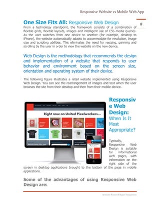
This document discusses responsive web design versus mobile web apps. It provides an overview of responsive web design, explaining that it uses fluid grids, flexible images and media queries to automatically adapt a website's layout for different screen sizes. The key elements of responsive web design like HTML, CSS and JavaScript are outlined. It also discusses some challenges of responsive web design like providing a less rich user experience than mobile apps and longer development cycles. Examples are given of when responsive web design would be most appropriate, such as for corporate, blog and news sites.