1. Film Poster Analysis
The Final Destinationisasupernatural horrorfilmwhichformspartof a pentalogy,the first
one beingreleasedin2000 and the mostrecentone beingreleasedin2008. Originally,the
storyline of the film(s) wasmeantforaTV seriesbutafterbeingdistributeditwasdecidedthat
it wasgoingto be made into a film, withfourothersfollowing.
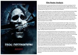
The main image of the filmposterisverydarkand mysterious,withthe blackandwhite effect
creatingshadowsandbuildingtensionforthe audience.The audienceare automatically
drawnto the brokenglasseffectonthe image whichisrevealingaskull beneathafemale’s
face,suggestingthatonce someone iscrackedtheirreal side willbegintoshow.The distressed
facial expressionof the characterexpressesfearandpanic,makingthe horrortheme more
apparentforthe audience.Thisimage isusedtomake the audience curiousandtogive them
an ideaof what the filmisall about,however,thisminimalisticcoverdoesnotgive much
away,keepingthe mysteryhidden.
At the top of the page isa tagline whichcorrespondswiththe mainimage,‘restinpieces’is
adaptedfromrestin peace whichisoftensaidto/aboutthe dead,suggestingthatadeathis
imminentinthe film.The ‘pieces’are representedbythe broken glass,whichinsinuatesthat
the individual facingdeathhasbeen brokenwhichgivesawaysomethingaboutthe plotof the
film.Thistagline usesawhite serif fontwhichstandsoutagainstthe dark backgroundof the
image,makingitstandout andveryvisible.
The title of the filmisbasedtowardsthe bottomof the page whichis usinga similarfont,a
serif style withastroke of lightgoingacrossthe topof the wordsto make the title standout
and give itas unusual lookwhichmakesthe overall postermuchmore effective. Thistitle stays
withinthe blackandwhite colourtheme of the posterandtherefore makesitlook
professionalandverysuccessful,attractingawide varietyof differentaudienceswiththe
abstract approach to the mainimage.Tofinishoff the posterthere isthe release date atthe
bottomof the page whichgoesagainstthe colourscheme,usingared serif font.The release
date is an importantpartof any filmposterasitgivesthe audience anideaof whenthe film
will be releasedandkeepstheminteresteduntilthe filmisreleased.The redfontcouldhave
beenusedtorepresentbloodandtoevoke fearwhichaddstothe horrorgenre of the filmand
makesa good difference touse acolourotherthan blackor white.
The target audience forThe Final Destinationwouldhave become clearthroughoutthe
previousfilms,beingteenagersandyoungadultsdue tothe age ratingof 15 andabove. The
characters includedinthe filmwouldbe of a similarage to the target audience,thisisso the
consumerscan relate tothe characters therefore makingthe filmmore successful and
effective.