Download as PDF, PPTX

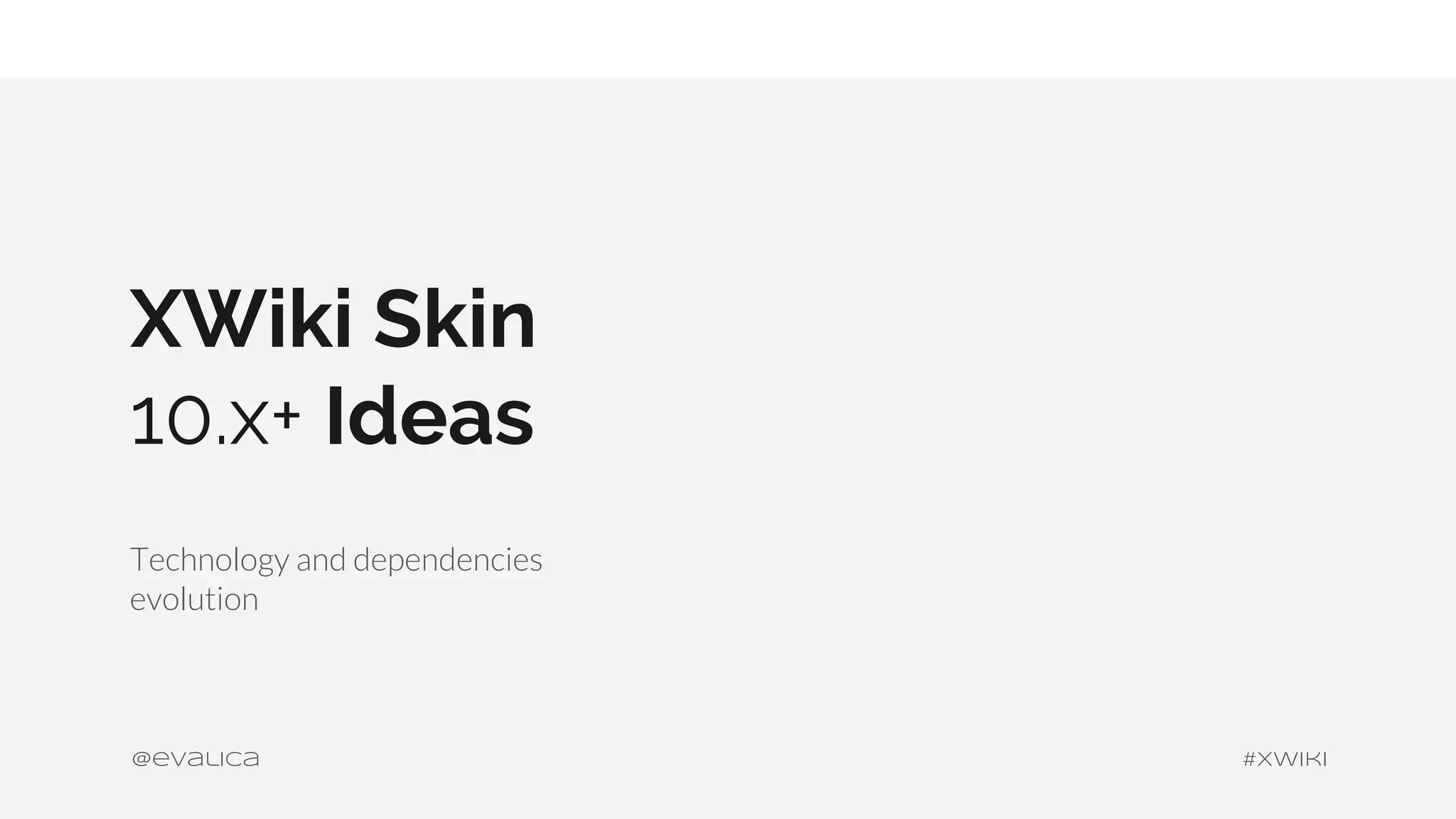

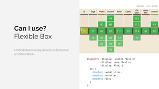
![Layout Specifications
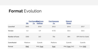
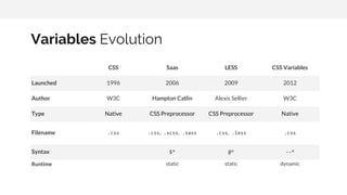
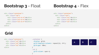
Float Display Position Flex Grid Multi-columns Regions Exclusions Shapes
Launched 1996- 1996-2011- 2008-2011- 2009-2017- 2012-2017- 1999-2017 2014 2013-2015 2014
Level CSS1
CSS1,
CSS2.1
CSS2.1 CSS3 CSS3 CSS3 CSS3 CSS3 CSS3
Maturity REC REC REC CR CR WD WD WD CR
Syntax float:
none|left|r
ight|initia
l|inherit;
display:
none|inline
|block|list
-item|inlin
e-block|tab
le| ...;
position:
static|abso
lute|fixed|
relative|st
icky|initia
l|inherit;
display:
flex; flex:
flex-grow
flex-shrink
flex-basis|
auto|initia
l|inherit;
display:
grid; grid:
none|grid-t
emplate-row
s /
grid-templa
te-columns|
grid-templa
te-areas|gr
id-template
-rows /
[grid-auto-
flow]
grid-auto-c
olumns|[gri
column-count:
auto |
<integer>;
break-bef
ore: auto
| always
| avoid |
left |
right |
page |
column |
region |
avoid-pag
e |
avoid-col
umn |
avoid-reg
ion;
wrap-flow:
auto | both
| start |
end |
minimum |
maximum |
clear;
shape-outsi
de:
none|margin
-box|conten
t-box|...;](https://image.slidesharecdn.com/skin10-190204112113/85/XWiki-Skin-10-x-ideas-13-320.jpg)


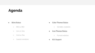
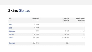
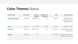
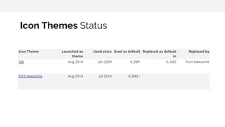
This document discusses the evolution of XWiki skins and layout technologies. It provides status updates on skins, color themes, icon themes, and support for technologies like Bootstrap, Flexbox, Grid, and CSS variables. It examines alternatives like floats, grids, and flexbox for layouts and discusses approaches for supporting older browsers like IE11.


![[Worskhop Summits] CSS3 Workshop](https://cdn.slidesharecdn.com/ss_thumbnails/schmitt-css3-v4-100114155033-phpapp02-thumbnail.jpg?width=640&height=640&fit=bounds)


![[WebVisions 2010] CSS3 Workshop (Afternoon)](https://cdn.slidesharecdn.com/ss_thumbnails/2010-webvisions-css3-100521114422-phpapp01-thumbnail.jpg?width=640&height=640&fit=bounds)


![[heweb11] CSS3 Makeover](https://cdn.slidesharecdn.com/ss_thumbnails/css3-makeover-111027113114-phpapp01-thumbnail.jpg?width=640&height=640&fit=bounds)