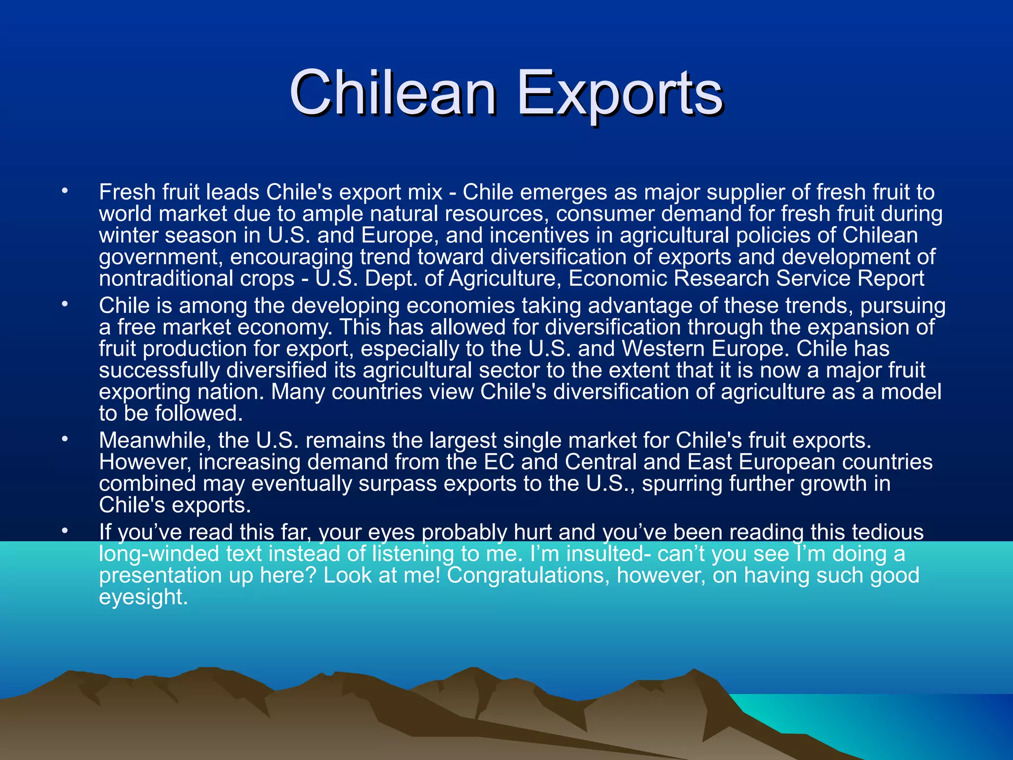
This presentation demonstrates examples of poor PowerPoint design and presentation skills. The first slide provides an overview of Chilean exports, noting that Chile has diversified its agricultural sector and become a major fruit exporter, especially to the US and Europe. The second slide contains a long paragraph with no formatting that would be difficult to read. The third slide provides tips on beginner motorcycles with minimal formatting. The remaining slides provide tips on racquetball fundamentals and presentation best practices, with varying formatting.
This PowerPoint presentation demonstrates common mistakes to avoid when creating slide shows. It includes slides with long blocks of unbroken text, small hard-to-read fonts, loud colors that clash or are difficult to read against backgrounds, too many distracting images, and overuse of animated transitions between slides. The presentation is intended to show examples of poor design that diverts the audience's attention from the content.
This presentation demonstrates examples of poor PowerPoint design and presentation skills. The first slide provides an overview of Chilean exports, noting that Chile has emerged as a major exporter of fresh fruit, particularly to the US and Europe. The second slide discusses beginner motorcycles, highlighting the Suzuki Savage model. The third slide outlines basic racquetball fundamentals such as serving rules. The subsequent slides provide tips for improving PowerPoint presentations, such as facing the audience, avoiding reading slides verbatim, and keeping content concise.
Great example of terrible powerpoint presentationDavid Dunn
ย
This PowerPoint presentation demonstrates many examples of poor design choices to avoid when creating slideshows. It includes blocks of overwhelming text that are hard to read, misuse of font sizes and colors, too many animated elements and transitions that distract from the content, and an excessive number of images that divert attention from the presentation. The slides that follow each bad example provide tips for keeping presentations clear, focused and engaging such as using minimal but relevant text, high contrast colors, simple animation, and citing sources.
You might not think of PowerPoint as engaging and exciting but PowerPoint is an extremely powerful tool in the right hands. During this two-part class we will:
- Discuss basic presentation concepts for keeping your audience engaged
- Show effective slide design using Microsoft PowerPoint
- Learn tips and tricks for improving presentations
- Demonstrate ways to interact and assess your audience
- Explore alternative presentation software
During this two part class, attendees will create a short presentation using PowerPoint, customize it for their audience, and have the option to receive feedback.
This document provides guidance on using PowerPoint effectively for presentations. It discusses key PowerPoint terminology like slides. It emphasizes keeping presentations concise with few words and using graphics. Presenters are advised to know their topic well, engage the audience, make eye contact, and avoid reading slides verbatim. Tips include starting strongly to grab attention, telling the main points at the beginning, middle and end, and making the presentation accessible.
Culture shock is defined as the feeling of disorientation, insecurity, and anxiety one may feel in unfamiliar surroundings. The document provides tips for dealing with culture shock, such as keeping in touch with friends and family back home, doing research and traveling, taking care of yourself and staying positive, making an effort to learn the local culture, and getting acquainted with the social conduct of the new environment. It also shares facts about Hong Kong, such as it being the most densely populated city in the world and having the highest number of mobile phones and luxury cars per capita.
Rivers go through three stages as they flow from their source to the sea - youthful, mature, and old. In the youthful stage, the fast-moving river erodes the landscape, creating V-shaped valleys, interlocking spurs, and waterfalls. During the mature stage, the river transports eroded material and deposits it, forming wider valleys, meanders, and flood plains. In the slow-moving old stage, deposition creates features like ox-bow lakes, levees, and deltas at the river's mouth. Rivers have long been important to people for transportation, water, and more recently, power generation through hydroelectric dams.
This is without a doubt, the worst presentation I have ever seen. An agency (name hidden to protect privacy) walked in and presented this gem to us over 45 minutes that I will never ever be able to recover.
What started out as a BTL activity pitch for a daily deals site (Groupon India), morphed into the world's worst crash course in marketing.
There is a something bizarre on each and every slide. Enjoy.
I did not create this presentation, but found it online. During my presentation, I made no changes to the original and gave credit to the person that created it.
The document provides sarcastic tips for creating a bad PowerPoint presentation, including using different colors and fonts on every slide, not preparing handouts, not checking for spelling or grammar errors, saving the main point for the end and only stating it once, not rehearsing or checking the equipment, using low contrast colors that are hard to read, including irrelevant graphics and audio, memorizing the talk word for word so you have to start over if you lose your place, cramming too much small text on slides, starting talking before animations finish, lacking logical progression of ideas, overusing animations and effects, not matching design to topic, zooming through slides too fast, lacking pacing and organization, and failing to summarize or
The document summarizes the key systems and components of a typical car, including:
1) The major systems are the power plant (engine), power train (transmission), running gear (suspension, wheels), and control system (steering, brakes).
2) The power plant includes subsystems like the engine, fuel system, electrical system, exhaust, lubrication, and cooling.
3) Most cars use a four-stroke engine cycle to power the vehicle.
Imagine a culture where the input of the whole organization turns an individual idea into a user story in just a couple of hours, where everybody's goal is to make the customerโs job easier and more effective, and where you work on projects you love instead of projects you loathe. A great coding culture concentrates on making developers productive and happy by removing unnecessary overhead, bringing autonomous teams together, helping the individual programmer to innovate, and raising awareness among developers about how to create better code.
I will talk about how to establish and foster a strong engineering-focused culture that scales from a small team to a huge organization with hundreds of developers. I'll give lots of examples from our experience at Atlassian to show that once you're working in a great coding culture, you won't want to work anywhere else.
https://www.youtube.com/watch?v=TAk04-_M-JM&feature=youtu.be
The document discusses bringing a zoo to the company building to attract customers. It lists various animals that could be regular exhibits such as giraffes, elephants, tigers, and lions. It also proposes a petting zoo with goats, donkeys, pigs, and other animals. Having a zoo is suggested as a great idea to bring in new customers and generate interest.
The What If Technique presented by Motivate DesignMotivate Design
ย
Why "What If"...?
The What If Technique tackles the challenge of engaging a creative, disruptive mindset when it comes to design thinking and crafting innovative user experiences.
Thinking disruptively is a disruptive thing to do, which means it's a very hard thing to do, especially when you add in risk-averse business leaders and company cultures, who hold on tight to psychological blocks, corporate lore, and excuse personas that stifle creativity and possibilities (see www.motivatedesign.com/what-if for more details).
The What If Technique offers key steps, tools and examples to help you achieve incremental changes that promote disruptive thinking, overcome barriers to creativity, and lead to big, innovative differences for business leaders, companies, and ultimately user experiences and products.
Let's find out what's what together! Explore your "What Ifs" with us. See www.motivatedesign.com/what-if for details about the What If Technique, studio workshops, the book, case studies and more downloads--including a the sample chapter "Corporate Lore and Blocks to Creativity"
Connect with us @Motivate_Design
PowerPoint is a tool to help you capture the hearts and minds of your audience, but this tool is often misused. Learn how to ICE your presentations. Impact your audience, Communicate your ideas, and Enhance your message.
See examples of bad PowerPoint slides as well as great ones to help you make your next presentation great.
This document provides examples of bad slide design and presentation techniques to avoid, including putting too much text on slides using a small font, including long paragraphs of text instead of emphasizing main points, using poor color combinations that are hard to read, including too many distracting animations and pictures, and failing to keep slides simple and easy to understand. It then offers tips for improving presentations with best practices such as using larger fonts, limiting text to key bullet points, choosing color contrasts that are easy to read, using only one or two relevant pictures per slide, and focusing on engaging the audience rather than reading slides.
Good presentations vs. Bad presentations hessa al rafi
ย
This document provides examples of bad PowerPoint slide design and presentation tips to avoid similar mistakes. It begins by showing a slide with a large block of unbroken text that would be difficult to read. Another slide contains too many small details and loud colors. The tips slides that follow advise the reader to keep slides simple with 1-2 pictures or bullets per slide, use a large font size, and avoid distracting color combinations or animation effects between slides. The document emphasizes keeping the presentation simple and talking to the audience rather than just reading the slides.
The sides I used with my Toastmasters speech from the Competent Communication manual, project #8 - Get Comfortable with Visual Aids on February 17, 2015.
This document provides tips and examples for creating effective presentations. It emphasizes the importance of good content and visuals. Examples are shown of presentation slides on various topics that demonstrate effective use of images, layout, color and minimal text. Design principles like alignment, repetition and contrast are discussed. The document encourages using fewer words per slide, meaningful images, motion and focusing on communicating key ideas rather than decorating slides. It concludes by recommending simplicity and keeping the audience in mind when designing presentations.
This PowerPoint presentation demonstrates many examples of poor design and formatting to avoid. It includes large blocks of unbroken text, small hard-to-read fonts, loud colors that clash or blend into backgrounds, overly animated slides with too many transition effects, and multiple unnecessary images per slide. The presentation emphasizes keeping slides simple with clear headings, large readable fonts, limited animation, and focusing on presenter's message rather than technological elements. It also stresses the importance of testing, backups, printing handouts, citing sources, practicing, and leaving time for questions.
This document provides examples of poor PowerPoint presentation design and tips for improving presentations. It begins by demonstrating common mistakes like using too much text on slides, font sizes that are too small, overwhelming images, and inconsistent or distracting animation effects. The following slides then offer advice on how to avoid these pitfalls, such as using fewer words and images per slide, choosing clear colors and large fonts, applying consistent transitions, and testing presentations beforehand. The overall message is that presentations should be simple, with an emphasis on speaking to the audience rather than reading from the slides.
This document provides examples of poor PowerPoint presentation design and tips for improving presentations. It begins by demonstrating common mistakes like using too much text on slides, font sizes that are too small, overwhelming images, and inconsistent or distracting animation effects. The following slides then offer advice on how to avoid these pitfalls, such as using fewer words and images per slide, choosing clear colors and large fonts, applying consistent transitions, and testing presentations beforehand. Overall, the document stresses keeping presentations simple and focused on the presenter's message rather than the visuals.
This document provides examples of poor PowerPoint presentation design and tips for improving presentations. It begins by demonstrating common mistakes like using too much text on slides, font sizes that are too small, overwhelming images, and inconsistent or distracting animation effects. The following slides then offer advice on how to avoid these pitfalls, such as using fewer words and images per slide, choosing clear colors and large fonts, keeping designs simple and unified, and testing presentations beforehand. It emphasizes keeping the audience's attention on the presenter and content rather than the visuals.
This document provides examples of poor PowerPoint presentation design and tips for improving presentations. It begins by demonstrating common mistakes like using too much text on slides, font sizes that are too small, overwhelming images, and inconsistent or distracting animation effects. The following slides then offer advice on how to avoid these pitfalls, such as using fewer words and images per slide, choosing clear colors and large fonts, applying consistent transitions, and testing presentations beforehand. Overall, the document stresses keeping presentations simple and focused on the presenter's message rather than the visuals.
This presentation provides examples of bad PowerPoint design and presentation mistakes to avoid. It includes slides with too much text in a small font, loud color choices, too many distracting pictures and animations per slide, and tips for keeping presentations simple with one animation style, pictures to reinforce key points, and leaving time for questions. The purpose is to demonstrate poor techniques and provide hints and tips for effective PowerPoint usage and public speaking.
This PowerPoint presentation demonstrates many examples of bad slide design and formatting to avoid. It includes blocks of dense text that are too small to read, too many animated elements and transitions that are distracting, as well as slides with poor color combinations and too many images. The presentation emphasizes keeping slides simple with only the most important points, using large readable fonts, limiting images and animations, and practicing and preparing thoroughly to avoid technical difficulties.
This document provides guidance on using presentation software effectively. It recommends keeping presentations short and simple, with no more than seven lines per slide and seven words per line. Statistics and large tables should be avoided, and color, templates, effects, and animation should only be used sparingly if they support the presentation. The document cautions against overwhelming the audience with too much text, small fonts, or excessive images. Instead, the focus should be on clearly communicating the most important points to the audience.
This document provides tips for creating effective presentations. It emphasizes focusing each slide on a single key idea, using visuals like images instead of heavy text, and employing good design principles for slide layout. Proper use of fonts, whitespace, and visual hierarchy helps audience understanding. The document cautions against long blocks of text that prevent audiences from listening to the presenter. Effective presentations require simplicity and clarity in both visuals and speaking.
The document provides biographical information about Daniel Jarjoura, including his education credentials and professional experience in telecommunications, computer science, and business development. It also outlines the structure and goals of an entrepreneurship course, including expectations around attendance, participation, and a final presentation. Key housekeeping rules are listed, such as the course being split into four 3-hour sessions with a 15 minute break. The goal of the course is stated as making students think, not just replicate.
Principles of Effective Presentations (In 10 Minutes or Less)Oscar Retterer
ย
The document outlines principles for effective presentations in 10 minutes or less, including planning the presentation, producing simple slides, practicing, and presenting with confidence. Key tips are to prepare a clear story and structure, keep slides simple with few lines and fonts, and practice presenting without reading slides while making eye contact with the audience.
This document provides examples of bad PowerPoint presentation design and tips to avoid common mistakes. It shows slides with too much text in a small font, loud color choices that are hard to read, overwhelming pictures that distract from the content, overuse of slide animations and transitions, and examples of what can go wrong when presenting such as technical issues. The document emphasizes keeping presentations simple with easy to read text, limited images, and consistency in design to engage the audience.
This document provides examples of bad PowerPoint presentation design and tips to avoid common mistakes. It shows slides with too much text in a small font, loud color choices that are hard to read, overwhelming pictures that distract from the content, overuse of slide animations and transitions, and examples of what can go wrong when presenting such as technical issues. The document emphasizes keeping presentations simple with clear main points, large readable fonts, limited images, and practice to prepare for any technical difficulties.
This document provides examples of bad PowerPoint presentation design and tips to avoid similar mistakes. It shows slides with too much text in a small font, loud color choices that are hard to read, overwhelming pictures that distract from the content, overuse of slide animations and transitions, and failure to proofread for errors. The tips slides advise keeping presentations simple with one idea per slide, using large readable fonts, limiting the number of pictures and animations, preparing handouts, and focusing on engaging the audience rather than just reading the slides.
The document advertises an Open Textbook Adoption Fair where faculty can choose from open textbooks recommended by fictional adoptable pets. The pets each recommend an open textbook for a different subject, describing the textbook's positive qualities and reviews. It encourages faculty to adopt open textbooks to save students money while retaining editorial control over customizing the texts. Adopting open textbooks also builds the institution's reputation through collaboration and avoids financial burdens on students. The document concludes by listing steps to find, adopt, and review an open textbook.
For fall 2018:
- There were 71 reported open textbook adoptions across Ontario universities and colleges. The majority (52%) were in social sciences.
- These adoptions impacted over 18,000 learners and saved them a total of over $2 million in textbook costs compared to commercial textbooks.
- Adoptions occurred mostly at universities but colleges are also increasing adoption, such as Centennial College which saved over 2,000 learners $100 each through open textbooks.
This document provides an agenda for a workshop on curation resources and techniques.
The workshop is divided into two stages: the first focuses on finding open resources, including an introduction to Creative Commons licenses. The second stage discusses creating a learning experience through curating resources in four phases: triggering interest, exploration, integration, and reflection. Participants will work in groups to curate a learning activity using resources from different repositories. The document emphasizes asking for help and sharing work to relieve pressure.
This document contains a series of questions related to family basics, issues facing families, online learning at Mohawk College, and study skills. The questions range in value from $100 to $500 and cover topics such as types of families (e.g. nuclear, lone parent, blended), reasons for changing family structures, living wage, family violence statistics, mental health aspects, addiction characteristics, using eLearn at Mohawk, benefits and differences of online versus in-person learning, meeting deadlines, using academic support services, and identifying errors in a reference citation.
This document discusses harm reduction and concurrent disorders. It defines harm reduction as a philosophical approach that aims to support people in reducing the negative consequences of substance use through moderating intake or safer methods of use. The key principles of harm reduction are that it is pragmatic, respectful, prioritizes goals, and maximizes intervention options. Harm reduction recognizes that people are at different stages of change and aims to remove barriers to accessing programs and services. Some challenges to harm reduction include community resistance, working with marginalized groups, ensuring proper training, and adequate resources.
This document provides a rubric to evaluate student performance on essays across four levels: beginning to develop, progressing toward the standard, meets the standard, and exceeds the standard. The rubric includes criteria in three categories: application of skills (30%), processing skills (30%), and following instructions (10%). Each criterion lists descriptions of the type of performance expected at each level. A fourth category, reflection (20%), focuses on a student's ability to assess their own performance and recommend improvements. The rubric provides a detailed framework to assess and differentiate student work at various performance levels.
The document discusses strengths-based development and the StrengthsQuest assessment. It makes three key points:
1. A strengths-based approach focuses on identifying and building upon individuals' natural talents and strengths, rather than focusing on weaknesses. The StrengthsQuest assessment identifies 34 key talent themes.
2. Having individuals work in roles that align with their strengths leads to greater workplace engagement, productivity, and satisfaction. It involves identifying, integrating, and applying one's strengths.
3. The goal of the StrengthsQuest is to help individuals discover their talents and strengths, understand how they relate to past successes, and gain confidence and direction by focusing on developing their strengths.
The jigsaw instructional strategy divides students into home groups, where each member is assigned a different role or task. Students then join expert groups of others with the same role to learn and prepare. They return to their home groups to teach their peers, so that each group benefits from members sharing their specialized knowledge and the full issue can be explored collaboratively.
The document discusses rubrics for evaluating student research papers. It provides a sample rubric that evaluates students on four dimensions of research: determining information needs, accessing information effectively, evaluating information sources critically, and using information effectively. For each dimension, the rubric describes criteria for beginning, proficient, and advanced performance levels, scored on a scale of 0-20 points. The document emphasizes that rubrics help set clear expectations for students and allow for consistent evaluation of research skills.
The document provides an introduction to using rubrics for assessing student work. It defines key terms related to rubrics and their purposes. It then outlines a five step process for developing rubrics, including deciding on dimensions of quality, achievement levels, descriptions for each level, rating schemes, and reviewing/revising. An example rubric for grading research papers is also included.
Copyright introduction for blended learning intensiveMohawk College
ย
The Librarians at Mohawk College in Hamilton ON have prepared an introduction to copyright in academia for faculty exploring blended delivery in the Spring Summer 2011 intensive.
This document provides steps for publishing a resource and adding metadata to make it easier for others to find. It outlines 5 steps to publish a file through the LOR link and publish button. It then describes 5 optional bonus steps to enhance the resource's metadata by filling out fields like the creator, keywords, type of learning object, copyright information, and categories.
Ethics presentation from Saskatchewan RN AssociationMohawk College
ย
The document discusses the CNA Code of Ethics for Registered Nurses. It provides guidance for nurses in ethical decision making and outlines their core values and responsibilities. The Code aims to establish standards for ethical nursing practice and advocate for quality care. It addresses how nurses can identify and manage ethical issues and moral distress in their work.
The document is a title page for a collection called "Museum of Memories" that contains trips, conferences, and general experiences from 2009. It provides a high-level title and timeframe but no other details on the specific contents within the collection.
Chapter wise All Notes of First year Basic Civil Engineering.pptxDenish Jangid
ย
Chapter wise All Notes of First year Basic Civil Engineering
Syllabus
Chapter-1
Introduction to objective, scope and outcome the subject
Chapter 2
Introduction: Scope and Specialization of Civil Engineering, Role of civil Engineer in Society, Impact of infrastructural development on economy of country.
Chapter 3
Surveying: Object Principles & Types of Surveying; Site Plans, Plans & Maps; Scales & Unit of different Measurements.
Linear Measurements: Instruments used. Linear Measurement by Tape, Ranging out Survey Lines and overcoming Obstructions; Measurements on sloping ground; Tape corrections, conventional symbols. Angular Measurements: Instruments used; Introduction to Compass Surveying, Bearings and Longitude & Latitude of a Line, Introduction to total station.
Levelling: Instrument used Object of levelling, Methods of levelling in brief, and Contour maps.
Chapter 4
Buildings: Selection of site for Buildings, Layout of Building Plan, Types of buildings, Plinth area, carpet area, floor space index, Introduction to building byelaws, concept of sun light & ventilation. Components of Buildings & their functions, Basic concept of R.C.C., Introduction to types of foundation
Chapter 5
Transportation: Introduction to Transportation Engineering; Traffic and Road Safety: Types and Characteristics of Various Modes of Transportation; Various Road Traffic Signs, Causes of Accidents and Road Safety Measures.
Chapter 6
Environmental Engineering: Environmental Pollution, Environmental Acts and Regulations, Functional Concepts of Ecology, Basics of Species, Biodiversity, Ecosystem, Hydrological Cycle; Chemical Cycles: Carbon, Nitrogen & Phosphorus; Energy Flow in Ecosystems.
Water Pollution: Water Quality standards, Introduction to Treatment & Disposal of Waste Water. Reuse and Saving of Water, Rain Water Harvesting. Solid Waste Management: Classification of Solid Waste, Collection, Transportation and Disposal of Solid. Recycling of Solid Waste: Energy Recovery, Sanitary Landfill, On-Site Sanitation. Air & Noise Pollution: Primary and Secondary air pollutants, Harmful effects of Air Pollution, Control of Air Pollution. . Noise Pollution Harmful Effects of noise pollution, control of noise pollution, Global warming & Climate Change, Ozone depletion, Greenhouse effect
Text Books:
1. Palancharmy, Basic Civil Engineering, McGraw Hill publishers.
2. Satheesh Gopi, Basic Civil Engineering, Pearson Publishers.
3. Ketki Rangwala Dalal, Essentials of Civil Engineering, Charotar Publishing House.
4. BCP, Surveying volume 1
This presentation was provided by Racquel Jemison, Ph.D., Christina MacLaughlin, Ph.D., and Paulomi Majumder. Ph.D., all of the American Chemical Society, for the second session of NISO's 2024 Training Series "DEIA in the Scholarly Landscape." Session Two: 'Expanding Pathways to Publishing Careers,' was held June 13, 2024.
Level 3 NCEA - NZ: A Nation In the Making 1872 - 1900 SML.pptHenry Hollis
ย
The History of NZ 1870-1900.
Making of a Nation.
From the NZ Wars to Liberals,
Richard Seddon, George Grey,
Social Laboratory, New Zealand,
Confiscations, Kotahitanga, Kingitanga, Parliament, Suffrage, Repudiation, Economic Change, Agriculture, Gold Mining, Timber, Flax, Sheep, Dairying,
Philippine Edukasyong Pantahanan at Pangkabuhayan (EPP) CurriculumMJDuyan
ย
(๐๐๐ ๐๐๐) (๐๐๐ฌ๐ฌ๐จ๐ง ๐)-๐๐ซ๐๐ฅ๐ข๐ฆ๐ฌ
๐๐ข๐ฌ๐๐ฎ๐ฌ๐ฌ ๐ญ๐ก๐ ๐๐๐ ๐๐ฎ๐ซ๐ซ๐ข๐๐ฎ๐ฅ๐ฎ๐ฆ ๐ข๐ง ๐ญ๐ก๐ ๐๐ก๐ข๐ฅ๐ข๐ฉ๐ฉ๐ข๐ง๐๐ฌ:
- Understand the goals and objectives of the Edukasyong Pantahanan at Pangkabuhayan (EPP) curriculum, recognizing its importance in fostering practical life skills and values among students. Students will also be able to identify the key components and subjects covered, such as agriculture, home economics, industrial arts, and information and communication technology.
๐๐ฑ๐ฉ๐ฅ๐๐ข๐ง ๐ญ๐ก๐ ๐๐๐ญ๐ฎ๐ซ๐ ๐๐ง๐ ๐๐๐จ๐ฉ๐ ๐จ๐ ๐๐ง ๐๐ง๐ญ๐ซ๐๐ฉ๐ซ๐๐ง๐๐ฎ๐ซ:
-Define entrepreneurship, distinguishing it from general business activities by emphasizing its focus on innovation, risk-taking, and value creation. Students will describe the characteristics and traits of successful entrepreneurs, including their roles and responsibilities, and discuss the broader economic and social impacts of entrepreneurial activities on both local and global scales.
Gender and Mental Health - Counselling and Family Therapy Applications and In...PsychoTech Services
ย
A proprietary approach developed by bringing together the best of learning theories from Psychology, design principles from the world of visualization, and pedagogical methods from over a decade of training experience, that enables you to: Learn better, faster!
A Visual Guide to 1 Samuel | A Tale of Two HeartsSteve Thomason
ย
These slides walk through the story of 1 Samuel. Samuel is the last judge of Israel. The people reject God and want a king. Saul is anointed as the first king, but he is not a good king. David, the shepherd boy is anointed and Saul is envious of him. David shows honor while Saul continues to self destruct.
Beyond Degrees - Empowering the Workforce in the Context of Skills-First.pptxEduSkills OECD
ย
Ivรกn Bornacelly, Policy Analyst at the OECD Centre for Skills, OECD, presents at the webinar 'Tackling job market gaps with a skills-first approach' on 12 June 2024
How to Setup Warehouse & Location in Odoo 17 InventoryCeline George
ย
In this slide, we'll explore how to set up warehouses and locations in Odoo 17 Inventory. This will help us manage our stock effectively, track inventory levels, and streamline warehouse operations.
SWOT analysis in the project Keeping the Memory @live.pptx
ย
Worst Presentation Ever
1. Quite Possibly TheQuite Possibly The
Worldโs Worst PowerPointWorldโs Worst PowerPoint
Presentation EverPresentation Ever
A Demonstration of WhatA Demonstration of What
NOT to do When CreatingNOT to do When Creating
and Using PowerPointand Using PowerPoint
Slide ShowsSlide Shows
2. How to Use this Presentation
โข Watch the slide show.
โข As a group or individually, record the horrible
examples of bad slide design and presentation.
โข Working individually, flip the horrible examples
into recommendations for better presentations.
โข Submit your recommendations to the Dropbox
folder, Improving Horrible PPTs.
3. Chilean ExportsChilean Exports
โข Fresh fruit leads Chile's export mix - Chile emerges as major supplier of fresh fruit to
world market due to ample natural resources, consumer demand for fresh fruit during
winter season in U.S. and Europe, and incentives in agricultural policies of Chilean
government, encouraging trend toward diversification of exports and development of
nontraditional crops - U.S. Dept. of Agriculture, Economic Research Service Report
โข Chile is among the developing economies taking advantage of these trends, pursuing
a free market economy. This has allowed for diversification through the expansion of
fruit production for export, especially to the U.S. and Western Europe. Chile has
successfully diversified its agricultural sector to the extent that it is now a major fruit
exporting nation. Many countries view Chile's diversification of agriculture as a model
to be followed.
โข Meanwhile, the U.S. remains the largest single market for Chile's fruit exports.
However, increasing demand from the EC and Central and East European countries
combined may eventually surpass exports to the U.S., spurring further growth in
Chile's exports.
โข If youโve read this far, your eyes probably hurt and youโve been reading this tedious
long-winded text instead of listening to me. Iโm insulted- canโt you see Iโm doing a
presentation up here? Look at me! Congratulations, however, on having such good
eyesight.
4. Beginner Motorcycles
โข My personal favorite:
the Suzuki Savage
โข Light weight (~380lbs)
โข Adequate power
(650cc engine)
โข Low seat height fits
most riders
5.
6. Racquetball Fundamentals
๏ฎ 2, 3, or 4 players.
๏ฎ 1 player serves, other โreturns.โ
๏ฎ Only serving player can skore.
๏ฎ Served balll must land passed serving line
and cannot hit back wall.
๏ฎ Ball can only bounce once before striking
front wallโฆbut ball does not have to bounce.
7. Racquetball Fundamentals
๏ฎ 2, 3, or 4 players.
๏ฎ 1 player serves, other โreturns.โ
๏ฎ Only serving player can skore.
๏ฎ Served balll must land passed serving line
and cannot hit back wall.
๏ฎ Ball can only bounce once before striking
front wallโฆbut ball does not have to bounce.