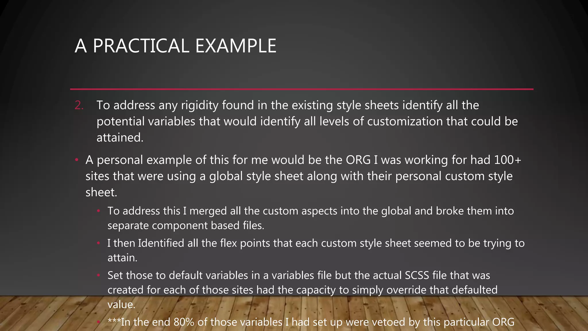
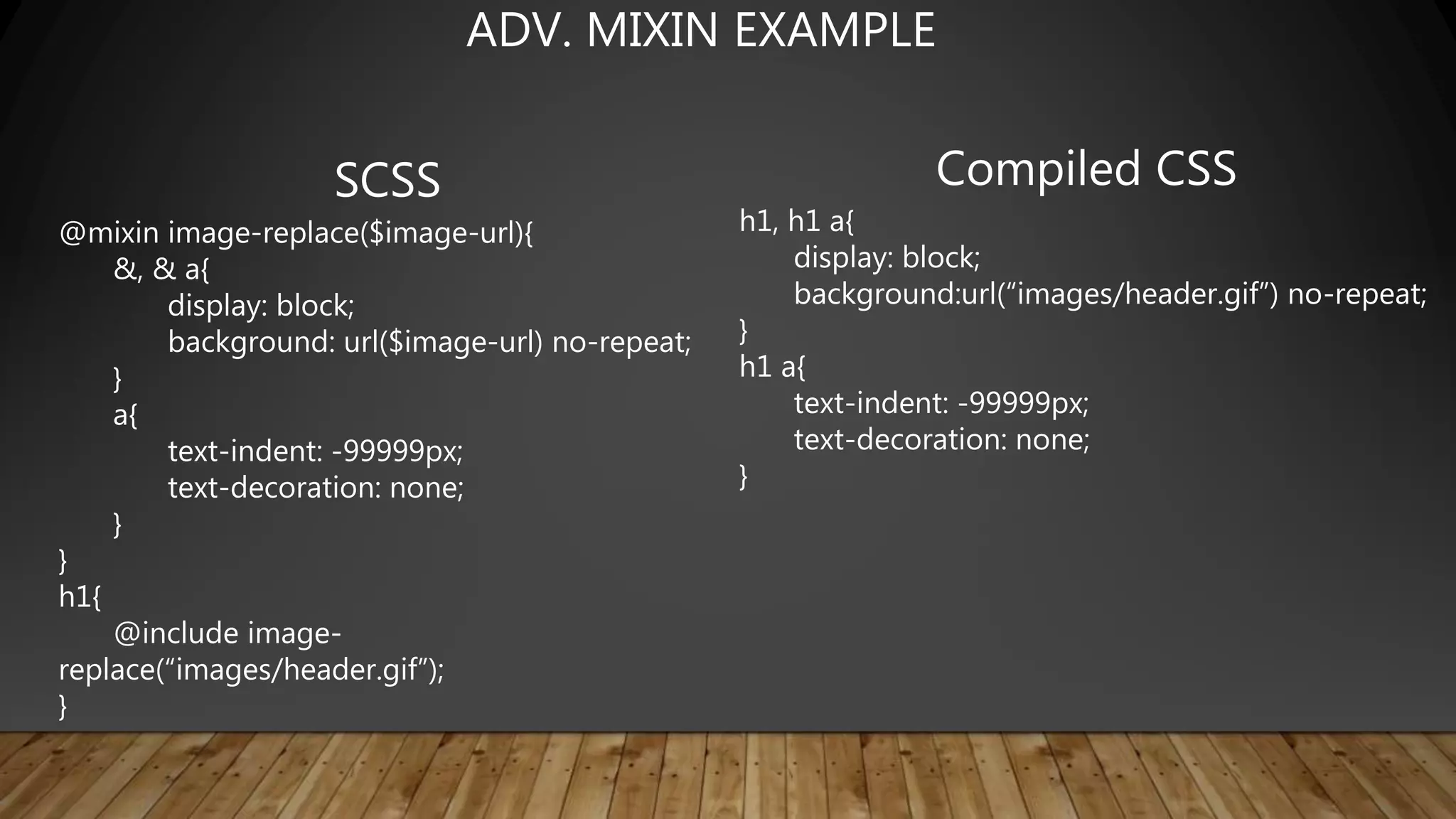
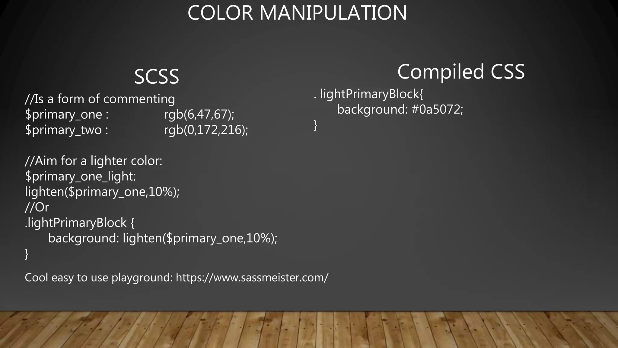
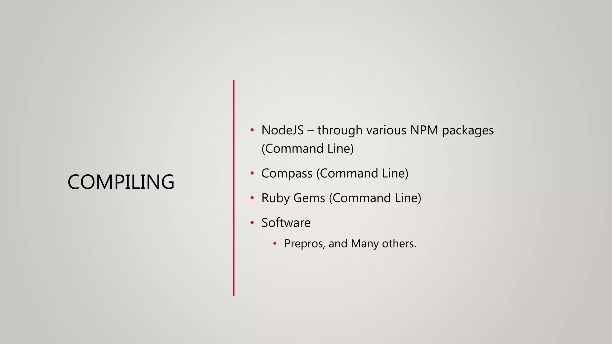
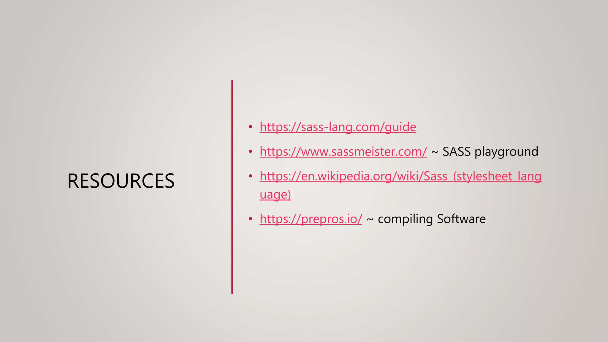
A PRACTICAL EXAMPLE
Company/Organization that has multiple platforms of media that all
should/would/could look the same but likely have different code Basis and
functions
1. This Organization likely has 3+ “custom” style sheets that work for its specific
HTML markup and function…Which creates a maintenance nightmare.
2. The styling is incredibly rigid or hardcoded colors, sizes, backgrounds, etc.
How can Sass Remedy This?
A PRACTICAL EXAMPLE
1. The Various Style sheets that have specific tooling for its various usages –
aggregate them into a series of components that can be lumped into a set of
files.
• Example: in all four of the Platforms this ORG uses there is a table with a blue
background but various different takes on the certain parts of that table and filters
associated.
• Get all those identified and what classes they maybe using(or IDs but less desireable) and
begin to craft a few basic mixins that define rules to certain elements.
• Once that is established use those as you define the various aspects individually as the
specific style sheets were doing previously.
• ***This is not the end goal this is the start of the process ~ the end goal is the markup be
the same and “.blue-box-table” would mean the same for all various platforms.
A PRACTICAL EXAMPLE
2. To address any rigidity found in the existing style sheets identify all the
potential variables that would identify all levels of customization that could be
attained.
• A personal example of this for me would be the ORG I was working for had 100+
sites that were using a global style sheet along with their personal custom style
sheet.
• To address this I merged all the custom aspects into the global and broke them into
separate component based files.
• I then Identified all the flex points that each custom style sheet seemed to be trying to
attain.
• Set those to default variables in a variables file but the actual SCSS file that was
created for each of those sites had the capacity to simply override that defaulted
value.
• ***In the end 80% of those variables I had set up were vetoed by this particular ORG
SASS
&
SCSS
SASS
• No brackets or
semicolons, based on
indentation
• Less characters to
type
• Enforced
conventions/neatnes
s
SCSS
• Semi-colon and bracket
syntax
• Superset of normal CSS
• Normal CSS is also valid
SCSS
• Newer and
recommended
SASS
&
SCSS
SASS
$txt-size: 12px
$txt-color: #333
$link-color: #999
#main
font-size: $txt-size
color: $txt-color
a
color: $link-color
SCSS
$txt-size: 12px;
$txt-color: #333;
$link-color: #999;
#main{
font-size: $txt-size;
color: $txt-color; a{
color: $link-color;
}
}
Two available syntaxes
• Both of the previous examples compile to:
#main{
font-size: 12px;
color: #333333;
}
#main a{
color: #999999;
}
• Already demonstrated basic variable usage and
nesting
• Note: Some examples compile using different
formatting, I changed them for the slides for
readability
SASS/SCSS HAVE THE SAME FUNCTIONALITY
SASS
&
SCSS
SCSS
#content{
font-size: 12px;
&, a{
color: #333;
}
}
Compiled CSS
#content{
font-size: 12px;
}
#content, #content a{
color: #333;
}
Additional Nesting Details
SCSS
.error{
color: red;
}
.seriousError{
@extend .error;
font-weight: bold;
}
Compiled CSS
.error, .seriousError{
color: red;
}
.seriousError{
font-weight: bold;
}
INHERITANCE FROM SELECTORS
SCSS
@mixin textBolded{
font-size: 24px;
font-weight: bold;
color: blue;
}
p{
@include textbolded;
}
Compiled CSS
p{
font-size: 24px;
font-weight: bold;
color: blue;
}
Mixins are sets of reusable styles, almost like methods in other
languages
MIXINS
SCSS
@mixin textBold($size){
font-size: $size;
font-weight: bold;
color: blue;
}
p{
@include textBold(24px);
}
li{
@include textBold(18px);
}
Compiled CSS
p{
font-size: 24px;
font-weight: bold;
color: blue;
}
li{
font-size: 18px;
font-weight: bold;
color: blue;
}
MIXINS WITH PARAMETERS
SCSS
@mixin image-replace($image-url){
&, & a{
display: block;
background: url($image-url) no-repeat;
}
a{
text-indent: -99999px;
text-decoration: none;
}
}
h1{
@include image-
replace(“images/header.gif”);
}
Compiled CSS
h1, h1 a{
display: block;
background:url(“images/header.gif”) no-repeat;
}
h1 a{
text-indent: -99999px;
text-decoration: none;
}
ADV. MIXIN EXAMPLE
SCSS
$page-width: 500px;
$sidebar-width: 100px;
$content-width: $page-width - $sidebar-width;
#main{
width: $page-width;
#sidebar{
width: $sidebar-width;
}
#content{
width: $content-width;
}
}
Compiled CSS
#main{
width: 500px;
}
#main #sidebar{
width: 100px;
}
#main #content{
width: 400px;
}
DOING MATH WITH SASS!
SCSS
$class-name: wrapper;
$attribute-name: font;
div.#{$class-name}{
#{$attribute-name}-size: 12px;
}
*This is Often done with Mixins to apply
Qualities to certain blocks dynamically
Compiled CSS
div.wrapper{
font-size: 12px;
}
INTERPOLATION
SCSS
IF >
$type: big;
p{
@if $type == big{
font-size: 24px;
}
}
if / else >
$type: small;
p{
@if $type == big {
font-size: 24px;
} @else if $type == medium{
font-size: 18px;
} @else { font-size: 16px; }
}
Compiled CSS
IF >
p{
font-size: 24px;
}
IF / ELSE >
p{
font-size: 16px;
}
CONTROL DIRECTIVES ~ IF / ELSE
SCSS
For Loop:
@for $i from 1 through 3 {
.item-#{$i} {
width: 10px * $i;
}
}
Each Loop:
@each $item in item1, item2{
.#{$item}{ width: 500px; }
}
While loop:
$i: 6;
@while $i > 0 {
.item-#{$i} { width: 10px * $i; }
$i: $i - 2;
}
Compiled CSS
For Loop:
.item-1{ width: 10px; }
.item-2{ width: 20px; }
.item-3{ width: 30px; }
Each Loop:
.item1{ width: 500px; }
.item2{ width: 500px; }
While loop:
.item-6{ width: 60px; }
.item-4{ width: 40px; }
.item-2{ width: 20px; }
CONTROL DIRECTIVES ~ FOR, EACH, WHILE
*This capacity is one if the greatest tool SASS offers In my opinion
SCSS
//Is a form of commenting
$primary_one : rgb(6,47,67);
$primary_two : rgb(0,172,216);
//Aim for a lighter color:
$primary_one_light:
lighten($primary_one,10%);
//Or
.lightPrimaryBlock {
background: lighten($primary_one,10%);
}
Compiled CSS
. lightPrimaryBlock{
background: #0a5072;
}
COLOR MANIPULATION
Cool easy to use playground: https://www.sassmeister.com/
COMPILING
• NodeJS – through various NPM packages
(Command Line)
• Compass (Command Line)
• Ruby Gems (Command Line)
• Software
• Prepros, and Many others.
RESOURCES
• https://sass-lang.com/guide
• https://www.sassmeister.com/ ~ SASS playground
• https://en.wikipedia.org/wiki/Sass_(stylesheet_lang
uage)
• https://prepros.io/ ~ compiling Software
LIVE CODING
• Mixins
• Extends
• If/else
• Oh my!
QUESTIONS
• Concerns
• ETC

Joes sass presentation

  • 1.
    A PRACTICAL EXAMPLE Company/Organizationthat has multiple platforms of media that all should/would/could look the same but likely have different code Basis and functions 1. This Organization likely has 3+ “custom” style sheets that work for its specific HTML markup and function…Which creates a maintenance nightmare. 2. The styling is incredibly rigid or hardcoded colors, sizes, backgrounds, etc. How can Sass Remedy This?
  • 2.
    A PRACTICAL EXAMPLE 1.The Various Style sheets that have specific tooling for its various usages – aggregate them into a series of components that can be lumped into a set of files. • Example: in all four of the Platforms this ORG uses there is a table with a blue background but various different takes on the certain parts of that table and filters associated. • Get all those identified and what classes they maybe using(or IDs but less desireable) and begin to craft a few basic mixins that define rules to certain elements. • Once that is established use those as you define the various aspects individually as the specific style sheets were doing previously. • ***This is not the end goal this is the start of the process ~ the end goal is the markup be the same and “.blue-box-table” would mean the same for all various platforms.
  • 3.
    A PRACTICAL EXAMPLE 2.To address any rigidity found in the existing style sheets identify all the potential variables that would identify all levels of customization that could be attained. • A personal example of this for me would be the ORG I was working for had 100+ sites that were using a global style sheet along with their personal custom style sheet. • To address this I merged all the custom aspects into the global and broke them into separate component based files. • I then Identified all the flex points that each custom style sheet seemed to be trying to attain. • Set those to default variables in a variables file but the actual SCSS file that was created for each of those sites had the capacity to simply override that defaulted value. • ***In the end 80% of those variables I had set up were vetoed by this particular ORG
  • 4.
    SASS & SCSS SASS • No bracketsor semicolons, based on indentation • Less characters to type • Enforced conventions/neatnes s SCSS • Semi-colon and bracket syntax • Superset of normal CSS • Normal CSS is also valid SCSS • Newer and recommended
  • 5.
    SASS & SCSS SASS $txt-size: 12px $txt-color: #333 $link-color:#999 #main font-size: $txt-size color: $txt-color a color: $link-color SCSS $txt-size: 12px; $txt-color: #333; $link-color: #999; #main{ font-size: $txt-size; color: $txt-color; a{ color: $link-color; } } Two available syntaxes
  • 6.
    • Both ofthe previous examples compile to: #main{ font-size: 12px; color: #333333; } #main a{ color: #999999; } • Already demonstrated basic variable usage and nesting • Note: Some examples compile using different formatting, I changed them for the slides for readability SASS/SCSS HAVE THE SAME FUNCTIONALITY
  • 7.
    SASS & SCSS SCSS #content{ font-size: 12px; &, a{ color:#333; } } Compiled CSS #content{ font-size: 12px; } #content, #content a{ color: #333; } Additional Nesting Details
  • 8.
    SCSS .error{ color: red; } .seriousError{ @extend .error; font-weight:bold; } Compiled CSS .error, .seriousError{ color: red; } .seriousError{ font-weight: bold; } INHERITANCE FROM SELECTORS
  • 9.
    SCSS @mixin textBolded{ font-size: 24px; font-weight:bold; color: blue; } p{ @include textbolded; } Compiled CSS p{ font-size: 24px; font-weight: bold; color: blue; } Mixins are sets of reusable styles, almost like methods in other languages MIXINS
  • 10.
    SCSS @mixin textBold($size){ font-size: $size; font-weight:bold; color: blue; } p{ @include textBold(24px); } li{ @include textBold(18px); } Compiled CSS p{ font-size: 24px; font-weight: bold; color: blue; } li{ font-size: 18px; font-weight: bold; color: blue; } MIXINS WITH PARAMETERS
  • 11.
    SCSS @mixin image-replace($image-url){ &, &a{ display: block; background: url($image-url) no-repeat; } a{ text-indent: -99999px; text-decoration: none; } } h1{ @include image- replace(“images/header.gif”); } Compiled CSS h1, h1 a{ display: block; background:url(“images/header.gif”) no-repeat; } h1 a{ text-indent: -99999px; text-decoration: none; } ADV. MIXIN EXAMPLE
  • 12.
    SCSS $page-width: 500px; $sidebar-width: 100px; $content-width:$page-width - $sidebar-width; #main{ width: $page-width; #sidebar{ width: $sidebar-width; } #content{ width: $content-width; } } Compiled CSS #main{ width: 500px; } #main #sidebar{ width: 100px; } #main #content{ width: 400px; } DOING MATH WITH SASS!
  • 13.
    SCSS $class-name: wrapper; $attribute-name: font; div.#{$class-name}{ #{$attribute-name}-size:12px; } *This is Often done with Mixins to apply Qualities to certain blocks dynamically Compiled CSS div.wrapper{ font-size: 12px; } INTERPOLATION
  • 14.
    SCSS IF > $type: big; p{ @if$type == big{ font-size: 24px; } } if / else > $type: small; p{ @if $type == big { font-size: 24px; } @else if $type == medium{ font-size: 18px; } @else { font-size: 16px; } } Compiled CSS IF > p{ font-size: 24px; } IF / ELSE > p{ font-size: 16px; } CONTROL DIRECTIVES ~ IF / ELSE
  • 15.
    SCSS For Loop: @for $ifrom 1 through 3 { .item-#{$i} { width: 10px * $i; } } Each Loop: @each $item in item1, item2{ .#{$item}{ width: 500px; } } While loop: $i: 6; @while $i > 0 { .item-#{$i} { width: 10px * $i; } $i: $i - 2; } Compiled CSS For Loop: .item-1{ width: 10px; } .item-2{ width: 20px; } .item-3{ width: 30px; } Each Loop: .item1{ width: 500px; } .item2{ width: 500px; } While loop: .item-6{ width: 60px; } .item-4{ width: 40px; } .item-2{ width: 20px; } CONTROL DIRECTIVES ~ FOR, EACH, WHILE *This capacity is one if the greatest tool SASS offers In my opinion
  • 16.
    SCSS //Is a formof commenting $primary_one : rgb(6,47,67); $primary_two : rgb(0,172,216); //Aim for a lighter color: $primary_one_light: lighten($primary_one,10%); //Or .lightPrimaryBlock { background: lighten($primary_one,10%); } Compiled CSS . lightPrimaryBlock{ background: #0a5072; } COLOR MANIPULATION Cool easy to use playground: https://www.sassmeister.com/
  • 17.
    COMPILING • NodeJS –through various NPM packages (Command Line) • Compass (Command Line) • Ruby Gems (Command Line) • Software • Prepros, and Many others.
  • 18.
    RESOURCES • https://sass-lang.com/guide • https://www.sassmeister.com/~ SASS playground • https://en.wikipedia.org/wiki/Sass_(stylesheet_lang uage) • https://prepros.io/ ~ compiling Software
  • 19.
    LIVE CODING • Mixins •Extends • If/else • Oh my!
  • 20.

Editor's Notes

  • #2 QuickStarter has created an outline to help you get started on your presentation. Some slides include information here in the notes to provide additional topics for you to research. Summary: In communications and information processing, code is a system of rules to convert information—such as a letter, word, sound, image, or gesture—into another form or representation, sometimes shortened or secret, for communication through a communication channel or storage in a storage medium. An early example is the invention of language which enabled a person, through speech, to communicate what he or she saw, heard, felt, or thought to others. But speech limits the range of communication to the distance a voice can carry, and limits the audience to those present when the speech is uttered. The invention of writing, which converted spoken language into visual symbols, extended the range of communication across space and time.