
Recommended
More Related Content
What's hot
What's hot (18)
Viewers also liked
Viewers also liked (20)
Similar to Web authoring conventions-sa
Similar to Web authoring conventions-sa (20)
More from haverstockmedia
More from haverstockmedia (20)
Recently uploaded
Recently uploaded (20)
Web authoring conventions-sa
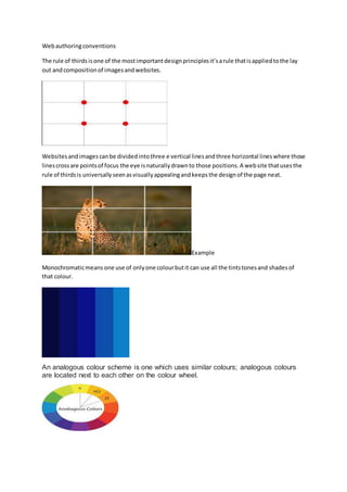
- 1. Web authoring conventions The rule of thirds is one of the most important design principles it’s a rule that is applied to the lay out and composition of images and websites. Websites and images can be divided into three e vertical lines and three horizontal lines where those lines cross are points of focus the eye is naturally drawn to those positions. A web site that uses the rule of thirds is universally seen as visually appealing and keeps the design of the page neat. Example Monochromatic means one use of only one colour but it can use all the tints tones and shades of that colour. An analogous colour scheme is one which uses similar colours; analogous colours are located next to each other on the colour wheel.
- 2. Complimentary colours are ones which are opposite but visually work very well together they are always found opposite each other on the colour wheel. Finding the right font for a website is important visually and for usability fonts are divided into two categories sent and sans sent. Sans serif means the letter are clear and have no serifs. Font size and colour are also important in designing a webpage. Titles and sub headings should be larger than the text below them to show importance and to break the page and content up. Fonts should also be clearly coloured so they can be easily read. for example I use a white font sans serif font on a black background . I do this because it is easier to read. Text on websites can sometimes be grouped together poorly . making it harder for the user to read. Paragraphs are used in websites. Same as they are in writing , to break up long bits of text . Each paragraph should have its own focus for example – a paragraph welcoming you to a website – a paragraph introducing the website and then another explaining what it’s about. Backgrounds on a website are generally either single colours patterns or images. Single colours – should follow your coloured scheme for consistency , and should make it easier to read the writing on your website. Patterns – can also be used but should not distract from the fore ground and content of your website. Images- are sometimes used, but finding the right image can be difficult and large images can make websites slower to load.