Download as PDF, PPTX

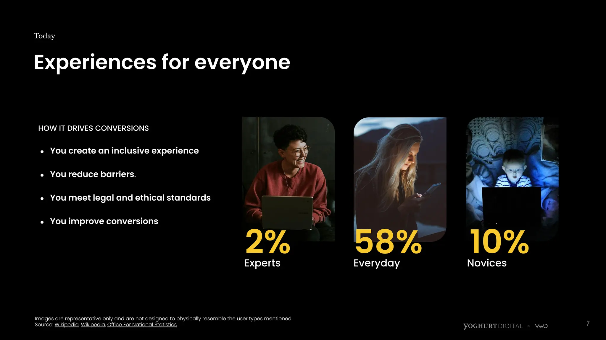
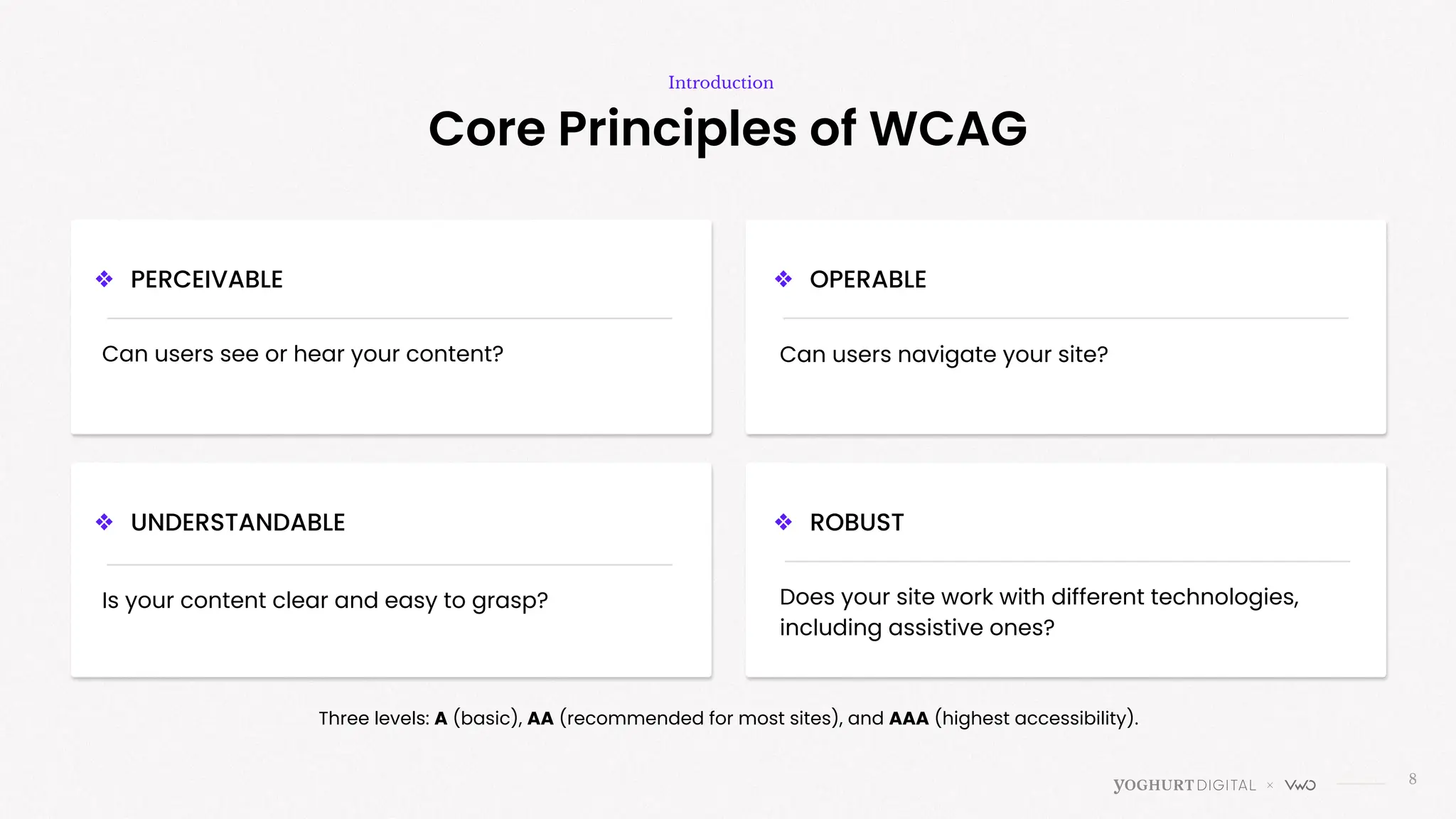
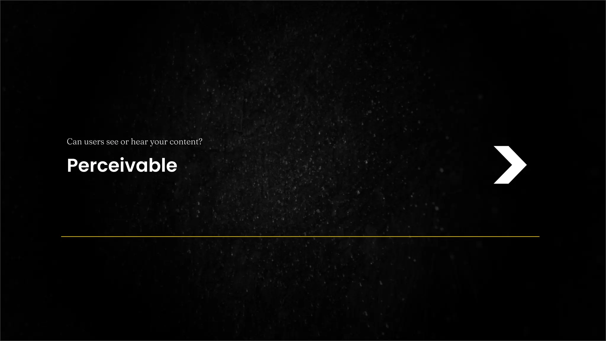
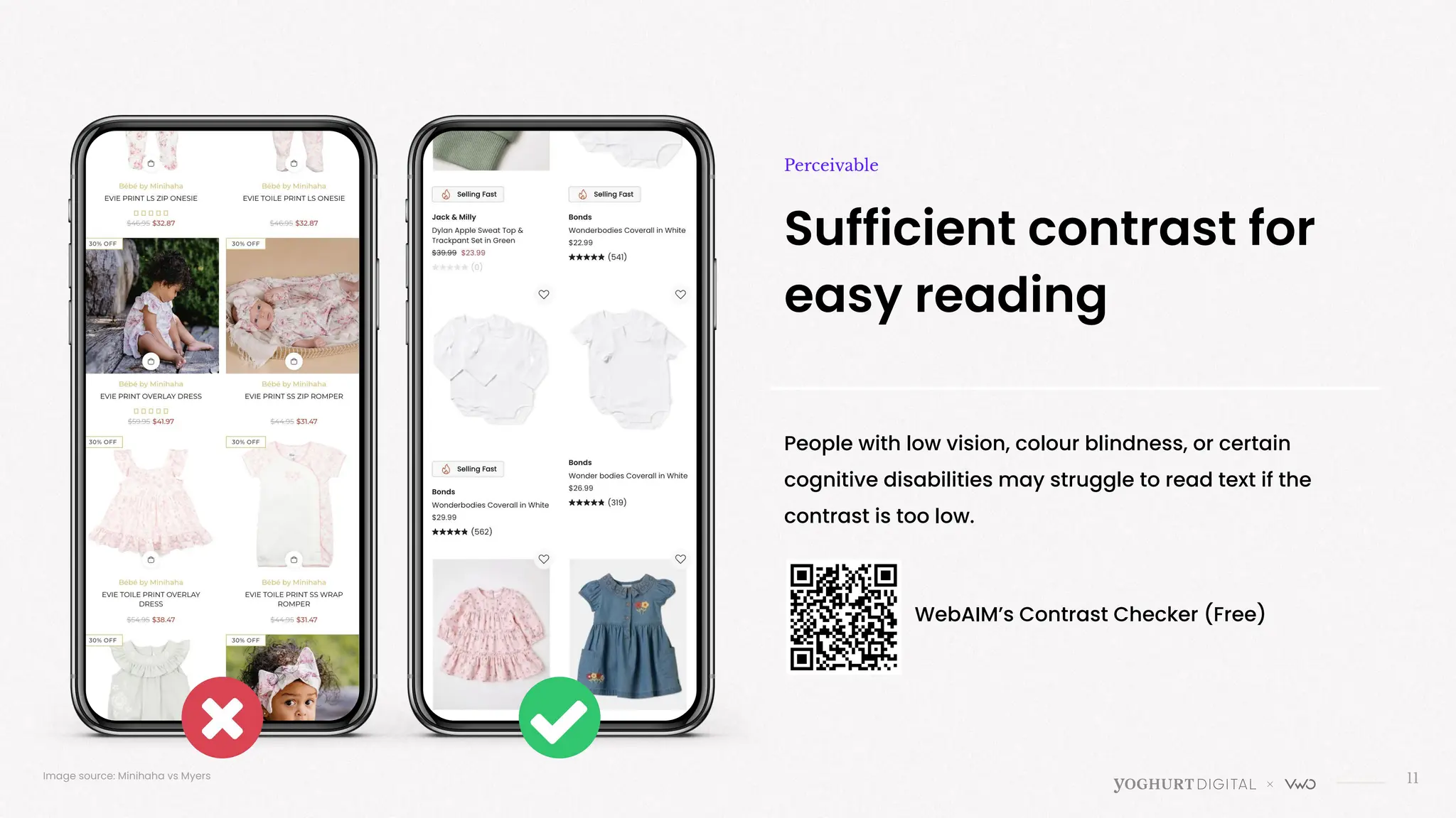
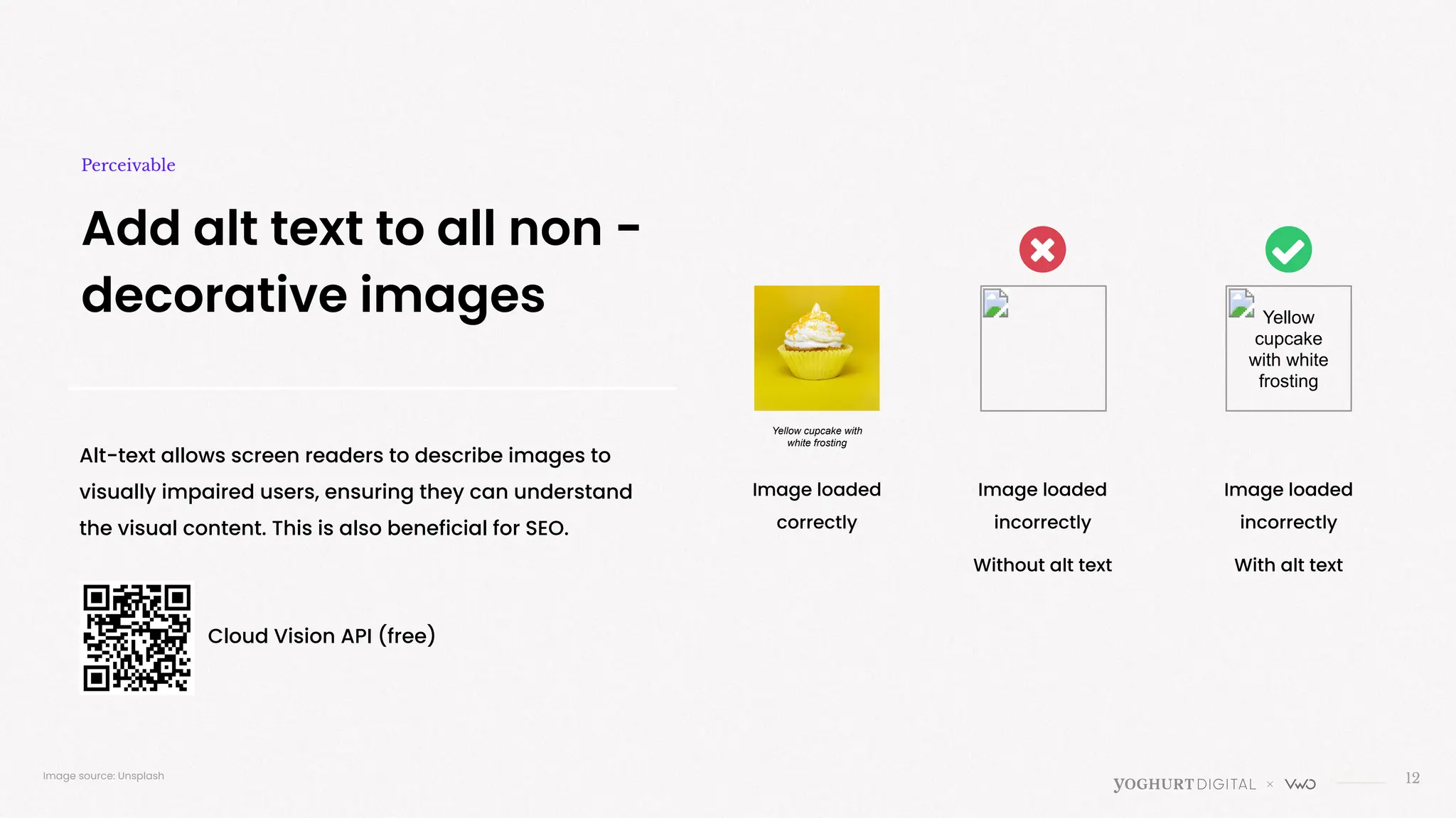
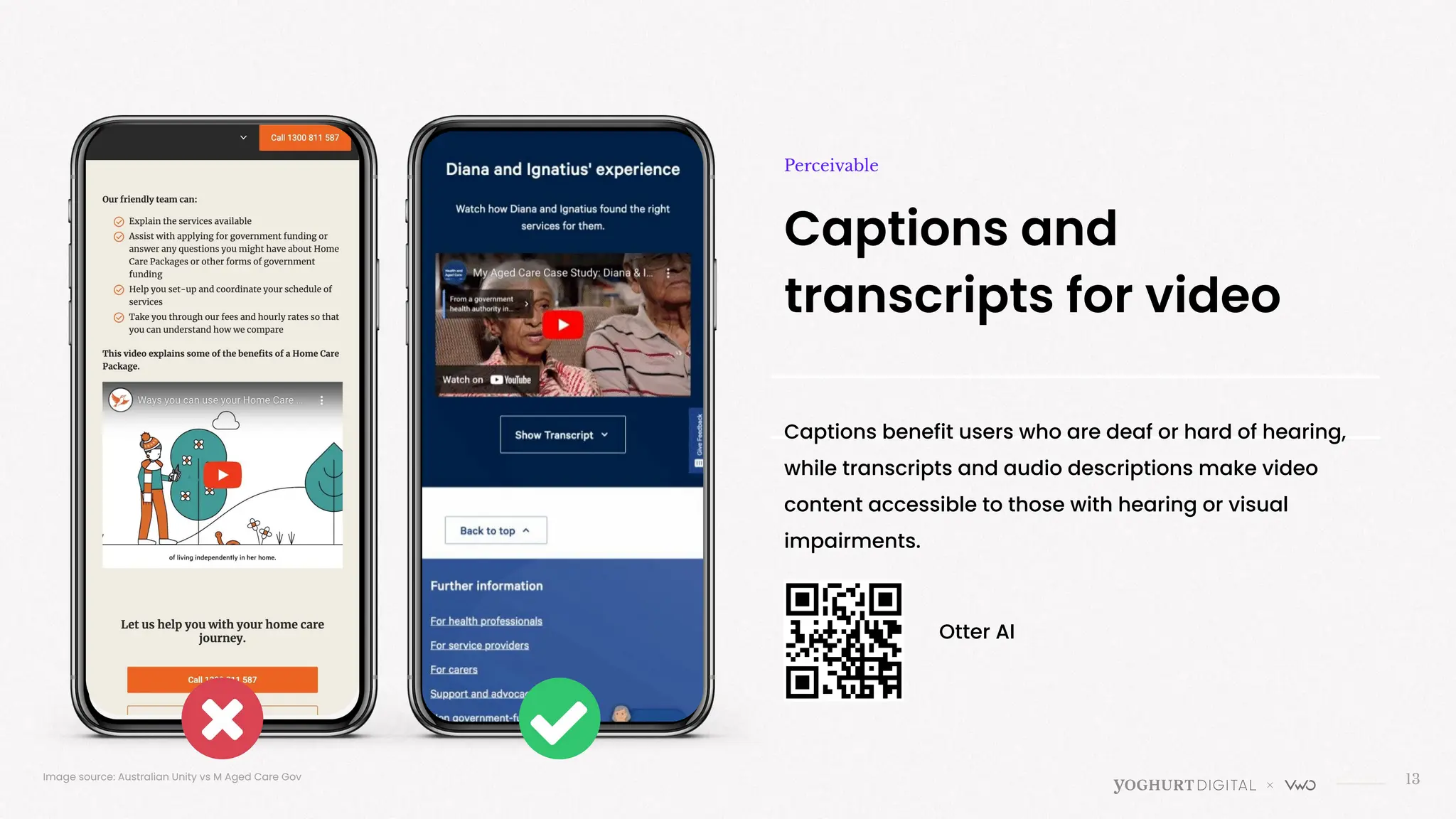

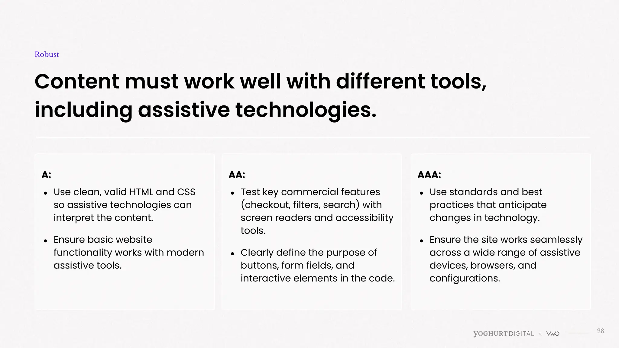
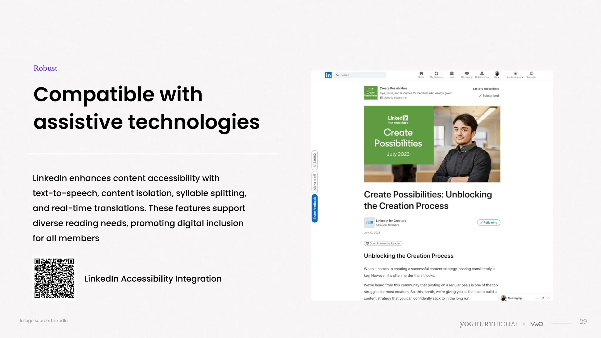
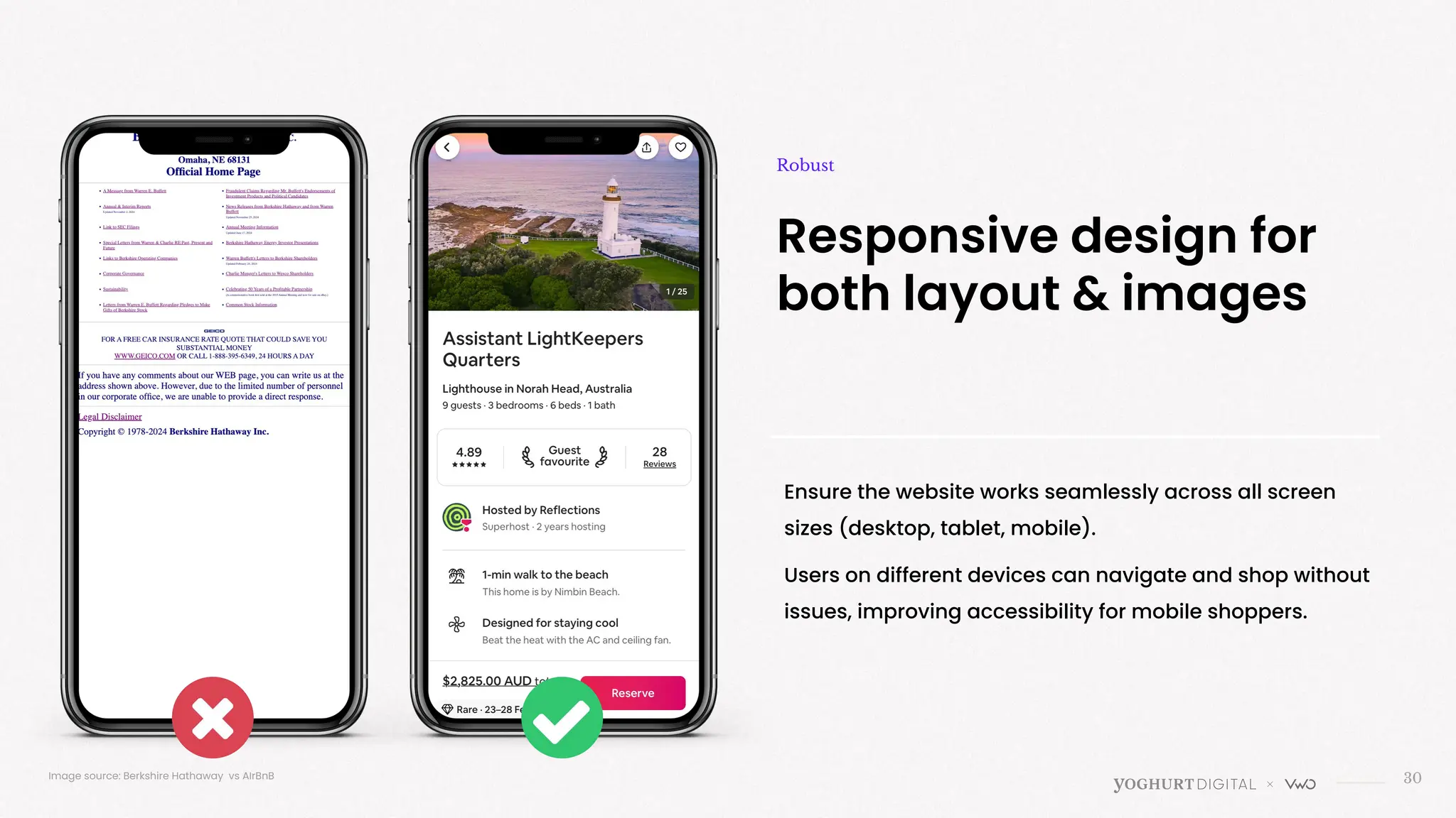
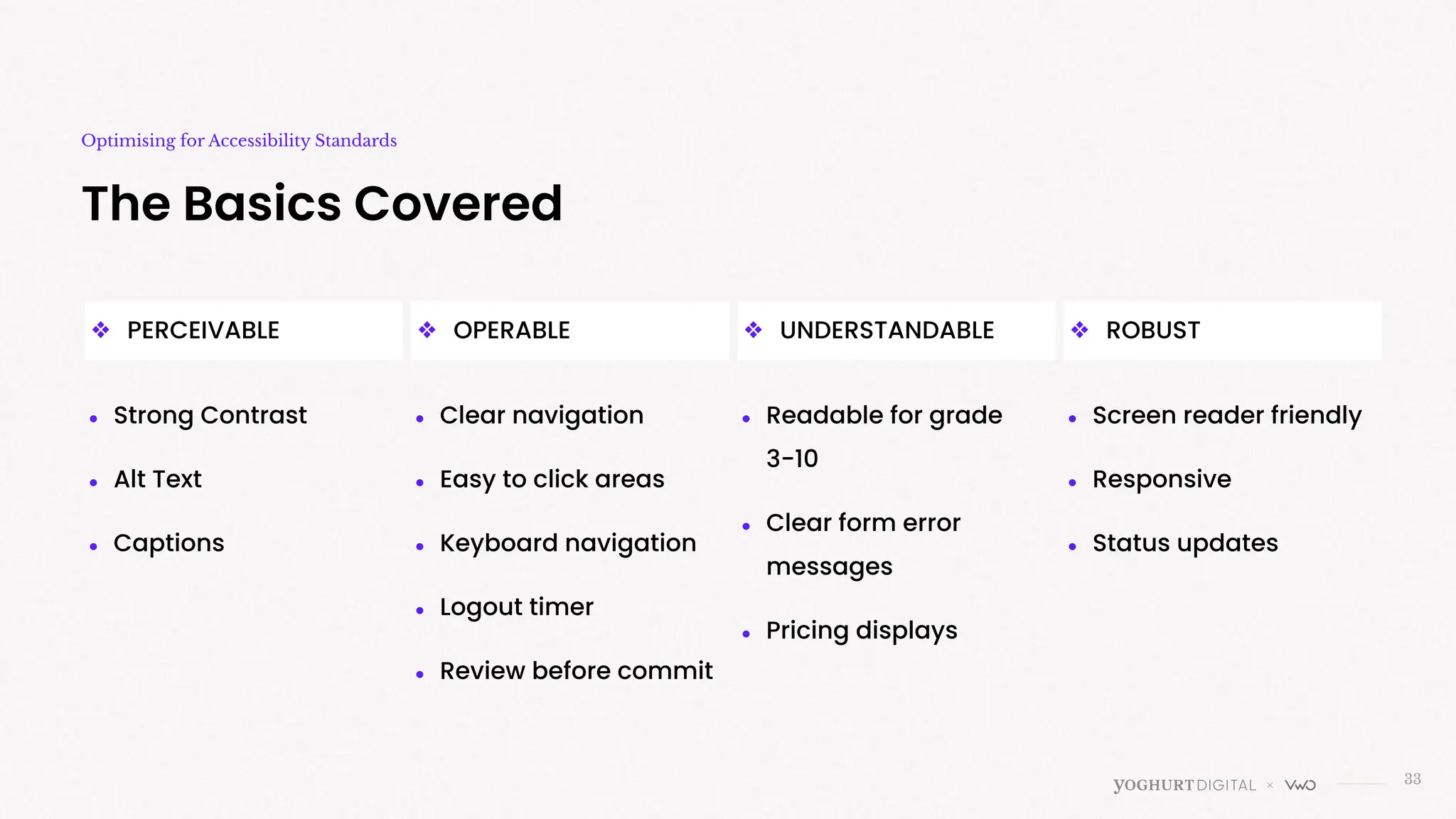
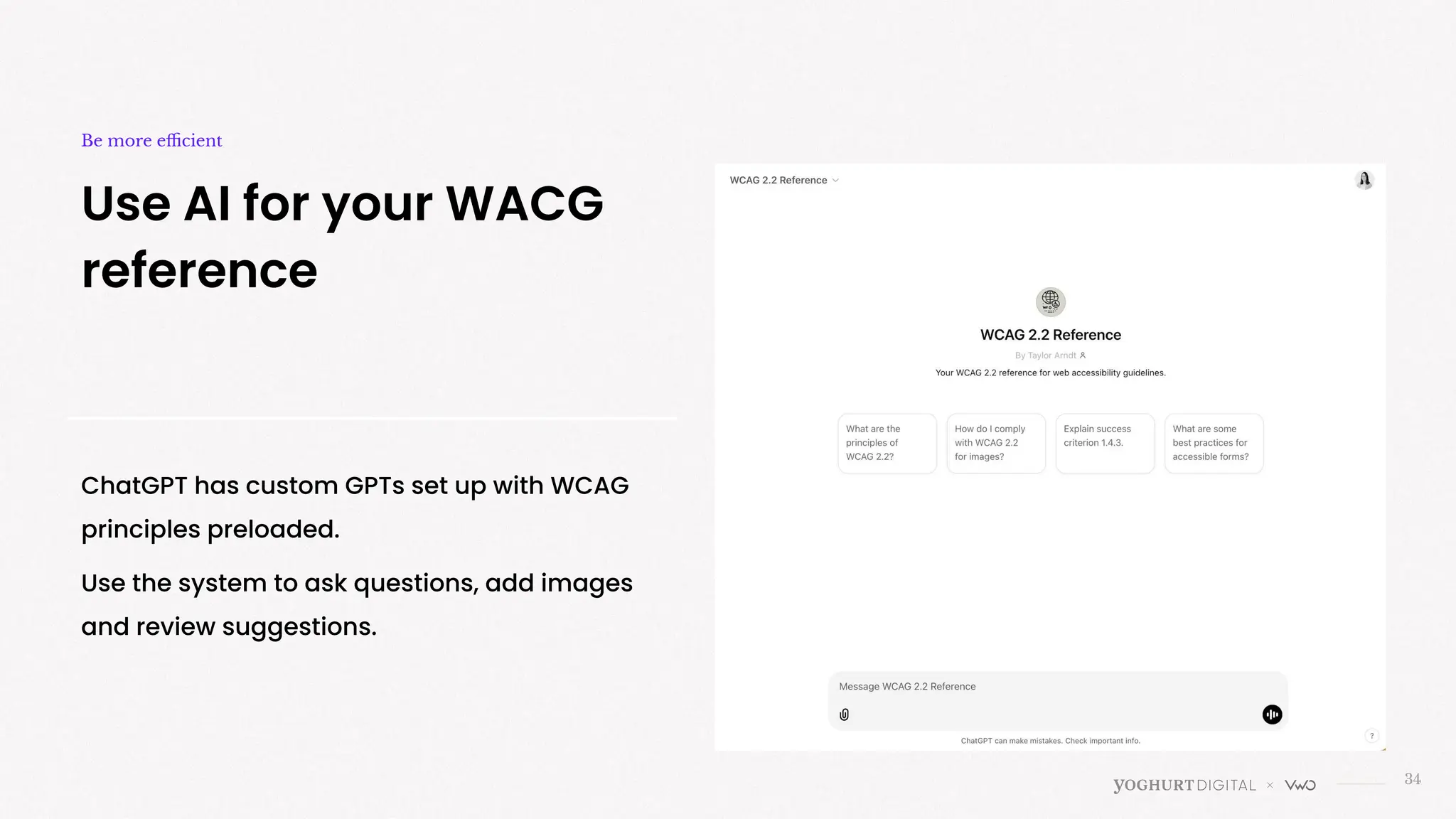

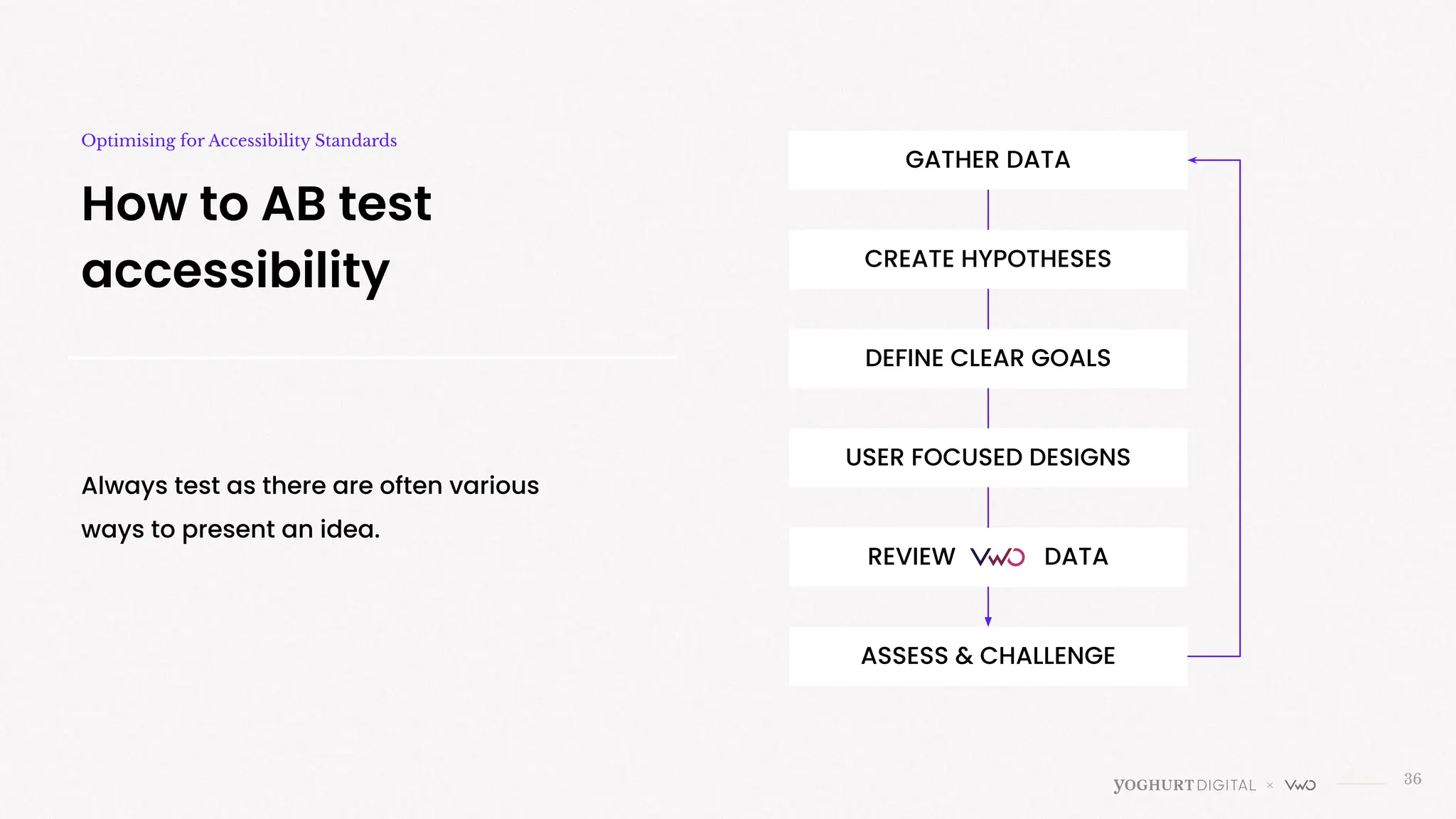

Have you ever thought about what it’s like to navigate your website with a screen reader or without a mouse? Here’s the thing: 15% of the global population lives with a disability that can make web browsing a challenge. That’s not just a stat—it’s millions of people potentially skipping your site because it’s hard to use. Accessibility isn’t just about checking boxes or avoiding legal headaches. It’s about creating an online space where everyone feels welcome—and let’s be honest, that’s good for business too. Because no fancy optimization trick matters if people can’t even get through your site in the first place. In this practical, no-fluff webinar, Amy Cheng, Head of UXC at Yoghurt Digital, will break down website accessibility into simple steps you can actually take. Together, we’ll demystify accessibility standards, show you how to spot common issues (hint: poor contrast and missing alt text), and share tools to help you fix them. By the end, you’ll know how to make your site a place where everyone—yes, everyone—can navigate, engage, and convert.


![[Webinar VWO] Testes e Personalização (1).pptx](https://cdn.slidesharecdn.com/ss_thumbnails/webinarvwotestesepersonalizacao1-250530124426-7f7ee994-thumbnail.jpg?width=640&height=640&fit=bounds)


