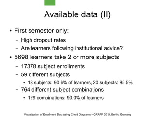
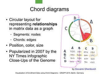
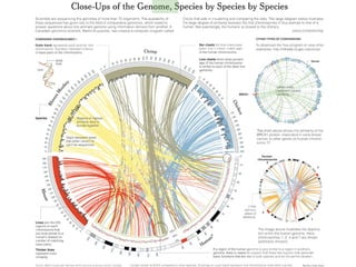
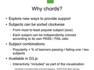
Download as PDF, PPTX


![Chord parametrization
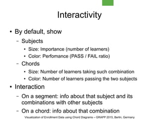
● Number of segments
– Number of chords grows quadratically
– Up to 10 segments looks fine, 6-8 seems optimal
● Segment colors
– From red (FAIL) to green (PASS) through yellow
– Other thresholds can be used: [0, 0.4, 0.6, 1]
● Chord colors
– Percentage of learners passing the two subjects
– Same red-yellow-green coloring
Visualization of Enrollment Data using Chord Diagrams – GRAPP 2015, Berlin, Germany](https://image.slidesharecdn.com/grapp2015-92-150314025217-conversion-gate01/85/Visualization-of-Enrollment-data-using-Chord-Diagrams-GRAPP-2015-10-320.jpg)
![Thank you!
jminguillona[at]uoc[dot]edu
twitter/@jminguillona
http://bit.ly/1wcZCBk
Visualization of Enrollment Data using Chord Diagrams – GRAPP 2015, Berlin, Germany](https://image.slidesharecdn.com/grapp2015-92-150314025217-conversion-gate01/85/Visualization-of-Enrollment-data-using-Chord-Diagrams-GRAPP-2015-15-320.jpg)

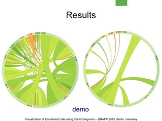
This document discusses visualizing enrollment data from an open university using chord diagrams. It analyzes subject combinations and visualizes intra-semester and inter-semester enrollment patterns. Chord diagrams show relationships between subjects as segments connected by chords. This allows exploration of popular subject combinations and pass/fail rates. The visualization is interactive, providing subject and combination details. While effective, it has limitations like complexity with many subjects and lack of data for uncommon choices. Future work includes evaluation, alternative visualizations, and integrating it into the enrollment process.


