Download as PDF, PPTX


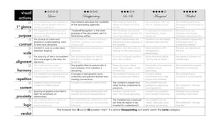


The document outlines instructions for redesigning a visual form, focusing on improved criteria for visual tools and actions. It details a critique of a poorly designed chart, leading to a redesigned illustration, and discusses design improvements emphasizing clarity and visual appeal. The new design is praised for its boldness and effective integration of elements, enhancing readability and cohesion while reducing clutter.


