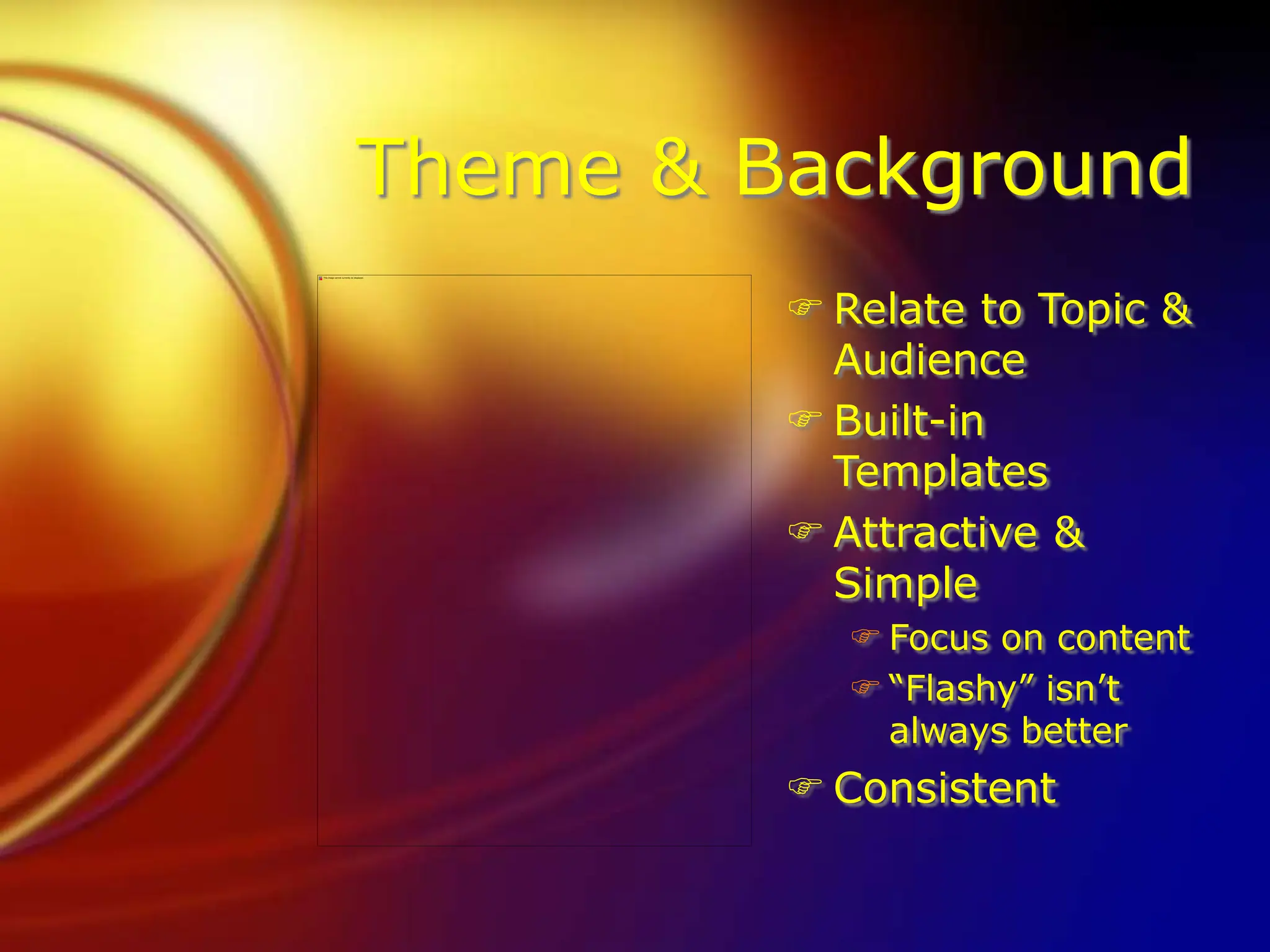
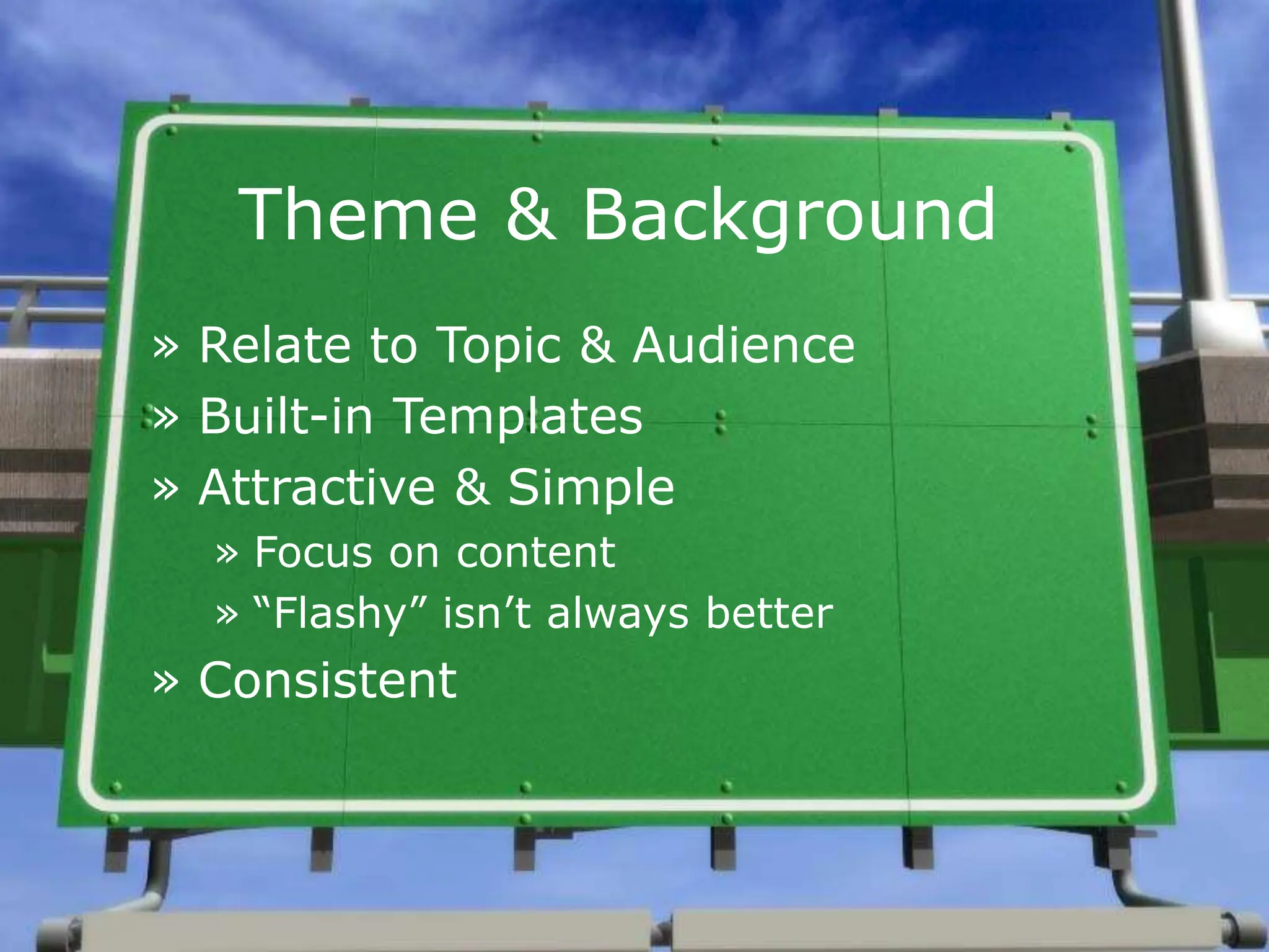
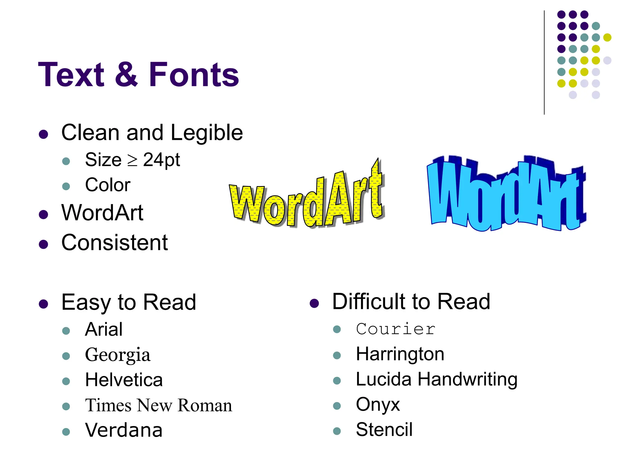
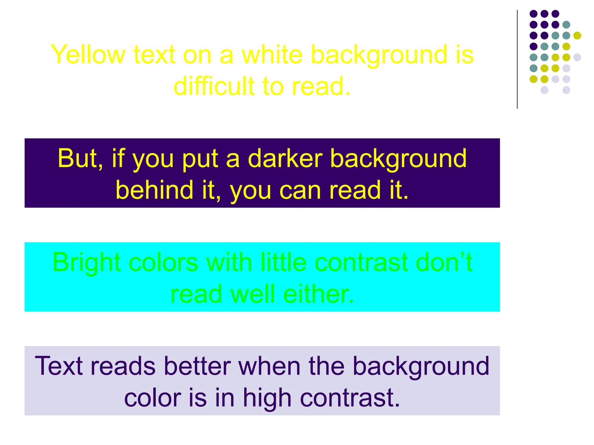
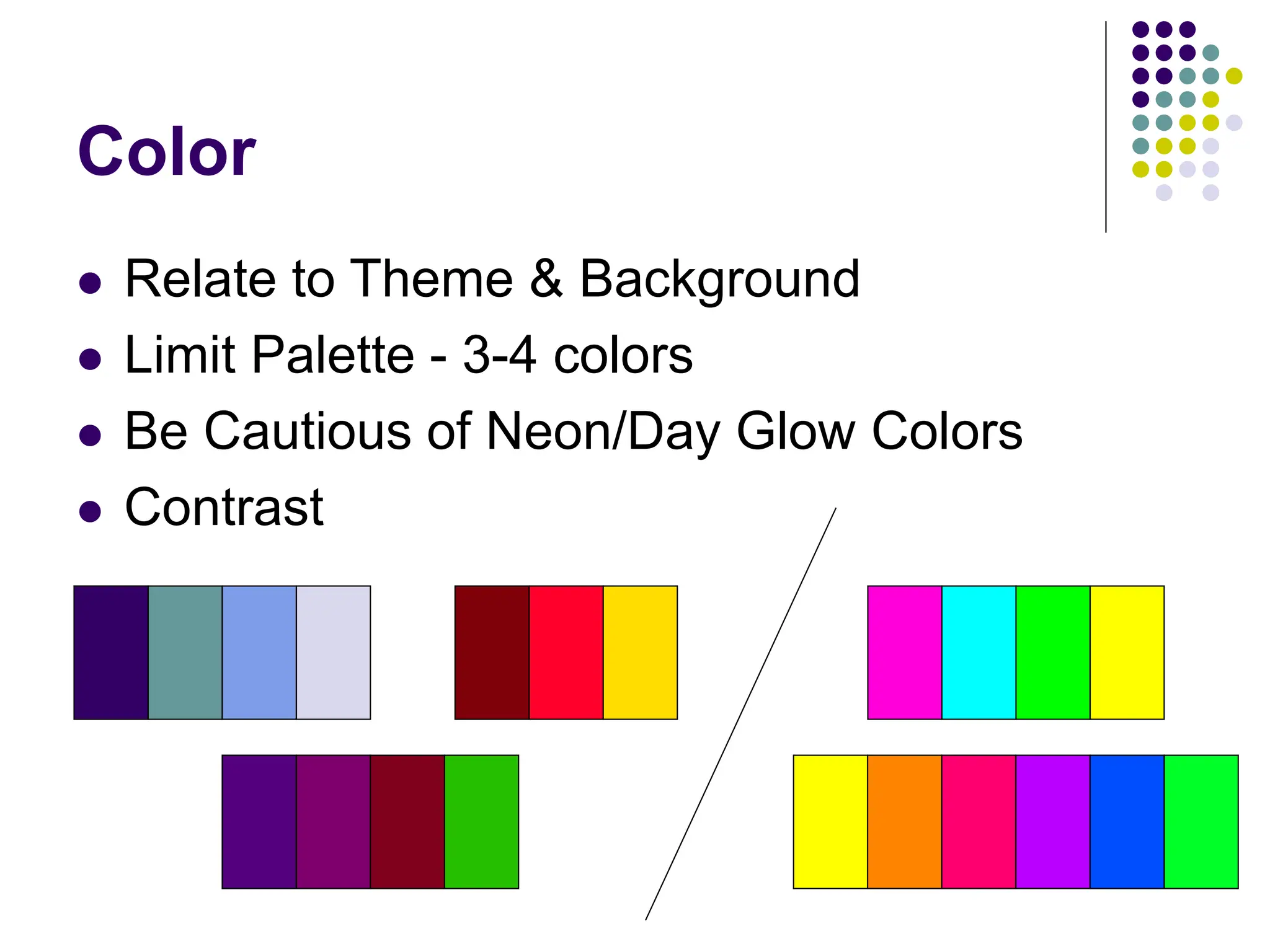
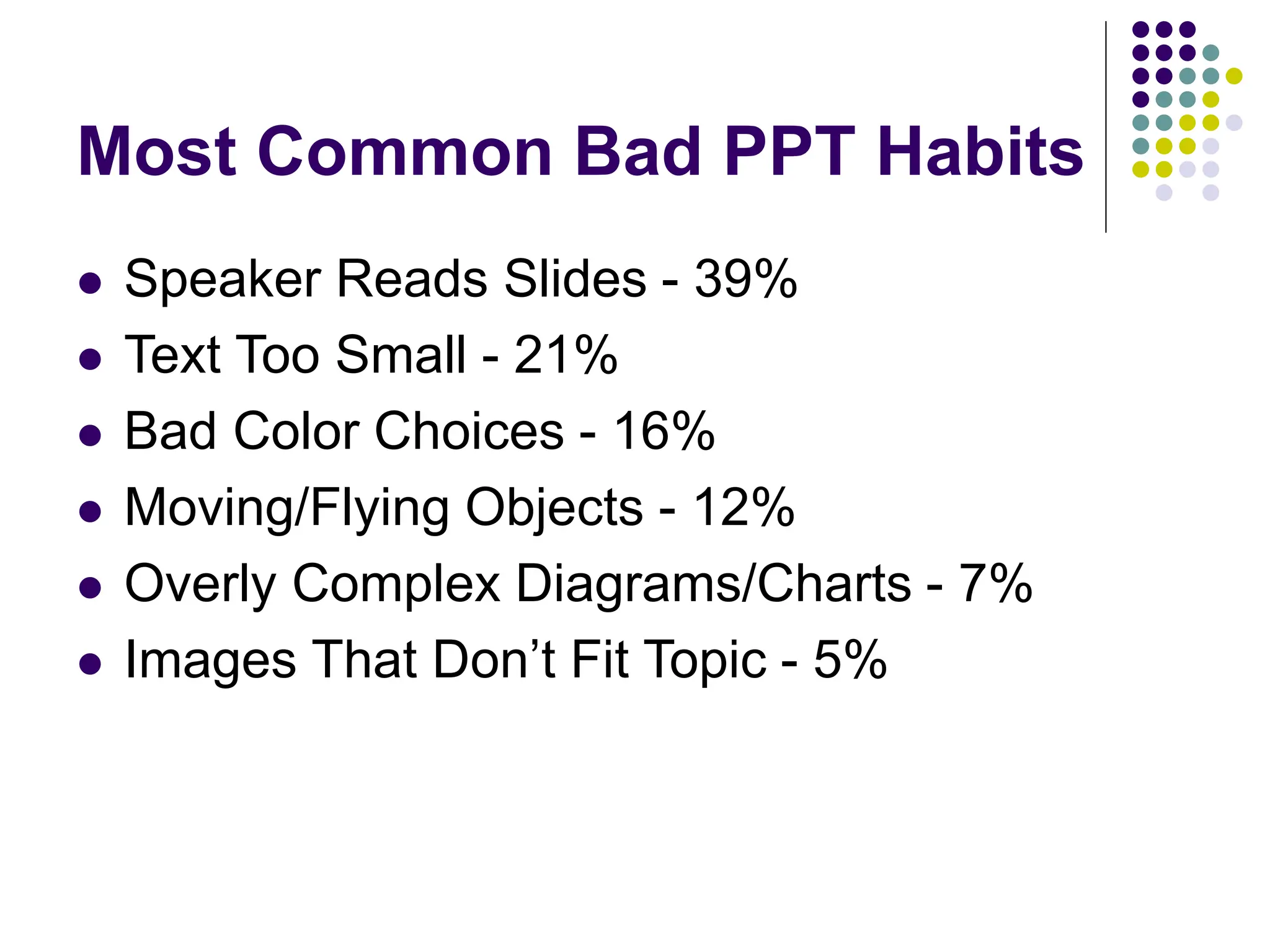
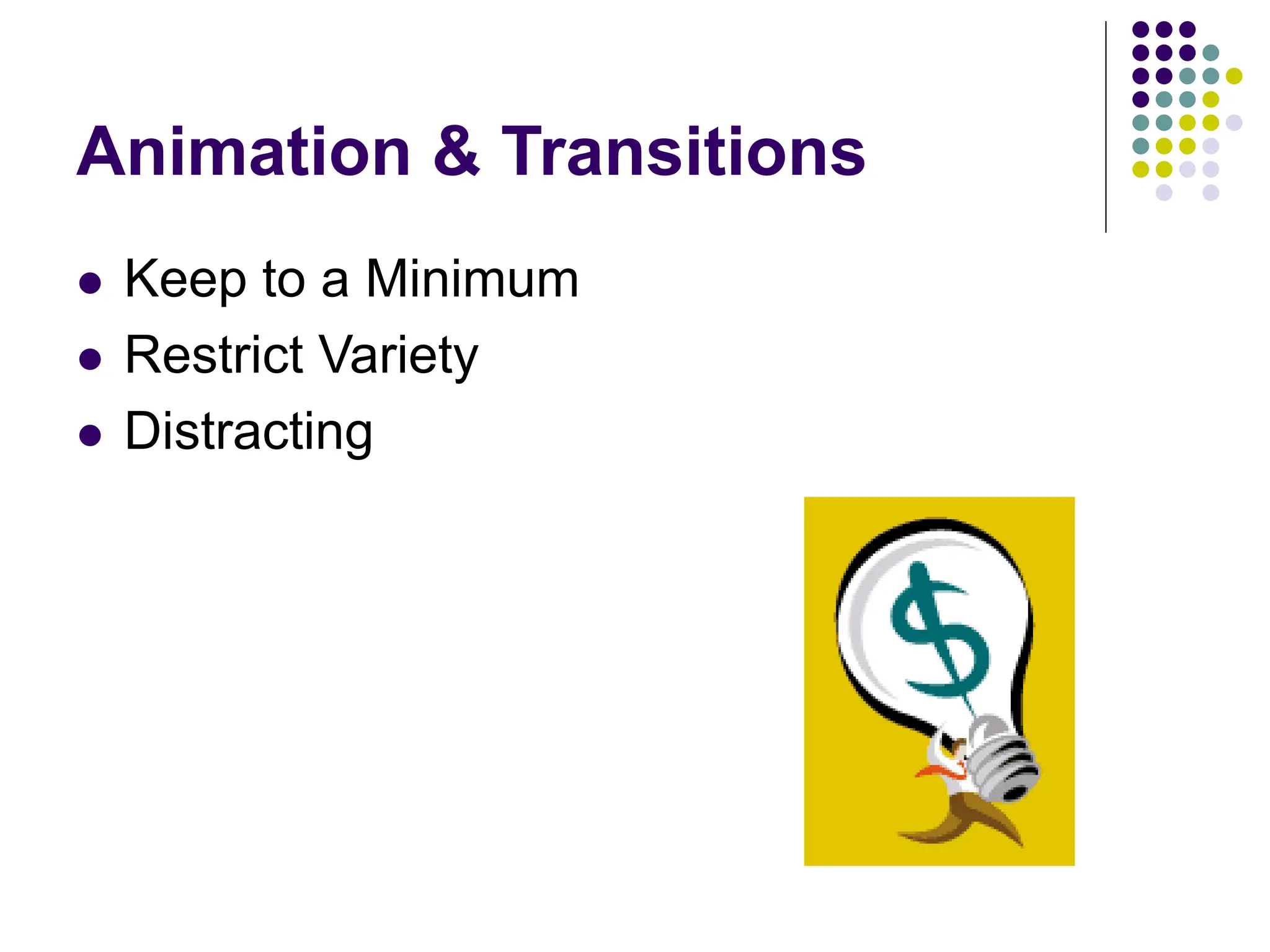
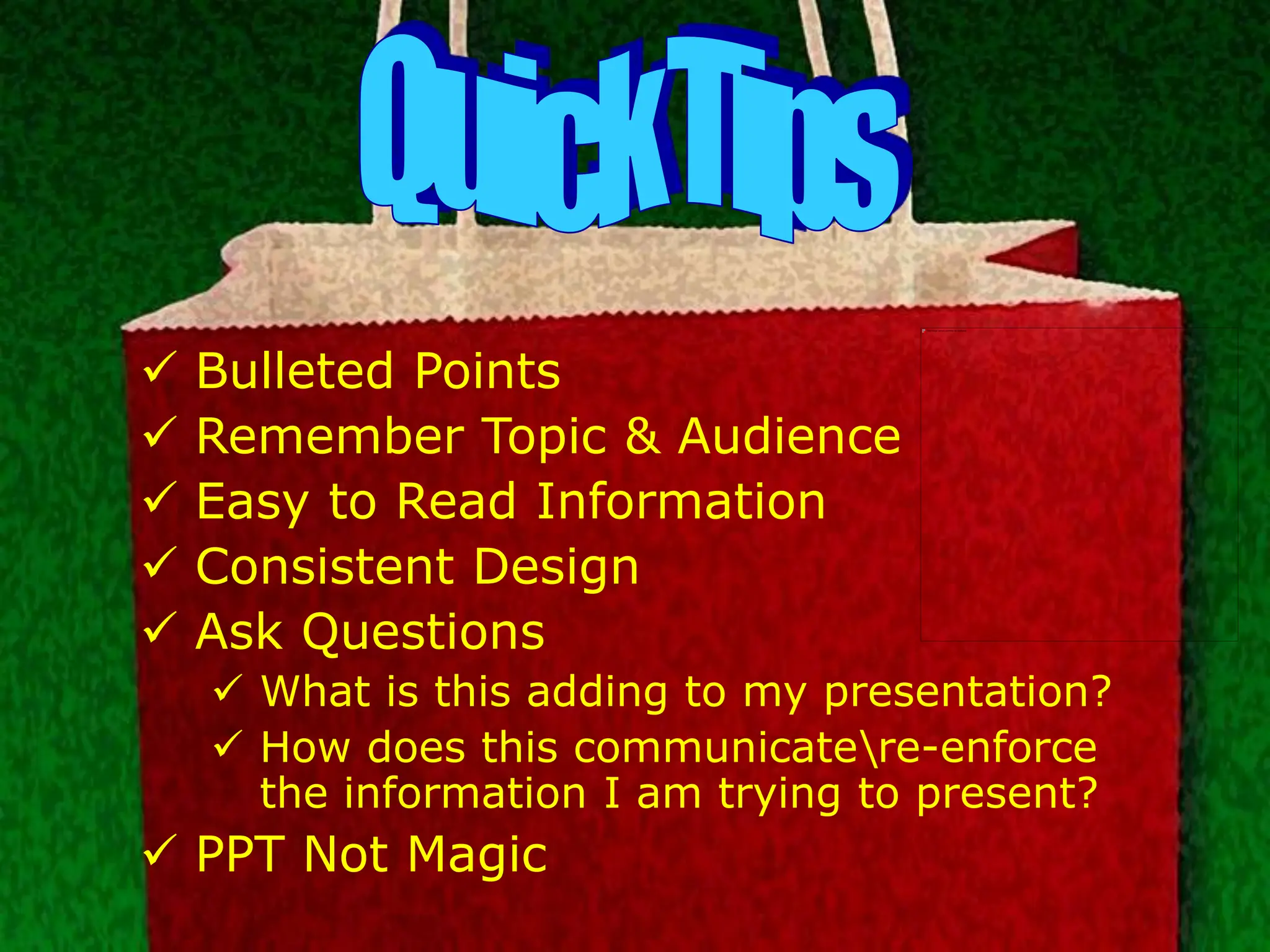
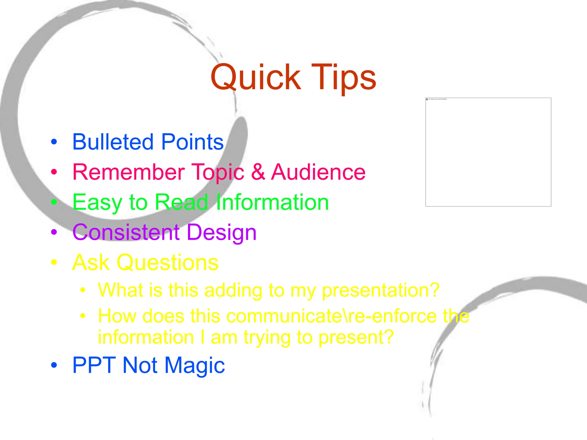
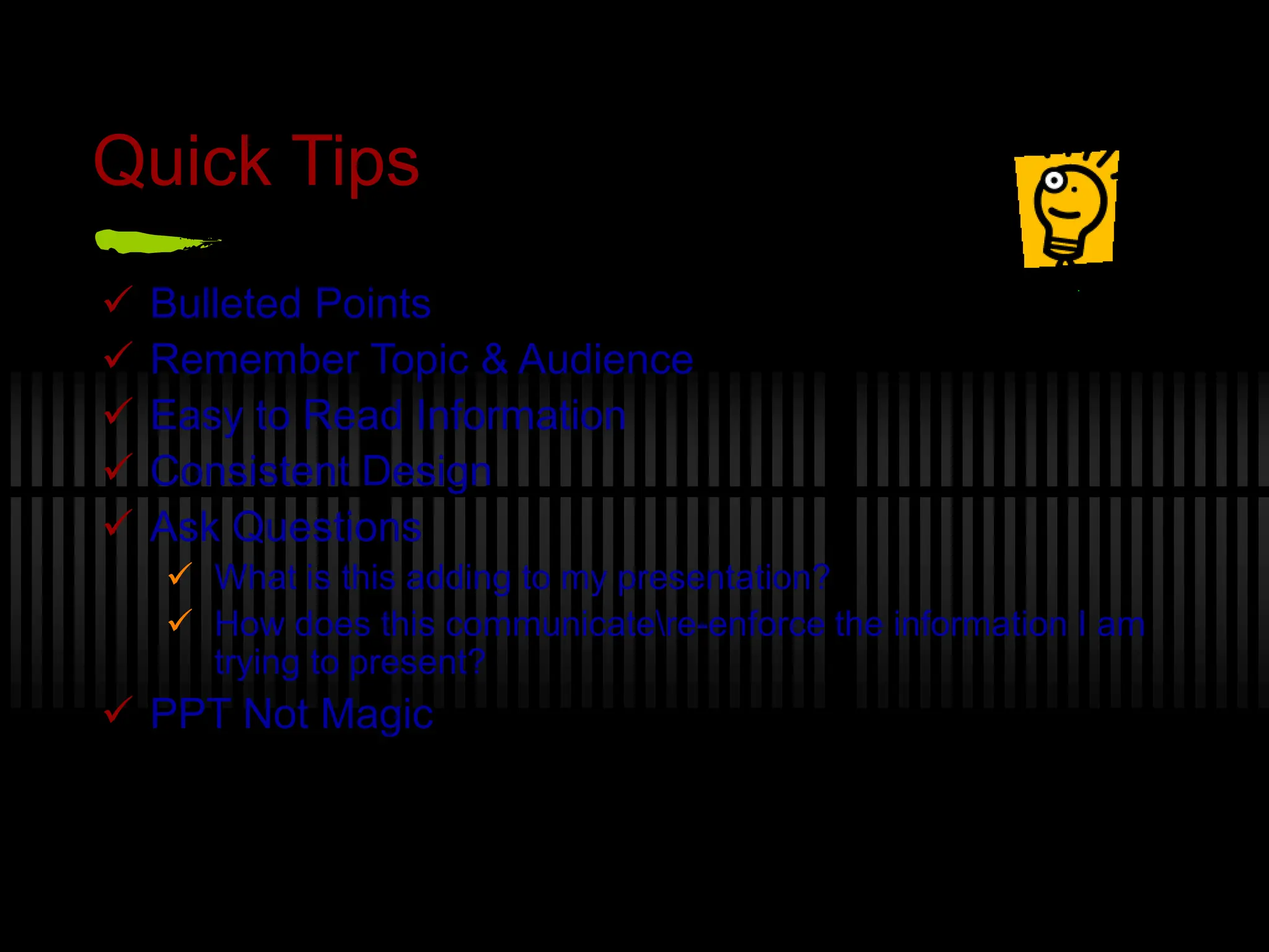
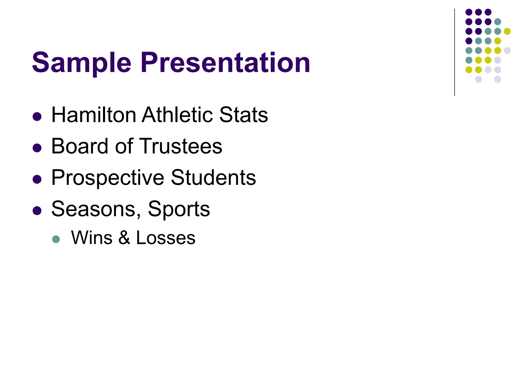
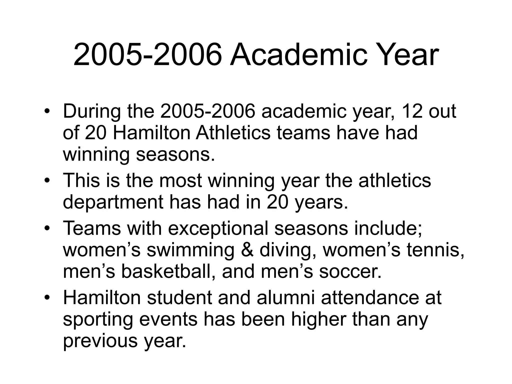
Visual Communication
and Design
for PowerPoint Presentations
Krista Siniscarco
ksinisca@hamilton.edu
PPT as a Presentation Tool
 Golden Rule: Do not put every word of your
presentation into PowerPoint and read the
text to your audience line for line.
 PowerPoint is not a teleprompter. It should
be used to augment an oral presentation, not
replace it.
 PowerPoint is not intended as a stand-alone
presentation tool. YOU, as the presenter, are
the biggest factor as to whether a
presentation is effective or not.
Rules to Remember
 Bulleted Points
 VISUAL Communication Tools
 Consistency
 Theme & Design
Theme & Background
 Relate to Topic & Audience
 Built-in Templates
 Attractive & Simple
 Focus on content
 “Flashy” isn’t always better
 Consistent
Theme & Background
 Relate to Topic &
Audience
 Built-in
Templates
 Attractive &
Simple
 Focus on content
 “Flashy” isn’t
always better
 Consistent
Theme & Background
» Relate to Topic & Audience
» Built-in Templates
» Attractive & Simple
» Focus on content
» “Flashy” isn’t always better
» Consistent
Text & Fonts
 Clean and Legible
 Size  24pt
 Color
 WordArt
 Consistent
 Easy to Read
 Arial
 Georgia
 Helvetica
 Times New Roman
 Verdana
 Difficult to Read
 Courier
 Harrington
 Lucida Handwriting
 Onyx
 Stencil
Yellow text on a white background is
difficult to read.
But, if you put a darker background
behind it, you can read it.
Bright colors with little contrast don’t
read well either.
Text reads better when the background
color is in high contrast.
Yellow text on a white background is
difficult to read.
But, if you put a darker background
behind it, you can read it.
Bright colors with little contrast don’t
read well either.
Text reads better when the background
color is in high contrast.
Color
 Relate to Theme & Background
 Limit Palette - 3-4 colors
 Be Cautious of Neon/Day Glow Colors
 Contrast
Graphics
 Images, Graphs, Charts, Diagrams
 Relate to Information
 Reinforce Information
 Communication Information
 Quality & Resolution
 Clipart & Animated GIFs
Most Common Bad PPT Habits
 Speaker Reads Slides - 39%
 Text Too Small - 21%
 Bad Color Choices - 16%
 Moving/Flying Objects - 12%
 Overly Complex Diagrams/Charts - 7%
 Images That Don’t Fit Topic - 5%
Most Common Bad PPT Habits
Help Desk Statistics
Animation & Transitions
 Keep to a Minimum
 Restrict Variety
 Distracting
Video & Audio
 Less than 10% of total presentation.
 Sound Effects
 Technology Issues & Support
Quick Tips
 Bulleted Points
 Remember Topic & Audience
 Easy to Read Information
 Consistent Design
 Ask Questions
 What is this adding to my presentation?
 How does this communicatere-enforce the
information I am trying to present?
 PPT Not Magic
 Bulleted Points
 Remember Topic & Audience
 Easy to Read Information
 Consistent Design
 Ask Questions
 What is this adding to my presentation?
 How does this communicatere-enforce
the information I am trying to present?
 PPT Not Magic
Quick Tips
• Bulleted Points
• Remember Topic & Audience
• Easy to Read Information
• Consistent Design
• Ask Questions
• What is this adding to my presentation?
• How does this communicatere-enforce the
information I am trying to present?
• PPT Not Magic
Quick Tips
 Bulleted Points
 Remember Topic & Audience
 Easy to Read Information
 Consistent Design
 Ask Questions
 What is this adding to my presentation?
 How does this communicatere-enforce the information I am
trying to present?
 PPT Not Magic
Sample Presentation
 Hamilton Athletic Stats
 Board of Trustees
 Prospective Students
 Seasons, Sports
 Wins & Losses
2005-2006 Academic Year
• During the 2005-2006 academic year, 12 out
of 20 Hamilton Athletics teams have had
winning seasons.
• This is the most winning year the athletics
department has had in 20 years.
• Teams with exceptional seasons include;
women’s swimming & diving, women’s tennis,
men’s basketball, and men’s soccer.
• Hamilton student and alumni attendance at
sporting events has been higher than any
previous year.
2005-2006 Academic Year
• 12 out of 20 teams had winning
seasons.
• Most winning in 20 years.
– women’s swimming & diving
– women’s tennis
– men’s basketball
– men’s soccer
• Higher student and alumni
attendance.
2005-2006 Academic
Year
• 12 out of 20 teams had winning
seasons.
• Most winning in 20 years.
– women’s swimming & diving
– women’s tennis
– men’s basketball
– men’s soccer
• Higher student and alumni
attendance.
Krista Siniscarco
ksinisca@hamilton.edu

Visual Communication and Design for PowerPoint Presentations .ppt

  • 1.
    Visual Communication and Design forPowerPoint Presentations Krista Siniscarco ksinisca@hamilton.edu
  • 2.
    PPT as aPresentation Tool  Golden Rule: Do not put every word of your presentation into PowerPoint and read the text to your audience line for line.  PowerPoint is not a teleprompter. It should be used to augment an oral presentation, not replace it.  PowerPoint is not intended as a stand-alone presentation tool. YOU, as the presenter, are the biggest factor as to whether a presentation is effective or not.
  • 3.
    Rules to Remember Bulleted Points  VISUAL Communication Tools  Consistency  Theme & Design
  • 4.
    Theme & Background Relate to Topic & Audience  Built-in Templates  Attractive & Simple  Focus on content  “Flashy” isn’t always better  Consistent
  • 5.
    Theme & Background Relate to Topic & Audience  Built-in Templates  Attractive & Simple  Focus on content  “Flashy” isn’t always better  Consistent
  • 6.
    Theme & Background »Relate to Topic & Audience » Built-in Templates » Attractive & Simple » Focus on content » “Flashy” isn’t always better » Consistent
  • 7.
    Text & Fonts Clean and Legible  Size  24pt  Color  WordArt  Consistent  Easy to Read  Arial  Georgia  Helvetica  Times New Roman  Verdana  Difficult to Read  Courier  Harrington  Lucida Handwriting  Onyx  Stencil
  • 8.
    Yellow text ona white background is difficult to read. But, if you put a darker background behind it, you can read it. Bright colors with little contrast don’t read well either. Text reads better when the background color is in high contrast.
  • 9.
    Yellow text ona white background is difficult to read. But, if you put a darker background behind it, you can read it. Bright colors with little contrast don’t read well either. Text reads better when the background color is in high contrast.
  • 10.
    Color  Relate toTheme & Background  Limit Palette - 3-4 colors  Be Cautious of Neon/Day Glow Colors  Contrast
  • 11.
    Graphics  Images, Graphs,Charts, Diagrams  Relate to Information  Reinforce Information  Communication Information  Quality & Resolution  Clipart & Animated GIFs
  • 12.
    Most Common BadPPT Habits  Speaker Reads Slides - 39%  Text Too Small - 21%  Bad Color Choices - 16%  Moving/Flying Objects - 12%  Overly Complex Diagrams/Charts - 7%  Images That Don’t Fit Topic - 5%
  • 13.
    Most Common BadPPT Habits
  • 14.
    Most Common BadPPT Habits
  • 15.
  • 16.
  • 17.
  • 18.
    Animation & Transitions Keep to a Minimum  Restrict Variety  Distracting
  • 19.
    Video & Audio Less than 10% of total presentation.  Sound Effects  Technology Issues & Support
  • 20.
    Quick Tips  BulletedPoints  Remember Topic & Audience  Easy to Read Information  Consistent Design  Ask Questions  What is this adding to my presentation?  How does this communicatere-enforce the information I am trying to present?  PPT Not Magic
  • 21.
     Bulleted Points Remember Topic & Audience  Easy to Read Information  Consistent Design  Ask Questions  What is this adding to my presentation?  How does this communicatere-enforce the information I am trying to present?  PPT Not Magic
  • 22.
    Quick Tips • BulletedPoints • Remember Topic & Audience • Easy to Read Information • Consistent Design • Ask Questions • What is this adding to my presentation? • How does this communicatere-enforce the information I am trying to present? • PPT Not Magic
  • 23.
    Quick Tips  BulletedPoints  Remember Topic & Audience  Easy to Read Information  Consistent Design  Ask Questions  What is this adding to my presentation?  How does this communicatere-enforce the information I am trying to present?  PPT Not Magic
  • 24.
    Sample Presentation  HamiltonAthletic Stats  Board of Trustees  Prospective Students  Seasons, Sports  Wins & Losses
  • 25.
    2005-2006 Academic Year •During the 2005-2006 academic year, 12 out of 20 Hamilton Athletics teams have had winning seasons. • This is the most winning year the athletics department has had in 20 years. • Teams with exceptional seasons include; women’s swimming & diving, women’s tennis, men’s basketball, and men’s soccer. • Hamilton student and alumni attendance at sporting events has been higher than any previous year.
  • 26.
    2005-2006 Academic Year •12 out of 20 teams had winning seasons. • Most winning in 20 years. – women’s swimming & diving – women’s tennis – men’s basketball – men’s soccer • Higher student and alumni attendance.
  • 27.
    2005-2006 Academic Year • 12out of 20 teams had winning seasons. • Most winning in 20 years. – women’s swimming & diving – women’s tennis – men’s basketball – men’s soccer • Higher student and alumni attendance.
  • 28.