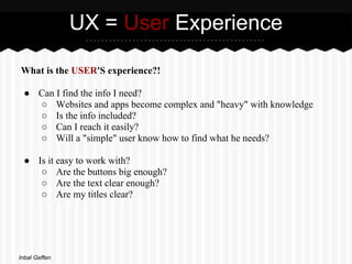
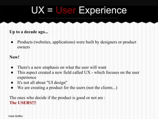
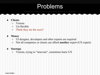
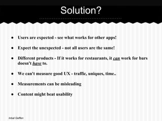
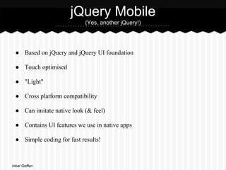
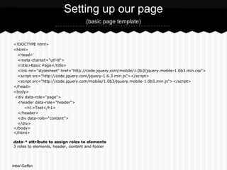
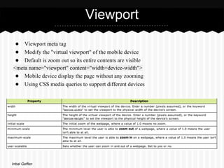
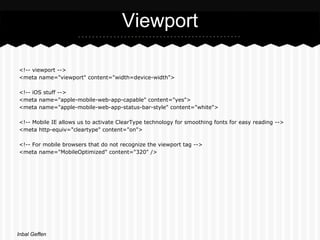
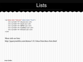
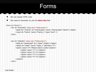
UX & jQuery Mobile


     Inbal Geffen
UX = User Experience

What is the USER'S experience?!

 ● Can I find the info I need?
   ○ Websites and apps become complex and "heavy" with knowledge
   ○ Is the info included?
   ○ Can I reach it easily?
   ○ Will a "simple" user know how to find what he needs?

 ● Is it easy to work with?
    ○ Are the buttons big enough?
    ○ Are the text clear enough?
    ○ Are my titles clear?


Inbal Geffen
UX = User Experience

Up to a decade ago...

 ● Products (websites, applications) were built by designers or product
   owners

Now!

 ● There's a new emphasis on what the user will want
 ● This aspect created a new field called UX - which focuses on the user
   experience
 ● It's not all about "UI design"
 ● We are creating a product for the users (not the clients...)

The ones who decide if the product is good or not are :
The USERS!!!

Inbal Geffen
Problems

 ● Clients
   ○ Visions
   ○ Un-flexible
   ○ Think they are the users!

 ● Money
   ○ UI designer, developers and other experts are required
   ○ Not all companies or clients can afford another expert (UX expert)

 ● Startups
    ○ Visions, trying to "innovate", sometimes hurts UX


Inbal Geffen
Solution?

 ● Users are expected - see what works for other apps!

 ● Expect the unexpected - not all users are the same!

 ● Different products - If it works for restaurants, it can work for bars
   doesn't have to.

 ● We can't measure good UX - traffic, uniques, time..

 ● Measurements can be misleading

 ● Content might beat usability


Inbal Geffen
Research

What UX experts provide is mostly research :

 ● Existing similar products

 ● Know your users - check existing similar markets (users)

 ● Existing similar views (pages or processes in our product)
       Inspiration : http://www.jqmgallery.com/


 ● Logical behavior

 ● Create wireframes according to research


Inbal Geffen
Wireframes

Pros:

       • Good for defining content

       • Good for documenting screens

Cons:

       • Bad at showing interactivity / flow

       • Can’t really use them for testing

       • Slow. Too much time spent describing.


Inbal Geffen
Describe what the user DOES

So how do we describe what users do?
Visualise the experience...

• Show every step to complete a task

• Show every click

• Preview the experience - see and feel how everything flows together


For example : Balsamiq (http://www.balsamiq.com/)


Inbal Geffen
Rapid Prototyping

• Fast!!

• User-centered design methodology

• For designing, communicating and evaluating user interfaces

• Getting feedback as early as possible

• The more cycles the better -


release early, release often!

Inbal Geffen
jQuery Mobile
                            (Yes, another jQuery!)


 ● Based on jQuery and jQuery UI foundation

 ● Touch optimised

 ● "Light"

 ● Cross platform compatibility

 ● Can imitate native look (& feel)

 ● Contains UI features we use in native apps

 ● Simple coding for fast results!


Inbal Geffen
Setting up our page
                                    (basic page template)


<!DOCTYPE html>
<html>
  <head>
  <meta charset="utf-8">
  <title>Basic Page</title>
  <link rel="stylesheet" href="http://code.jquery.com/mobile/1.0b3/jquery.mobile-1.0b3.min.css">
  <script src="http://code.jquery.com/jquery-1.6.3.min.js"></script>
  <script src="http://code.jquery.com/mobile/1.0b3/jquery.mobile-1.0b3.min.js"></script>
</head>
<body>
<div data-role="page">
  <header data-role="header">
      <h1>Test</h1>
  </header>
  <div data-role="content">
  </div>
</body>
</html>

data-* attribute to assign roles to elements
3 roles to elements, header, content and footer


Inbal Geffen
Viewport
 ● Viewport meta tag
 ● Modify the "virtual viewport" of the mobile device
 ● Default is zoom out so its entire contents are visible
<meta name="viewport" content="width=device-width">
 ● Mobile device display the page without any zooming
 ● Using CSS media queries to support different devices


Inbal Geffen
Viewport

<!-- viewport -->
<meta name="viewport" content="width=device-width">

<!-- iOS stuff -->
<meta name="apple-mobile-web-app-capable" content="yes">
<meta name="apple-mobile-web-app-status-bar-style" content="white">

<!-- Mobile IE allows us to activate ClearType technology for smoothing fonts for easy reading -->
<meta http-equiv="cleartype" content="on">

<!-- For mobile browsers that do not recognize the viewport tag -->
<meta name="MobileOptimized" content="320" />


Inbal Geffen
Lists

<ul data-role="listview" data-inset="true">
    <li><a href="#">Acura</a></li>
    <li><a href="#">Audi</a></li>
    <li><a href="#">BMW</a></li>
    <li><a href="#">Cadillac</a></li>
    <li><a href="#">Ferrari</a></li>
</ul>


More info on lists:
http://jquerymobile.com/demos/1.0.1/docs/lists/docs-lists.html


Inbal Geffen
Forms
 ●     We use regular HTML code

 ●     We need to remember to use the data-role field


<form id="form1">
     <div id="fnameDiv" data-role="fieldcontain">
           <label for="fname" id="fnameLabel" name="fnameLabel">Name*</label>
           <input id="fname" name="fname_r" type="text" />
     </div>


       <div id="stateDiv" data-role="fieldcontain">
             <label id="stateLabel" for="state">State*</label>
             <select id="state" name="state_r" tabindex="2">
             <option value="0">Please select a state</option>
                   <option value="1">1</option>
                   <option value="2">2</option>
                   <option value="3">3</option>
                   <option value="4">4</option>
             </select>
       </div>


Inbal Geffen
Header - navigation bar

http://jquerymobile.com/test/docs/toolbars/docs-headers.html


<div data-role="header" id="hdrMain" name="hdrMain" data-nobackbtn="true">
           <h1>New Claim</h1>
</div>


   Inbal Geffen

jQuery mobile UX

  • 1.
    UX & jQueryMobile Inbal Geffen
  • 2.
    UX = UserExperience What is the USER'S experience?! ● Can I find the info I need? ○ Websites and apps become complex and "heavy" with knowledge ○ Is the info included? ○ Can I reach it easily? ○ Will a "simple" user know how to find what he needs? ● Is it easy to work with? ○ Are the buttons big enough? ○ Are the text clear enough? ○ Are my titles clear? Inbal Geffen
  • 3.
    UX = UserExperience Up to a decade ago... ● Products (websites, applications) were built by designers or product owners Now! ● There's a new emphasis on what the user will want ● This aspect created a new field called UX - which focuses on the user experience ● It's not all about "UI design" ● We are creating a product for the users (not the clients...) The ones who decide if the product is good or not are : The USERS!!! Inbal Geffen
  • 4.
    Problems ● Clients ○ Visions ○ Un-flexible ○ Think they are the users! ● Money ○ UI designer, developers and other experts are required ○ Not all companies or clients can afford another expert (UX expert) ● Startups ○ Visions, trying to "innovate", sometimes hurts UX Inbal Geffen
  • 5.
    Solution? ● Usersare expected - see what works for other apps! ● Expect the unexpected - not all users are the same! ● Different products - If it works for restaurants, it can work for bars doesn't have to. ● We can't measure good UX - traffic, uniques, time.. ● Measurements can be misleading ● Content might beat usability Inbal Geffen
  • 6.
    Research What UX expertsprovide is mostly research : ● Existing similar products ● Know your users - check existing similar markets (users) ● Existing similar views (pages or processes in our product) Inspiration : http://www.jqmgallery.com/ ● Logical behavior ● Create wireframes according to research Inbal Geffen
  • 7.
    Wireframes Pros: • Good for defining content • Good for documenting screens Cons: • Bad at showing interactivity / flow • Can’t really use them for testing • Slow. Too much time spent describing. Inbal Geffen
  • 8.
    Describe what theuser DOES So how do we describe what users do? Visualise the experience... • Show every step to complete a task • Show every click • Preview the experience - see and feel how everything flows together For example : Balsamiq (http://www.balsamiq.com/) Inbal Geffen
  • 9.
    Rapid Prototyping • Fast!! •User-centered design methodology • For designing, communicating and evaluating user interfaces • Getting feedback as early as possible • The more cycles the better - release early, release often! Inbal Geffen
  • 10.
    jQuery Mobile (Yes, another jQuery!) ● Based on jQuery and jQuery UI foundation ● Touch optimised ● "Light" ● Cross platform compatibility ● Can imitate native look (& feel) ● Contains UI features we use in native apps ● Simple coding for fast results! Inbal Geffen
  • 11.
    Setting up ourpage (basic page template) <!DOCTYPE html> <html> <head> <meta charset="utf-8"> <title>Basic Page</title> <link rel="stylesheet" href="http://code.jquery.com/mobile/1.0b3/jquery.mobile-1.0b3.min.css"> <script src="http://code.jquery.com/jquery-1.6.3.min.js"></script> <script src="http://code.jquery.com/mobile/1.0b3/jquery.mobile-1.0b3.min.js"></script> </head> <body> <div data-role="page"> <header data-role="header"> <h1>Test</h1> </header> <div data-role="content"> </div> </body> </html> data-* attribute to assign roles to elements 3 roles to elements, header, content and footer Inbal Geffen
  • 12.
    Viewport ● Viewportmeta tag ● Modify the "virtual viewport" of the mobile device ● Default is zoom out so its entire contents are visible <meta name="viewport" content="width=device-width"> ● Mobile device display the page without any zooming ● Using CSS media queries to support different devices Inbal Geffen
  • 13.
    Viewport <!-- viewport --> <metaname="viewport" content="width=device-width"> <!-- iOS stuff --> <meta name="apple-mobile-web-app-capable" content="yes"> <meta name="apple-mobile-web-app-status-bar-style" content="white"> <!-- Mobile IE allows us to activate ClearType technology for smoothing fonts for easy reading --> <meta http-equiv="cleartype" content="on"> <!-- For mobile browsers that do not recognize the viewport tag --> <meta name="MobileOptimized" content="320" /> Inbal Geffen
  • 14.
    Lists <ul data-role="listview" data-inset="true"> <li><a href="#">Acura</a></li> <li><a href="#">Audi</a></li> <li><a href="#">BMW</a></li> <li><a href="#">Cadillac</a></li> <li><a href="#">Ferrari</a></li> </ul> More info on lists: http://jquerymobile.com/demos/1.0.1/docs/lists/docs-lists.html Inbal Geffen
  • 15.
    Forms ● We use regular HTML code ● We need to remember to use the data-role field <form id="form1"> <div id="fnameDiv" data-role="fieldcontain"> <label for="fname" id="fnameLabel" name="fnameLabel">Name*</label> <input id="fname" name="fname_r" type="text" /> </div> <div id="stateDiv" data-role="fieldcontain"> <label id="stateLabel" for="state">State*</label> <select id="state" name="state_r" tabindex="2"> <option value="0">Please select a state</option> <option value="1">1</option> <option value="2">2</option> <option value="3">3</option> <option value="4">4</option> </select> </div> Inbal Geffen
  • 16.
    Header - navigationbar http://jquerymobile.com/test/docs/toolbars/docs-headers.html <div data-role="header" id="hdrMain" name="hdrMain" data-nobackbtn="true"> <h1>New Claim</h1> </div> Inbal Geffen