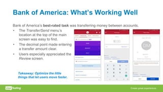
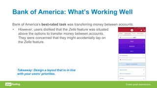
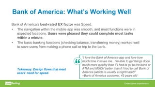
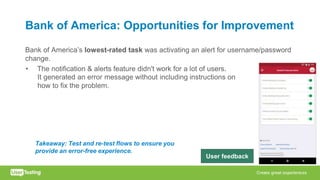
Download as PDF, PPTX


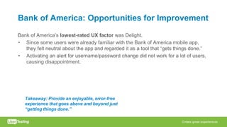
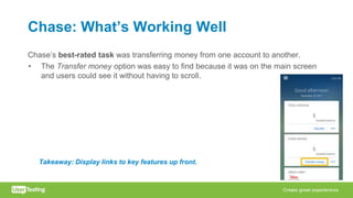
![Chase: Opportunities for Improvement
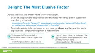
Chase’s lowest-rated UX factor was Delight.
• The difficulty in locating the online security settings led to low ratings.
“Once I found where you [set alerts for online settings],
it was easy, but getting there was difficult. I wish that
there was a menu item that said something like ALL
ACCOUNT SETTINGS/NOTIFICATIONS or something
like because having it under three or four steps in order
to get to that is difficult and time consuming.”
–Chase customer, 31 years old
Takeaway: Make features easier to find to
increase users’ delight. User feedback](https://image.slidesharecdn.com/thebankingcxindexinsightstoimprovethemobilebankingexperience21feb3-180221221005-180228155801/85/User-Testing-Webinar-Mobile-Banking-Industry-Insights-02-21-2018-27-320.jpg)
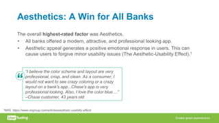
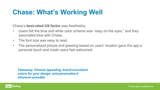
![Wells Fargo: What’s Working Well
Wells Fargo’s best-rated UX factor was Aesthetics.
• The app’s design was clean, clear, and professional looking. The red and gold
colors were viewed as consistent with the Wells Fargo brand.
– However, the color scheme generated a mix of reactions. Half the users
praised the colors and imagery as “pleasant,” while the other half of users felt
that the color red was “jarring.”
“I like the color scheme, it's simple and bold
at the same time. I particularly like the gray
[background] for the account balances, which
make them easy to see, even in the dark.” –
Wells Fargo customer, 42 years oldTakeaway: Create a professional look for your
app, but be judicious about using bold colors.](https://image.slidesharecdn.com/thebankingcxindexinsightstoimprovethemobilebankingexperience21feb3-180221221005-180228155801/85/User-Testing-Webinar-Mobile-Banking-Industry-Insights-02-21-2018-29-320.jpg)


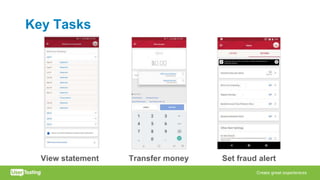
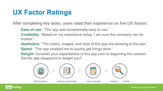
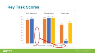
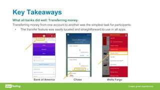
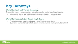
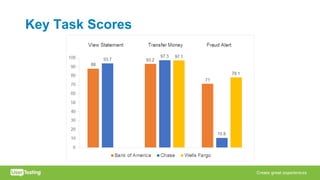
This document summarizes the findings of a study comparing the mobile banking experiences of Bank of America, Chase, and Wells Fargo. Key findings include: 1. Transferring money between accounts was the easiest task for all banks. Setting fraud alerts had the lowest ratings. 2. Bank of America had the top-rated overall experience and consistency. Finding statements was difficult in the Wells Fargo app. 3. All banks can improve navigation and labeling to make features easier to find. Meeting expectations is not enough - apps must delight users.


