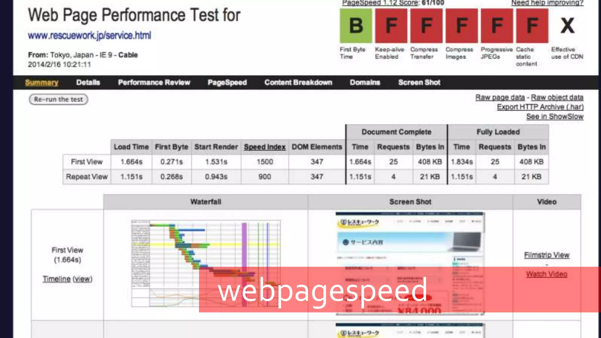
Usability things for your next project
Steven Morey
Personalised
Currency
Language
Country specific deals
Taxes, or delivery options
Registering provides value
For example a "Free Trial" button communicates a
clear benefit, but a "Register" button doesn't.
Transparent pricing
Prices are clearly displayed. There are no hidden costs
or surprises in the terms.
Sample content
For example there is a sample newsletter next to a
newsletter sign up form.
Creditability
References
Contact information
Location
Images of real people
Professionally designed and up-to-date
Uncluttered service information
Information is scannable
Images can be zoomed
Homepage
Clear call for action
Users know what to do next and the benefits
Understandable value proposition and purpose
First impressions
Homepage creates a positive first impression and supports conversio
Logged in user's name is displayed on the site
Major changes to the site are announced
Company location and contact information
There is a privacy policy
Images and videos are relevant and meaningful
URL redirection
Accessibility
Alt attributes are provided for non-text elements
Colour alone is not used to convey information
Content is readable without a style sheet
Accessible navigation
Links, buttons and checkboxes are easily clickable
Navigation
Important links aren't placed in moving features
Alphabetical A-Z sorting is avoided
Users know where they are on the site
Navigation is consistent on every page
Links are descriptive. No "click here" links
Search
There is a search bar
Available on every page, not just the homepage
Search keywords are tracked by Analytics
Links
Important commands are displayed as buttons, not links
Links are easily recognizable. For example underlining text is avoided
Colour - Visited links colour is different than unvisited
There are no broken links
S p e e d >
Page loads from 1-2 Seconds
Page size is less than 600kb
Hosted locally
CSS & JS are optimised
Use a CDN
Images are optimised
Layout
Important content is displayed first
Responsive
Related information is grouped together clearly
There are a minimum amount of pop-up windows
Consistency
Pages aren't cluttered – White space!
FORMS
Simplicity
Long dropdown menus are avoided
Fields are labelled
Form submission is confirmed
Error messages are shown next to the input field
Content.
Contrast.
Content is scannable.
Common language.
Contact and company information.
Useful and up-to-date.
CONTENT
 Contrast.
 Content is scanable
 Common language
 Contact and company information
 Useful and up-to-date
Process
Issue tracking
User testing with target users
Prioritizing
Impact analysis of changes
ROI of changes
Tools
Screenr.com
CrazyEgg.com
WebPageSpeed.org
Usertesting.com
screenr
crazyegg
crazyegg
webpagespeed
usertesting
comments?

User Experience Design - Things to consider on your next project