
Recommended
More Related Content
What's hot
What's hot (18)
Viewers also liked
Viewers also liked (18)
Similar to Use,develop and challenge new double page spread
Similar to Use,develop and challenge new double page spread (20)
Use,develop and challenge new double page spread
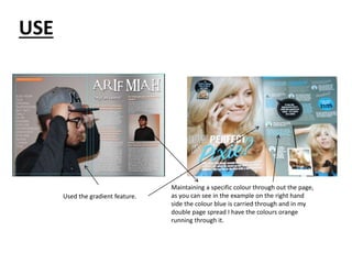
- 1. USE Used the gradient feature. Maintaining a specific colour through out the page, as you can see in the example on the right hand side the colour blue is carried through and in my double page spread I have the colours orange running through it.
- 2. Develop Whilst creating my double page spread I had researched a variety of double page spreads as well as the features used within different magazines such as the gradient tool in which I used on my double page spread but developed it in a way that doesn’t look the same as the images illustrated on the left hand side.
- 3. Challenge Whilst creating my double page spread I had to consider using a different shot type for the image used and using my research I began to consider the type of shot I would be taking to make it look more genre specific. Therefore, from looking at the images on the left hand side I have challenged the shot types as well as colours.