This document provides an introduction to basic statistical analysis and the general linear model (GLM). It discusses key concepts like experiments versus correlational research, independent and dependent variables, parametric versus non-parametric analyses, and statistical significance. It also recaps analysis of variance (ANOVA) and introduces the GLM. The GLM is a flexible method for analyzing data that allows testing of hypotheses through linear regression. The document emphasizes understanding statistical techniques rather than just using computer programs to generate output.


![coefficient for X1 × X2 [the interaction between X1 and X2] is significant, especially
in experimental settings’.
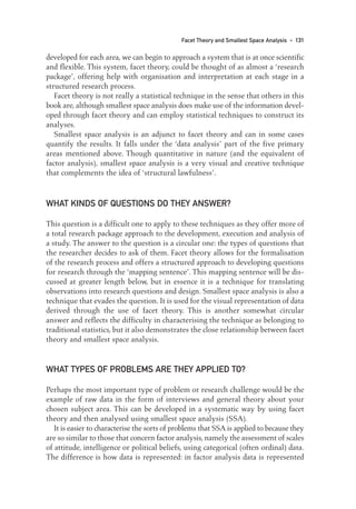
EXAMPLES OF MULTIPLE
REGRESSION AND ITS INTERPRETATION
From psychology
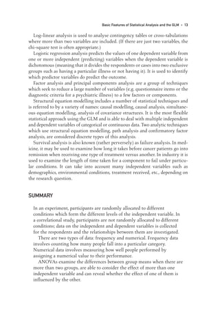
In the field of cognitive psychology, there has been considerable interest in the
speed with which people can identify pictures of objects. Bonin et al. (2002)
presented respondents with over 200 drawings of objects on a computer and
measured how long they took to start to name the objects either by speaking or
by writing the name. They removed outliers from the data: ‘latencies exceeding
two standard deviations above the participant and item means were excluded’
(p. 97).
Various features of the objects pictured and their names were recorded including
rated image agreement (the degree to which images generated by the participants
matched the picture’s visual appearance), estimated age at which the respondent
acquired the word (AoA, but three different measure of this were collected),
rated image variability (whether the name of an object evoked few or many
different images of the object), word frequency, name agreement (the degree to
which participants agreed on the name of the pictured object), rated familiarity
of the concept depicted, visual complexity of the drawing (the number of lines
and details it contained).
Multiple regression with response latency as the dependent variable showed
that the same variables had significant effects on both the oral and written
response tasks. These variables were image agreement, AoA, image variability
and name agreement. Other variables, including word frequency, had no effect.
Bonin et al., state that ‘Among the major determinants of naming onset latencies …
was the age at which the word was first learned’ (p. 102) and that a noticeable
finding was that word frequency ‘did not emerge as a significant determinant of
naming latencies’ (p. 103). They conclude that their study made it possible to
identify certain major determinants of spoken picture naming onset latencies.
(It is noteworthy that they have nine independent variables in the table summaris-
ing the multiple regression analysis, but had only 36 respondents in each of the
two tasks of spoken or written responding.)
From health
Gallagher et al. (2002) were interested in the role that women’s appraisal of their
breast cancer and coping resources play in psychological morbidity (high levels
42 • UNDERSTANDING AND USING ADVANCED STATISTICS
03-Foster-3327(ch-03).qxd 10/13/2005 11:41 AM Page 42](https://image.slidesharecdn.com/understandingandusingadvancedstatistics-230316031812-78bb8fcf/85/Understanding_and_Using_Advanced_Statistics-pdf-58-320.jpg)


![WHEN DO YOU NEED SEM?
SEM is applied to situations where a number of variables are present and uses
many of the statistical techniques discussed elsewhere in this book. It is not a
statistical technique itself but rather a collection of techniques pulled together to
provide an account of complex patterns in the data. It is especially useful in the social
sciences and psychology where ‘concepts’ (latents) are frequently encountered.
Concepts such as intelligence, empathy, aggression or anxiety are often subjects
of analysis; each of these is defined with respect to observed as well as other latent
variables. What is important is that latent variables are unobserved and only
understood through their relationship to each other and to observed variables.
SEM seeks to understand the relationships between latent variables and the
observed variables which form the structural framework from which they are
derived. It also allows for these relationships to be proposed as predictive models.
There is nothing new in SEM: most of the techniques are well known and
used, but it combines them and adds the spin of a visual component to aid in the
assessment of complex data.
WHAT KINDS OF DATA ARE NEEDED?
Generally, SEM is appropriate for multivariate analysis of qualitative and quan-
titative data. Large sample sizes (n ≥ 200 observations and usually many more)
should be used, but it really depends on the number of variables. Most sources
recommend 15 cases per predictor as a general rule of thumb for deciding what
is the minimum size of a data set. But these are only rules of thumb: the number
of observations in SEM is dependent on how many variables there are. There is
a simple formula that dictates this: number of observations = [k(k + 1)]/2 where
k is the number of variables in the model.
HOW DO YOU DO SEM?
As noted above, the technique is a computer-driven one, so in this section the
basic logic and order in which steps of the procedure are carried out will be
explained, and an overview of computer programs that handle SEM provided.
Kenny (1997) divides the procedure into four steps but we shall add a further
step to the process. The steps are: specification, identification, estimation and
testing of model fit. Stage 1, specification, is a statement of the theoretical model
in terms of equations or a diagram. Stage 2, identification, is when the model can,
in theory, be estimated with the observed data. Stage 3, estimation, is when the
Structural Equation Modelling • 105
08-Foster-3327(ch-08).qxd 10/13/2005 11:29 AM Page 105](https://image.slidesharecdn.com/understandingandusingadvancedstatistics-230316031812-78bb8fcf/85/Understanding_and_Using_Advanced_Statistics-pdf-121-320.jpg)


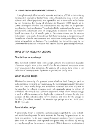
![Comparative or relative fit refers to a situation where two or more models are
compared to see which one provides the best fit to the data. One of the models
will be the total independence or null hypothesis model where there is known to
be a poor fit. The comparative fit index (CFI) is the primary measurement here
and ranges from 0 to 1 with values above 0.9 considered to indicate a good fit.
The non-normed fit index (NNFI) is similar to the Tucker Lewis index (which is
another index of fit indication measured on the same scale and which may also
be encountered as a test) and has a range of 0 to 1 with values approaching 1
indicating a better fit. The non-normed fit index (and the associated normed fit
index (NFI)) are fairly robust measures unless the sample size is small (small
here meaning less than the recommended sample size of over 200), in which case
the result can be difficult to interpret.
Parsimonious fit is about finding a balance between adding more parameters
to give a better fit and shaving these parameters for better statistical validity.
Kelloway (1998, p. 10) indicates that ‘the most parsimonious diagram [is one that]
(a) fully explains why variables are correlated and (b) can be justified on theo-
retical grounds’. Parsimonious normed fit indices and parsimonious goodness of
fit have ranges 0 to 1, with results approaching 1 (0.90 or higher) indicating a
parsimonious fit.
The Akaike information criterion is another measure of fit but does not con-
form to the ranges that we have seen here. It compares models and generates a
numerical value for each model; whichever has the lower number is the better
fit. These numbers can often be in the hundreds so appear strange in the context
of the much smaller numerical values used in many of the other indices.
SOME COMPUTER PROGRAMS
LISREL was the first and some argue is still the best program for SEM. It is now
more user-friendly than it used to be although it still requires some basic
programming skills. Currently, student versions can be downloaded free from
the website: www.ssicentral.com. The handbook to use the program is included
on the website. (The program is an execution (.exe) type file, which may be an
issue for those working on networked university systems where downloading
such files is forbidden.)
MX is an SEM program which does what it needs to do in a no-frills way. It is
free to download and fairly easy to use. Like LISREL, the download is an .exe file.
SPSS has not yet released its own SEM program but does exclusively distribute
AMOS. AMOS is window based, easy to use and generates elegant diagrams.
AMOS and SPSS are compatible so you can transfer data sets from SPSS to AMOS.
EQS is a Windows-based program with all the bells and whistles one could
hope for. It is easy to use and the diagrams are easily and intuitively developed.
110 • UNDERSTANDING AND USING ADVANCED STATISTICS
08-Foster-3327(ch-08).qxd 10/13/2005 11:29 AM Page 110](https://image.slidesharecdn.com/understandingandusingadvancedstatistics-230316031812-78bb8fcf/85/Understanding_and_Using_Advanced_Statistics-pdf-126-320.jpg)


![The value of q in the ARIMA model is the moving average component; it
represents the relationship between the current score and the random shocks at
previous lags. When q is 1 there is a relationship between the current scores and
the random shocks at lag 1; if q is 2 there is a relationship between the current
score and the random shocks at lag 2. As with d, when either p or q are 0 they
are not needed to model the data in a representative manner.
When estimating the p and q values there are a few rules which apply. The
technicalities are more complex than can be covered here, but two points worth
making are that the parameters included all differ significantly from 0 or they
would be excluded from the model and both the auto-regressive and moving
average components are correlations and as such will be between −1 and +1.
The changes or cycles in the ACFs and PACFs can be either local, which means
weekly or monthly patterns in the data, or seasonal. An example of a seasonal cycle
is the fluctuation in Christmas tree sales, which increase steadily towards the middle
of December compared with a low baseline throughout the remainder of the year.
Using the ARIMA model, the components would be presented in this manner:
(p,d,q)(P,D,Q)s, with the first brackets containing the model for the non-seasonal
aspect of the time series, the second brackets containing the components neces-
sary to model the seasonal component and the subscript s indicating the lag at
which the seasonal component occurs.
Random shocks are unpredictable variations in the dependent variable. They
should be normally distributed with a mean of zero. The influence of random
shocks is important for both the identification and estimation phases of TSA: in
the identification phase they are sorted and assessed; in the estimation phase the
size of the ACFs and the PACFs is used to reduce the random shocks to their nor-
mally distributed (and random) state, effectively removing any pattern. The
residuals plotted in the diagnostic phase of the analysis reflect the random
shocks in the data set.
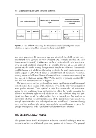
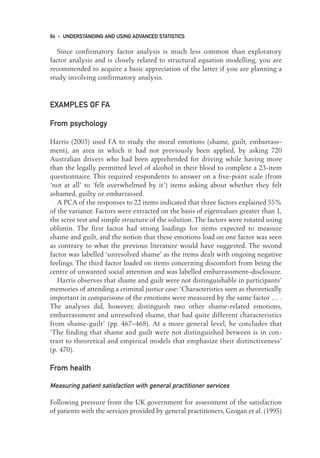
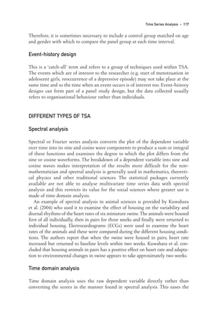
Pereira’s (2004) ACF and PACF plots of the time series before and after dif-
ferencing can be seen in Figure 9.2. The background to the study, as mentioned
earlier, was the need to model demand for blood in a hospital clinic. The A and B
parts of Figure 9.2 represent the original time series. Pereira reported that there
was a significant trend in the ACF up to Lag 16. This can be in Figure 9.2A as the
reasonably steady decline in the ACF through to Lag 16. The data was differ-
enced once to remove a linear trend and this led to the PACF decreasing expo-
nentially (see Figure 9.2D) and left a spike in the ACF data at Lag 1 (seen in
Figure 9.2C). ‘In both correlograms [i.e. Figure 9.2A and B] there is a significant
positive coefficient at Lag 12, which … supports the presence of seasonal effects
with a 12-month period’ (p. 742). On the basis of these plots the ARIMA model
thought to fit the data adequately was (0,1,1)(0,1,1)12.
In the third phase of the analysis, diagnosis, the model produced by the esti-
mation phase is assessed to see whether it accounts for all the patterns in the
dependent variable. During the diagnosis phase, the residuals are examined to
122 • UNDERSTANDING AND USING ADVANCED STATISTICS
09-Foster-3327(ch-09).qxd 10/12/2005 12:16 PM Page 122](https://image.slidesharecdn.com/understandingandusingadvancedstatistics-230316031812-78bb8fcf/85/Understanding_and_Using_Advanced_Statistics-pdf-138-320.jpg)


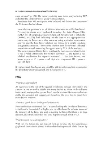
![numerically while in SSA it is represented visually. As Guttman and Greenbaum
(1998, p. 18) suggest, ‘[SSA] provides a geometric representation of intercorrela-
tions among variables as points in Euclidean space. The distances between pairs
of points in the space correspond to the correlations among the variables.’
WHAT KINDS OF DATA ARE NEEDED?
The raw data can be quantitative or qualitative depending on the sort of enquiry
carried out. The data that is generated by the process of facet theory, which
involves the production of structured research questions and methods, can be
quantitative or qualitative. The data is transformed by the process of facet theory
(the evolution of the mapping sentence) into discrete data – usually nominal or
ordinal. It is at the stage when the data has been transformed that it can then be
analysed using SSA.
HOW DO YOU USE FACET THEORY
AND DO SSA?
Theory construction: the mapping sentence
The mapping sentence allows the researcher to conceptualise and design an
experiment or research enquiry. The mapping sentence is the key element for
this stage in the research, although just one element in the system or package
that is built on the systematic deployment of elements.
For Guttman and Greenbaum (1998, p. 15), the task of the mapping sentence
is to ‘express observations in a form that facilitates theory construction in an
explicit and systematic way’. But what exactly is it? The mapping sentence is a
formalised way of asking a question that ‘maps’ onto the observations made in
a piece of research. The word ‘maps’ here means exactly what it would in a
geographical sense. Landforms, roads and towns have observed characteristics that
are represented by maps and the mapping sentence represents a similar situation
where the observed characteristics of a social phenomenon (for example) are
represented in the sentence.
The mapping sentence is composed of a focus set and a sense set, together
called the domain. The set of images, items, experiences, etc., to which the
domain refers is called the range. Together, the focus, sense and range are called
the universe of observations. To explain this we will work through an example.
Suppose we have a man named Robert and we make a statement about him:
‘Robert eats apples.’ The focus here is Robert – he is an element in a set of, say,
132 • UNDERSTANDING AND USING ADVANCED STATISTICS
10-Foster-3327(ch-10).qxd 10/14/2005 4:35 PM Page 132](https://image.slidesharecdn.com/understandingandusingadvancedstatistics-230316031812-78bb8fcf/85/Understanding_and_Using_Advanced_Statistics-pdf-148-320.jpg)
![all the men working at the BBC or all the men watching a musical. Suppose this
set includes the elements Robert, Reginald, Roderick and Rudi. The sense set in
‘Robert eats apples’ is the word ‘eats’. Eats is a member of a set of actions that
might include eats, peels, throws, picks and shines. The image set in ‘Robert eats
apples’ is ‘apples’; we could say that this might include different types of fruit
like pears or bananas, but in this case we will be more specific and say that it
includes specific types of apples. The image set here is the ‘range’ and the range
of apples might include Pink Lady, Granny Smith, Braeburn and Red Delicious.
If we now put together these components we will have something that looks like
the following:
F
Fo
oc
cu
us
s S
Se
en
ns
se
e I
Im
ma
ag
ge
e
{Robert} {eats} {Pink Lady}
{Reginald} {peels} → {Granny Smith}
{Roderick} {throws} {Braeburn}
{Rudi} {picks} {Red Delicious}
{shines}
This basic mapping framework, where we have the focus set and sense set making
up the domain and the image set making up the range, is the general form of the
mapping sentence. The arrow here, from domain to range, means that sets form-
ing the domain are assigned (generally) to sets in the range. But like the adage
‘the map is not the terrain’, the mapping sentence does not designate what the
actual assignment might be.
From this framework we can ask questions based on the structure. For
example, we can ask: What sort of apple does Robert throw? Rudi eats what sort
of apple? Which type of apple is peeled by Reginald? In this example there can
be 20 such questions (the four men and the five actions). The focus set and sense
set form a Cartesian set, which can be combined in 20 ways: Robert eats, Robert
peels, Robert throws, … , Rudi shines. The objects of these actions are in the
range and are the types of apples, so we might have Robert eats Braeburn
[apples].
Further refining our vocabulary here we can say that the objects, people,
items, concepts, etc., that make up the sense set and focus set, in addition to being
components of a Cartesian set, are called a facet.
The above example can be expanded when we think about the everyday
actions of men towards apples: Robert may eat any number of a variety of apples
and Rudi may throw any sort that he can lay his hands on.To designate this rela-
tionship, we specify the image (or apple) set by putting double vertical lines
around them. This allows for the explicit possibility of these choices, and when
so designated is called a power set.
Facet Theory and Smallest Space Analysis • 133
10-Foster-3327(ch-10).qxd 10/14/2005 4:35 PM Page 133](https://image.slidesharecdn.com/understandingandusingadvancedstatistics-230316031812-78bb8fcf/85/Understanding_and_Using_Advanced_Statistics-pdf-149-320.jpg)
![F
Fo
oc
cu
us
s S
Se
en
ns
se
e I
Im
ma
ag
ge
e
{Robert} {eats} Pink Lady
{Reginald} {peels} → Granny Smith
{Roderick} {throws} Braeburn
{Rudi} {picks} Red Delicious
{shines}
The double vertical lines also suggest that the set contains all the possible
subsets, for example: (1) Pink Lady, Granny Smith, Braeburn, Red Delicious;
(2) Pink Lady, Granny Smith, Braeburn; (3) Pink Lady, etc. Also we could say
that the men commit actions against nothing: Robert throws nothing, for exam-
ple. So {nothing} is also part of the set.
Staying with this example we might observe the following interactions of man and
apple. (Note that the arrow is now double stemmed, indicating specific assignment):
Robert shines ⇒ {Pink Lady, Red Delicious}
Robert peels ⇒ {Granny Smith}
Robert eats ⇒ {Granny Smith, Pink Lady}
Reginald throws ⇒ {nothing}
Now we can further refine this design such that the range can be designated as
a set of four {yes, no} facets which will refer to the varieties of apples present:
F
Fo
oc
cu
us
s S
Se
en
ns
se
e I
Im
ma
ag
ge
e (the observed actions
of men towards apples)
{Robert} {eats}
{Reginald} {peels} → {yes, no} {yes, no} {yes, no} {yes, no}
{Roderick} {throws}
{Rudi} {picks}
{shines}
The power set has been transformed into {yes, no} sets called the ‘range facets’. In
the above illustration, note that the arrow is once again single stemmed: this is to
designate not specific assignment but that these are all the assignments available.
Specific assignments might look like this:
Robert shines ⇒ [Pink Lady:] yes; [Granny Smith:] no
Robert peels ⇒ [Granny Smith:] yes
Robert eats ⇒ [nothing:] no; [Braeburn:] no
In this example we have constructed a type of mapping sentence that has as
possible responses only ‘yes’ and ‘no’. If, however, our empirical observations of
134 • UNDERSTANDING AND USING ADVANCED STATISTICS
10-Foster-3327(ch-10).qxd 10/14/2005 4:35 PM Page 134](https://image.slidesharecdn.com/understandingandusingadvancedstatistics-230316031812-78bb8fcf/85/Understanding_and_Using_Advanced_Statistics-pdf-150-320.jpg)
![the research subject (here the action of men towards apples) are different, then
facet theory allows for the flexible refinement of the range.
Let us add another dimension to the range, and ask how often Robert eats
apples: is it often, sometimes, rarely or never? We can now combine the previous
range with the domain to refine our new range as shown in this diagram:
D
Do
om
ma
ai
in
n R
Ra
an
ng
ge
e
{Robert} {eats} {Pink Lady} {often}
{Reginald} {peels} {Granny Smith} → {sometimes}
{Roderick} {throws} {Braeburn} {rarely}
{Rudi} {picks} {Red Delicious} {never}
{shines}
In this mapping sentence, we can begin to see the structure of a questionnaire
taking shape. We could assign numeric values (e.g. 1,2,3,4) to the range set and
thus be able to score the sentences later. The mapping sentence is flexible enough
at this stage to take into account new observations; in the above example, these
concern the frequency of actions towards apples.
So far we have covered the construction of the mapping framework and sen-
tence and explained that it is composed of a focus and sense that make up the
domain and an image, experience or concept that make up the range. Symbols
such as a single- or double-stemmed arrow have been described, as has the sig-
nificance of double vertical lines around the range. Perhaps most important for
this chapter on facet theory is the identification of the term ‘facet’ as it applies
to the components of the sets.
There can be a variety of facets to both the domain and range. For example,
with both there can be more than one facet and these can be very specific. First we
will look at the ‘range facet’. Taking a new example where we look at the perfor-
mance of students in an exam, the mapping sentence might look like this:
F
Fo
oc
cu
us
s S
Se
en
ns
se
e r
ra
an
ng
ge
e[
[1
1]
] r
ra
an
ng
ge
e[
[2
2]
]
{Jean} {studied for} {2–4 days} {excellent}
{Mark} {performed} → {1–2 days} {good}
{Guy} {0–1 day} {fair}
{poor}
What is notable here is that the limits of the range suggest that they have come
from empirical observation: they are not set arbitrarily, although they could be
in the initial stages of development. The range could also be set at a more refined
level which might indicate more precisely the hours studied or the exact percent-
age correct scored in the exam. The determination of the range is up to the
Facet Theory and Smallest Space Analysis • 135
10-Foster-3327(ch-10).qxd 10/14/2005 4:35 PM Page 135](https://image.slidesharecdn.com/understandingandusingadvancedstatistics-230316031812-78bb8fcf/85/Understanding_and_Using_Advanced_Statistics-pdf-151-320.jpg)


![How is SSA different from multidimensional scaling?
They are the same essentially, though with MDS the relationships between
concepts are precisely determined through an algorithm. SSA uses this technique
in computer applications. Recall, however, that SSA can be determined in ways
that are not necessarily mathematical (e.g. by a panel of experts).
SUMMARY
Facet theory is a total research package that allows the researcher to
develop and implement a study systematically and provides a method for
analysing the results through its adjunct smallest space analysis. Smallest
space analysis is analogous to factor analysis but the output is visual.
The premise of the visual representation of concepts in space is that those
concepts which are more closely related will be closer together in
geometric space. It does not, however, depend on statistical analysis and
its proponents do not see this as problematic; they see this aspect as part
of the flexibility of the approach. Smallest space diagrams, they note, can
be organised by a panel of experts who may bring experience and
qualitative information about relatedness which statistical procedures
cannot account for. Some of the criticisms of facet theory centre around
this flexibility. Holz-Ebeling (1990), for example, notes that facet theory
is not a theory at all but a method that has as its goal a ‘logical principle
of thought’ rather than a type of analysis or a type of theory.
The proponents would probably smile at such a criticism and maybe
even agree.
GLOSSARY
D
Do
om
ma
ai
in
n the domain is composed of the focus set and the sense set and is the
first part of constructing a mapping sentence. In the example mentioned above
about apples, the focus set would have been the man whose name began with an
‘R’ with the sense set being what this man did with apples.
M
Ma
ap
pp
pi
in
ng
g s
se
en
nt
te
en
nc
ce
e the mapping sentence is composed of a focus set and a sense
set together called the domain. The set of images, items, experiences, etc., to
which the domain refers is called the range. Together the focus, sense and range
are called the universe of observations. Essentially a device for research design,
Shye (1998) defines the mapping sentence as ‘[a tool] for the formalization of
the definitional framework for collecting data’.
Facet Theory and Smallest Space Analysis • 143
10-Foster-3327(ch-10).qxd 10/14/2005 4:35 PM Page 143](https://image.slidesharecdn.com/understandingandusingadvancedstatistics-230316031812-78bb8fcf/85/Understanding_and_Using_Advanced_Statistics-pdf-159-320.jpg)


![1 would mean ‘having a reliable career’ and a rating of 5 would mean ‘having an
unreliable career’, the opposite of the present meanings. If one does this, the load-
ings on the components are identical except that for C5 the loading on the first
component becomes positive rather than negative.) C2 (indoor) loads on the first
component 0.78 and C4 (very skilful) loads on it not at all but does load highly
on the second component (0.994).
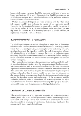
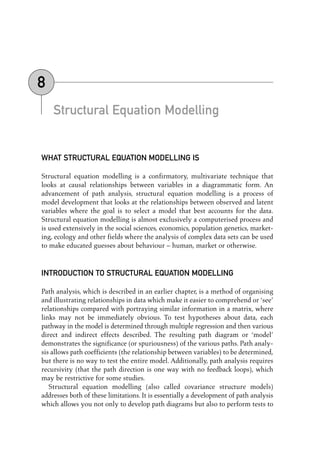
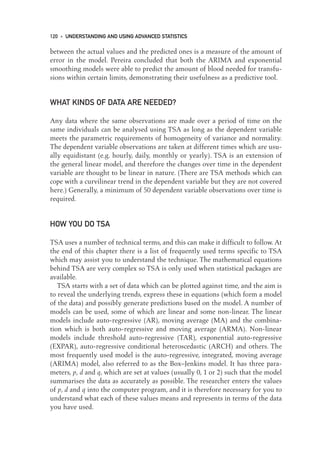
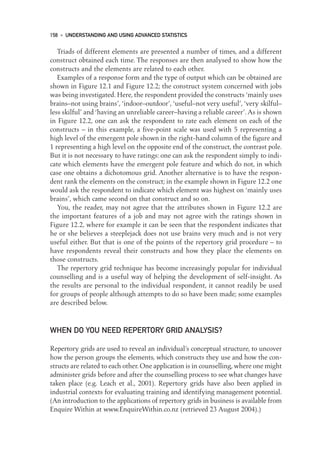
Figure 12.4 illustrates the SPSS output following hierarchical cluster analysis
on the same grid. It shows a tree-like structure, known as a dendrogram, in which
the elements form clusters according to their proximity. Elements 3 (a job I would
not like) and 5 (a well-paid job) form the first, closest cluster. Elements 2 (my cur-
rent job) and 6 (a socially valuable job) form the next cluster and elements 1
(a job I would like) and 4 (my ideal job) form the third one. The second and third
clusters then join to make up the higher order cluster before that one joins with
the first cluster to form the final overall cluster. (A similar form of analysis can
be applied to constructs, using the absolute values of the correlations between
them to order the sequence in which the constructs join clusters.)
Elements and constructs can be represented jointly if one uses a dedicated grid
analysis program such as FOCUS or a technique such as biplot analysis which
Leach et al. describe as ‘basically a plot of the constructs from the simple PCA
[Principal Components Analysis] … with the elements superimposed’ (p. 240).
Fransella et al. (2004) observe that attempts have been made to use a single
number which will summarise a grid and allow simple comparisons to be made.
A number of such single-figure summaries have been proposed. One line of
thought has been to create an index of cognitive complexity. Fransella et al.
describe a number of them, including the functionally independent construct
(FIC) index devised by Landfield. According to their description, the initial
ratings of each element on a scale from − 6 to + 6 were reduced to three levels:
negative, zero or positive. The ratings of two elements on two constructs are
164 • UNDERSTANDING AND USING ADVANCED STATISTICS
Dendrogram using Average Linkage (Within Group)
Rescaled Distance Cluster Combine
3
5
1
4
2
6
* * * * * * * * * H I E R A R C H I C A L C L U S T E R A N A L Y S I S * * * * * * * * *
Label Num
C A S E 0 5 10 15 20 25
+ + + + + +
Figure 12.4 Dendrogram showing the clustering of the elements
12-Foster-3327(ch-12).qxd 10/12/2005 12:16 PM Page 164](https://image.slidesharecdn.com/understandingandusingadvancedstatistics-230316031812-78bb8fcf/85/Understanding_and_Using_Advanced_Statistics-pdf-180-320.jpg)


![Fournier and Payne report the number of respondents who perceived themselves
as having changed or remained stable on each of the 35 dimensions. The authors
also tabulate the number of respondents for whom a dimension disappeared
between the first and second occasions and the number for whom a new dimen-
sion appeared on the second occasion.
Changes in self-esteem were measured by taking the distance between ‘actual
self’ and ‘ideal self’ on both occasions and the distance between ‘past self’ and
‘ideal self’ ratings obtained on the second occasion. Fournier and Payne write:
‘Overall, graduates at T2 [i.e. the second testing occasion] have a higher esteem
for their actual self than they have for their past self. The paired t test shows that
the difference between the average ideal self-past self distance and ideal self-
actual self distance at T2 is significant’ (p. 309).
From health
Freshwater et al. (2001) used repertory grids in a study of survivors of childhood
sexual abuse: 40 women who had been sexually abused in childhood, and 28 who
had not, completed a number of measures including rating scales of supplied ele-
ments (e.g. self now, ideal self, men in general) and constructs (e.g. trustworthy–
untrustworthy). For the clinical group, dyad grids were also completed; here the
elements represented the relationships between people (e.g. self to mother).
Additional constructs were elicited using the triarchic procedure.
Freshwater et al. examined a number of element relationships including the
distance on five supplied constructs between ‘self now’ and ‘ideal self’ and the
distance between ‘men in general’ and ‘women in general’. The latter is taken to
assess sex–role polarisation. The authors report the mean element distances of
the ‘self’ versus ‘ideal self’ discrepancy and of sex–role polarisation, and note that
‘survivors had significantly higher self/ideal self distances than the non-abused
group’ (p. 387) while there were no significant differences on the sex–role
polarisation measure: ‘hypothesized differences in sex–role polarization between
survivors and others were not found’ (p. 390) which ‘challenges opinion on the
construal patterns of survivors’ (p. 391).
From business/management
Langan-Fox and Tan (1997) interviewed 13 managers in a study of organisational
culture in Australia; they describe the study as concerned with ‘measuring general
perceptions of a culture in transition with a public service (government) organiza-
tion that had recently introduced a new quality service culture’ (p. 277). In the inter-
views, they elicited constructs which were then administered to all the managers.
The elicited constructs were subjected to content analysis which identified five
main issues which contrasted the established old culture with the desired new one.
Repertory Grids • 167
12-Foster-3327(ch-12).qxd 10/12/2005 12:16 PM Page 167](https://image.slidesharecdn.com/understandingandusingadvancedstatistics-230316031812-78bb8fcf/85/Understanding_and_Using_Advanced_Statistics-pdf-183-320.jpg)