Download to read offline


![UI/IADocumentation P a g e | 21
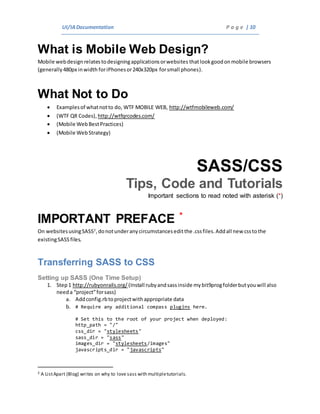
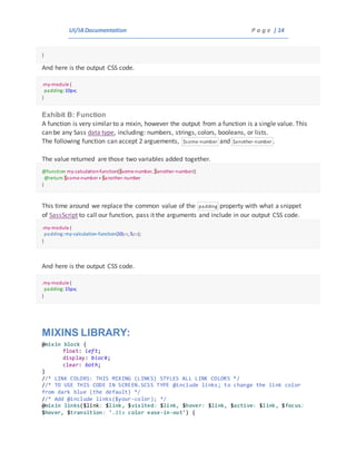
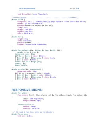
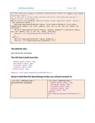
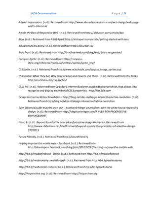
#main-menu, #footer-menu, #main-menu ul, #footer-menu ul, .inactive {
display: none; /* THESE WILL BE VISIBLE UPON TOGGLE */
}
}
@mixin body {
.active, .logged-out #footer-menu, .logged-out #footer-menu ul {
display: block !important;
}
#left-menu {
position: absolute;
z-index: 101;
.fixed {
position: fixed;
overflow: scroll;
background: repeat $dark-blue;
height: 100%;
margin-top: 0em;
padding-top: 1em;
@include box-shadow( $white 0px 2px 3px 0.1em,
$black 0px 2px 2px 0.2em,
$dark-blue 0px 4px 7px 0.2em);
}
}
h1.title, h2.title, h1, h2 {
font-size: 35px;
}
h3, h4, h5, h6 {
font-size: 22px;
}
.description, p {
font-size: 16px;
}
#container {
width: 80%;
}
#container.toggle {
margin-left: 31%;
margin-right: 0px;
padding-bottom: 15%;
width: auto;
overflow-x:hidden;
}
#topMenu span {
right: 0px;
}
[id*="MaintTable_filter"] {
margin-top: 0em;
} //* SEARCH */
}](https://image.slidesharecdn.com/d6f91999-ff0b-40da-8e80-c543c8492eff-150821212508-lva1-app6891/85/UI-IA-deploy-21-320.jpg)
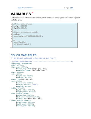
![UI/IADocumentation P a g e | 27
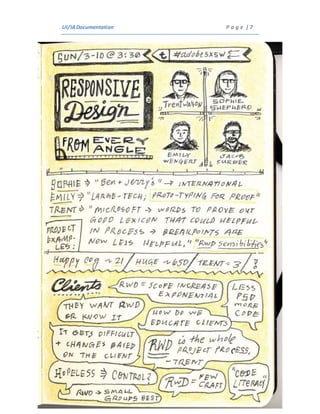
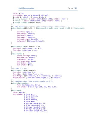
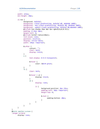
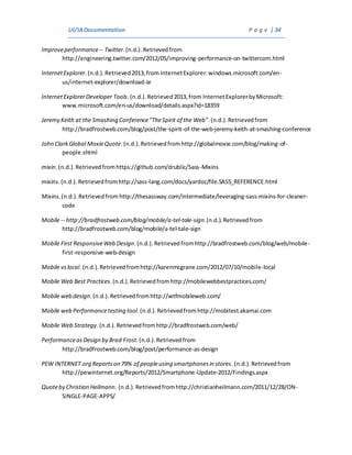
@import "mysprite/*.png";
COLOR CODING SASS IN ECLIPSE
You need to associate the .scss file type with the native Eclipse CSS Editor in Eclipse [Part 1]. After you
do that, you need to add the .scss file type to the native CSS Editor as well so the CSS Editor will be able
to open it [Part 2]. Here are the steps for eclipse (I’m running Eclipse Java EE IDE for Web Developers,
Indigo):
———- [Part 1] ———-
1. Go to Window –> Preferences
2. Drill down to General –> Editors –> File Associations
3. In File Associations pane, click the ‘Add…” button on the top right.
4. For “File Type:”, enter *.scss and then click OK.
5. Find the *.scss entry in the File Associations list and select it.
6. After selecting *.scss, on the bottom pane “Associated editors:”, click the “Add…” button.
7. Make sure “Internal editors” is selected on the top, then find and select “CSS Editor” and then
click OK.
This associated the file type .scss with eclipses native CSS Editor. Now we have to configure the
native CSS Editor to support .scss files. To do this, follow this steps:
———- [Part 2] ———-
1. Go to Window –> Preferences
2. Drill down to General –> Content Types
3. In the Content Types pane, expand “Text”, then select “CSS”.
4. After “CSS” is selected, on the bottom “File associations:” pane, click the “Add…” button.
5. For “Content type:”, enter *.scss and then click OK.
6. Click OK to close out the Preferences window.
All done. All you need to do now is close any .scss files that you have open then re-open them
and wha-la, css colors in Eclipse for .scss files!
Hope this helps. – http://stackoverflow.com/questions/7614612/is-there-an-eclipse-editor-for-
sasss-scss-files-or-syntax-coloring-plugin](https://image.slidesharecdn.com/d6f91999-ff0b-40da-8e80-c543c8492eff-150821212508-lva1-app6891/85/UI-IA-deploy-27-320.jpg)
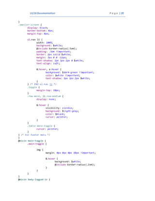
![UI/IADocumentation P a g e | 31
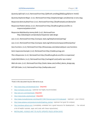
The Arkansas Medicaid Episode BasedPayment System
is built for page widths of 480px (mobile screensize)
and larger. The additional screenoptimizations are
in 650px width(tablet size), 760px (smallcomputer
screen), 850px (small computer screen), 1024
(average browser width), and 1170px (large average
browser size)............................................................. 9
S
SASS
On websites usingSASS , do not under any
circumstances edit the .css files. Addallnew css to
the existing SASS files.....10, 11, 13, 22, 23, 24, 26, 27
Sass Functions
Sass gladlylets you addcalculations andlogic ina way
that CSS wouldnever abide. But doesthat meanyou
should goaroundadding anddividingjust
anywhere?Find out how you can use pure Sass
functions to make reusable logic more useful and
your working Sass file more readable..................... 13
SASS include
A SASS include references a mixin............................... 22
screenshot
A screen dump, screencapture (or screen-cap),
screenshot (or screenshot), screengrab(or screen
grab), or print screen[1]is animage takenbythe
computer user to record the visible items displayed
on the monitor, television, or another visual output
device. Usuallythis is a digitalimage usingthe (host)
operatingsystemor software running onthe
computer, but it canalso be a capture made bya
camera or a device interceptingthe video output of
the display(such as a DVR). That latent image
converted and saved to animage file such as to .JPG,
.BMP, or .GIF format is also called a screenshot..... 29
sprite
A web page withmanyimagescantake a longtime to
loadandgeneratesmultiple server requests. Using
image sprites will reduce the number of server
requests and save bandwidth................................. 12
Sprite Images
Compass Sprite Images work like configurable variables
but require their ownfolder andpages. There are
manyadd-on gems that make this even easier...... 26](https://image.slidesharecdn.com/d6f91999-ff0b-40da-8e80-c543c8492eff-150821212508-lva1-app6891/85/UI-IA-deploy-31-320.jpg)


This document provides specifications and documentation for UI/IA/UX design. It includes sections on responsive design, browser compatibility, SASS/CSS tips and code, responsive mixins, variables, sprites, and more. The document gives overviews and descriptions of topics from SXSW presentations on responsive design. It also provides instructions for setting up and using SASS for CSS preprocessing and includes code examples for mixins, partials, and other SASS features.


