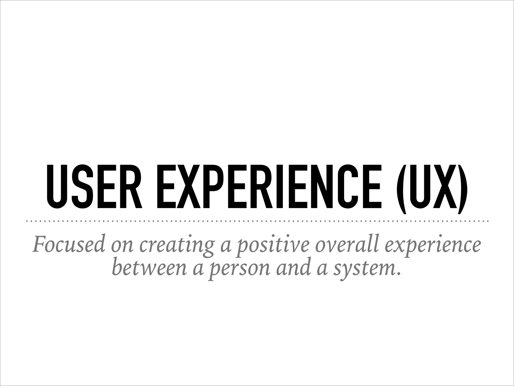
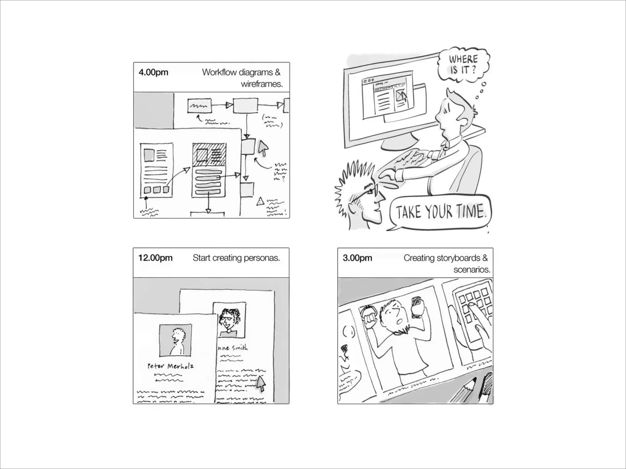
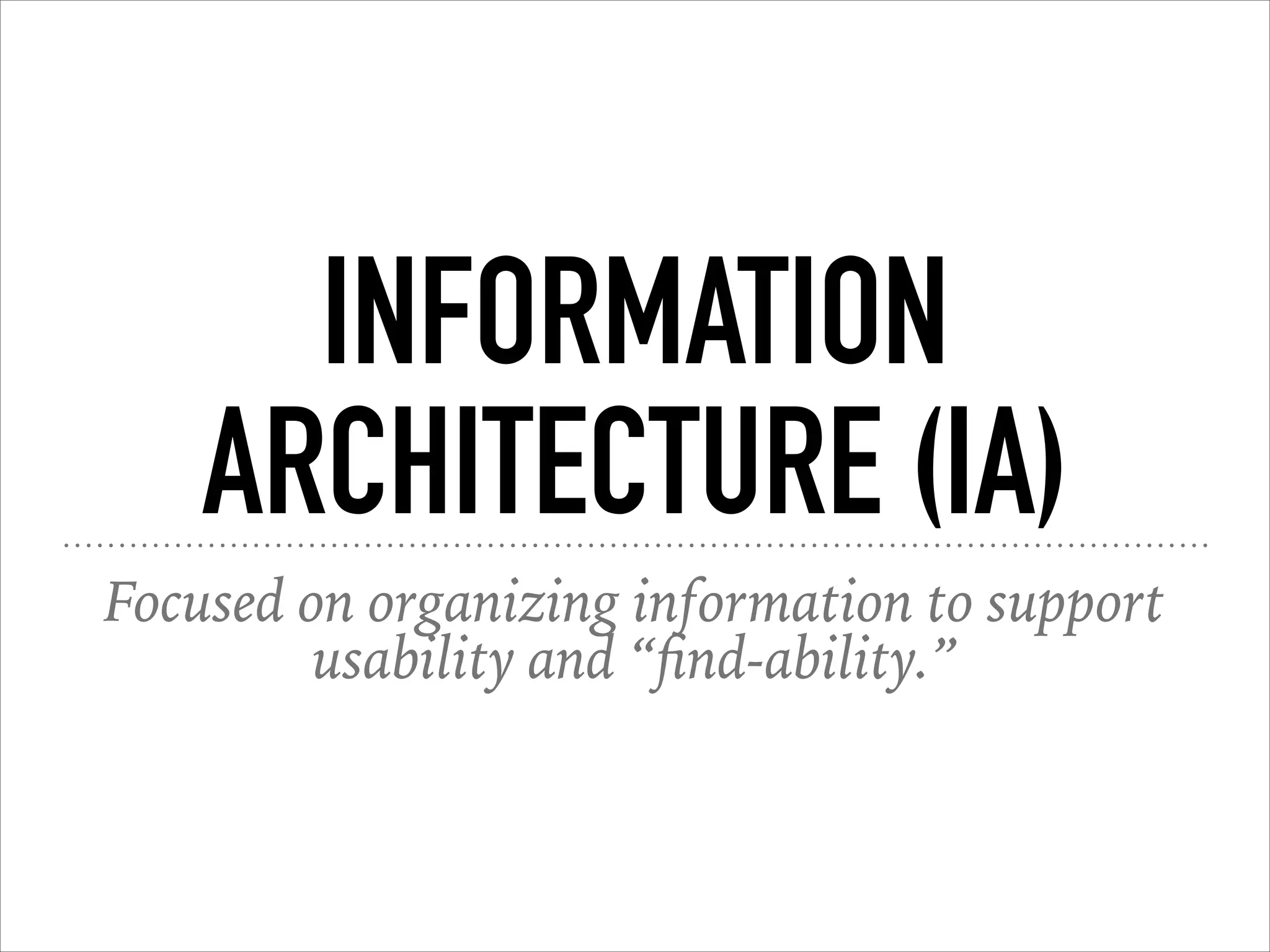
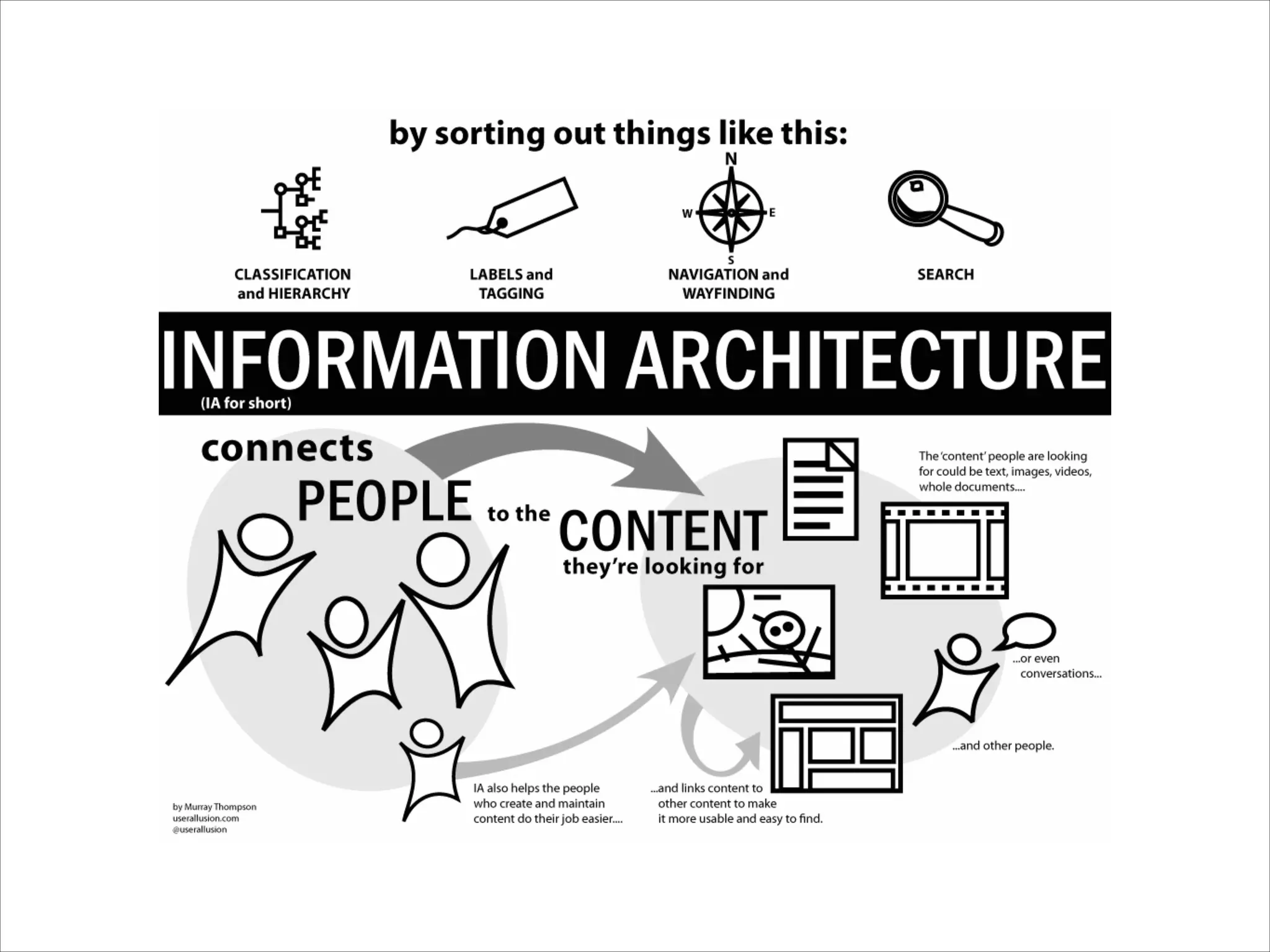
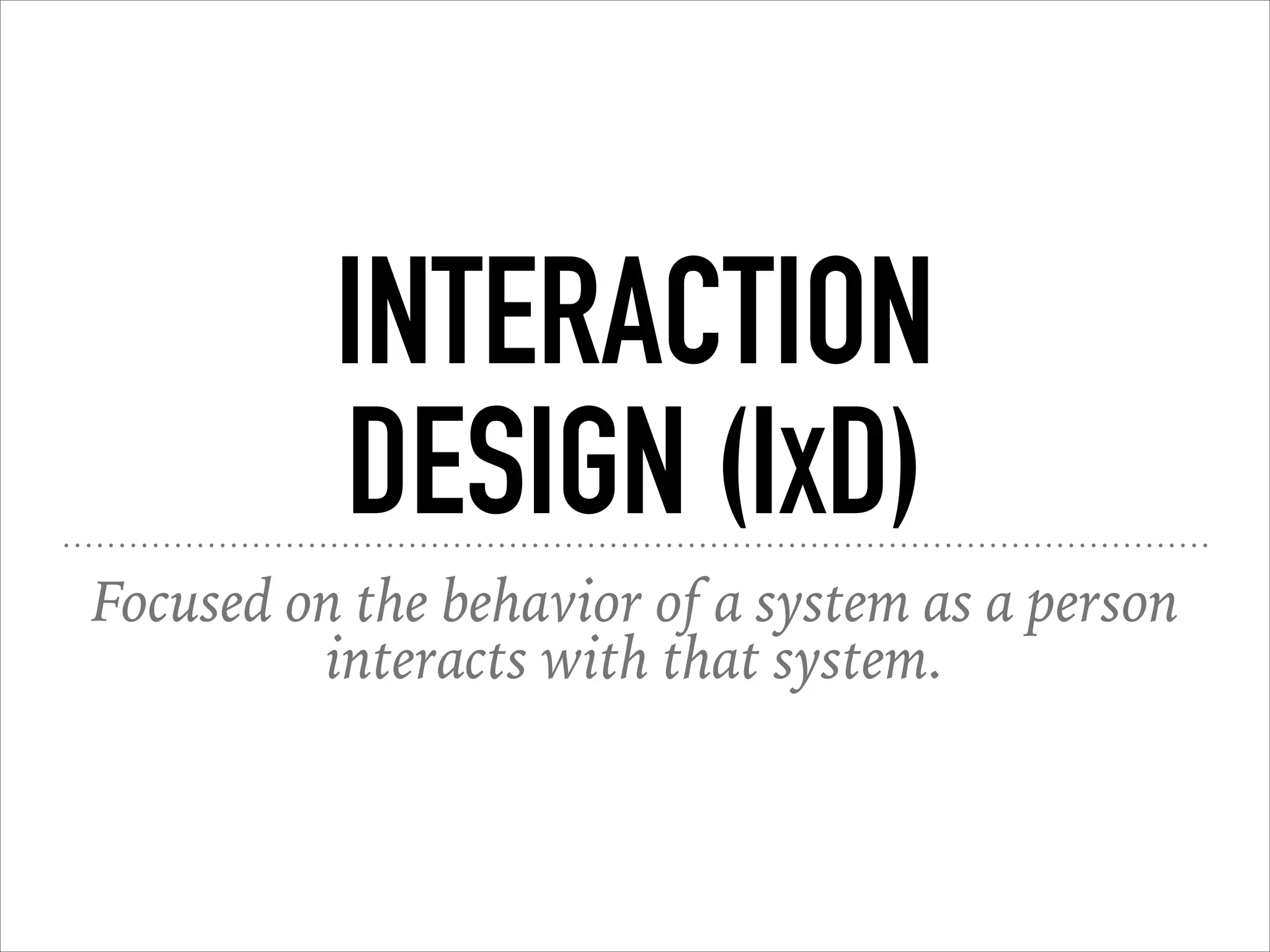
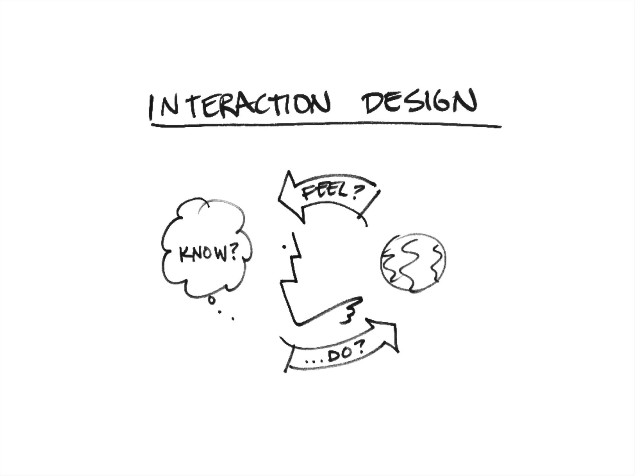
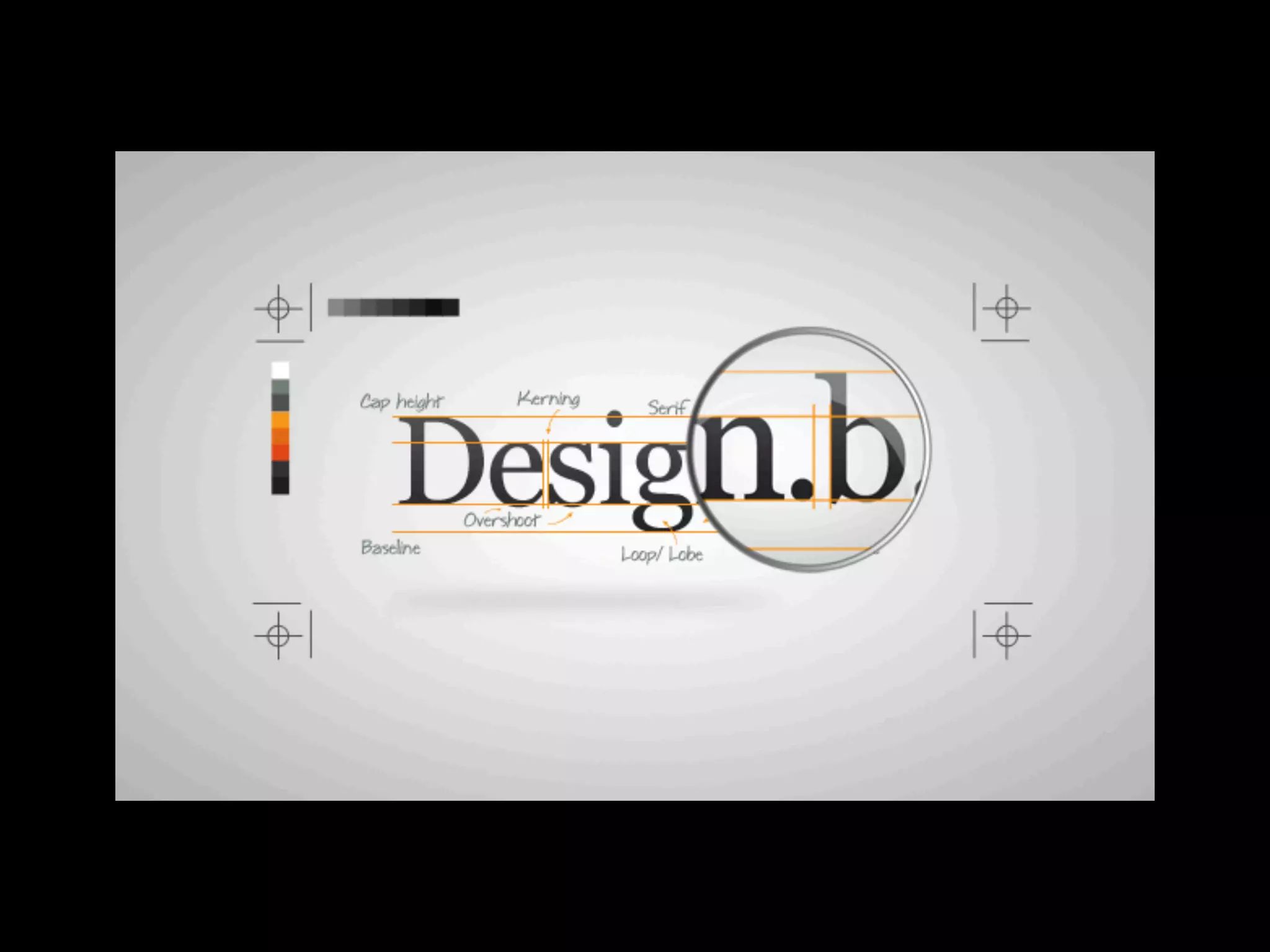
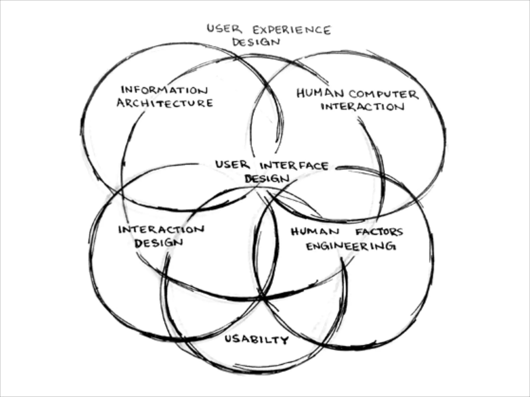
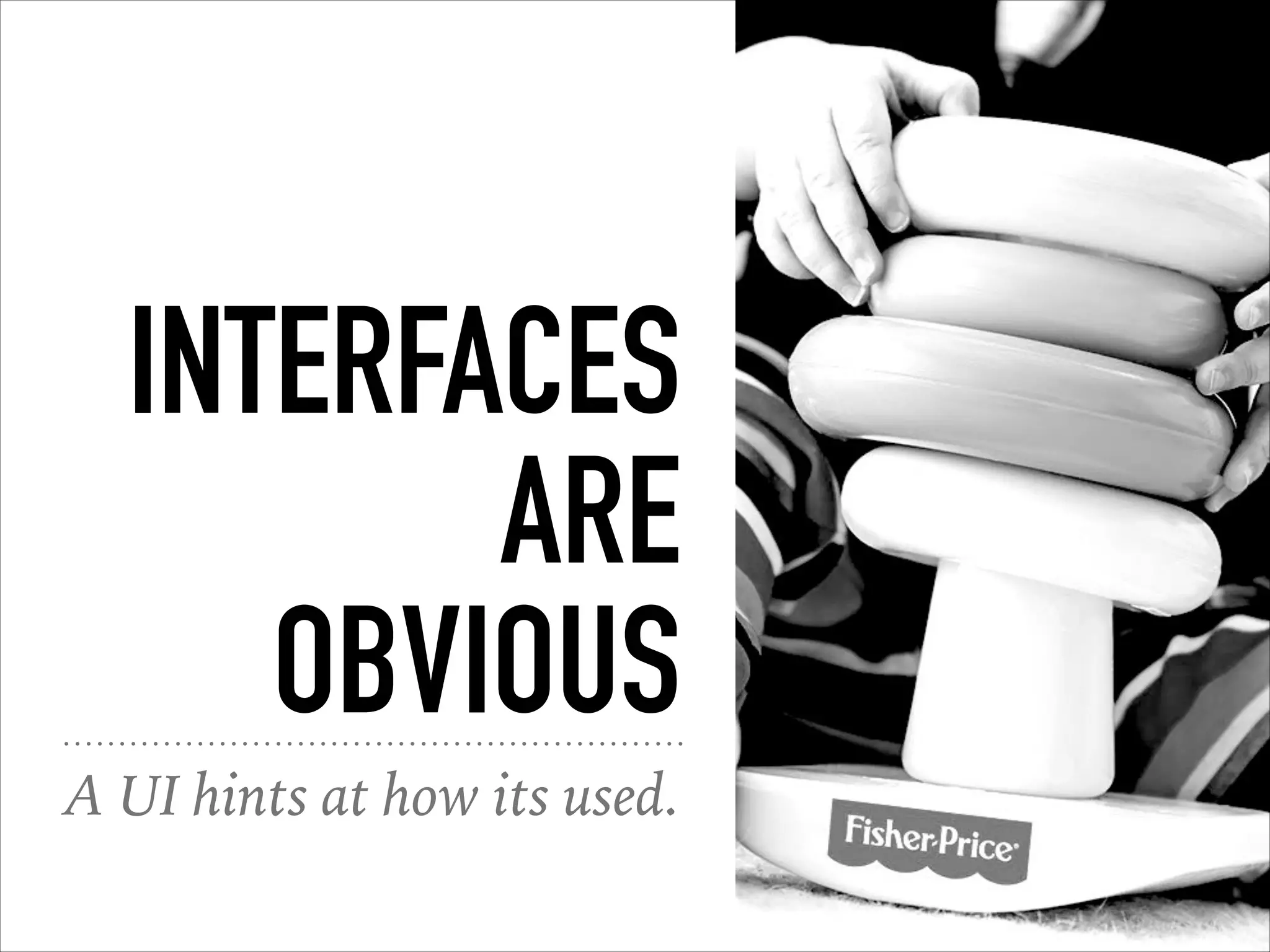
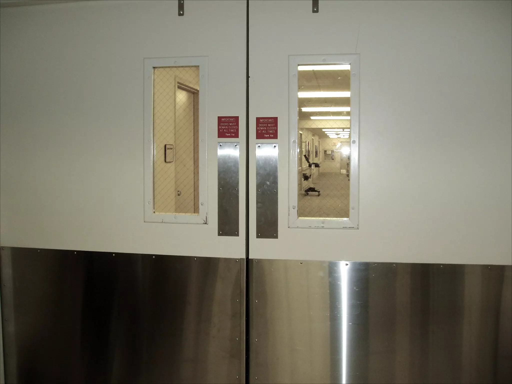
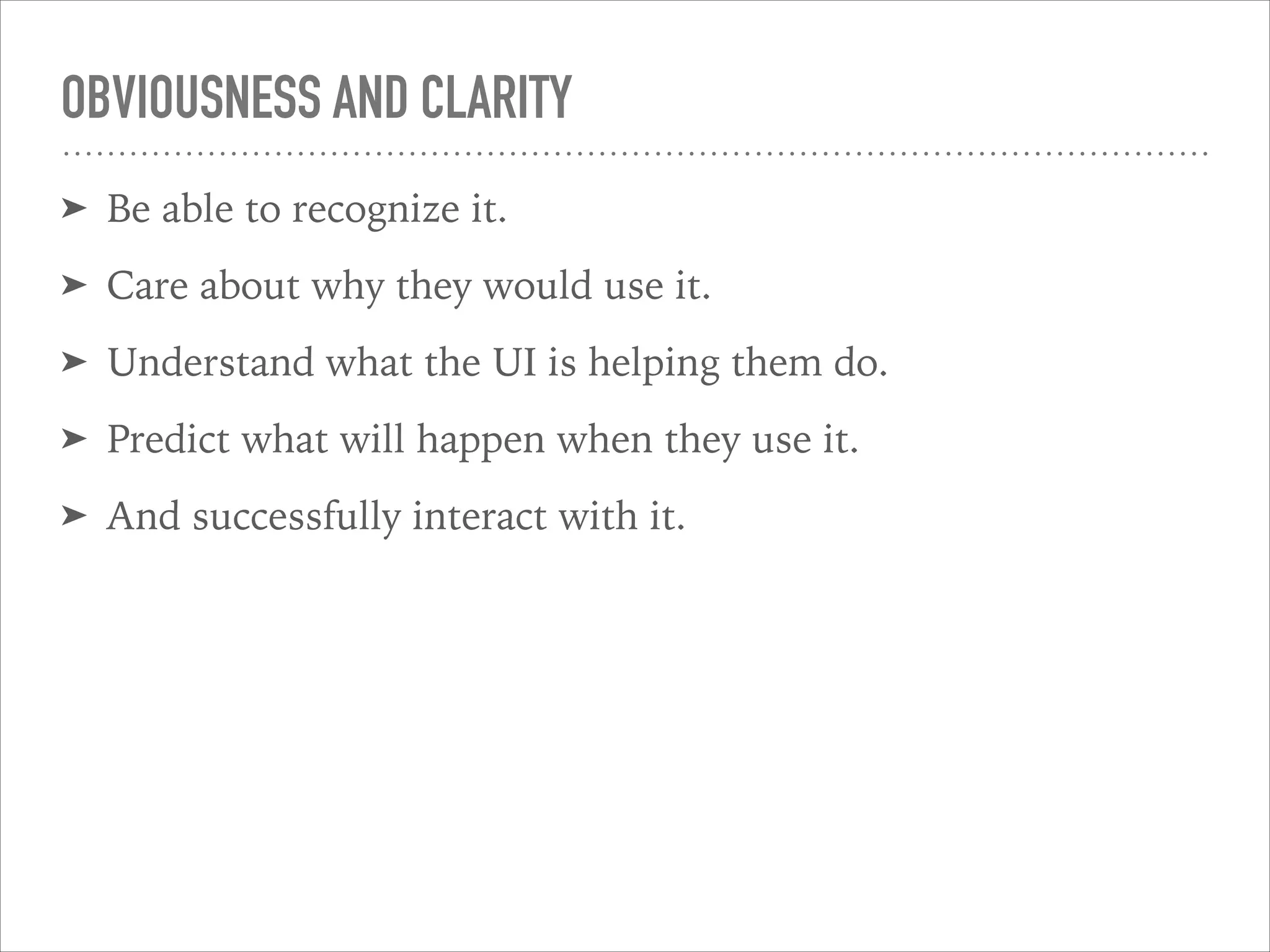
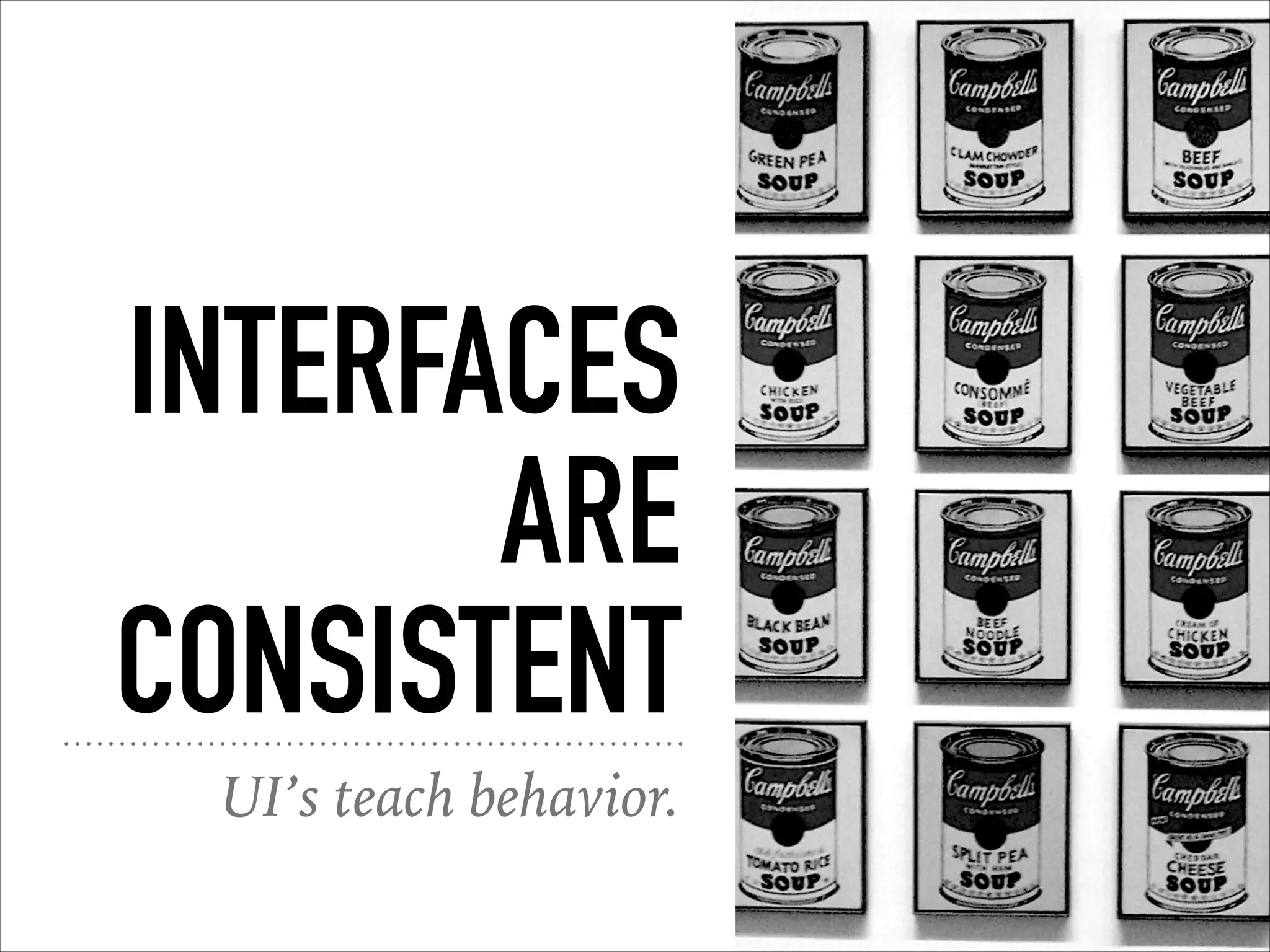
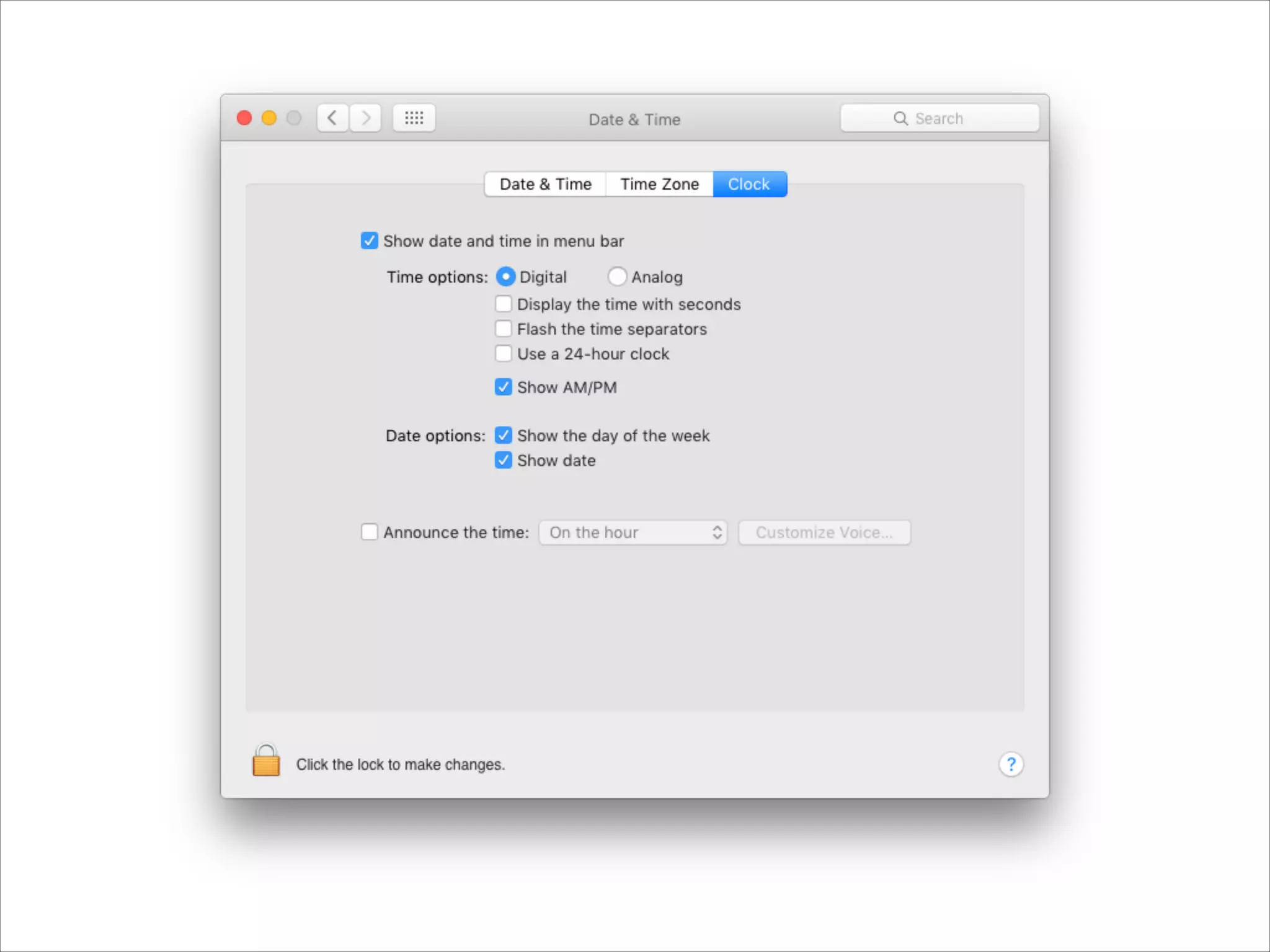
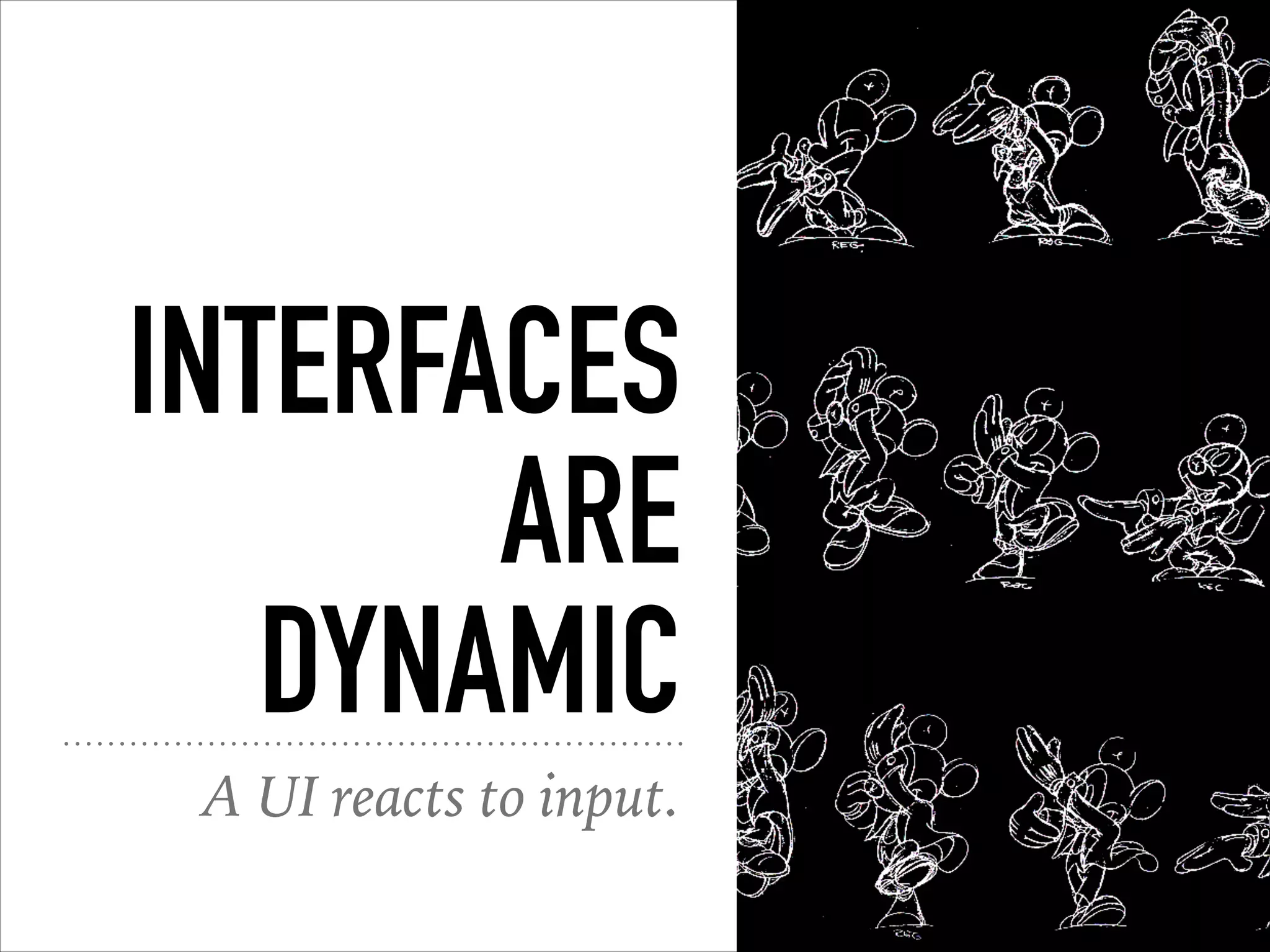
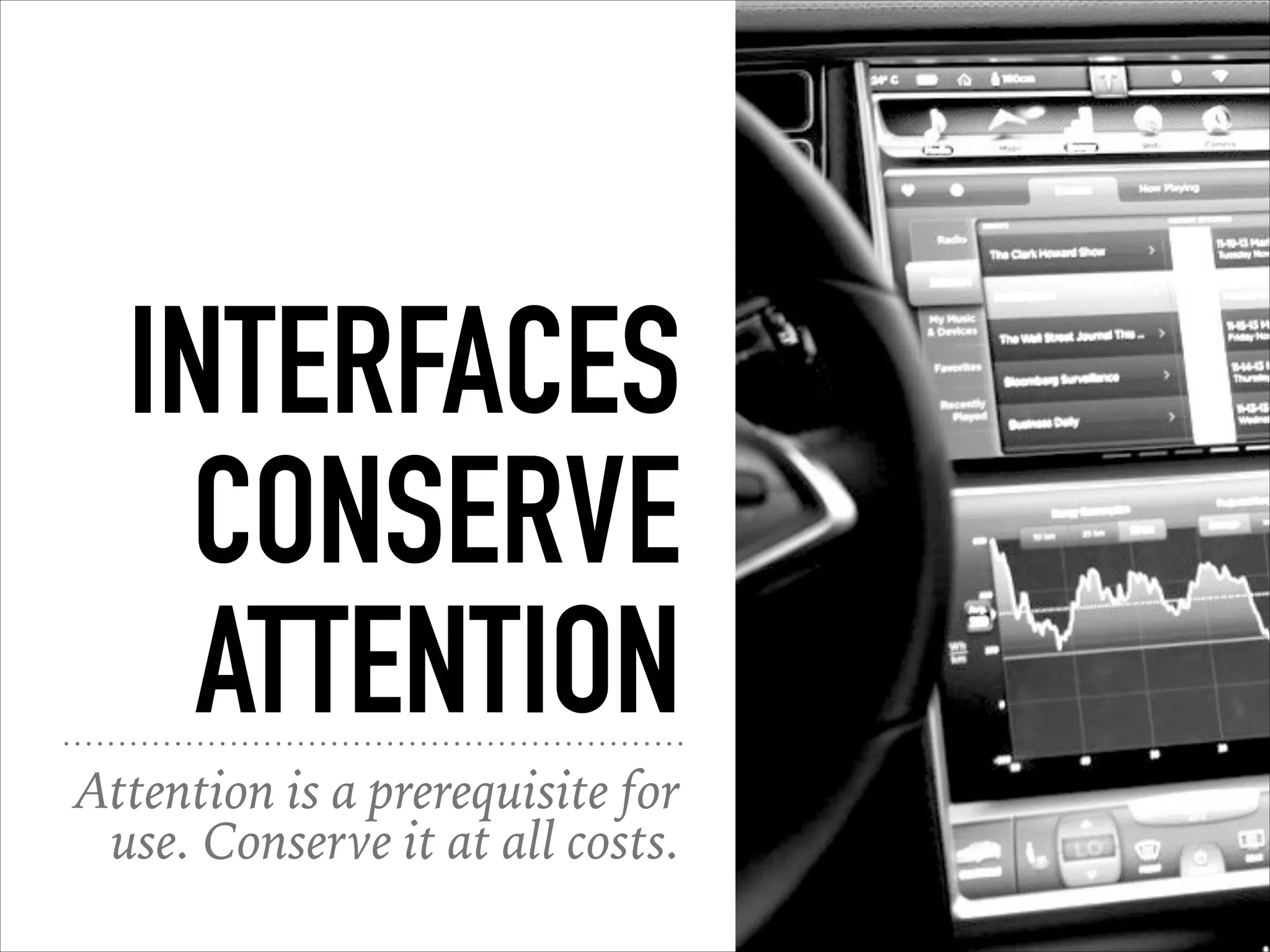
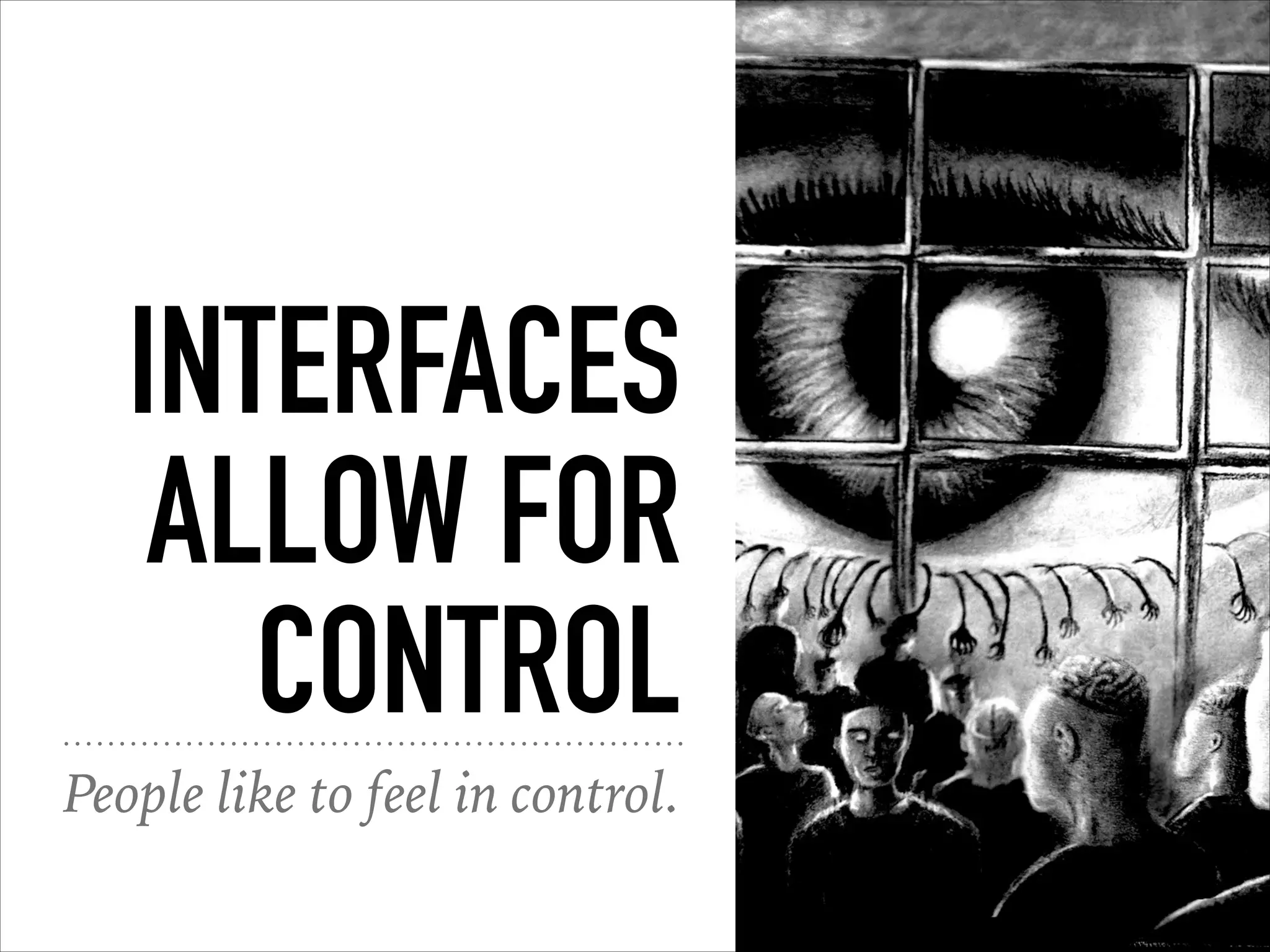
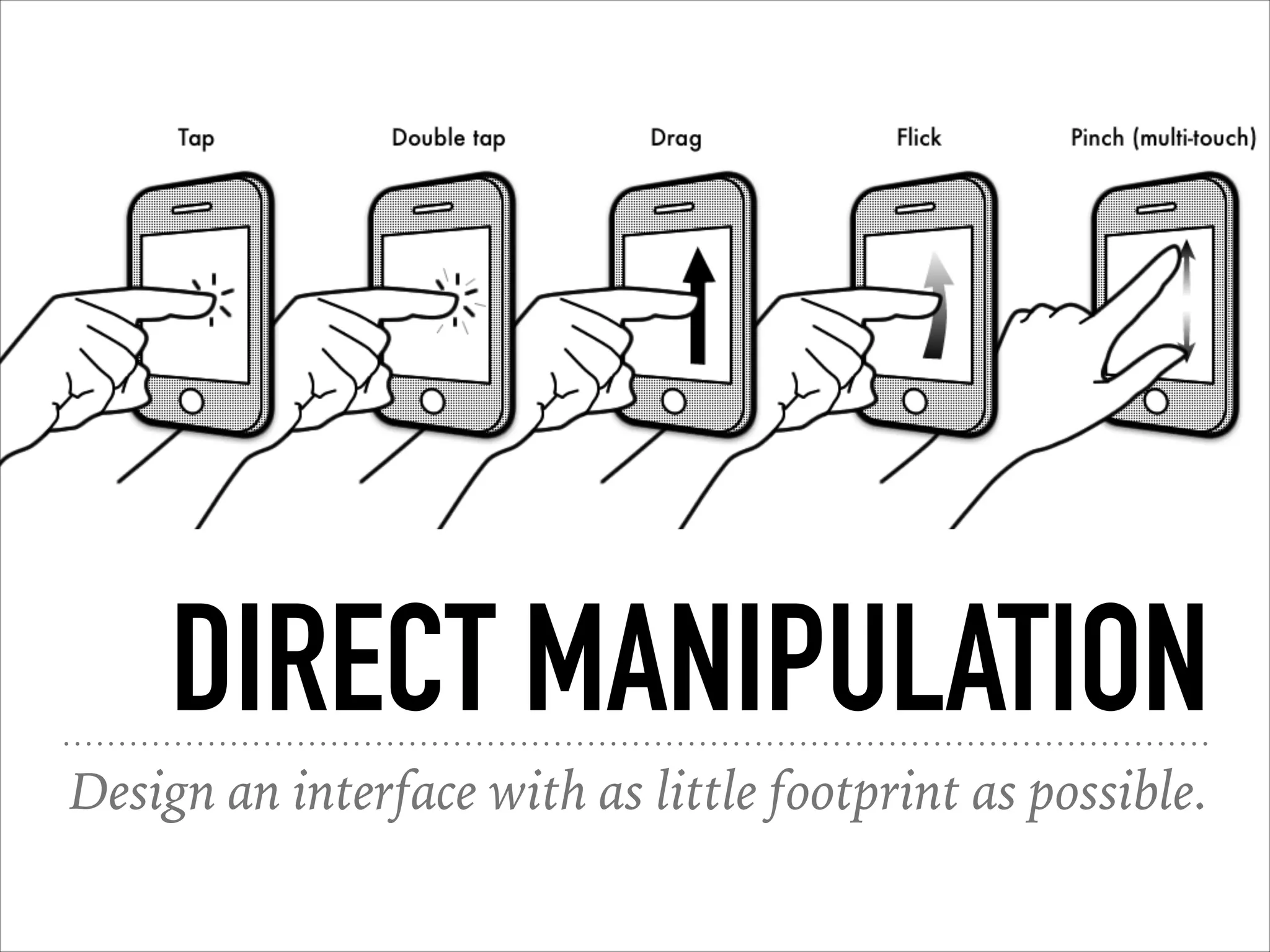
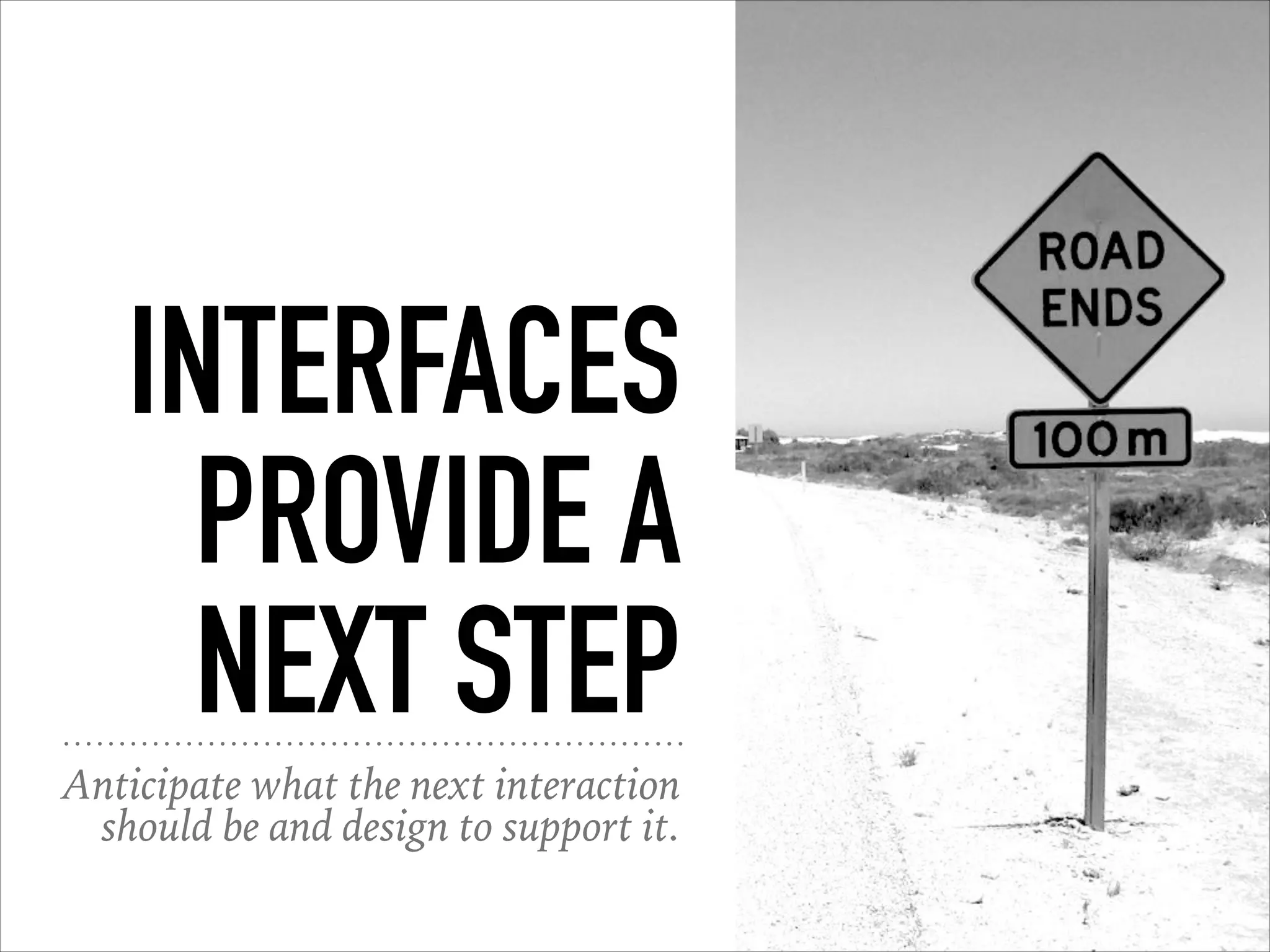
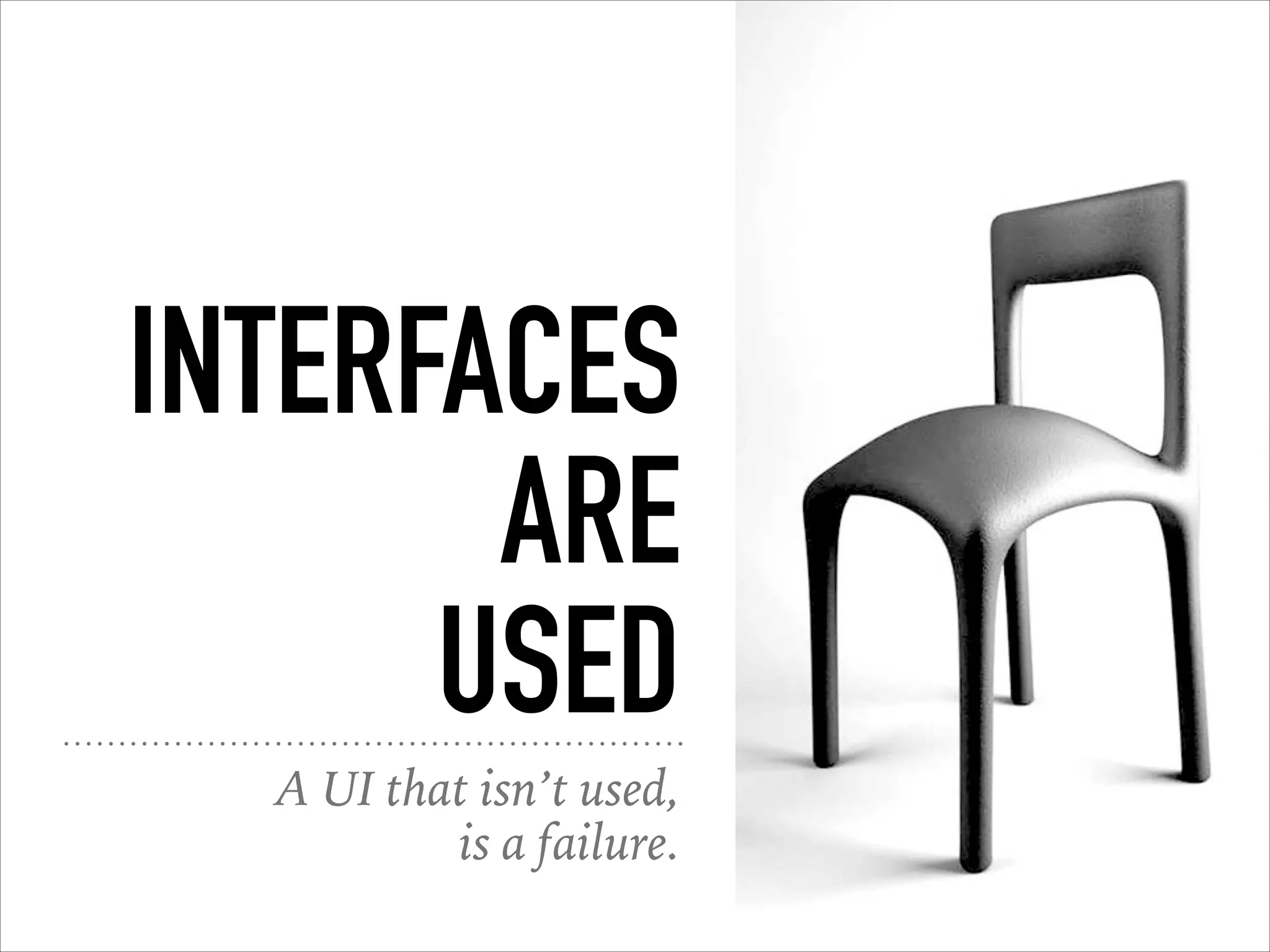
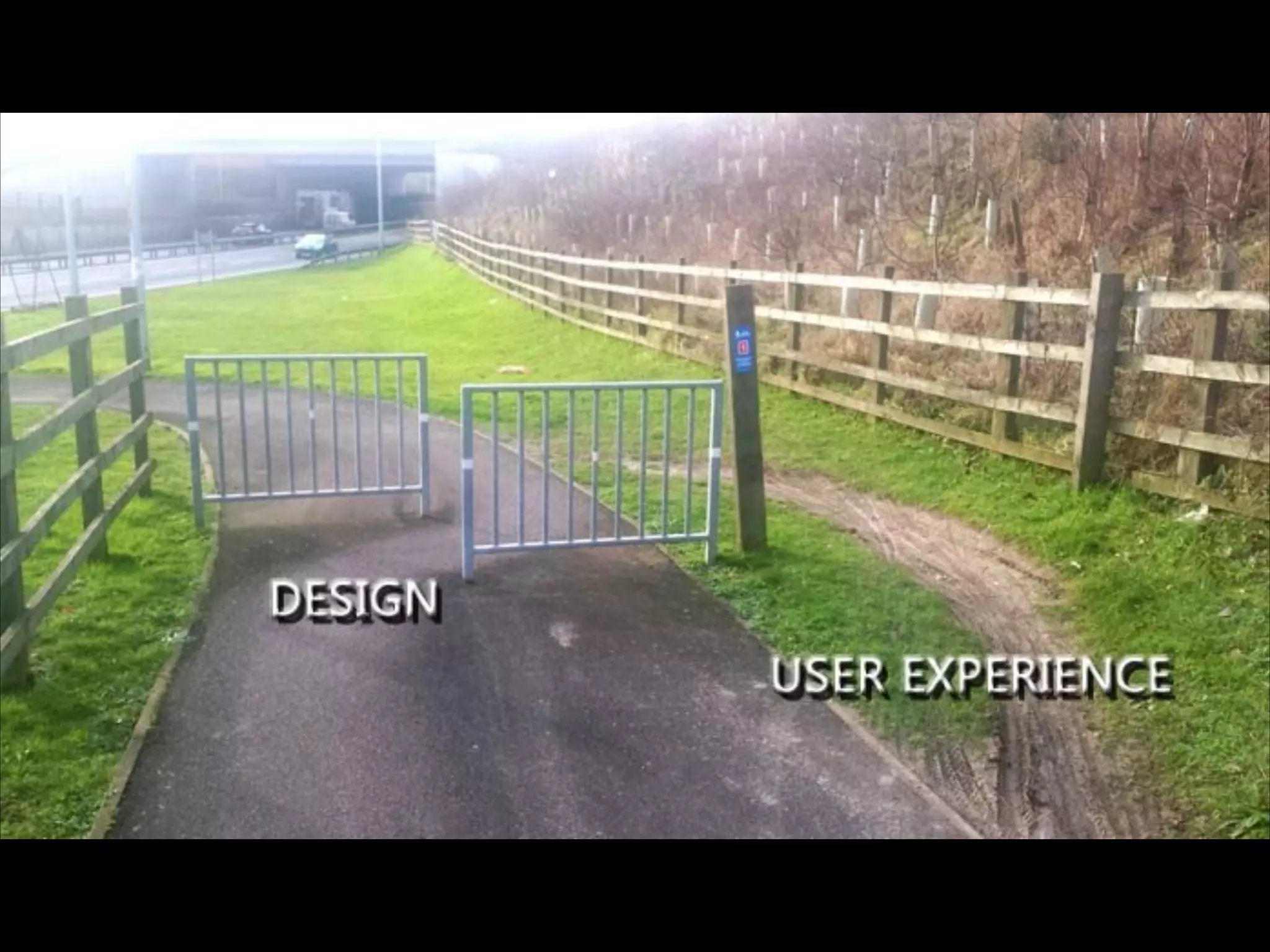
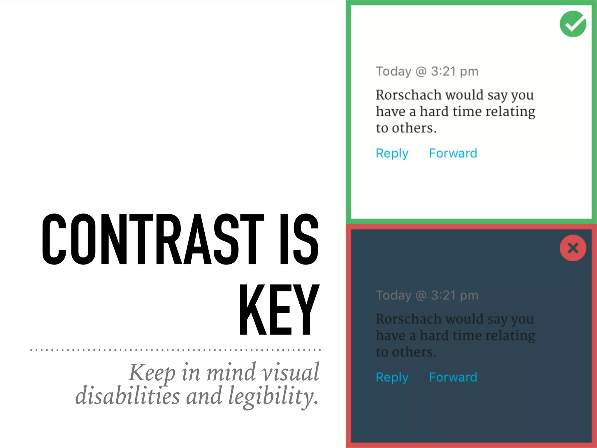
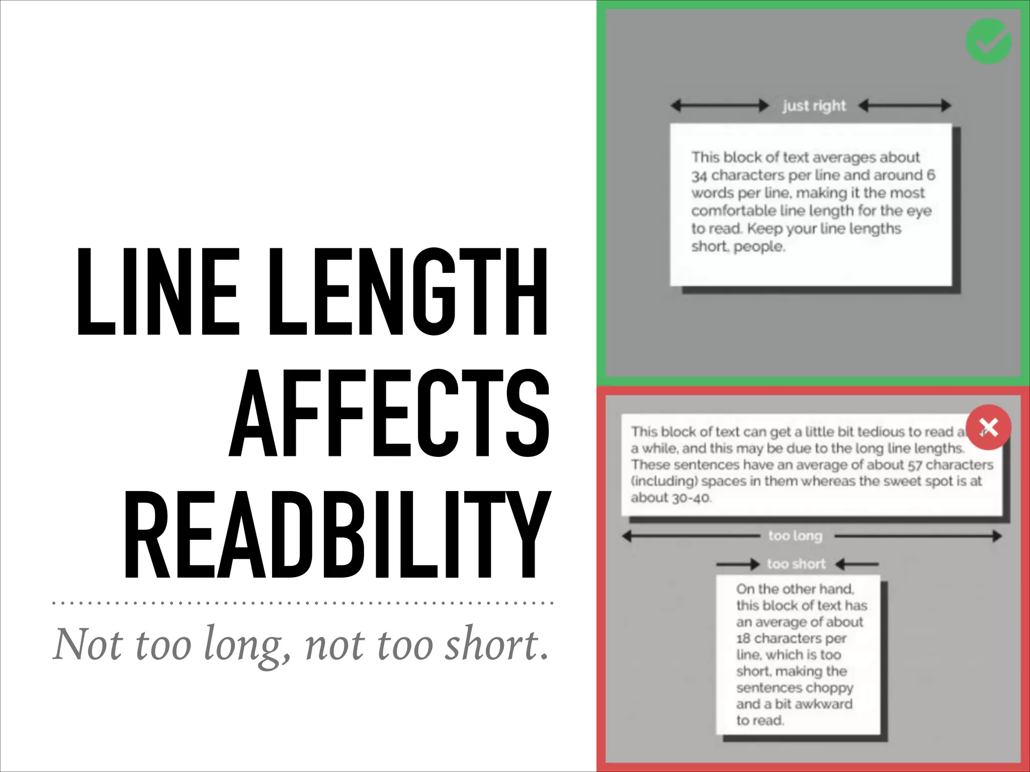
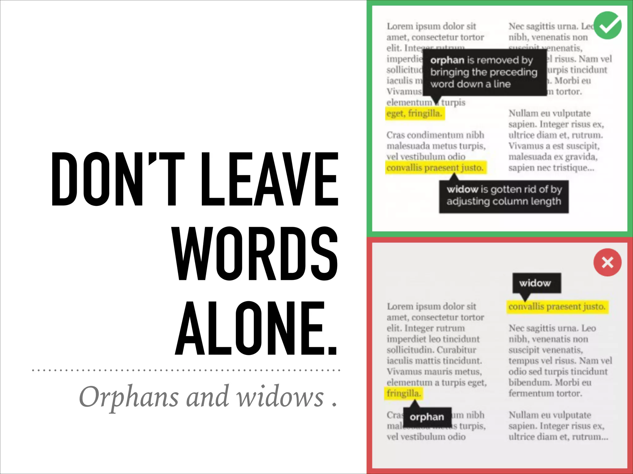
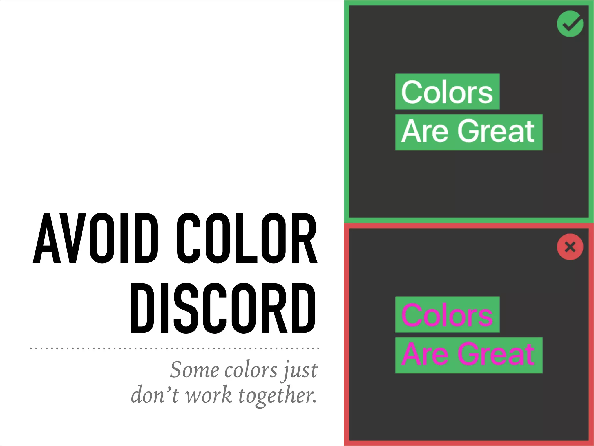
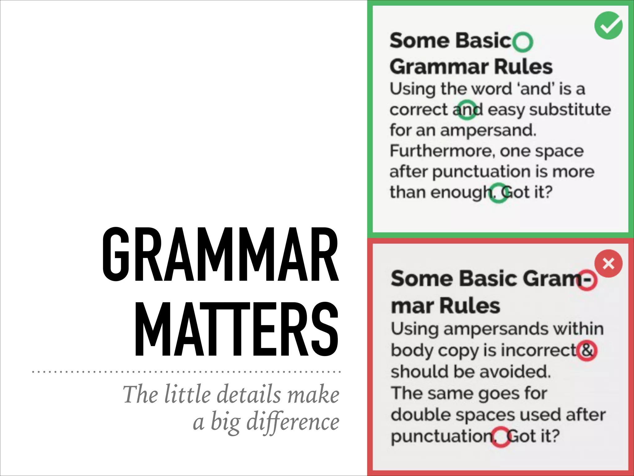
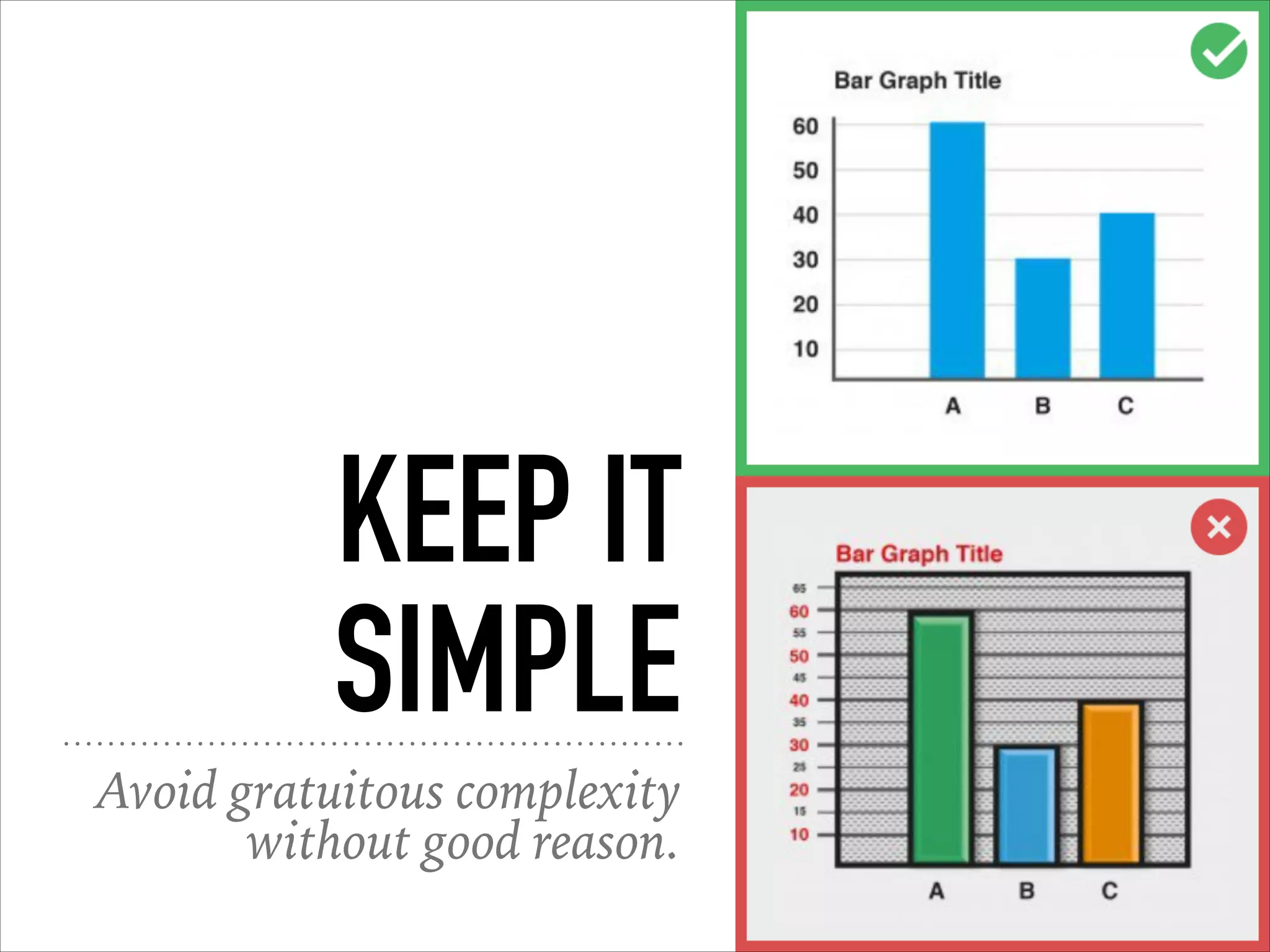
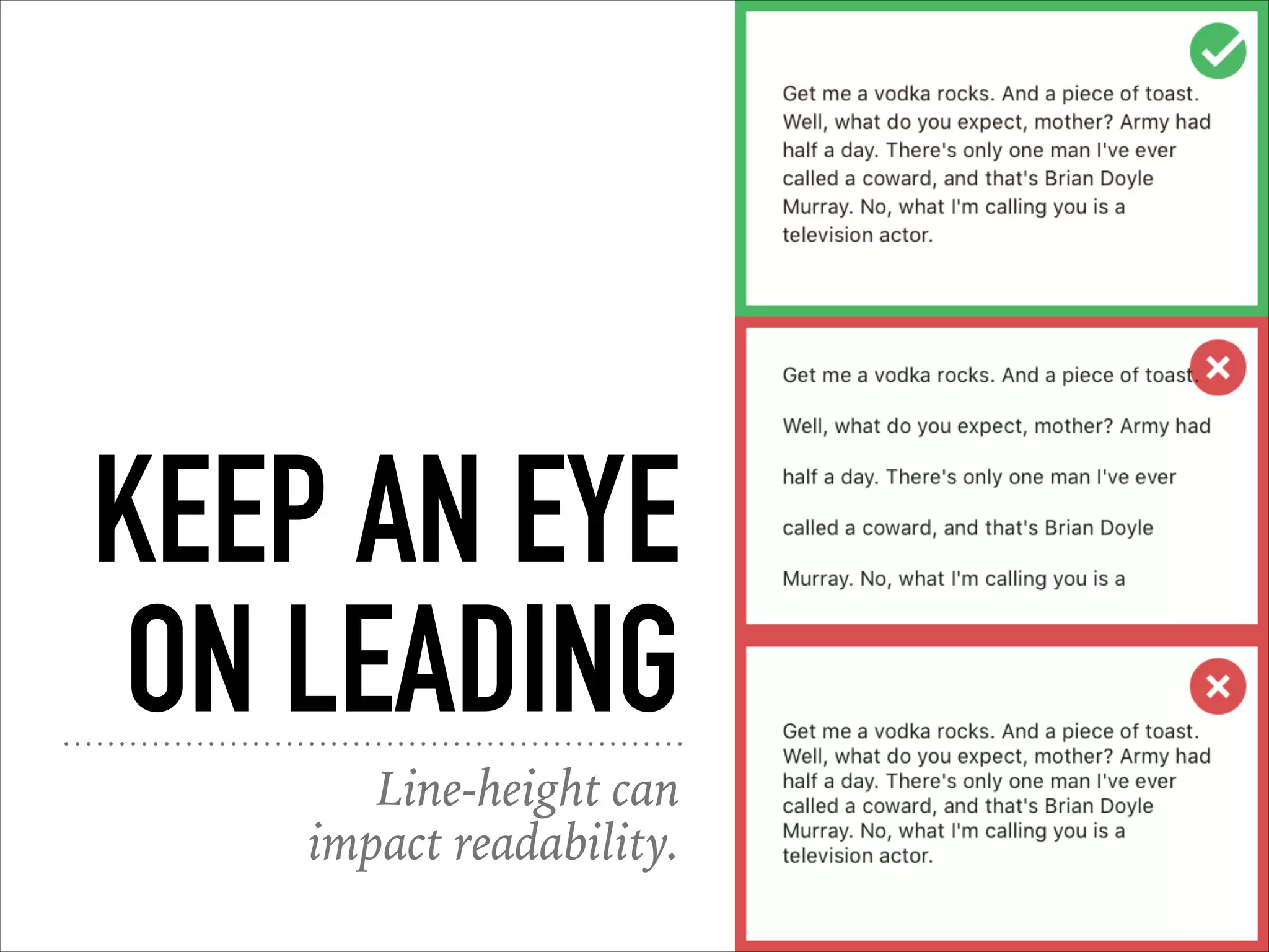
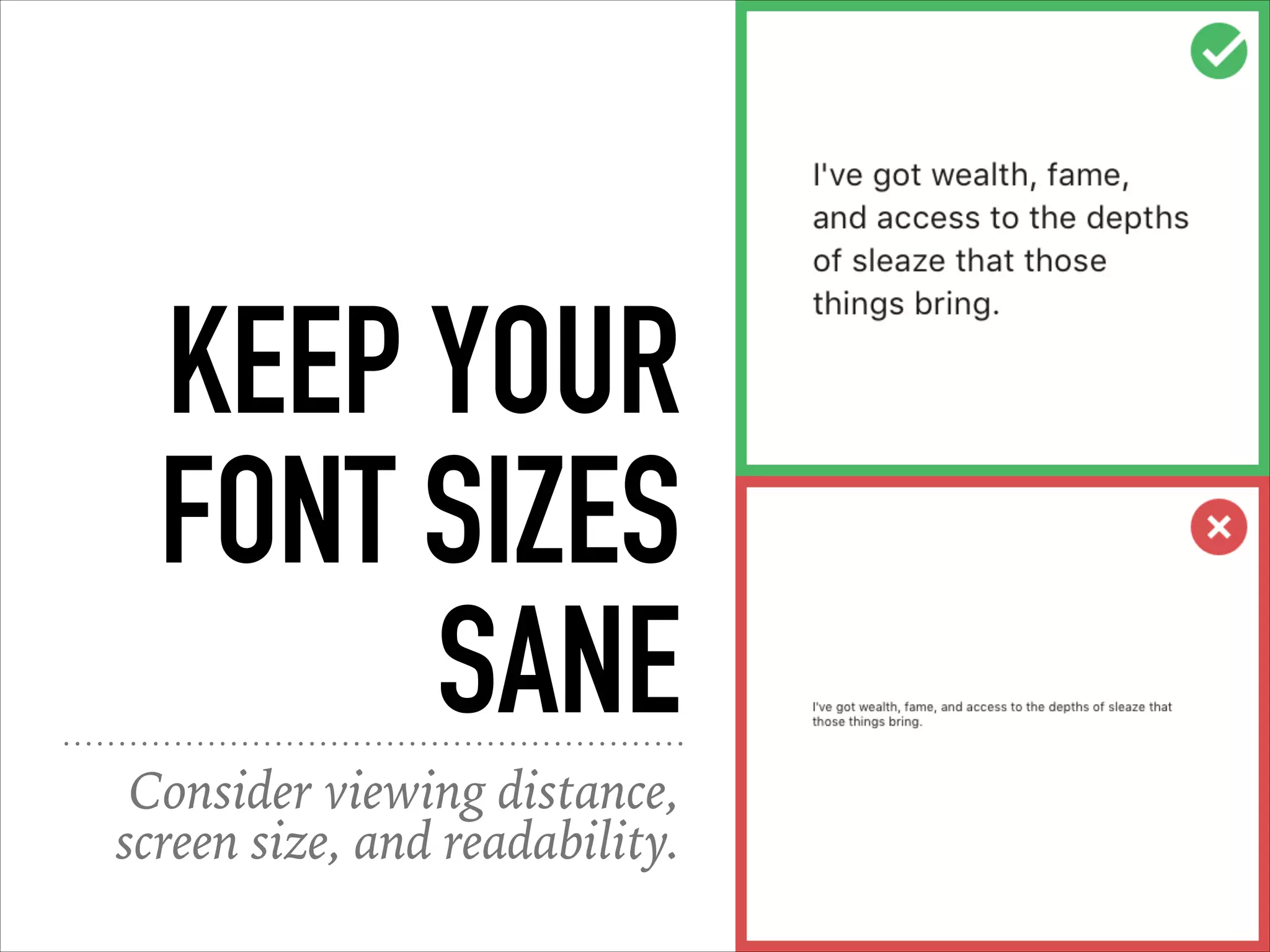
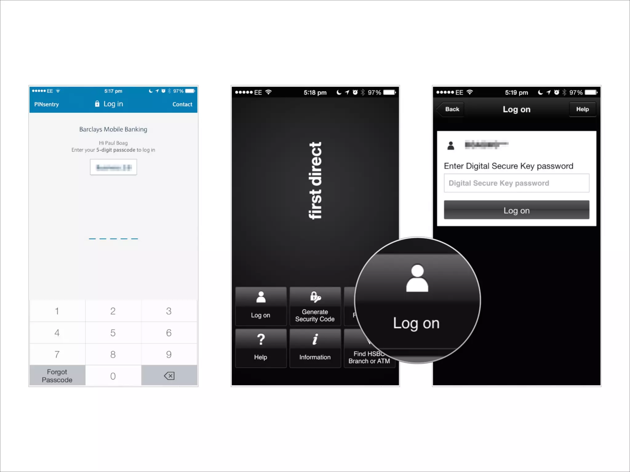
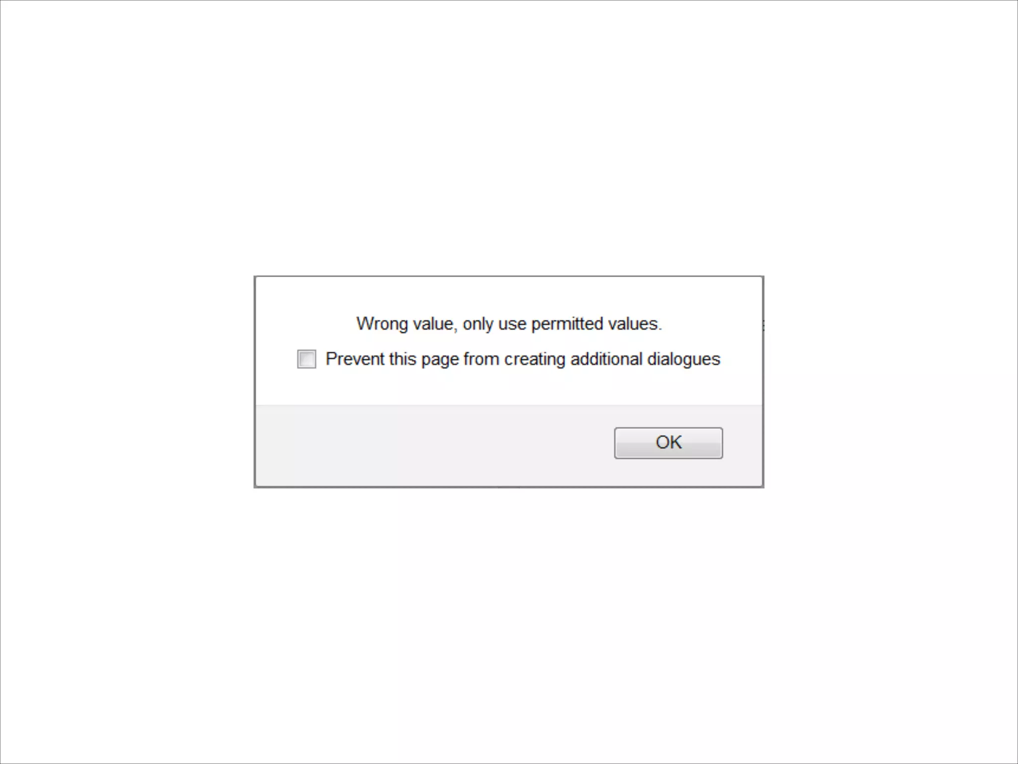
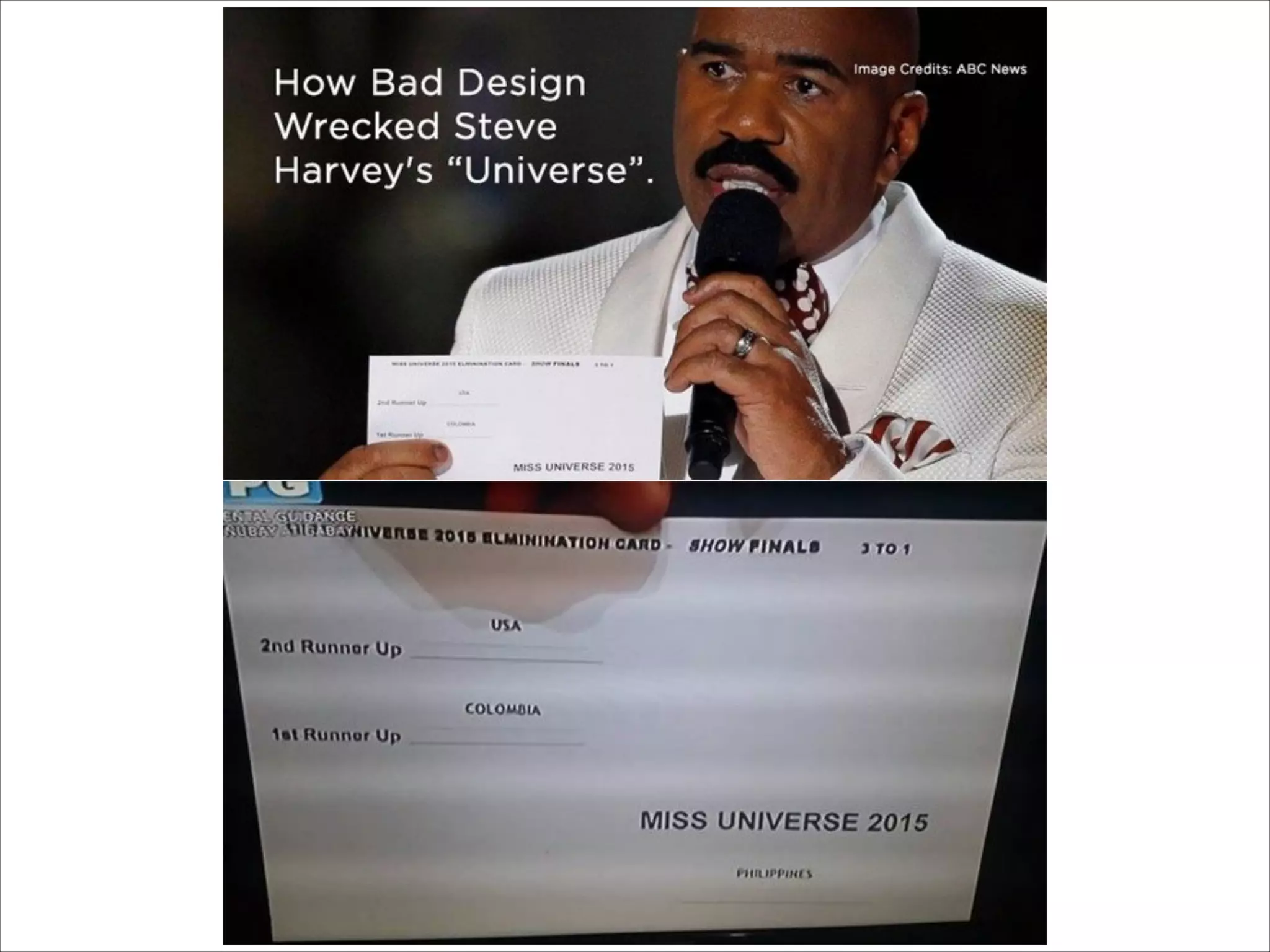
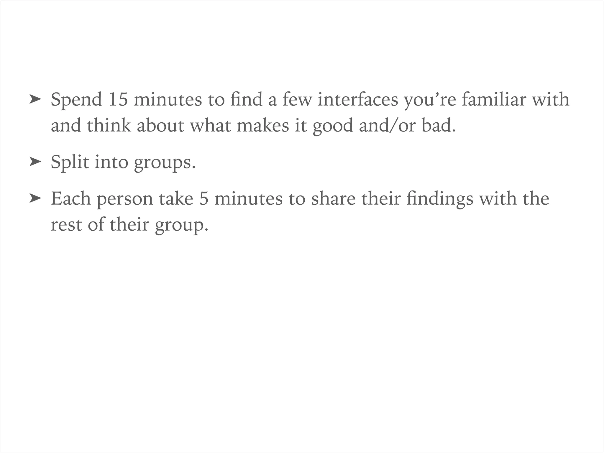
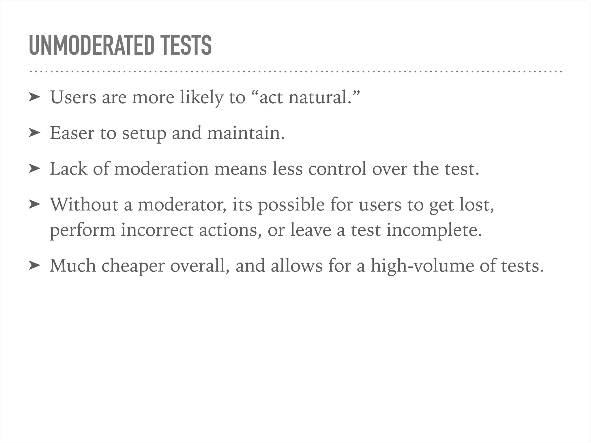
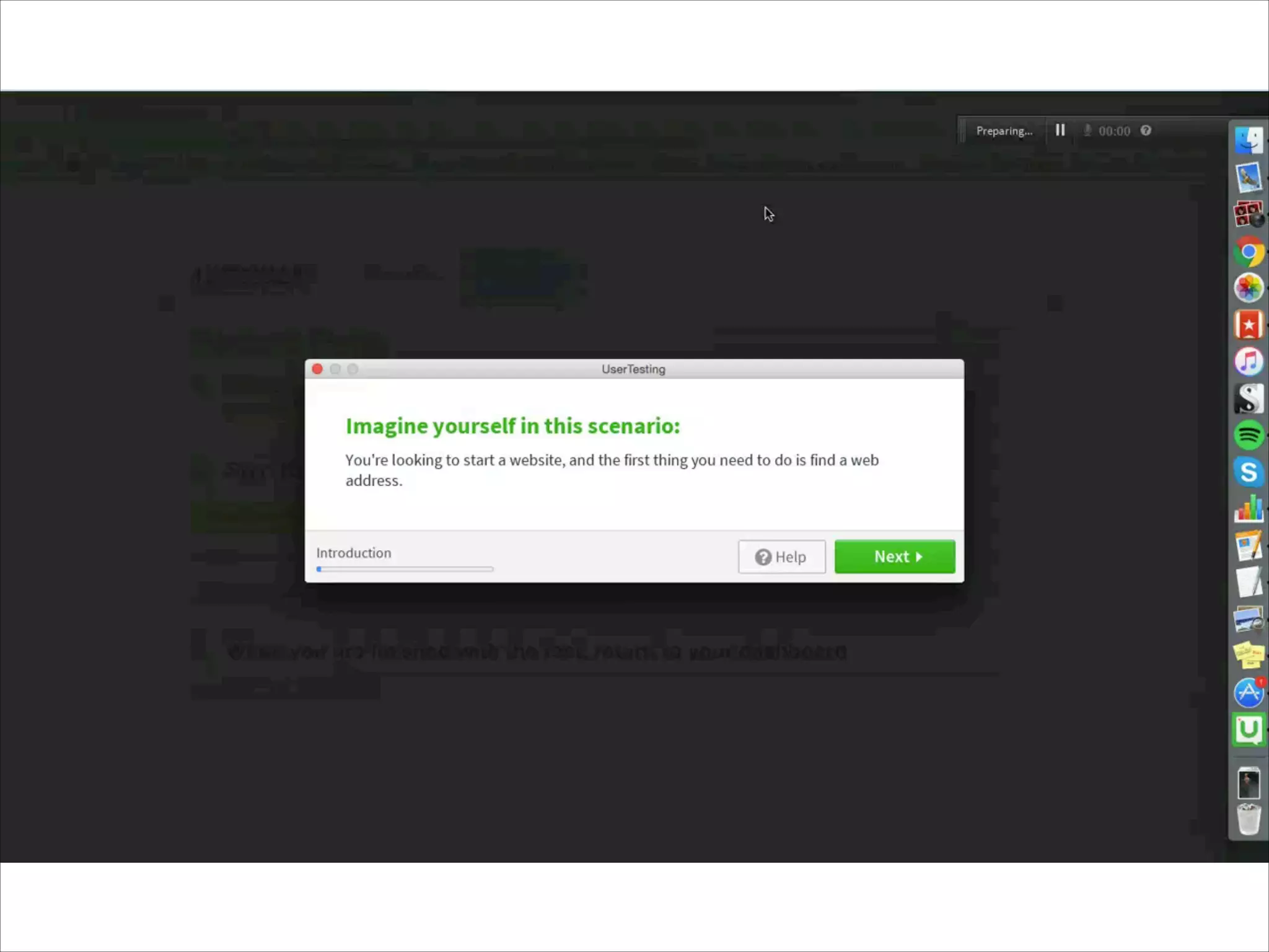
UI DESIGN BASICS
Automattic GM 2016
WELCOME
MIKE SHELTON
Spectrum Division, Cerulean
.blog, domains, and the WordPress.com store
SHAUN ANDREWS
Delta (NUX & retention)
Previously
Triton, Reader Squad
Editorial
dotOrg
VaultPress
THIS IS A DISCUSSION
Please feel free to ask questions anytime.
WHAT IS UI DESIGN?
LETS HEAR
FROM YOU
FIRST
Tell us your name, team, and
what UI Design means to you.
WHAT IS UI
DESIGN?
Making things that people
use to accomplish a task.
UI, UX, IA, IXD
RESEARCH
PROTOTYPING
TESTING
COPYWRITING
LAYOUT
COLOR
TYPOGRAPHY
Oh my…
USER EXPERIENCE (UX)
Focused on creating a positive overall experience
between a person and a system.
INFORMATION
ARCHITECTURE (IA)
Focused on organizing information to support
usability and “find-ability.”
INTERACTION
DESIGN (IXD)
Focused on the behavior of a system as a person
interacts with that system.
VISUAL DESIGN
Focused on imagery, colors, shapes, typography,
and form.
IT’S ALL CONNECTED
UI DESIGN PRINCIPLES
INTERFACES
ARE
OBVIOUS
A UI hints at how its used.
OBVIOUSNESS AND CLARITY
➤ Be able to recognize it.
➤ Care about why they would use it.
➤ Understand what the UI is helping them do.
➤ Predict what will happen when they use it.
➤ And successfully interact with it.
YOU AGAIN
What are some obvious UI’s
you’ve experienced.
INTERFACES
ARE
CONSISTENT
UI’s teach behavior.
INTERFACES
ARE
DYNAMIC
A UI reacts to input.
INTERFACES
CONSERVE
ATTENTION
Attention is a prerequisite for
use. Conserve it at all costs.
INTERFACES
ALLOW FOR
CONTROL
People like to feel in control.
DIRECT MANIPULATION
Design an interface with as little footprint as possible.
INTERFACES
PROVIDE A
NEXT STEP
Anticipate what the next interaction
should be and design to support it.
INTERFACES
ARE
HELPFUL
UI’s guide you towards
your goal.
INTERFACES
ARE
ACCESSIBLE
Anyone should be able to use it,
regardless of ability or device.
INTERFACES
ARE
USED
A UI that isn’t used,
is a failure.
VISUAL DESIGN DO’S
AND DON’TS
Some basics to keep in mind.
CONTRAST IS
KEY
Keep in mind visual
disabilities and legibility.
LINE LENGTH
AFFECTS
READBILITY
Not too long, not too short.
USE
HIERARCHY
TO HELP
Font, size, weight, color, and spacing can
help group and emphasis your message.
KEEP YOUR
AUDIENCE IN
MIND
Context matters.
DON’T LEAVE
WORDS
ALONE.
Orphans and widows .
KEEP FONTS
TO A
MINIMUM
Stick with one serif
and one sans-serif.
AVOID COLOR
DISCORD
Some colors just
don’t work together.
WHITE SPACE
IS YOUR
FRIEND
It’s not empty space.
GRAMMAR
MATTERS
The little details make
a big difference
KEEP IT
SIMPLE
Avoid gratuitous complexity
without good reason.
KEEP AN EYE
ON LEADING
Line-height can
impact readability.
ALWAYS
TRUST YOUR
EYE
“Technically” right isn’t
always right.
AVOID ALL
CAPS
Said the man who’s slides use
gratuitous all caps.
KEEP YOUR
FONT SIZES
SANE
Consider viewing distance,
screen size, and readability.
MOTION
Real world interfaces move.
MOTION
TELLS A
STORY
Interfaces are stories, too.
THE
ILLUSION OF
LIFE
Learn from Disney animators.
http://the12principles.tumblr.com
http://wp.me/puPv3-2xz
COPY AS DESIGN
KNOW YOUR
AUDIENCE
Users should be able to read
and understand all of the text.
YOUR TURN
What are some idioms that
don’t cross cultural boundaries?
BRIEF BUT
INFORMATIVE
People can only process small
amounts of information at one time.
REMOVE
IRRELEVANT
INFO
Only give them what they
need to complete their task.
WORDS
MATTER
Use the most effective and
accurate words.
USE THE
ACTIVE VOICE
Move people to take action.
MAKE IT
PERSONAL
Make it a pleasant and even
humorous experience.
TERRIBLE UI
What makes a UI bad?
“Bad user interface
design is death by
a thousand cuts
-Paul Boag
GROUP ACTIVITY
Lets break up into groups and find some examples
of good/terrible UI.
➤ Spend 15 minutes to find a few interfaces you’re familiar with
and think about what makes it good and/or bad.
➤ Split into groups.
➤ Each person take 5 minutes to share their findings with the
rest of their group.
USER TESTING 101
LETS DO A USER TEST
Its super easy.
WHY DO WE TEST?
You’ll never guess what happens next…
MODERATED VS.
UNMODERATED
A few key differences.
MODERATED TESTS
➤ Perfect for early stages of design, like prototypes.
➤ Moderators can ask questions to obtain a deeper
understanding of users.
➤ Moderators can help keep users on track, and clarify
confusion to help complete a test.
➤ People act differently when someones watching them.
➤ Can be time consuming and costly.
UNMODERATED TESTS
➤ Users are more likely to “act natural.”
➤ Easer to setup and maintain.
➤ Lack of moderation means less control over the test.
➤ Without a moderator, its possible for users to get lost,
perform incorrect actions, or leave a test incomplete.
➤ Much cheaper overall, and allows for a high-volume of tests.
TREE TESTINGS
Strip away the visuals and focus on the
information architecture.
BENCHMARK TESTING
Get a raw measurement of user performance.
HALLWAY TESTING
Grab the next person to walk by the hallway and
have them use your UI.
LETS WATCH SOME
UIDB -  Day 1
UIDB -  Day 1

UIDB - Day 1