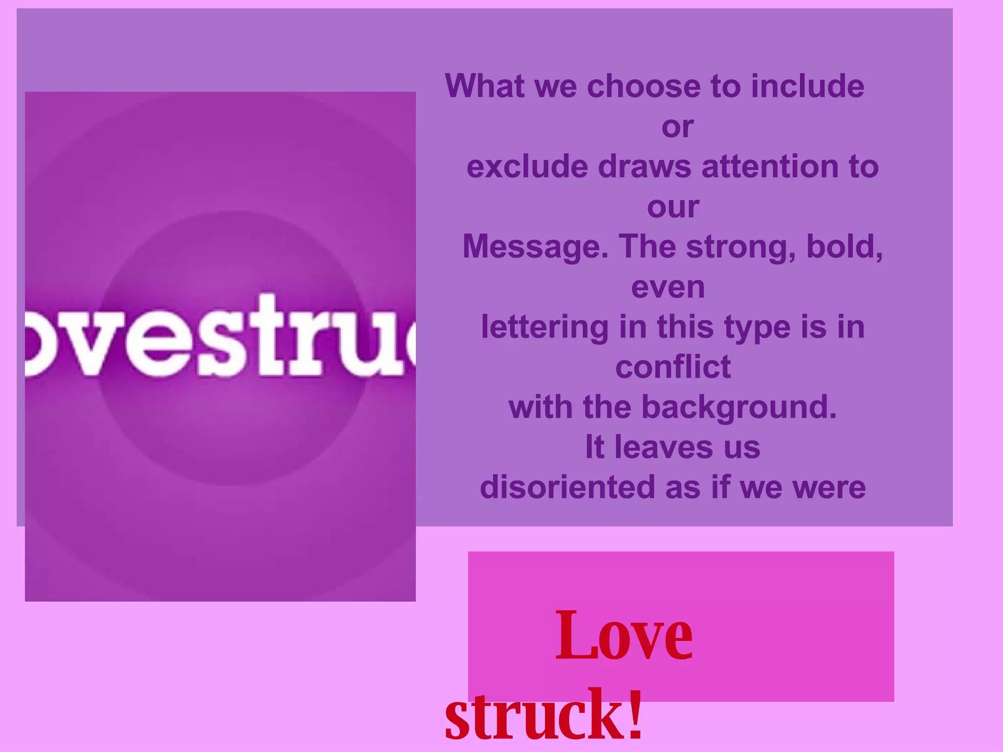
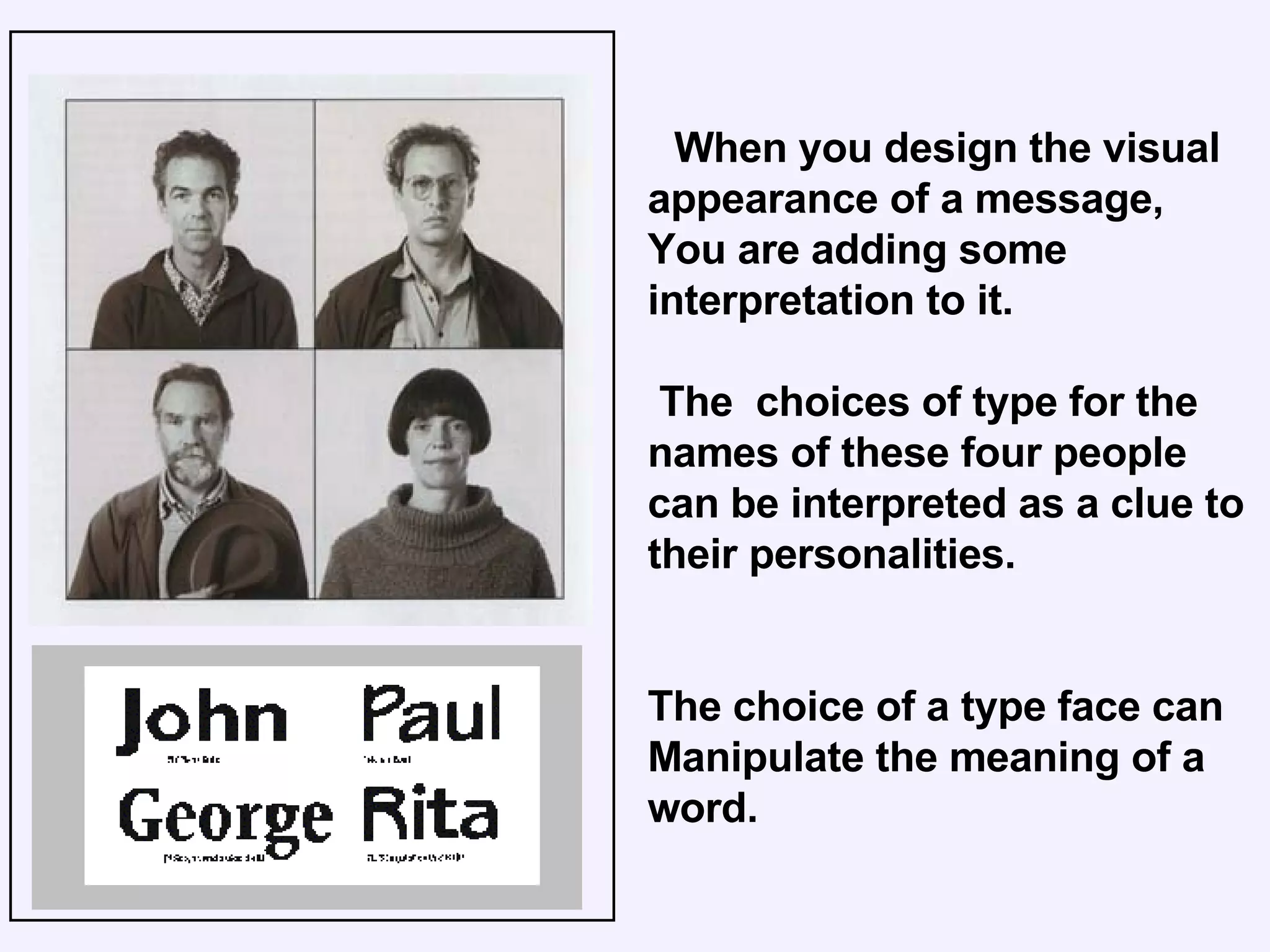
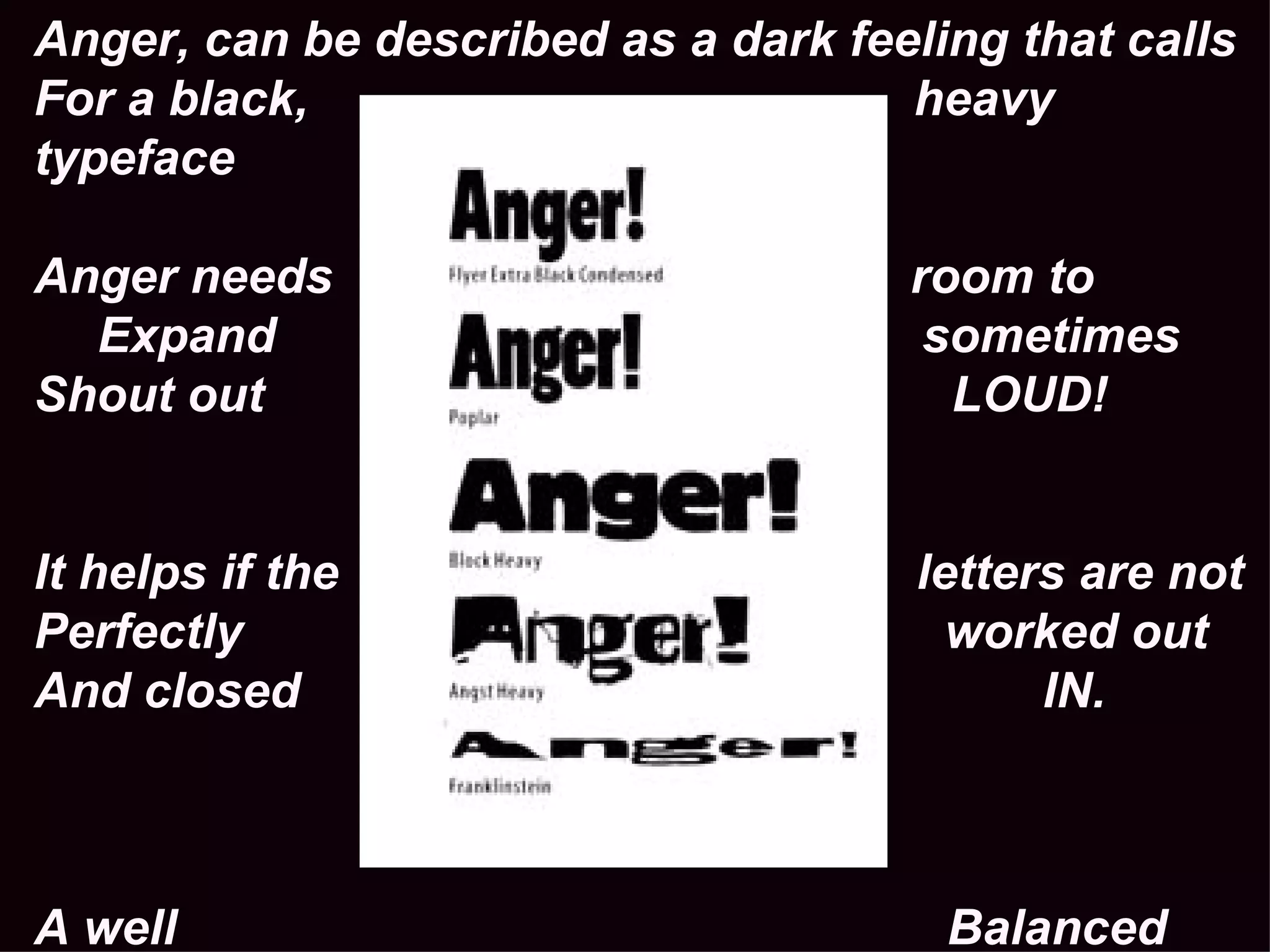
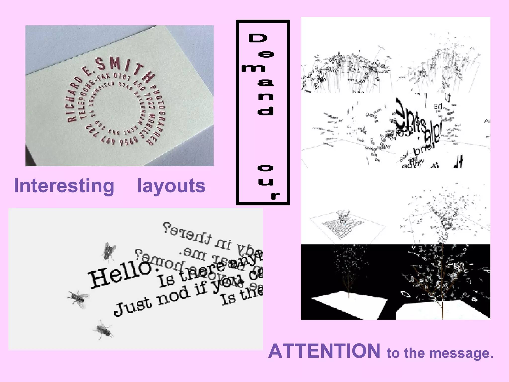
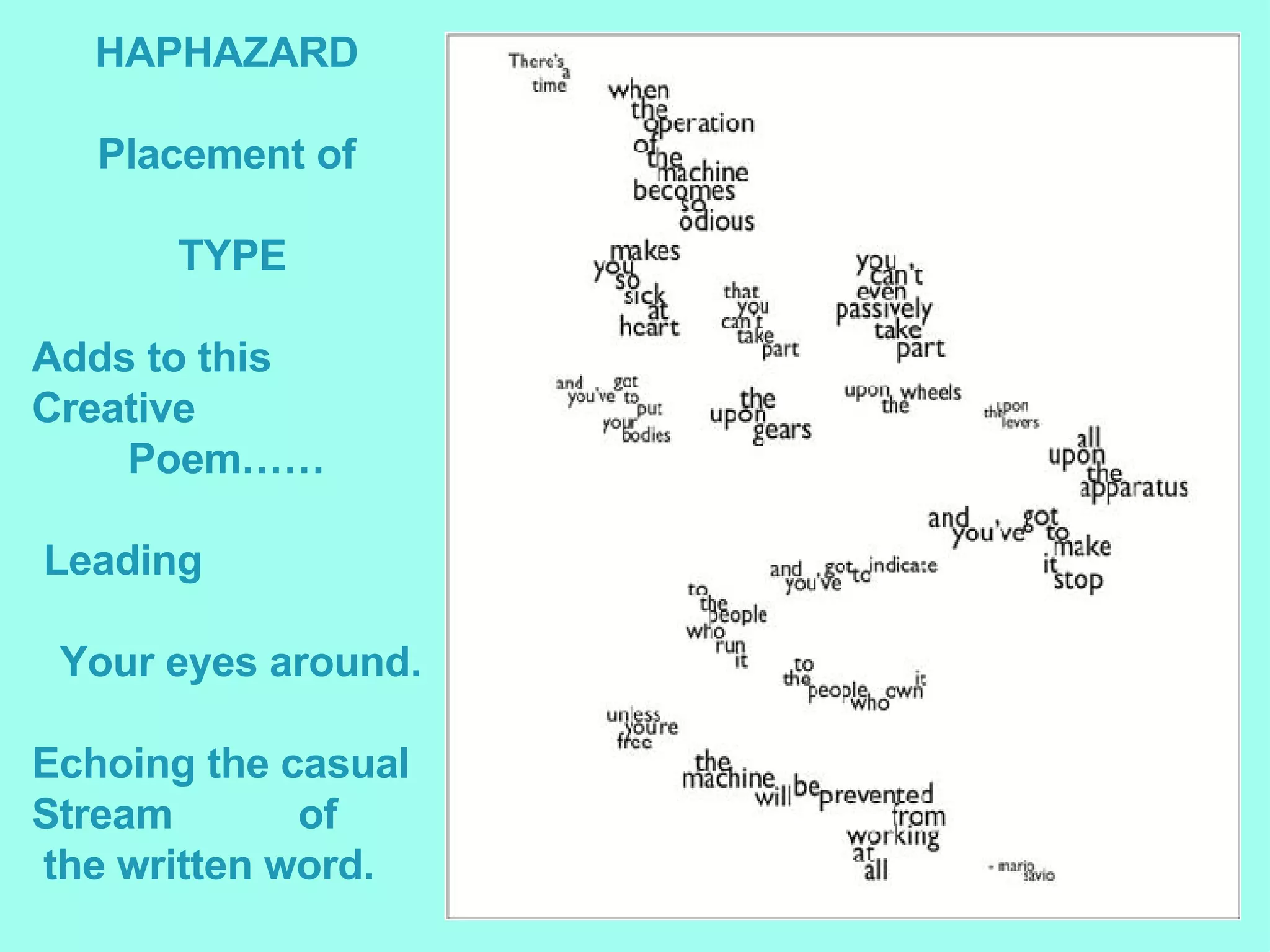
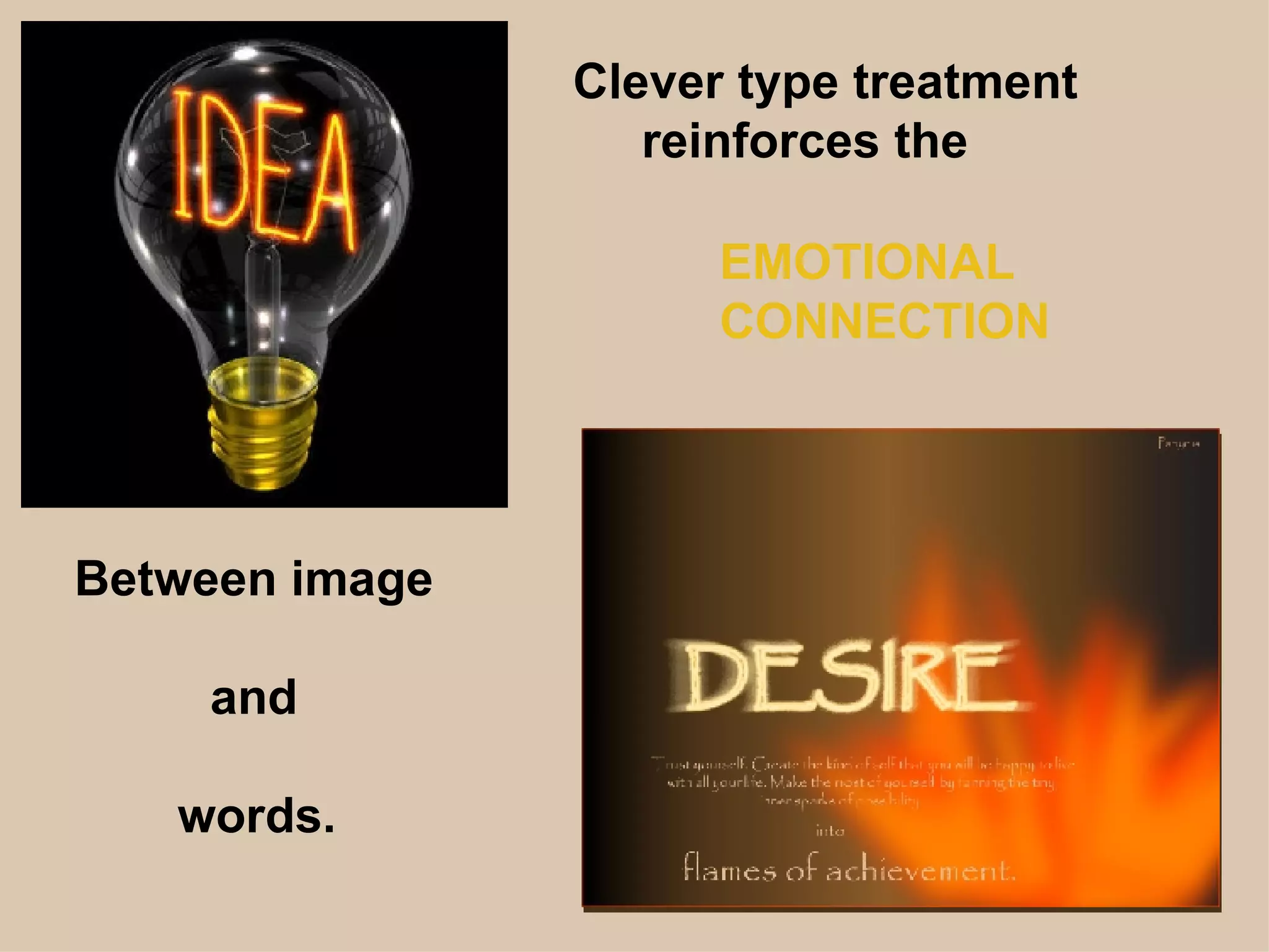
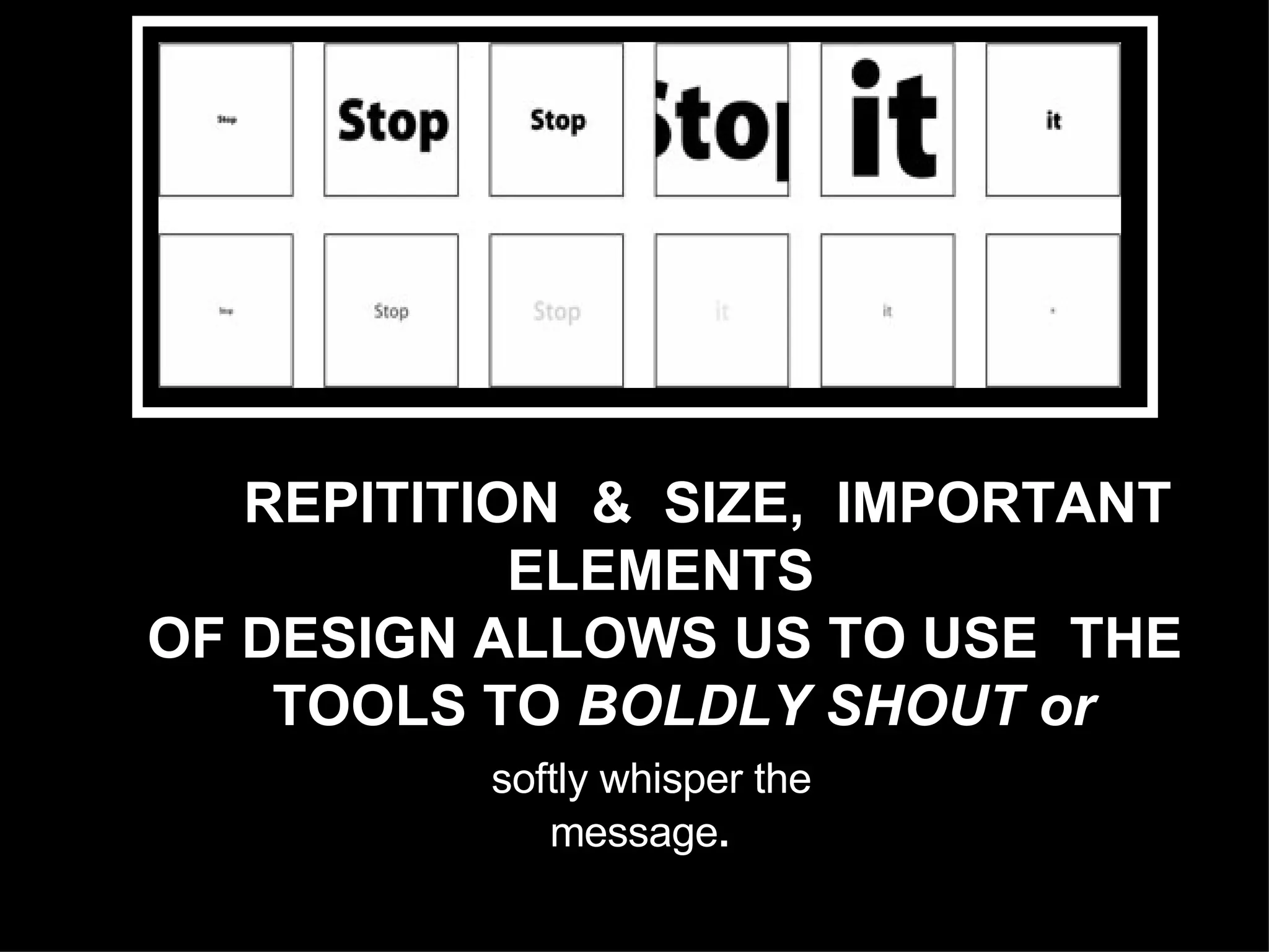
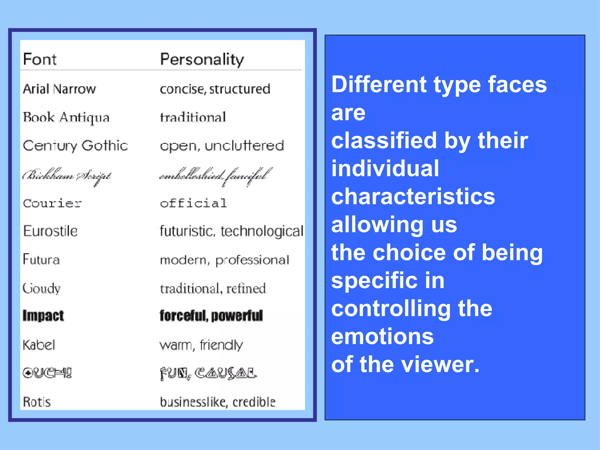
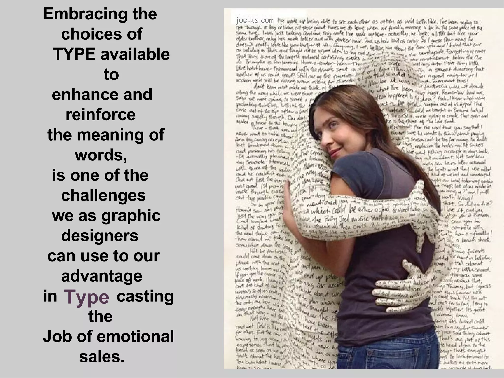
2. As children we relate to the world first through images. Then we are given a set of letters and we learn that when we combine them we can define what we see visually. As Graphic Designers we push the envelope one step further. By using specific fonts we can illustrate the emotion behind the words.
3. What we choose to include or exclude draws attention to our Message. The strong, bold, even lettering in this type is in conflict with the background. It leaves us disoriented as if we were Love struck!
4. When you design the visual appearance of a message, You are adding some interpretation to it. The choices of type for the names of these four people can be interpreted as a clue to their personalities. The choice of a type face can Manipulate the meaning of a word.
9. REPITITION & SIZE, IMPORTANT ELEMENTS OF DESIGN ALLOWS US TO USE THE TOOLS TO BOLDLY SHOUT or softly whisper the message .
10. Different type faces are classified by their individual characteristics allowing us the choice of being specific in controlling the emotions of the viewer.
11. Embracing the choices of TYPE available to enhance and reinforce the meaning of words, is one of the challenges we as graphic designers can use to our advantage in casting the Job of emotional sales. Type
12. To research this topic further see links below: www.designingwithtype.com/essays/essayRand.html http://experiencedynamics.blogs.com/site_search_usability/2004/08/ http://www.creativepro.com/story/feature/17988.html