This document provides context about the exhibition "TWO-FACED FAME: Celebrity in Print: 1962 - 2013" at the Kent Print Collection. It discusses how artists in the 1960s incorporated celebrity imagery into their work in response to changes brought by new media. Specifically, it analyzes Richard Hamilton's 1965 work "My Marilyn" which appropriated contact sheets from Marilyn Monroe photo sessions shortly before her death, featuring her editorial markings. The work explored photography's limits as communication through the tension between Monroe's image and aggressive self-editing marks.
'Bad' Painting and the work of Anton HenningJames Clegg
This lecture users the theme of taste to explore the subject of postmodernism, building to a consideration of 'Bad' Painting and the work of German artist Anton Henning. By James Clegg
'Bad' Painting and the work of Anton HenningJames Clegg
This lecture users the theme of taste to explore the subject of postmodernism, building to a consideration of 'Bad' Painting and the work of German artist Anton Henning. By James Clegg
A lecture designed to introduce the basic principles of Modernism and its fragmentation in the 1960s. Its basic emphasis is upon the plurarity of forms of art spawned from reactionary and critical break with Greenberg's notion of 'pure', autonomous disciplines.
(If you want to read my notes, download this presentation).
PHOT 154, History of Photography, Grossmont College, Family of Man exhibition, Photography in South America, Photography in West Africa, Photography in Japan, Cold War
PHOT 154, History of Photography, Grossmont College, Photography and Mass Media, DADA, Surrealism, Surrealist Photography, Duchamp, Man Ray, Readymade, Rodchenko, Photomontage, Hannah Hoch, Maholy-Nagy, Hans Bellmer, Claude Cahun, André Kertész, Henri Cartier-bResson, Paul Outerbridge, Bauhaus, Experimental Photography and
Advertising, California Modern, f64 Group, Straight Photography, Film und Foto exhibition
What's New in the Surreal World - Surrealism isn’t dead - Its dreaming. By Te...bienvenidobonesbanez1
What's New in the Surreal World - Surrealism isn’t dead - Its dreaming. By Terrance Lindall
H.R. Giger, “Birth MachineBaby,” 1998, bronze.Yuko Nii, “Sand Harbors of theAncient Planet,” 1996, oil on linen.Kelly Newcomer, “Hello I Love YouRobot” (left), 2003, acrylic on ceramicwith LEDs. include all derivatives of surrealismunder the category “Pansurrealism” todescribe an all-inclusive artistic stylederived from ideas in Breton’s 1924 Man-ifesto of Surrealism. There are three rea-sons to use this term. First, all of theseart types being debated evolve out of orare inspired by dream states and the sub-conscious (as put forth by Breton) or anautonomous “re-aspecting” of reality.Second, class theory in philosophy com-pels the naming of the class to whichthese art types belong. And third,by using one term rather than anexpression, it is most accurate tocall the class to which thesecommon art types belong“Pansurrealism.” While onecould just call them all “surre-alists,” the purists cannot seemto allow it and the debatewould continue ad infinitum. In his Manifesto, Bretondefines surrealism as “pure 164ART & ANTIQUESOver the past fewyears I have noted themajor shows on surrealismlaunched at the Guggenheim, the Metro-politan Museum of Art and the NationalAcademy of Design in New York, as wellasthe Philadelphia Museum and thePompidou Centre in Paris. They docu-ment the subject very well—on theassumption that surrealism died in the1960s or that only a vestigial group ofsurrealists still practice, such as Leonora Carrington in Mexico. However, nothingcan be further from the case. In fact, oneESSAYof the largest and mostdynamic art movementsworldwide today is surreal/visionary. What do Surrealism,Surreal/Conceptual, Vision-ary, Fantastic, Symbolism,Magic Realism, the ViennaSchool, Neuve Invention, Outsider, theMacabre, Grotesque, Singulier Art, Char-acterism and Massurrealism have in com-mon? Though each has fine differences,they all evolve from an artistic styleinherent to the thinking of André Breton,the leader of the surrealist movement. In recent years there has been a dis-pute internationally among my col-leagues regarding the artists who cantruly be considered surrealists, but tomake things simple I decided toSome of the top new surrealists; onecan collect the best works by theseartists for $2,000 to $100,000:uUnited States:Roberto Venosa, Yuko Nii, Antanas Adomaitis, Kris Kuksi, Chris Mars, Christina Dallas, Dana Parlier, Tim Slowinski,Madeline von Foerster, TheoKamecke, Bethany Jean Fancher,Alex Grey, Richard Huck and Cynthia von Buhler. What’sNew in theSurrealWorldSurrealism isn’tdead—it’s dreaming.By Terrance Lindall / uEurope:Von Strop, De Es Schwertberger, H.R. Giger, Daniel Hanequand, Hawk Alfredson and Wolfgang Grasse. uRussia:Dmitry Yakovin, Sofia Baturina and Dmitry Pahomov. uColombia:Mariu Suarez. uPhilippines:Bienvenido “Bones” Banez. uAustralia:Damian Michael's. Top Contemporary Surrealists
Two-Faced Fame Catalogue (writing sample on slide 20 and 45)
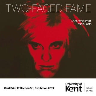
1. TWO-FACED FAME
Kent Print Collection 5th Exhibition 2013
Celebrity in Print:
1962 - 2013
2. Acknowledgements:
This exhibition would not have been possible without the kind
generosity and support of artists, art dealers, galleries, lenders and
curators. We are very grateful to: Artizan Editions, Hove; Meri Atkin
at Livestock Market, St. Pancras Editions, London; Manifold Editions,
London; Advanced Graphics, London; White Cube, London;
Jonathan Yeo; Stella Vine; GSG; Sam Ogilvie; Gavin Turk; The Laing
Foundation; Ingleby Gallery, Edinburgh; Gallerie Simpson, London;
Goldmark Gallery, Rutland; Paul Stolper, London; Julian Page,
London; Brandler Galleries, Essex; Sims Reed, London; Professor
Stephen Bann; John and Joseph Hayes; Hawkswells, Canterbury;
BSP; Infinite Imagery; CKN Print of Northampton and Steve Allen.
At the University of Kent, our sincere thanks are due to: John
Buckingham; Creative Campus; Dr. Jonathan Friday; Rebecca
Goodall; Professor Martin Hammer; Michael Healey; Mike Keeling-
Smith; Dr. Louise Naylor; Dr. Michael Newall; No-Wave; Dr. Grant
Pooke; Katie Scoggins; Paul Sharp; Dennis Smith; The Estates
Department; Dr. Sian Stevenson and Dr. Ben Thomas.
Photographic Credits
The authors and publisher have made all reasonable efforts to
contact copyright holders for permission, and apologise for any
omissions or errors in the form of credits given.
Pages 2&3
3. TWO-FACED FAME
Celebrity in Print: 1962 - 2013
Kent Print Collection 5th Exhibition 2013
Studio 3 Gallery, Jarman Building, Canterbury:
28 May – 14 June 2013
Edited by Michael Healey
Written by:
Sila Aslan; Adam Ball; Molly Barrs; Anastazia Bromovsky; Lydia Burrell;
Luke Carver; Isabelle Chambury; Frances Chiverton; Lynne Dickens;
Steven Douglas; Luke Doyle; Bethany Gibbs; Joseph Hayes; Felicity
Heath; Lauren Holmes; Laura Jones; Sebastian Jordahn; Anna Lidster-
Woolf; Isolde Proud; Andrew Tan Wei Aun; Rose Thompson and
Christina Tsakiriou.
5. Andy Warhol: Some company recently was interested in
buying my ‘aura’. They didn’t want my product. They kept
saying, ‘We want your aura’. I never figured out what they
wanted. But they were willing to pay a lot for it.1
What is a celebrity? A ‘human pseudo-event’ overshadowing
genuine heroes? ‘The spectacular representation of a living
human being’ in a society defined by spectacle where social
relations are mediated by images? A readily available ‘dream that
money can buy’ in the photographic brothel? Or, is a celebrity a
‘mythical concept’ where myth is understood to be a system of
communication, where the material of the message has already
been worked on to enhance its suitability for communication,
and where the mythical concept’s fundamental property is to be
appropriated?2 All of these theories about celebrity emerged from
the ferment of ideas and criticism stimulated by new media in the
late 1950s and 1960s. It seemed that a world was emerging where
electric circuitry ensured a constant flow of information and where,
as Marshall McLuhan argued, ‘our electrically-configured world
has forced us to move from the habit of data classification to the
mode of pattern recognition’.3 Celebrities, recognisable to a wide
audience for their fame, wealth, beauty or notoriety, give form and
focus, therefore, to the ever shifting flood of data provided by mass
media. Whether their effect is to connect or alienate, their function
is semiotic.
Artists in the 1960s were also intensely aware of, and receptive
to, changes brought about by new media; in fact, according to
McLuhan, they were the only people to consciously adjust to the
challenge of new technological extensions of human faculties,
anticipating their impact, and imaginatively building ‘models or
Noah’s arks for facing the change that is at hand’.4 Turning away
from the prevailing tendency for abstraction in the post-war period,
artists began working – as Robert Rauschenberg put it – in the
gap between life and art. The composer John Cage described
the four panels of Rauschenberg’s White Painting (1951, New York,
The Robert Rauschenberg Foundation) as ‘airports for the lights,
shadows and particles’, and pointed to the artist’s receptivity to his
1 A. Warhol, The Philosophy of Andy Warhol, first published 1975, London: Penguin, 2007,
p. 77.
2 D. J. Boorstin, The Image or What Happened to the American Dream, first published
1962, Harmondsworth: Penguin, 1963, p. 75; G. Debord, Society of the Spectacle,
first published 1967, Detroit: Black & Red, 1983, 60 [unpaginated]; M. McLuhan,
Understanding Media, first published 1964, London and New York: Routledge, 2001, p.
205; R. Barthes, ‘Myth Today’ in Mythologies, first published 1957, London: Paladin, 1989,
p. 117-19, and p. 129.
3 M. McLuhan, Quentin Fiore and Jerome Agel, The Medium is the Massage, first
published 1967, London: Penguin, 2008, p. 63.
4 McLuhan, Understanding Media, (note 2), p. 71.
surroundings symbolised by the incorporation of three functioning
radios into one of his ‘combines’.5 The combine, collage, the
adapted readymade, were all approaches to art that produced
associative, open compositions that let contemporary life back
into the art work. As Cage put it, faced with an empty canvas
‘the subject looms up’, and an integral part of the environmental
information channelled by the artist is celebrity: ‘Is Gloria V. a
subject or an idea? Then, tell us: How many times was she married
and what do you do when she divorces you?’6
In particular, commercial printmaking techniques like
screenprinting, photo-etching and colour lithography allowed
photographic imagery to be assimilated to the fine art print, and
consequently printmaking became more central to the practice
of artists: as Lawrence Alloway said of Rauschenberg: ‘[his] prints
belong in the main course of his development and are in no sense
peripheral’.7 Prints, in turn, became more experimental and less
bound by the rules established for ‘original prints’ by the Print
Council of America in 1961 – in fact, Joe Tilson, whose own taste in
celebrities was for political icons like Che Guevara and Ho Chi Minh,
set out to consciously break the rules of printmaking by tearing,
burning, crumpling, attaching objects, and painting and drawing on
his prints. The critic Leo Steinberg, in describing the major shift that
he perceived had occurred in contemporary art, even drew on a
term from printmaking: the flatbed picture plane.
The flatbed picture plane ‘makes its symbolic allusion to hard
surfaces such as tabletops, studio floors, charts, bulletin boards
– any receptor surface on which objects are scattered, on which
data is entered, on which information may be received, printed,
impressed – whether coherently or in confusion. The pictures of
the last fifteen to twenty years insist on a radically new orientation,
in which the painted surface is no longer the analogue of a visual
experience of nature but of operational processes’.8
Steinberg’s principal example of an artist working with the
flatbed picture plane was Rauschenberg, for whom the precursor in
this regard had been Marcel Duchamp.
Perhaps the most ubiquitous celebrity to feature in the art
of the 1960s was Marilyn Monroe, combining as she did pin-up
allure with the tragedy and mystery of her death. Alloway divided
the phenomenon of ‘Marilyn as Subject Matter’ into two phases:
5 Cage, Silence: Lectures and Writings, first published in 1968, London and New York:
Marion Boyars, 2009, pp. 98-108.
6 Ibid, p. 99.
7 L. Alloway, ‘Rauschenberg’s Graphics’ in Topics In American Art since 1945, New York
and London: Norton, 1975, p. 125.
8 L. Steinberg, Other Criteria, first published 1972, London and Chicago: University of
Chicago Press, 2007, p. 84.
Most Wanted, Even…
6. before and after her untimely death in 1962.9 In the first phase it
was Marilyn Monroe as screen idol - ‘her physical and carnal image,
intimate and conventionalized’ – that fascinated artists, whether she
emerged unbidden as in Willem de Kooning’s 1954 painting as part
of his Women series, or artfully deployed as part of an installation
in the Independent Group’s This is Tomorrow exhibition at the
Whitechapel Gallery in 1956. She can be found, along with Elvis
Presley and James Dean, in the late 1950s collages of Ray Johnson,
and in the works of the pioneers of British Pop – abstracted from
a Paris Match cover by Richard Smith, incorporated into mosaics
of desire by Peter Blake, or set against her French rival Brigitte
Bardot in a sort of pinball game For Men Only – Starring MM and
BB in 1961 by Peter Phillips. It was in the year of her death that Andy
Warhol produced Gold Marilyn, the Marilyn Diptych and Marilyn’s
Lips – all part of his fascination with what Hal Foster has called ‘the
distressed image’.10 Marilyn also appeared in 1962 torn and frayed
in the recovered posters of Mimmo Rotella, with her features to
be reassembled by the viewer in Allan D’Arcangelo’s pop portrait,
glossy as a commodity in James Rosenquist’s spray-painted art,
and then more touchingly and respectfully in 1963 in Pauline Boty’s
The Only Blonde in The World and Colour Her Gone.11
Alloway argued that the one exception to the ‘dropped level
of post-1962 MM pictures’ was Richard Hamilton’s My Marilyn
(1965). Hamilton had shown a previous interest in Marilyn Monroe,
as he was part of the design team that included the iconic still
photograph of her from Billy Wilder’s 1955 film The Seven Year
Itch in the display for This is Tomorrow (where she appears quite
unaware of a looming giant Robbie the Robot from Forbidden
Planet behind her, and a similarly outsized nearby bottle of
Newcastle Brown). Admiring the way that Marilyn had stood by
her husband Arthur Miller, during the author’s ordeal before the
House Un-American Activities Committee in 1956, Hamilton had
even carried a life-size cut-out of Marilyn Monroe on the 1958 CND
march to Aldermaston as an anti-Establishment symbol.12
The photographs that Hamilton used in My Marilyn were
taken at Santa Monica beach on 13 July 1962 by George Barris - a
friend of the film star who was working on a book project with
her - and showed Marilyn in a bikini spontaneously playing with a
large piece of seaweed. Barris’s photo session appears to capture
9 L. Alloway, ‘Marilyn as Subject Matter’, first published 1967, in Topics in American Art
since 1945, New York and London: Norton, 1975, pp. 140-44.
10 H. Foster, The First Pop Age, Princeton and Oxford: Princeton University Press, 2012, pp.
109-171.
11 For these examples and more, see: M. Livingstone, Pop: A Continuing History, London:
Thames and Hudson, 2000.
12 A. Wilson, Richard Hamilton: Swingeing London 67, London: Afterall Books, 2011, p. 11.
an intimate glimpse of the person behind the screen persona,
with Marilyn seemingly un-posed and in high spirits shortly before
her death on 5 August 1962. Marilyn’s own editing marks on the
contact sheets from this session, and also from a slightly earlier
photo session for Vogue with Bert Stern in late June 1962, took
on the status of clues following what the coroner described as
her ‘probable suicide’.13 This is, presumably, partly what motivated
the posthumous publication in various magazines of the contact
sheets with Marilyn’s emphatic lipstick crosses, and under-linings
and ticks gouged into the surface with nail files, rejecting
or approving particular shots. Hamilton saw the Barris contact
sheets in the November 1962 of Town magazine, and Stern’s
photographs in the autumn volume of Eros of the same year, and
he commented on how Marilyn’s indications were ‘brutally and
beautifully in conflict with the image’, and how the ‘aggressive
obliteration of her own image has a self-destructive implication
that made her death all the more poignant’. Alongside the violence
with which the actress controlled her own self-image, Hamilton
also detected a ‘fortuitous narcissism for the negating cross is also
the childish symbol for a kiss. My Marilyn starts with her signs and
elaborates the graphic possibilities these suggest’.14
Therefore, in a way consistent with Roland Barthes’s analysis
of contemporary myth, the photographic material that Hamilton
appropriated had already been extensively ‘worked on’: firstly
by Marilyn herself, and secondly by the editors and designers of
the stylish magazines Town and Eros. However, the ‘brutal and
beautiful’ contrast between the photographic image of the star and
her own editorial indications suggested space for a ‘mythologist’
like Hamilton to do further work. The contact sheets confront the
viewer with two orders of indexicality: that of the photographic
image, created by light reflected from its subject, and that of the
expressive, almost scar-like marks left as surface traces by the
violent gestures enacted by Marilyn on her photographs. Richard
Morphet has argued that My Marilyn was the project in which
Hamilton’s interest in exploring the limits of photography as a
means of communication was first manifested, but this interest
developed in tension with the ambiguous implications of Marilyn’s
own ‘action painting’.15
13 For an account of the circumstances of Marilyn Monroe’s probably accidental death,
see: D. Spoto, Marilyn Monroe: The Biography, London: Chatto & Windus, 1993, pp. 641-
658.
14 R. Hamilton, Collected Words, 1953-1982, London and New York: Thames and Hudson,
1982, p. 65. Cited also in R. Morphet, Richard Hamilton, exhibition catalogue, London:
Tate, 1970, p. 57. This text originally published in Richard Hamilton, Paintings 1964-66,
exhibition catalogue, New York: Galerie Alexandre Iolas, 1967.
15 Morphet, (note 14), p. 57.
Pages 6&7
7. Taking his cue from Barris’s four black and white 35mm
contact prints, Hamilton first produced a ‘paste-up’ establishing the
composition of his work (1964, Cologne, Museum Ludwig), which
divides roughly into six sections in a grid pattern with the original
contact sheet of four photographs occupying the middle position
on the lower tier of the grid. The contact sheet appears again in
the upper left corner, enlarged and cropped at the left and top of
the sheet (so that Marilyn’s comment 'Good' with a tick is removed).
The remaining four spaces on the ‘grid’ are then filled with enlarged
versions of the four photographs, rearranged in such a way that
the enlarged version of the chosen shot occupies the bottom right
corner and is encircled by a curving sweep of disapproving crosses
(or perhaps a halo of kisses?). By contrast the image approved by
Marilyn recurs three times in a diagonal pattern from upper left to
lower right, emphasised by the emphatic L-shaped framing mark
with which Marilyn singled it out, together with an arrow that now
has a directional as well as indicative function. The compositional
process adopted by Hamilton here (quite different from his usual
concern with perspective) could be said, paraphrasing McLuhan,
to involve the recognition of patterns in the changing flow of
information, and also to follow the associative logic of the flatbed
picture plane.
The ‘paste-up’ then initiated a process of systematic analysis
that resulted in 1965 in a ‘painting’ consisting of oil and collage
over photographs on panel (Stadt Aachen, Ludwig Forum für
Internationale Kunst) and a screenprint, printed in an edition of
75 by Chris Prater of Kelpra Studios. Hamilton produced his own
trial proofs of prints using an experimental process, based on
borrowed screens from Newcastle University’s textile department,
before involving Prater’s expertise in stencil-cutting for the final
screenprint. Throughout, the process of translation from one
medium to another remains the focus of the artistic work, so
that it would be misleading to say that the print was ‘after’ the
unique and hand-made painting. Rather, because screenprint can
incorporate photographic sources, it could be said to mediate
between the collaged ‘paste-up’ and the ‘painting’, while also
playing with photographic reversal, accidental textural effects,
and a colour palette whose pinks, blues, and greys, together with
dashes of purple and orange, seems like a knowing tribute both to
De Kooning and to Stern’s photographs of Marilyn posing with a
transparent orange and white scarf. Where the screenprint could
be said to interrogate the photographic language of the original
contact sheet – through repetition, cropping, enlargement and
negative reversal – the painting develops the brutal beauty of
Marilyn’s handmade marks in a series of sustained interventions
that, as Morphet commented, elaborate ‘the principle of
interference with given information’ to the point where even the
repeated use of images becomes unreadable.16 The approved
image in the bottom right corner, for example, is totally effaced,
becoming merely a blank space outlined by Marilyn’s contour and
bikini lines. Hamilton’s systematic analysis of the process by which
Marilyn arrived at her own approved self-image, involved switching
between positive and negative photographic images, between
index and icon, and – in McLuhan’s terms – between the ‘hot’
medium of photography and the ‘cold’ one of paint. The focus is
therefore on the nature of communications media, and the process
of translation between them, in constituting Marilyn as multiple and
conventional.17
The emphasis in Hamilton’s exploration of the celebrity aura
of the tragic and charismatic Marilyn is on process, and in this he
differs from Warhol who preferred to work with a posed publicity
shot for the film Niagara taken in 1953. For Warhol, Marilyn is a
singular icon, one that can be differently inked and repeated to
fade in works that blur the line between painting and screenprint,
but essentially unchangeable – Warhol liked ‘exact’ repetition that
rendered the image ultimately meaningless. Whether Hamilton’s
Marilyn turns out to be ‘the master artist of her own powerful
iconicity’, as Hal Foster has argued, or the author of her own
annihilation is left more ambiguous.18 It seems fitting that Hamilton
would turn later in 1965 to the project of a full-scale copy of
Duchamp’s The Bride Stripped Bare by Her Bachelors, Even as
Marilyn like The Bride remains, in spite of prolonged media analysis,
an unobtainable object of desire. The fascination of her iconic aura,
and the means by which her myth was established, goes a long
way to explaining the enduring interest in celebrity figures shown
in the work of the artists displayed in this exhibition.
Ben Thomas
Curator of Studio 3 Gallery
16 Morphet, p. 86.
17 McLuhan, Understanding Media, (note 2), p. 211: ‘Instead of depicting a world that
matched the world we already knew, the artist turned to presenting the creative
process for public participation. He has given to us now the means for becoming
involved in the making-process.’
18 H. Foster, ‘Notes on the First Pop Age’, in Hal Foster with Alex Bacon (eds), Richard
Hamilton: October Files, Cambridge, Mass. and London: MIT Press, 2010, p. 60.
8. Curators’ Foreword
Beginning with Andy Warhol as a reference point, Two-
Faced Fame pushes some of his British contemporaries,
such as Sir Peter Blake, Gerald Laing and Joe Tilson, whose
contributions to the Pop Art movement have arguably been
overlooked, into the limelight. Subsequently, our focus is on
contemporary British art. By displaying work from the 1960s to the
present day, Two-Faced Fame is quite unique, since there are very
few similar exhibitions that have adopted this approach; many have
looked at Pop Art, but not at how the theme of celebrity culture has
been addressed by modern day artists. This was important, and
something we wanted to explore further.
Is this because there is a lack of contemporary artists who
are interested in addressing celebrity culture in their work? For
example, artists such as Gary Hume, Marc Quinn and Jason Brooks
depict celebrities only occasionally; Hume has painted a handful
of celebrities in his 20 years as an artist. Maybe today’s artists feel
they have nothing new to add to the subject? Quinn’s sculpture of
the supermodel Kate Moss addresses the ‘collision between Moss’s
real life and image’.1 Of course, Warhol made this critique of fame in
the early 1960s, with his Marilyn series, wherein he showed how the
true identity of Marilyn Monroe had been consumed by the artifice
of fame.
Most of the prints in Two-Faced Fame arguably borrow from
Warhol – some clearly, and some less so. For example, many artists
are concerned with the notion of ‘anti-celebrity’. A two-fold notion,
this can refer either to artists drawn to untypical celebrities (i.e. not
singers or actors);2 or to artists who are offering a critical comment
on celebrity culture. Other artists meanwhile have depicted dead
celebrities; Warhol was the first to explore, and exploit, the human
condition’s fascination with celebrities and tragedy (it is noteworthy
that he himself was only drawn to Monroe once she had died).
Celebrities become immortalised, almost overnight, if they die
a premature, preferably horrible, death. This explains the infinite
appeal of Monroe, while other tragic stars like James Dean (Russell
Young), Che Guevara (Tilson), Princess Diana (Blek le Rat), Michael
Jackson (Hume) and Warhol himself (Blake) can be seen in Two-
Faced Fame.
Gavin Turk’s Fright Wig (Red) is also relevant, and has been
purposefully chosen as the cover image for this catalogue. For
herein, Turk shows how fame is ‘two-faced’, in that while stars
become iconic (we recognise immediately that it is Warhol, through
his wig, whose face has been replaced) through mass-reproduction
1 C. Higgins, ‘Meet Kate Moss – contorted’, The Guardian, 12 April 2006.
2 We are referring here to Warhol’s Thirteen Most Wanted Men, of 1964. A screenprint
from this series is included in Two-Faced Fame.
and repetition, this simultaneously reduces them to clichéd
commodities.3 They cease to be seen as human beings, but as cold,
petrified products.
All these approaches, especially the latter, can be said to
allude to the vicious, destructive cycle of celebrity culture. The
funereal undertones of the sub-title, ‘Celebrities in Print: from 1962
- 2013’, is intended as a sort of poignant eulogy to both celebrity
culture in art, and to celebrity culture itself. Ultimately, it may be
argued that Two-Faced Fame is the first, and will perhaps be the
only, exhibition to look at fame in art, from Pop Art to now.
Frances Chiverton
3 In other portraits, Turk has added his face on to that of Elvis Presley, Che Guevara and
Joseph Beuys respectively. The viewer knows instantly, from the quiff/the scruffy hair
and cap / and the felt hat, the identities of the original subjects.
Pages 8&9
9. Andy Warhol
Andy Warhol was born Andrew Warhola on August 6, 1928,
to Carpatho-Rusyn immigrants in Pittsburgh, and studied
painting and design at the Carnegie Institute of Technology.
After a short but very successful career as a commercial artist in
New York during the 1950s, Warhol made the move towards fine
art and painting. By 1962, he had become a household name,
thanks to his series of Campbell’s Soup Cans, innovative for both
the depiction of everyday items, and how they were made – Warhol
pioneered the screenprinting technique. Such work offered a
stark contrast to the prevailing art movement at the time, Abstract
Expressionism. Indeed, Arthur Danto believes that Warhol’s success
was in part due to how he painted what his audience already
knew about; unlike with the Abstract Expressionists, there was
no ‘hidden secret’, but a natural bond between the artist and the
viewer. He was particularly interested in celebrity and death; he
began making portraits of Monroe just months after her suicide
in 1962. It is around this time that Warhol also started his series of
‘death and disaster’ paintings, based on newspaper images of car
accidents, poisonings and suicides. This step has been attributed to
art critic Henry Geldzahler, who drew Warhol’s attention to a press
headline of an aircraft crash. About these particular works, Warhol
has said: ‘I guess it was the big plane crash picture, the front page
of a newspaper: 129 die. I was also painting the Marilyns. I realized
that everything I was doing must have been death … every time
you turned on the radio they said something like ‘Four million are
going to die’, that started it.’1 It is in this respect that his art can be
said to engage directly with the viewer, and to perhaps exploit, the
human condition; after all, it could be said that many of us have
a morbid, but natural fascination with death and disaster/tragedy.
That Warhol died from complications following routine surgery
in 1987, is noteworthy, since he became as much a victim of fame
as his previous subjects. Indeed, Warhol was always philosophical
about his fame; ‘If I weren’t famous, I wouldn’t have been shot for
being Andy Warhol.’2
Warhol’s series of portraits of Marilyn Monroe ‘remain some
of the most celebrated pictures in Pop Art.’3 He used a publicity still
from the 1953 film Niagara – when Monroe was at her peak both
in terms of her beauty and in her career – and cropped it, so as
to focus on her face, and repeatedly produced this image, often
1 L. Alloway, American Pop Art, New York: Collier Books, 1974, p.109.
2 A. Warhol, The Philosophy of Andy Warhol: From A to B and Back Again, New York:
Harcourt Brace Jovanovich, 1975, p.78. Warhol was shot by Valerie Solanis, in 1968, and
although he survived, this incident had a profound effect on Warhol, both mentally and
physically.
3 P. Moorhouse, Pop Art Portraits, London: National Portrait Gallery Publications,
exhibition catalogue, 2008, p. 48.
using garish colours. In Gold Marilyn Monroe, there is a sense of
otherworldliness created by his use of gold leaf that is suggestive
of a Byzantine icon. In the screenprint exhibited in Two-Faced
Fame, Warhol has used chrome yellow (for the hair), bright blue (for
the eye shadow) and blood red (for the lipstick), to show how the
personal identity of Monroe had been devoured by the artifice of
fame, and so the colours serve as a sort of ‘mask’ worn by Monroe.
Many of Warhol’s contemporaries have also used Monroe in their
works to critique the artificial and destructive nature of fame.4
Furthermore, in producing so many variations of this work, Warhol
also comments on the commodification of celebrities.
It should be noted that the print exhibited here is after
Warhol, and unsigned. It is included primarily as a reference-point
for the viewer, so they can appreciate how contemporary
artists have drawn, and continue to draw, inspiration from this
portrait. For example, Banksy has transposed the face of Kate
Moss over Warhol’s original, commenting perhaps on how easily
interchangeable celebrities can be. Or maybe Banksy is hailing
Moss as a modern day equivalent of Monroe, and so exploring
the same themes as Warhol? Just as Warhol could not identify
with the ‘real’ Monroe, so today there is a similar dispute between
the ‘real’ Moss and her public persona. No exhibition on Pop Art
and the subject of celebrity culture would be complete without
this most original and celebrated Pop artist. However, unlike many
curators and writers who tend to focus exclusively on American
artists like Warhol, Roy Lichtenstein, Robert Rauschenberg and
James Rosenquist, in our exhibition we are celebrating British art. In
particular, we want to draw attention to the contributions made by
the British Pop artists of the 60s, like Sir Peter Blake, Joe Tilson and
Gerald Laing.
4 I am thinking here of Allan D’Arcangelo’s painting of Monroe (1962); Richard Hamilton’s
My Marilyn (1965); Claes Oldenburg’s Ghost Wardrobe for MM (1967); and The
Metamorphosis of Norma Jean Baker (1967) by Robert Indiana.
10. We are also exhibiting an original screenprint from Warhol’s
series entitled Thirteen Most Wanted Men, of 1964. In looking at
wanted criminals, Warhol was one of the first artists to explore the
notion of ‘anti-celebrity’ (untypical celebrities, i.e. not musicians or
actors.) In this exhibition, one will see portraits of political figures
and poets (Tilson); circus freaks (Blake); an array of dictators and
murderers (Pure Evil); and a female pilot who fought in the Second
World War (Stella Vine).
Warhol’s interest in celebrity culture inspired him to found
Interview, in 1969, which was devoted to interviewing the leading
stars from film, fashion and popular culture. An issue of this
magazine is included in Two-Faced Fame. Vol. VII, No. 12, from
December 1977, features the singer Mick Jagger on the cover
dressed as Father Christmas, with the model Iman and Paul von
Ravenstein. It is signed by Warhol in black ink, lower left. The image
was taken by Ara Gallant, and re-worked in a Warhol-like manner, by
the artist Richard Bernstein.5
Lynne Dickens
5 Indeed, his work was often mistaken for Warhol’s. Born in the Bronx, 1932, Bernstein
was a long-time member of the Warhol circle, and re-worked over a hundred portraits
for Interview, from 1972 – 87.
Left: Andy Warhol, Interview, 1977, signed lithograph, 38 x 20 cm. Kindly on
loan from Goldmark Gallery, Rutland.
Right: After Andy Warhol, Marilyn, screenprint, 91.5 x 91.5 cm. Kindly on loan
from Goldmark Gallery, Rutland.
Pages 10&11
11.
12. Joe Tilson
Born in London in 1928, Joe Tilson is a painter, printmaker and
sculptor. After serving in the RAF between 1946-9, he studied
at St. Martin’s School of Art and then at the Royal College
of Art. Awarded the Rome Prize in 1955, his work is now held in
important collections across the world. In 1991, Tilson was elected a
Royal Academician, for his work as a printmaker.
Considered one of the founding figures of British Pop Art,
Tilson was engrossed in the ideas of hedonism and optimism
which were prominent during the 1960s. But by 1967 he had
changed direction, because of the Vietnam War; his new subject
matter was now highly political, focusing on figures such as
Che Guevara, Ho Chi Minh, and Malcolm X. In contrast to his
contemporaries like Peter Blake and Richard Hamilton, Tilson
had managed to create a considerably different approach to the
conventional understanding of ‘fame’, by representing those who
were not singers or actors. Tilson has said that his ‘aim was to
make things that corresponded to my feelings and thoughts – not
to pre-established categories.’1 Indeed, towards the mid-1960s
Tilson rebelled strongly against accepted printmaking conventions
by making use of found material, and this might explain why he
dedicated several prints to the political revolutionary and guerrilla
leader Che Guevara. In the screenprint entitled Letter from Che
Guevara (1969) Tilson appropriated found newspaper images of
Guevara, and has used paperclips and string to attach letters and
notes to the print. Similarly, Ho Chi Minh (1970) is another anti-authoritarian
political figure depicted by Tilson with the aid of found
materials. The golden light, in which Minh is seemingly portrayed
by Tilson, could allude to the fact that the adopted name ‘Ho Chi
Minh’ means ‘Bringer of Light’. The wooden fish and birds that are
attached to the print could also be symbolic: the birds may be
an allegory of Minh’s aim of reuniting Vietnam under Communist
rule, since they often symbolise lightness and closeness to God.
Tilson has included the original photograph of Minh which he
has appropriated, at the bottom of this print. Tilson also makes
use of appropriation and collage in New Coloured Fire from the
Vast Strange Country (1968), which depicts the poet Guillaume
Apollinaire. Although not a political figure, Apollinaire was no less
radical; as an art critic he championed extreme avant-garde art
movements, and as a poet, incorporated words, letters and phrases
into complex visual collages, known as Calligrammes. It was this
innovative form of poetry which fascinated Tilson, and indeed,
there are two Calligrammes in this print.
Sila Aslan
1 C. Gleadell, ‘Joe Tilson; the forgotten king of British Pop Art‘, The Telegraph, 21 April,
2009.
Pages 12&13
14. Born in Dartford, Kent in 1932, Sir Peter Blake is one of
Britain’s most important artists, who, in his own words
‘invented Pop Art, if one is being arrogant.’1 Though Andy
Warhol is often seen as the pioneer of Pop, the work Blake created
during his time at the Royal College of Art between 1953-6 is
considered to be a sincere, unpretentious look at contemporary
culture, more concerned with defining his own experience than
a preoccupation with art theory. Blake was more interested in
expressing engagement with Americanisation and Pop culture in
the transatlantic atmosphere of the 1960s, as opposed to American
Pop artists, who tended to remove themselves from popular
culture and critique it from afar. In his acclaimed Self-Portrait with
Badges (1961), Blake depicts himself as a fan, and it is precisely this
element of affection for popular culture that has set his work apart
from the ironic and critical works of his contemporaries.
One of his first depictions of celebrity culture came in
the form of door collages (fake doors covered with pictures of
celebrities), which were akin to a teenager’s personal shrine to
their favourite stars. Indeed, Blake’s fascination with stardom, as
can be seen in Marilyn Monroe (Silver) (2012), is also rooted in his
childhood from his trips to the cinema. The way in which the artist
portrays the actress, flawless and shimmering with diamond dust,
conveys the sense of awe that would have been felt seeing the
star through the admiring eyes of a child. It is in this sense that
Blake’s work can be seen as nostalgic and escapist. This nostalgia
and awe can be seen again in M is for Marilyn (1991), wherein Blake
presents images of Marilyn that span from childhood to her years
as an actress. With regard to Elvis Presley, Blake has said that he
is ‘a fan of the legend rather than the person.’2 By presenting Elvis
as a shining, diamond dust silhouette, in Love Me Tender (2004),
Blake shows how ‘in popular art the image of the person - hero
or heroine, real or fictional - carries a potency beyond that of the
simple portrait.’3 A similar theme is explored in Diamond Dust
Warhol II (2010).
Like Monroe, Kate Moss is a recurring celebrity in this
exhibition, and is depicted by Blake in Kate (2010). This print
is arguably reminiscent of his aforementioned ‘door collages’,
and also recalls Marilyn Monroe, White No.1 (1990), wherein the
same composition and wood-effect background are used, and
so perhaps Blake is presenting Kate Moss as the 21st century
1 Lynn Barber, ‘Blake’s Progress’, The Observer, 17 June 2007.
2 M. Vaizey, Peter Blake, London: Weidenfeld and Nicolson, 1986, p. 24.
3 M. Vaizey, 1986, Op. Cit.
equivalent of Marilyn Monroe. Moss also appears in Vintage Blake
(2012), which is a reworking of his famous ‘Sgt. Pepper’s Lonely
Hearts Club Band’ album cover he designed for the Beatles, in 1967.
It includes all the current-day celebrities who he admires, including
those from music, film and art. As Michael Compton has noted,
‘Blake is an artist whose work seems to spring in the most direct
way from his interests and affections.’4 This sense of nostalgia and
boyish fandom, and the celebration of celebrity culture, will make
for a dramatic, even refreshing, contrast from most of the other
prints in this exhibition.
Finally, we have also included Blake’s portfolio of wood-engravings
entitled Side Show (1974–78), depicting various circus
freaks. As with his portraits of celebrities, these circus freaks are
portrayed in a dignified, uncritical manner. Indeed, they appear
to be ‘natural artefacts’ – wood-engravings were used by the
popular press during the Victorian period. In depicting untypical,
anti-celebrities, Side Show can be compared to other works in Two-
Faced Fame, such as Joe Tilson’s portraits of poets and political
activists, and to Warhol’s prints of criminals. It also allows interesting
thought on how some of today’s celebrities are portrayed as
‘freaks’, performing for the ‘circus’ that is today’s mass media.
Adam Ball, Lauren Holmes and Christina Tsakiriou
4 M. Compton, Peter Blake, London: Tate Publishing, exhibition catalogue, 1983, p.14.
Sir Peter Blake
Pages 14&15
Right: Peter Blake, Marilyn Monroe (Silver), 2012, inkjet and silkscreen
with diamond dust, 170 x 134.5 cm, edition of 5. Kindly on loan from Paul
Stolper, London.
Not featured: Peter Blake, M is for Marilyn, 1991, screenprint, 77 x 103 cm,
edition of 95. Kindly on loan from Brandler Galleries, Essex.
17. Far left: Peter Blake, Kate, 2010, silkscreen with photo collage and diamond
dust, 75 x 58 cm, edition of 100. Kindly on loan from Paul Stolper, London.
Left: Peter Blake, Vintage Blake, 2012, screenprint, 75 x 77 cm, edition of 250.
Kindly on loan from Joseph Hayes.
Above left: Peter Blake, Love Me Tender, 2004, screenprint with diamond
dust, 75 x 57.8 cm, edition of 75. Kindly on loan from Paul Stolper, London.
Above: Peter Blake, Diamond Dust Warhol II, 2010, inkjet with diamond dust,
52 x 50.5 cm, edition of 75. Kindly on loan from Paul Stolper, London.
18. Pages 18&19
Peter Blake, R.A. Students, undated, signed
screenprint, 81 x 53.4 cm, edition of 200. Kindly
on loan from Goldmark Gallery.
19. Gary Hume
Born in Tenterden, Kent in 1962, Gary Hume studied at
Goldsmiths alongside Damien Hirst and Sarah Lucas.
Graduating in 1988, his work was included that year in
Freeze, the groundbreaking exhibition of students’ work curated
by Hirst. His paintings were purchased by the art collector Charles
Saatchi, and included in Brilliant!, which showcased the work of
the Young British Artists (YBAs). The following year Hume was
nominated for the Turner Prize, and represented Great Britain at the
Venice Biennale. He was elected a Royal Academician in 2001.
Hume has always said that he is a painter of emotions rather
than of ideas. This seems particularly evident in his early, acclaimed
series of Door Paintings, which were based on hospital doors.
Hume has described these as ‘perfect paintings – a relief from
the picture world I’ve created for myself.’1 They were made using
household gloss paint on aluminium, and this reflective surface
allowed there to be multiple viewpoints and various layers giving
the works more depth, a concept which fascinated Hume. His work
continues to demonstrate an attention to drawing and in particular
to the importance of line. His paintings are often based on images
of nature, found in magazines, which he adapts and abstracts,
and paints in flat, bold colours. As such, his works are aesthetically
pleasing, and so quite different from the controversial work of many
of his contemporaries.
Hume does not often paint portraits, and has only produced
a handful depicting famous faces. He started by painting ‘flawed
idols’,2 like Patsy Kensit and DJ Tony Blackburn. His portrait of the
late singer Michael Jackson, which is exhibited here (a limited
edition screeprint after the painting, of 2001), is arguably his most
interesting, and emotive portrait. One can see immediately Hume’s
distinctive economy of line and colour, as mentioned above. One
is also struck by the unusual composition of this piece. The vast
expanse of white serves perhaps to enforce the loneliness of
Jackson’s reclusive lifestyle. The colour white also gives a cold,
clinical, even sterile ambience to the piece, and links with the
ashen face of Jackson. Hume could thus be referring to the plastic
surgery Jackson became obsessed with, and which was one of
the reasons why the media found him such a fascinating, even
curious individual. Certainly, the composition is not dissimilar to
those of the hospital doors Hume painted in his early years. The
work, then, is arguably about the time Jackson spent in and out
of hospital, what with his surgeries and his drug addiction, and
the ill health which resulted from both. Dominic Murphy adds that
1 G. Hume, as quoted in the press release of his solo exhibition at Modern Art Oxford, in
2008.
2 G. Hume, as quoted in D. Murphy, ‘Little Promises’, The Guardian, 7 September 2002.
‘the unflattering doodle for a nose’3 emphasises Jackson’s fixation
with plastic surgery. However, Hume has said that 'I tried to be as
sympathetic as I could. I wasn’t in any sense trying to ridicule him.'4
He adds that he found Michael Jackson ‘a totally peculiar man’,5 and
this portrait certainly conveys him as such. In addition, it assumes
greater poignancy, since Jackson’s death in 2009.
Molly Barrs
Gary Hume, Michael, 2002, screenprint, 152.5 x 76 cm,
edition of 80. Kindly on loan from White Cube, London.
3 D. Murphy, Ibid.
4 G. Hume, Ibid.
5 G. Hume, Ibid.
20. Gavin Turk
Born in 1967 in Guildford, Surrey, Gavin Turk studied at the
Chelsea School of Art from 1986-9 and then at the Royal
College of Art from 1989-91. It was during his final year at
the latter that Turk first gained a level of notoriety, for a work he
presented at his MA degree show, which was simply a blue English
Heritage plaque that read: ‘Borough of Kensington, Gavin Turk,
Sculptor, Worked Here, 1989-1991.’ This daring gesture caught the
attention of Charles Saatchi, who subsequently thrust Turk into the
spotlight as part of the Young British Artists (YBAs).
Turk often makes use of appropriation, to challenge notions
of authorship, authenticity and identity. His engagement with the
modernist, avant-garde debate of the ‘myth’ of the artist and the
questioning of authorship dates back to the ‘ready-mades’ of the
Dadaist, Marcel Duchamp. Turk has made a number of works
consisting purely of his own signature, to make a playful comment
on the value the artist’s name places on an artwork, an example
of which can be seen here, in Your Authorised Reflection (2009).
Turk has also presented bin bags, cardboard boxes and sleeping
bags that appear as straightforward ‘ready-mades’, but which are in
fact made of painted bronze. This is an obvious nod to Duchamp’s
Why Not Sneeze Rose Selavy? (1921), wherein the ‘sugar cubes’ are
actually individually sculpted marble cubes.
Also included in Two-Faced Fame are prints such as Triple
Pop (2009), a variant after Turk’s waxwork sculpture Pop (1993),
‘which shows the artist as Sid Vicious in the pose of Andy Warhol’s
Elvis Presley, which imagined the be-quiffed star as a gunslinging
cowboy – the original king of Pop as celebrated by the original
‘king’ of Pop Art.’1 Triple Pop makes two very distinctive statements;
first and foremost, about the nature of celebrity and the inherent
self-destructive outcomes of the star system, which has the young
and damaged as martyrs. Both Sid Vicious and Elvis Presley met
untimely, tragic ends, having been glorified and then spat out
by the same system. Turk is suggesting that self-destruction is a
necessary requirement for stardom, and in particular, immortality
– this is certainly a sub-theme of this exhibition. Secondly, Triple
Pop offers a devious comment on the commodification of culture,
which is also explored in Red Che, Fright Wig (Red), and Jackie
Blue Elvis with Diamonds. In these works, Turk transposes his own
face over that of Che Guevara, Andy Warhol and Elvis respectively.
In so doing, these works comment on how instantly recognizable
these celebrities are (we know whose face has been concealed
immediately), and how icons become ingrained in our memory. But
while this repetition makes them instantly recognisable, it can also
undermine their aura. Indeed, they can become mere clichés, and
so Turk is offering ‘a wry take on the commodification of culture, in
which rebels and heroes, artists, art works and icons are reduced to
products.’2
Luke Doyle and Andrew Tan Wei Aun
1 As quoted from the summary accompanying an image of Triple Pop, on Gavin Turk’s
website, www.gavinturk.com.
2 Ibid – www.gavinturk.com.
Pages 20&21
21. Left: Gavin Turk, Jackie Blue Elvis with Diamonds, 2004, silkscreen with
diamond dust, 100 x 70 cm, edition of 40. Kindly on loan from Paul Stolper,
London.
Above left: Gavin Turk, Fright Wig (Red), 2011, silkscreen, 34 x 31 cm, edition of
100. Kindly on loan from Paul Stolper, London.
Above centre: Gavin Turk, Fright Wig (Green), 2011, silkscreen, 34 x 31 cm,
edition of 100. Kindly on loan from Paul Stolper, London.
Above right: Gavin Turk, Fright Wig (Purple), 2011, silkscreen, 34 x 31 cm,
edition of 100. Kindly on loan from Paul Stolper, London.
Left centre: Gavin Turk, Your Authorised Reflection, 2009, silkscreen on glass,
60 x 45 cm, edition of 100. Kindly on loan from Paul Stolper, London.
22. Left: Gavin Turk, Triple Pop, 2009, screenprint, 107 x 83 cm, edition of 100.
Kindly on loan from Julian Page, London.
Above: Gavin Turk, Red Che, 2009, screenprint on glass, 100 x 70 cm,
edition of 10. Kindly on loan from Paul Stolper, London.
Pages 22&23
23. Russell Young
Russell Young was born in 1959 in Northern England,
and studied photography at Exeter Art College. After a
commission to produce an album cover for the singer
George Michael, Young went on to become a prolific celebrity
photographer, whose sitters included Bob Dylan and Bruce
Springsteen. Young recently turned his attention to producing fine
art silkscreenprints, for which he has won much acclaim.
His first solo show, held in Los Angeles, 2003, consisted of a
series of works entitled ‘Pig Portraits’. According to the artist, these
were about 'glamour in the dark side of crime, fame, sex, drugs and
rock n’ roll'.1 Indeed, he has said ‘the idea to create ‘anti-celebrity’
portraits was probably a reaction to my former career. However,
they turned out to be even more beautiful and iconic.’2
In 2007, he started using diamond dust, because he liked
the contrast between the glamour of the diamond dust and the
disturbing image he had chosen to use, with Elvis Presley with a
Pistol being a particularly apt example. He stated: ‘We are seduced
and want to love it but the subject matter makes us repel it, like
oil and water.’3 In relation to the Elvis Presley print, seeing such a
celebrity with a gun is shocking, yet the diamond dust gives the
print an air of attraction, a sort of sinister beauty. These works
may be seen as commenting on the nature of fame, and that the
lifestyles are not always as glamorous as they seem. Andy Warhol
made a similar comment on how the true identity of Marilyn
Monroe had been destroyed by fame, with his screenprints of 1962.
In the print exhibited here, Young has depicted the American
film star James Dean. The use of the colour red is perhaps
significant, referring to the brutal nature of his death in a car crash,
when aged just 24. Indeed, the American Pop artist Ray Johnson
referred to Dean’s death via the use of the colour red, in his 1957
portrait. This interest in celebrities who die young is arguably a part
of the human condition, whereby we have a morbid but natural
interest in death and tragedy, especially when it concerns the rich
and famous. Young has made portraits of other tragic stars like
Monroe, Elvis, Kurt Cobain and Sid Vicious. Other artists in this
exhibition also depict tragic stars, such as Warhol (Monroe), Joe
Tilson (Che Guevara) and Blek Le Rat (Princess Diana).
Anastazia Bromovsky and Felicity Heath
1 As quoted from a short biography of Young, from Hang-Up Contemporary, an art
dealership in London. It can be seen here: <http:www.hangupcontemporary.com/
russellyoung/>.
2 Ibid.
3 R. Young, from an online video interview of 2012, conducted by Creative Map-ping,
which can be seen on www.youtube.com; <http://www.youtube.com/
watch?v=LiPrzztvK4A>.
Russell Young, James Dean (Red), 2007, screenprint, 37.5 x 29 cm, edition of
50. Kindly on loan from Sims Reed, London.
24. Jonathan Yeo
Jonathan Yeo was born in London in 1970. Self-taught, he is
regarded as one of Britain’s most renowned portraitists, having
painted the likes of Tony Blair, Dennis Hopper and Nicole
Kidman, to name but a few. Although perhaps best known for his
portrait paintings, Yeo’s oeuvre also contains a number of photo-collages,
made using cuttings from pornographic magazines, the
most infamous of which is arguably Bush (2007). This piece was
produced in reaction to a cancelled commission for a portrait
painting of then President of America, George W. Bush. Yeo has
made similar portraits of celebrities in this manner, such as Paris
Hilton and Tiger Woods, all of which were first exhibited in his solo
show Blue Period, of 2008.
At first, Bush may appear as an amusing and playful reaction
to the cancelled commission. Indeed, according to Kriston
Capps, it is a ‘juvenile protest and caricature.’1 However, the piece
arguably provides a nuanced critique of what Yeo describes as the
‘creeping pornographication of the mass media.’2 Previous artists
have also focused on the sexualisation of consumer and media
1 K. Capps, ‘Portrait of the President as a Skin Mag’, The American Prospect, September
2007.
2 J. Yeo, as quoted in P. Barkham, ‘Jonathan Yeo gets under the skin’, The Guardian, 5
December 2011.
culture; ‘sex is everywhere’,3 the British Pop artist Richard Hamilton
once observed. In an interview with News Week, Yeo stated that
rather than being personal attacks, his pornographic collages are
intended to comment on the mass media manipulated image of
the subject. On commenting on the celebrities he had chosen
to depict, Yeo has said they were ‘people who’ve traded on their
sexuality or their questionable morality’, adding, ‘I don’t know the
truth about these people – I’m just basing it purely on their media
image.’4
As is common within the work of Pop artists such as Hamilton
and Warhol, Yeo partially employs what Hal Foster refers to as
an ‘irony of affirmation’5 by appropriating and recontextualizing a
familiar mass media image into a work of art. By doing this, Yeo
essentially holds up the ‘metaphorical mirror’ to society so that
we can contemplate these images outside of their usual setting,
in the art gallery space – a place which invites critical reflection
and contemplation. Further parallels can be drawn between
Yeo and Hamilton, in the way he seeks to ‘ironize the fetishistic
logic’6 of the mass media image. Foster explains how Hamilton’s
work ‘demonstrates a conflation of the sexual fetish with the
commodity fetish, since the two bodies exchange properties, even
parts.’7 In the same way, Yeo’s images arguably demonstrate an
amalgamation of the sexual and mass media fetish to provide a
powerful comment on our scopophillic treatment of the media and
celebrity images.
Jonathan Yeo, Bush, 2007, screenprint, 69.5 x 86.5 cm,
edition of 150. Kindly on loan from Jonathan Yeo.
Luke Carver
3 R. Hamilton, as quoted in L. Alloway, ‘Artists as Consumers’, Image, No. 3, 1961, p. 14
4 This interview, which aired in 2010, can be viewed via Yeo’s website: <http://www.
jonathanyeo.com/Links.asp>.
5 H. Foster, The First Pop Age: Painting and Subjectivity in the Art of Hamilton,
Lichtenstein, Warhol, Richter, and Ruscha, New Jersey: Princeton University Press, 2011,
p. 25.
6 H. Foster, 2011, p. 25.
7 H. Foster, 2011, Op. Cit.
Pages 24&25
25. Gerald Laing
Born in Newcastle-upon-Tyne in 1936, Gerald Laing originally
trained at the Royal Military Academy in Sandhurst,
becoming a young officer in his father’s regiment in 1955.
However, soon afterwards, he decided to resign and enrol at St
Martin’s School of Art in London. Laing was primarily interested
in the relationship between photography and painting, and it
was in this respect, that he pre-empted the work of Pop artists
Andy Warhol and Roy Lichtenstein. His approach was to paint the
photographs he found in newspapers, with a careful attention to
recreating the spacing and varying sizes of the black dots, of which
the image consisted. His first portrait was of Brigitte Bardot, and
this remains one of his most famous works. At a time of political
and social unrest, painting celebrity culture offered hope and
escapism; ‘By painting the new icons that surrounded us - icons
which seemed to promise a perfect world – I felt as if I saw past
the present and into the future.’1 It was this that set the early British
Pop artists apart from their American contemporaries, who were
far more critical and ironic. Indeed, Laing visited America during his
third year at St Martin’s, and met Warhol and Lichtenstein, before
they achieved fame and fortune, and then worked as a studio
assistant for Robert Indiana. When returning to England, he left
most of the paintings he had made, many based on images of the
American space race at the time, in Indiana’s loft. They were later
spotted by art dealer Richard Feignam, who offered to represent
Laing at his gallery in New York, alongside other British Pop artists
like Allen Jones and Peter Philips. As a result, Laing soon became a
sought-after artist, exhibiting at the San Paolo Biennale in 1966 and
selling work to the Whitney Museum of American Art.
By 1969 he had grown tired of New York, and decided to
move to Scotland, during which time he concentrated on making
sculptural work. It was only in 2003, when seeing the images
showing the torture of prisoners at the hands of American soldiers
in Abu Ghraib, Iraq, that Laing returned to appropriating newspaper
images for his art. In contrast to the ‘Utopian paintings’ he made in
the 60s, depicting celebrities like Bardot and Jean Harlow (a print
of which we have in Two-Faced Fame),2 these were very made ‘to
shame the perpetrators of the war crimes at Abu Ghraib and those
of the war itself.’3 Indeed, his recent images of celebrity culture
are also very different to the uncritical early works. In particular,
Laing has taken a keen interest in Amy Winehouse; ‘my work is
concerned with the myth and portrays her as she appeared to us,
the public, via the media.’4 Laing explores the media’s obsession
with the late singer’s dysfunctional, destructive lifestyle, by showing
her kissing her hand-cuffed, then-husband before he is led away to
1 G. Laing, as quoted in G. Laing, ‘Brief Biography’, 2006, www.geraldlaing.com
2 The screenprint, made in 2011, is after the original painting of 1964.
3 G. Laing, 2006.
4 G. Laing, Ibid.
Gerald Laing, Jean Harlow, 2012, screenprint, 86 x 121 cm, edition of 200.
Kindly on loan from St. Pancras Editions, London.
26. prison, and in another, her reaching for a bottle of champagne. The
titles of these works are important; 'Gethsemane' was the garden in
Jerusalem where Jesus and his disciples prayed the night before he
was arrested, and 'Belshazzar’s Feast' is another biblical story that
also foresees a death. In a largely secular society, Laing offers an
ironic comment perhaps on our piteous modern-day heroes in the
former, and offers a chilling foresight in Belshazzar’s Feast, as it was
made before Winehouse died of alcoholism. Similarly, in Kate Moss
(2007), Laing shows how Moss has been reduced by the media to
nothing more than a sexualised product. Laing died in 2011.
Pages 26&27
Lydia Burrell
27. Left: Gerald Laing, Belshazzar’s Feast, 2010, screenprint, 85.5 x 122 cm, edition
of 90. Kindly on loan from Artizan Editions, Hove.
Left centre: Gerald Laing, Gethsemane, 2008, screenprint, 96.5 x 71 cm,
edition of 90. Kindly on loan from Artizan Editions, Hove.
Above: Gerald Laing, Kate Moss, 2007, screenprint, 65.5 x 98.5 cm, edition of
90. Kindly on loan from Artizan Editions, Hove.
28. Stella Vine
Stella Vine was born in Northumberland in 1969. She is a
predominantly self-taught artist, who has led an interesting
life. At 13 she left home; at 14 she left school; and at 16 she
fell pregnant. In between home-educating her son she attended
classes at the Hampstead School of Art. She spent the next few
years working various jobs, including as a stripper. In 2003, Vine
began running her own non-commercial art and performance
space in London, and rose to fame in the following year, when her
work was bought by Charles Saatchi. After many successful shows
across the globe, including a solo exhibition at Modern Art Oxford,
Vine has now decided to stop exhibiting in galleries and instead
concentrate on curating her own shows, in a bid to gain a greater
sense of freedom.
Vine’s paintings are often of well-known celebrities including
Kate Moss, Princess Diana and Amy Winehouse. Vibrant and
colourful, her work is painted in a rather clumsy, childlike style, with
exaggerated focus on the shapes and features of the subject’s face.
This style of painting has naturally proved unpopular with some art
critics, and Vine’s subject matter has also roused debate. In the New
Blood exhibition at the Saatchi Gallery, for example, a vast amount
of controversy surrounded Vine’s portrait of Rachel Whitear, a
student who had died from a drug overdose in 2000. The parents
of the deceased girl appealed to Saatchi to remove the image
from the exhibition, but were ignored. This work raises interesting
thoughts about how individuals can be thrust into the celebrity
limelight almost overnight, and without their consent.
Similarly, we are exhibiting here a giclee print of Vine’s
painting of Maureen Dunlop. Maureen Dunlop was an Argentinean-born
British wartime pilot. She rose to fame when a photo, taken
of her climbing out of an aircraft, was featured on the front-page of
Picture Post in 1942. With this photo, capturing her beautiful smile
and with a graceful hand-in-hair pose, Dunlop instantly became
a ‘pin-up’ girl. Therefore, this is an example of a woman who rose
to fame completely unwittingly, which contrasts with the likes of
Marilyn Monroe and other celebrities in the exhibition. Interestingly,
Dunlop did not pursue her newfound celebrity status, and indeed
it seems she was indifferent to fame; after the war she returned
to Argentina to work as a commercial airline pilot, before retiring
to Norfolk to live a quiet life breeding horses. Fame, then, can
sometimes be wholly unwanted, and this can be seen not only
with Whitear and Dunlop but even with the artist herself, who is
quite a shy individual. Indeed, she too was pushed into the limelight
almost as quickly as Dunlop, thanks to Saatchi and soon became
depressed by the negative publicity, and started taking drugs.1 The
print of Maureen Dunlop is thus refreshing within the collection of
artworks exhibited in Two-Faced Fame; not only have we included a
work by a female artist in an otherwise male-dominated exhibition,
but is it an interesting counter to the images of ‘typical’ celebrities
that we see. In this work, Vine has given us the ability to challenge
our notions of celebrity, and what it means to be famous.
Laura Jones
1 The reader can find an interesting discussion on this, in L. Barber, ‘The Interview: Stella
Vine’, The Guardian, 8 July 2007.
Stella Vine, Flight Officer Maureen Dunlop, 2008, giclee, 79 x 88 cm,
edition of 100. Kindly on loan from Stella Vine.
Pages 28&29
29. Blek Le Rat
Xavier Prou, better known as Blek le Rat, was born in Paris in
1952, and studied architecture and etching at the renowned
Ecole des Beaux Arts, Paris. Prou was initially drawn to graffiti
art when he saw stylized letters sprayed onto the sides of trains
in New York City, in 1971. He became known as Blek Le Rat in the
1980s. Drawing inspiration from the infamous ‘Kilroy was here’
graffiti found in numerous locations where soldiers had travelled
during the Second World War, ‘Blek’ used the image of a rat to
create the same sense of omnipresence and mystery. The genesis
of the rat motif derived from Prou’s belief that the rat is ‘the only
free animal in the city ... which spreads the plague everywhere, just
like street art.’ 1 Indeed, Blek was interested in highlighting the plight
of the marginalised (especially the homeless), and so he is likening
1 J. Reiss, Blek le Rat, Swindle Magazine, Issue 11, 2009.
his artwork to an epidemic, which challenges and disrupts the
established conventions of authority.
Blek placed a particular emphasis on the use of stencils in his
work, in a conscious effort to move away from the aesthetic of the
American graffiti artists.2 Indeed, although not a household name,
his influence has been vast; ‘before Banksy, there was Blek le Rat.
If he doesn’t sound familiar, it’s because instead of tagging his own
moniker, the ‘Father of Stencil Graffiti’ introduced a new style of
street art to the world.’3 In so doing, Blek was the first street artist
to introduce images into a previously letter-based art form. The
artist has commented: ‘I can’t imagine representing anything else
other than people with my art. It is mostly a social worry that I feel
and certainly a commentary of my social environment.’4 Indeed,
another notable characteristic of Blek’s work is his propagandist
stance, one, which may have been inspired by a childhood
memory while on holiday in Italy, when seeing the face of Mussolini
pasted on walls.5 Just as the artist operates above the law, so the
works he illicitly paints throughout cities around the world often
contain a socio-political message, notably as his work in Berlin,
where an image of an armed guard has been emblazoned on
the site of Checkpoint Charlie, to question the supposed peace
between East and West Germany.
Diana and Angel expresses a cynicism rife throughout Blek le
Rat’s work, and one that is typical of street art. This monochromatic
screenprint (after the original stencil) shows the recognisable
figure of Lady Diana interacting with a classicist angel. Herein, Blek
illustrates the popular public feeling that Diana Princess of Wales
was tantamount to an angel. Blek juxtaposes the two figures to
present a satirical comment on the elevation of an individual via
the media. Just as Diana can never attain these absurd heights of
adoration, so Warhol has commented on how fame can consume,
and even obliterate personal identity, as he showed with his garish
screenprints of Monroe.
Joseph Hayes and Isabelle Chambury
2 C. Lewisohn, Street Art: The Graffiti Revolution, London: Tate Publishing, 2008, p. 70.
3 S. Gilewicz,‘The Insider: Blek Le Rat’, Nylon Magazine, 2008.
4 B. Le Rat, as quoted in ‘Blek Le Rat interview’, www.ukstreetart.co.uk, 2008, <http://www.
ukstreetart.co.uk/blek-le-rat-interview/>.
5 M. Battersby, ‘Blek le Rat: Streetwriting man’, The Independent, 25 April 2012.
Blek Le Rat, Diana and Angel, 2008, screenprint, 96 x 87 cm, edition of 100.
Kindly on loan from Goldmark Gallery, Rutland.
30. Alan Kitching was born in 1940 in County Durham.
Pages 30&31
He works as a typographer, teacher and letterpress
printmaker. Renowned for his designs for advertising and
publishing, his work has featured on postage stamps, billboards,
and magazine and book covers. He established The Typography
Workshop in Clerkenwell in 1989, and taught at the Royal College
of Art from 1991 to 2006. He has recently turned his attention to
making limited edition fine art prints. These are created with the
use of a letterpress. Invented in 1440 by Johannes Gutenberg,
this process involves composing and locking movable type into
the bed of a press, and applying ink and pressing paper against
it to form an impression. It remained the most common form of
printing text until the 19th century. Derek Birdsall has commented
on how Kitching ‘fashions new forms, brilliant and fresh, as if
printing were invented yesterday. His work invests intelligent text
with clarity, dignity and economy. It is as if letterpress had been
invented for him.’1
1 D. Birdsall, as quoted in ‘Typography: Alan Kitching at St Bride Library’, 2007, www.
stbride.org
Frida Diego (2008) refers to the Mexican artists and husband-and-
wife Frida Kahlo and Diego Rivera. Through the letters, which
merge together, overlapping; the linear-style typography; and the
vivid, charged colours, this work has a clear sense of movement
and intensity, and arguably refers to the couple’s complicated,
volatile relationship. Beckett – More Pricks Than Kicks (2006) takes
its title and content from Samuel Beckett’s book of prose of the
same name, published in 1934. It follows the life of Belacqua Shuah,
a character inspired by Dante’s Inferno and ends with his funeral.
The underlying blackness to Beckett’s literature seems evident
in Kitching’s subdued palette. The darkness of both Beckett’s
writing and Kitching’s work is counteracted by the humorous text.
Kitching’s selection of Beckett gibberish is scrawled across the
paper in a disorderly way. He has included streaks of colour which
obscure the text, creating an erratic, intense energy. In this work,
Kitching recreates Beckett’s dark humour, personality and mood
through the careful selection of colour, words and placement.
In Homage to Hendrix (2008) the shadowy shapes forming the
guitar are enlivened by the use of poems dictating the tuning of
guitar strings, in place of the actual strings. These poems and the
use of cool, slick primary red and blue arguably create a slightly
adolescent atmosphere, perhaps referencing the stereotype of the
teenage obsession with idols.
It is interesting that all the celebrities referenced in the
above works, are arguably innovative individuals unafraid of
experimenting with new styles, and so have cult followings. For
example, Kahlo, in continuing to paint despite suffering from both
physical and psychological injuries, became something of a cult
figure, as did Hendrix, with his wildly experimental musicianship,
and raucous rock n’ roll lifestyle. Samuel Beckett’s work was
similarly exploratory; he is considered by some as one of the last
modernist writers, and by others as one of the first postmodernists.
This may be what has drawn Kitching to these artists. Indeed,
experimentation has been an important element to his own ethos;
in 1964, he co-founded the experimental printing workshop at
Watford College of Technology. Ultimately, then, by using letters,
rather than images, and promoting this notion of ‘cult’, as opposed
to that of ‘celebrity’, Kitching’s prints offer an interesting counter to
other works in Two-Faced Fame.
Isolde Proud
Alan Kitching
31. Left: Alan Kitching, Beckett – More Pricks than Kicks, 2006, letterpress, 63.5
x 91.5 cm, edition of 8. Kindly on loan from Advanced Graphics, London.
Left centre: Alan Kitching, Frida Diego, 2008, letterpress, 87 x 61 cm, edition
of 14. Kindly on loan from Advanced Graphics, London.
Above: Alan Kitching, Homage to Hendrix, 2008, letterpress, 70 x 50 cm,
edition of 14. Kindly on loan from Advanced Graphics, London.
32. Pure Evil
Charles Uzzell Edwards aka Pure Evil was born in South Wales
Pages 32&33
in 1968. A man of many talents, he has worked as a designer
for a clothing company; been involved in the electronic
music scene in San Francisco; and has worked as a recording artist
for an ambient record label in Frankfurt, Germany. Since 2007
he has run The Pure Evil Gallery in Shoreditch, London. He often
participates in workshops and lectures, which address the subject
of ‘street art’. He has had solo exhibitions throughout the world,
such as at The Scarlett Gallery Stockholm, and the Corey Helford
Gallery, California.
Pure Evil is fascinated by the darker side of life; his work
often examines the psychological as well as the physical division
between good and evil. He has discussed his interest in this subject
thus; 'think I am obsessed with evil, I think I see it as a force in the
world and having grown up as catholic, you know, Catholicism
is all about good and evil. [...]Pieces that I’ve done have talked
about dictators and serial killers and I tried to sort of incorporate
them into a part of the work. We are supposed to have been able
to remember things that have happened in the past so we don’t
repeat them in the future. But they get repeated.'1
He is also deeply interested in the complex and capricious
nature of the Utopian Dream. This is very evident in the giclee
print seen in this exhibition. In the work Sergeant Pepper’s Lonely
Hearts Bastards (2007) Pure Evil has taken the iconic album cover
Peter Blake designed in 1967 for the Beatles, and has turned it
around to represent the opposite to that which was originally
intended. For example, the original design depicted an eclectic
array of individuals who the Beatles revered, such as Edgar Alan
Poe, Bob Dylan and the Hindu Guru Sri Yukteswar Giri. By such
an instantly recognisable image, we are lulled into a pleasant and
nostalgic comfort zone. On closer examination, however, we begin
to recognise that the famous faces have been replaced by those
of dictators, mass murderers, controversial politicians and even
the fictional Count Dracula. Pure Evil has stated that this work was
a product of his frustration at the time; he has described it as ‘a
dream team of the worst dictators, despots and serial killers I could
find.’2
It is a great opportunity to be able to view this work alongside
Blake’s Vintage Blake (2012), an updated version of his first design,
wherein the artist chooses to depict the celebrities that have
inspired him. Pure Evil’s work reminds us of the fame, or more
precisely, the infamy, which can be attained by individuals through
acts of crime and violence. Warhol was the first artist to explore
infamy in his artwork, with his series of wanted criminals. In so
doing, artists like Warhol and Pure Evil, are arguably showing the
irony of modern society’s attitude to fame, and the power which
the media has over how we view the familiar faces of the influential,
whether good or bad.
Isolde Proud
1 Pure Evil, as quoted in ‘Street Art Interview with Pure Evil’, BBC Blast, 27 November,
2008. The interested reader can watch this video interview at http://www.youtube.
com/watch?v=VhPzzKmD1x8.
2 Pure Evil, BBC Blast interview, 2008.
Pure Evil, Sergeant Pepper’s Lonely Hearts Bastards, 2007, giclee,
69 x 54.7 cm, edition of 300. Kindly on loan from Brandler Galleries,
Essex.
33. Banksy
Banksy (born 1974) is an English graffiti artist from Bristol,
renowned for his sardonic style of street art, which appears
in various destinations throughout the UK and around the
world. He began as a freehand artist in 1990, and participated
in the Bristol underground scene. When hiding from policemen
underneath a lorry, Banksy noticed the stencilled serial number,
and it was then that he changed his graffiti medium to stencilling.
He originally stencilled directly onto walls, surreptitiously and
illegally, though his work is now reproduced as paintings and
as limited edition prints. His images are usually humorous, but
can also contain political messages, such as being against war
or capitalism, for example. He continues to keep his identity
anonymous despite consistent coverage in the media. Indeed, he
has somehow managed to turn the art world upside down, from
once ‘bombing’ walls in Bristol in the 90s, to today commanding
millions of pounds in both Britain and America.
Banksy’s Kate Moss record sleeve is appropriated from
Warhol’s famous screenprint of Marilyn Monroe. Banksy has
transposed the iconic face of Kate Moss, over that of Monroe, and
issued it as a limited edition screenprint. It has now been used
without permission by the band Dirty Funker for the cover of their
single, entitled ‘Let’s Get Dirty’. In one sense, this is interesting, as
Banksy has himself appropriated existing images/artworks without
permission. By transposing the face of Moss over that of Warhol’s
Marilyn, and by using the same garish colours, Banksy is perhaps
showing how easily interchangeable celebrities can be. Or, one
might argue that this is this merely a witty subversion of a well-known
image, with no deeper meaning on, or critique of, fame.1
Indeed, arguably his most famous subversions of popular images
is that of John Travolta and Samuel L Jackson, from Pulp Fiction,
wherein their guns are replaced by bananas. Some commentators
have seen this as simply raising a laugh, and nothing more; “What
did it mean? Something to do with the glamourisation of violence,
yeah? Never mind. It looked cool.”2
Ultimately, Banksy is an enigmatic artist who divides opinion.
His seemingly contradictory attitudes to fame and celebrity culture
arguably enforce this mystery about him; some will see him as
simply selling-out, by reproducing his stencils as paintings and
prints, many of which are bought by celebrities.3 Others might see
this as a typically playful, ingenious act.
Anna Lidster-Woolf
1 Given that Warhol, in the original Monroe print, was showing how the personal identity
of Monroe had been lost to the artificial nature of fame, perhaps Banksy is saying the
same thing has happened to Moss; her ‘real’ self has been lost to an unrealistic, illusory
persona, created by both the media and celebrity culture.
2 C. Brooker, ‘Supposing…Subversive genius Banksy is actually rubbish’, The Guardian, 22
September 2006.
3 Banksy began by stencilling onto walls, so that his work could not be commodified.
And yet now, he has reproduced these stencils as paintings, many of which are owned,
as limited edition screenprints, by an array of world-famous singers, sportsmen and
actors including Christina Aguilera, David Beckham and Brad Pitt. Although some
artists thrive for fame, Banksy has achieved this anonymously and is perhaps more
famous than artists like Damien Hirst and Tracey Emin, who are just as noted as media
personalities, if not more so, than their work.
Banksy, Kate Moss record sleeve, after the original screenprint of 2005, 30.5 x
31 cm. Kindly on loan from Brandler Galleries, Essex.
34. D*Face
D*Face (real name Dean Stockton) was born in 1978 and
Pages 34&35
grew up in London. From an early age he showed an
interest in graffiti, which D*Face accredits to Henry Chalfant,
whose photographs of New York subway art were a great influence
on his work.1 D*Face’s overall aim is to force his audience to really
look at what surrounds them. Using the term ‘aPOPcalyptic’
to define his work, D*Face therefore tries to comment on our
corruptive, commercial and consumerist society.
Arguably one of D*Face’s most famous pieces is his recent
‘collaboration’ with Queen Elizabeth II, on a series of banknotes. In
the 1970s, the political artist Cildo Meireles introduced worthless,
altered American banknotes back into circulation in order to make
1 These photographs appeared in his book, Spraycan Art (1987), for example.
an anti-capitalist statement. Perhaps in response to this, D*Face’s
banknotes replaced the Queen’s head with a human skull, and were
put back into circulation. The implication that the public would not
notice, denotes D*Face’s views on how as a society, we mindlessly
absorb all information that is fed to us by the media.
In the print exhibited here, an appropriation of Warhol’s
Marilyn, Monroe has been ‘D*Face’d’. Of course, Warhol had already
hinted at the shallow nature of celebrity culture in this work. But
D*Face has gone one step further; in depicting Monroe with a half-skull,
and with a severed head, he attempts to show, and critique,
our hollow society, which is dominated by a bizarre fascination
with celebrity culture. To enforce this connection with death and
destruction, D*Face has added angel wings for ears, which is a
recurring motif in his work.2
Interestingly, despite his apparent dislike of celebrity culture,
D*Face created the artwork for Christina Aguilera’s 2010 album,
entitled Bionic. Although he seems to be critiquing the nature of
fame in many of his works such as in Marilyn Monroe, here he
has arguably contradicted himself by undertaking a commission
for one of the most famous singers of the 21st century. In this
piece Aguilera is represented positively as a 'sexbot',3 a persona
with which she experimented on this album. This provokes an
interesting debate regarding D*Face’s attitude to fame. For, if he
held these values, as expressed in the portrait of Monroe, then
surely he would not have accepted this commission? Banksy,
another artist featured in this exhibition, supposedly holds many
of the same values as D*Face, but now exhibits in museums
worldwide and his work is owned by many celebrities including
David Beckham and Tom Cruise. Thus, not only can one argue that
these two artists have ‘sold out’, but beyond this, they may be said
to perfectly encapsulate our bizarre fascination with fame, whereby
they are being drawn into this culture themselves, despite trying to
highlight, and criticise it in their work.
Bethany Gibbs
2 D*Face also adds angel wings to portraits of the Queen, Michael Jackson, and John
Lennon. In the latter, half of Lennon’s face is depicted as a skull human skull.
3 J. Pareles, ‘New CDs’, The New York Times, 6 June 2010.
D*Face, Poptart, screenprint, 2007, 74 x 76 cm, edition of 125. Kindly on
loan from Goldmark Gallery, Rutland.
35. Jason Brooks
Born in Rotherham in 1968, Jason Brooks studied at
Cheltenham College of Art and then at Chelsea College of
Art. He was selected for the John Moores 20 in 1997, along
with Gary Hume and Callum Innes, and in 1999, won the NatWest
Art Prize. His reputation has since been cemented by the fact that
the National Portrait Gallery, Walker Art Gallery, and the Saatchi
Gallery have exhibited, and purchased, examples of his work.
Brooks is associated with Hyperrealism, a genre of painting
that resembles high-resolution photographs. For Brooks, it is
important to create a ‘pornographic gaze, a forensic detail’1 which
can be seen throughout his work, notably in his portrait of the
tattoo artist Zoe Windle, which was shown at the National Portrait
Gallery in 2008. It is the flaws and the marks contained within
a person’s make-up that interests Brooks, and in this respect his
work is comparable to Gary Hume’s portrait of Michael Jackson,
wherein there is arguably an emphasis on the detrimental effects
of plastic surgery. In addition, Brooks’ portraits of Windle and Sir
1 J. Brooks, as quoted in A. Stephens, ‘Photographs? Look carefully – they’re paintings’,
London Evening Standard, 23 May 2008.
Paul Nurse reflect a fascination with mortality; Sir Paul Nurse was a
cancer research specialist, and Windle endures pain for her artistic
endeavours. Brooks himself is conscious of the mortality of the
subject and of his own creative process: ‘my work is ephemeral
and that related to photography, the funeral aspect of photography,
capturing that frozen moment.’2 There is an obvious Memento
Mori dimension of photography, which is further perpetuated
within Brooks’s work, the capturing of a single moment frozen
in time, which he painstakingly reproduces through painting is
an ever-present reminder of the eventual inevitability of death.
According to Norman Rosenthal, Brooks’s work, ‘represents a reality
that seems to be bound into the necessary and often fetishist
absurdities of existence. Hyperrealism for its own sake is tedious,
even unnecessary, except as a display of technique: when, as here,
it is combined with a thoughtful discourse on layers of reality, it
becomes a thing of value and even moral resolution.’3
This interest in mortality perhaps accounts for why Brooks
has painted the portraits of Jenson Button and Fernando Alonso
respectively, since both have engaged, and continue to do so, in
the perilously high-speed sport of Formula One. The etching we are
exhibiting here of Alonso is after the acrylic painting. In the context
of this exhibition, Brooks can be seen as continuing the interest
in death and celebrities, as initiated by Warhol, and continued by
artists of today. Also, it would appear that for Brooks, celebrities
should not be given ‘special treatment’; there is no clear or concise
distinction, and so depicting a celebrity is precisely the same as
depicting anyone else. For Brooks, it is less about what they are or
who they are but instead how one is defined by how they look and
how their own lives may change that.
Steven Douglas
2 J. Brooks, as quoted in A. Stephens, 2008.
3 N. Rosenthal, Jason Brooks, London: Max Wigram Gallery, exhibition catalogue, 2005,
p. 3.
Jason Brooks, Fernando, 2008, screenprint, 74 x 96 cm, not numbered
(edition size not known). Kindly on loan from Goldmark Gallery, Rutland.
36. John Dove and Molly White
John Dove trained and worked as an artist and illustrator, while
Molly White pursued a career as a textile designer. They began
collaborating in 1968, on T-shirt designs. With a genuine desire
to be innovative, they were the first to incorporate screenprinting,
trompe l’oeil and photomontage into their T-shirt designs. 'We
were always searching to come up with something new',1 explains
Dove. Their designs were varied, inspired by anything from Marilyn
Monroe to tattoos to leopard heads. Their work blended aspects
of Pop Art, Dada, Surrealism and rock n’ roll, and went on to make
a particular impact in the 70s, when coinciding with the punk
revolution. In this decade, their prolific output of rock n’ roll T-shirts
and jackets were worn by the likes of Mick Jagger, Paul McCartney
and Lou Reed. The rocker Iggy Pop was photographed wearing a
leather jacket with an image of a leopard head on the back, for the
cover of his album Raw Power, in 1973. Their designs were featured
in The Fabrics of Pop, at the Victoria & Albert Museum, London, and
in another, more recent exhibition at Ferens Art Gallery, Hull.2
After more than 40 years, production stopped, and they
have since turned their attention to making fine art screenprints.
The paper is made from recycled T-shirts, and most of the designs
are portraits of the rock or punk musicians from the 70s and 80s.
In this exhibition, we have portraits of David Bowie and Debbie
Harry respectively. As such, these works are now arguably tinged
with nostalgia, evoking memories of glam rock, androgynous girls
and boys, and legendary acts in long forgotten nightclubs. These
icons are celebrated for the cultural significance they served to the
zeitgeist in a time of socio-economic turbulence and nuclear war,
issues often touched upon in their music, as well as in Dove and
White's T-shirts.3
Of course, such sincerity and celebration of celebrity culture
is at odds with much of the work in this exhibition. They are similar
only to Sir Peter Blake, who champions celebrities, both past and
present. And, like Blake, both Dove and White have taken a keen
interest in celebrity culture from an early age. For example, in 1966,
Dove made a series of watercolour studies of a topless Brigitte
Bardot – who was the first celebrity depicted by Gerald Laing, also
at around this time. Exhibited in Milan at the Galleria d’Arte del
Naviglio, these were some of the first artworks produced by Dove.
Interestingly, these studies later served as inspiration for their T-shirt
designs.4
Sebastian Jordahn
1 J. Dove, as quoted on www.wonderworkshop.co.uk.
2 I am referring here to the 2009 group exhibition Revolutionary Fabrics.
3 See Atomic Mickey, for example, or Too Hot to Handle.
4 See their T-shirts which consist of a screenprinted image of breasts. The drawing of
Bardot is entitled Bardot Topless Dress, of 1966.
Pages 36&37
37. Left: John Dove and Molly White, Bowie (Face No. 1), 2010, screenprint, 76 x 56
cm, edition of 100. Kindly on loan from Paul Stolper, London.
Above: John Dove and Molly White, Debbie Harry (Face No. 5), 2012, screenprint,
76 x 56 cm, edition of 100. Kindly on loan from Paul Stolper, London.
38. Shane Wheatcroft, who works under the pseudonym GSG
Pages 38&39
(Greasy Spoon Gallery), was born in 1974 in Colchester, Essex.
He has exhibited in various group and solo shows across
the country. Predominately a painter, GSG has recently taken a
keen interest in making screenprints, the focus of which is often
on celebrity culture. He has said: ‘I’ve got a lot of celebrity heroes
that I’ve always loved. I think everyone has to a certain extent.’1 In
each of the prints exhibited here, GSG offers varying critiques on
celebrity culture.
1 S. Wheatcroft, as quoted in ‘Presentation of Fame in Contemporary Art’, an interview
with the artist conducted by R. Thompson and L. Carver, 13 March 2013.
GSG
Immaterial Girl (2011) depicts the pop icon Madonna, smiling
behind a supermarket checkout. Herein, through the inclusion
of the newspaper and price label bearing the names of ‘Lady
Gaga’ and ‘Cheryl Cole’, GSG seems to explore the link between
celebrities and commodities, and so perhaps making reference to
the transient nature of contemporary celebrity culture. GSG has
explained how ‘Madonna’s style has been continuously copied…
so female pop stars come along and try to emulate her … she is
constantly having to make way for the new icons of pop who are
trying to be like her.’ 2 Similarly, in switching the face of Monroe with
Kate Moss, for example, Banksy’s Kate Moss Record Sleeve, also
seems to raise questions about the changing face of fame.
Love Hate Relationship (2013) takes inspiration from Jasper
Johns’s 1974 screenprint entitled Target (ULAE 147). GSG has
appropriated the basic characteristics of Johns’ iconic work in
order to merge Raphael’s The Three Graces (of 1501) with three
modern female celebrities. This postmodern notion of the collapse
between high art and low culture is typical of GSG’s work. Indeed,
by merging works of great art with fickle and obtrusive paparazzi
celebrity imagery, Love Hate Relationship critiques the importance
of the artistic canon compared to the status of the modern
celebrity. In addition, in printing the celebrity images of Lindsay
Lohan, Kim Kardashian and Paris Hilton in garish colours, GSG
arguably seems to echo Warhol, and so reinforces the idea that
these individuals are being consumed by the artifice of celebrity
and mass culture, much in the same way as Warhol’s Marilyn.
Similarly, Call Face (2009), which depicts Tony Montana from the
film Scarface, plays heavily upon sensationalism and mainstream
mass media, as the catalysts for celebrity self-destruction.
Great Leveller (2013) is a montage of celebrity and civilian
mug-shots in which the status of these individuals is literally
‘leveled’ out. Rather than fetishizing or celebrating the celebrity
image, GSG plays on the notion of the celebrity as everyman. By
having a repetitive series of faces with no particular emphasis on
the celebrities within the group, GSG succeeds in stripping the
‘aura’ of the celebrity. This print also provides an interesting critique
of the two-faced role the mass media plays in celebrity culture, in
that they are celebratory and complicit one moment, and then
damming and exploitative the next.
Luke Carver and Rose Thompson
2 S. Wheatcroft, 2013.
39. Left: GSG, Callface, 2009, screenprint, 70 x 50 cm, edition of 50. Kindly on loan
from Shane Wheatcroft.
Left centre: GSG, Immaterial Girl, 2011, screenprint, 70 x 50 cm, edition of 50.
Kindly on loan from Shane Wheatcroft.
Above centre: GSG, The Great Leveller, 2013, acrylic and screenprint on 28
canvases, 143 x 102 cm (total dimensions), unique. Kindly on loan from Shane
Wheatcroft.
Above: GSG, Love Hate Relationship, 2013, acrylic, screenprint, and collage
on canvas, Left centre: 70cm x 100cm, unique. Kindly on loan from Shane
Wheatcroft.
40. Marc Quinn
Born in London in 1964, Marc Quinn is a critically acclaimed
artist most recognisably associated with the Young British
Artists (YBAs). Quinn was one of the first artists to be
represented by Jay Jopling at the White Cube Gallery, in the early
1990s, and in 1997, he participated in Sensation, one of the defining
YBA exhibitions, which also included works by Damien Hirst, Rachel
Whiteread and Sarah Lucas. One of the most infamous exhibits
was Quinn’s Self (1991). Herein, he froze and encased four pints of
his own blood within a cast of his face to produce what was the
first in a long line of self-portraits using bodily fluids. Indeed, Quinn
is principally interested in the depiction of the human form and
the reconfiguration of identity, and his ‘insistence on working with
his own body is a quest to understand what it physically means to
exist in the world.’ 1
Quinn’s recent sculptures are made using more traditional
materials, but continue to look at the human body. In Complete
Marbles (1999-2001), for example, Quinn has made marble
sculptures of physically disabled individuals. These sculptures
force the viewer to question the deep-rooted, social sensitivity
surrounding disability and the consequences it has on our
contemporary ideals of beauty. Similarly, Alison Lapper Pregnant
(2005) is of a naked, pregnant woman who has no arms and short
legs. Unveiled on Trafalgar Square’s fourth plinth in 2005, this work
was used again in the opening ceremony of the 2012 London
Paralympic Games.
The screenprints exhibited here are after Quinn’s painted
bronze sculpture of the model Kate Moss. Quinn stated about this
piece:
‘In a world without Gods and Goddesses, celebrity has
replaced divinity. Do we create images or do images form us? What
is interesting to me about Kate Moss is that she is someone whose
image has completely separated from her real self and this image
has a life of its own. Our problem is: How do we measure ourselves
against the impossible infinite virtual world of perfect images? Yoga,
the gym, tattooing, are all ways in which we try to anchor ourselves
into our bodies or live up to these images in reaction to the virtual
disembodied lives we now currently lead. These hollow bronze
1 V. Pomery, Marc Quinn, London: Tate Publications, exhibition catalogue, 2002, p.7.
sculptures, de-materialized by white paint, are like egg-shells or
cinema screens to me, sites for the projection of our desire, twisted
mirrors to ourselves.’2
A comparable work to Sphinx is Andy Warhol’s Marilyn (1962),
as it also critiques the artifice and superficiality of fame. As Quinn
stated previously, ‘what is interesting to me about Kate Moss is
that she is someone whose image has completely separated from
her real self’,3 this is one of the principal reasons why many artists,
especially during the 1960s, were drawn to Marilyn Monroe. Warhol
and Richard Hamilton, amongst others, commented upon how
fame consumed, masked and destroyed the personal identity of
Monroe, replacing her with a superficial visual persona. Quinn too
promotes this idea in Sphinx, of the celebrity as a media-fuelled
representation of an unrealistic idyll, a ‘real person’ wholly detached
from their celebrity status.
Rose Thompson and Sebastian Jordahn
2 M. Quinn, New York, 2007; this quote was used by the Mary Boone Gallery, New York,
as the display caption for the work, when hosting a solo exhibition of the artist in 2007.
3 M. Quinn, as quoted in C. Higgins, ‘Meet Kate Moss – contorted’, The Guardian, 12 April
2006.
Pages 40&41
41. Left: Marc Quinn, Sphinx (silver leaf), 2012, screenprint with silver leaf, 70 x 55
cm, edition of 150. Kindly on loan from Manifold Editions, London.
Above: Marc Quinn, Sphinx (gold leaf), 2012, screenprint with gold leaf, 70 x
55 cm, edition of 150. Kindly on loan from Manifold Editions, London.
42. John Stezaker
John Stezaker was born in 1949 in Worcester and studied at the
Pages 42&43
Slade School of Fine Art. A Conceptual artist who has taught at
Goldsmiths and at the Royal College of Art, Stezaker was given
a retrospective at the Whitechapel Gallery, London, in 2011. Despite
not being a photographer – his collages are made from found
photographs – Stezaker won the prestigious Deutsche Börse Prize
for Photography last year. Influenced by the Surrealist paintings
of Giorgio De Chirico, Stezaker began working with the technique
of photomontage in the late 1960s. This technique is itself heavily
linked to Surrealism, with some of the first artists to adopt this
method being John Heartfield and Grete Stern.
Focusing on thematically diametric opposites, between
male/female, presence/absence, interior/exterior, and artificial/
natural, his art focuses on ‘the deployment of contradiction – the
image becoming what it is not – as a means of transformation.’1
1 D. Ades & M. Bracewell, John Stezaker, London: Riding House and Whitechapel Gallery,
2011. p. 12.
Preferring to work with found images from old, obscure film stills
and magazines, Stezaker has explained that: ‘When I come across
an image I don’t know why it has a particular effect on me, I can
only think of the word ‘fascination’ to describe this.’2 For images to
come alive again they must go through a process of ‘obsolescence
or dysfunction’.3 By merging old images from outdated sources,
Stezaker offers new life and meaning. On one hand, some may see
his works as being merely playful and witty appropriations, much
like that of other artists exhibited here, such as Banksy and Gavin
Turk. Within the context of Two-Faced Fame, one might see these
photomontages as commenting on the fleeting nature of fame.
Whereas Peter Blake treats the photos of well-known celebrities
with adoration (see his diamond dust prints), so Stezaker thinks
only of destruction, of cutting up these images of unknown,
unloved stars, to create something far more stimulating. Others
have seen Stezaker’s pieces as treading a fine line between
beauty and abjection. With regard to the latter, the three prints
we have here are relevant. In Blind (2013), for example, Stezaker
has appropriated a black and white film still, and made a simple
incision across the centre of the actress’s eyes. This perhaps recalls
the infamous eye-cutting scene in silent movie, Un Chien Andalou,
written by Luis Buñuel and Salvador Dali.4
Including Stezaker in this exhibition provides a curious
juxtaposition in a number of ways. Stezaker’s work is ‘anti-celebrity’,
in that he focuses on now unknown celebrities, and in so doing,
critiques the brevity of fame. In an exhibition where one can see
portraits of Monroe, Bowie, Moss, Jackson and Winehouse, it is
refreshing to find an artist who is drawn to forgotten stars. Like
the other artists, Stezaker sources and appropriates images from
popular culture, but from a culture that is now archaic, and so
‘his portraits retain their aura of glamour, whilst simultaneously
operating as exotic ‘artefacts’ of an obsolete culture.’5
Frances Chiverton
2 L. Buck, ‘So much emerges from what I destroy’, The Art Newspaper, Issue 220,
January 2011.
3 A. Warstat, ‘Interview with John Stezaker’, Parallax, Volume 16, Issue 2, May 2010, p.75.
4 In both L (2013) and Untitled (2013), only the edge of one eye can be seen. All three
images have been sliced, at different angles, across the sight-line or face creating an
era of disquiet. In L he has made a vertical and horizontal incision whilst in Blind he
has created a horizontal cut and Untitled has a diagonal incision across the face. It
should also be noted that Blind was originally a billboard image commissioned by
Ingleby Gallery, as part of Edinburgh’s public art project. Stezaker is the 19th artist to
design work for the project. The photographic installation of Blind was on show for
three months on the side of the gallery from February-April 2013. To coincide with the
project, Stezaker produced a signed and numbered limited edition print of Blind.
5 'John Stezaker – Artist’s Profile’, www.saatchi-gallery.co.uk.
43. Left: John Stezaker, Blind, 2013, archival inkjet print, 38.2 x 45.8cm, edition of
50. Kent Print Collection.
Above: John Stezaker, Untitled, 2013, polymer gravure, 47 x 40.5cm, edition of
125. Kindly on loan from Ingleby Gallery, Edinburgh.
Centre: John Stezaker, L, 2013, polymer gravure, 47 x 40.5cm, edition of 125.
Kindly on loan from Ingleby Gallery, Edinburgh