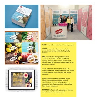
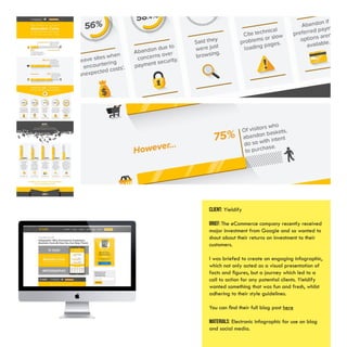
This document provides information about a graphic designer named Tom Williams, including his skills, education, experience, clients, and personal projects. He has 6 years of experience as both an in-house and freelance designer, having worked for global brands and marketing agencies. Some of his clients include Springboard Charity, Custard Communications, Barclays Bank, and Thorpe Park. His work includes designs for websites, print materials, branding projects, and motion graphics. He also enjoys personal projects like creating digital artwork showing the evolution of Star Wars Stormtroopers.
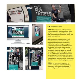
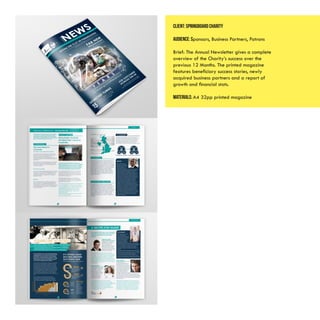
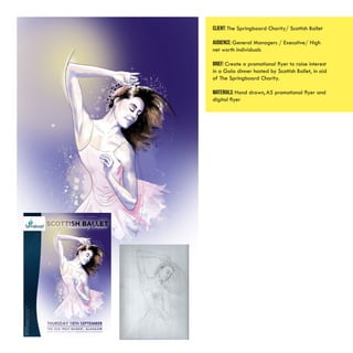
![Client: Springboard Charity /Sodexo
AUDIENCE: General Managers of top Hotels &
restaurants/ Executives/ Hotel & restaurant
owners
BRIEF: Create a fun and engaging identity for
a fundraising event aimed at high net worth
individuals which paid homage to the venue
[Churchill War Rooms] whilst maintaining a
feeling of exclusivity.
MATERIALS: A5 flyer 2pp/branded manila C5
envelope/HTML Email campaign / brochure
[newspaper]/presentation slides/ tickets/](https://image.slidesharecdn.com/f4edeb12-4af4-4c62-b03b-c5ba1c938ddc-161107192038/85/TomWilliamsPortfolio-9-320.jpg)