
Recommended
More Related Content
What's hot
What's hot (17)
Similar to TMG Culture Clash
Similar to TMG Culture Clash (20)
More from dannymilch
Recently uploaded
Recently uploaded (20)
TMG Culture Clash
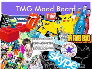
- 1. TMG Mood Board This mood board shows the culture of my TMG. Features include social networking sites, i will use this phenomenon by incorporating a “what you rockstars are up too” section where i take quotes from their face-books and twitter accounts similar to kerrang magazine. Also clothing and accessories are a big interest, i could use this on my double page spread by having a Rockstar recommends section.
- 2. Audience Profiling Age: 14-22 year olds Background: Mainly College/University Students Occupation: Part Time work mainly to fit around their education Gender: My Magazines is uni-sex but some elements are aimed towards the male gender. Likes: Social Networking, attending concerts/festivals, Alternative Clothing, Retro products, Big Hair, 80ʼs bands Dislikes: Chav culture, expensive brands of clothing, Pop Music Ambitions: To become rock stars like their idols in the magazine Musical Preferences: Rock, Emo, Scene, Punk, Alternative Pop-Punk, Metal but all of these are sub-genres of Rock Looks up to/idolizes: Rock Stars, Cult Celebrities e.g Russel Brand Media Consumer Habits: The Mighty Boosh, Tim Burton Films, Reads novels such as the twilight saga. This audience watches the same regular shows as anyone else ranging from comedies to tv dramas e.t.c Dislikes:Chav society is extremely disliked by this genre due to hate crime committed by This is a Paul Griffiths (pictured) is an idol for the this group. The media is aware of this hatred stereotypical emo/ majority of this audience he owns a clothing due to tragic deaths such as Sophie rock fan i created company (babycakes) which is commonly Bands such as The Horrors show some of Lancaster in 2008 on Habbo Hotel. worn within this genre the fashion associated with this audience, they also represent the hair styles as well.
- 3. Band Mood Board This mood board shows the style of bands i will feature in my magazine. I will use some of their poses such as Gerard Way from My Chemical Romance below as a shot for my double page spread. As many of these bands are different i aim to unite them, as my Target Market like all of these, and i am aiming to please them. I could categorise these bands into different sections of my magazine.
- 4. Mood Board Alternative Justice For All Afterlife Ace of Spades New Born Rock Emo Radio Heart Resonance Blast Blare Electro Rawr! Retro Kings and Queens Syrinx Pop Dub-Step Genre M.A.D Names Hitcher This is War Until It Sleeps Scene The Jester Rap Anarchy No Leaf Clover Magazine Smokers Outside The Hospital Battle Of One Door Underlined Random Busy Text Layout Bold Colours Large Minimalistic Small Italics Tessellating
- 5. Text Sample- This is Impact Font, it is very bold, this is a san-serif font. It is used on a variety of different backgrounds where it can easily be seen. Sample-This is a Algerian Font. It is detailed serif font. It would be used for effect for a handwritten/ old fashioned/ royal look about a text. SAMPLE-This is the Apple Casual font, it is copyrighted and is exclusive to apple. It would be used to promote apple products and to be used by companies loyal to apple. It is a casual, bold font. Examples-Playgroups, children's products Sample- This is a Braggadocio font. It is very bold and modern, so would be used for concerts or art exhibits. It is fairly difficult to read however so is limited of its uses. Sample- This is a Menlo font, it has a computerized effect with large spaces between words. It gives a professional feel and can be used widely. As it is a very thin font, the color would need to contrast. Sample-This is a handwriting Dakota font. It gives a casual, personal feel so the audience would feel relaxed about reading this font. It is very thin however, so can be fairly difficult to incorporate. I recently purchased this issue of rock sound and loved the title effect, the smashed look looks very three dimensional and professional, i would like to take inspiration from this.
- 6. Pitch Within The Market My Magazine is aimed at 14-22 year old music fans, it will be for alternative music genreʼs. But specifically at rock fans. My Target Market is niche but tends to have to extreme styles of fashion, firstly very vibrant and colourful and the second very dark and gothic. The layout of my front cover will be similar to Q, as it is simplistic and easy to understand for a bigger TMG. Although i shall have elements of Rock Sound Magazine, this way i can develop my photoshop skills further, and establish a niche range of music.My Magazine is aimed at the teenager/young adult market. But the majority of the magazine would aim to please a wider market, so new readers would not be put off by this. Most magazines have a basic look to their front covers and i want to follow this trend. These are used to ease the reader. My contents page needs to be organised into sections with different subheadings, this gives a professional look to the magazine. My magazine will have a screen shot of the front cover in the contents page for a “whats on the cover” index of what is in the magazine.
- 7. Response To Pitch After Pitching my idea to my fellow students i have had the following criticisms, Firstly i shouldnʼt be so simplistic, i should focus more on the layout of Rock Sound, so i can show off my photoshop skills to achieve a higher grade. Also i should not stick to three single colours of red/white/black i should include tiny bits of another contrasting colour such as pink. I made it clear who my target audience was, i know this as the handouts that i gave out all were filled in with the correct age group and genre. From my Pitch the response was that my magazine was most like Q magazine. Out of my two models i feel i should have the girl on the front cover, therefore the male gender are more likely to buy it for “eye candy” and the girls would purchase this for a idol to look up to. I asked my classmates which would work better? the model in a naturalistic environment or the model cut out using a magnetic lasso in a photoshop background. They decided to choose the naturalistic background, this posed the question where to photograph my model for my magazine. I decided to choose a graveyard in Lutterworth for my double page spread, and in a field in Cosby for my front page picture. Additional comments were that gold should be added to the red/black/white. I should have some exclusive items within the magazine. Everyone seemed to like the idea of aiming to please a specific audience but being accessible by everyone but they thought this was hard to achieve. Also my magazine appears to look too much like “Rock Soundʼ magazine, as i am now aware of this, i am going to evaluate Rock Sound magazine further in order to develop a more unique style. Everyone commented on my in depth research and planning which shows i have thought about potential problems and positive themes. Overall 3 people said that the Red/Black/White contrast is over used, even though this is a small percentage, i aim to please everyone so will still use these colours but use deeper shades and added extra colours such as gold or a light blue.I should keep my layout very simple and organised, too much information and images on your front cover can put off a reader. Most common comments were the Colours and camera shots work well with my magazine Teacher comments were that the name “Asylumʼ works really well as it fits the niece audience. I need to be very clear and specific about target audience and how the genre will reach them. She likes the difference between the text and images on contents page as it makes it look sophisticated. Also the use of social networking sites within the magazine engages modern, teenage readers.