1. TLIELAXU MIYKEL | Typography 1 | DAVID HAKE Instructor
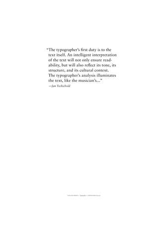
“The typographer’s first duty is to the
text itself. An intelligent interpretation
of the text will not only ensure read-
ability, but will also reflect its tone, its
structure, and its cultural context.
The typographer’s analysis illuminates
the text, like the musician’s...”
—Jan Tschichold
2. TLIELAXU MIYKEL | Typography 1 | DAVID HAKE Instructor
SANS SERIF
PROTOTYPEFACE
SQUARE BIZ
SANS SERIF
SQUARE BIZ
3. TLIELAXU MIYKEL | Typography 1 | DAVID HAKE Instructor
VISIBLE AND INVISIBLE LANGUAGE
The written language is visible; the spoken is invisible. Ideographic
systems are based on pictorial symbols that represent meanings, and
have a semantic basis; alphabetic systems are based on letter forms
that represent units of speech and have a phonetic basis. Ideographic
forms are pictorial, derived from simple drawn pictograms—symbols
which represents a person or object. But to represent more abstract
concepts they must work in combination—whereupon the pictogram
has become ideographic: a symbol that represents not merely an object
but a concept. Ideographic systems based on pictograms require the
development of many symbols. It is theoretically possible therefore, to
‘read’ ideographic systems without being able to speak the language.
Eastern languages such as Chinese and Japanese are ideographically based.
Chinese students can today ‘read’ the words of Confucius written
2,500 years ago—but were his voice to have been recorded, they would
barely recognize a word. Under an alphabetic system, symbols are used
to represent the phonemes of a language. The symbols in themselves have
no meaning, but they represent the sounds of speech. By ordering the
phonetic symbols along a line, the sound of a word can be represented.
In most alphabetic systems, groups of phonemes are separated by gaps
to indicate the end of one word and the beginning of another.
Type & Typography—Phil Baines and Andrew Haslam
GARALDE
TYPESETTING
ADOBE GARAMOND PRO
ADOBE GARAMOND PRO
8/12/LEFT
+20 TRACKING
4. TLIELAXU MIYKEL | Typography 1 | DAVID HAKE Instructor
VISIBLE AND INVISIBLE LANGUAGE
The written language is visible; the spoken is invisible. Ideographic
systems are based on pictorial symbols that represent meanings, and
have a semantic basis; alphabetic systems are based on letter forms
that represent units of speech and have a phonetic basis. Ideographic
forms are pictorial, derived from simple drawn pictograms—symbols
which represents a person or object. But to represent more abstract
concepts they must work in combination—whereupon the pictogram
has become ideographic: a symbol that represents not merely an object
but a concept. Ideographic systems based on pictograms require the
development of many symbols. It is theoretically possible therefore, to
‘read’ ideographic systems without being able to speak the language.
Eastern languages such as Chinese and Japanese are ideographically based.
Chinese students can today ‘read’ the words of Confucius written
2,500 years ago—but were his voice to have been recorded, they would
barely recognize a word. Under an alphabetic system, symbols are used
to represent the phonemes of a language. The symbols in themselves have
no meaning, but they represent the sounds of speech. By ordering the
phonetic symbols along a line, the sound of a word can be represented.
In most alphabetic systems, groups of phonemes are separated by gaps
to indicate the end of one word and the beginning of another.
Type & Typography—Phil Baines and Andrew Haslam
GARALDE
TYPESETTING
ADOBE GARAMOND PRO
ADOBE GARAMOND PRO
8/12/RIGHT
+20 TRACKING
5. TLIELAXU MIYKEL | Typography 1 | DAVID HAKE Instructor
VISIBLE AND INVISIBLE LANGUAGE
The written language is visible; the spoken is invisible. Ideographic
systems are based on pictorial symbols that represent meanings, and
have a semantic basis; alphabetic systems are based on letter forms that
represent units of speech and have a phonetic basis. Ideographic forms
are pictorial, derived from simple drawn pictograms—symbols which
represents a person or object. But to represent more abstract concepts
they must work in combination—whereupon the pictogram has become
ideographic: a symbol that represents not merely an object but a concept.
Ideographic systems based on pictograms require the development of
many symbols. It is theoretically possible therefore, to ‘read’ ideographic
systems without being able to speak the language. Eastern languages such
as Chinese and Japanese are ideographically based. Chinese students can
today ‘read’ the words of Confucius written 2,500 years ago—but were
his voice to have been recorded, they would barely recognize a word.
Under an alphabetic system, symbols are used to represent the phonemes
of a language. The symbols in themselves have no meaning, but they
represent the sounds of speech. By ordering the phonetic symbols along a
line, the sound of a word can be represented. In most alphabetic systems,
groups of phonemes are separated by gaps to indicate the end of one
word and the beginning of another.
Type & Typography—Phil Baines and Andrew Haslam
GARALDE
TYPESETTING
ADOBE GARAMOND PRO
ADOBE GARAMOND PRO
8/12/JUSTIFIED
+20 TRACKING
6. TLIELAXU MIYKEL | Typography 1 | DAVID HAKE Instructor
VISIBLE AND INVISIBLE LANGUAGE
The written language is visible; the spoken is invisible. Ideographic
systems are based on pictorial symbols that represent meanings,
and have a semantic basis; alphabetic systems are based on letter forms
that represent units of speech and have a phonetic basis.
Ideographic forms are pictorial, derived from simple drawn pictograms—
symbols which represents a person or object. But to represent
more abstract concepts they must work in combination—whereupon
the pictogram has become ideographic: a symbol that
represents not merely an object but a concept. Ideographic systems
based on pictograms require the development of many symbols.
It is theoretically possible therefore, to ‘read’ ideographic systems without
being able to speak the language. Eastern languages such as
Chinese and Japanese are ideographically based. Chinese students can
today ‘read’ the words of Confucius written 2,500 years ago—
but were his voice to have been recorded, they would barely recognize
a word. Under an alphabetic system, symbols are used to
represent the phonemes of a language. The symbols in themselves have
no meaning, but they represent the sounds of speech.
By ordering the phonetic symbols along a line, the sound of a word can
be represented. In most alphabetic systems, groups of
phonemes are separated by gaps to indicate the end of one word and the
beginning of another.
Type & Typography—Phil Baines and Andrew Haslam
GARALDE
TYPESETTING
ADOBE GARAMOND PRO
ADOBE GARAMOND PRO
8/12/CENTER
+20 TRACKING
7. TLIELAXU MIYKEL | Typography 1 | DAVID HAKE Instructor
The written language is visible; the spoken is invisible. Ideographic
systems are based on pictorial symbols that represent meanings, and
have a semantic basis; alphabetic systems are based on letter forms
that represent units of speech and have a phonetic basis.
The written language is visible; the spoken is invisible. Ideographic
systems are based on pictorial symbols that represent meanings, and
have a semantic basis; alphabetic systems are based on letter forms
that represent units of speech and have a phonetic basis.
The written language is visible; the spoken is invisible. Ideographic
systems are based on pictorial symbols that represent meanings, and
have a semantic basis; alphabetic systems are based on letter forms
that represent units of speech and have a phonetic basis.
The written language is visible; the spoken is invisible. Ideographic
systems are based on pictorial symbols that represent meanings, and
have a semantic basis; alphabetic systems are based on letter forms
that represent units of speech and have a phonetic basis.
The written language is visible; the spoken is invisible. Ideographic
systems are based on pictorial symbols that represent meanings, and
have a semantic basis; alphabetic systems are based on letter forms
that represent units of speech and have a phonetic basis.
The written language is visible; the spoken is invisible. Ideographic
systems are based on pictorial symbols that represent meanings, and
have a semantic basis; alphabetic systems are based on letter forms
that represent units of speech and have a phonetic basis.
HUMANIST | GARALDE | DIDONE | SLAB-SERIF | SANS SERIF
TYPESETTING
HORLEY OLD STYLE | ADOBE GARAMOND PRO | JANSON | DIDOT | EGYPTIENNE | OPTIMA
HORLEY OLD STYLE
7.5/12/LEFT
+28 TRACKING
ADOBE GARAMOND PRO
8/12 PT/LEFT
+20 TRACKING
JANSON
7.5/12 PT/LEFT
+25 TRACKING
DIDOT
7.3/12 PT/LEFT
+11 TRACKING
EGYPTIENNE
6.6/12 PT/LEFT
+27 TRACKING
OPTIMA
7.2/12 PT/LEFT
+28 TRACKING
8. TLIELAXU MIYKEL | Typography 1 | DAVID HAKE Instructor
A X I S
A x i s
A x i s
L I N K
L i n k
L i n k
S P U R
S p u r
S p u r
A P E X
A p e x
A p e x
S T E M
S t e m
S t e m
LOOP
L o o p
L o o p
A X I S
A x i s
A x i s
L I N K
L i n k
L i n k
S P U R
S p u r
S p u r
A P E X
A p e x
A p e x
S T E M
S t e m
S t e m
LOOP
L o o p
L o o p
A X I S
A x i s
A x i s
L I N K
L i n k
L i n k
S P U R
S p u r
S p u r
A P E X
A p e x
A p e x
STEM
S t e m
S t e m
LOOP
Loop
L o o p
A X I S
A x i s
A x i s
L I N K
L i n k
L i n k
SP U R
Spur
S p u r
A P E X
A p e x
A p ex
ST E M
S t e m
S t e m
LOOP
L o o p
L o o p
A X I S
A x i s
A x i s
L I N K
L i n k
L i n k
S P U R
S p u r
S p u r
A P E X
A p e x
Apex
S T E M
S t e m
S t e m
L O O P
Lo o p
L o o p
A X I S
A x i s
A x i s
L I N K
L i n k
L i n k
S P U R
S p u r
S p u r
A P E X
A p e x
A p e x
S T E M
S t e m
S t e m
L O O P
L o o p
L o o p
HUMANIST | GARALDE | DIDONE | SLAB-SERIF | SANS SERIF
TYPESETTING
HORLEY OLD STYLE | ADOBE GARAMOND PRO | JANSON | DIDOT | EGYPTIENNE | OPTIMA
HORLEYOLDSTYLE|CAPS.U&LC.ITALIC
3.8/4.5/4.7/18TR+200/+230/+225
ADOBEGARAMONDPRO|CAPS.U&LC.ITALIC
4.2/4.9/5.1/18TR+195/+230/+220
JANSON|CAPS.U&LC.ITALIC
3.9/4.6/4.8/18TR+175/+225/+225
DIDOT|CAPS.U&LC.ITALIC
3.8/4.5/4.7/18TR+185/+190/+215
EGYPTIENNE|CAPS.U&LC.ITALIC
4.0/4.2/4.3/18TR+180/+200/+180
OPTIMA|CAPS.U&LC.ITALIC
3.9/4.1/4.3/18TR+250/+300/+250
9. TLIELAXU MIYKEL | Typography 1 | DAVID HAKE Instructor
TAIL
ARC
DESCENDER
STEM
SPUR
EYE
ARM
ASCENDER
SERIF
LEG
APEX
LOOP
COUNTER
LINK
j
l
l
e
e
ee
e
e
e
e
e
GARALDE
TYPE ANATOMY
ADOBE GARAMOND PRO
15. TLIELAXU MIYKEL | Typography 1 | DAVID HAKE Instructor
Simplicity is the
deciding factor in the
aesthetic equation.
SIMPLICITY IS THE
DECIDING FACTOR IN THE
AESTHETIC EQUATION.
DIDONE
KERNING HEADLINES
BAUER BODONI ROMAN
BAUER BODONI ROMAN
27/32 PT/CAP/U&LC
25 TRACKING
23/32 PT/CAP/U&LC
0 TRACKING
16. TLIELAXU MIYKEL | Typography 1 | DAVID HAKE Instructor
“Typography must be clear and
good in order to communicate—a
clearly polished window into
the mind of the reader.”
–Beatrice Warde
“TYPOGRAPHY MUST BE CLEAR AND
GOOD IN ORDER TO COMMUNICATE—A
CLEARLY POLISHED WINDOW INTO
THE MIND OF THE READER.”
–BEATRICE WARDE
DIDONE
KERNING HEADLINES
BAUER BODONI ROMAN
BAUER BODONI ROMAN
19/23 PT/CAP/U&LC
0 TRACKING
15/23 PT/CAP/U&LC
0 TRACKING
17. TLIELAXU MIYKEL | Typography 1 | DAVID HAKE Instructor
23 May 2010
Lexicon
2258 Howard Street, Suite 100
San Francisco CA 94105
Dear Ms. Jackson,
I would like to welcome you as a new client. I look forward to
working together on the Academy Project and I am sure that you will
be extremely satisfied with the services my business provides.
You are invited to make an appointment to visit our office at
your earliest convenience. The office manager will be happy to show
you around and discuss any aspect of our credit policy with you.
I am enclosing several samples and an estimate for your review.
Please let me know if these figures fall within your budget for the
project. If you have any questions, please don’t hesitate to call.
Yours truly,
Tlielaxu Miykel
Designer
Tlielaxu Miykel
Graphic Designer
[415] 205-5959
tlielaxumiykel@me.com
1241 Bush St., Suite 202
San Francisco CA 94109
www.miykel.com
GARALDE | SANS SERIF
STATIONERY SYSTEM
SABON | UNIVERS
18. GARALDE | SANS SERIF
STATIONERY SYSTEM | TYPE EXPLORATIONS
SABON | UNIVERS
Ms. Pauline Jackson
Lexicon
2258 Howard Street, Ste 100
San Francisco CA 94105-1234
First-Class
Postage
Required
Post Office
will not deliver
without proper
postage
Tlielaxu Miykel
1241 Bush Street, Apt. 202
San Francisco CA, 94109-5218
Tlielaxu Miykel
Graphic Designer
[415] 205-5959
tlielaxumiykel@me.com
1 Bush St., Suite 202
Francisco CA 94109
w.miykel.com
Tlielaxu Miykel
Graphic Designer
[415] 205-5959
tlielaxumiykel@me.com
1241 Bush St., Suite 202
San Francisco CA 94109
www.miykel.com
19. TLIELAXU MIYKEL | Typography 1 | DAVID HAKE Instructor
GARALDE | TRANSITIONAL | SANS SERIF
TYPE CLASSIFICATION POSTERS
SABON | VERSAILLES | AVANT GARDE
Sabon
A B C D E F G H I J K L M
N O P Q R S T U V W X Y Z
a b c d e f g h i j k l m n o p q r s t u v w x y z
0 1 2 3 4 5 6 7 8 9
One of the finest modern adaptations of the Garamond model, Jan Tschichold’s Sabon
stands as the culmination of a hugely influential typographic career in which type
design developed alongside book typography and critical writing. It is named for
the punchcutter and type founder Jakob (or Jacques) Sabon of Lyon, whi is credited
with bringing the Garamond types originating with
Plantin or Granjon into use in Frankfurt, thus introducing the Garamond model
into German printing. Sabon is, however, far more than a literal revival, since it
incorporates characteristics drawn from the different sizes of the Garamonds to
form one consistent and definitively 20th-century interpretation of the ideas that
they embody.
It has an elegant bold font, and is exceptionally balanced and legible across italic and
roman in both its weights. It has a harmonious visual consistency and few obtrusive
distinguishing features—an inclined stress, open counters, and a complementary
interaction between characters. It incorporates expert set features, including small
caps, ligatures, and non-lining numerals.
Sabon is beautifully balanced across italic
and roman in both its weights. It has
a harmonious visual consistency and
few obtrusive distinguishing features—
an inclined stress, open counters, and
a complementary interaction between
characters. The Open Type era provided
the conditions for the improved Sabon
Next, developed by Jean-Francois Porchez,
extending the family to five weights and
including a generous complement of
alternates and other Open Type features.
Will Hill: the complete typographer. Second/Third edition.
H U M A N I S T
G A R A L D E
T R A N I S T I O N A L
D I D O N E
S L A B - S E R I F
S A N S S E R I F
COUNTER
STEM
HAIRLINE
In Versailles, Adrian Frutiger
did not use his usual tapered strokes.
This straightening might have
been implemented for reasons of
design alone, but could also be
attributed to a consideration of the
limitations of digital technology.
Vectorisation, i.e. the description of
curves through a series of short
straight lines, did not yet allow for the
same quality that had been a char-
acteristic of earlier forms of production.
However, compared to the begin-
ning of the 1980s, some technological
progress must have taken place,
because Frutiger wrote in 1985: “Today
I know about the refinement in
reproduction and therefore my most
recent typeface ‘Versailles’—recon-
sidering earlier traditions of non-bit-
mapped setting technologies—has
been deliberately designed using a
more subtle stroke.”
In 1984 Versailles was released in 8
fonts for the Linotype CRT machines
by D. Stempel AG; this release was
followed slightly later by the additional
publication of old style numerals
and small capitals in the thin and regular
fonts. Since 1993 Versailles has been
available as a Post-Script font but with-
out the aforementioned additions.
Adrian Frutiger Typefaces: The Complete Works
Versailles
A
E
IJ
N
R
V
Z
d
h
v
m
q
y
2
6
B
F
K
O
S
W
a
e
ij
n
r
v
z
3
7
C
G
L
P
T
X
b
f
k
o
s
w
0
4
8
D
H
M
Q
U
Y
c
g
l
p
t
x
1
5
9
H U M A N I S T G A R A L D E T R A N S I T I O N A L D I D O N E S L A B - S E R I F S A N S - S E R I F
TAIL
ASCENDER
SERIF
AvantG
arde
w
asdesig
ned
by
Herb
Lubalin
asa
displa
y
face
w
hile
Luablin
w
asarteditorforthe
m
agazin
e
ofthe
sam
e
nam
e.It
w
asorig
in
ally
d
esig
ned
a
s
a
titling
fa
ce
a
nd
in
corpora
ted
a
n
in
g
e
nio
us
ra
ng
e
o
f
ca
p
ita
llig
a
ture
s
to
m
a
in
ta
in
the
very
tig
ht
settin
g
fo
r
w
hic
h
it
w
a
s
d
e
sig
ne
d
.It
is
a
fully
g
e
o
m
e
tric
fa
c
e
,
w
ith
very
few
ofthe
a
d
ju
stm
entsto
ju
nctio
ns
seen
in
Renner’s
Futura
.The
geom
etric
rig
or
p
rovid
es
fora
d
ra
m
a
tic
set
ofca
p
ita
lform
s
and
a
ratherle
sssatisfactory
lo
w
ercase.Avant
G
a
rd
e
p
roved
id
ea
lly
suited
to
d
ig
itiza
tio
n,
sin
c
e
its
sim
p
lic
ity
o
f
fo
rm
re
q
uire
s
few
e
r
b
itm
a
p
p
o
in
ts,a
nd
therefo
re
le
ss
m
em
o
ry,
than
m
ostfaces.A
sa
consequence,a
severely
red
uced
a
nd
unsa
tisfa
ctory
versio
n
ofAva
nt
G
a
rd
e
is
w
id
ely
a
va
ila
ble
.
AVA
N
TG
A
RD
E
A
B
C
D
E
F
G
H
I
J
K
L
M
N
O
P
Q
R
S
T
U
V
W
X
Y
Z
0
1
2
3
4
5
6
7
8
9a
b
c
d
e
f
g
h
i
j
k
l
m
n
o
p
q
r
s
t
u
v
w
x
y
z
!
&
(
)
=
%
$
@
?
H
U
M
A
N
IST
G
A
R
A
LD
E
TR
A
N
ISTIO
N
A
L
D
ID
O
N
E
SLA
B
-SE
R
IF
S
A
N
S
S
E
R
IF
—
G
E
O
M
E
TR
IC
Sub
se
q
ue
nt
d
e
ca
d
e
s
sa
w
Ava
nt
G
a
rd
e
in
crea
sin
g
ly
a
d
opted
foruse
a
s
a
textfa
ce.
W
hile
the
rig
id
g
eo
m
etry
o
f
the
d
esig
n
is
tem
pered
in
the
ju
nctio
nsofsom
e
le
tters,the
lo
w
erca
se
is
in
m
a
ny
w
a
ys
le
ss
sa
tis
fa
cto
ry
tha
n
the
ca
p
ita
ls,
revea
ling
m
a
ny
o
f
the
sho
rtc
o
m
ing
s
o
f
G
e
o
m
e
tric
sa
ns
se
rifs
w
hen
used
fo
r
textsettin
g
.The
rep
etitio
n
o
f
g
eom
etric
form
s
ca
n
im
pede
differentia
tio
n
betw
een
le
tters,and
the
circula
rcounterscan
b
e
visua
lly
in
trusiv
e.
W
illHill:
th
e
com
ple
te
ty
pog
ra
pher.
Second
editio
n.
BO
W
L
C
RO
SSBA
R
LEG
20. TLIELAXU MIYKEL | Typography 1 | DAVID HAKE Instructor
Sabon
A B C D E F G H I J K L M
N O P Q R S T U V W X Y Z
a b c d e f g h i j k l m n o p q r s t u v w x y z
0 1 2 3 4 5 6 7 8 9
One of the finest modern adaptations of the Garamond model, Jan Tschichold’s Sabon
stands as the culmination of a hugely influential typographic career in which type
design developed alongside book typography and critical writing. It is named for
the punchcutter and type founder Jakob (or Jacques) Sabon of Lyon, whi is credited
with bringing the Garamond types originating with
Plantin or Granjon into use in Frankfurt, thus introducing the Garamond model
into German printing. Sabon is, however, far more than a literal revival, since it
incorporates characteristics drawn from the different sizes of the Garamonds to
form one consistent and definitively 20th-century interpretation of the ideas that
they embody.
It has an elegant bold font, and is exceptionally balanced and legible across italic and
roman in both its weights. It has a harmonious visual consistency and few obtrusive
distinguishing features—an inclined stress, open counters, and a complementary
interaction between characters. It incorporates expert set features, including small
caps, ligatures, and non-lining numerals.
Sabon is beautifully balanced across italic
and roman in both its weights. It has
a harmonious visual consistency and
few obtrusive distinguishing features—
an inclined stress, open counters, and
a complementary interaction between
characters. The Open Type era provided
the conditions for the improved Sabon
Next, developed by Jean-Francois Porchez,
extending the family to five weights and
including a generous complement of
alternates and other Open Type features.
Will Hill: the complete typographer. Second/Third edition.
H U M A N I S T
G A R A L D E
T R A N I S T I O N A L
D I D O N E
S L A B - S E R I F
S A N S S E R I F
COUNTER
STEM
HAIRLINE
21. TLIELAXU MIYKEL | Typography 1 | DAVID HAKE Instructor
In Versailles, Adrian Frutiger
did not use his usual tapered strokes.
This straightening might have
been implemented for reasons of
design alone, but could also be
attributed to a consideration of the
limitations of digital technology.
Vectorisation, i.e. the description of
curves through a series of short
straight lines, did not yet allow for the
same quality that had been a char-
acteristic of earlier forms of production.
However, compared to the begin-
ning of the 1980s, some technological
progress must have taken place,
because Frutiger wrote in 1985: “Today
I know about the refinement in
reproduction and therefore my most
recent typeface ‘Versailles’—recon-
sidering earlier traditions of non-bit-
mapped setting technologies—has
been deliberately designed using a
more subtle stroke.”
In 1984 Versailles was released in 8
fonts for the Linotype CRT machines
by D. Stempel AG; this release was
followed slightly later by the additional
publication of old style numerals
and small capitals in the thin and regular
fonts. Since 1993 Versailles has been
available as a Post-Script font but with-
out the aforementioned additions.
Adrian Frutiger Typefaces: The Complete Works
Versailles
A
E
IJ
N
R
V
Z
d
h
v
m
q
y
2
6
B
F
K
O
S
W
a
e
ij
n
r
v
z
3
7
C
G
L
P
T
X
b
f
k
o
s
w
0
4
8
D
H
M
Q
U
Y
c
g
l
p
t
x
1
5
9
H U M A N I S T G A R A L D E T R A N S I T I O N A L D I D O N E S L A B - S E R I F S A N S - S E R I F
TAIL
ASCENDER
SERIF
22. TLIELAXU MIYKEL | Typography 1 | DAVID HAKE Instructor
AvantG
arde
w
asdesigned
by
Herb
Lubalin
asa
display
face
w
hile
Luablin
w
asarteditorforthe
m
agazine
ofthe
sam
e
nam
e.Itw
asoriginally
d
esigned
a
s
a
titling
fa
ce
a
nd
incorpora
ted
a
n
ing
e
nio
us
ra
ng
e
o
f
ca
p
ita
llig
a
ture
s
to
m
a
inta
in
the
very
tig
ht
setting
fo
r
w
hich
it
w
a
s
d
e
sig
ne
d
.It
is
a
fully
g
e
o
m
e
tric
fa
c
e
,
w
ith
very
few
ofthe
a
d
justm
entsto
junctions
seen
in
Renner’s
Futura
.The
geom
etric
rigor
p
rovid
es
fora
d
ra
m
a
tic
set
ofca
p
ita
lform
s
and
a
ratherlesssatisfactory
low
ercase.Avant
G
a
rd
e
p
roved
id
ea
lly
suited
to
d
ig
itiza
tion,
sinc
e
its
sim
p
lic
ity
o
f
fo
rm
re
q
uire
s
few
e
r
b
itm
a
p
p
o
ints,a
nd
therefo
re
less
m
em
o
ry,
than
m
ostfaces.A
sa
consequence,a
severely
red
uced
a
nd
unsa
tisfa
ctory
version
ofAva
nt
G
a
rd
e
is
w
id
ely
a
va
ila
ble.
AVA
N
TG
A
RD
E
A
B
C
D
E
F
G
H
I
J
K
L
M
N
O
P
Q
R
S
T
U
V
W
X
Y
Z
0
1
2
3
4
5
6
7
8
9a
b
c
d
e
f
g
h
i
j
k
l
m
n
o
p
q
r
s
t
u
v
w
x
y
z
!
&
(
)
=
%
$
@
?
H
U
M
A
N
IST
G
A
R
A
LD
E
TR
A
N
ISTIO
N
A
L
D
ID
O
N
E
SLA
B
-SE
R
IF
S
A
N
S
S
E
R
IF
—
G
E
O
M
E
TR
IC
Sub
se
q
ue
nt
d
e
ca
d
e
s
sa
w
Ava
nt
G
a
rd
e
increa
sing
ly
a
d
opted
foruse
a
s
a
textfa
ce.
W
hile
the
rig
id
g
eo
m
etry
o
f
the
d
esig
n
is
tem
pered
in
the
junctionsofsom
e
letters,the
low
erca
se
is
in
m
a
ny
w
a
ys
less
sa
tisfa
cto
ry
tha
n
the
ca
p
ita
ls,
revea
ling
m
a
ny
o
f
the
sho
rtc
o
m
ing
s
o
f
G
e
o
m
e
tric
sa
ns
se
rifs
w
hen
used
fo
r
textsetting
.The
rep
etitio
n
o
f
g
eom
etric
form
s
ca
n
im
pede
differentia
tion
betw
een
letters,and
the
circularcounterscan
b
e
visua
lly
intrusive.
W
illHill:the
com
plete
typog
ra
pher.Second
edition.
BO
W
L
C
RO
SSBA
R
LEG
23. TLIELAXU MIYKEL | Typography 1 | DAVID HAKE Instructor
5
1
3
6
8
7
2
GARALDE
TYPE ANATOMY
ADOBE GARAMOND PRO
TAIL
ARC
DESCENDER
STEM
SPUR
EYE
ARM
ASCENDER
SERIF
LEG
APEX
LOOP
COUNTER
LINK
j
l
l
e
e
ee
e
e
e
e
e
HUMANIST | GARALDE | TRANSITIONAL | DIDONE | SLAB-SERIF | SANS SERIF
TYPESETTING
HORLEY OLD STYLE | ADOBE GARAMOND PRO | JANSON | DIDOT | EGYPTIENNE | OPTIMA
TLIELAXU MIYKEL | Typography 1 | DAVID HAKE Instructor
HORLEYOLDSTYLE|CAPS.U&LC.ITALIC
3.8/4.5/4.7/18TR+200/+230/+225
ADOBEGARAMONDPRO|CAPS.U&LC.ITALIC
4.2/4.9/5.1/18TR+195/+230/+220
JANSON|CAPS.U&LC.ITALIC
3.9/4.6/4.8/18TR+175/+225/+225
DIDOT|CAPS.U&LC.ITALIC
3.8/4.5/4.7/18TR+185/+190/+215
EGYPTIENNE|CAPS.U&LC.ITALIC
4.0/4.2/4.3/18TR+180/+200/+180
OPTIMA|CAPS.U&LC.ITALIC
3.9/4.1/4.3/18TR+250/+300/+250
A X I S
A x i s
A x i s
L I N K
L i n k
L i n k
S P U R
S p u r
S p u r
A P E X
A p e x
A p e x
S T E M
S t e m
S t e m
LOOP
L o o p
L o o p
A X I S
A x i s
A x i s
L I N K
L i n k
L i n k
S P U R
S p u r
S p u r
A P E X
A p e x
A p e x
S T E M
S t e m
S t e m
LOOP
L o o p
L o o p
A X I S
A x i s
A x i s
L I N K
L i n k
L i n k
S P U R
S p u r
S p u r
A P E X
A p e x
A p e x
STEM
S t e m
S t e m
LOOP
Loop
L o o p
A X I S
A x i s
A x i s
LI N K
L i n k
L i n k
SP U R
Spur
S p u r
A P E X
A p e x
A p e x
ST E M
S t e m
S t e m
LOOP
L o o p
L o o p
A X I S
A x i s
A x i s
L I N K
L i n k
L i n k
S P U R
S p u r
S p u r
A P E X
A p e x
Apex
S T E M
S t e m
S t e m
L O O P
Lo o p
L o o p
A X I S
A x i s
A x i s
L I N K
L i n k
L i n k
S P U R
S p u r
S p u r
A P E X
A p e x
A p e x
S T E M
S t e m
S t e m
L O O P
L o o p
L o o p
VISIBLE AND INVISIBLE LANGUAGE
The written language is visible; the spoken is invisible. Ideographic
systems are based on pictorial symbols that represent meanings, and
have a semantic basis; alphabetic systems are based on letter forms
that represent units of speech and have a phonetic basis. Ideographic
forms are pictorial, derived from simple drawn pictograms—symbols
which represents a person or object. But to represent more abstract
concepts they must work in combination—whereupon the pictogram
has become ideographic: a symbol that represents not merely an object
but a concept. Ideographic systems based on pictograms require the
development of many symbols. It is theoretically possible therefore, to
‘read’ ideographic systems without being able to speak the language.
Eastern languages such as Chinese and Japanese are ideographically based.
Chinese students can today ‘read’ the words of Confucius written
2,500 years ago—but were his voice to have been recorded, they would
barely recognize a word. Under an alphabetic system, symbols are used
to represent the phonemes of a language. The symbols in themselves have
no meaning, but they represent the sounds of speech. By ordering the
phonetic symbols along a line, the sound of a word can be represented.
In most alphabetic systems, groups of phonemes are separated by gaps
to indicate the end of one word and the beginning of another.
Type & Typography—Phil Baines and Andrew Haslam
+15 -36
+18
-30
-37
+10
-20
-41
-25
+05
+20
-27
+10
-17
-30
-39
+15
-10
Typography
TYPOGRAPHY
HUMANIST | GARALDE | TRANSITIONAL | DIDONE | SLAB-SERIF | SANS SERIF
TYPESETTING
HORLEY OLD STYLE | ADOBE GARAMOND PRO | JANSON | DIDOT | EGYPTIENNE | OPTIMA
HORLEY OLD STYLE
7.5/12/LEFT
+28 TRACKING
ADOBE GARAMOND PRO
8/12 PT/LEFT
+20 TRACKING
JANSON
7.5/12 PT/LEFT
+25 TRACKING
DIDOT
7.3/12 PT/LEFT
+11 TRACKING
EGYPTIENNE
6.6/12 PT/LEFT
+27 TRACKING
OPTIMA
7.2/12 PT/LEFT
+28 TRACKING
The written language is visible; the spoken is invisible. Ideographic
systems are based on pictorial symbols that represent meanings, and
have a semantic basis; alphabetic systems are based on letter forms
that represent units of speech and have a phonetic basis.
The written language is visible; the spoken is invisible. Ideographic
systems are based on pictorial symbols that represent meanings, and
have a semantic basis; alphabetic systems are based on letter forms
that represent units of speech and have a phonetic basis.
The written language is visible; the spoken is invisible. Ideographic
systems are based on pictorial symbols that represent meanings, and
have a semantic basis; alphabetic systems are based on letter forms
that represent units of speech and have a phonetic basis.
The written language is visible; the spoken is invisible. Ideographic
systems are based on pictorial symbols that represent meanings, and
have a semantic basis; alphabetic systems are based on letter forms
that represent units of speech and have a phonetic basis.
The written language is visible; the spoken is invisible. Ideographic
systems are based on pictorial symbols that represent meanings, and
have a semantic basis; alphabetic systems are based on letter forms
that represent units of speech and have a phonetic basis.
The written language is visible; the spoken is invisible. Ideographic
systems are based on pictorial symbols that represent meanings, and
have a semantic basis; alphabetic systems are based on letter forms
that represent units of speech and have a phonetic basis.
1. Stationery System
2. Kerning Headlines
3. Type Classification Poster
4. Text Paragraphs
5. Type Anatomy
6. Microtype
7. Prototypeface
8. Typesetting
4
AvantG
arde
w
asdesigned
by
Herb
Lubalin
asa
display
face
w
hile
Luablin
w
asarteditorforthe
m
agazine
ofthe
sam
e
nam
e.Itw
asoriginally
d
esigned
a
s
a
titling
fa
ce
a
nd
incorpora
ted
a
n
ing
e
nio
us
ra
ng
e
o
f
ca
p
ita
llig
a
ture
s
to
m
a
inta
in
the
very
tig
ht
setting
fo
r
w
hich
it
w
a
s
d
e
sig
ne
d
.It
is
a
fully
g
e
o
m
e
tric
fa
c
e
,
w
ith
very
few
ofthe
a
d
justm
entsto
junctions
seen
in
Renner’s
Futura
.The
geom
etric
rigor
p
rovid
es
fora
d
ra
m
a
tic
set
ofca
p
ita
lform
s
and
a
ratherlesssatisfactory
low
ercase.Avant
G
a
rd
e
p
roved
id
ea
lly
suited
to
d
ig
itiza
tion,
sinc
e
its
sim
p
lic
ity
o
f
fo
rm
re
q
uire
s
few
e
r
b
itm
a
p
p
o
ints,a
nd
therefo
re
less
m
em
o
ry,
than
m
ostfaces.A
sa
consequence,a
severely
red
uced
a
nd
unsa
tisfa
ctory
version
ofAva
nt
G
a
rd
e
is
w
id
ely
a
va
ila
ble.
AVA
N
TG
A
RD
E
A
B
C
D
E
F
G
H
I
J
K
L
M
N
O
P
Q
R
S
T
U
V
W
X
Y
Z
1
2
3
4
5
6
7
8
9a
b
c
d
e
f
g
h
i
j
k
l
m
n
o
p
q
r
s
t
u
v
w
x
y
z
!
&
(
)
=
%
$
@
?
H
U
M
A
N
IST
G
A
R
A
LD
E
TR
A
N
ISTIO
N
A
L
D
ID
O
N
E
SLA
B
-SE
R
IF
S
A
N
S
S
E
R
IF
—
G
E
O
M
E
TR
IC
Sub
se
q
ue
nt
d
e
ca
d
e
s
sa
w
Ava
nt
G
a
rd
e
increa
sing
ly
a
d
opted
foruse
a
s
a
textfa
ce.
W
hile
the
rig
id
g
eo
m
etry
o
f
the
d
esig
n
is
tem
pered
in
the
junctionsofsom
e
letters,the
low
erca
se
is
in
m
a
ny
w
a
ys
less
sa
tisfa
cto
ry
tha
n
the
ca
p
ita
ls,
revea
ling
m
a
ny
o
f
the
sho
rtc
o
m
ing
s
o
f
G
e
o
m
e
tric
sa
ns
se
rifs
w
hen
used
fo
r
textsetting
.The
rep
etitio
n
o
f
g
eom
etric
form
s
ca
n
im
pede
differentia
tion
betw
een
letters,and
the
circularcounterscan
b
e
visua
lly
intrusive.
W
illHill:the
com
plete
typog
ra
pher.Second
edition.
BO
W
L
C
RO
SSBA
R
LEG
Tlielaxu Miykel
Graphic Designer
[415] 205-5959
tlielaxumiykel@me.com
1241 Bush St., Suite 202
San Francisco CA 94109
www.miykel.com