The Current Top 10 Reigning Visual Slide Style Cliches
•
0 likes•558 views

This brilliant presentation covers the Top 10 current slide design cliches broadly in use today. How do I know they are brilliant? Easy! I designed them. And if you don't think that's enough, the designs and fonts will convince you!
Report
Share
Report
Share
Download to read offline

Recommended
How do you say bye in Spanish
Do you want to learn How to say bye in Spanish? In this short presentation we will look at How to say bye in Spanish as well as other phrases that may be useful.
Learn more about this topic here: http://learningspanishforbeginners.com/conversational-spanish/spanish-phrases/how-to-say-bye-in-spanish
5 things audiences hate about presentations
The document provides advice to speakers on how to keep their audience awake during presentations. It identifies the five most common mistakes speakers make: relying too heavily on technical aids like PowerPoint slides; lacking in-depth, engaging content; having no interaction with the audience; overusing filler words; and experiencing technical difficulties. The document urges speakers to avoid these pitfalls by preparing well and focusing on telling stories and sharing expertise, rather than just facts and slides. This will help keep audiences interested and awake.
Oy vey, guess the cliche!
At Pepper Group we don't deal in cliches, just fresh, strategic marketing ideas that help B2B clients drive revenue and profitability. Enjoy this amusing deck and see if you can guess the cliche.
Pitch Deck 101 - #BizDisruptors
This document provides tips for creating effective presentations. It recommends keeping slides simple with one main message per slide, using visuals like diagrams and examples to illustrate concepts, and designing slides that are easy to view from the back of the room. It also emphasizes rehearsing presentations out loud and having backup plans in case of technical issues. The overall message is to focus on clarity over cleverness and make information easy for any audience to understand.
Steal this presentation
This document provides tips for designing effective presentations. It recommends using a bold title and visually stunning opening slide to grab attention. Color schemes, high-quality images, and minimal text are suggested to make slides appealing. Videos should be short and relevant, and presentations should be shared online to reach wider audiences. The key principles of contrast, repetition, alignment and proximity are emphasized for slide design.
Ice breaker brain teasers
The document contains a series of "icebreaker brain teasers" intended to engage readers through visual and linguistic puzzles. The teasers include spotting hidden words, counting letters, and recognizing optical illusions. The final sections provide information about a consulting firm called XONITEK that helps clients optimize business processes and leverage new technologies.
Death by Powerpoint
Lighting talk at Global Diversity CFP Day Oceania. 5 problems that I've seen with slide decks during presentations, and ways you can do better!
A presentation about... presentaions!
This document provides tips for creating effective presentations, noting that presentations should be informative, engage audiences visually and verbally, and relax presenters. It emphasizes keeping presentations simple with clear images, catchphrases instead of sentences, engaging the audience, and using humor. Above all, presenters should practice and feel free to adapt typical rules as needed.
Apresentationabout 161128133535
This document provides tips for creating effective presentations, noting that presentations should be informative, engage audiences visually and verbally, and relax presenters. It emphasizes keeping presentations simple with clear images, catchphrases instead of sentences, engaging the audience, and using humor. Above all, presenters should practice and feel free to adapt typical rules as needed.
I hate power_point blobert
The document criticizes overuse and misuse of PowerPoint presentations. It argues that PowerPoint is often used as a crutch by presenters to fill time without conveying essential information. Specific complaints include presentations with too many text-heavy slides, unnecessary clip art and logos, small font sizes, and printing out slides even when they are being projected. The document suggests PowerPoint hinders clear communication and wastes resources like paper and time that could be better spent.
Data Visualization & Information Design: One Learner's Perspective
This is my first slide deck designed to share. It reflects a summary and applied practice of some basic lessons learned about data visualization and information design in the context of presentations, and from my perspective as an educator / program evaluator. Enjoy!
The Sound Guide to Storytelling
This document provides a guide to storytelling. It discusses the importance of crafting powerful stories and outlines the process for developing an effective narrative. Some key points include:
- Stories are an engaging way to get people to remember your message. Effective storytelling is important for branding and persuasion.
- The storytelling process involves forming hypotheses, analyzing insights from research, and organizing the narrative into chapters before developing visual slides.
- Slides should enhance but not replace the story. Developers are advised to fully outline their narrative before beginning slide creation.
- The guide emphasizes crafting a solid substantive story over purely stylistic elements. It stresses developing a coherent narrative flow and using parallel structures, language cadence
3 Ways to Fix a Messy Presentation
We hope this presentation will be helpful to fix a messy presentation. These 3 ways we find valuable to make presentation clear and concise.
10 Tips for an Effective Presentation
Mainly for people who are new to world of Slide Show presentations; some basic tips for creating and delivering effective presentations.
Hr pts-e-dn-version 2.0
The document provides tips for using visual aids like overhead transparencies and slides when giving presentations. It recommends including an agenda, stating key points, using simple visuals rather than complicated diagrams, speaking as visuals are displayed, making eye contact with the audience, asking questions to engage listeners, and referring to the visuals during the presentation. The tips are intended to help presenters effectively incorporate visual elements into their speaking.
How to create a really GOOD Presentation
I proudly present you my presentation from my speech on The Hub events "The Art of Presentation". Some useful tips for your questioners.
Powerful Presentations
This document provides tips for making presentations more powerful. It emphasizes the importance of preparation such as brainstorming ideas offline before creating slides. The main message of the presentation should be distilled into a single sentence. Storytelling is recommended to engage audiences. Simplicity is key - slides should have minimal text and empty space. Overcrowding slides and reading slides verbatim should be avoided. Using colorful pictures and focusing on the presenter rather than the slides can make presentations more memorable and impactful.
UiGathering Talk - Masters of visualization / by Allen Chan
UiGathering Talk - Masters of visualization / by Allen ChanUXTW(Taiwan User Experience Professional Association)
The document discusses the visual design process for redesigning the user interface of Trend Micro Titanium security software. It describes exploring different styles, concepts, and iterations to make the interface simpler, lighter, and more visually appealing. The final design used animations, image sprites, and a video to help tell the story and engage users. The document emphasizes that every visual element impacts the user experience and inspires designers to believe in themselves.3 Stage Of Drama.pptx
This document provides guidance on effective storytelling techniques for presentations. It emphasizes establishing an engaging timeline and idea in the first 5 minutes to attract the audience. Key recommendations include:
1) Use a simple, compelling timeline in 140 characters or less to capture attention and give reason to listen further.
2) Express passion for the idea through an emotional statement and elaborate the timeline with three memorable keynotes.
3) In the second 5 minutes, share experiences and testimony to tell an incredible story through analogy and numbers.
The document stresses keeping slides simple with visuals and few words, and practicing delivery with open posture, hand gestures, and appropriate costume to dramatically end the presentation.
The Science of Presentations
The document provides tips and guidance for improving presentation skills. It emphasizes preparing thoroughly by starting offline and focusing on curiosity before content. When designing presentations, it recommends keeping things simple with one point per slide, high quality visuals over text, and dumping templates. For delivery, it stresses practicing extensively, presenting from notes not slides, using presenter view, and asking for feedback. The overall goal is to treat audiences like kings by planning strategically and designing and delivering presentations that are visual, coherent and engage attention.
Presentation Guides
Why A Good Presentation? You want people to: Understand your work; Be INTERESTED in your work; Think you're great! What happens if you give a bad one?
Slides to keep your audience awake
The document discusses how to create more effective PowerPoint presentations by reducing excessive information on slides. It notes that people can only process around 5-7 pieces of information at a time. The document analyzes a sample slide that contains over 15 individual pieces of data, text, images and formatting. It then provides suggestions to simplify slides by removing logos, titles, unnecessary text and spreading content over multiple focused slides to keep the audience engaged.
Why iPad Owners Are Better Lovers
1) The document discusses how writing is an important skill for startups and provides tips for improving writing abilities.
2) It suggests focusing on seduction, reduction and avoiding unnecessary ideas in writing.
3) The author claims iPad owners are better lovers because the iPad teaches writing skills like focusing content and using words effectively through interfaces like Flipboard.
Originality and creativity - sophie
The document discusses t-shirt design criteria and concepts for a shark awareness t-shirt to benefit the Hong Kong Shark Foundation charity. It outlines 6 initial designs, with Design 2 being the most popular based on a survey. The final design incorporated feedback and featured a cartoon shark with a catchy slogan in red text on a white t-shirt, with the HKSF logo on the back to promote the charity.
Linkedin etiquettes
Etiquettes on LinkedIn include:
1. Set a professional, clear profile photo of yourself rather than inappropriate images.
2. Fill out your profile completely but keep it crisp, interesting and clear.
3. Network respectfully and avoid bluffing about what you do for work.
How to create the worst presentation ever
This document summarizes common PowerPoint mistakes made by presenters. It notes that putting all text from a presentation on slides can make them wordy and lose audience attention. Other mistakes include not spelling checking slides, using excessive bullet points that do not emphasize key messages, and distracting backgrounds or fonts that strain viewers' eyes. The document advocates keeping slides clear and concise to engage audiences.
Public Speaking for Geeks: change your career with this superpower!
This document provides tips for improving public speaking skills. It suggests that introductions should provide value to the audience rather than just introducing the speaker. Stories and questions are recommended to engage audiences rather than bullet points. Rehearsal is important but should involve other people rather than just oneself. Anxiety can be reduced through preparation, breathing techniques and power poses. Overall, the document emphasizes engaging audiences with stories and emotions rather than just information.
Elle Luna, Senior Communication Designer at IDEO
This document discusses the metaphor of a debutante's bow to teach lessons about being a woman in design. It describes the four steps of the bow - raising arms to set a foundation, beginning the descent while smiling, risking it all by putting one's forehead to the floor, and rising in glory at the end. The document encourages building a story repertoire, designing one's story and life, and finding what gives one meaning and happiness.
Divertidamente SLIDE.pptxufururururuhrurid8dj
Hsuehebvdhdueuw8wiiwieih3udud8e8wisbdydvw7wbidj38ehehdheuwjhdiwjwieheheueurhryrurhrgryd7eueue
Impact of Fonts: in Web and Apps Design
Fonts play a crucial role in both User Interface (UI) and User Experience (UX) design. They affect readability, accessibility, aesthetics, and overall user perception.
More Related Content
Similar to The Current Top 10 Reigning Visual Slide Style Cliches
Apresentationabout 161128133535
This document provides tips for creating effective presentations, noting that presentations should be informative, engage audiences visually and verbally, and relax presenters. It emphasizes keeping presentations simple with clear images, catchphrases instead of sentences, engaging the audience, and using humor. Above all, presenters should practice and feel free to adapt typical rules as needed.
I hate power_point blobert
The document criticizes overuse and misuse of PowerPoint presentations. It argues that PowerPoint is often used as a crutch by presenters to fill time without conveying essential information. Specific complaints include presentations with too many text-heavy slides, unnecessary clip art and logos, small font sizes, and printing out slides even when they are being projected. The document suggests PowerPoint hinders clear communication and wastes resources like paper and time that could be better spent.
Data Visualization & Information Design: One Learner's Perspective
This is my first slide deck designed to share. It reflects a summary and applied practice of some basic lessons learned about data visualization and information design in the context of presentations, and from my perspective as an educator / program evaluator. Enjoy!
The Sound Guide to Storytelling
This document provides a guide to storytelling. It discusses the importance of crafting powerful stories and outlines the process for developing an effective narrative. Some key points include:
- Stories are an engaging way to get people to remember your message. Effective storytelling is important for branding and persuasion.
- The storytelling process involves forming hypotheses, analyzing insights from research, and organizing the narrative into chapters before developing visual slides.
- Slides should enhance but not replace the story. Developers are advised to fully outline their narrative before beginning slide creation.
- The guide emphasizes crafting a solid substantive story over purely stylistic elements. It stresses developing a coherent narrative flow and using parallel structures, language cadence
3 Ways to Fix a Messy Presentation
We hope this presentation will be helpful to fix a messy presentation. These 3 ways we find valuable to make presentation clear and concise.
10 Tips for an Effective Presentation
Mainly for people who are new to world of Slide Show presentations; some basic tips for creating and delivering effective presentations.
Hr pts-e-dn-version 2.0
The document provides tips for using visual aids like overhead transparencies and slides when giving presentations. It recommends including an agenda, stating key points, using simple visuals rather than complicated diagrams, speaking as visuals are displayed, making eye contact with the audience, asking questions to engage listeners, and referring to the visuals during the presentation. The tips are intended to help presenters effectively incorporate visual elements into their speaking.
How to create a really GOOD Presentation
I proudly present you my presentation from my speech on The Hub events "The Art of Presentation". Some useful tips for your questioners.
Powerful Presentations
This document provides tips for making presentations more powerful. It emphasizes the importance of preparation such as brainstorming ideas offline before creating slides. The main message of the presentation should be distilled into a single sentence. Storytelling is recommended to engage audiences. Simplicity is key - slides should have minimal text and empty space. Overcrowding slides and reading slides verbatim should be avoided. Using colorful pictures and focusing on the presenter rather than the slides can make presentations more memorable and impactful.
UiGathering Talk - Masters of visualization / by Allen Chan
UiGathering Talk - Masters of visualization / by Allen ChanUXTW(Taiwan User Experience Professional Association)
The document discusses the visual design process for redesigning the user interface of Trend Micro Titanium security software. It describes exploring different styles, concepts, and iterations to make the interface simpler, lighter, and more visually appealing. The final design used animations, image sprites, and a video to help tell the story and engage users. The document emphasizes that every visual element impacts the user experience and inspires designers to believe in themselves.3 Stage Of Drama.pptx
This document provides guidance on effective storytelling techniques for presentations. It emphasizes establishing an engaging timeline and idea in the first 5 minutes to attract the audience. Key recommendations include:
1) Use a simple, compelling timeline in 140 characters or less to capture attention and give reason to listen further.
2) Express passion for the idea through an emotional statement and elaborate the timeline with three memorable keynotes.
3) In the second 5 minutes, share experiences and testimony to tell an incredible story through analogy and numbers.
The document stresses keeping slides simple with visuals and few words, and practicing delivery with open posture, hand gestures, and appropriate costume to dramatically end the presentation.
The Science of Presentations
The document provides tips and guidance for improving presentation skills. It emphasizes preparing thoroughly by starting offline and focusing on curiosity before content. When designing presentations, it recommends keeping things simple with one point per slide, high quality visuals over text, and dumping templates. For delivery, it stresses practicing extensively, presenting from notes not slides, using presenter view, and asking for feedback. The overall goal is to treat audiences like kings by planning strategically and designing and delivering presentations that are visual, coherent and engage attention.
Presentation Guides
Why A Good Presentation? You want people to: Understand your work; Be INTERESTED in your work; Think you're great! What happens if you give a bad one?
Slides to keep your audience awake
The document discusses how to create more effective PowerPoint presentations by reducing excessive information on slides. It notes that people can only process around 5-7 pieces of information at a time. The document analyzes a sample slide that contains over 15 individual pieces of data, text, images and formatting. It then provides suggestions to simplify slides by removing logos, titles, unnecessary text and spreading content over multiple focused slides to keep the audience engaged.
Why iPad Owners Are Better Lovers
1) The document discusses how writing is an important skill for startups and provides tips for improving writing abilities.
2) It suggests focusing on seduction, reduction and avoiding unnecessary ideas in writing.
3) The author claims iPad owners are better lovers because the iPad teaches writing skills like focusing content and using words effectively through interfaces like Flipboard.
Originality and creativity - sophie
The document discusses t-shirt design criteria and concepts for a shark awareness t-shirt to benefit the Hong Kong Shark Foundation charity. It outlines 6 initial designs, with Design 2 being the most popular based on a survey. The final design incorporated feedback and featured a cartoon shark with a catchy slogan in red text on a white t-shirt, with the HKSF logo on the back to promote the charity.
Linkedin etiquettes
Etiquettes on LinkedIn include:
1. Set a professional, clear profile photo of yourself rather than inappropriate images.
2. Fill out your profile completely but keep it crisp, interesting and clear.
3. Network respectfully and avoid bluffing about what you do for work.
How to create the worst presentation ever
This document summarizes common PowerPoint mistakes made by presenters. It notes that putting all text from a presentation on slides can make them wordy and lose audience attention. Other mistakes include not spelling checking slides, using excessive bullet points that do not emphasize key messages, and distracting backgrounds or fonts that strain viewers' eyes. The document advocates keeping slides clear and concise to engage audiences.
Public Speaking for Geeks: change your career with this superpower!
This document provides tips for improving public speaking skills. It suggests that introductions should provide value to the audience rather than just introducing the speaker. Stories and questions are recommended to engage audiences rather than bullet points. Rehearsal is important but should involve other people rather than just oneself. Anxiety can be reduced through preparation, breathing techniques and power poses. Overall, the document emphasizes engaging audiences with stories and emotions rather than just information.
Elle Luna, Senior Communication Designer at IDEO
This document discusses the metaphor of a debutante's bow to teach lessons about being a woman in design. It describes the four steps of the bow - raising arms to set a foundation, beginning the descent while smiling, risking it all by putting one's forehead to the floor, and rising in glory at the end. The document encourages building a story repertoire, designing one's story and life, and finding what gives one meaning and happiness.
Similar to The Current Top 10 Reigning Visual Slide Style Cliches (20)
Data Visualization & Information Design: One Learner's Perspective
Data Visualization & Information Design: One Learner's Perspective
UiGathering Talk - Masters of visualization / by Allen Chan
UiGathering Talk - Masters of visualization / by Allen Chan
Public Speaking for Geeks: change your career with this superpower!
Public Speaking for Geeks: change your career with this superpower!
Recently uploaded
Divertidamente SLIDE.pptxufururururuhrurid8dj
Hsuehebvdhdueuw8wiiwieih3udud8e8wisbdydvw7wbidj38ehehdheuwjhdiwjwieheheueurhryrurhrgryd7eueue
Impact of Fonts: in Web and Apps Design
Fonts play a crucial role in both User Interface (UI) and User Experience (UX) design. They affect readability, accessibility, aesthetics, and overall user perception.
哪里办理美国中央华盛顿大学毕业证双学位证书原版一模一样
原版一模一样【微信:741003700 】【美国中央华盛顿大学毕业证双学位证书】【微信:741003700 】学位证,留信认证(真实可查,永久存档)offer、雅思、外壳等材料/诚信可靠,可直接看成品样本,帮您解决无法毕业带来的各种难题!外壳,原版制作,诚信可靠,可直接看成品样本。行业标杆!精益求精,诚心合作,真诚制作!多年品质 ,按需精细制作,24小时接单,全套进口原装设备。十五年致力于帮助留学生解决难题,包您满意。
本公司拥有海外各大学样板无数,能完美还原海外各大学 Bachelor Diploma degree, Master Degree Diploma
1:1完美还原海外各大学毕业材料上的工艺:水印,阴影底纹,钢印LOGO烫金烫银,LOGO烫金烫银复合重叠。文字图案浮雕、激光镭射、紫外荧光、温感、复印防伪等防伪工艺。材料咨询办理、认证咨询办理请加学历顾问Q/微741003700
留信网认证的作用:
1:该专业认证可证明留学生真实身份
2:同时对留学生所学专业登记给予评定
3:国家专业人才认证中心颁发入库证书
4:这个认证书并且可以归档倒地方
5:凡事获得留信网入网的信息将会逐步更新到个人身份内,将在公安局网内查询个人身份证信息后,同步读取人才网入库信息
6:个人职称评审加20分
7:个人信誉贷款加10分
8:在国家人才网主办的国家网络招聘大会中纳入资料,供国家高端企业选择人才
Timeless Principles of Good Design
Timeless Principles of Good Design from my 2015 Presentation at TYPO SF
EASY TUTORIAL OF HOW TO USE CAPCUT BY: FEBLESS HERNANE
CapCut is an easy-to-use video editing app perfect for beginners. To start, download and open CapCut on your phone. Tap "New Project" and select the videos or photos you want to edit. You can trim clips by dragging the edges, add text by tapping "Text," and include music by selecting "Audio." Enhance your video with filters and effects from the "Effects" menu. When you're happy with your video, tap the export button to save and share it. CapCut makes video editing simple and fun for everyone!
Graphic Design Tools and Software .pptx
Explore the essential graphic design tools and software that can elevate your creative projects. Discover industry favorites and innovative solutions for stunning design results.
Practical eLearning Makeovers for Everyone
Welcome to Practical eLearning Makeovers for Everyone. In this presentation, we’ll take a look at a bunch of easy-to-use visual design tips and tricks. And we’ll do this by using them to spruce up some eLearning screens that are in dire need of a new look.
Storytelling For The Web: Integrate Storytelling in your Design Process
In this slides I explain how I have used storytelling techniques to elevate websites and brands and create memorable user experiences. You can discover practical tips as I showcase the elements of good storytelling and its applied to some examples of diverse brands/projects..
Maximize Your Content with Beautiful Assets : Content & Asset for Landing Page
Figma is a cloud-based design tool widely used by designers for prototyping, UI/UX design, and real-time collaboration. With features such as precision pen tools, grid system, and reusable components, Figma makes it easy for teams to work together on design projects. Its flexibility and accessibility make Figma a top choice in the digital age.
一比一原版(BU毕业证)波士顿大学毕业证如何办理
BU毕业证学位证【微信95270640】办理BU毕业证【Q微信95270640】波士顿大学毕业证书原版↑制作波士顿大学学历认证文凭办理波士顿大学留信网认证,留学回国办理毕业证成绩单文凭学历认证【Q微信95270640】专业为海外学子办理毕业证成绩单、文凭制作,学历仿制,回国人员证明、做文凭,研究生、本科、硕士学历认证、留信认证、结业证、学位证书样本、美国教育部认证百分百真实存档可查】
【实体公司】办波士顿大学波士顿大学本科毕业证成绩单学历认证学位证文凭认证办留信网认证办留服认证办教育部认证(网上可查实体公司专业可靠)
— — — 留学归国服务中心 — — -
【主营项目】
一.波士顿大学毕业证成绩单使馆认证教育部认证成绩单等!
二.真实使馆公证(即留学回国人员证明,不成功不收费)
三.真实教育部学历学位认证(教育部存档!教育部留服网站永久可查)
四.办理各国各大学文凭(一对一专业服务,可全程监控跟踪进度)
国外毕业证学位证成绩单办理流程:
1客户提供波士顿大学波士顿大学本科毕业证成绩单办理信息:姓名生日专业学位毕业时间等(如信息不确定可以咨询顾问:我们有专业老师帮你查询);
2开始安排制作毕业证成绩单电子图;
3毕业证成绩单电子版做好以后发送给您确认;
4毕业证成绩单电子版您确认信息无误之后安排制作成品;
5成品做好拍照或者视频给您确认;
6快递给客户(国内顺丰国外DHLUPS等快读邮寄)。
专业服务请勿犹豫联系我!本公司是留学创业和海归创业者们的桥梁。一次办理终生受用一步到位高效服务。详情请在线咨询办理,欢迎有诚意办理的客户咨询!洽谈。
招聘代理:本公司诚聘英国加拿大澳洲新西兰美国法国德国新加坡各地代理人员如果你有业余时间有兴趣就请联系我们咨询顾问:+微信:95270640知道母亲身体不好家里盖新房也欠了不少钱总想趁假期赚点钱在校寄宿时用不着老向爷爷奶奶要盛夏的乡村仍旧清凉清清爽爽的山娃也过得自由自在不知为啥山娃总情不自禁地思念起城里的父亲每年暑假瞅见远乡近邻的小伙伴都争先恐后地往城里跑山娃就更思念父亲了老想着进父亲的城看看每次从城里洋里洋气地回来小伙伴们总争论着各自到过的城比试比试谁父亲的城最大最美他们大谈城里的新鲜事大谈父亲携他们逛城的快乐事在孩子们幼小的心中地
UNIT V ACTIONS AND COMMANDS, FORMS AND CONTROLS.pptx
Actions and Commands:
Tap, Swipe, and Pinch
Rotate and Shake -Buttons -Menu Bars – Menus
Toolbars - Links- Action Panels
Hover Tools - Keyboard Actions- Drag-and-Drop
Typed Commands-Affordance-Direct Manipulation.
Forms and Controls:
Basics of Form Design
Patterns.
Technoblade The Legacy of a Minecraft Legend.
Technoblade, born Alex on June 1, 1999, was a legendary Minecraft YouTuber known for his sharp wit and exceptional PvP skills. Starting his channel in 2013, he gained nearly 11 million subscribers. His private battle with metastatic sarcoma ended in June 2022, but his enduring legacy continues to inspire millions.
International Upcycling Research Network advisory board meeting 4
Slides used for the International Upcycling Research Network advisory board 4 (last one). The project is based at De Montfort University in Leicester, UK, and funded by the Arts and Humanities Research Council.
PDF SubmissionDigital Marketing Institute in Noida
https://www.safalta.com/online-digital-marketing/advance-digital-marketing-training-in-noidaTop Digital Marketing Institute in Noida: Boost Your Career Fast
[3:29 am, 30/05/2024] +91 83818 43552: Safalta Digital Marketing Institute in Noida also provides advanced classes for individuals seeking to develop their expertise and skills in this field. These classes, led by industry experts with vast experience, focus on specific aspects of digital marketing such as advanced SEO strategies, sophisticated content creation techniques, and data-driven analytics.
AHMED TALAAT ARCHITECTURE PORTFOLIO .pdf
Architectural and constructions management experience since 2003 including 18 years located in UAE.
Coordinate and oversee all technical activities relating to architectural and construction projects,
including directing the design team, reviewing drafts and computer models, and approving design
changes.
Organize and typically develop, and review building plans, ensuring that a project meets all safety and
environmental standards.
Prepare feasibility studies, construction contracts, and tender documents with specifications and
tender analyses.
Consulting with clients, work on formulating equipment and labor cost estimates, ensuring a project
meets environmental, safety, structural, zoning, and aesthetic standards.
Monitoring the progress of a project to assess whether or not it is in compliance with building plans
and project deadlines.
Attention to detail, exceptional time management, and strong problem-solving and communication
skills are required for this role.
UNIT IV-VISUAL STYLE AND MOBILE INTERFACES.pptx
Visual Style and Aesthetics: Basics of Visual Design
Visual Design for Enterprise Applications
Range of Visual Styles.
Mobile Interfaces:
Challenges and Opportunities of Mobile Design
Approach to Mobile Design
Patterns
Connect Conference 2022: Passive House - Economic and Environmental Solution...
Passive House: The Economic and Environmental Solution for Sustainable Real Estate. Lecture by Tim Eian of TE Studio Passive House Design in November 2022 in Minneapolis.
- The Built Environment
- Let's imagine the perfect building
- The Passive House standard
- Why Passive House targets
- Clean Energy Plans?!
- How does Passive House compare and fit in?
- The business case for Passive House real estate
- Tools to quantify the value of Passive House
- What can I do?
- Resources
一比一原版(UW毕业证)西雅图华盛顿大学毕业证如何办理
UW毕业证学历书【微信95270640】做UW文凭、办UW文凭、买UW文凭Q微信95270640买办国外文凭UW毕业证买学历咨询/代办美国毕业证成绩单文凭、办澳洲文凭毕业证、办加拿大大学毕业证文凭英国毕业证学历认证-毕业证文凭成绩单、假文凭假毕业证假学历书制作仿制、改成绩、教育部学历学位认证、毕业证、成绩单、文 凭、UW学历文凭、UW假学位证书、毕业证文凭、、文凭毕业证、毕业证认证、留服认证、使馆认证、使馆证明 、使馆留学回国人员证明、留学生认证、学历认证、文凭认证、学位认证
(诚招代理)办理国外高校毕业证成绩单文凭学位证,真实使馆公证(留学回国人员证明)真实留信网认证国外学历学位认证雅思代考国外学校代申请名校保录开请假条改GPA改成绩ID卡
1.高仿业务:【本科硕士】毕业证,成绩单(GPA修改),学历认证(教育部认证),大学Offer,,ID,留信认证,使馆认证,雅思,语言证书等高仿类证书;
2.认证服务: 学历认证(教育部认证),大使馆认证(回国人员证明),留信认证(可查有编号证书),大学保录取,雅思保分成绩单。
3.技术服务:钢印水印烫金激光防伪凹凸版设计印刷激凸温感光标底纹镭射速度快。
办理西雅图华盛顿大学西雅图华盛顿大学毕业证假文凭流程:
1客户提供办理信息:姓名生日专业学位毕业时间等(如信息不确定可以咨询顾问:我们有专业老师帮你查询);
2开始安排制作毕业证成绩单电子图;
3毕业证成绩单电子版做好以后发送给您确认;
4毕业证成绩单电子版您确认信息无误之后安排制作成品;
5成品做好拍照或者视频给您确认;
6快递给客户(国内顺丰国外DHLUPS等快读邮寄)
-办理真实使馆公证(即留学回国人员证明)
-办理各国各大学文凭(世界名校一对一专业服务,可全程监控跟踪进度)
-全套服务:毕业证成绩单真实使馆公证真实教育部认证。让您回国发展信心十足!
(详情请加一下 文凭顾问+微信:95270640)欢迎咨询!实伙伴平时山娃上学阿黑也摇头晃脑地跟去暑假用不着上学阿黑更是天天围着山娃转山娃上山除了察看埋下的野兽铁夹子看护早上逐上山的大黄牛外也觅着采草药摘红菇积攒起来拿到镇上卖山娃知道母亲身体不好家里盖新房也欠了不少钱总想趁假期赚点钱在校寄宿时用不着老向爷爷奶奶要盛夏的乡村仍旧清凉清清爽爽的山娃也过得自由自在不知为啥山娃总情不自禁地思念起城里的父亲每年暑假瞅见远乡近邻的小伙伴都争先恐后地往城里跑山娃就更思片
Recently uploaded (20)
EASY TUTORIAL OF HOW TO USE CAPCUT BY: FEBLESS HERNANE
EASY TUTORIAL OF HOW TO USE CAPCUT BY: FEBLESS HERNANE
Storytelling For The Web: Integrate Storytelling in your Design Process
Storytelling For The Web: Integrate Storytelling in your Design Process
Maximize Your Content with Beautiful Assets : Content & Asset for Landing Page
Maximize Your Content with Beautiful Assets : Content & Asset for Landing Page
Virtual Tour Application Powerpoint for museum of edinburgh
Virtual Tour Application Powerpoint for museum of edinburgh
UNIT V ACTIONS AND COMMANDS, FORMS AND CONTROLS.pptx
UNIT V ACTIONS AND COMMANDS, FORMS AND CONTROLS.pptx
International Upcycling Research Network advisory board meeting 4
International Upcycling Research Network advisory board meeting 4
PDF SubmissionDigital Marketing Institute in Noida
PDF SubmissionDigital Marketing Institute in Noida
Connect Conference 2022: Passive House - Economic and Environmental Solution...
Connect Conference 2022: Passive House - Economic and Environmental Solution...
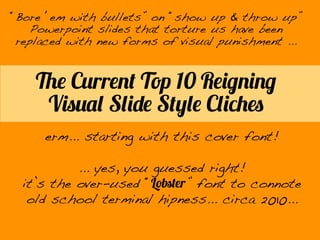
The Current Top 10 Reigning Visual Slide Style Cliches
- 1. The Current Top 10 Reigning Visual Slide Style Cliches erm... starting with this cover font! ... yes, you guessed right! it’s the over-used “Lobster” font to connote old school terminal hipness... circa 2010... “Bore ‘em with bullets” on “show up & throw up” Powerpoint slides that torture us have been replaced with new forms of visual punishment ...
- 2. the opaque banner, obligatory grey/orange thing in Apex font ... often done with grey or a photo background... HEY YOU, I AM A DESIGNER! 1
- 3. the “picture = 1K Words” Haiku Deck thing... I HAVE GREAT IDEAS, RESPECT ME! STAY AWAY FROM DETAILS 2
- 4. BIG IDEA the BIG obligatory TED red/black thing...3
- 5. HEADER BANNER ANOTHER HEADER YET ANOTHER HEADER Praesent posuere, magna in porttitor convallis, nibh dolor condimentum leo, eu tristique justo nisl ac nulla. Praesent posuere, magna in porttitor convallis, nibh dolor condimentum leo, eu tristique justo nisl ac nulla. #% Praesent posuere #% Praesent posuere #% Praesent posuere #% Praesent posuere DESCRIPTION Praesent posuere, magna in porttitor convallis, nibh dolor condimentum leo. DESCRIPTION Praesent posuere, magna in porttitor convallis, nibh dolor condimentum leo. # # # # # 0 3 6 9 12 15 # # # # 0 3 6 9 12 15# # # # # 0 3 6 9 12 15 the infographic thing...4
- 6. the wall of words thing... I HAVE REALLY BIG IDEAS AND I NEED TO CLOBBER YOU ACROSS THE HEAD TO GET YOUR STUPID ATTENTION. IF YOU WERE LESS CLUELESS I WOULDN’T BE REDUCED TO HAVING TO DO THIS TO MAKE MY POINT. YOU SHOULD THANK ME FOR HELPING YOU LIKE THIS! 5
- 7. I have really big ideas so small you can’t read them. Why did “Wired” turn me down for that job? the Minimalist “good taste thing...6
- 8. There are some things which are just cool and I know what is. the “clean white” alpha mask object thing...7
- 9. the “Formalist “approach thing...9 listen nowto me 1 2 3 4
- 10. the “Keep Calm & Carry On” thing...10 SLIDE DESIGNTHAT MAKESYOU A SUPERIOR HUMAN WHY SLIDES CAN SAVEYOUR LIFE IN BIG WAYS BY NOBODYYOU KNOW ?
- 11. No slides. Just talk. the Zen approach thing...0