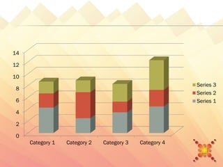
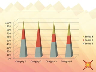
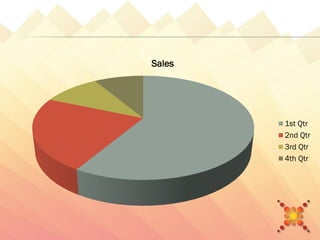
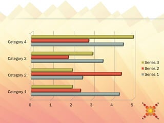
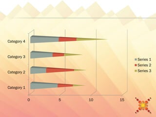
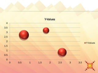


The document contains 4 charts showing sales data over time. The first chart shows sales by quarter for categories 1-4, with category 4 having the highest sales. The second chart shows the percentage of total sales by category each quarter, with category 4 making up over 50% of sales. The third chart compares sales amounts for each category. Category 4 had the highest sales. The fourth chart shows a linear relationship between two variables with y-values ranging from 0 to 4.