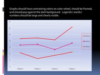
1. Graphs should have contrasting colors on color wheel, should be framed,
and should pop against the dark background. Legends / words /
numbers should be large and clearly visible.
14
12
10
Series 3
8 Series 2
6 Series 1
4
2
0
Category 1 Category 2 Category 3 Category 4
2. NOT what they were taught
6
5
4
Series 1
3
Series 2
2 Series 3
1
0
Category 1 Category 2 Category 3 Category 4
3. Equally Bad
5
4.5
4
3.5
3
2.5
2
1.5
1
0.5 Series 3
0 Series 2
Category 1 Series 1
Category 2
Category 3
Category 4
4. Light screens blind audience
/ loses audience attention
Numbers should be visualized
whenever possible using
chart features / excel in
PPT – lots of options.
5. Lots of
6
Graph 4
Options 2
Series 3
4-6
0 2-4
Series 1
0-2
Sales
1st Qtr
2nd Qtr
3rd Qtr
4th Qtr
6. 5
4
3 Series 1
Series 2
2 Series 3
1
0
Category 1 Category 2 Category 3 Category 4
7. 1/5/2002
35
30
25
20
15
1/9/2002 10 1/6/2002
5
Series 1
0
Series 2
1/8/2002 1/7/2002