Tablet & data
•
1 like•807 views

Report about tablet apps for Information visualization (Courtesy of DesityDesign Research Lab)

Recommended
More Related Content
Similar to Tablet & data
Similar to Tablet & data (20)
Recently uploaded
Recently uploaded (20)
Tablet & data
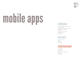
- 1. www.densitydesign.org mobile apps reference HEALTH PROFILE OF ENGLAND HOMESPOTTER ITALIAN BETTER LIFE INDEX RESEARCH NETWORK PENNAT STATS OF THE UNION URBAN FLOW WIKIWEB business GOOGLE GLOBE MINT ROAMBI SPOTFIRE entertainment PLANETARY HITLANTIS ANTIMAP WORLD CUP VISUALIZER BIOLOGIC SOLYARIS
- 2. HEALTH PROFILE OF ENGLAND Illustrate the differences in health performance The different ‘Health Wheels’ distil 32 different health indicators across 9 geographical regions. The wheels act as visual barometers for the health of each region, in order to provide users with an intuitive way of scanning through all the indicators. A map of England communicates the national perspective in response to the wheel, with a colour code identifying which regions score ‘better than’, ‘worse than’ or ‘average’ compared to the national mean. For the regional view, segments on the wheel are color-coded according to the performance of each indicator. CATEGORY REFERENCE VISUALIZATION INTERACTION GEO/MAP - DATAVIZ TOUCH MULTITOUCH SENSORS DEVICE TAP - SLIDE - SCROLL DATA TYPE SOURCE STATIC PROPRIETARY https://vimeo.com/13007086#at=0 by Applied Works www.densitydesign.org
- 3. HOMESPOTTER by Mobile Realty Apps Augmented reality HomeSpotter uses augmented reality coupled with a smartphone or tablet’s GPS and compass to overlay property information on a device’s live camera feed. As a home hunter points their smartphone or tablet down the street, they see a view of the street and info on all the houses for sale pops up. There’s even a radar display that show the direction and proximity of nearby properties for sale. CATEGORY REFERENCE VISUALIZATION INTERACTION GEO/MAP - DATAVIZ TOUCH MULTITOUCH SENSORS DEVICE TAP - SCROLL GPS - CAMERA DATA TYPE SOURCE DYNAMIC SOCIAL/OPEN https://vimeo.com/31953529 www.densitydesign.org
- 4. ITALIAN BETTER LIFE INDEX Life quality informations The application shows informations about Italian life quality using georeferenced data, comparisons, charts and other infoviz. CATEGORY REFERENCE VISUALIZATION INTERACTION CHARTS - GEO/MAP - DATAVIZ TOUCH MULTITOUCH SENSORS DEVICE TAP - SLIDE DATA TYPE SOURCE STATIC SOCIAL/OPEN https://vimeo.com/33801366 by Laura Cattaneo www.densitydesign.org
- 5. RESEARCH NETWORK* by M. Stefaner and C. Warnow * not for tablet Network view of the Max Planck Institutes and their connections This multi-touch installation reveals how Max Planck Institutes collaborate with each other, and with their international partners. The size of the circles represents the number of scientific publications for each institute, and the width of the connecting lines the number of jointly published papers between two institutes. The map of Max Planck institutes on the right shows you their respective locations, whereas the world map on the bottom shows the locations of external collaboration partners. CATEGORY REFERENCE VISUALIZATION INTERACTION NETWORK - GEO/MAP TOUCH MULTITOUCH SENSORS DEVICE TAP - SCROLL SCALE DATA TYPE SOURCE DYNAMIC PROPRIETARY https://vimeo.com/28776928 www.densitydesign.org
- 6. PENNANT by Steve Varga Storytelling for baseball stats Pennant is an interactive history of baseball now available for the iPad. Pennant’s rich interface allows fans to browse and view data from over 115,000 games that have taken place from 1950 to 2010. Seasons, games and events are graphically represented and visualised in a manner that takes them beyond the numbers. The app consists of two main parts, the application itself that lives on the ipad, and the data, which exists on external servers. CATEGORY REFERENCE VISUALIZATION INTERACTION CHARTS - GEO/MAP - DATAVIZ TOUCH MULTITOUCH SENSORS DEVICE TAP - SLIDE - DRAG DATA TYPE SOURCE STATIC SOCIAL/OPEN https://vimeo.com/11372358# www.densitydesign.org
- 7. STATS OF THE UNION Vital health signs of the U.S. on the iPad The interactive visualization provides a geographical view on various detailed statistics, such as population demographics, risk factors and indicators of health, all aggregated per county. iPad owners can explore the geographical distribution of age, population density or ethnicity, check how people are born versus how they die. The population can be filtered by disease, preventative procedures or risk factors, and many other relevant parameters. In addition, interesting views or patterns can be saved and exported. CATEGORY REFERENCE VISUALIZATION INTERACTION GEO/MAP TOUCH MULTITOUCH SENSORS DEVICE TAP - SLIDE - SCROLL SCALE DATA TYPE SOURCE STATIC SOCIAL/OPEN https://vimeo.com/23482967#at=0 by Ben Fry www.densitydesign.org
- 8. URBAN FLOW* by Nordkapp * not for tablet Infoviz & real world Urban Flow is an interface that use GPS coordinates in order to give informations such as city spots, poits of interest, directions traffic density, energy consuption, air quality and parking services. Geolocated informations are visualized on the city map using geographical coordinates of the position of the user. CATEGORY REFERENCE VISUALIZATION INTERACTION INFOVIZ - GEO/MAPS TOUCH MULTITOUCH SENSORS DEVICE TAP GPS DATA TYPE SOURCE DYNAMIC PROPRIETARY https://vimeo.com/26030147#at=0 www.densitydesign.org
- 9. WIKIWEB by Friends of the Web www.densitydesign.org Visual and interactive way to explore knowledge of Wikipedia The app’s interface consists of 2 separate panes, one with a calm rendition of a Wikipedia article, the other with a weighed network graph of all connections of that article with any other article on Wikipedia. Interestingly, these network maps can be shared through email or Twitter. As there already exist plenty of other Wikipedia readers on the market, the key differentiating feature is that of visualizing the connections, and using the resulting graph as an open-ended way to browse through more, and potentially unexpected, articles. CATEGORY REFERENCE VISUALIZATION INTERACTION NETWORK TOUCH MULTITOUCH SENSORS DEVICE TAP - SELECT - TYPE - SCROLL SCALE DATA TYPE SOURCE DYNAMIC SOCIAL/OPEN http://www.wikiwebapp.com/
- 10. GOOGLE GLOBE by Aerys 3D data visualization The Google Globe is a 3D data visualization Chrome Experiment. Aerys decided to port it to Flash to see how hard it might be and how it would perform. CATEGORY BUSINESS VISUALIZATION INTERACTION CHARTS - GEO/MAP - 3D TOUCH MULTITOUCH SENSORS DEVICE SCROLL SCALE DATA TYPE SOURCE STATIC OWN - SOCIAL/OPEN http://www.youtube.com/watch?v=jRMHie8dj9Y www.densitydesign.org
- 11. MINT by Honeycomb www.densitydesign.org Individualized look at personal finances Mint finds new ways of helping the end user visualize their data, and developing things like historical spending behavior. Pinch, tap, and flick on charts and graphs to see where you’re spending and where you can save. CATEGORY BUSINESS VISUALIZATION INTERACTION CHARTS TOUCH MULTITOUCH SENSORS DEVICE UNKNOWN DATA TYPE SOURCE DYNAMIC OWN DATA www.mint.com/how-it-works/anywhere/ipad/
- 12. ROAMBI by MeLLmo www.densitydesign.org Analysis dashboard Roambi Analytics turns data and business reports in visualizations. The application includes reports for mobile systems that allow to touch a scroll informations on the animated display. CATEGORY BUSINESS VISUALIZATION INTERACTION CHARTS TOUCH MULTITOUCH SENSORS DEVICE TAP - SLIDE - SCROLL DATA TYPE SOURCE DYNAMIC OWN - SOCIAL/OPEN www.roambi.com/it/iphone-videos.html
- 13. SPOTFIRE by Tibco Visualize, interact with, and share data The Spotfire App extends the reach of Spotfire analytics to anyone with an iPad. You can visualize, aggregate, filter, and drill into data sets of virtually any size, so you can spot opportunities and risks buried in the data CATEGORY BUSINESS VISUALIZATION INTERACTION CHARTS - GEO/MAP TOUCH MULTITOUCH SENSORS DEVICE TAP - SLIDE - SELECT - SCROLL DATA TYPE SOURCE DYNAMIC SOCIAL/OPEN www.youtube.com/watch?v=EqcUb5N73Sc www.densitydesign.org
- 14. PLANETARY by Bloom Studio www.densitydesign.org Explore your music collection Created using Cinder framework, allows to navigate dynamically through informations about recording artists. Every star in Planetary represents an artist from your music library. Albums are planets, they orbit around their artist star. The planet surface is derived from the album cover art. No two planets are the same. Tracks are moons, they orbit at a speed based on the length of the track. The size of the moon is based on the play count. Artist are filtered by Letter to create a constellation of highlighted stars. CATEGORY ENTERTAINMENT VISUALIZATION INTERACTION NETWORK TOUCH MULTITOUCH SENSORS DEVICE TAP - SCROLL DATA TYPE SOURCE DYNAMIC OWN http://vimeo.com/23168163 MUSIC
- 15. HITLANTIS by Bloom Studio www.densitydesign.org Exploration of the activity streams of your friends Hitlantis allows people to explore their vast online music collection. The bubble map is divided into different musical genres, each distinguished by a different color. Individual artists ‘orbit’ the core as unique bubbles, which increase in size as their content is shared, liked or bought. So the more ‘attention’ an artist receives, the larger it grows, and the closer it gravitates toward the center of the ‘universe’. Hitlantis shows visually what is going on: for instance, the pulsating artist balls reveal what bands are currently played by the music player. CATEGORY ENTERTAINMENT VISUALIZATION INTERACTION DATAVIZ TOUCH MULTITOUCH SENSORS DEVICE TAP - TYPE - SCROLL SCALE DATA TYPE SOURCE http://hitlantis.com/ DYNAMIC SOCIAL/OPEN MUSIC
- 16. ANTIMAP* by Trent Brooks * not for tablet www.densitydesign.org Collecting real time data Using accelerometer and compass sensors, Antimap allows to collect and create own data. The application visualize real time information about speed, rotation and inclination using a dashboard style infoviz. CATEGORY ENTERTAINMENT VISUALIZATION INTERACTION SPORT INFOVIZ TOUCH MULTITOUCH SENSORS DEVICE ACCELEROMETER - COMPASS DATA TYPE SOURCE DYNAMIC COLLECT/CREATE https://vimeo.com/27648004
- 17. WORLD CUP VISUALISER Exploring the real-time sports statistics The World Cup Visualiser proposes a compelling solution: separating your two passions on two separate screens: following a live football match on your massive HDTV screen at home, while exploring the real-time sports statistics on the iPad on your lap. For one, it undoubtedly would augment the average sports discussion with some real facts. CATEGORY ENTERTAINMENT VISUALIZATION INTERACTION CHARTS - DATAVIZ TOUCH MULTITOUCH SENSORS DEVICE UNKNOWN DATA TYPE SOURCE DYNAMIC SOCIAL/OPEN http://mintdigital.com/blog/ipadchallenge SPORT by Mint Digital www.densitydesign.org
- 18. BIOLOGIC by Bloom Studio www.densitydesign.org Exploration of the activity streams of your friends Bloom has chosen a metaphor of biological cells, to graphically and dynamically convey one’s social network and the activities that happen inside of it. As a result, it’s graphical style is unique, to say the least. In terms of visual representation, each ‘cell’ in Biologic represents a unique person. People who have posted more content recently have bigger cells. Each glowing ‘particle’ inside a cell represents a recent update from that respective person. The more a particle is moving around, the more retweets/favorites/likes it has. CATEGORY ENTERTAINMENT VISUALIZATION INTERACTION DATAVIZ TOUCH MULTITOUCH SENSORS DEVICE TAP SCALE DATA TYPE SOURCE DYNAMIC SOCIAL/OPEN http://biologic.bloom.io/ SOCIAL
- 19. SOLYARIS by Beat Raess www.densitydesign.org Exploration into Open Movie Database Solyaris is an “exploration into organic information design to visualise movies, actors, directors and their relationship”. The application for iPad made in Cinder allows you to search the entire Open Movie Database (TMDb) collection for movies, actors or directors. Expand nodes to gather information about their connections. Learn about the cast and filmography. CATEGORY ENTERTAINMENT VISUALIZATION INTERACTION MUSIC NETWORK TOUCH MULTITOUCH SENSORS DEVICE TAP - SLIDE - DRAG - TYPE - SCROLL SCALE DATA TYPE SOURCE DYNAMIC SOCIAL/OPEN http://www.youtube.com/watch?v=nxOOkapKqYs
- 20. VISUALIZATION INTERACTIONS REFERENCE 44.44% HEALTH PROFILE OF ENGLAND HOMESPOTTER ITALIAN BETTER LIFE INDEX RESEARCH NETWORK* tap (14) PENNANT STATS OF THE UNION scroll (11) URBAN FLOW* touch WIKIWEB dataviz (9) BUSINESS 22.22% slide (7) GOOGL GLOBE type (4) geo/map (9) MINT ROAMBI charts (7) SPOTFIRE select (2) drag (2) ENTERTAINMENT 33.33% networks (4) MUSIC 11.11% PLANETARY 3D (1) scale (7) multitouch HITLANTIS SPORT 11.11% GPS (2) ANTIMAP* compass (1) WORLD CUP VISUALIZER camera (1) SOCIAL 5.56% accelerometer (1) BIOLOGIC gyroscope (1) MOVIES 5.56% SOLYARIS * not for tablet unknown (2) sensors
- 21. TYPE SOURCE REFERENCE 44.44% HEALTH PROFILE OF ENGLAND HOMESPOTTER ITALIAN BETTER LIFE INDEX RESEARCH NETWORK* PENNANT STATS OF THE UNION URBAN FLOW* WIKIWEB BUSINESS 22.22% GOOGL GLOBE dynamic (13) social/open (11) MINT ROAMBI proprietary (5) SPOTFIRE static (5) own data (4) ENTERTAINMENT 33.33% MUSIC 11.11% PLANETARY HITLANTIS SPORT 11.11% ANTIMAP* WORLD CUP VISUALIZER SOCIAL 5.56% BIOLOGIC MOVIES 5.56% SOLYARIS * not for tablet collect/create (1)
- 22. www.densitydesign.org suggestions device INTERACT WITH MOTION INTERACT WITH 3D SPACE objects MODIFY VIRTUAL OBJECTS INTERACT WITH PHYSICAL OBJECTS users COLLABORATIVE INTERACTION
- 24. Interact with motion www.densitydesign.org eyetracking 3d space simulation http://www.youtube.com/watch?v=7SImOIMcMlk
- 25. Interact with 3D space www.densitydesign.org Multitouch tilt http://www.youtube.com/watch?v=mAUBwoUB9BQ
- 28. Interact with physical objects www.densitydesign.org devices cards recognizing https://vimeo.com/29945783