Downloaded 19 times

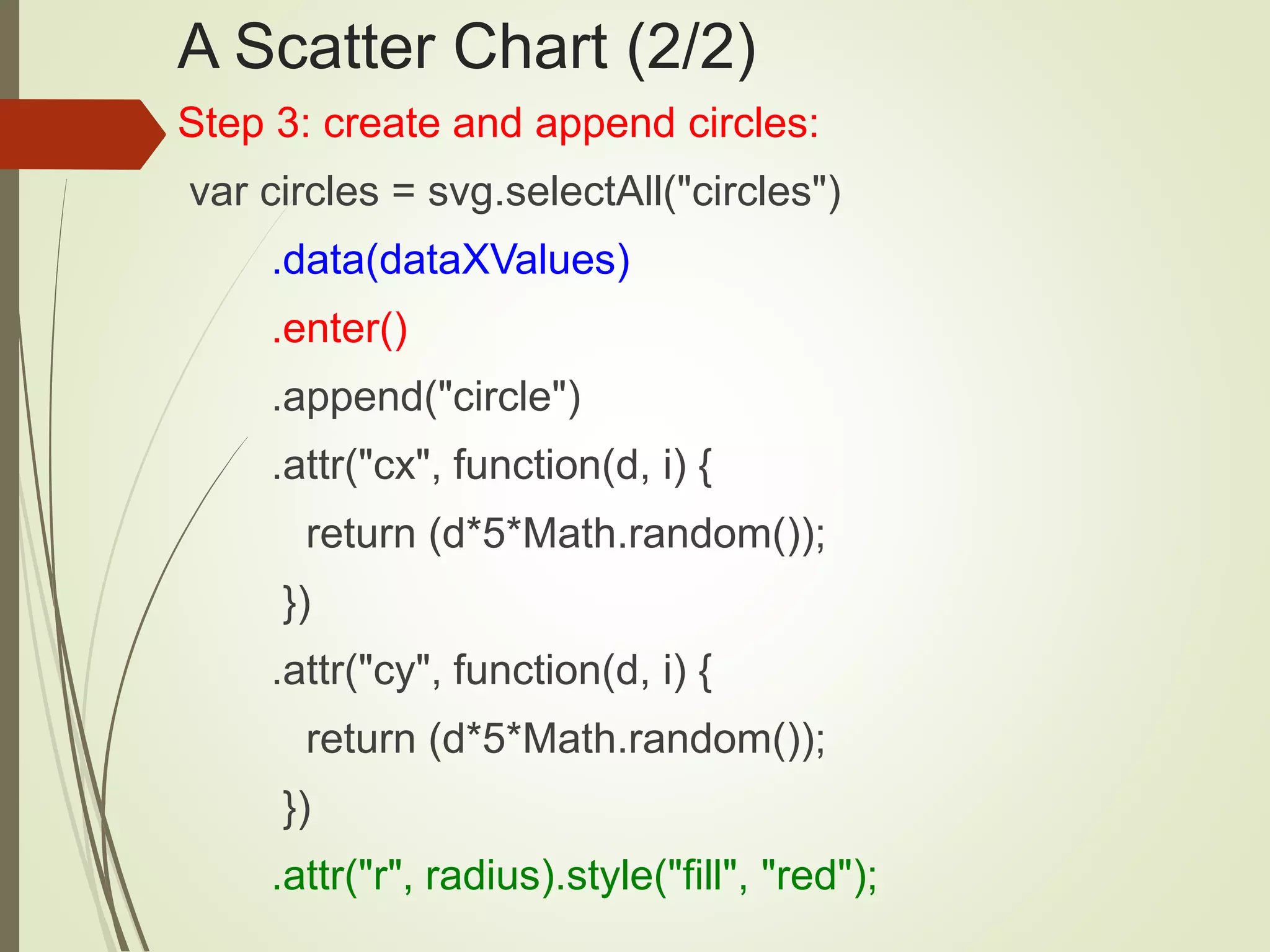
![A Scatter Chart (1/2)
Step #1 define a JS array with data values:
var dataXValues=[10, 50, 20, 80,150,180,220];
Step #2 Create an SVG element:
var svg = d3.select("body")
.append("svg")
.attr("width", width)
.attr("height", height);](https://image.slidesharecdn.com/svgcss3d3-beg1-160513043252/75/SVG-CSS3-and-D3-for-Beginners-44-2048.jpg)
![Use Arrays of Arrays (or Objects)
var dataXYValues=[[10,30], [50,70], [20,200],
[80,300],[70,50],[180,100],[220,250]];
var generalizedCircles = svg.selectAll("circles")
.data(dataXYValues).enter().append("circle")
.attr("cx", function(d, i) { return d[0]; })
.attr("cy", function(d, i) { return d[1]; })
.attr(”r", function(d, i) { return dataRValues[i];})
.style (”fill", function(d, i) { return dataFValues[i];})](https://image.slidesharecdn.com/svgcss3d3-beg1-160513043252/75/SVG-CSS3-and-D3-for-Beginners-46-2048.jpg)

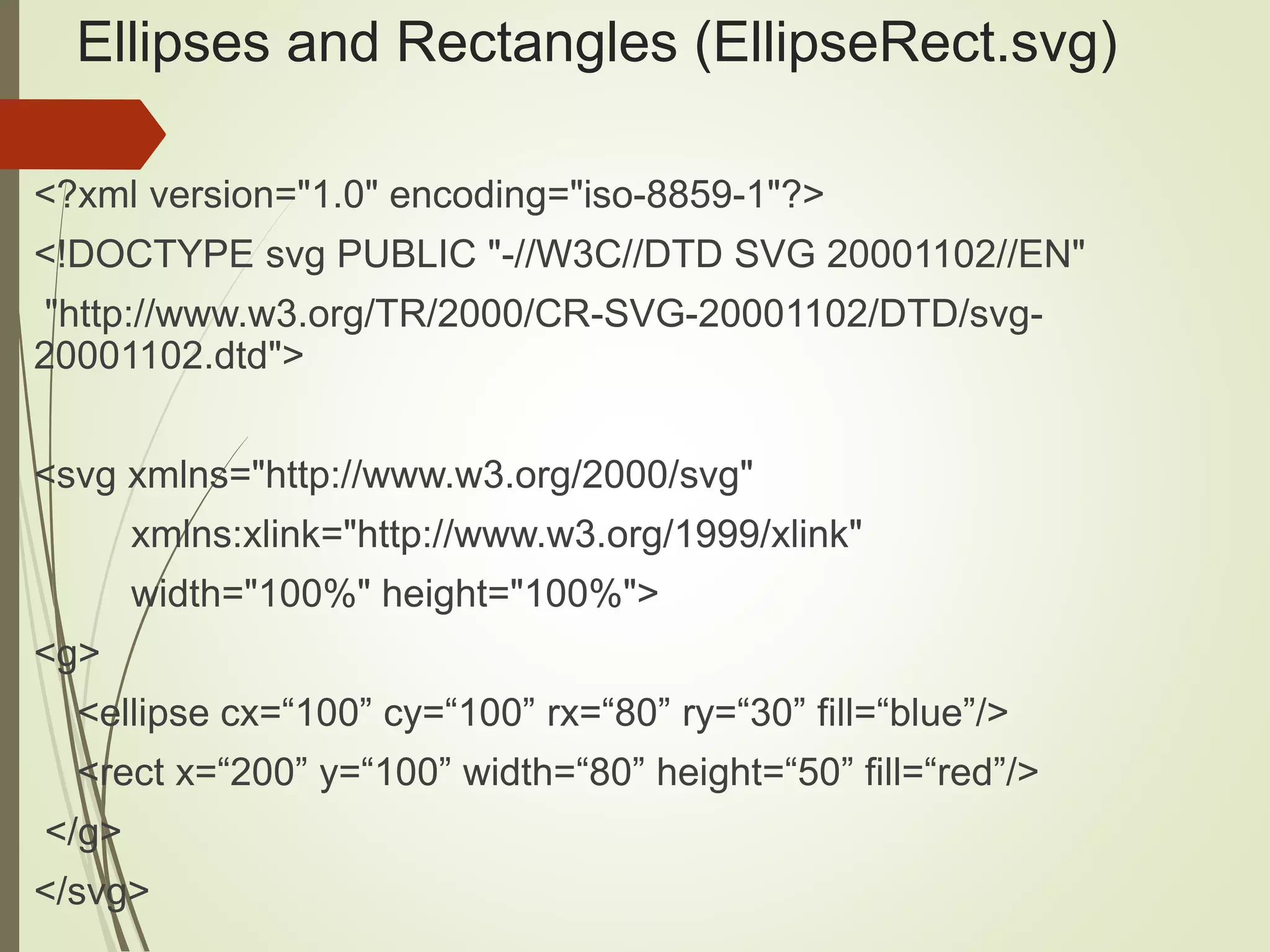
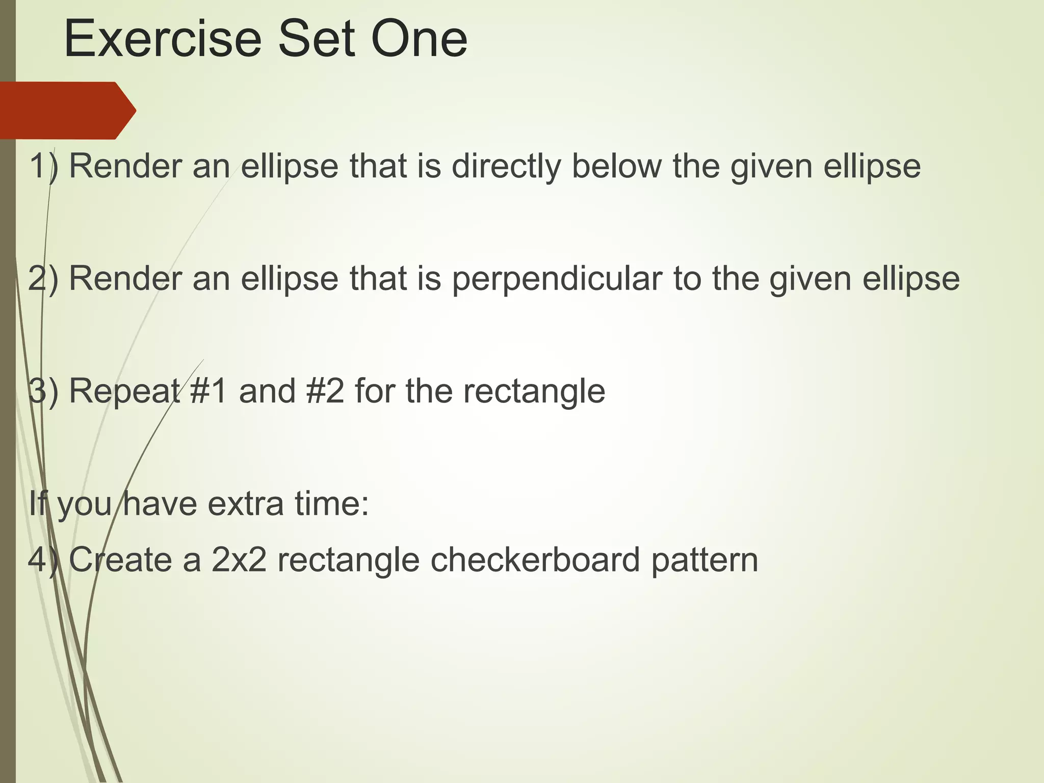
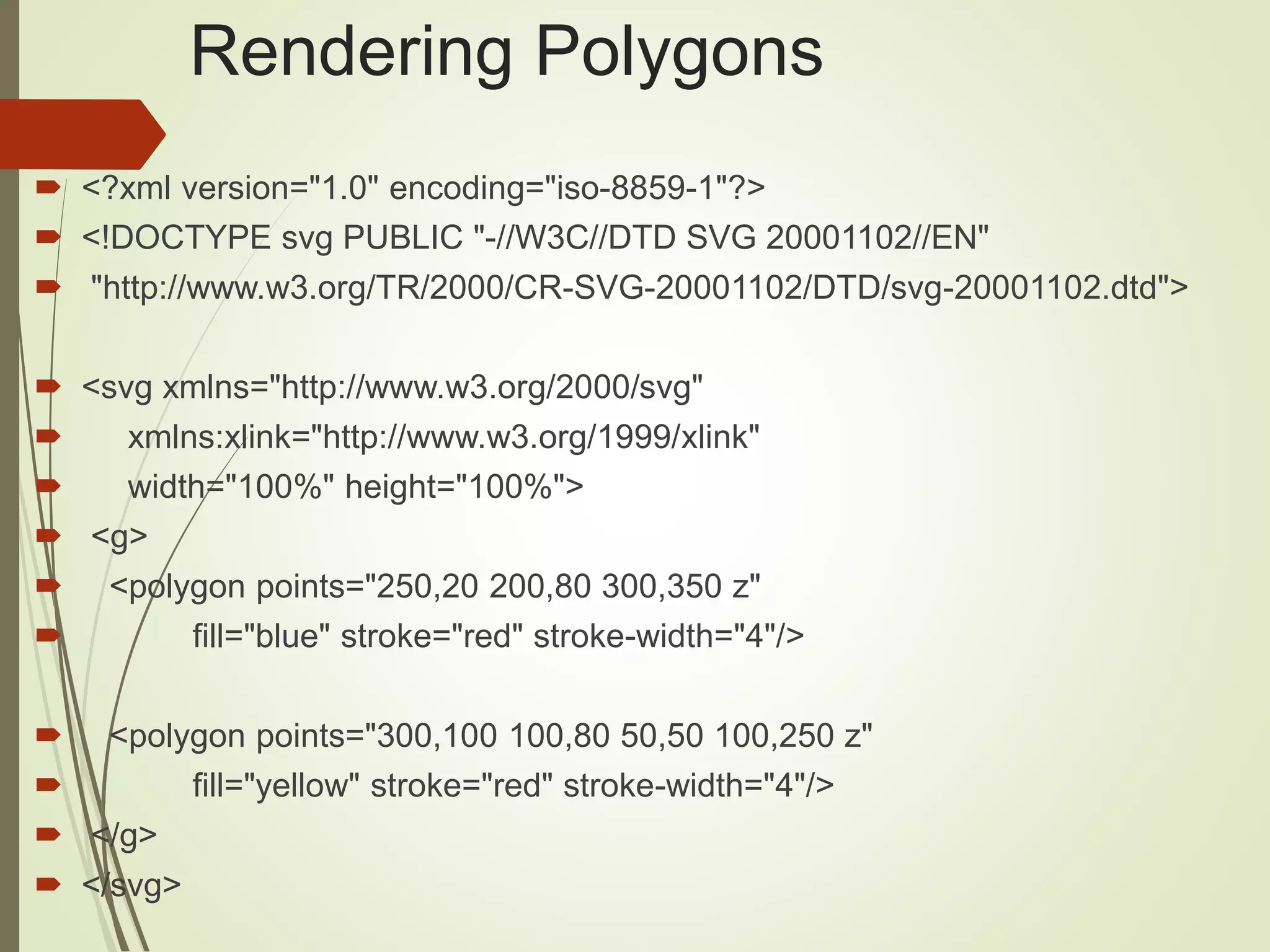
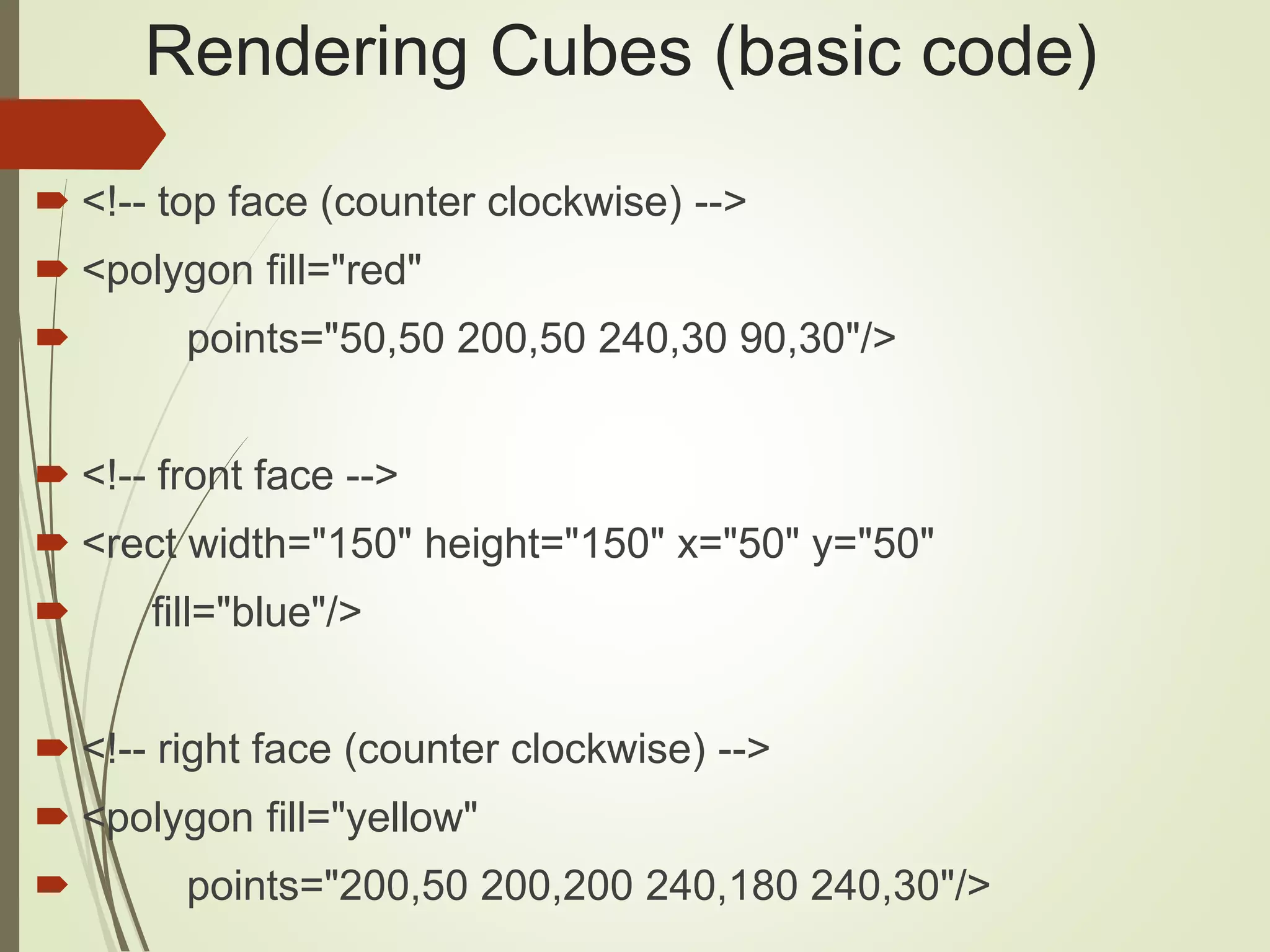
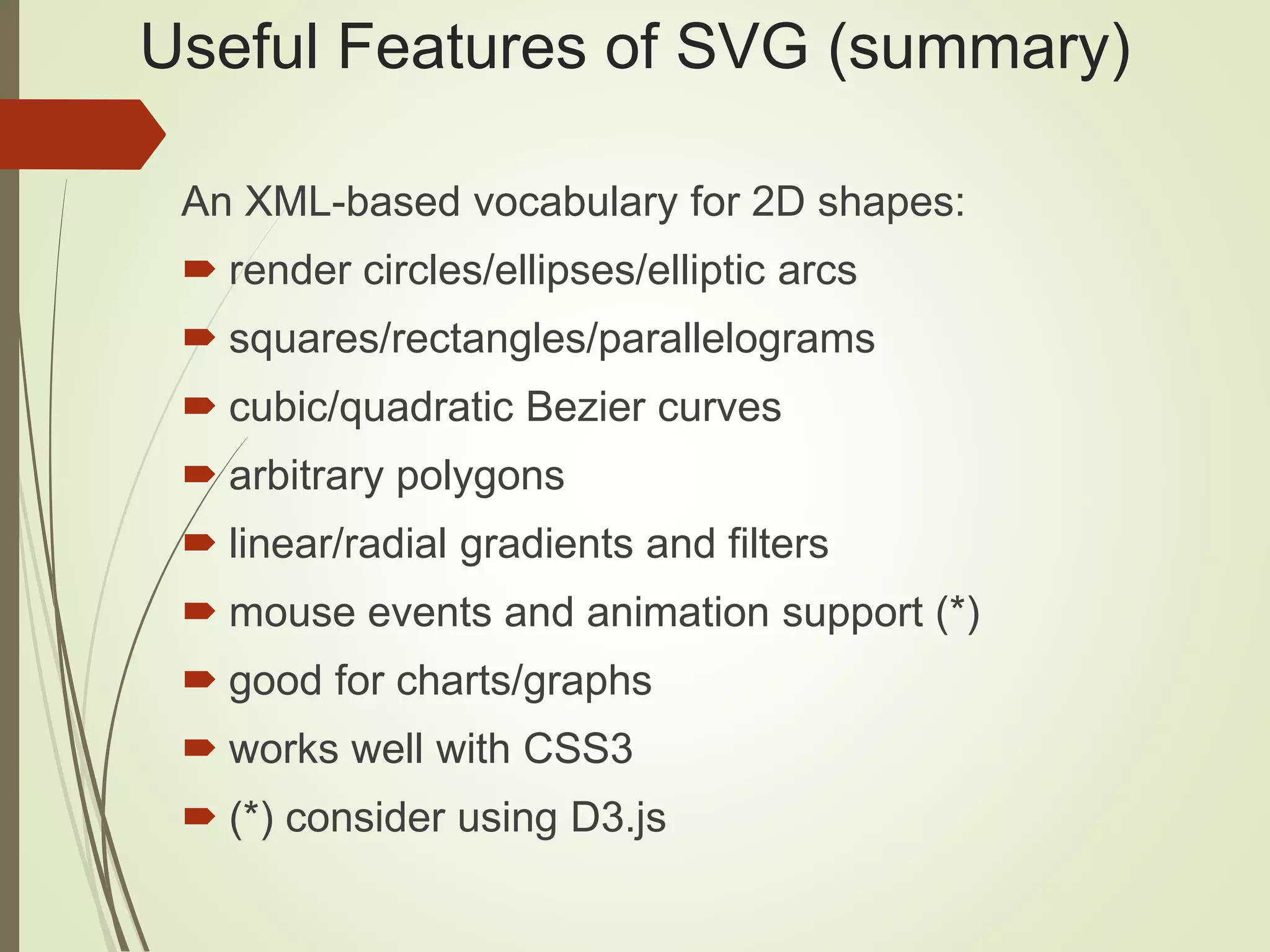
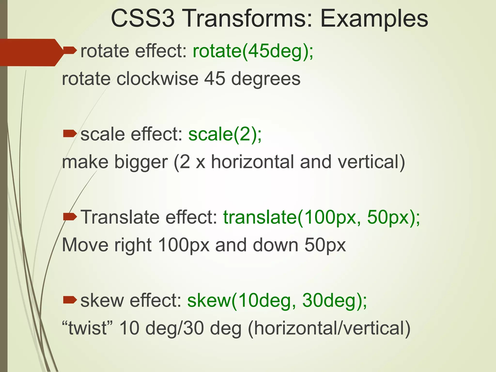
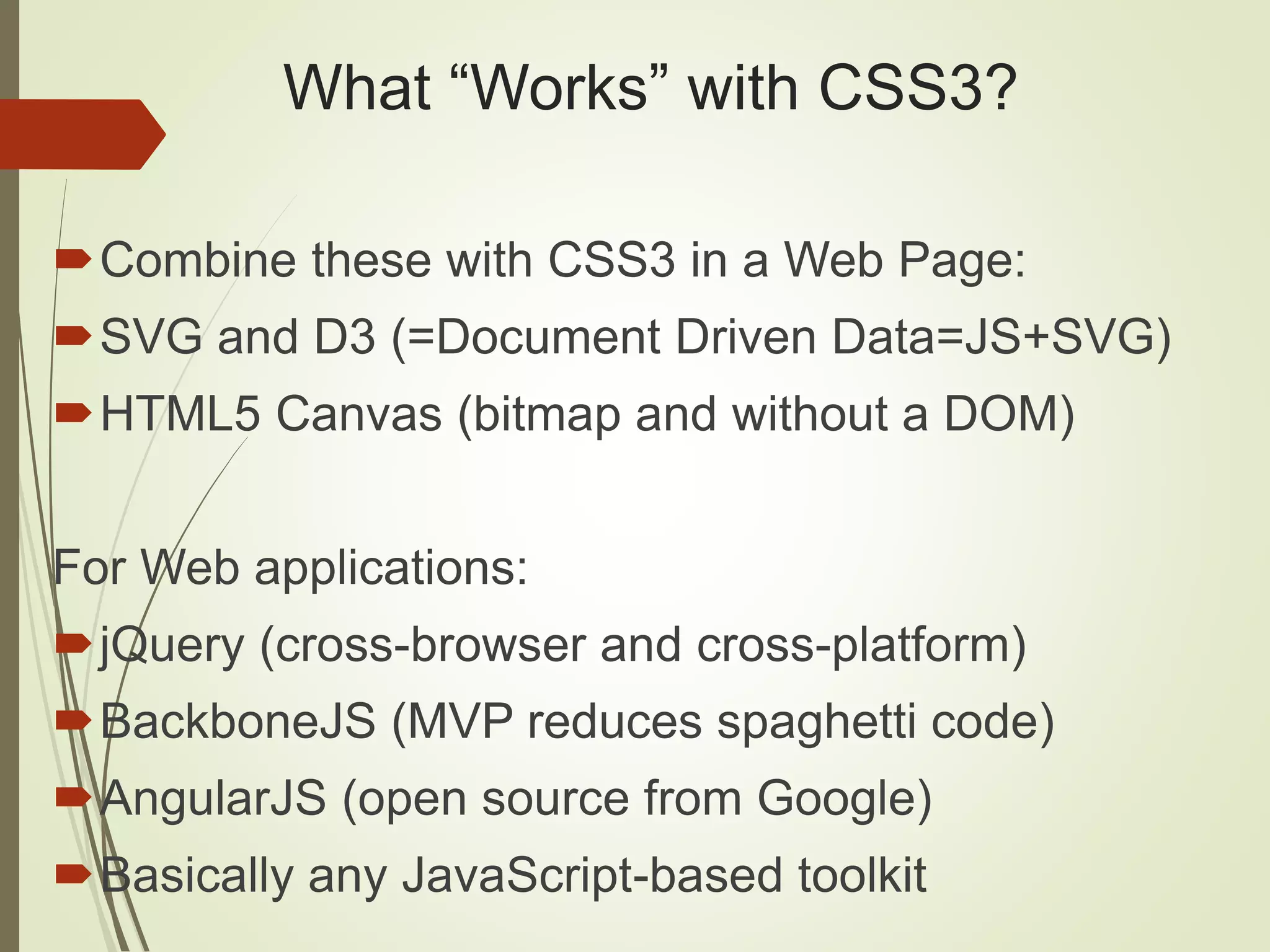
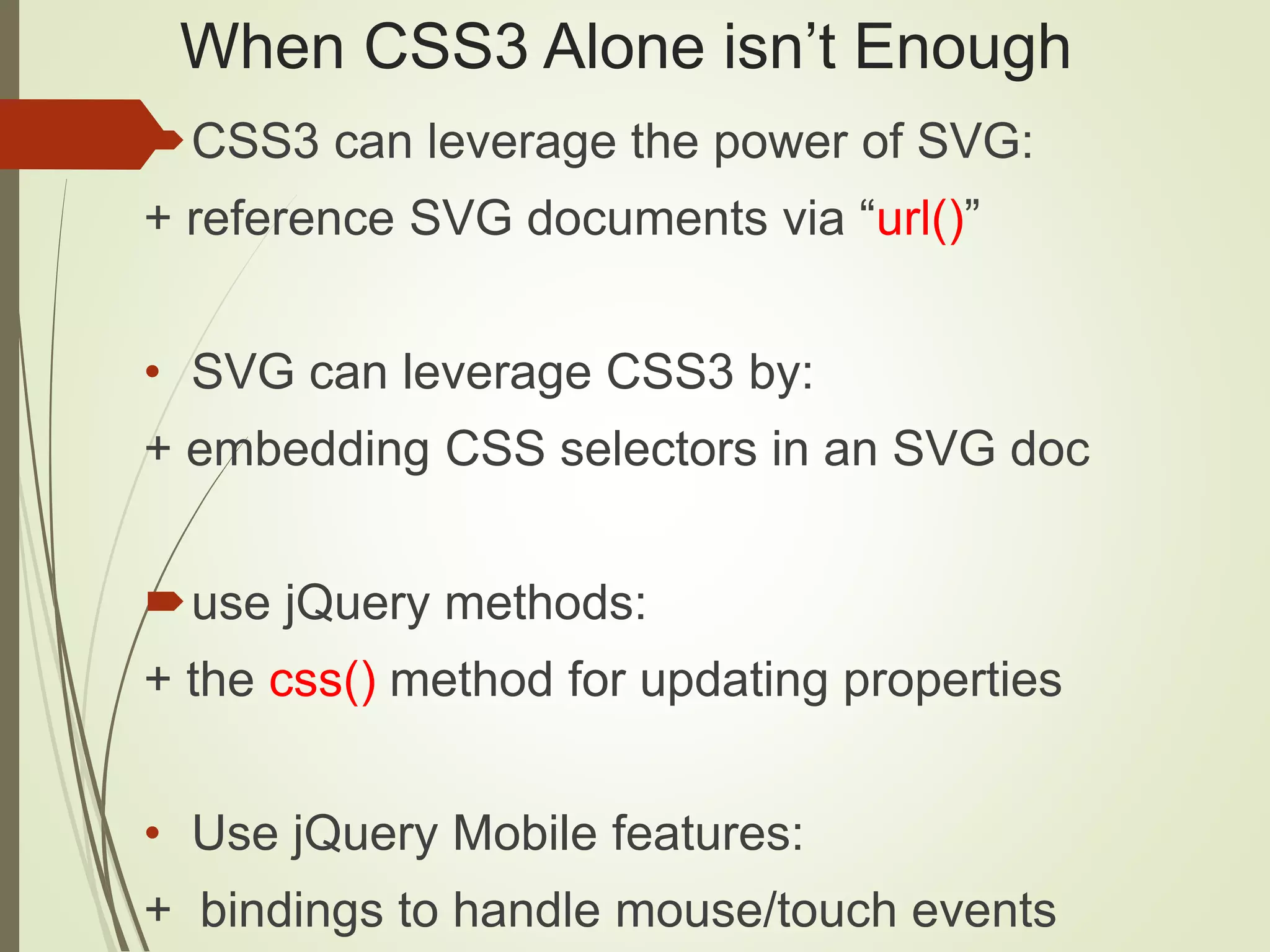
This document provides an overview of SVG, CSS3, and D3 for beginners. It covers key SVG elements like <line>, <ellipse>, <rect>, <polygon>, and <path> as well as features like gradients, filters, transforms and animation. It also demonstrates CSS3 concepts like rounded corners, gradients and transforms. Examples are provided in HTML files with linked CSS style sheets. The document then introduces D3, an open source JavaScript library for data visualization that uses SVG, HTML and CSS. Key D3 concepts, functionality and use cases are outlined.


