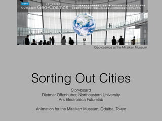
Storyboard Miraikan Sorting Out Cities
•
1 like•846 views

the storyboard for a new installation at the Miraikan Museum, Tokyo, Collaboration with Ars Electronica Futurelab

Recommended
More Related Content
What's hot
What's hot (20)
Similar to Storyboard Miraikan Sorting Out Cities
Similar to Storyboard Miraikan Sorting Out Cities (20)
More from Dietmar Offenhuber
More from Dietmar Offenhuber (6)
Recently uploaded
Recently uploaded (20)
Storyboard Miraikan Sorting Out Cities
- 1. Sorting Out Cities Storyboard Dietmar Offenhuber, Northeastern University Ars Electronica Futurelab ! Animation for the Miraikan Museum, Odaiba, Tokyo Geo-cosmos at the Miraikan Museum
- 2. in out The sequence starts with a bar-chart wrapped around the globe that shows how the land mass is distributed: Ice and desert; cities; grassland, cropland and savanna; forests and wetlands. The bar chart transforms into a map of the earth, showing how these portions are distributed around the earth, then moves back into the bar chart. At the end of the sequence, only the cities cluster remains and turns into a yellow circle.Cities are highlighted in yellow.
- 3. in out Cities occupy 3% of the earth’s land surface. If all urban areas would be combined in one large city, it would be slightly larger than the size of Europe, or about half the size of Brazil.
- 4. Data sources MODIS 500-m map of global urban extent — Center for Sustainability and the Global Environment (SAGE), University of Wisconsin-Madison h"p://sage.wisc.edu/people/schneider/ research/data_readme.html ! Schneider, A., M. A. Friedl and D. Potere (2009) A new map of global urban extent from MODIS data. Environmental Research Le2ers, volume 4, article 044003. ! Center for International Earth Science Information Network - CIESIN - Columbia University, International Food Policy Research Institute - IFPRI, The World Bank, and Centro Internacional de Agricultura Tropical - CIAT. 2011. Global Rural-Urban Mapping Project, Version 1 (GRUMPv1): Urban Extents Grid. Palisades, NY: NASA Socioeconomic Data and Applications Center (SEDAC). h"p://dx.doi.org/10.7927/H4GH9FVG Balk, D.L., U. Deichmann, G. Yetman, F. Pozzi, S. I. Hay, and A. Nelson. 2006. Determining Global Population Distribution: Methods, Applications and Data. Advances in Parasitology 62:119-156. h"p://dx.doi.org/10.1016/S0065-‐308X(05)62004-‐0. ! The dataset used in the animation is a composite of both data sources, downsampled (nearest neighbor) to a grid resolution of 500x250.
- 5. in out Two clusters of moving dots appear, representing the part of the global population that lives in urban and rural areas. After a while, the two populations form a global population map made of dots of different diameters, representing the number of people who live in the respective spatial unit.
- 6. in out 53% of the global population lives in cities; the city cluster is slightly larger than the rural cluster. We also see (in the map, but especially in the histogram), that more than half of the global population lives in Southeast Asia.
- 7. Data sources Center for International Earth Science Information Network - CIESIN - Columbia University. 2014. Gridded Population of the World, Version 4 (GPWv4): Population Count. Palisades, NY: NASA Socioeconomic Data and Applications Center (SEDAC). h"p://sedac.ciesin.columbia.edu/data/set/gpw-‐v4-‐populaMon-‐count.
- 8. in out “Cities are located in different climate zones” The section starts with an animation of the monthly precipitation over the land mass. The rainfall animation blends into a map of the global water footprint, overlaid over the population map. The relevant water footprint index here is the amount of fresh water used in production (including agriculture and industry).
- 9. in out We see that more cities are in relatively moderate climates. We see that in the western part of the world, more water is used in production relative to the population density compared to the rest of the world.
- 10. Data sources GPCC Precipitation Normals Version 2010, Global Precipitation Climatology Centre (GPCC), Deutscher Wetterdienst, Offenbach a. M., Germany Np://Np-‐anon.dwd.de/pub/data/gpcc/html/gpcc_normals_download.html ! Water footprints of national production (1996-2005). h"p:// www.waterfootprint.org/?page=files/WaterStat-‐NaMonalWaterFootprints Hoekstra, A.Y. and Mekonnen, M.M. (2012) The water footprint of humanity, Proceedings of the National Academy of Sciences, 109(9): 3232–3237
- 11. in out “90% of the Earth’s land surface can be reached from a large city within 2 days” This section shows a map of the world colored according to the travel time from a large city to the respective point on the map. The animation starts with yellow dots (around urban areas = areas accessible in less than an hour), blending into red dots (rural areas = areas accessible in 1-2 hours), and then ending with black dots (remote areas = areas accessible in more than 2 days). When the map is complete, all landmass blends together and shows a uniform area sorted by color.
- 12. in out We see that over 90% of the land mass is accessible in less than two days from a major city [6]. Remote areas can be located around the Sahara desert, the Himalaya Mountains, Greenland and the Amazonian rainforest. In the densely populated areas, cities can be reached from most places in minutes rather than hours.
- 13. Data sources Travel time to major cities: A global map of Accessibility, A. Nelson, Global Environment Monitoring Unit – Joint Research Center (JRC), European Commission h"p://bioval.jrc.ec.europa.eu/products/gam/index.htm ! Uchida, H. and Nelson, A. Agglomeration Index: Towards a New Measure of Urban Concentration. Background paper for the World Bank’s World Development Report 2009.
- 14. in out “people move between cities” Starting from our familiar world map, connecting curves start to emerge between countries, representing the most significant migration streams (. The width of the curve corresponds to the number of migrants. The curves are bundled together rather than straight connections, to make the hierarchical nature of connections links easier to read (for example, the curves from the same continents and regions are bundled together). During the past 25 years, Japanese citizens emigrated to the USA, Brunei, Australia, and Canada and Brazil. Japan received immigration from China, South Korea, Brazil, the Philippines and Peru.
- 15. Data sources Abel & Sander (2014). Quantifying Global International Migration Flows. Science, 343 (6178). Abel (2013). Estimating global migration flow tables using place of birth data. Demographic Research 28(18):505-546. http://www.global-migration.info ! The centroid for the flow vectors has been calculated for each country using the population center of gravity derived from the GRUMP dataset (2).
- 16. in out The 20 largest cities in the year 2030. 10 of them, including the 4 largest, will be in Asia. Only 1 of them in Europe, only 2 in North America. Tokyo remains the world’s largest city. An animation introducing the largest urban clusters in the year 2030, according to current forecasts by the UN. The animation concludes with the statement that in the year 2050, two thirds of the world’s population will live in cities.
- 17. Data sources United Nations, Department of Economic and Social Affairs (UNDESA), Population Division special updated estimates of urban population as of October 2011, consistent with World Population Prospects: The 2010 revision and World Urbanization Prospects: The 2009 revision. ! http://esa.un.org/wpp/documentation/WPP%202010%20publications.htm