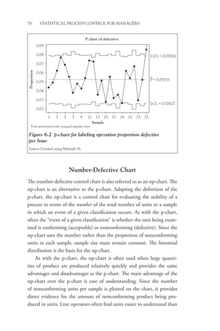
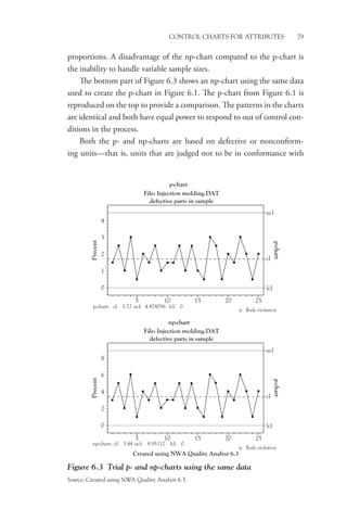
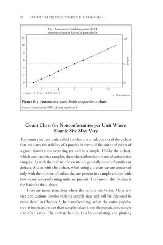
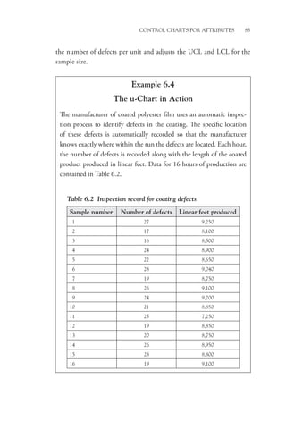
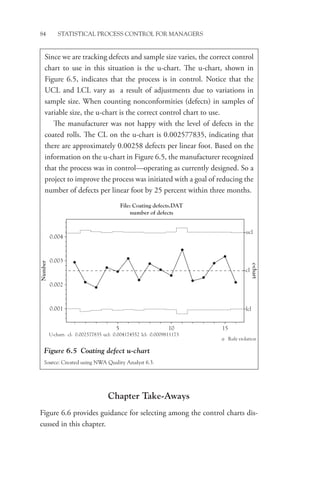
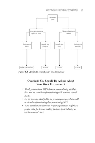
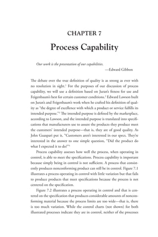
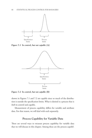
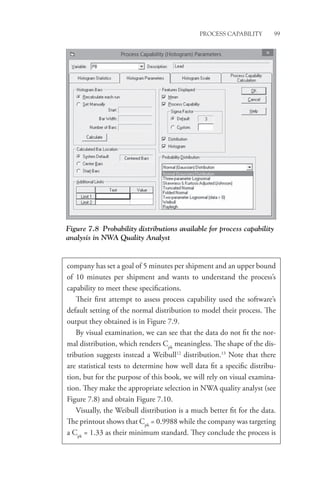
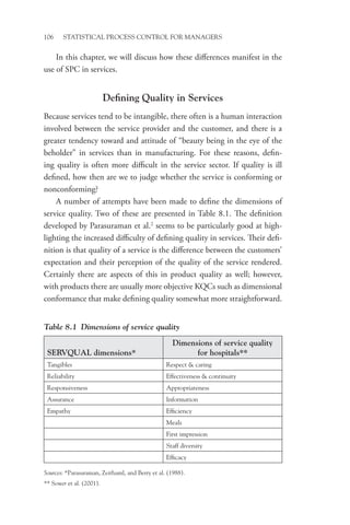
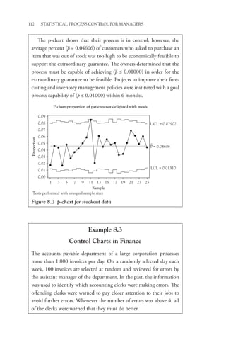
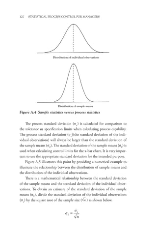
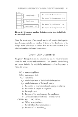
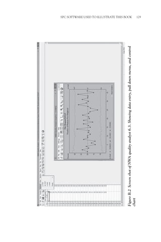
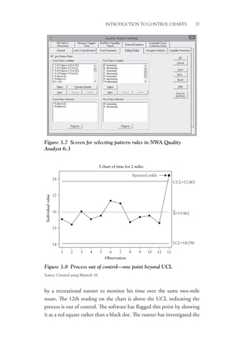
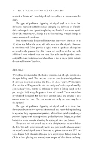
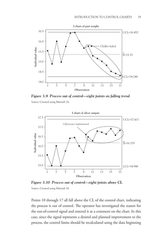
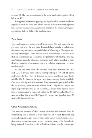
This book provides a conceptual understanding of statistical process control (SPC) for managers. It focuses on how and why managers should consider using SPC rather than technical calculations. The book utilizes popular software packages to create control charts and analyze data. It addresses why SPC is valuable, how to implement it, and how to use it to improve processes, products, and services. Examples from over 25 years of experience illustrate the concepts.


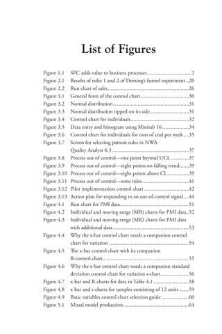


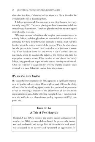


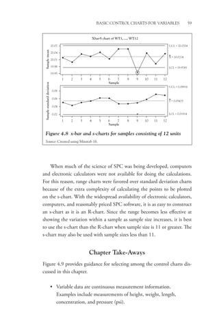

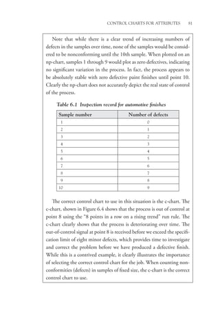
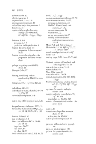
![Advanced Control Charts for Variables 65
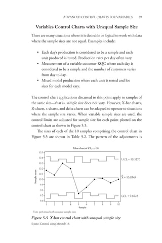
are taken and where two different parts (A and B) are being produced by
the same process. The raw data are entered into the software that calculates
the delta statistic (Observation – Target). Delta-bar, which is the mean of
the delta statistics for each sample [for example (0.002 + 0.004)/2 = 0.003
Delta-bar for Sample No. 1)], is plotted on the delta chart.
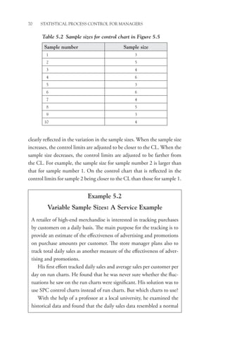
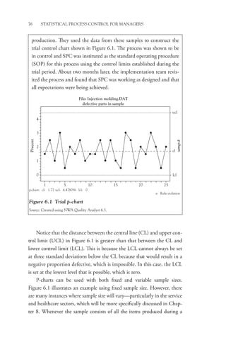
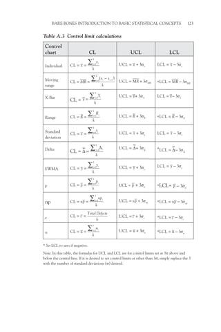
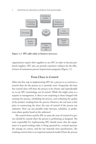
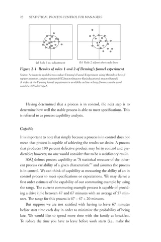
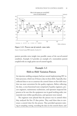
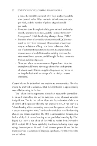
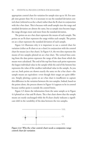
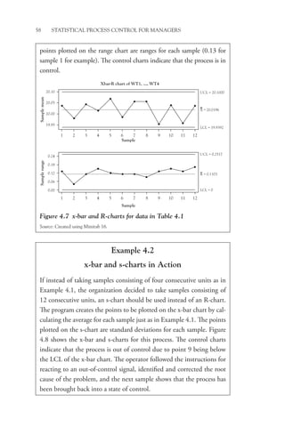
The delta chart, shown in Figure 5.3 with its companion R-chart,
looks like the x-bar chart, but note that if all parts are, on average, exactly
centered on the target value, the central line (CL) of the delta chart will
be zero with the points evenly distributed on either side of the CL when
the process is operating in control.
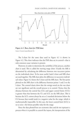
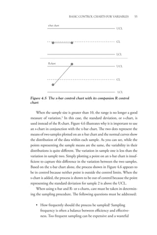
Table 5.1 Calculation of the delta statistic
Sample
No.
Part
ID Target
Obser-
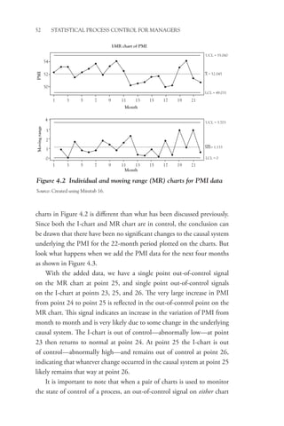
vation
1 raw
Obser-
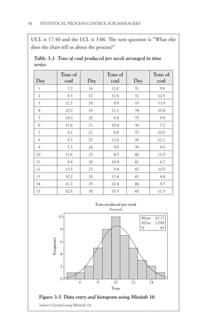
vation
1 delta
Obser-
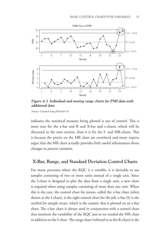
vation
2 raw
Obser-
vation
2 delta
Delta-
Bar
1 A 1.000 1.002 0.002 1.004 0.004 0.003
2 A 1.000 0.991 –0.009 1.009 0.009 0.000
3 B 1.500 1.497 –0.003 1.501 0.001 –0.001
4 B 1.500 1.501 0.001 1.503 0.003 0.002
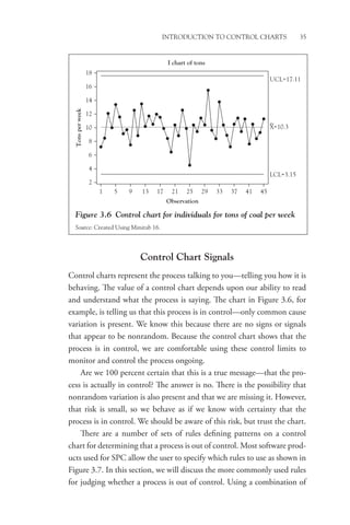
Delta-R chart of C1, ..., C2
Sample
Sample
mean
Sample
range
UCL = 0.01588
X = 0.001
LCL = −0.01388
−0.01
0.00
0.000
0.006
0.012
0.018
0.024
0.01
0.02
1 2 3 4
UCL = 0.02586
R = 0.00791
LCL = 0
Sample
1 2 3 4
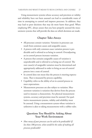
Figure 5.3 Delta and R-charts
Source: Created using Minitab 16.](https://image.slidesharecdn.com/statisticalprocesscontrol-231017131602-5a4010de/85/Statistical-Process-Control-pdf-88-320.jpg)