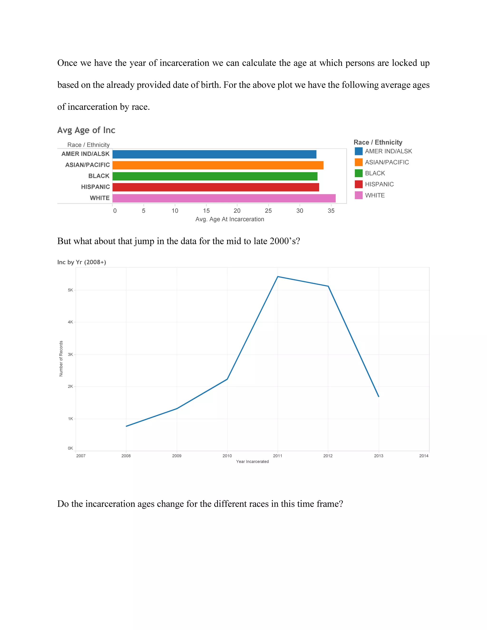
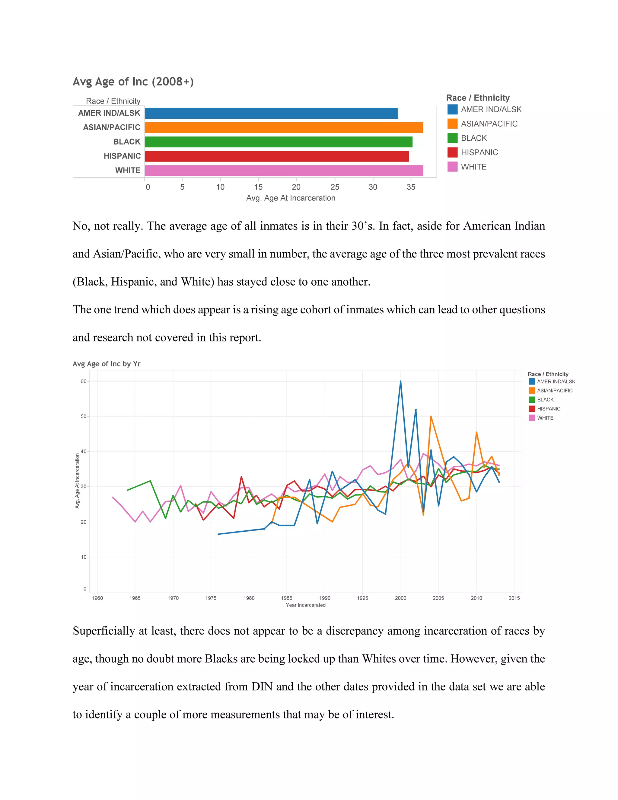
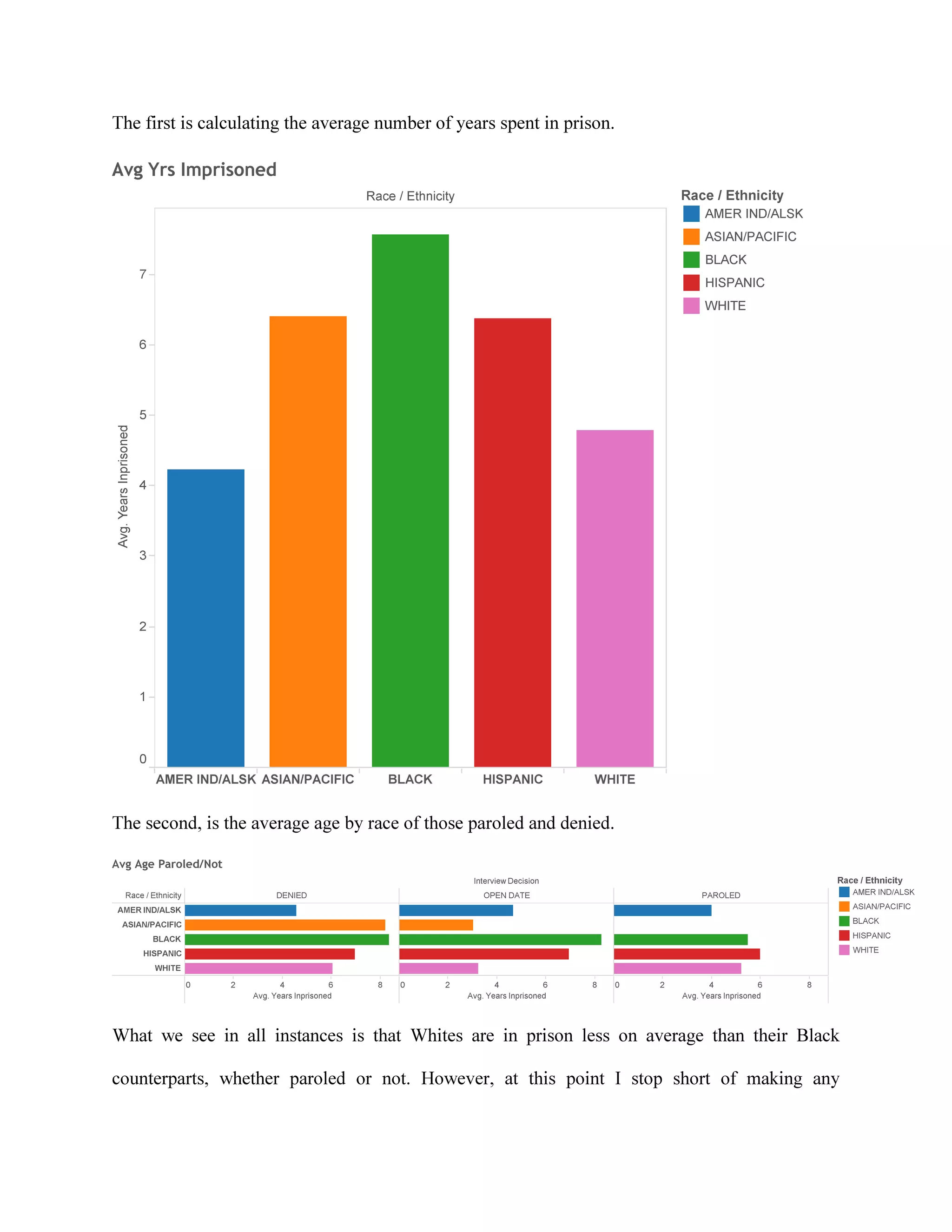
Download to read offline
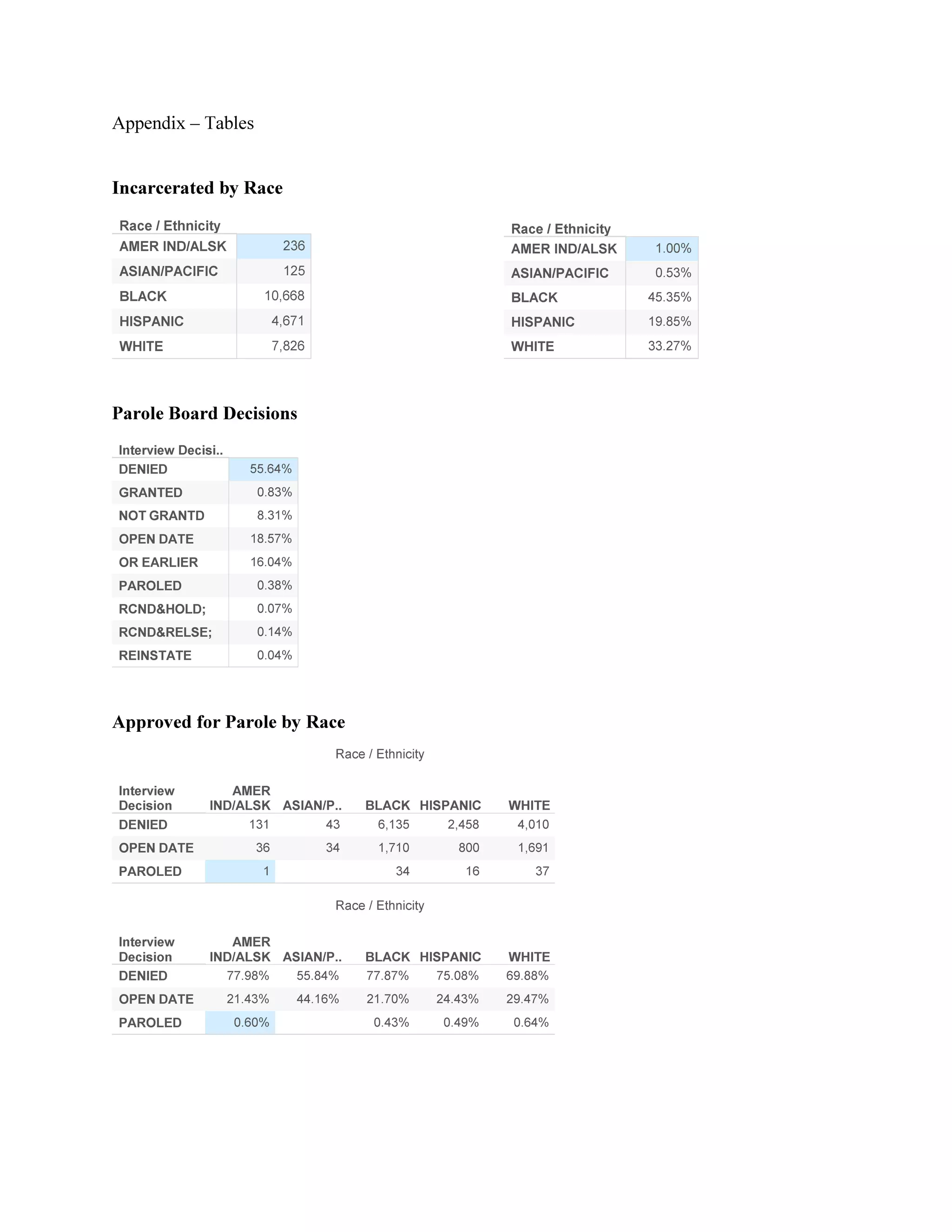

The document analyzes New York State parole data with a focus on race demographics among inmates and parole decisions. It reveals that over half of inmates are denied parole and highlights potential racial disparities, with higher incarceration rates for black individuals compared to their white counterparts. Further research is recommended to explore the impacts of crime types on prison time and parole outcomes, as current data lacks details on offenses committed.


![Incareration Project presentation (2) (2) [Repaired]](https://cdn.slidesharecdn.com/ss_thumbnails/19c99f2f-9820-4738-98d2-e23f57d93c11-160524111517-thumbnail.jpg?width=640&height=640&fit=bounds)


