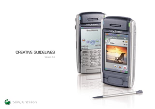
Sony Ericsson Creative Guidleines P810
•
4 likes•606 views

The creative guidelines for the full 810 Smart Phone marketing campaign.

Recommended
More Related Content
Viewers also liked
Similar to Sony Ericsson Creative Guidleines P810
Similar to Sony Ericsson Creative Guidleines P810 (20)
More from Mathew C.P Hayward
Sony Ericsson Creative Guidleines P810
- 2. Introduction Guiding Principles Tone of Voice Above the Line Below the Line TV CONTENTS 1
- 3. As our industry gets more and more complex and confusing, Sony Ericsson wants to simplify the product offering and communication, allowing the product to stand proud. This information illustrates how key elements will be used in advertising materials to demonstrate a Sony Ericsson style and create greater consistency as a brand. This is NOT a completely fixed advertising template, but there are definite rules regarding core elements, such as photographic style and use of the Sony Ericsson logotype that must be followed to start to build a Sony Ericsson style. INTRODUCTION 2
- 4. 1. The product is the hero. It is the centre of everything we produce and must be the focus of all communication. The core benefit of the product must always be focused on. 2. All communications must illustrate one of the three core areas of the Sony Ericsson Application focus: • Imaging / Messaging • Entertainment (Music / Gaming) • Connectivity 3. Respect must always be paid to the Sony Ericsson Logotype. It must always be reproduced faithfully using master artwork and following the principles as laid out in these guidelines and in the Sony Ericsson Identity Guidelines. GENERAL GUIDING PRINCIPLES 3 WITHTHE NEW SONY ERICSSON T610 t-six-ten.com sonyericsson.com/p800 to full personal organiser capabilities, and a memory stick to give you all the bytes you need. You can even view e-mail attachments on your phone. So not only does it keep your life in order, it keeps you entertained too. In fact, it’s the only piece of kit you’re ever going to need. If you want to up your game, look no further than the P800 smartphone. It carries all the latest technology from top of the range digital camera Lateral thinking. P800 smartphone.
- 5. ‘Simplicity’ has become even more important as a tone and visual manner for the company. Sony Ericsson needs to stand out from the crowd. We started this company with an aim of challenging the industry ‘norms’. This must be illustrated in visuals, which means a lack of clutter; simple clear messages and a simple single idea. TONE OF VOICE 4
- 6. Print 1 Photographic Style 2 The Sony Ericsson Logotype 3 Feature/Application Brands 4 Headlines 5 Feature Column 6 URL Placement 7 3rd Party logo placement Please note: These guidelines should be used in combination with all of the basic Sony Ericsson Identity guidelines, for reproduction of our logotype and basic corporate identity rules. ABOVE THE LINE 5
- 7. 6 t-six-ten.com THE NEW SONY ERICSSON T610 WITH Simplicity in form, with sleek, clean lines of high gloss black and brushed aluminium, designed to be tactile and responsive. Simplicity in function, with a built-in camera, snap-on-flash and new QuickShare™ functionality that delivers an intuitive imaging experience for faster, easier image sharing. QuickShare™ starts with a built- in camera. Where it ends is up to you. • In-built camera with shutter button • High Resolution 65,536 colour screen • MMS • Bluetooth and Infra Red Connectivity • Polyphonic Sound with DJ melody Composer • Easy-to-use menu with Joystick. 5 3 2 6 1 4 Photographic Style The Sony Ericsson Logotype Feature/Application Brands Headlines Feature Column URL Placement6 5 4 3 2 1
- 8. 7 t-six-ten.com WITH THE NEW SONY ERICSSON T610 Simplicity in form, with sleek, clean lines of high gloss black and brushed aluminium, designed to be tactile and responsive. Simplicity in function, with a built-in camera, snap-on-flash and new QuickShare™ functionality that delivers an intuitive imaging experience for faster, easier image sharing. QuickShare™ starts with a built- in camera. Where it ends is up to you. • In-built camera with shutter button • High Resolution 65,536 colour screen • MMS • Bluetooth and Infra Red Connectivity • Polyphonic Sound with DJ melody Composer • Easy-to-use menu with Joystick. Photographic Style The Sony Ericsson Logotype Feature/Application Brands Headlines Feature Column URL Placement6 5 4 3 2 1 5 3 2 6 1 4
- 9. Photographic Style The Sony Ericsson Logotype Feature/Application Brands Headlines Feature Column URL Placement6 5 4 3 2 1 8 sonyericsson.com/p800 to full personal organiser capabilities, and a memory stick to give you all the bytes you need. You can even view e-mail attachments on your phone. So not only does it keep your life in order, it keeps you entertained too. In fact, it’s the only piece of kit you’re ever going to need. If you want to up your game, look no further than the P800 smartphone. It carries all the latest technology from top of the range digital camera Lateral thinking. P800 smartphone. 2 4 1 5 6
- 10. Sony Ericsson has 3 photographic categories: • Product • Screen Content / Application Support • Inferred Lifestyle PHOTOGRAPHIC STYLE 9
- 11. The product should be central to all photography and should be iconic. The product is the hero - never demean or disfigure the product. Lighting is essential to accentuate physical beauty and illustrate the Sony Ericsson industrial design language. MAIN PRODUCT SHOT 10
- 12. These images are never used as the hero image. They always appear in the body copy area. Their function is to show: • Accessories – ie flash on T610 • Applications - imaging, messaging, connectivity ie In-built Camera or Memory Stick on P800, camera button on t610 • Colourways They are always placed in the Feature Column on the print layout (see page 16 for details) FEATURE COLUMN PRODUCT SHOTS 11
- 13. PICTURES Screen shots can be used to enhance the story and core benefits of the product in all print executions. They can use humor and / or pictures that are not offensive. Richness in color and definition is important, but should not exceed the products capability (if in any doubt a statement can be placed on the advertisement stating that picture quality has been enhanced). MENU SCREENS • Menu Screens should never be used with the main hero product shot • The Menu Screens must be relevant to the communication message The screens of the phones must never be blank. SCREEN CONTENT 12
- 14. There are two elements of ‘Inferred Lifestyle’. • Reflecting the lifestyle of the target consumer • Showing the target consumer When using talent in the second option, they must be attractive and aspirational, and they must be illustrating the core feature/s of the product in relation to either Imaging / Entertainment or Connectivity. Any additional photography must always compliment the hero product and not fight with it. INFERRED LIFESTYLE 13
- 15. SONY ERICSSON LOGOTYPE USAGE The Logo must be reproduced faithfully. Always use master artworks when reproducing the logotype and any of its elements. Please refer to the Sony Ericsson Corporate Identity Guidelines for full usage instruction/colour etc. • Never redraw or distort the logotype in any way • Combination B of the Sony Ericsson logotype is the only approved combination to use in advertising materials. • The logotype must be placed on uncluttered neutral backgrounds, photographs or pictures. See overleaf for examples of logo misuse • Keep the isolation zone from any other graphical elements. Never combine the stylised Name with anything else • Minimum size for the Sony Ericsson logotype is 6mm for the Symbol and a minimum width of the 10mm for the Stylised Name SONY ERICSSON LOGOTYPE 14 (Combination B)
- 16. EXAMPLES OF LOGO MISUSE 15
- 17. SONY ERICSSON LOGOTYPE COLOUR The Sony Ericsson logotype should always be displayed using one of the following colours: • The liquid identity will only be represented in four colour CMYK • The stylised name is reproduced in Pantone 431C which is the Sony Ericsson Grey • For four colour CMYK print, simulate the Pantone 431C with 65% black • When displaying the logotype independently, use one of the four corporate colours indicated below. SONY ERICSSON LOGOTYPE 16 PANTONE 431C (SE GRAY) PANTONE 877C (SILVER)PANTONE BLACKPANTONE 343C (SE GREEN)WHITE
- 18. SONY ERICSSON LOGOTYPE PLACEMENT The Sony Ericsson logotype should always be placed in the bottom left hand corner. SONY ERICSSON LOGOTYPE 17 sonyericsson.com/p800 to full personal organiser capabilities, and a memory stick to give you all the bytes you need. You can even view e-mail attachments on your phone. So not only does it keep your life in order, it keeps you entertained too. In fact, it’s the only piece of kit you’re ever going to need. If you want to up your game, look no further than the P800 smartphone. It carries all the latest technology from top of the range digital camera Lateral thinking. P800 smartphone. t-six-ten.com THE NEW SONY ERICSSON T610 WITH Simplicity in form, with sleek, clean lines of high gloss black and brushed aluminium, designed to be tactile and responsive. Simplicity in function, with a built-in camera, snap-on-flash and new QuickShare™ functionality that delivers an intuitive imaging experience for faster, easier image sharing. QuickShare™ starts with a built- in camera. Where it ends is up to you. • In-built camera with shutter button • High Resolution 65,536 colour screen • MMS • Bluetooth and Infra Red Connectivity • Polyphonic Sound with DJ melody Composer • Easy-to-use menu with Joystick. 2 2
- 19. SONY ERICSSON LOGOTYPE SIZE Print vs Poster A print logo’s height should be roughly 5% of the overall height of the ad e.g. x is 5% of y The logo on a Poster should be at least 30% larger that that on a press ad due to the shorter dwell time on the creative. SONY ERICSSON LOGOTYPE 18 WITHTHE NEW SONY ERICSSON T610 t-six-ten.com THE NEW SONY ERICSSON T610 WITH t-six-ten.com Press DPS - 100% 48-Sheet Poster THE NEW SONY ERICSSON T610 WITH t-six-ten.com 6-Sheet Poster t-six-ten.com WITH THE NEW SONY ERICSSON T610 Simplicity in form, with sleek, clean lines of high gloss black and brushed aluminium, designed to be tactile and responsive. Simplicity in function, with a built-in camera, snap-on-flash and new QuickShare™ functionality that delivers an intuitive imaging experience for faster, easier image sharing. QuickShare™ starts with a built- in camera. Where it ends is up to you. • In-built camera with shutter button • High Resolution 65,536 colour screen • MMS • Bluetooth and Infra Red Connectivity • Polyphonic Sound with DJ melody Composer • Easy-to-use menu with Joystick. Press Single Page - 100% x y
- 20. Feature/Application based logos are a new introduction to Sony Ericsson Advertising. The first of these is QuickShare™ and has been developed to promote the uptake and functionality of our premium imaging products. In the future additional feature brands may evolve and will also be utilised in the same manner with the same strict guidelines policy. Feature logos must always be utilised in the copy where applicable Feature Brands/Quickshare Each Feature brand will have different guidelines. Below is an example using Quickshare. • The QuickShare logo must be reproduced from master artwork. • The QuickShare logo can be used in both positive and negative imprinting. • The QuickShare logo should never be used in combination with other letters, designs, symbols or logos. It must be used independently. • The QuickShare logo must never be larger than the Sony Ericsson logotype. • It is recommended to use a neutral color (black / white / grey / silver) and should always be in a single color. • The isolation zone should conform to the specifications shown For examples of incorrect use, see next page x x x x x x x x x x FEATURE/APPLICATION BRANDS 19 t-six-ten.com Simplicity in form, with sleek, clean lines of high gloss black and brushed aluminium, designed to be tactile and responsive. Simplicity in function, with a built-in camera, snap-on-flash and new QuickShare™ functionality that delivers an intuitive imaging experience for faster, easier image sharing. QuickShare™ starts with a built- in camera. Where it ends is up to you. • In-built camera with shutter button • High Resolution 65,536 colour screen • MMS • Bluetooth and Infra Red Connectivity • Polyphonic Sound with DJ melody Composer • Easy-to-use menu with Joystick. 3
- 21. 20 EXAMPLES OF FEATURE/APPLICATION BRANDS MISUSE
- 22. HEADLINES THE NEW SONY ERICSSON T610 • Print and poster ads must always include a Headline. • Headlines must be set in Eurostile Regular. • Headlines must be in proportion to other elements in ad (see examples). ABCDEFGHIJKLMNOPQRSTUVWXYZ abcdefghijklmnopqrstuvwxyz 01234567890 • Headlines must not be in italics. • Do not adapt or distort the Headline font. THE NEW SONY ERICSSON T610 Lateral thinking. P800 smartphone. 21 HEADLINE HEADLINE P800 Headline T610 Headline 4 WITH THE NEW SONY ERICSSON T610 t-six-ten.com WITH THE NEW SONY ERICSSON T610 t-six-ten.com
- 23. The Feature column contains the following elements: A Close up Product Shots B Feature Logo/Application Brands C Body Copy You can include screen shots, close ups or photos to show additional colours and accessories. However, these must be incorporated into the Feature Column. FEATURE COLUMN 22 t-six-ten.com Simplicity in form, with sleek, clean lines of high gloss black and brushed aluminium, designed to be tactile and responsive. Simplicity in function, with a built-in camera, snap-on-flash and new QuickShare™ functionality that delivers an intuitive imaging experience for faster, easier image sharing. QuickShare™ starts with a built- in camera. Where it ends is up to you. • In-built camera with shutter button • High Resolution 65,536 colour screen • MMS • Bluetooth and Infra Red Connectivity • Polyphonic Sound with DJ melody Composer • Easy-to-use menu with Joystick. 5
- 24. FEATURE COLUMN CLOSE-UP PHOTOGRAPHY No photographs may exceed the alignment of the feature column. See page 8 for details. FEATURE COLUMN – FEATURE BRAND It is recommended that all Feature Brands be placed in the Feature column. The combination of the Feature logo, Body Copy and Close up Product shots highlight the core benefits of the product. The column should always be set on the right edge of the page with a wide enough measure to display the product shots at an acceptable size B A FEATURE COLUMN 23 t-six-ten.com WITH THE NEW SONY ERICSSON T610 Simplicity in form, with sleek, clean lines of high gloss black and brushed aluminium, designed to be tactile and responsive. Simplicity in function, with a built-in camera, snap-on-flash and new QuickShare™ functionality that delivers an intuitive imaging experience for faster, easier image sharing. QuickShare™ starts with a built- in camera. Where it ends is up to you. • In-built camera with shutter button • High Resolution 65,536 colour screen • MMS • Bluetooth and Infra Red Connectivity • Polyphonic Sound with DJ melody Composer • Easy-to-use menu with Joystick. sonyericsson.com/p800 to full personal organiser capabilities, and a memory stick to give you all the bytes you need. You can even view e-mail attachments on your phone. So not only does it keep your life in order, it keeps you entertained too. In fact, it’s the only piece of kit you’re ever going to need. If you want to up your game, look no further than the P800 smartphone. It carries all the latest technology from top of the range digital camera Lateral thinking. P800 smartphone. A A B
- 25. BODY COPY • Body Copy should be used in the advertising where appropriate ie where more explanation of product features is required and the advertising environment is correct. • Body Copy is set in upper and lower case Helvetica. ABCDEFGHIJKLMNOPQRSTUVWXYZ abcdefghijklmnopqrstuvwxyz 0123456789 • Print and Poster ads can appear with Headline only without Body Copy. sonyericsson.com/p800 to full personal organiser capabilities, and a memory stick to give you all the bytes you need. You can even view e-mail attachments on your phone. So not only does it keep your life in order, it keeps you entertained too. In fact, it’s the only piece of kit you’re ever going to need. If you want to up your game, look no further than the P800 smartphone. It carries all the latest technology from top of the range digital camera martphone. C FEATURE COLUMN 24 C
- 26. The URL should sit on the same baseline as the text on the Sony Ericsson logo, ranging right with the feature columnURL USAGE 25 t-six-ten.com Simplicity in form, with sleek, clean lines of high gloss black and brushed aluminium, designed to be tactile and responsive. Simplicity in function, with a built-in camera, snap-on-flash and new QuickShare™ functionality that delivers an intuitive imaging experience for faster, easier image sharing. QuickShare™ starts with a built- in camera. Where it ends is up to you. • In-built camera with shutter button • High Resolution 65,536 colour screen • MMS • Bluetooth and Infra Red Connectivity • Polyphonic Sound with DJ melody Composer • Easy-to-use menu with Joystick. 6
- 27. If Partner logos are to be used, they should either: Multiple Partners sit outside the main design, in a white panel along the bottom, with the panel being at least 15mm deep and cover the width of the ad. Single Partners sit on the same baseline as the logo on the opposite side on a neutral area of the background image. B A PARTNER LOGO PLACEMENT 26 THE NEW SONY ERICSSON T610 WITH t-six-ten.com Stockist Example Name 123 The High Street Sometown Country Phone +44 234 5678 Stockist Example Name 123 The High Street Sometown Country Phone +44 234 5678 Stockist Example Name 123 The High Street Sometown Country Phone +44 234 5678 Stockist Example Name 123 The High Street Sometown Country Phone +44 234 5678 Stockist Example Name 123 The High Street Sometown Country Phone +44 234 5678 THE NEW SONY ERICSSON T610 WITH t-six-ten.com Now available on Vadaphone live! A B
- 28. POINT OF SALE POS materials should be illustrative of the ATL idea into retail. Where appropriate, and aiming for consistency, the Sony Ericsson Logotype must be placed in the bottom left corner at all times. The relevant URL address must be placed in the bottom right corner. When the words Sony Ericsson are written on materials, it is acceptable to not use the Sony Ericsson Logotype as well. Point of sale materials should retain a high level of simplicity, clarity and elegance of design across every item. Co-op materials will be determined by local market offices and there local market operator. BUT - operator logos should always be visually aligned to the centre of the Sony Ericsson logo. The operator logos should never appear larger than the Sony Ericsson logo. Headlines are set in Eurostile Regular and should appear in a contrasting manner to a strong background. For example: White in Black Black on Silver Black on White Body copy is set in Helvetica Neue Roman. When producing POS items, please ensure the products being illustrated are printed actual size wherever possible. BELOW THE LINE 27
- 29. POINT OF SALE (continued) Point of sale materials should follow all the basic Brand Guidelines at all times. Combination B of the Logotype is the standard. Only when the size justifies it can Combination A be used. Combination BCombination A 28 THE NEW T610 TM THE NEW SONY ERICSSON T610 WITH
- 30. GENERAL PRINCIPLES FOR TV PRODUCTION The same guiding principles for print apply to TV advertising. The product is the hero. Never demean or disfigure the product. It is the centre of everything we produce and must be the focus of all communication. The core benefit of the product must always be focused on. All communications must illustrate one of the three core areas of the Sony Ericsson Application focus: • Imaging / Messaging • Entertainment (Music / Gaming) • Connectivity ‘Simplicity’ has become even more important as a tone and visual manner for the TV advertising. Sony Ericsson needs to stand out from the crowd. The casting process needs to follow Industry Standard Advertising Council Guidelines in regards to Ethnicity, Gender, Sexual Orientation, TV 29
- 31. LOGO ANIMATION All Television productions MUST finish on the approved 1.5 seconds or 3 seconds animated brand sequence There are no regional animations of the Sony Ericsson logo to be made and incorporated into the TV production outside of the specified materials provided. When co-op advertising is produced, as paid for by Sony Ericsson, we must finish on the Sony Ericsson brand presentation. TV 30
- 32. <#>
- 33. EXAMPLES OF LOGO MISUSE <#>
- 34. SONY ERICSSON LOGOTYPE The Logo must be reproduced faithfully. Always use master artworks when reproducing the logotype and any of its elements. Never redraw or distort the logotype in any way Combination B of the Sony Ericsson logotype is the only approved combination to use in advertising materials. The logotype must be placed on uncluttered neutral backgrounds, photographs or pictures. Keep the isolation zone from any other graphical elements. Never combine the stylised Name with anything else. Minimum size of the Sony Ericsson logotype is 6mm for the Symbol and a minimum width of 10mm for the Stylised Name Please refer to the Sony Ericsson Identity Foundation literature in the Guidelines. SONY ERICSSON LOGOTYPE COLORS The Sony Ericsson logotype should always be displayed using one of the following colours; The Liquid Identity will only be represented in four color CMYK. The stylised name is reproduced in Pantone 431C which is the Sony Ericsson grey. For four color CMYK print, stimulate the Pantone 431C by substituting it with 65% black. When displaying the logotype independently, use one of the four corporate colours indicated below SONY ERICSSON LOGOTYPE PLACEMENT The Sony Ericsson logotype should always sits in the bottom left. BACKGROUND Any additional photography must always compliment the hero product and not fight with it. MATERIAL The background may simply reflect the materials of the phone or be of a more graphic nature. INFERRED LIFESTYLE There are two elements of ‘Inferred Lifestyle’. Reflecting the lifestyle of the target consumer Showing the target consumer When using talent in the second option, they must be attractive and aspirational, and they must be illustrating the core feature/s of the product in relation to either Imaging / Entertainment or Connectivity. <#>
- 35. PRINT VS POSTER The logo on a Poster ad should be x% larger do to the shorter dwell time on the creative Studio to recommend SONY ERICSSON LOGOTYPE SIZE <#>
- 36. specifications shown below. The size of the QuickShare logo is indicated by height (h) as shown. It should never go below 10 mm in diameter. It is recommended to use a neutral color (black / white / grey / silver) and should always be in a single color. FEATURE/APPLICATION BRANDS Feature/Application based logos are a new introduction to Sony Ericsson Advertising. The first of these is QuickShare™ and has been developed to promote the uptake and functionality of our premium imaging products. In the future additional feature brands may evolve and will also be utilised in the same manner with the same strict guidelines policy. Feature logos must always be utilised in the copy where applicable Feature Brands/Quickshare Each Feature brand will have different guidelines. This is an example using Quickshare. The QuickShare logo must be reproduced from master artwork. The QuickShare logo can be used in both positive and negative imprinting. The QuickShare logo should never be used in combination with other letters, designs, symbols or logos. It must be used independently. The QuickShare logo must never be larger than the Sony Ericsson logotype. The isolation zone should conform to the <#>
- 37. FEATURE COLUMN The Feature column contains the following elements Feature Logo Body Copy Close up Product Shots All additional product photography, you can include screen shots, close ups or photos to show additional colours and accessories must be incorporated into the Feature Column. FEATURE COLUMN CLOSE-UP PHOTOGRAPHY Photographs / Images must be sized to fill the width of the Feature Column or as best fit. No photographs may exceed the alignment of the feature column. FEATURE COLUMN – FEATURE BRAND It is recommended that all Feature Brands be placed in the Feature column. The combination of the Feature logo, Body Copy and Close up Product shots highlight the core benefits of the product. Feature Column positioning URL placement Partner logo Placement HEADLINES AND BODY COPY HEADLINES Print and poster ads must always include Headlines Headlines must be set in UPPER and lower case Eurostile Regular. Headlines must not be in italics. Do not adapt / or distort the headline font. Print and Poster ads can appear with Headline only without Body copy. BODY COPY Body Copy should be used in the advertising where appropriate ie where more explanation of product features is required and the advertising environment is correct. Body Copy is set in upper and lower case Helvetica Size of Typeface depends on the materials being produced <#>
- 38. should appear in a contrasting manner to a strong background. For example: White in Black Black on Silver Black on White Body copy is set in Helvetica Neue Roman. When producing POS items, please ensure the products being illustrated are printed actual size wherever possible. BTL POINT OF SALE Point of sale materials should follow all the basic Brand Guidelines at all times. Combination B of the Logotype is the standard. Only when the size justifies it can Combination A be used. POS materials should be illustrative of the ATL idea into retail. Where appropriate, and aiming for consistency, the Sony Ericsson Logotype must be placed in the bottom left corner at all times. The relevant URL address must be placed in the opposite corner, in the bottom ride corner. When the words Sony Ericsson are written on materials, it is acceptable to not use the Sony Ericsson Logotype as well. Point of sale materials should retain a high level of simplicity, clarity and elegance of design across every item. Co-op materials will be determined by local market offices and there local market operator. BUT - operator logos should always be visually aligned to the centre of the Sony Ericsson logo. The operator logos should never appear larger than the Sony Ericsson logo. Headlines are set in Eurostile Regular and <#>
- 39. There are no regional animations of the Sony Ericsson logo to be made and incorporated into the TV production outside of the specified materials provided. When co-op advertising is produced, as paid for by Sony Ericsson, we must finish on the Sony Ericsson brand presentation. The casting process needs to follow Industry Standard Advertising Council Guidelines in regards to Ethnicity, Gender, Sexual Orientation, TV GENERAL PRINCIPLES FOR TVPRODUCTION The same guiding principles for print apply to TV advertising. The product is the hero. Never demean or disfigure the product. It is the centre of everything we produce and must be the focus of all communication. The core benefit of the product must always be focused on. All communications must illustrate one of the three core areas of the Sony Ericsson Application focus: Imaging / Messaging Entertainment (Music / Gaming) Connectivity ‘Simplicity’ has becomes even more important as a tone and visual manner for the TV advertising. Sony Ericsson needs to stand out from the crowd. LOGO ANIMATION All Television productions MUST finish on the approved 1.5 seconds or 3 seconds animated brand sequence <#>