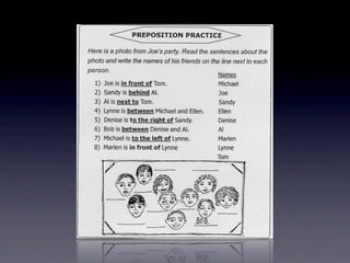
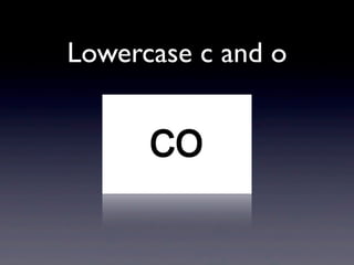
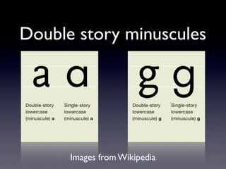
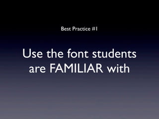
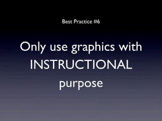
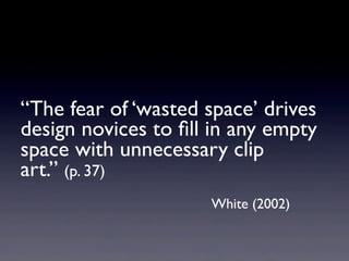
Visual design best practices
        for handouts
              Cameron Romney
               Center for Foreign Language Education

                       Momoyama Gakuin University

                            (St. Andrew’s University)

                               March 23, 2013
Agenda
• Introduction

• Typography

• Page Layout

• Graphics: Illustrations/Photographs, etc.
Connect

Theory and Practice
        with

  ‘Best Practices’
Do you know anything about typography/
         page layout/graphics?

 Do you think it (they) are important?
          Why or why not?
“Unfortunately, most of the materials made at
home, no matter how good in content, are
atrocious in terms of layout. In my experiences
with both publishers and students, I have come
to the conclusion that


 layout is just as important as...no, even
	

 more important than...content”
                              Curtis Kelly, 1998
Visual design effects
                  on readers
•   Motivation
    Smiley (2004); Misanchuk (1992); Bell & Sullivan (1981)


•   Comprehension
    Gasser, Boeke, Haffernan, & Tan (2005); Romney (2004); Smiley (2004); Walker (2001), Hoener, Salend & Kay (1997); Garofalo
    (1988), Lewis & Walker (1989)


•   Recall
    Gasser, Boeke, Haffernan, & Tan (2005); Smiley (2004); Lewis & Walker (1989)


•   Efficiency/Speed
    Smiley (2004); Hoener, Salend & Kay (1997)
“...more easily perceiving ... text on a
page ... less attentional resources are
required for the process of reading. More
attentional resources can then be
devoted to attending to the message in
the text, which results in deeper
processing and an easier recall of the
information presented.” (p. 185)

                  Gasser, Boek, Haffernan & Tan (2005)
Typeface
 i.e. font
Common Problems
      for
  L2 Learners
Legibility
LC l and UC I
LC d, b, q and p
Lowercase i and j
Lowercase c and o
Lowercase f and t
Double story minuscules


      Images from Wikipedia
Best Practice #1


Use the font students
 are FAMILIAR with
“people most easily read material
printed in the typefaces with
which they are most familiar.” (p. 32)

                  Hoener, Salend & Kay (1997)
Copyright page
Identifont & WhatTheFont


 www.identifont.com   http://new.myfonts.com/WhatTheFont
                              (includes an iPhone app)
Best Practice #1 (version two)


Use a font with good
    LEGIBILITY
Recommended
                Typefaces

    Serif                    Sans Serif

•   Georgia              •   Verdana

•   (Bembo) Schoolbook   •   Helvetica Textbook
Georgia


Image from Identifont
Bembo Schoolbook


   Image from Identifont
Verdana


Image from Identifont
Helvetica Textbook


   Image from Identifont
Best Practice #2


set the typeface at a
    LARGER size
• Less skilled readers benefit from larger text
                      Carter, Day & Meggs (2006); Petterson (1989)


• 9-12 pt is standard for adults
                                       Carter, Day & Meggs (2006)


• 18 pt for 1st grade, 14 pt for 3rd grade, 11 pt
  for 6th grade
                                      Hoener, Salend & Kay (1997)
Best Practice #3


   Use typography to
signal different sections
Example
Tip


   Don’t forget the
PRINTING & COPYNG
Page Layout
Best Practice #4


Use INCREASED
  line spacing
       and
  white space
Theory (line spacing)

“...the reader has an effortless
return path to the left edge ... for
the next line.” (p. 115)

                           White (2002)
Theory (white space)

“Space attracts readers by
making the page look accessible,
unthreatening, and manageable”

                        White (2002)
Best Practice #5


Use lines & shapes to
ORGANIZE the page
Theory

“...directing the readers eye
around the page, drawing attention
to specific parts... breaking copy
into sections” (p.86)

                        Dabner (2004)
Graphics
Best Practice #6


Only use graphics with
 INSTRUCTIONAL
       purpose
“The fear of ‘wasted space’ drives
design novices to fill in any empty
space with unnecessary clip
art.” (p. 37)
                     White (2002)
Theory

Graphics can be a distraction
       Evans, Watson and Willows (1987); Peeck (1987)
          Clark & Lyons (2011); Romney & Bell (2011)
“If instructional facilitation is not
highly probable, then ... graphics
should not be used in instructional
material.” (p. 239)
                      Misanchuk (1992)
Putting it all together
 A Before and After
Thank You
romney.cameron@gmail.com

        LinkedIn

Twitter: @CameronRomney

  CameronRomney.com

Visual Design Best Practices for Handouts