Download to read offline
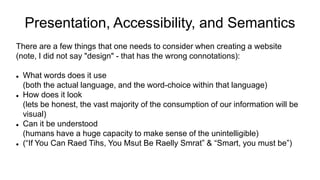
![Where does "Semantics" fit into all this?
What is "Semantics" anyway?
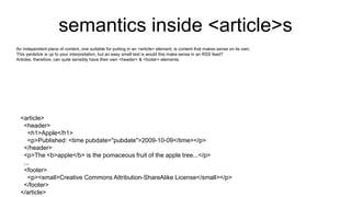
In this environment, Semantics is the "logic" of a web page, the "structure" - as opposed to the "presentation"
The elements <ol> and <ul> have semantic meaning: Ordered List and Unordered List
The elements <div> and <span> have no semantic meaning, then just identify things as a block level group or an inline group
Semantics is used by presentation tools to render the html document for users to "read"
Web browsers have spent 20+ years writing tools to visually render some [sometimes truly awful] html files into something readable.... like knowing a paragraph has ended because a new "block-level element" has started.
We have grown up without having to use Semantics in web pages.](https://image.slidesharecdn.com/semanticaccessibility-210131111153/85/Semantic-accessibility-2-320.jpg)
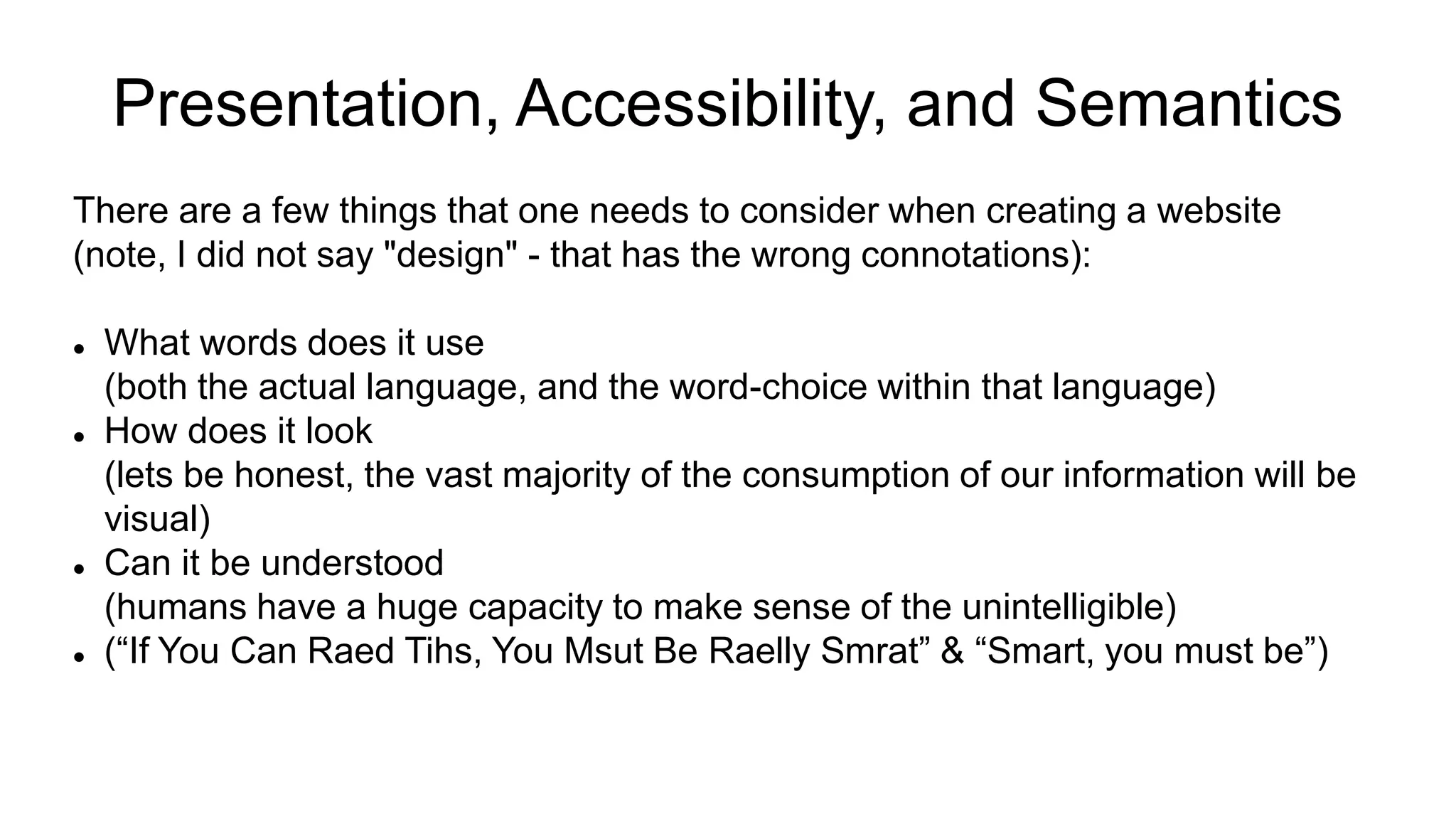
![Other tips & tricks
Identify page language, and language changes (<p>You'd say that in Chinese as <span lang="zh-Hans">中国科学院文献情报中心</span>.</p>)
Associate a label with every form control
Use <button> not <div class=button> for buttons
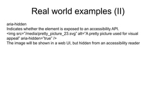
Have alt text for every image*
Reflect the reading order in the code order
Use headings correctly to organize the structure of your content.
Give your links unique and descriptive names.
Use tables for tabular data, not for layout.
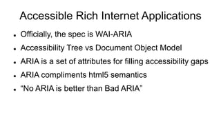
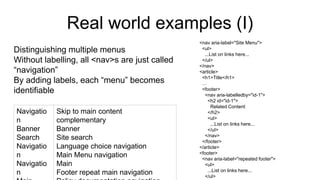
Use ARIA roles and landmarks (however the first rule of ARIA is “Don’t use ARIA.”)
[*] Not all images are content, see ARIA](https://image.slidesharecdn.com/semanticaccessibility-210131111153/85/Semantic-accessibility-11-320.jpg)
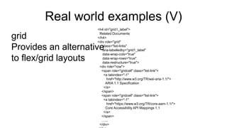
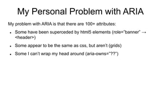
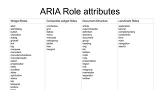
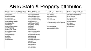


The document discusses the importance of semantics, accessibility, and presentation in web design, highlighting the role of semantic HTML5 elements like <article>, <section>, and <nav> in enhancing understanding and accessibility. It emphasizes the need for proper use of ARIA roles and properties to address accessibility gaps and provides best practices for structuring content effectively. Additionally, it compares layout methodologies such as flex and grid, and suggests using CSS preprocessors for efficient styling.


![[O'Reilly] HTML5 Design](https://cdn.slidesharecdn.com/ss_thumbnails/html5-workshop-111215160913-phpapp01-thumbnail.jpg?width=640&height=640&fit=bounds)