SalesLogix Visual Analyzer Data Sheet
•
1 like•367 views

SalesLogix Visual Analyzer delivers customizable dashboard views of key Sage SalesLogix data, for a low cost of deployment, providing your organization the insight needed to extend your competitive advantage.

Recommended
More Related Content
What's hot
What's hot (19)
Viewers also liked
Viewers also liked (14)
Similar to SalesLogix Visual Analyzer Data Sheet
Similar to SalesLogix Visual Analyzer Data Sheet (20)
Recently uploaded
Recently uploaded (20)
SalesLogix Visual Analyzer Data Sheet
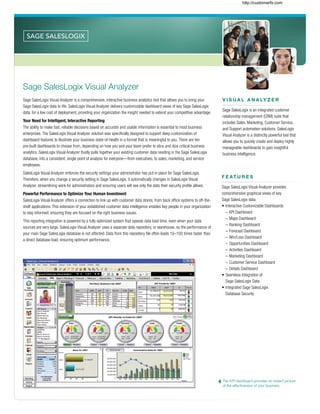
- 1. F E AT U R E S Sage SalesLogix Visual Analyzer provides comprehensive graphical views of key Sage SalesLogix data. • Interactive Customizable Dashboards – KPI Dashboard – Maps Dashboard – Ranking Dashboard – Forecast Dashboard – Win/Loss Dashboard – Opportunities Dashboard – Activities Dashboard – Marketing Dashboard – Customer Service Dashboard – Details Dashboard • Seamless Integration of Sage SalesLogix Data • Integrated Sage SalesLogix Database Security The KPI dashboard provides an instant picture of the effectiveness of your business. Sage SalesLogix Visual Analyzer Sage SalesLogix Visual Analyzer is a comprehensive, interactive business analytics tool that allows you to bring your Sage SalesLogix data to life. SalesLogix Visual Analyzer delivers customizable dashboard views of key Sage SalesLogix data, for a low cost of deployment, providing your organization the insight needed to extend your competitive advantage. Your Need for Intelligent, Interactive Reporting The ability to make fast, reliable decisions based on accurate and usable information is essential to most business enterprises. The SalesLogix Visual Analyzer solution was specifically designed to support deep customization of dashboard features to illustrate your business state-of-health in a format that is meaningful to you. There are ten pre-built dashboards to choose from, depending on how you and your team prefer to slice and dice critical business analytics. SalesLogix Visual Analyzer fluidly pulls together your existing customer data residing in the Sage SalesLogix database, into a consistent, single point of analysis for everyone—from executives, to sales, marketing, and service employees. SalesLogix Visual Analyzer enforces the security settings your administrator has put in place for Sage SalesLogix. Therefore, when you change a security setting in Sage SalesLogix, it automatically changes in SalesLogix Visual Analyzer, streamlining work for administrators and ensuring users will see only the data their security profile allows. Powerful Performance to Optimize Your Human Investment SalesLogix Visual Analyzer offers a connection to link up with customer data stores, from back office systems to off-the- shelf applications. This extension of your established customer data intelligence enables key people in your organization to stay informed, ensuring they are focused on the right business issues. This reporting integration is powered by a fully optimized system that speeds data load time, even when your data sources are very large. SalesLogix Visual Analyzer uses a separate data repository, or warehouse, so the performance of your main Sage SalesLogix database is not affected. Data from this repository file often loads 10–100 times faster than a direct database load, ensuring optimum performance. V I S U A L A N A LY Z E R Sage SalesLogix is an integrated customer relationship management (CRM) suite that includes Sales, Marketing, Customer Service, and Support automation solutions. SalesLogix Visual Analyzer is a distinctly powerful tool that allows you to quickly create and deploy highly manageable dashboards to gain insightful business intelligence. http://customerfx.com
- 2. The Ranking dashboard allows you to see at-a-glance your Top Ten Accounts or reverse the order to show slower performers. Dashboard View Features KPI Dashboard Considered the “home base” of SalesLogix Visual Analyzer, the KPI (key performance indicator) dashboard is the main summary page for all critical business metrics. Easy-to-understand gauges illustrate the current health of selected components of your organization, such as total sales or opportunities year over year. Based upon the security viewing profile established, you are able to drill down from the Dashboard view into the selected transaction details for further analysis. Starting from the KPI dashboard, you can navigate to the nine other dashboard views available in SalesLogix Visual Analyzer. More than just static views of data, SalesLogix Visual Analyzer supports a connection with pre-existing customer data stores that transform silos of disconnected data into actionable business insight. Forecast Dashboard Understanding sales trends and making appropriate, timely adjustments can have a big impact on sales performance. The Forecast dashboard allows you to analyze your sales pipeline, forecasts, and close rates. You can determine: the stage at which opportunities are being delayed, where to introduce new programs to help bolster sluggish sales, and which sales representatives require assistance to help meet goals. To further illustrate potential sales opportunities, forecasts can be segmented by sales representative, product line, or region. A historical analysis of past sales provides the support in accurately estimating future sales growth. Ranking Dashboard The Ranking dashboard provides a list or ranking for any KPI you may choose, such as: Accounts, Sales Representatives, Opportunities, Products, or other entities in the Sage SalesLogix database. A popular ranking feature is the Top Ten Accounts, but you have the flexibility to rank whatever set of metrics is most meaningful to you and your business. You can also choose to rank from the bottom up, identifying customers with slower performance that need additional sales and marketing support. Once the list is established, you can create a Sage SalesLogix Group and then launch a targeted marketing campaign to that Sage SalesLogix Group. B E N E F I T S Analyze critical business metrics with customizable dashboard views that illustrate your organization’s state-of-health. Make fast, reliable business decisions based on accurate and usable information to help shift strategic priorities. Optimize your human investment with a reporting connection that links up with customer data stores to extend business intelligence and help monitor changes or trends. Leverage seamless integration of customer details from your Sage SalesLogix database. http://customerfx.com
- 3. Win/Loss Dashboard The Win/Loss dashboard helps you understand how well you and your sales team are closing opportunities. The graphical chart shows win and loss units by month, while the grid positioned below provides detailed information for each opportunity won or lost. This perspective enables you to consider your company’s performance as compared to that of the general market. As a result, your strength in a particular industry could shape your strategic goals and objectives. Opportunities Dashboard Your sales team will especially appreciate the Opportunities dashboard, as they can identify the opportunities with the best chance of closing in the current period. With just a couple of clicks, they can parse out the list of all opportunities in their territory that are in the mid stages of the sales process. This target list can then be built onto a Sage SalesLogix Group to be easily accessed while actively working the opportunities. Maps Dashboard The geographic Maps dashboard shows analysis information overlaid on a map. Data can be viewed by region, country, state, city, and metropolitan area, and then drilled down further in a specific region to conduct territory analysis. Activities Dashboard The Activities dashboard provides an introspective view into the types of prospect touches and communications it takes on average to close a sale. It also explores the number of communications it takes to close a sale. Consider the success rate of face time versus phone calls versus e-mails, and the power of those personal interactions with customers. If you are an Account Manager, you can select a customer record and receive a historical list of previous contact with your client. Marketing Dashboard The key to continual growth in a sales pipeline is strong marketing initiatives. The Marketing dashboard tracks the vital metrics required to determine the effectiveness of marketing programs. This view will help you analyze campaign response rates, sales success, and conversion rates—from mailing list prospect to interested client. Customer Service Dashboard The backbone to any customer relationship management tool is the ability to track and analyze the Customer Service experience. This dashboard gives you an instant picture of service levels with an analysis of reasons for customer calls, resolution rates, and average length of time to resolve an issue. Drill down to the details of a particular case or ticket to explore the historical profile and initiate an informed response. Details Dashboard The Details dashboard provides a single-screen view of the Sage SalesLogix details for the selected record. It presents the Account Detail view with all the tabs spread out on a single page, so that every data point related to the Account can be viewed simultaneously. The Maps dashboard provides a visual perspective on geographical sales support and performance. Utilize the Marketing dashboard to track campaign performance and make adjustments as needed to maintain a strong pipeline of leads. http://customerfx.com