SlideShare a Scribd company logo
1 of 28
Slide 1 of 28
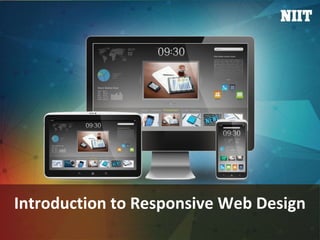
Introduction to Responsive Web Design
Slide 2 of 28
Course Overview
Use the animation, Course Intro.zip, to provide the overview of the course.
Slide 3 of 28
 In this session, you will learn to:
 Identify Web designing techniques
Objectives
Slide 4 of 28
 Advancement in technology has changed the way
users access online information.
 People are accessing websites through multiple
devices, such as:
 PCs
 Laptops
 Smartphones
 iPads
 To cater to this large user base, organizations adopt
web designing techniques that properly represent
the websites on various devices.
Identifying Web Designing Techniques
Slide 5 of 28
 Some of the Web designing techniques are:
Identifying Web Designing Techniques (Contd.)
Slide 6 of 28
 AWD is the way of representing the same website by using separate Uniform
Resource Locaters (URLs) on different devices. For example:
 URL of Facebook for a PC or laptop is:
 https://www.facebook.com
 URL of Facebook for a smartphone is:
 https://m.facebook.com/
 AWD creates a series of layouts of a website based on various screen sizes of
different devices.
AWD
Slide 7 of 28
 The Web page layout is designed according to the screen size of the device on
which it is rendered.
AWD (Contd.)
Slide 8 of 28
 On a smartphone, the Web design of the same website:
 Becomes compact
 Displays lesser content
AWD (Contd.)
Slide 9 of 28
AWD (Contd.)
Slide 10 of 28
RWD
Slide 11 of 28
 Let us first understand the factors that distinguish a
desktop Web page from a mobile device Web page.
 These factors are:
 Screen size
 Ergonomics or touch capability
 Navigation and widgets
 Content, blank spaces, and whitespaces
 Images
 Advertising
RWD (Contd.)
Slide 12 of 28
RWD (Contd.)
Slide 13 of 28
RWD (Contd.)
Slide 14 of 28
RWD (Contd.)
Slide 15 of 28
RWD (Contd.)
Slide 16 of 28
RWD (Contd.)
Slide 17 of 28
RWD (Contd.)
Slide 18 of 28
 The following table displays the differences between AWD and RWD.
RWD (Contd.)
AWD Technique RWD Technique
It uses separate URLs to represent the
same website on different devices.
It uses a single URL to represent the same
website on different devices.
Different versions of Web pages are
carefully constructed for a varied set of
devices. Based on a request, the
appropriate version of the Web page is
sent as a response.
New concepts, such as media queries,
flexible images, and fluid grids, are
introduced. These new concepts allow you
to create a single Web page that modifies
its layout as per the screen size of the
device.
It is server side. It is client side.
A Web page gets loaded faster because
different designs for different devices are
available on different domains.
A Web page gets loaded slowly compared
to AWD, because the website is available
on the same domain name and the device
is loaded with the entire responsive
codebase, which may make it heavy.
Slide 19 of 28
 Considerations for RWD:
 Design:
 Design the website such that it looks similar on all devices and environment.
 Image size and screen layout:
 Images should be optimized for all screen sizes and resolutions.
RWD (Contd.)
Slide 20 of 28
 Mobile first:
 To optimize a website, present the content best suited for the small screens and then
enhance it for the large screens.
 Website navigation:
 Due to the small screen size of portable devices, keep navigation easy and simple.
RWD (Contd.)
Slide 21 of 28
 Benefits of RWD are:
RWD (Contd.)
Slide 22 of 28
RWD (Contd.)
Slide 23 of 28
 Limitations of RWD are:
 You cannot implement RWD on an existing website.
 You need to overhaul, redesign, and rebuild the website.
 The development time is 20% more than that of a standard website.
 The Web page loads slower than AWD.
RWD (Contd.)
Slide 24 of 28
Group Discussion
Let us discuss which technique is better, AWD or RWD.
Slide 25 of 28
 Once a website is created using the ______ technique, there is no need to
create the separate websites for other devices.
 AWD
 Fixed-width
 RWD
 Flexible Web design
Just a Minute
Slide 26 of 28
 Answer:
 RWD
Just a Minute (Contd.)
Slide 27 of 28
 In this session, you learned that:
 AWD is the way of representing the same website by using separate URLs on different
devices.
 RWD helps designers to create device-independent Web content and neglect device-
specific elements, such as physical attributes, browsers, client-side rendering, and
operating systems.
 Factors distinguishing a desktop Web page from a mobile device Web page are:
 Screen size
 Ergonomics or touch capability
 Navigation and widgets
 Content, blank spaces, and whitespaces
 Images
 Advertising
 Some of the benefits of RWD are minimal maintenance, social sharing, and better
viewing experience to users.
Summary
Slide 28 of 28
 After this session, you need to do the following tasks:
 Read Chapter 1
 Perform the following exercises of chapter 1:
 Exercise 1
 Exercise 2
 Exercise 3
 Exercise 4
 Exercise 5
 Exercise 6
What’s Next?

More Related Content

Similar to Introduction to Responsive Web Design

Adaptive vs Responsive Layouts
Adaptive vs Responsive LayoutsAdaptive vs Responsive Layouts
Adaptive vs Responsive LayoutsIhor Zenich
 
Word press with react – implementing headless wordpress with reactjs converted
Word press with react – implementing headless wordpress with reactjs convertedWord press with react – implementing headless wordpress with reactjs converted
Word press with react – implementing headless wordpress with reactjs convertedDaljeetSingh210
 
G0373049057
G0373049057G0373049057
G0373049057theijes
 
Whitepaper: Responsive Test - A test framework to cover it all
Whitepaper: Responsive Test - A test framework to cover it allWhitepaper: Responsive Test - A test framework to cover it all
Whitepaper: Responsive Test - A test framework to cover it allIndium Software
 
Responsive Web Design On Student's day
Responsive Web Design On Student's day Responsive Web Design On Student's day
Responsive Web Design On Student's day psophy
 
Running ADF Faces on Tablets and Mobile Phones
Running ADF Faces on Tablets and Mobile PhonesRunning ADF Faces on Tablets and Mobile Phones
Running ADF Faces on Tablets and Mobile PhonesSteven Davelaar
 
Responsive Web Design in Cascade Server, by Chris Cox of BarkleyREI
Responsive Web Design in Cascade Server, by Chris Cox of BarkleyREIResponsive Web Design in Cascade Server, by Chris Cox of BarkleyREI
Responsive Web Design in Cascade Server, by Chris Cox of BarkleyREIhannonhill
 
Responsive web designing
Responsive web designingResponsive web designing
Responsive web designingAanand Bohara
 
BarkleyREI & Hannon Hill Webinar - Responsive Web Design
BarkleyREI & Hannon Hill Webinar - Responsive Web DesignBarkleyREI & Hannon Hill Webinar - Responsive Web Design
BarkleyREI & Hannon Hill Webinar - Responsive Web Designhannonhill
 
Kendo UI workshop introduction - PUG Baltic Annual Conference 2017
Kendo UI workshop introduction - PUG Baltic Annual Conference 2017Kendo UI workshop introduction - PUG Baltic Annual Conference 2017
Kendo UI workshop introduction - PUG Baltic Annual Conference 2017Alen Leit
 
Vb net xp_15
Vb net xp_15Vb net xp_15
Vb net xp_15Niit Care
 
Cloud computing and software engineering
Cloud computing and software engineeringCloud computing and software engineering
Cloud computing and software engineeringRavindra Dastikop
 
Web Usability
Web UsabilityWeb Usability
Web UsabilityWilson Su
 
Two approaches to RWD: Pure & Hybrid. Brendan Falkowski
Two approaches to RWD: Pure & Hybrid. Brendan Falkowski Two approaches to RWD: Pure & Hybrid. Brendan Falkowski
Two approaches to RWD: Pure & Hybrid. Brendan Falkowski MeetMagentoNY2014
 
Overview of Responsive Web Design
Overview of Responsive Web DesignOverview of Responsive Web Design
Overview of Responsive Web DesignPankaj Bajaj
 
Is Vue catching up with React.pdf
Is Vue catching up with React.pdfIs Vue catching up with React.pdf
Is Vue catching up with React.pdfMindfire LLC
 
Micro-Frontends JSVidCon
Micro-Frontends JSVidConMicro-Frontends JSVidCon
Micro-Frontends JSVidConAmir Zuker
 

Similar to Introduction to Responsive Web Design (20)

Adaptive vs Responsive Layouts
Adaptive vs Responsive LayoutsAdaptive vs Responsive Layouts
Adaptive vs Responsive Layouts
 
Word press with react – implementing headless wordpress with reactjs converted
Word press with react – implementing headless wordpress with reactjs convertedWord press with react – implementing headless wordpress with reactjs converted
Word press with react – implementing headless wordpress with reactjs converted
 
G0373049057
G0373049057G0373049057
G0373049057
 
Whitepaper: Responsive Test - A test framework to cover it all
Whitepaper: Responsive Test - A test framework to cover it allWhitepaper: Responsive Test - A test framework to cover it all
Whitepaper: Responsive Test - A test framework to cover it all
 
Responsive Web Design On Student's day
Responsive Web Design On Student's day Responsive Web Design On Student's day
Responsive Web Design On Student's day
 
Running ADF Faces on Tablets and Mobile Phones
Running ADF Faces on Tablets and Mobile PhonesRunning ADF Faces on Tablets and Mobile Phones
Running ADF Faces on Tablets and Mobile Phones
 
Nitishreys
NitishreysNitishreys
Nitishreys
 
Responsive Web Design in Cascade Server, by Chris Cox of BarkleyREI
Responsive Web Design in Cascade Server, by Chris Cox of BarkleyREIResponsive Web Design in Cascade Server, by Chris Cox of BarkleyREI
Responsive Web Design in Cascade Server, by Chris Cox of BarkleyREI
 
Responsive web designing
Responsive web designingResponsive web designing
Responsive web designing
 
BarkleyREI & Hannon Hill Webinar - Responsive Web Design
BarkleyREI & Hannon Hill Webinar - Responsive Web DesignBarkleyREI & Hannon Hill Webinar - Responsive Web Design
BarkleyREI & Hannon Hill Webinar - Responsive Web Design
 
Web summit.pptx
Web summit.pptxWeb summit.pptx
Web summit.pptx
 
Kendo UI workshop introduction - PUG Baltic Annual Conference 2017
Kendo UI workshop introduction - PUG Baltic Annual Conference 2017Kendo UI workshop introduction - PUG Baltic Annual Conference 2017
Kendo UI workshop introduction - PUG Baltic Annual Conference 2017
 
Vb net xp_15
Vb net xp_15Vb net xp_15
Vb net xp_15
 
Cloud computing and software engineering
Cloud computing and software engineeringCloud computing and software engineering
Cloud computing and software engineering
 
Web Usability
Web UsabilityWeb Usability
Web Usability
 
Two approaches to RWD: Pure & Hybrid. Brendan Falkowski
Two approaches to RWD: Pure & Hybrid. Brendan Falkowski Two approaches to RWD: Pure & Hybrid. Brendan Falkowski
Two approaches to RWD: Pure & Hybrid. Brendan Falkowski
 
Overview of Responsive Web Design
Overview of Responsive Web DesignOverview of Responsive Web Design
Overview of Responsive Web Design
 
qadeer intern report.pdf
qadeer intern report.pdfqadeer intern report.pdf
qadeer intern report.pdf
 
Is Vue catching up with React.pdf
Is Vue catching up with React.pdfIs Vue catching up with React.pdf
Is Vue catching up with React.pdf
 
Micro-Frontends JSVidCon
Micro-Frontends JSVidConMicro-Frontends JSVidCon
Micro-Frontends JSVidCon
 

Recently uploaded

MENTAL STATUS EXAMINATION format.docx
MENTAL     STATUS EXAMINATION format.docxMENTAL     STATUS EXAMINATION format.docx
MENTAL STATUS EXAMINATION format.docxPoojaSen20
 
URLs and Routing in the Odoo 17 Website App
URLs and Routing in the Odoo 17 Website AppURLs and Routing in the Odoo 17 Website App
URLs and Routing in the Odoo 17 Website AppCeline George
 
“Oh GOSH! Reflecting on Hackteria's Collaborative Practices in a Global Do-It...
“Oh GOSH! Reflecting on Hackteria's Collaborative Practices in a Global Do-It...“Oh GOSH! Reflecting on Hackteria's Collaborative Practices in a Global Do-It...
“Oh GOSH! Reflecting on Hackteria's Collaborative Practices in a Global Do-It...Marc Dusseiller Dusjagr
 
APM Welcome, APM North West Network Conference, Synergies Across Sectors
APM Welcome, APM North West Network Conference, Synergies Across SectorsAPM Welcome, APM North West Network Conference, Synergies Across Sectors
APM Welcome, APM North West Network Conference, Synergies Across SectorsAssociation for Project Management
 
Presiding Officer Training module 2024 lok sabha elections
Presiding Officer Training module 2024 lok sabha electionsPresiding Officer Training module 2024 lok sabha elections
Presiding Officer Training module 2024 lok sabha electionsanshu789521
 
Accessible design: Minimum effort, maximum impact
Accessible design: Minimum effort, maximum impactAccessible design: Minimum effort, maximum impact
Accessible design: Minimum effort, maximum impactdawncurless
 
Incoming and Outgoing Shipments in 1 STEP Using Odoo 17
Incoming and Outgoing Shipments in 1 STEP Using Odoo 17Incoming and Outgoing Shipments in 1 STEP Using Odoo 17
Incoming and Outgoing Shipments in 1 STEP Using Odoo 17Celine George
 
_Math 4-Q4 Week 5.pptx Steps in Collecting Data
_Math 4-Q4 Week 5.pptx Steps in Collecting Data_Math 4-Q4 Week 5.pptx Steps in Collecting Data
_Math 4-Q4 Week 5.pptx Steps in Collecting DataJhengPantaleon
 
Introduction to ArtificiaI Intelligence in Higher Education
Introduction to ArtificiaI Intelligence in Higher EducationIntroduction to ArtificiaI Intelligence in Higher Education
Introduction to ArtificiaI Intelligence in Higher Educationpboyjonauth
 
The basics of sentences session 2pptx copy.pptx
The basics of sentences session 2pptx copy.pptxThe basics of sentences session 2pptx copy.pptx
The basics of sentences session 2pptx copy.pptxheathfieldcps1
 
Contemporary philippine arts from the regions_PPT_Module_12 [Autosaved] (1).pptx
Contemporary philippine arts from the regions_PPT_Module_12 [Autosaved] (1).pptxContemporary philippine arts from the regions_PPT_Module_12 [Autosaved] (1).pptx
Contemporary philippine arts from the regions_PPT_Module_12 [Autosaved] (1).pptxRoyAbrique
 
Micromeritics - Fundamental and Derived Properties of Powders
Micromeritics - Fundamental and Derived Properties of PowdersMicromeritics - Fundamental and Derived Properties of Powders
Micromeritics - Fundamental and Derived Properties of PowdersChitralekhaTherkar
 
BASLIQ CURRENT LOOKBOOK LOOKBOOK(1) (1).pdf
BASLIQ CURRENT LOOKBOOK  LOOKBOOK(1) (1).pdfBASLIQ CURRENT LOOKBOOK  LOOKBOOK(1) (1).pdf
BASLIQ CURRENT LOOKBOOK LOOKBOOK(1) (1).pdfSoniaTolstoy
 
Concept of Vouching. B.Com(Hons) /B.Compdf
Concept of Vouching. B.Com(Hons) /B.CompdfConcept of Vouching. B.Com(Hons) /B.Compdf
Concept of Vouching. B.Com(Hons) /B.CompdfUmakantAnnand
 
Call Girls in Dwarka Mor Delhi Contact Us 9654467111
Call Girls in Dwarka Mor Delhi Contact Us 9654467111Call Girls in Dwarka Mor Delhi Contact Us 9654467111
Call Girls in Dwarka Mor Delhi Contact Us 9654467111Sapana Sha
 
Grant Readiness 101 TechSoup and Remy Consulting
Grant Readiness 101 TechSoup and Remy ConsultingGrant Readiness 101 TechSoup and Remy Consulting
Grant Readiness 101 TechSoup and Remy ConsultingTechSoup
 
POINT- BIOCHEMISTRY SEM 2 ENZYMES UNIT 5.pptx
POINT- BIOCHEMISTRY SEM 2 ENZYMES UNIT 5.pptxPOINT- BIOCHEMISTRY SEM 2 ENZYMES UNIT 5.pptx
POINT- BIOCHEMISTRY SEM 2 ENZYMES UNIT 5.pptxSayali Powar
 
mini mental status format.docx
mini    mental       status     format.docxmini    mental       status     format.docx
mini mental status format.docxPoojaSen20
 
A Critique of the Proposed National Education Policy Reform
A Critique of the Proposed National Education Policy ReformA Critique of the Proposed National Education Policy Reform
A Critique of the Proposed National Education Policy ReformChameera Dedduwage
 

Recently uploaded (20)

MENTAL STATUS EXAMINATION format.docx
MENTAL     STATUS EXAMINATION format.docxMENTAL     STATUS EXAMINATION format.docx
MENTAL STATUS EXAMINATION format.docx
 
URLs and Routing in the Odoo 17 Website App
URLs and Routing in the Odoo 17 Website AppURLs and Routing in the Odoo 17 Website App
URLs and Routing in the Odoo 17 Website App
 
“Oh GOSH! Reflecting on Hackteria's Collaborative Practices in a Global Do-It...
“Oh GOSH! Reflecting on Hackteria's Collaborative Practices in a Global Do-It...“Oh GOSH! Reflecting on Hackteria's Collaborative Practices in a Global Do-It...
“Oh GOSH! Reflecting on Hackteria's Collaborative Practices in a Global Do-It...
 
APM Welcome, APM North West Network Conference, Synergies Across Sectors
APM Welcome, APM North West Network Conference, Synergies Across SectorsAPM Welcome, APM North West Network Conference, Synergies Across Sectors
APM Welcome, APM North West Network Conference, Synergies Across Sectors
 
Presiding Officer Training module 2024 lok sabha elections
Presiding Officer Training module 2024 lok sabha electionsPresiding Officer Training module 2024 lok sabha elections
Presiding Officer Training module 2024 lok sabha elections
 
Accessible design: Minimum effort, maximum impact
Accessible design: Minimum effort, maximum impactAccessible design: Minimum effort, maximum impact
Accessible design: Minimum effort, maximum impact
 
Incoming and Outgoing Shipments in 1 STEP Using Odoo 17
Incoming and Outgoing Shipments in 1 STEP Using Odoo 17Incoming and Outgoing Shipments in 1 STEP Using Odoo 17
Incoming and Outgoing Shipments in 1 STEP Using Odoo 17
 
_Math 4-Q4 Week 5.pptx Steps in Collecting Data
_Math 4-Q4 Week 5.pptx Steps in Collecting Data_Math 4-Q4 Week 5.pptx Steps in Collecting Data
_Math 4-Q4 Week 5.pptx Steps in Collecting Data
 
Introduction to ArtificiaI Intelligence in Higher Education
Introduction to ArtificiaI Intelligence in Higher EducationIntroduction to ArtificiaI Intelligence in Higher Education
Introduction to ArtificiaI Intelligence in Higher Education
 
The basics of sentences session 2pptx copy.pptx
The basics of sentences session 2pptx copy.pptxThe basics of sentences session 2pptx copy.pptx
The basics of sentences session 2pptx copy.pptx
 
Contemporary philippine arts from the regions_PPT_Module_12 [Autosaved] (1).pptx
Contemporary philippine arts from the regions_PPT_Module_12 [Autosaved] (1).pptxContemporary philippine arts from the regions_PPT_Module_12 [Autosaved] (1).pptx
Contemporary philippine arts from the regions_PPT_Module_12 [Autosaved] (1).pptx
 
Micromeritics - Fundamental and Derived Properties of Powders
Micromeritics - Fundamental and Derived Properties of PowdersMicromeritics - Fundamental and Derived Properties of Powders
Micromeritics - Fundamental and Derived Properties of Powders
 
BASLIQ CURRENT LOOKBOOK LOOKBOOK(1) (1).pdf
BASLIQ CURRENT LOOKBOOK  LOOKBOOK(1) (1).pdfBASLIQ CURRENT LOOKBOOK  LOOKBOOK(1) (1).pdf
BASLIQ CURRENT LOOKBOOK LOOKBOOK(1) (1).pdf
 
Concept of Vouching. B.Com(Hons) /B.Compdf
Concept of Vouching. B.Com(Hons) /B.CompdfConcept of Vouching. B.Com(Hons) /B.Compdf
Concept of Vouching. B.Com(Hons) /B.Compdf
 
Call Girls in Dwarka Mor Delhi Contact Us 9654467111
Call Girls in Dwarka Mor Delhi Contact Us 9654467111Call Girls in Dwarka Mor Delhi Contact Us 9654467111
Call Girls in Dwarka Mor Delhi Contact Us 9654467111
 
Grant Readiness 101 TechSoup and Remy Consulting
Grant Readiness 101 TechSoup and Remy ConsultingGrant Readiness 101 TechSoup and Remy Consulting
Grant Readiness 101 TechSoup and Remy Consulting
 
POINT- BIOCHEMISTRY SEM 2 ENZYMES UNIT 5.pptx
POINT- BIOCHEMISTRY SEM 2 ENZYMES UNIT 5.pptxPOINT- BIOCHEMISTRY SEM 2 ENZYMES UNIT 5.pptx
POINT- BIOCHEMISTRY SEM 2 ENZYMES UNIT 5.pptx
 
mini mental status format.docx
mini    mental       status     format.docxmini    mental       status     format.docx
mini mental status format.docx
 
Staff of Color (SOC) Retention Efforts DDSD
Staff of Color (SOC) Retention Efforts DDSDStaff of Color (SOC) Retention Efforts DDSD
Staff of Color (SOC) Retention Efforts DDSD
 
A Critique of the Proposed National Education Policy Reform
A Critique of the Proposed National Education Policy ReformA Critique of the Proposed National Education Policy Reform
A Critique of the Proposed National Education Policy Reform
 

Introduction to Responsive Web Design

  • 1. Slide 1 of 28 Introduction to Responsive Web Design
  • 2. Slide 2 of 28 Course Overview Use the animation, Course Intro.zip, to provide the overview of the course.
  • 3. Slide 3 of 28  In this session, you will learn to:  Identify Web designing techniques Objectives
  • 4. Slide 4 of 28  Advancement in technology has changed the way users access online information.  People are accessing websites through multiple devices, such as:  PCs  Laptops  Smartphones  iPads  To cater to this large user base, organizations adopt web designing techniques that properly represent the websites on various devices. Identifying Web Designing Techniques
  • 5. Slide 5 of 28  Some of the Web designing techniques are: Identifying Web Designing Techniques (Contd.)
  • 6. Slide 6 of 28  AWD is the way of representing the same website by using separate Uniform Resource Locaters (URLs) on different devices. For example:  URL of Facebook for a PC or laptop is:  https://www.facebook.com  URL of Facebook for a smartphone is:  https://m.facebook.com/  AWD creates a series of layouts of a website based on various screen sizes of different devices. AWD
  • 7. Slide 7 of 28  The Web page layout is designed according to the screen size of the device on which it is rendered. AWD (Contd.)
  • 8. Slide 8 of 28  On a smartphone, the Web design of the same website:  Becomes compact  Displays lesser content AWD (Contd.)
  • 9. Slide 9 of 28 AWD (Contd.)
  • 10. Slide 10 of 28 RWD
  • 11. Slide 11 of 28  Let us first understand the factors that distinguish a desktop Web page from a mobile device Web page.  These factors are:  Screen size  Ergonomics or touch capability  Navigation and widgets  Content, blank spaces, and whitespaces  Images  Advertising RWD (Contd.)
  • 12. Slide 12 of 28 RWD (Contd.)
  • 13. Slide 13 of 28 RWD (Contd.)
  • 14. Slide 14 of 28 RWD (Contd.)
  • 15. Slide 15 of 28 RWD (Contd.)
  • 16. Slide 16 of 28 RWD (Contd.)
  • 17. Slide 17 of 28 RWD (Contd.)
  • 18. Slide 18 of 28  The following table displays the differences between AWD and RWD. RWD (Contd.) AWD Technique RWD Technique It uses separate URLs to represent the same website on different devices. It uses a single URL to represent the same website on different devices. Different versions of Web pages are carefully constructed for a varied set of devices. Based on a request, the appropriate version of the Web page is sent as a response. New concepts, such as media queries, flexible images, and fluid grids, are introduced. These new concepts allow you to create a single Web page that modifies its layout as per the screen size of the device. It is server side. It is client side. A Web page gets loaded faster because different designs for different devices are available on different domains. A Web page gets loaded slowly compared to AWD, because the website is available on the same domain name and the device is loaded with the entire responsive codebase, which may make it heavy.
  • 19. Slide 19 of 28  Considerations for RWD:  Design:  Design the website such that it looks similar on all devices and environment.  Image size and screen layout:  Images should be optimized for all screen sizes and resolutions. RWD (Contd.)
  • 20. Slide 20 of 28  Mobile first:  To optimize a website, present the content best suited for the small screens and then enhance it for the large screens.  Website navigation:  Due to the small screen size of portable devices, keep navigation easy and simple. RWD (Contd.)
  • 21. Slide 21 of 28  Benefits of RWD are: RWD (Contd.)
  • 22. Slide 22 of 28 RWD (Contd.)
  • 23. Slide 23 of 28  Limitations of RWD are:  You cannot implement RWD on an existing website.  You need to overhaul, redesign, and rebuild the website.  The development time is 20% more than that of a standard website.  The Web page loads slower than AWD. RWD (Contd.)
  • 24. Slide 24 of 28 Group Discussion Let us discuss which technique is better, AWD or RWD.
  • 25. Slide 25 of 28  Once a website is created using the ______ technique, there is no need to create the separate websites for other devices.  AWD  Fixed-width  RWD  Flexible Web design Just a Minute
  • 26. Slide 26 of 28  Answer:  RWD Just a Minute (Contd.)
  • 27. Slide 27 of 28  In this session, you learned that:  AWD is the way of representing the same website by using separate URLs on different devices.  RWD helps designers to create device-independent Web content and neglect device- specific elements, such as physical attributes, browsers, client-side rendering, and operating systems.  Factors distinguishing a desktop Web page from a mobile device Web page are:  Screen size  Ergonomics or touch capability  Navigation and widgets  Content, blank spaces, and whitespaces  Images  Advertising  Some of the benefits of RWD are minimal maintenance, social sharing, and better viewing experience to users. Summary
  • 28. Slide 28 of 28  After this session, you need to do the following tasks:  Read Chapter 1  Perform the following exercises of chapter 1:  Exercise 1  Exercise 2  Exercise 3  Exercise 4  Exercise 5  Exercise 6 What’s Next?