Downloaded 13 times

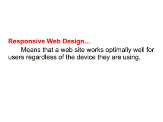
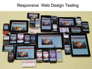

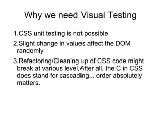
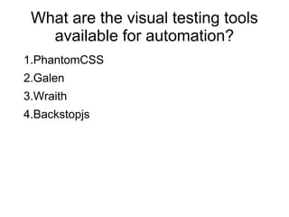

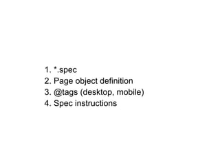
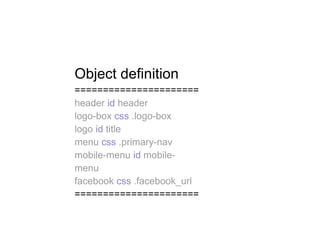

This document discusses responsive web design testing across different devices. It introduces responsive web design and the concept of viewports. It then discusses tools for testing responsive designs visually, including PhantomCSS, Galen, Wraith and Backstopjs. It focuses on Galen, an open source layout testing tool, describing its key features and how to define tests using Galen specs. Examples are provided of defining page objects, tags and test instructions in Galen specs. The document also shows how to parameterize and run Galen tests across different device sizes and tags.


![[Srijan Wednesday Webinars] Automating Visual Regression using ‘Galen’](https://cdn.slidesharecdn.com/ss_thumbnails/swwbysoumyajitanddeepshikha-170210122854-thumbnail.jpg?width=640&height=640&fit=bounds)


