Downloaded 31 times
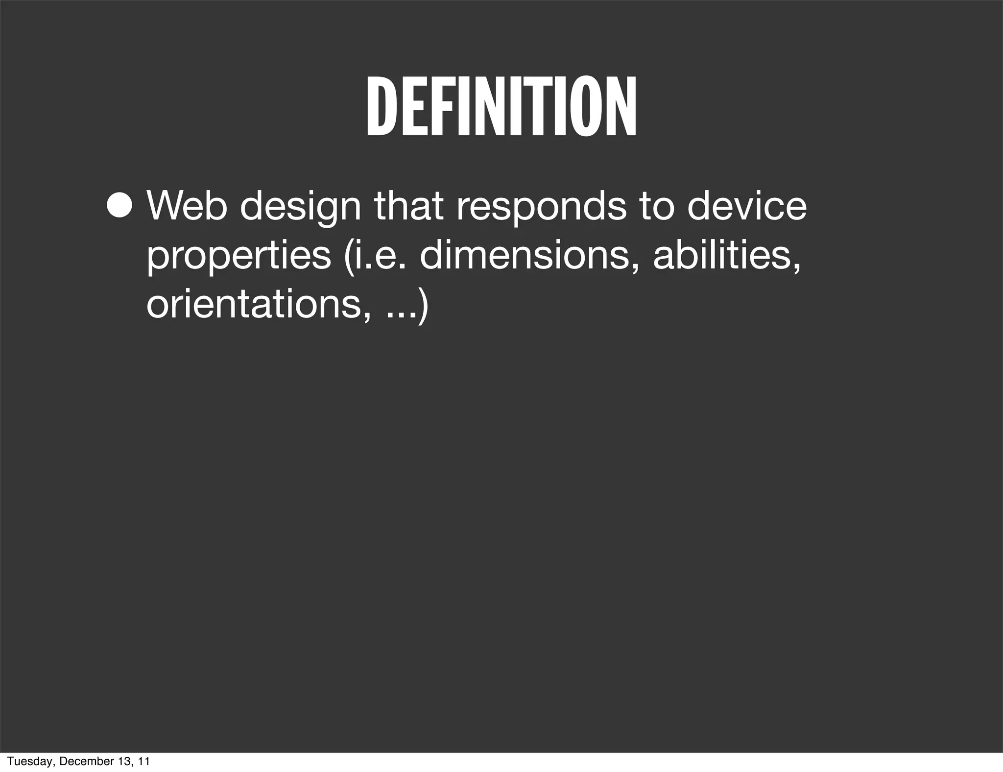
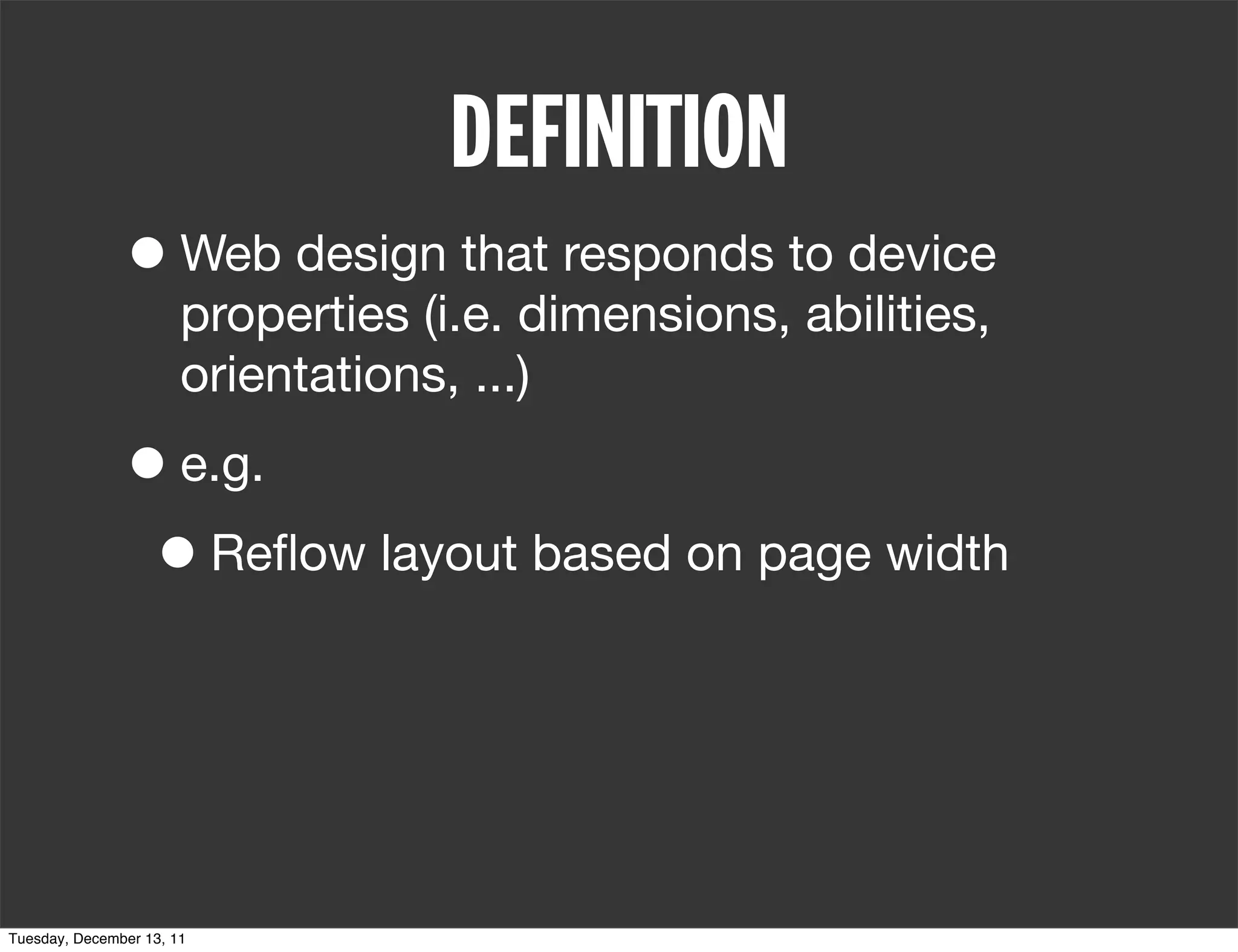
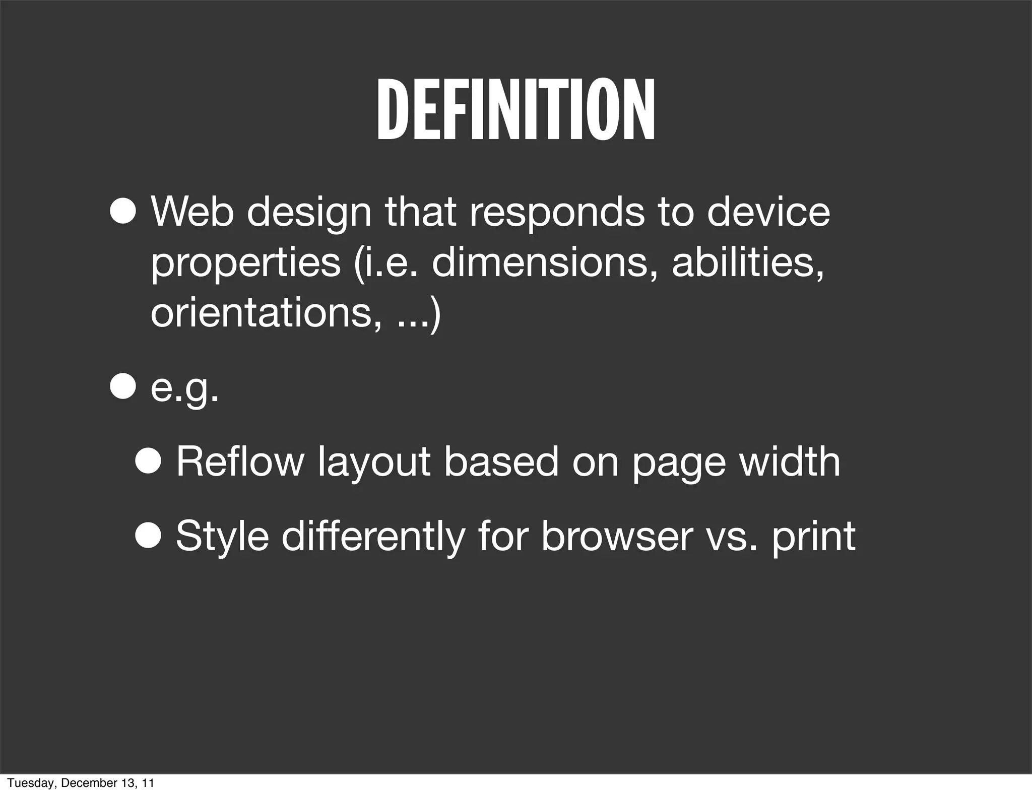
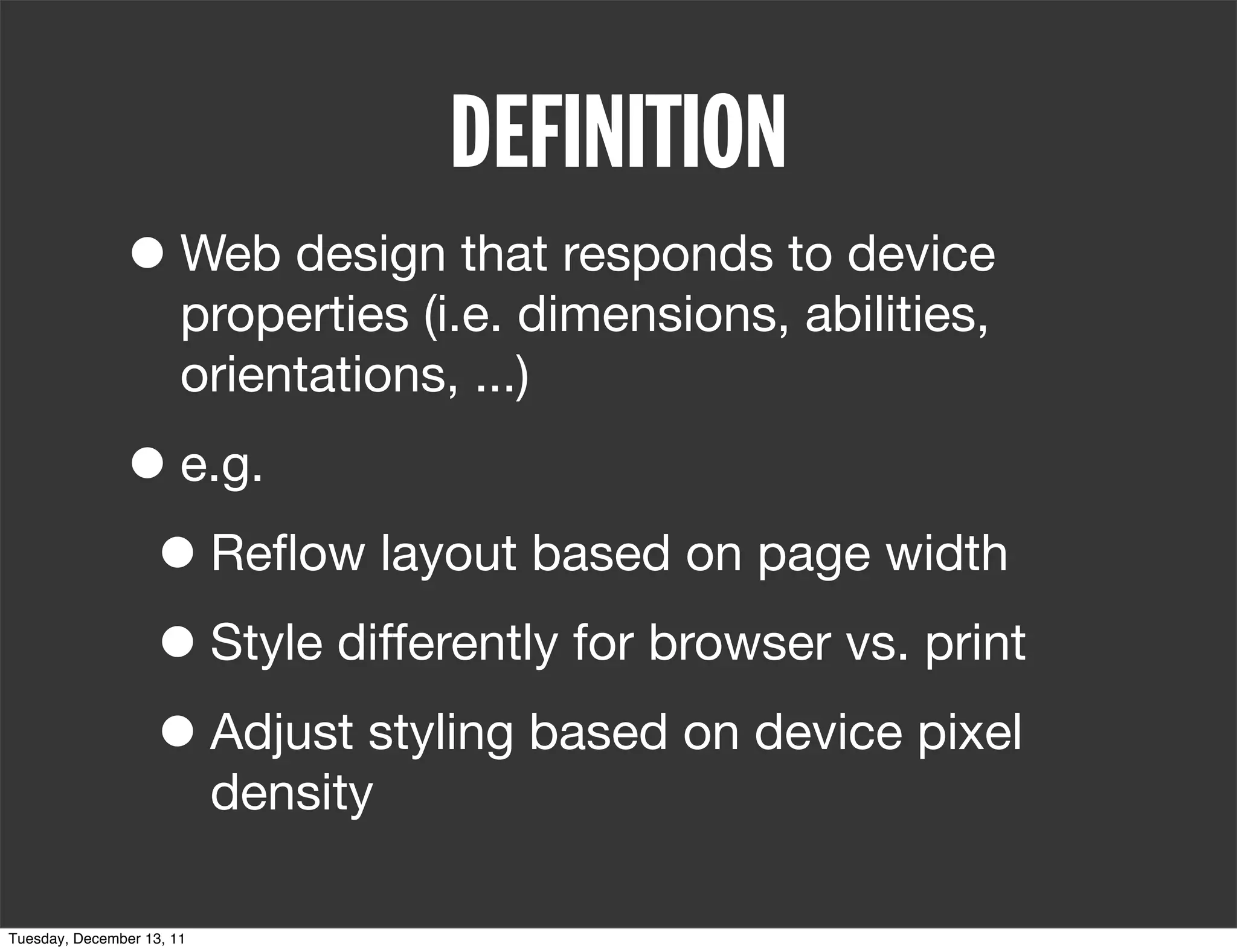
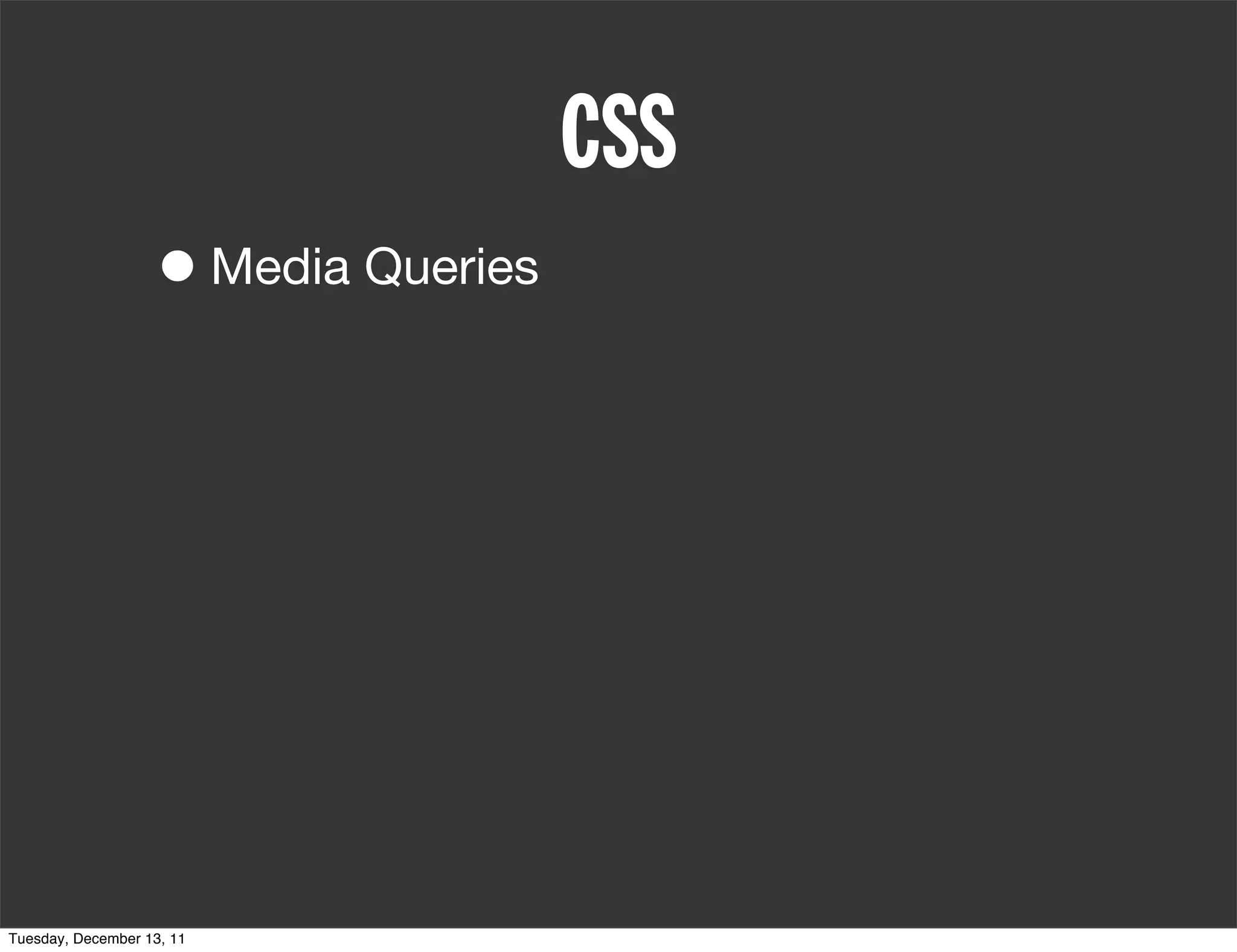
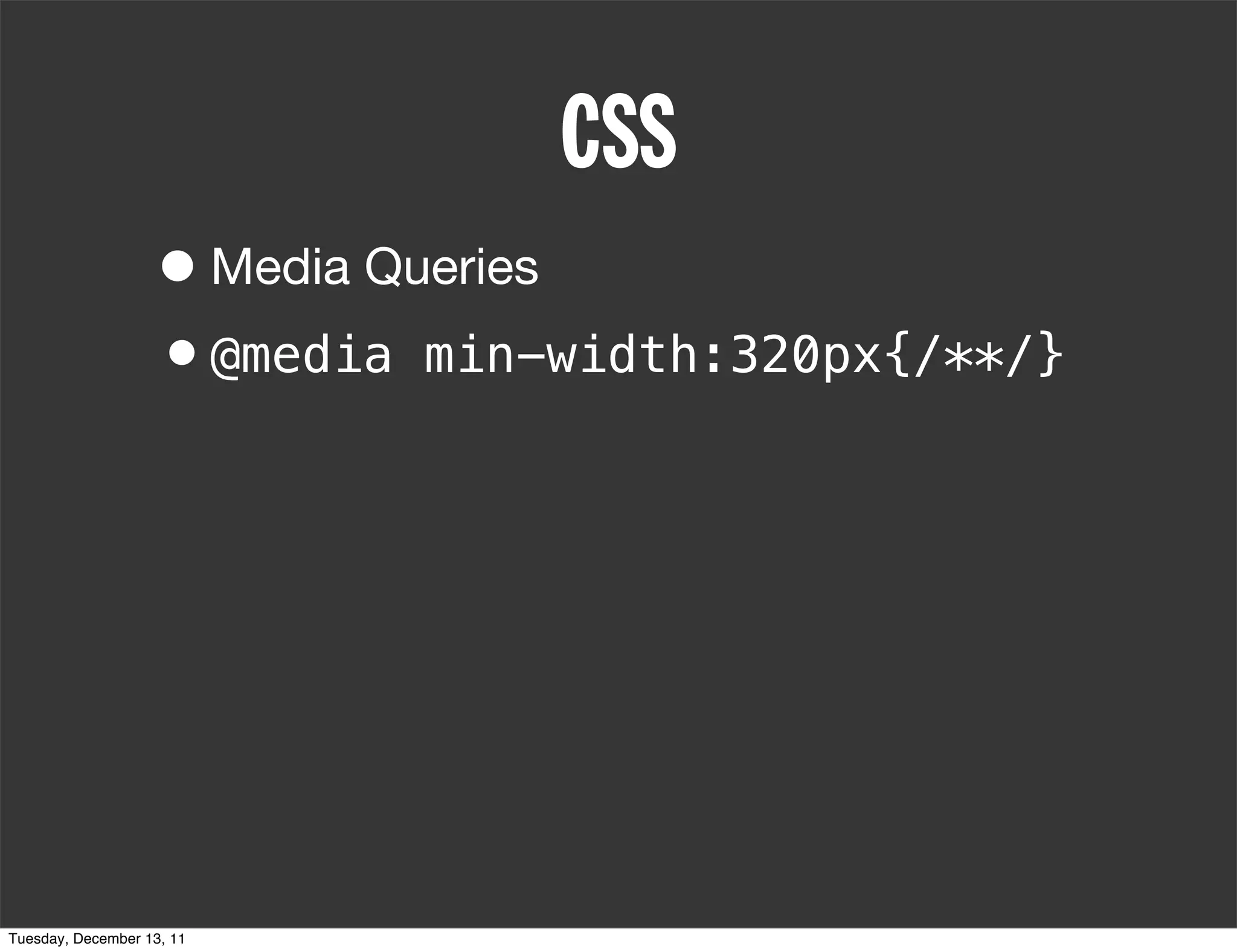
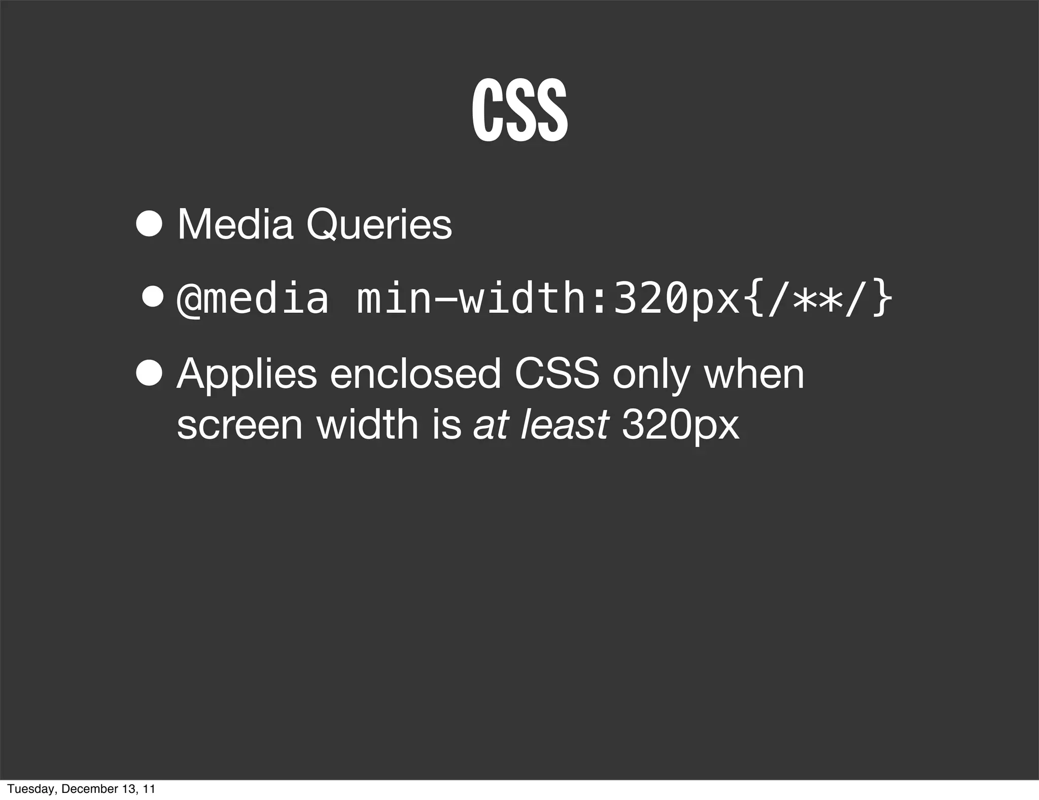
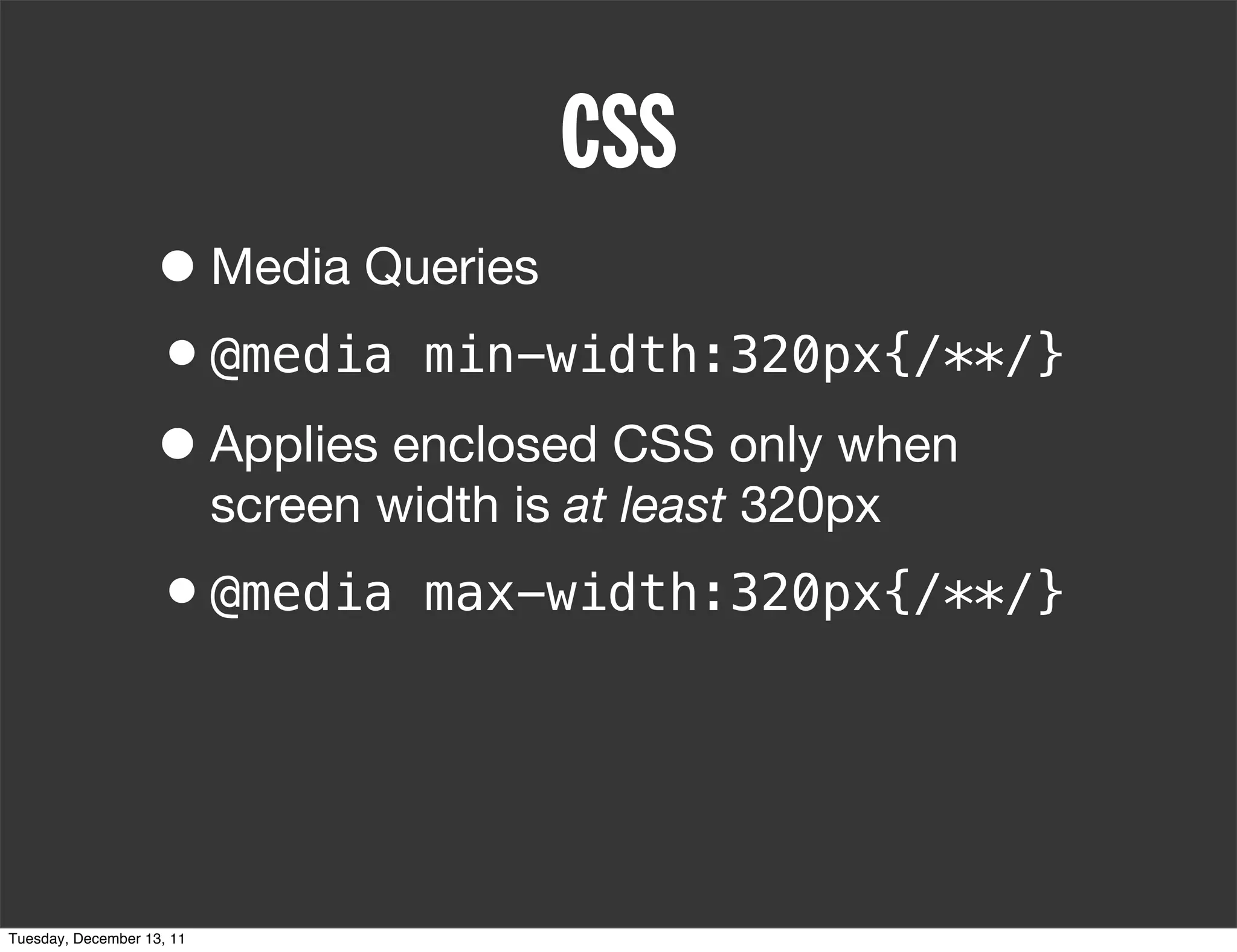
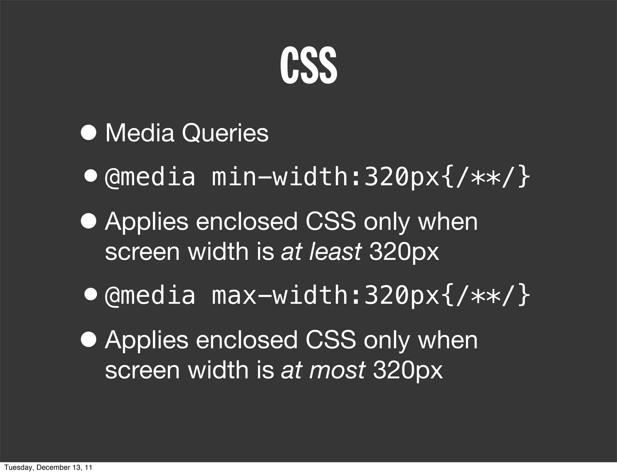

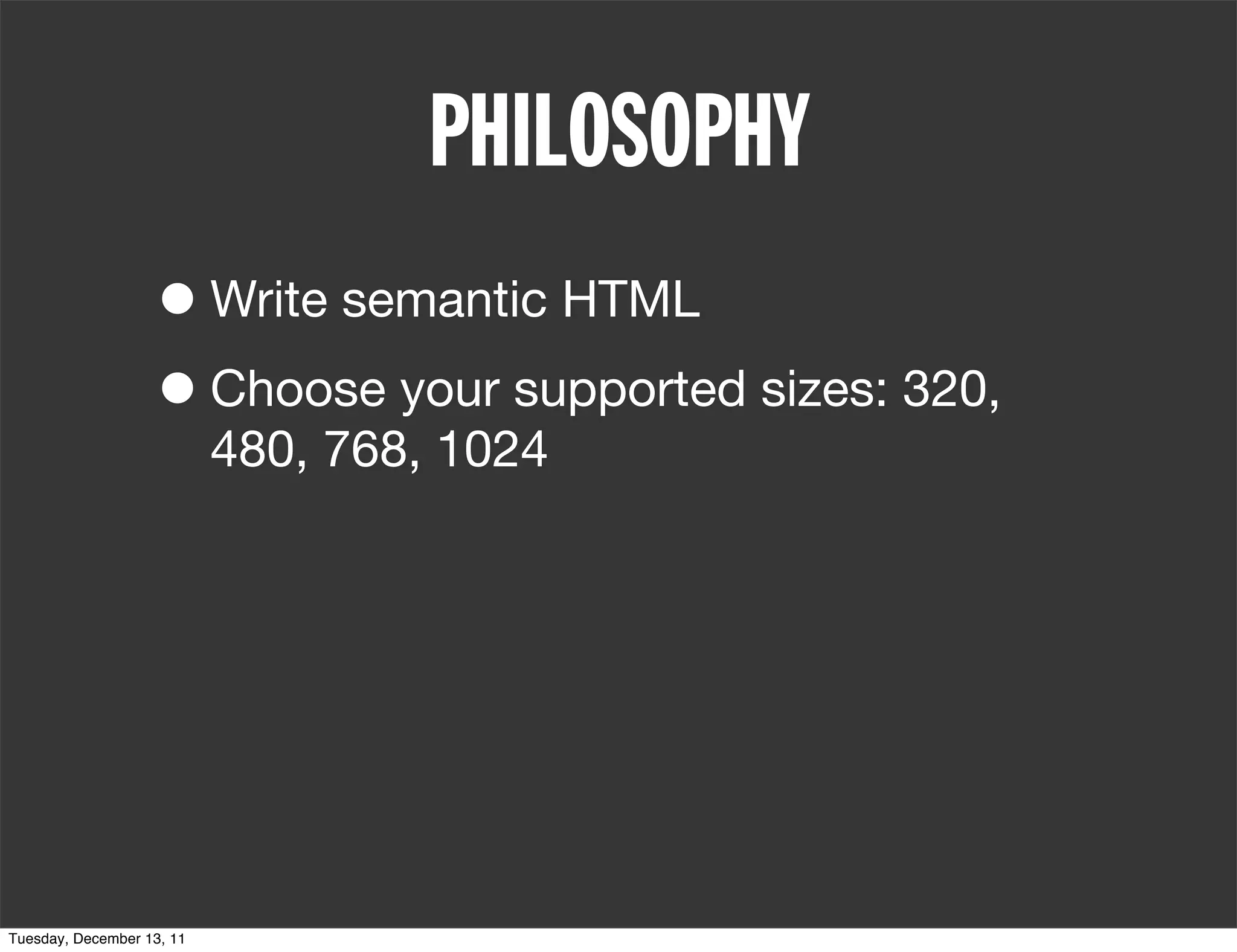
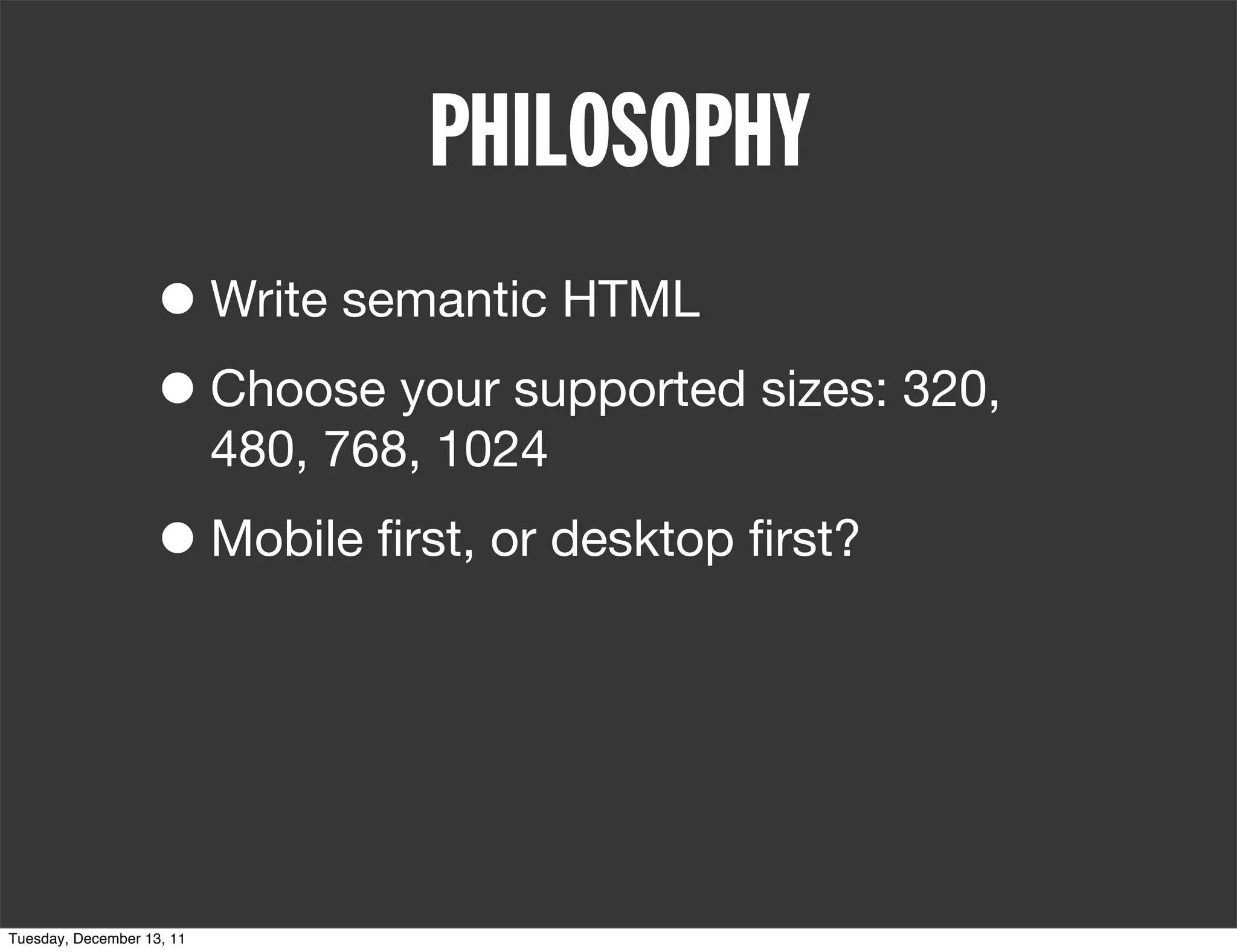
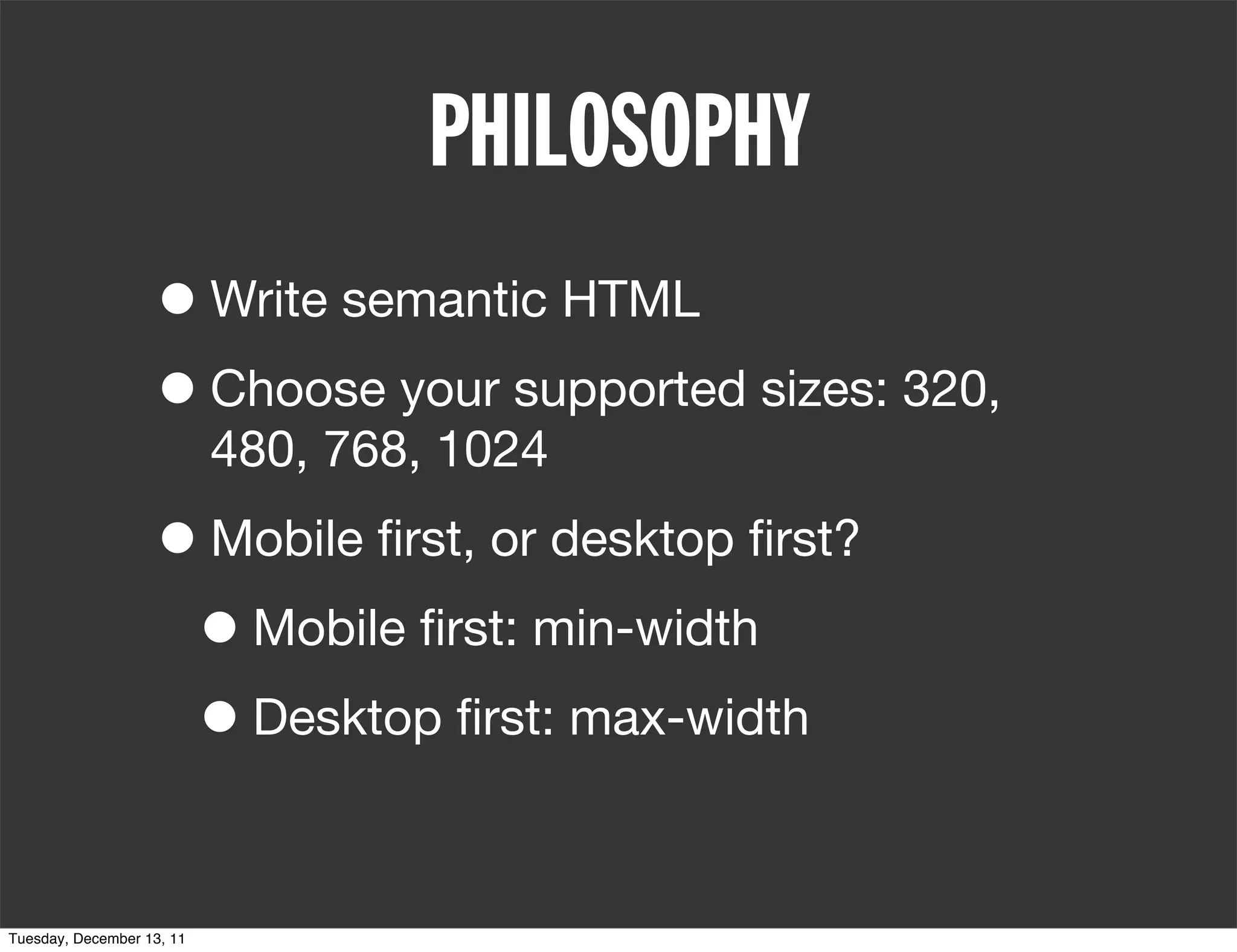


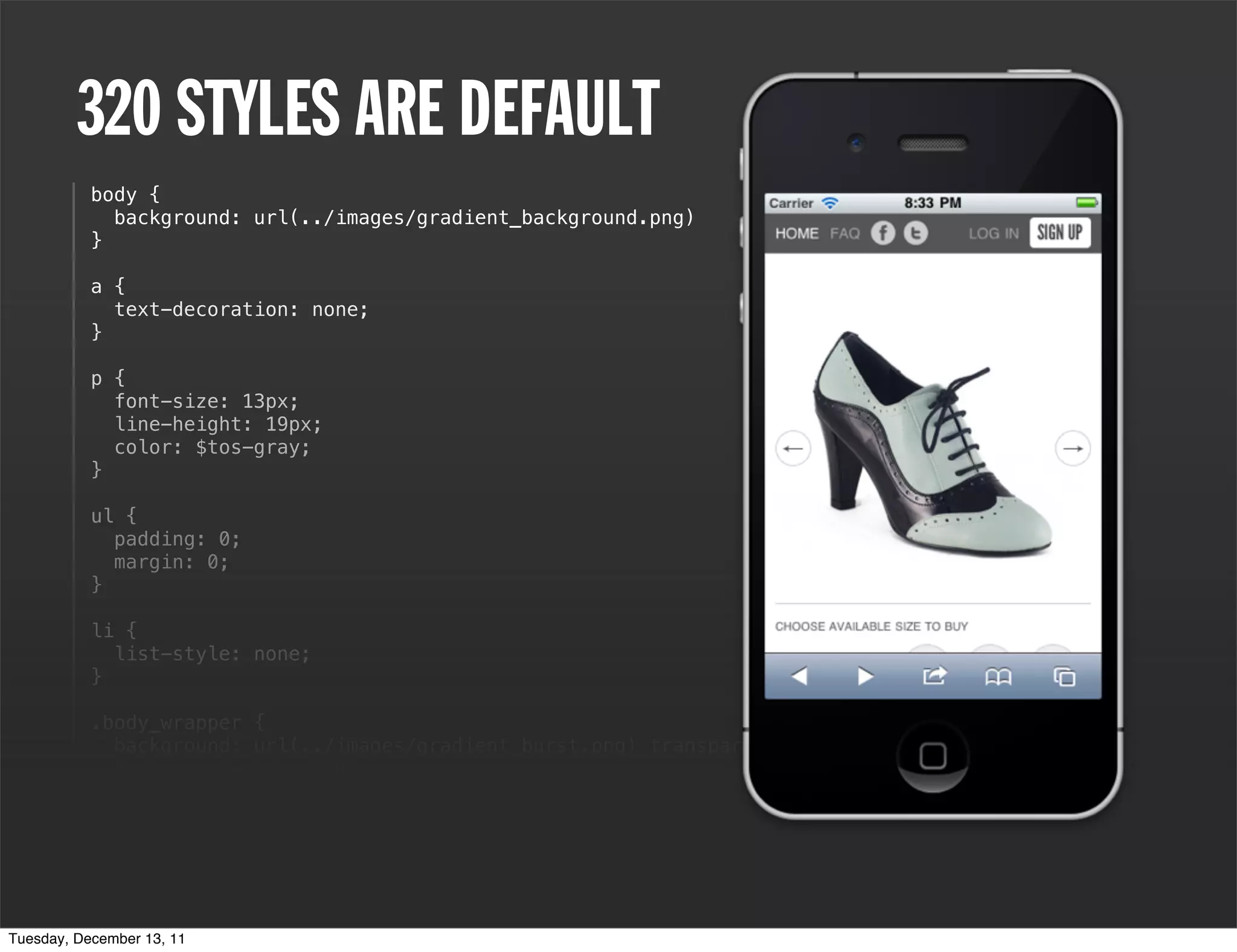
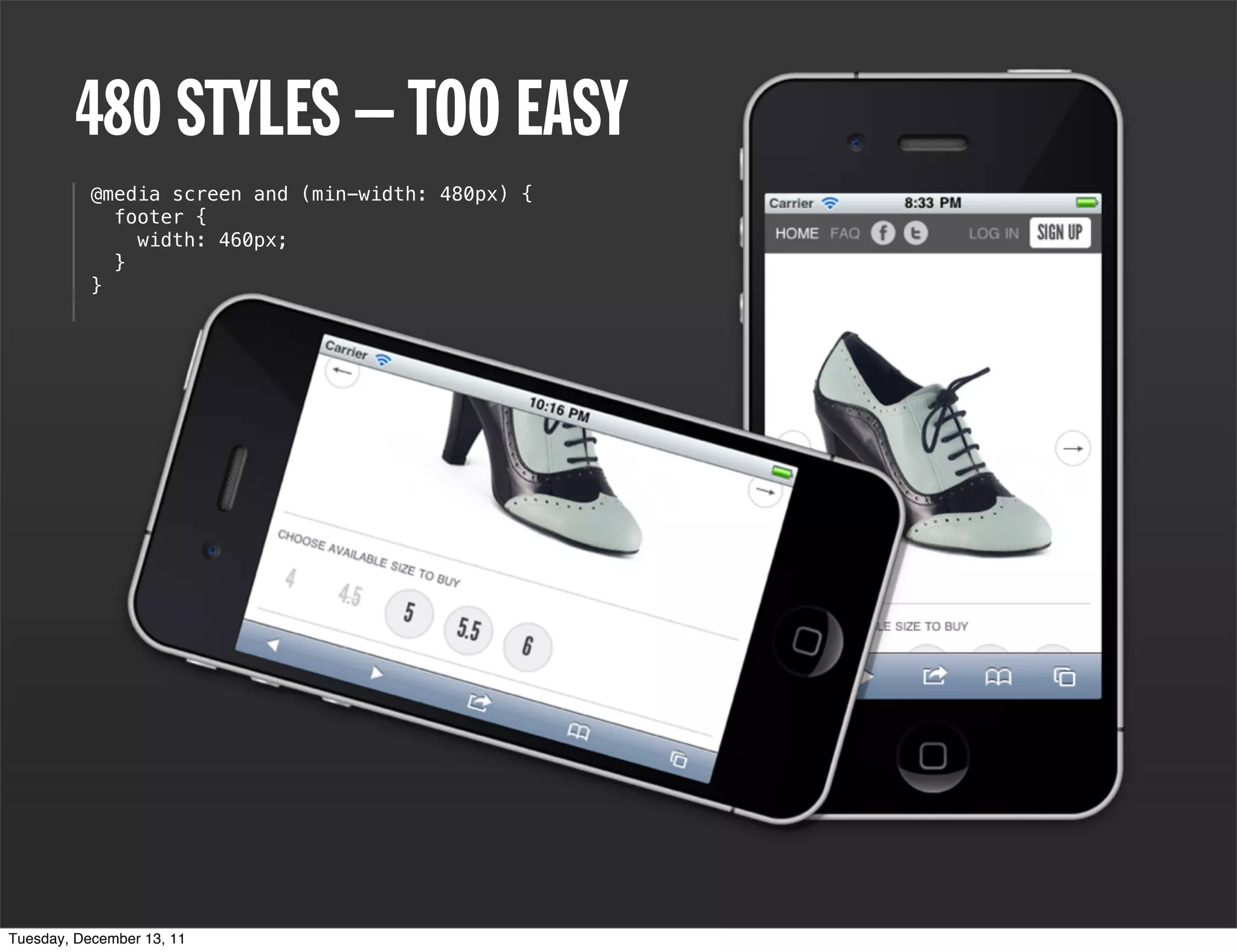
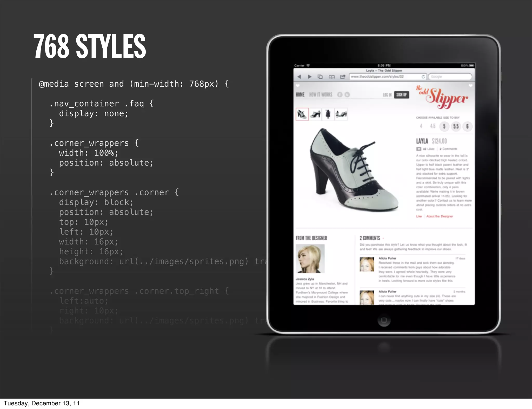
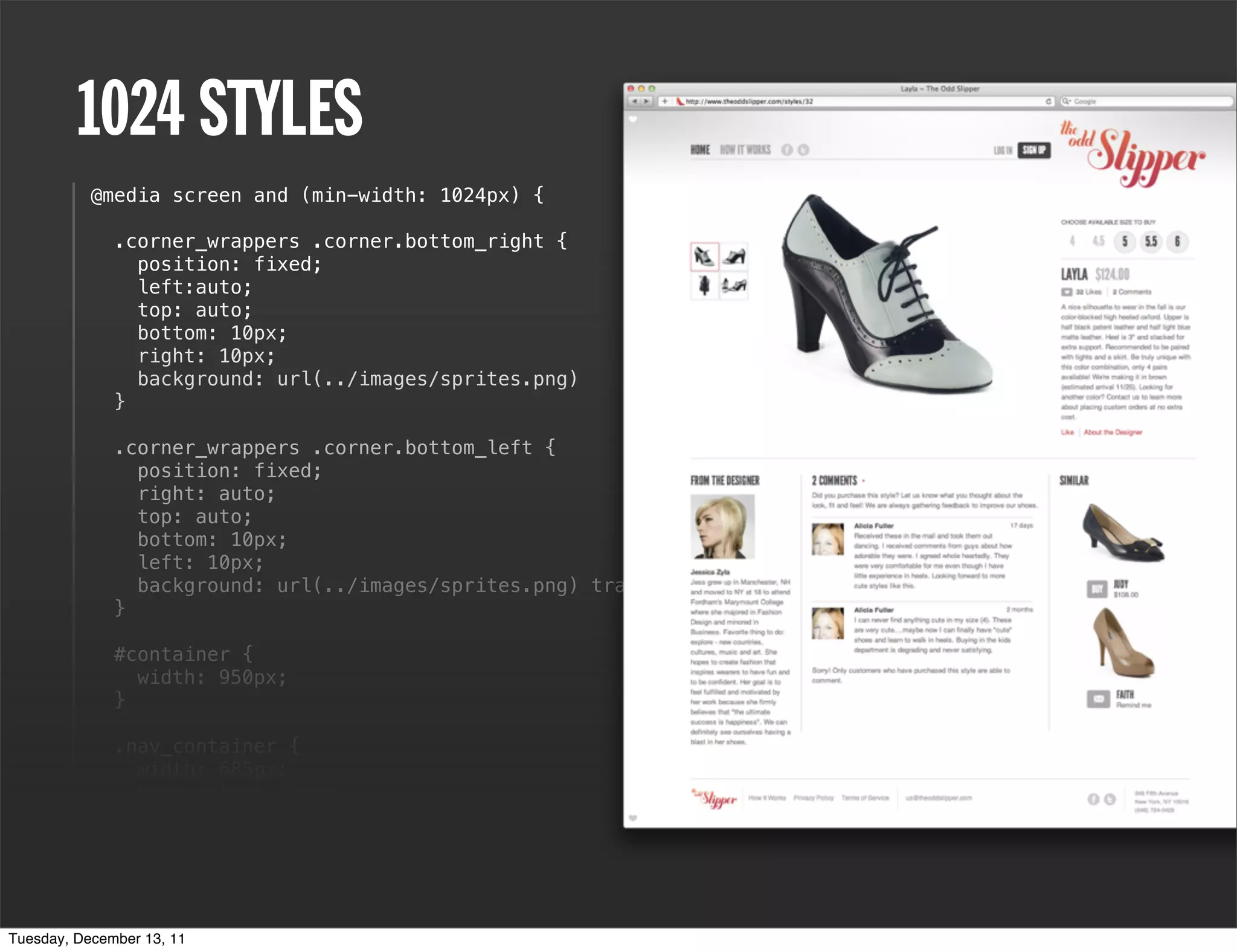
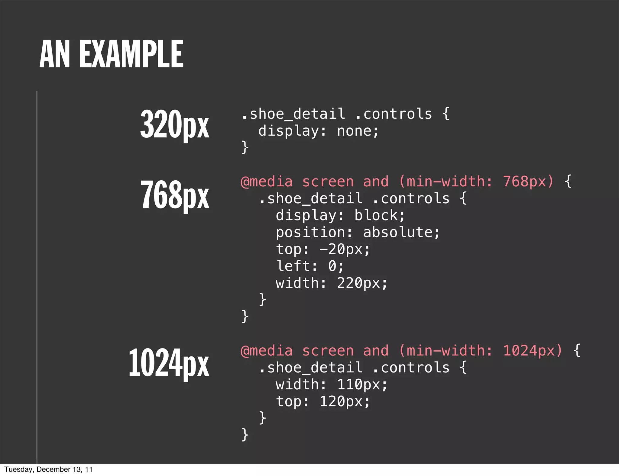

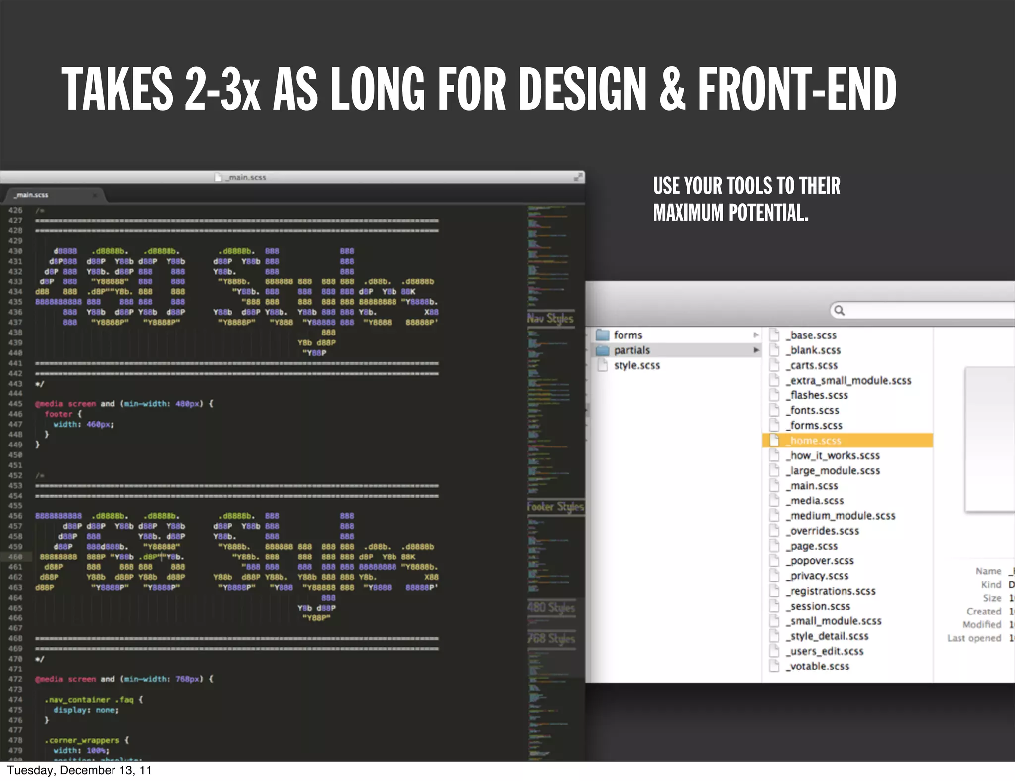


Responsive web design adapts to various device properties, such as dimensions and orientations, using techniques like media queries to apply different styles based on screen size. Key principles include writing semantic HTML and determining whether to adopt a mobile-first or desktop-first approach, along with specific styling for multiple screen widths (320px, 480px, 768px, and 1024px). The document also discusses practical design examples and emphasizes reflowing content effectively to optimize front-end development.


![[DCTPE2011] 7) Mobile Drupal(英/中雙語)](https://cdn.slidesharecdn.com/ss_thumbnails/mobile-drupal-110709035619-phpapp02-110814094115-phpapp02-thumbnail.jpg?width=640&height=640&fit=bounds)


![Vibe Coding vs. Spec-Driven Development [Free Meetup]](https://cdn.slidesharecdn.com/ss_thumbnails/vibecodingvsspecdrivendevelopment-251209105622-43f455e7-thumbnail.jpg?width=640&height=640&fit=bounds)


