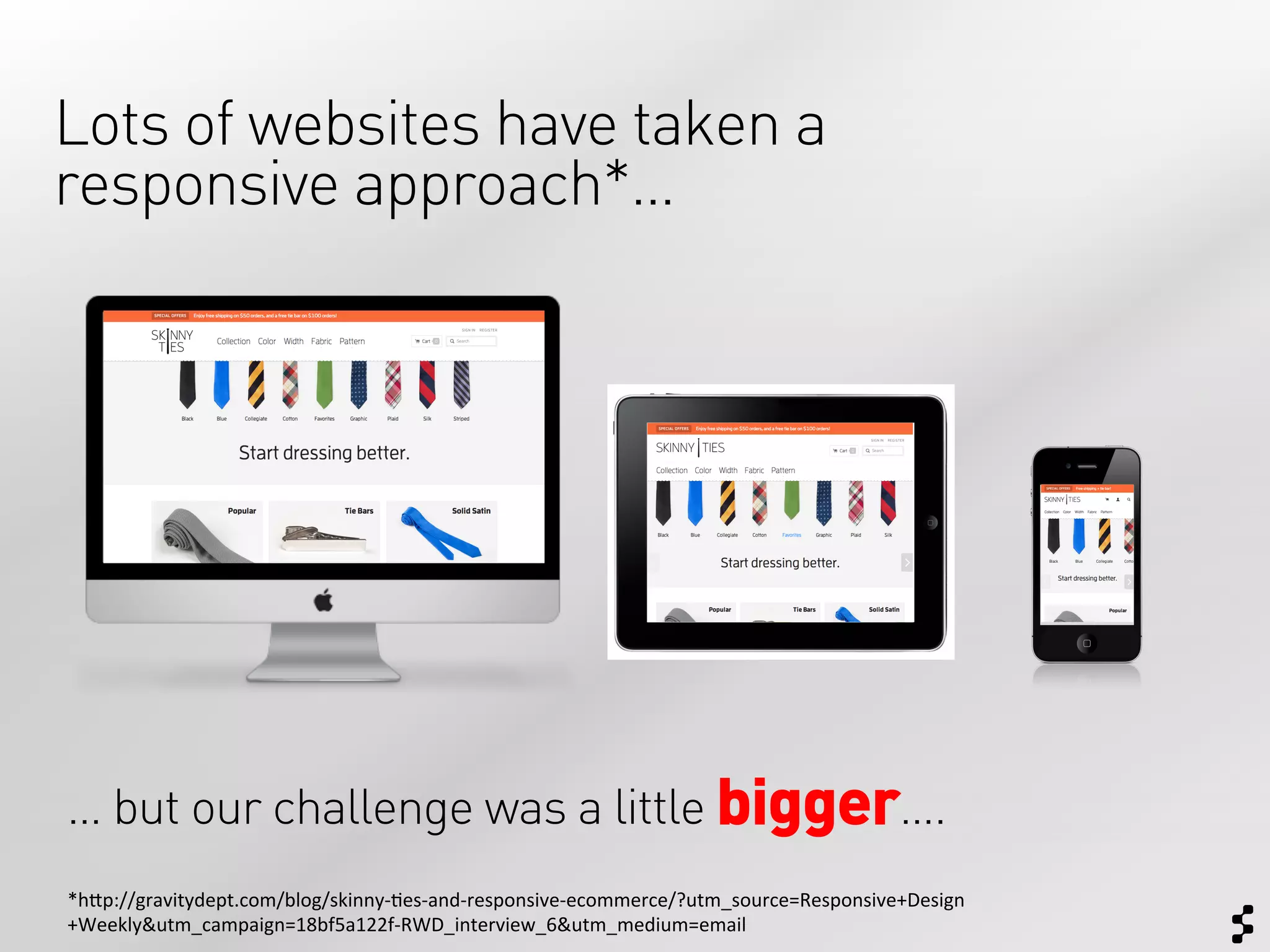
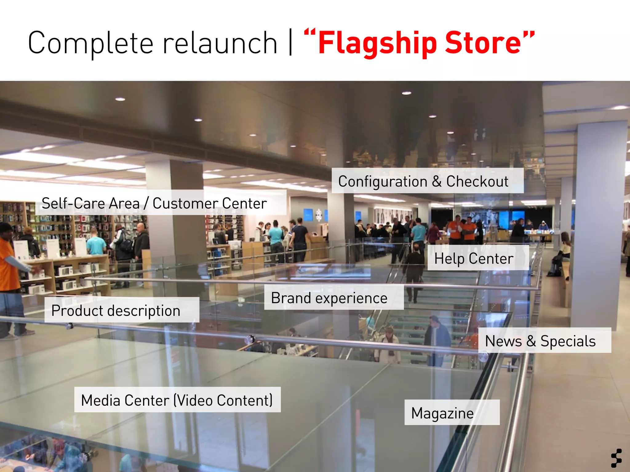
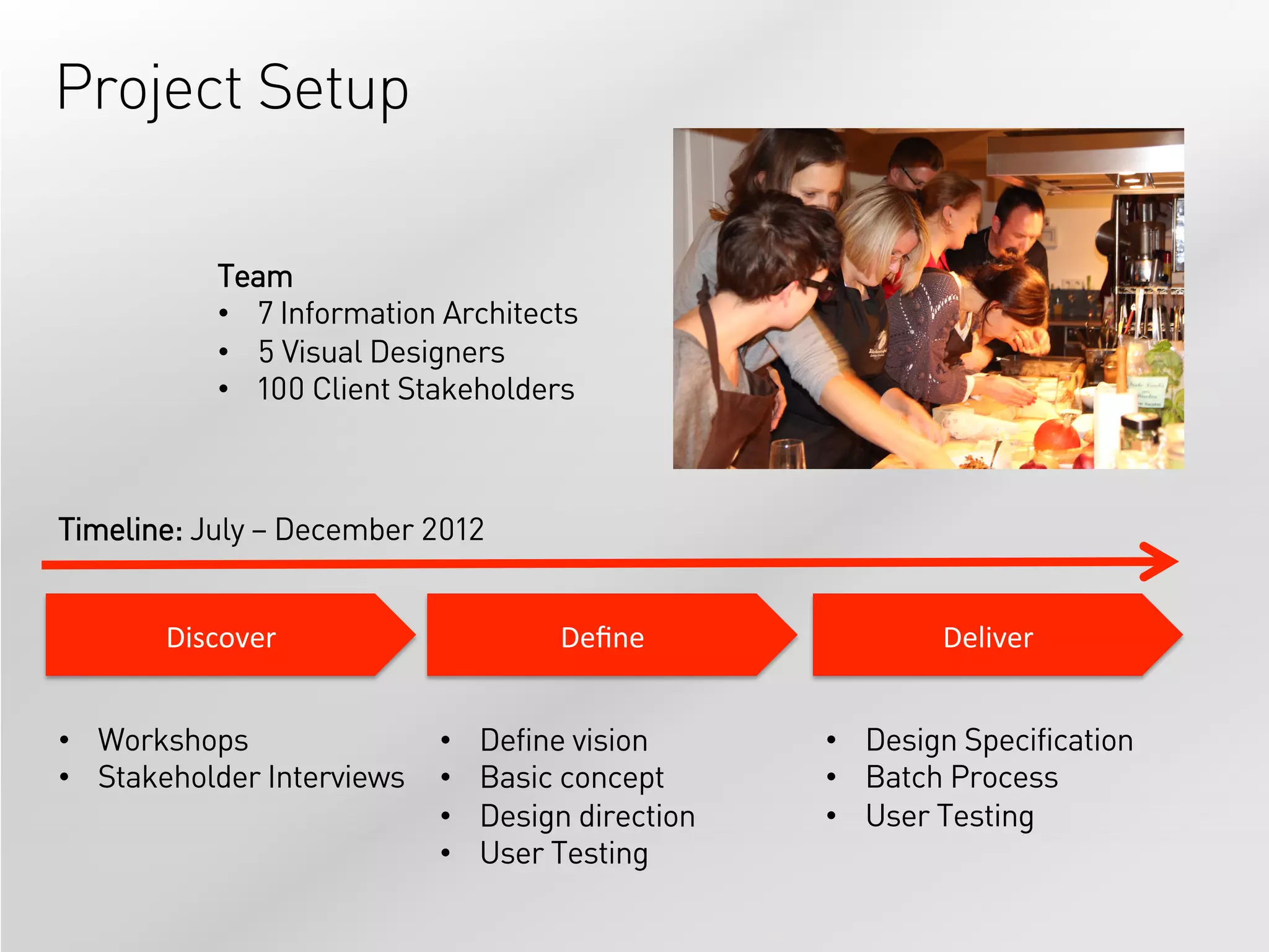
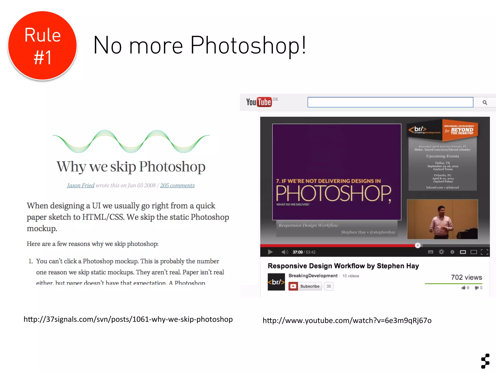
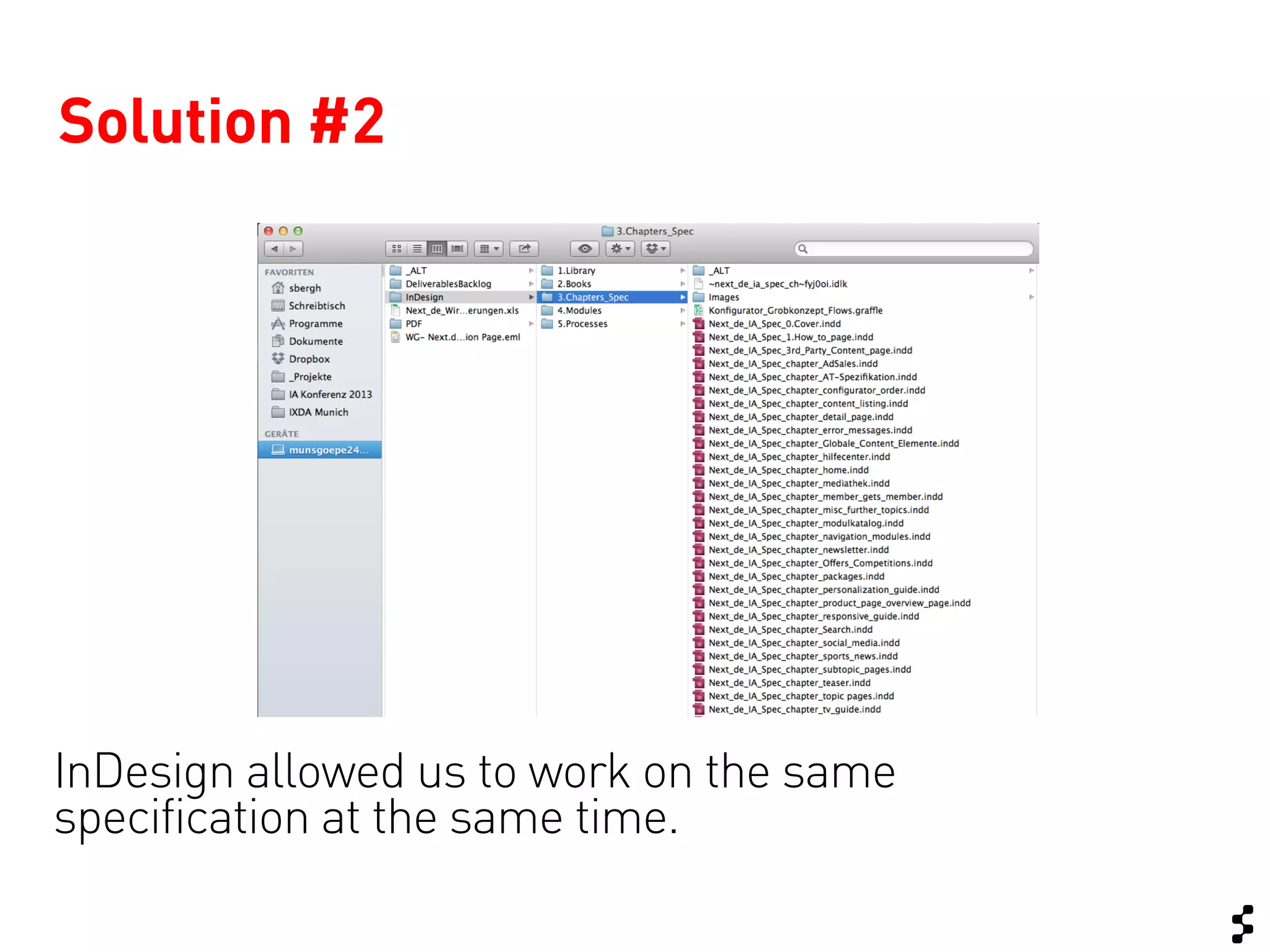
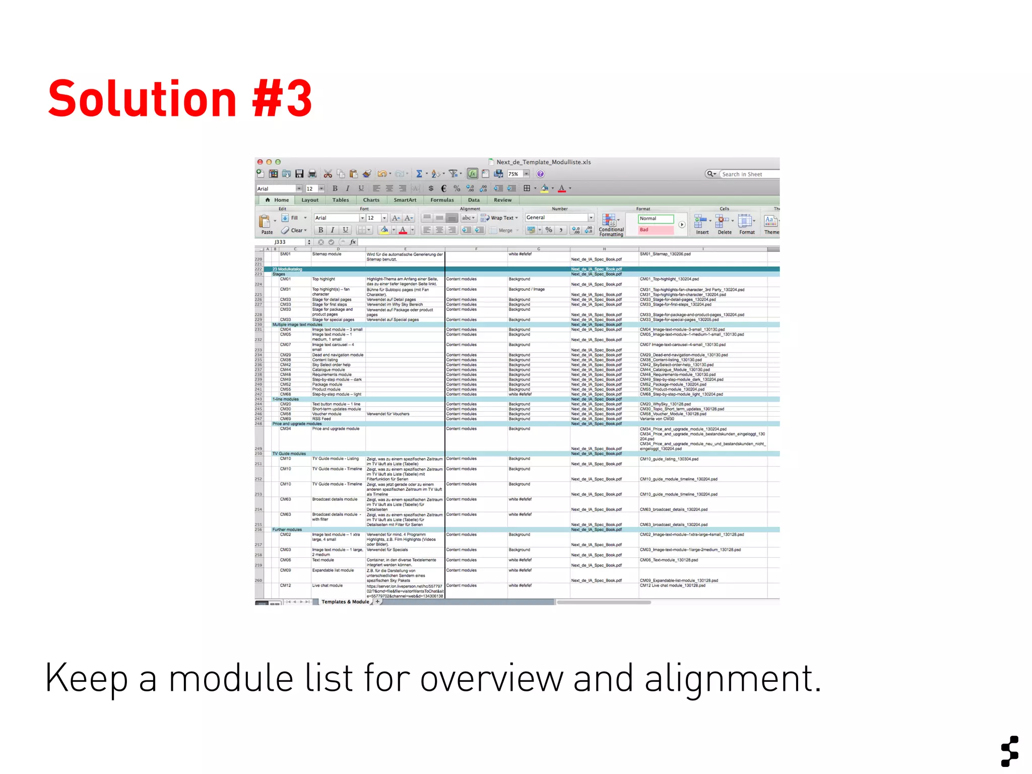
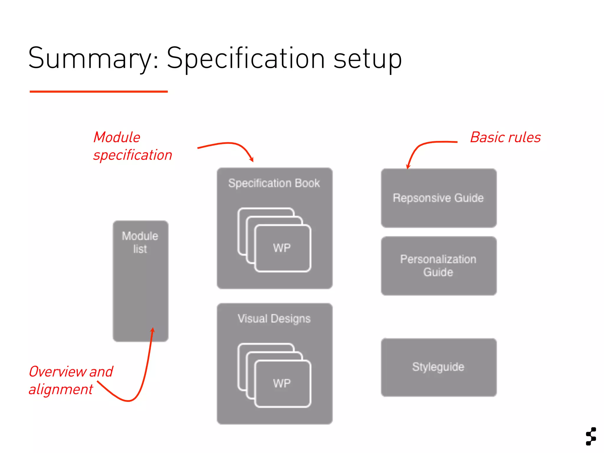
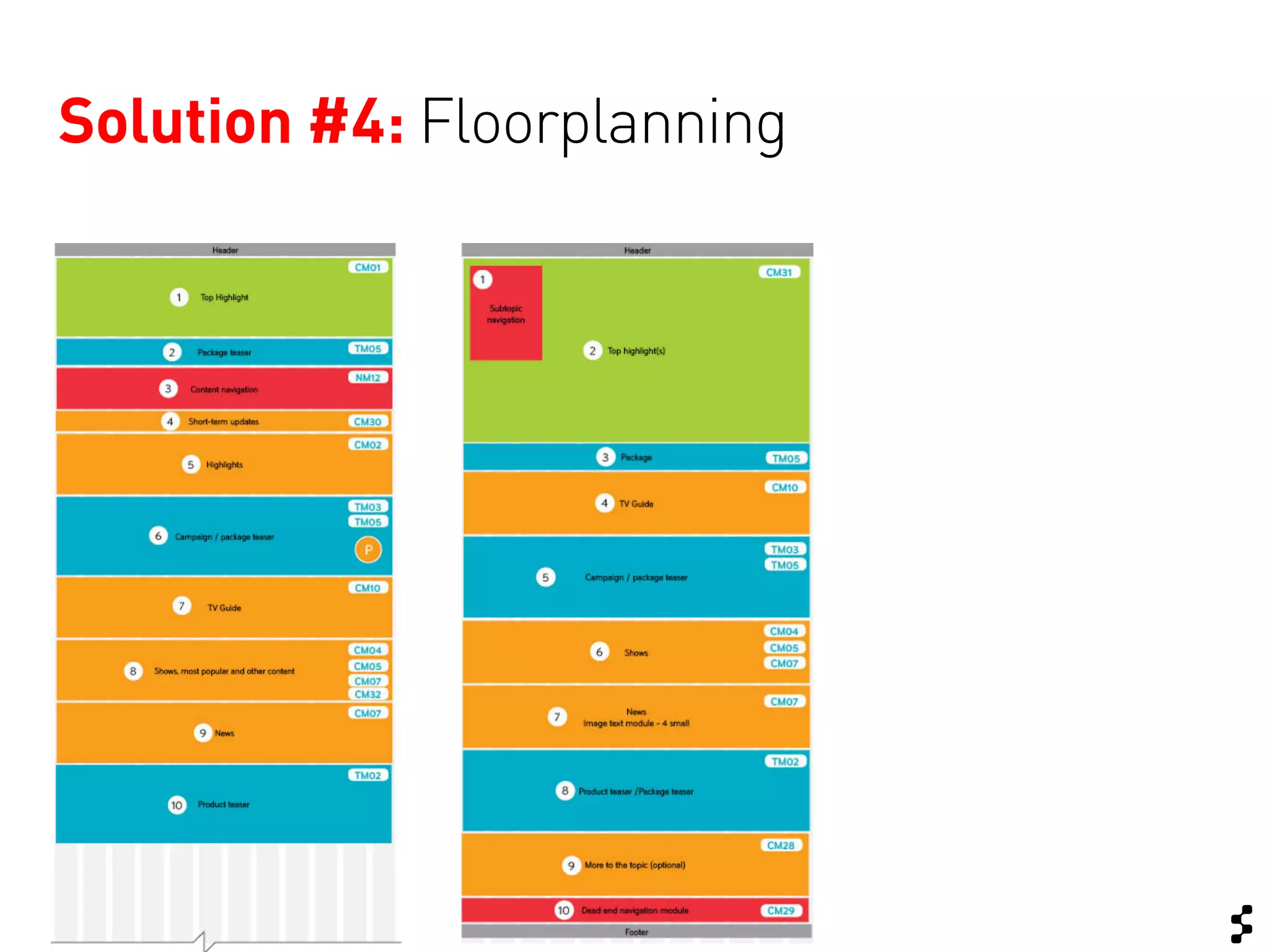
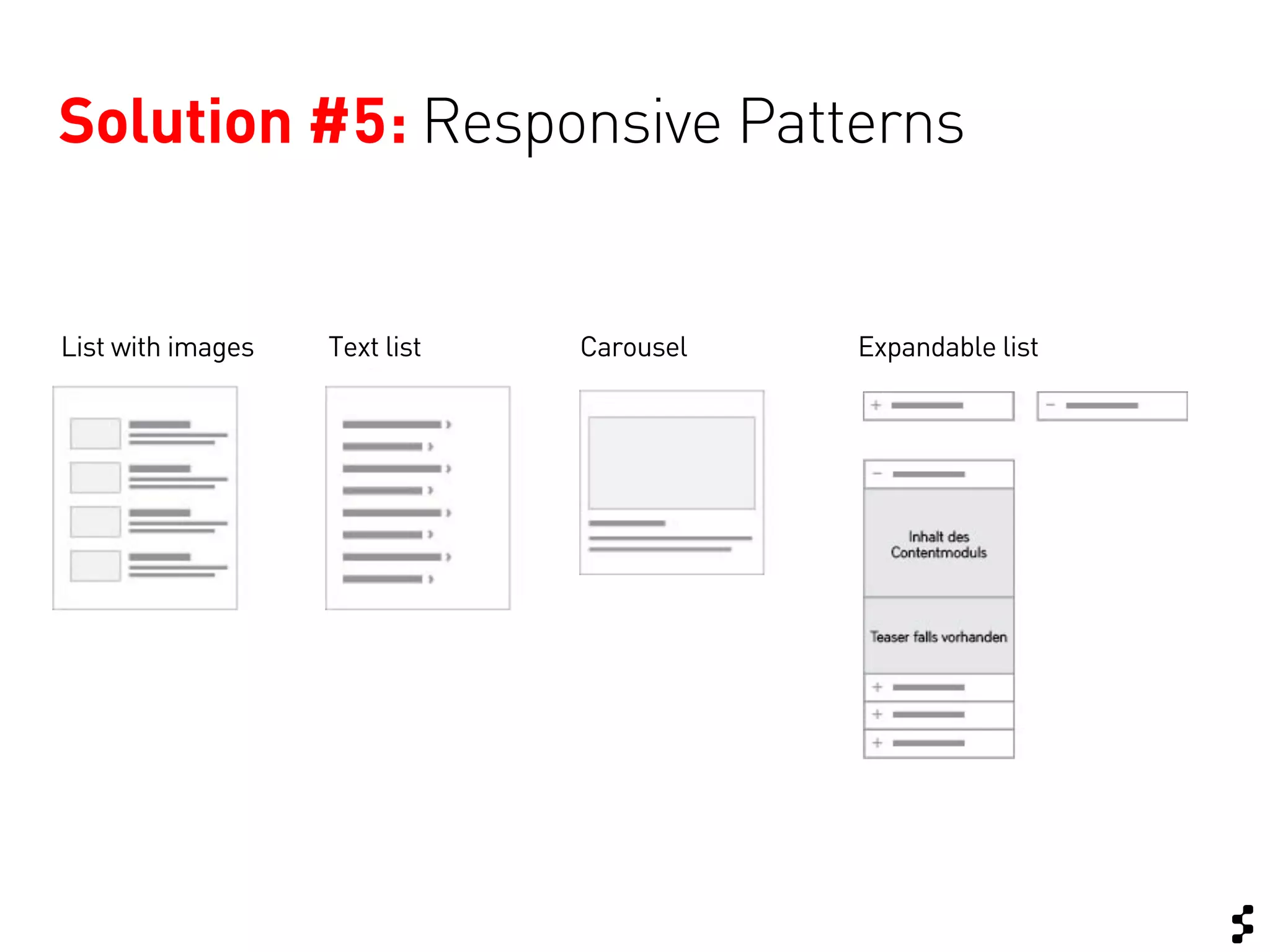
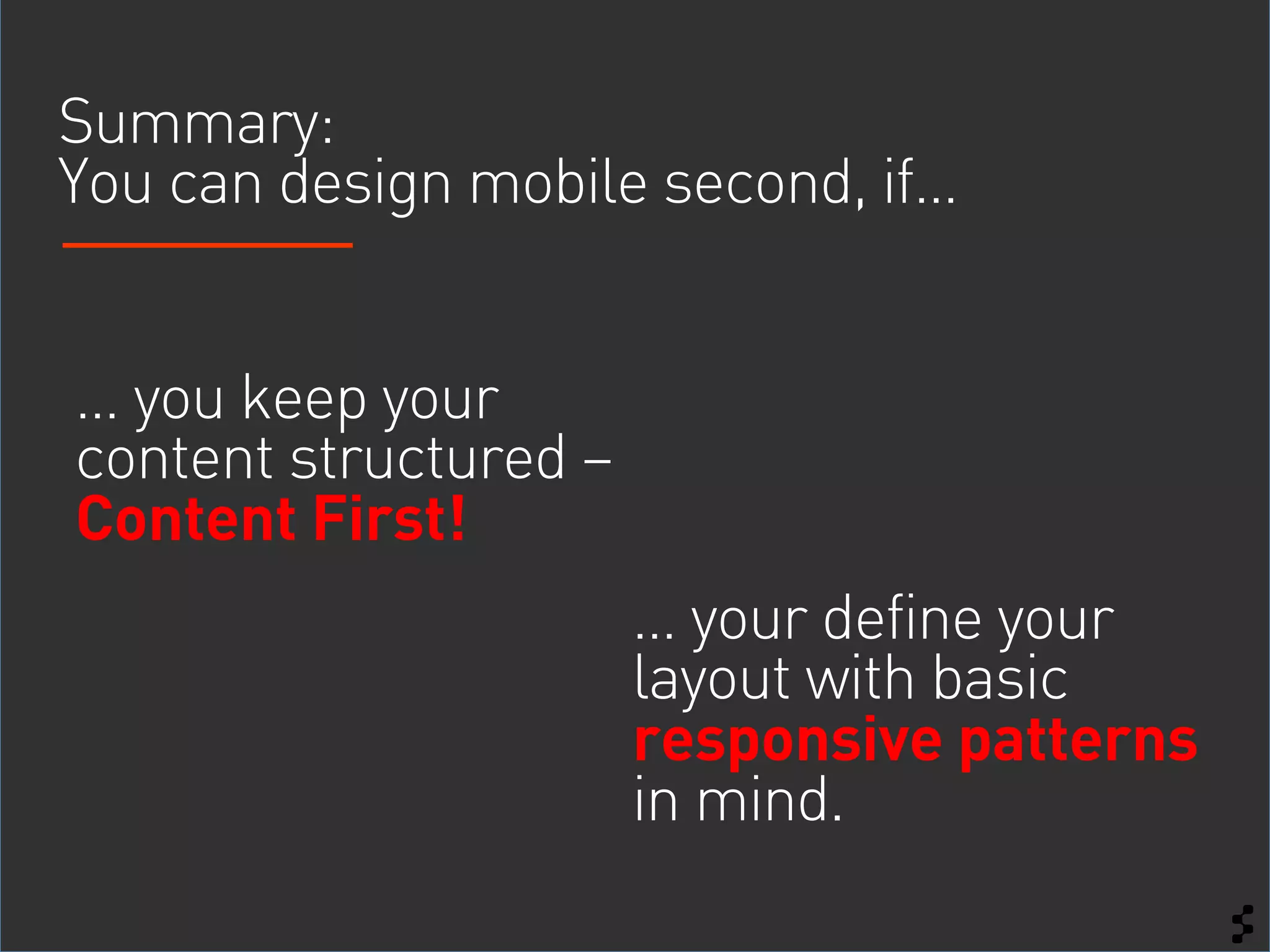
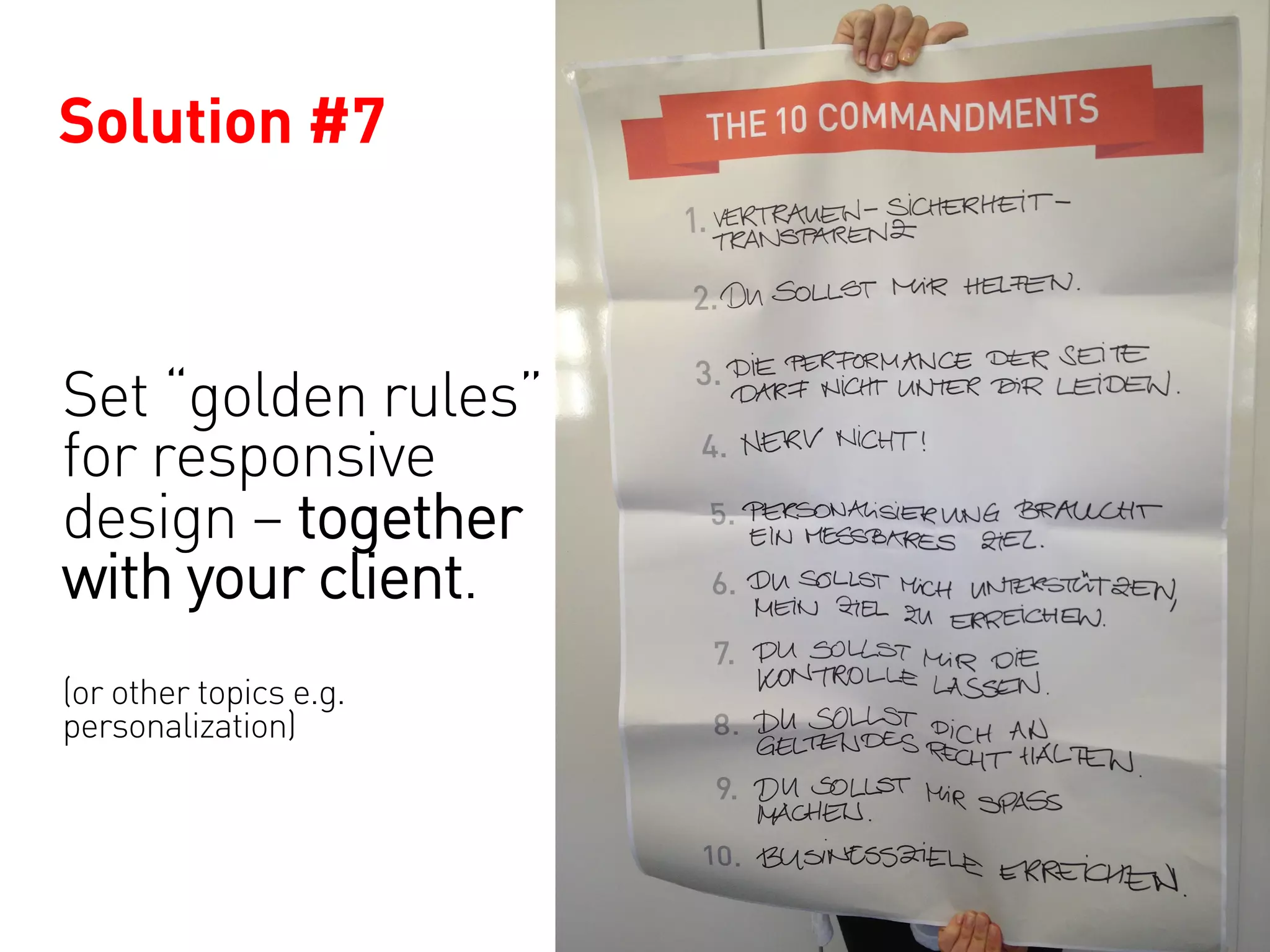
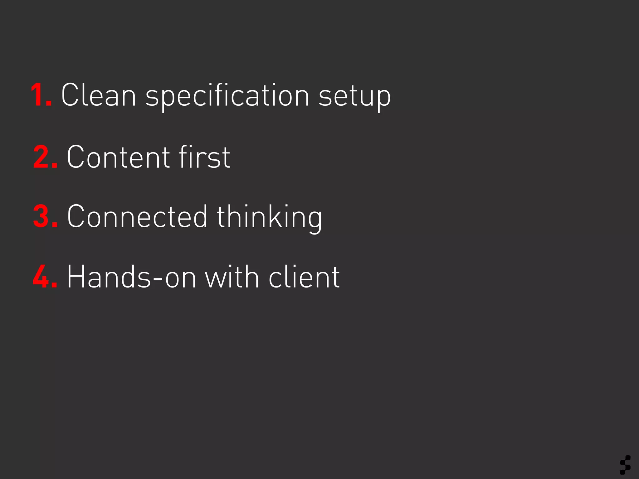
This document discusses responsive design for complex websites. It outlines some common rules and challenges when taking a responsive approach. These include using tools like InDesign instead of Photoshop, keeping content structured with basic responsive patterns, and getting technical and creative teams connected early through concepts and testing. The presentation aims to help others learn from their experience designing a large responsive redesign project.
The web is not a fixed width. So if the medium is fluid, should the process be fixed? Open source evangelist Steve Fisher prefers designing within the browser, especially when responsive design is a requirement since Fireworks and Photoshop are not flexible enough to demonstrate media queries, button and menu states, HTML5 and JavaScript behaviors, dynamic resizing of elements and navigation flow.
Learn how to develop a fluid process to match the fluidity of interactive design as Steve shows you why a responsive process is a responsible process. He’ll explore some of his recent work helping clients transform their processes to fit a responsive workflow and share some of the tips, techniques and processes he’s developed. One web to rule them all!
When Web Performance Optimization was emerging as a new field of engineering we had a handful of rules to follow. Gzip here, minify there, do some caching. This was 15 years ago.
This year’s Smashing Magazine performance checklist has 62 items with hundreds of links for further research.
Have we learned so much or has the Web become so complicated?
In this talk I will try to make sense of today’s most pressing Web Performance issues with easily digestible lessons about metrics, budgets, JavaScript frameworks, functional programming, browsers and plain old HTML.
The web is finally coming of age with respect to increasing sophistication of the structure and presentation of visual information, the standardization of technologies to more easily create and display this information, physical devices that make this information easily accessible, and finally growing social connectivity. Presented at Rich Web Experience 2011, Ft. Lauderdale, FL.
The story of what it's like being a UXer part of a large organisational transformation journey from Waterfall to Agile practices, and the "in-progress" view of the process looks like.
Drupal session 3 - biginlucerne.com - lessons learnedNETNODE AG
Together with clou kreativ (www.cloukreativ.ch) we create www.biginlucerne.com, a photo contest in Lucerne, Switzerland. We used Drupal as a tool to allow users upload, rate, comment, share images. In this presentation Slava Rys explains some core functions, problems that occured during development as well as some insight about how the site was built.
Also find additional comments on www.netnode.ch/blog
Challenge your product development department by a challenging contest with LEGO bricks: "Who Delivers Value First?" - Agile or Waterfall?
Product Owner Challenge is an agile game w/ Lego bricks. Its about challenging the product development to communicate clear objectives, requirements, and vision.
Slidedeck contains playing instructions, examples, and further info.
Material needed: (a) "Presentation User Stories for POChallenge", (b) "Process Cards for POChallenge" - both on my SlideShare account
Keynote "Digital Transformation, Mobile Business & Banjos" von Prof. Dr. Andrea Back und Sabine Berghaus, gehalten auf dem Mobile Business Forum am 03. Juni 2015 in St.Gallen. www.aback.iwi.unisg.ch.
Adoption of Mobile Business Solutions and its Impact on Organizational Stakeh...Sabine Berghaus
This is the presentation I held at the 27th Bled eConference on 4th June 2014 in Slovenia. The original paper was pubished in the Bled 2014 Proceedings.
Short excerpt from our session at barcamp Mainz. We are part of the Samsung Mobilers project and this is one of our results from the ideation phase we would like to develop further. It is still a very rough concept, but please feel free to give us feedback.
Essentials of Automations: Optimizing FME Workflows with ParametersSafe Software
Are you looking to streamline your workflows and boost your projects’ efficiency? Do you find yourself searching for ways to add flexibility and control over your FME workflows? If so, you’re in the right place.
Join us for an insightful dive into the world of FME parameters, a critical element in optimizing workflow efficiency. This webinar marks the beginning of our three-part “Essentials of Automation” series. This first webinar is designed to equip you with the knowledge and skills to utilize parameters effectively: enhancing the flexibility, maintainability, and user control of your FME projects.
Here’s what you’ll gain:
- Essentials of FME Parameters: Understand the pivotal role of parameters, including Reader/Writer, Transformer, User, and FME Flow categories. Discover how they are the key to unlocking automation and optimization within your workflows.
- Practical Applications in FME Form: Delve into key user parameter types including choice, connections, and file URLs. Allow users to control how a workflow runs, making your workflows more reusable. Learn to import values and deliver the best user experience for your workflows while enhancing accuracy.
- Optimization Strategies in FME Flow: Explore the creation and strategic deployment of parameters in FME Flow, including the use of deployment and geometry parameters, to maximize workflow efficiency.
- Pro Tips for Success: Gain insights on parameterizing connections and leveraging new features like Conditional Visibility for clarity and simplicity.
We’ll wrap up with a glimpse into future webinars, followed by a Q&A session to address your specific questions surrounding this topic.
Don’t miss this opportunity to elevate your FME expertise and drive your projects to new heights of efficiency.
GraphRAG is All You need? LLM & Knowledge GraphGuy Korland
Guy Korland, CEO and Co-founder of FalkorDB, will review two articles on the integration of language models with knowledge graphs.
1. Unifying Large Language Models and Knowledge Graphs: A Roadmap.
https://arxiv.org/abs/2306.08302
2. Microsoft Research's GraphRAG paper and a review paper on various uses of knowledge graphs:
https://www.microsoft.com/en-us/research/blog/graphrag-unlocking-llm-discovery-on-narrative-private-data/
Generating a custom Ruby SDK for your web service or Rails API using Smithyg2nightmarescribd
Have you ever wanted a Ruby client API to communicate with your web service? Smithy is a protocol-agnostic language for defining services and SDKs. Smithy Ruby is an implementation of Smithy that generates a Ruby SDK using a Smithy model. In this talk, we will explore Smithy and Smithy Ruby to learn how to generate custom feature-rich SDKs that can communicate with any web service, such as a Rails JSON API.
Smart TV Buyer Insights Survey 2024 by 91mobiles.pdf91mobiles
91mobiles recently conducted a Smart TV Buyer Insights Survey in which we asked over 3,000 respondents about the TV they own, aspects they look at on a new TV, and their TV buying preferences.
Responsive Design for Complex Websites (IXDA Munich)
1. Responsive Design for Complex Websites
Reality check – How does it really change
the design process?
IXDA Munich Meeting
08 April 2013
Sabine Berghaus
2. Lots of websites have taken a
responsive approach*…
… but our challenge was a little bigger….
*h$p://gravitydept.com/blog/skinny-‐;es-‐and-‐responsive-‐ecommerce/?utm_source=Responsive+Design
+Weekly&utm_campaign=18bf5a122f-‐RWD_interview_6&utm_medium=email
3. Complete relaunch | “Flagship Store”
Configuration & Checkout
Self-Care Area / Customer Center
Help Center
Brand experience
Product description
News & Specials
Media Center (Video Content)
Magazine
4. Project Setup
Team
• 7 Information Architects
• 5 Visual Designers
• 100 Client Stakeholders
Timeline: July – December 2012
Discover
Define
Deliver
• Workshops • Define vision • Design Specification
• Stakeholder Interviews • Basic concept • Batch Process
• Design direction • User Testing
• User Testing
5. Reality Common “Rules”
Check and our approach
Limitations
6. Rule
#1
No more Photoshop!
h$p://37signals.com/svn/posts/1061-‐why-‐we-‐skip-‐photoshop
h$p://www.youtube.com/watch?v=6e3m9qRj67o
21. Summary:
You can design mobile second, if…
… you keep your
content structured –
Content First!
… your define your
layout with basic
responsive patterns
in mind.
26. Summary:
Get tech and creative connected as soon
as possible – even if the track has not
officially started.
Challenge and review creative
concepts.