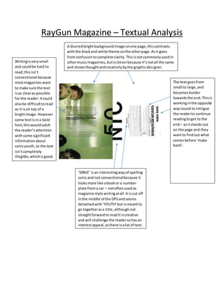
RayGun Magazine – Textual Analysis 
A blurred bright background image on one page, this contrasts 
with the black and white theme on the other page. As it goes 
from confusion to complete clarity. This is not commonly used in 
other music magazines, but is clever because it’s not all the same 
and shows thought and creativity by the graphic designer. 
Writing is very small 
and could be hard to 
read; this isn’t 
conventional because 
most magazines want 
to make sure the text 
is as clear as possible 
for the reader. It could 
also be difficult to read 
as it is on top of a 
bright image. However 
some text is in a bold 
font, this would catch 
the reader’s attention 
with some significant 
information about 
sonic youth, so the text 
isn’t completely 
illegible, which is good. 
‘50NIC’ is an interesting way of spelling 
sonic and not conventional because it 
looks more like a book or a number 
plate from a car – not often used as 
magazine style writing at all. It is cut off 
in the middle of the DPS and seems 
detached with ‘YOUTH’ but is meant to 
go together as a title, although not 
straight forward to read it is creative 
and will challenge the reader so has an 
interest appeal, as there is a lot of text. 
The text goes from 
small to large, and 
becomes bolder 
towards the end. This is 
working in the opposite 
way round to intrigue 
the reader to continue 
reading to get to the 
end – as it stands out 
on the page and they 
want to find out what 
comes before ‘make 
bank’.

Ray Gun magazine dps

  • 1.
    RayGun Magazine –Textual Analysis A blurred bright background image on one page, this contrasts with the black and white theme on the other page. As it goes from confusion to complete clarity. This is not commonly used in other music magazines, but is clever because it’s not all the same and shows thought and creativity by the graphic designer. Writing is very small and could be hard to read; this isn’t conventional because most magazines want to make sure the text is as clear as possible for the reader. It could also be difficult to read as it is on top of a bright image. However some text is in a bold font, this would catch the reader’s attention with some significant information about sonic youth, so the text isn’t completely illegible, which is good. ‘50NIC’ is an interesting way of spelling sonic and not conventional because it looks more like a book or a number plate from a car – not often used as magazine style writing at all. It is cut off in the middle of the DPS and seems detached with ‘YOUTH’ but is meant to go together as a title, although not straight forward to read it is creative and will challenge the reader so has an interest appeal, as there is a lot of text. The text goes from small to large, and becomes bolder towards the end. This is working in the opposite way round to intrigue the reader to continue reading to get to the end – as it stands out on the page and they want to find out what comes before ‘make bank’.